
Last offseason we looked at dance leos and rhythmic outfits, found our faves, then determined which teams in college gymnastics we thought would be most likely to wear each design. We’re continuing the trend this week by taking a look at cheer uniforms and how they could possibly make great leos—then deciding which team we want to make a similar design. Stay tuned for part two, which will take a look at college cheer uniforms!
Score: 9.250
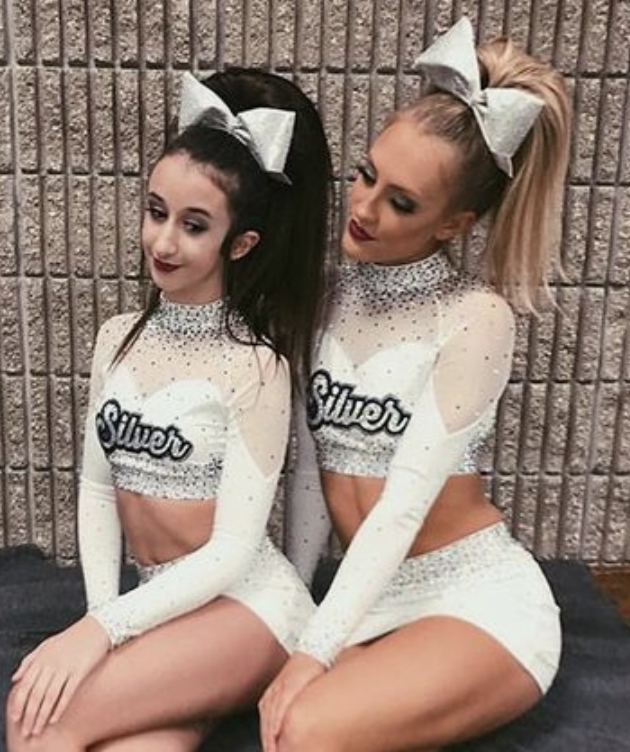
View the full image on Pinterest, here.
Elizabeth: 9.7/10
This is as close to a real leo design as I think these cheer uniforms are going to get. I really like it too. The sweetheart neckline, the matte white, the sparkles—it’s nearly perfect. I’ll go with Ohio State for the team.
Carolyn: 10/10
Perfect. I love everything about it. At first glance I thought back to Cal’s conference champs leo and thought this would go hand-in-hand with it, so I will say Cal.
Tara: 9.1/10
I love the simplicity of the fabric paired with the elegant sparkle design. The sweetheart neckline between the mesh and plain fabric seals the deal. I think the simplicity of this design could appeal to many teams. If I had to pick one I might say it fits Utah well.
Talitha: 8.2/10
I like the white body a lot, but the yellowish mesh part (is it supposed to be nude?) is ugly, and I don’t like the use of black crystals. A choice of grey, white or silver ones would have been more elegant. I could see Temple working out a beautiful leotard based on this design.
Score: 8.875

View the full image on Pinterest, here.
Elizabeth: 9.3/10
YAS this back! It’s so similar to my favorite Oklahoma leo of all time, as well as a similar Florida back design. More of this in cheerleading, and I might actually watch it…
Carolyn: 8.5/10
Ooh! Cute and unique top! Florida has some similar backs like this one does, so it would only make sense for me to put them together.
Tara: 8.7/10
I LOVE the back. I don’t love the sleeve detailing or the style of print on the front, but the back makes up for it and even more. The back definitely reminds me of a Florida leo.
Talitha: 9/10
I love the strappy back and the teal color of the front is also very pretty. A+! The back reminds me of a Florida leotard, too, but perhaps Michigan could also make it work by adding some yellow here and there?
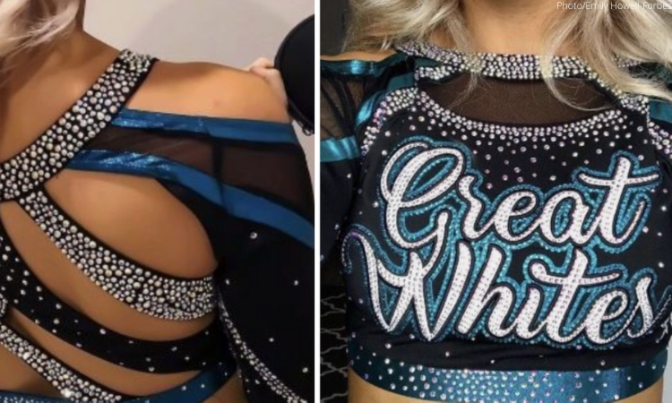
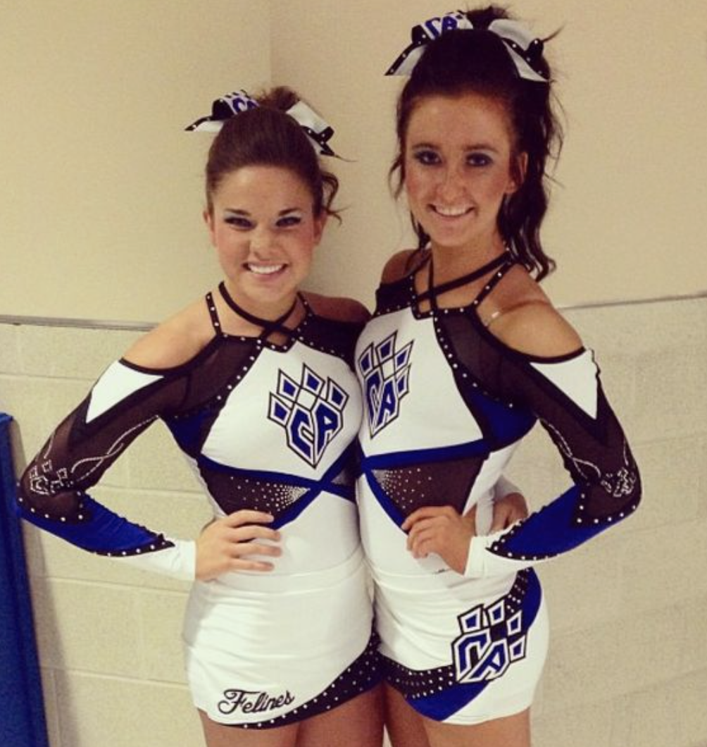
Score: 8.600
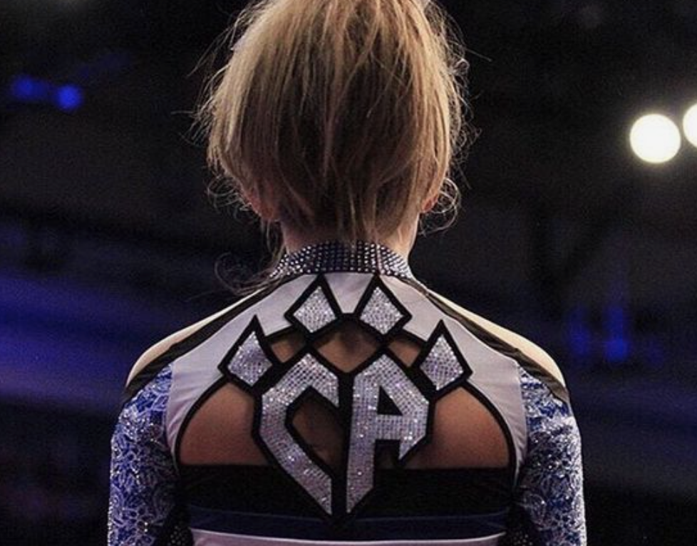
View the full image on Pinterest, here.
Elizabeth: 9.6/10
The back is SO unique, and the arms are just the right amount of funky. This design screams BYU. It reminds me so much of BYU’s current pink leo.
Carolyn: 9/10
Ooh I love this! The sparkles that spell out CA but also form a claw is everything, and the back side of those sleeves are to die for. BYU should adopt this one!
Tara: 7.8/10
I enjoy the open back combined with the team logo! It’s VERY sparkly, but I’m kind of loving it. BYU has a leo that incorporates the school logo in the back, maybe it could do another like this one?
Talitha: 8/10
I don’t like the strappy shoulders, but I like the high neck—and I love the placement of the logo on the strappy back. It’s so imaginative. I will go with New Hampshire here.
Score: 8.475
View the full image on Pinterest, here.
Elizabeth: 8.3/10
The matte white here is great, and it pairs nicely with the royal blue. I don’t even mind those side cutouts. The neck straps are a little meh, but what can you do… Kentucky should wear a similar design.
Carolyn: 9/10
I love this whole uniform, but mostly because of the fun cutouts. I can see how from my fellow editors it looks like a Kentucky leo, but my first thought was Penn State so I’ll stick to that.
Tara: 8.4/10
I’m not sure how practical the off-the-shoulder design would be on a leo, but I do love the look. I also love the super simple black and white with a pop of color in the logo. With all of Iowa’s quirky black and white designs, I can definitely see the Hawkeyes in a leo like this.
Talitha: 8.2/10
I like this design! It’s definitely unusual, and the neck and shoulder part is unique; that’s what makes it interesting. I could see Kentucky wearing it.
Score: 8.450

View the full image on Pinterest, here.
Elizabeth: 9.6/10
I actually really like this one. It’s athletic while still being flashy. The sparkly black fabric and ribbon design works well. I could definitely see Michigan State wearing a similar design.
Carolyn: 9.5/10
OK! I like this green color and the silvery-metal. Since EMU already uses something similar to this, I think this as a leo would be a great addition to their collection.
Tara: 6.7/10
I like this concept as a cheer uniform. I’m not sure how it would translate to a leo, but with some slight modifications I’d love to see LIU convert it to a leo since it is so clearly meant to resemble a shark.
Talitha: 8/10
Oh, I really like the idea! Both black mesh and green can be gorgeous on a good design, and this could be it. I would love to see Michigan State working with this style of design.
Score: 8.400

View the full image on Pinterest, here.
Elizabeth: 9.1/10
I love this a lot actually. The ombre is great, and I like the red paired with blue. It’s a very athletic look, which I appreciate. Let’s go with ombre lover Rutgers for the team.
Carolyn: 9/10
Perfect uniform! I see almost nothing wrong with it, however I would just add more sparkles to the wrists and sleeves. This uniform would go great with Northern Illinois’ colors!
Tara: 8/10
I love the simple black combined with the red ombre sleeves! I can see a team like Ball State adopting this look.
Talitha: 7.5/10
I like the ombre sleeves, and black and red always work well together. It’s a simple yet pretty and effective design that screams Nebraska to me.
Score: 8.250

View the full image on Pinterest, here.
Elizabeth: 8.5/10
I actually like this design as a whole. The back is nice and the sleeve design isn’t over the top It could totally be a Towson leo if you switch those leopard spots to tiger stripes.
Carolyn: 9/10
Yep, solid Missouri leo. And that’s all I have to say about that.
Tara: 9/10
Ooh, this is pretty! I love the back and the simple logo on the front. I can definitely see a variety of teams wearing this, but Missouri is sticking out to me!
Talitha: 6.5/10
I’m not sure about mixing grey and black on the sleeves, but I could totally see Missouri wearing a leotard similar to this design.
Score: 8.225

View the full image on Pinterest, here.
Elizabeth: 9.5/10
I love the back on this. The mix of the three colors with the matte fabric works well. I wish the front neckline was a little more classic, but overall, it’s nice. I could see UW-La Crosse in something similar.
Carolyn: 8.5/10
Again, I love this color and the silvery-metal! The white and surrounding sparkles also look great with it. Oddly enough, I can see Cal wearing something like this?
Tara: 7.4/10
I love the strappy back! I don’t love the front chest holes, but the rest is good. Keeping the green color, this could easily be an MSU leo, though I can also see a red version being a Stanford leo.
Talitha: 7.5/10
I think I would really enjoy the matching sparkly greyish bands on the stomach and the neck on an actual leotard. I’m not sure about the combination of white, green and black, though. Eastern Michigan?
Score: 7.400

View the full image on Pinterest, here.
Elizabeth: 8.9/10
Another good back. With the right combination of colors, this reminds me of that low, open back Arkansas leo that’s all-red and gorgeous.
Carolyn: 8/10
This looks like a N.C. State or Georgia leo to me. Those sharp red and black colors fit right in with these teams.
Tara: 7.7/10
This is simple but nice. I don’t love the change of angle on the red line on the arm or the mesh cutout on the arms, but I quite enjoy the rest of it. This is screaming Nebraska or Ohio State to me.
Talitha: 5/10
I don’t like random stripes cutting across leotards, so this is not my style. The overall design is a bit boring, too. I thought Georgia the first time I saw it—not sure why.
Score: 7.075
View the full image on Pinterest, here.
Elizabeth: 6.3/10
I like the sort of swooping, asymmetrical design here. It’s a similar concept to Illinois’ Big Ten leo. The use of real gold makes me think maybe an out-of-the-box Washington design if you change the black to purple.
Carolyn: 8/10
With the colors, I can see Lindenwood wearing this, but with the word Champion on the back, it is kinda giving me LSU vibes!
Tara: 8/10
I like the simplicity of this along with the open back. Reminds me of past Lindenwood leos!
Talitha: 6/10
I like the concept and the back, the golden sleeves a bit less. I will go for UW-Oshkosh!
Score: 6.225

View the full image on Pinterest, here.
Elizabeth: 6.4/10
If the weird swooping neck hole wasn’t there, this would actually be a pretty nice leo. Like Tara said, it could definitely be something Oklahoma pulled out.
Carolyn: 3/10
Yuck. That skirt to shorts transition ain’t it, and those odd cutouts don’t do it for me. If UNC were a little more crazy, I could see them using something like this.
Tara: 7.5/10
I like this overall! I really love the back. I would probably remove the front chest cutout, but other than that this is a good one. I can see KJ Kindler pulling out something similar in Oklahoma colors.
Talitha: 8/10
I really like the color combination here; it’s very pretty. The neck design is not my style, but I appreciate the uniqueness and I’m quite obsessed with the back band. The mesh parts look a bit cheap, unfortunately. I would love to see LIU create a leotard with these colors.
Score: 5.725

View the full image on Pinterest, here.
Elizabeth: 5.1/10
This is exactly the kind of egregiously large mascot design Boise State would put on its leo. Not a fan…
Carolyn: 6/10
I like the back, just definitely not the front. I wish the bobcat thing was more of a head like this Georgia one, but at least the surrounding sparkles make up for it. If kept like this however, I would give it to New Hampshire.
Tara: 6.8/10
I like this overall, I just don’t love the huge bobcat. The rest is gorgeous, and I could see a team like BYU or New Hampshire embracing it.
Talitha: 5/10
The black stripes are horrible, but the blue and white design is quite pretty. I would say Penn State.
Score: 4.625

View the full image on Pinterest, here.
Elizabeth: 2.0/10
I’m having post-traumatic stress flashbacks to the George Washington pink leo and internally screaming. Needless to say it’s a no from me.
Carolyn: 4/10
Ooh yuck again. Some of these are horrendous, and this one is no exception. The back of the top is solid, but the LOVE on the front kills it. I can see Washington wearing this, but considering they never get new leos, why get my hopes up?
Tara: 6.5/10
I’m not loving the camo on the sides or the cursive font used, but the rest is solid. With the purple color, I can definitely picture Bridgeport or even Washington in this design.
Talitha: 6/10
The purple and white combination is beautiful and so are the ombre sleeves. But what on earth is that green pattern on the sides and most importantly why is it there? Without the camo, I could see LSU wearing something similar.
Score: 4.225

View the full image on Pinterest, here.
Elizabeth: 5.4/10
Honestly, this design is pretty boring. It reminds me of the mid-2010s leos Illinois would wear.
Carolyn: 5/10
I’m really liking that neckline, but those colors don’t work well together. I’m thinking that that blue is something Florida could use inits leos sometime soon.
Tara: 3.5/10
Mostly I just don’t love the color combination of this. I usually like striped designs, but there’s something I can’t pinpoint about what I dislike (maybe the fact that it’s on the shoulders/arms?). I’m honestly not even sure what team I could picture wearing this. Maybe Alaska?
Talitha: 3/10
Ooof, light green and light blue really don’t work well together, do they? The design also looks a bit amateurish, and those holes between the neck and the shoulders are not pretty either. Perhaps Alaska? Sorry Seawolves!
Score: 3.325

View the full image on Pinterest, here.
Elizabeth: 4.3/10
I’ve never liked lace, and this doesn’t make me want to start. It’s similar to a SEMO leo that already exists, so I’ll go with that.
Carolyn: 3/10
Ooh yuck. SEMO has a leo that is similar to this, so that is what it reminded me of. But gosh that skirt is just killing me. I don’t want any team to wear this tbh.
Tara: 4/10
Um, I think this would actually work better with a full-bodied leo and reminds me of something UCLA would do (I feel like it has one like it?). The lace sleeve to fabric ratio is just way off on the cheer uniform.
Talitha: 2/10
Yikes, no. This is not how you use lace. I can’t impose this horror on any team, sorry.
Score: 2.750
View the full image on Pinterest, here.
Elizabeth: 6.0/10
That side hole physically hurts me to look at… If it was mesh rather than a real hole, this is right up Iowa’s alley.
Carolyn: 3/10
At first glance it’s not that bad, but the more I look at it the worse it gets. It kinda reminds me of that old horrendous Missouri pink meet leo that we should NOT bring back please and thank you.
Tara: 1/10
Oh boy. NOPE. That cutout is a BIG NOPE. Even filling it in with mesh on a leo wouldn’t be pretty. I wouldn’t wish this design as a leotard on any team, nor can I really picture any team adopting it—though BYU might have the boldness to go for it if the hole is filled in.
Talitha: 1/10
Oh dear, no no no… The hole on the stomach is terrible, and the asymmetric shoulder design is not very flattering either. Holes aside, it could be one of Florida’s numerous Pink Meet designs.
READ THIS NEXT: Leotard Rankings: Rhythmic Gymnastics
Article by Elizabeth Grimsley, Carolyn Lien, Tara Graeve, Talitha Ilacqua
Like what you see? Consider donating to support our efforts throughout the year! [wpedon id=”13158″]

2 comments
Comments are closed.