Last offseason we looked at dance leos and rhythmic outfits, found our faves, then determined which teams in college gymnastics we thought would be most likely to wear each design. Earlier this offseason we looked at cheer uniforms. We’re back once again to look at college cheer designs to determine how they could be transformed into gym team leos.
Lindenwood: 9.140
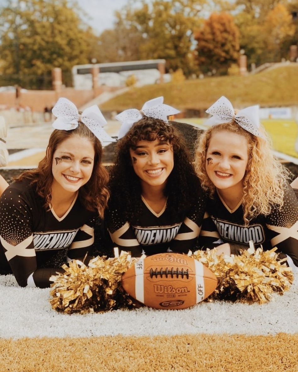
Photo/Instagram, @LindenwoodCheerleading
Elizabeth: 9.3/10
I like the subtleness of this mostly black design. It allows for the sparkle to really pop, and the gold to really stand out. Lindenwood has always done well incorporating real gold into its leos, and this would be another good option.
Carolyn: 8.2/10
This uniform really reminds me of this leo Lindenwood already has, but I can absolutely see it adding something similar to this uniform to its collection. LU doesn’t really write out the full “Lindenwood” word on its leos already, maybe because it’s so long, but I would love to see it in the future!
Kathleen: 9.0/10
I like this one a lot and again think it would be pretty easy to translate it into a leotard. I especially love the gold crosses over the sleeves. I think those would look lovely on a leo!
Allison: 10.0 + stick bonus/10
I love black leos. I love the sleeves here, the Lindenwood across the chest, the geometric shapes—all of it. Please make this a leotard immediately. Maybe add some straps in the back to add some extra pizzazz to really earn the stick bonus.
Tara: 9.2/10
I love this! It reminds me of a leo Lindenwood already has, and it’s a good one. You wouldn’t even need to change it a whole lot to make it a good leo.
Iowa: 8.900
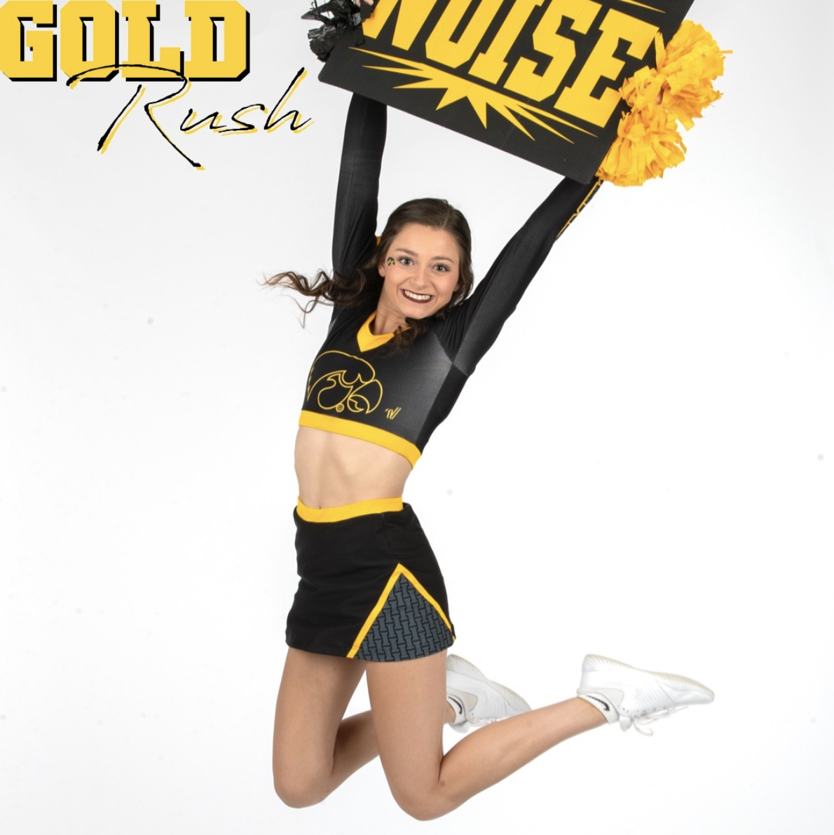
Photo/Instagram, @IowaCheerleading
Elizabeth: 8.3/10
Picture this: black and grey ombre with a thick yellow neckline and thick, athletic, yellow stripes down the sides with this funky little Hawkeye logo on the chest. I’m here for it, and it would be completely different than anything Iowa currently has.
Carolyn: 9.3/10
Oooh I’m loving the secret “I” design on the bottom! Such a nice feature to add! Iowa gymnastics should SO use some dark grey in its leos like Iowa cheer did in this uniform; it would really disrupt its usual style for the better.
Kathleen: 9.2/10
I like this one a lot. I’m such a sucker for a good two piece! I’d love to keep the top the way it is and keep the fun triangle design on the hip of the leotard. I would also love to see this awesome gray be part of Iowa’s ensemble. I feel like it would look great on the whole team.
Allison: 8.9/10
There’s not much I’d change here, I love the gold triangle collar that’s happening, and I like the design in the triangle on the bottom. Maybe move that to the sleeves or near the cuff. But for sure keep the gold borders as much as possible, and add some gemstones to the hawkeye.
Tara: 8.8/10
As is, this would be really on par with what Iowa likes to do with leos. I’m all for adding some gray in and making it an ombre bodice and topping it off with some sparkles.
Utah: 8.760

Photo/Instagram, @UtahSpirit_
Elizabeth: 8.6/10
I do want to see more majority-red leos from Utah, and this would be a good start. I don’t normally care for high necklines, but it could work here. Plus, the super sparkly UU logo on the chest is a good contrast with an otherwise simple design.
Carolyn: 9.5/10
Oh cute! I love this! That red color pops so well, and I love how the high neckline curves away from the shoulders. I also can’t not mention that sparkly UU on the chest, which completes this uniform and would translate really well onto a leo. Make this uniform a Utah leo!
Kathleen: 8.3/10
I like this one! I think it would be cute as a high-neck leo—almost a retro vibe. I’d keep the sleeves all red and make the Utah logo with with sparkles on top.
Allison: 9.0/10
I love this! I would keep the logo with the sparkles and the red body. The sleeves would need something, so maybe silver sparkles down them to add a little pop. Super clean design-wise but stunning.
Tara: 8.4/10
Ooh, this is nice! The all red is lovely. I’d make the logo slightly smaller and add red to white ombre sleeves with sparkles on them.
Oregon State: 8.700

Photo/Instagram, @BeaverCheer
Elizabeth: 7.2/10
It’s funny how this already reminds me of some older Oregon State leos. Maybe flip the skirt to the top and have the design extend to the arm and you have yourself a solid leo.
Carolyn: 9.2/10
I love the athletic look of this uniform! I would continue the top’s design down the bodice and then put those fun lines from the top down the sides like the UCLA centennial leo.
Kathleen: 9.3/10
Ooh, I love this one. The two-piece look is so fun, and I love the way the colors work together. I think it would be cool to keep the white of the top for the top of the body of the leo and then do a black bottom for the body. I’d do orange straps for the back and potentially orange piping on the sleeves.
Allison: 9.1/10
Absolutely love this. I love athletic styles. I think it could use the pattern and colors on the bottom as the body for the leo or keep the body a plain white and black but use the swirls on the sleeves.
Tara: 8.7/10
I love how this combines an athletic look with the sparkle waist. I can definitely see this design as an Oregon State leo. I’d change the black on top to white and then do either an orange or black bottom with white mesh sleeves and add some rhinestones scattered on the sleeves.
Pittsburgh: 8.500

Photo/Instagram, @Pitt_Cheer
Elizabeth: 7.9/10
This is already pretty similar to Pitt leos we’ve seen in the past. I like the arm design, and the athletic look of the top with the logo. Just add some sparkles, and you’re ready to go.
Carolyn: 8.0/10
I like how athletic yet feminine this uniform is. I think the big Pitt logo and the arm design would look great on a Pitt leo.
Kathleen: 9.0/10
I think this uniform looks great. I love how the blue, yellow and white are spaced out so they don’t clash with each other. I think it would be able to translate into a leo pretty immediately, especially since it already has long sleeves. I might take out the swirl on the sleeves and make it more of a line with yellow in the middle and white framing it.
Allison: 8.8/10
This is plain but in an elegant way. Honestly I’m not sure what I’d change aside from adding some gemstones down the yellow piping—maybe use a strappy back to add another level of pop. But overall I think it’s great as it is to use for a leo.
Tara: 8.8/10
This already reminds me of a leo. The blue with yellow accents are nice, and the design is athletic yet elegant. Make it mystique fabric, add some sparkles and you’re good to go.
UCLA: 8.300

Photo/Instagram, @UCLASpiritSquad
Elizabeth: 8.7/10
This is close to those UA sample leotards we saw during preseason one year. I think it has potential though. I like the rhinestones around the neckline. Maybe UCLA could reverse the colors, making a solid blue leo with a thicker neckline with sparkles and a blinged-out logo on the chest.
Carolyn: 7.5/10
I would completely change the colors (and partially the design) on this one. I would make the base color that pretty blue that’s already on this uniform, change the original blue area into the Bruin gold color and then make the arms white. I would then switch the UCLA to the back and put some sort of fun sparkle chest design on the front.
Kathleen: 8.5/10
I think this uniform is so cute, and the design reminds me a little of UCLA’s centennial leo. I think it would be fun to keep the base white with the blue UCLA but use the blue as piping on the neckline and sleeves. I would also keep the rhinestones on the piping and throw some sparkles over the UCLA on the front. It could be fun to do one of the illusion backs for this leo as well, where a sports bra is blended into the design of the leotard. It could be criss-crossing straps of that same blue.
Allison: 8.6/10
I’m not usually a fan of a white base, but I think with a blue trim and bedazzled UCLA it would be perfect. It would let other features pop and be the focus rather than the body of the leo. I think it would be great with the rhinestones around the collar and use the blue and gold trim down the back and with the cuffs of the sleeves.
Tara: 8.2/10
This would translate well to a leo. The components are there, and I love the rhinestone UCLA on the chest. I’d either extend the blue to the sleeves (maybe with some ombre?) or reverse the colors and have a blue bodice with white sleeves.
Georgia: 8.060

Photo/Instagram, @UGACheerleading
Elizabeth: 8.4/10
The grey intrigues me. I think Georgia could definitely take inspiration from this and use a shiny silver with a similar arrow design to create an elevated athletic look with the Super G.
Carolyn: 8.5/10
Cute! That downwards stripe definitely reminds me of the US Women’s team final leo that debuted at the Olympics this summer. If I were to make this into a leo I would keep the red neckline and the overall grey color, but make the arms grey to red ombre with the red being at the wrists.
Kathleen: 7.5/10
I like the uniform overall, but it’s not my favorite. I wish the gray was a bit darker or just black, especially with how red the sleeves are. I like Carolyn’s idea of using an ombre on the sleeves to make the difference between the colors a bit less jarring, and I’d definitely darken the gray to more of a charcoal.
Allison: 7.9/10
I love the gray. If it was just a bit darker, I think it’d be perfect. But I love the v-shape of the lines, it feels almost retro, and I think that would look gorgeous on a leo, especially if the lines continued down the sleeves.
Tara: 8.0/10
I love the gray combined with the V. Make it matte gray with a similar design, throw in some rhinestones and this would be a hit leo.
Oklahoma: 8.060

Photo/Instagram, @OU_Spirit
Elizabeth: 9.0/10
Similar to my thoughts on UCLA’s leo, I really like how the sparkle is presented here. I think OU gym could take a leaf out of this design book, and do something that uses matte white with incredibly sparkly arms?
Carolyn: 7.5/10
I like the concept that OU had here: make the bodice simple and make an overlooked feature the center point. Perhaps OU gymnastics could incorporate that same concept onto a leo? I’m thinking sparkle ombre on the arms (so that lots of sparkles are at the wrist and then less and less come up to the shoulders).
Kathleen: 8.0/10
I like the style of this one, but I’m not a huge fan of the red and white combination. It gives me Santa Claus vibes. To make it into a leo, I think I’d keep the all-white body and I would change the “Oklahoma” into a red “OU” logo—and add some red sparkles all over. I might keep the red piping to frame the back of the leo.
Allison: 7.7/10
For this to be a leo I’d need a little bit more, so maybe if they could use the rhinestones on the trim for the back and make it into a strappy back, otherwise I need a little more color, so maybe a silver white ombre as the body but have the rhinestone trim throughout.
Tara: 8.1/10
This is similar to the UCLA one, and I love the sparkle details on it too. I’d keep the white design and add white to red ombre with some sparkles on the arms.
Florida: 7.780

Photo/Instagram, @UFCheer
Elizabeth: 8.9/10
ORANGE. I literally don’t have to say anything besides that. Just keep the asymmetric swoop and Gators logo, add sleeves, and you have a leo that’s already totally different than anything else Florida already has.
Carolyn: 7.0/10
Not my fave, but I do appreciate the swooped neckline and the boldness of this design. I’m sure it makes a difference in person from across the stadium.
Kathleen: 7.2/10
I like the overall design a lot, especially the swooping neckline that still feels practical. That being said, while I would like to see Florida incorporate more orange into its leos, this goes a bit heavy on it for my taste. I’d like to keep the neckline and the top, but maybe make parts of the bottom blue.
Allison: 8.2/10
I know I said I liked the athletic look, but I need something a little more here. I’d keep the stripes and the white body and use white down the sleeves, but maybe blue for the bottom and some orange piping throughout. For sure add some bedazzling on the Gators text.
Tara: 7.6/10
I love the athletic look. And the ORANGE! It would definitely be different from a lot of Florida leos. I’d add blue sleeves and a few sparkles throughout, too.
Nebraska: 4.640

Photo/Instagram, @HuskerCheerSquad
Elizabeth: 9.3/10
I would DIE if Nebraska did a vertical stripe, retro leo that was blinged out with rhinestones. Especially if it looks more throwback-y and less circus tent.
Carolyn: 4.0/10
Ohhhh. Strongly dislike. I would not like to see this on a leo, but if Nebraska did incorporate this vertical stripe into one of their designs, I would want everything to be made out of sparkles. Sparkle stripes. That’s it.
Kathleen: 3.0/10
No. No thank you. We do not need a candy cane leo. I would be fine with, like, a solid red leo and maybe an off-center white stripe down the middle, but I do not vibe with the stripes at all.
Allison: 3.1/10
This doesn’t really do much for me. Unless you were to thin out the lines and only use them on the sleeves, it feels very retro but misses the mark on how to make the pattern fashionable or stylish. But the stripes would for sure need to be in a small area for it to work.
Tara: 3.8/10
This would work for a retro leo if done right, but I’m not loving it. I’m with Carolyn—I’d do sparkle stripes. I’d also make the top the stripes and do a V waist line with solid red or black underneath and extend the color of the last stripe to the sleeves.
READ THIS NEXT: Leotard Rankings: Cheer Uniforms Part 1
Article by Elizabeth Grimsley, Carolyn Lien, Kathleen McPartland, Allison Freeman and Tara Graeve
Like what you see? Consider donating to support our efforts throughout the year! [wpedon id=”13158″]