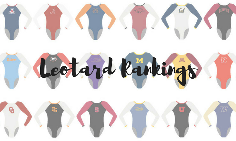
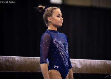
We introduced some new teams to the rankings this week by the likes of Air Force, Southern Utah and Towson. But did they make it to the top of our list of favorites? The criteria is the same as always: up to three points for design; two points for fabric, sparkle, etc.; and two points for school spirit; three points for overall appearance. This week’s guest judge is Emily M, our Big 10 editor.
BYU: 8.875
https://twitter.com/BYUgymnastics/status/967229535572803584
| Design | Fabric/
Sparkle |
School
Spirit |
Overall
Appearance |
Total | |
| Caroline | 2.6/3 | 1.6/2 | 2.0/2 | 2.6/3 | 8.8/10 |
| Christina | 2.8/3 | 1.5/2 | 2.0/2 | 2.7/3 | 9.1/10 |
| Elizabeth | 3.0/3 | 1.4/2 | 2.0/2 | 2.8/3 | 9.2/10 |
| Emily M | 2.4/3 | 1.5/2 | 2.0/2 | 2.5/3 | 8.4/10 |
Caroline: There is SO much happening here but somehow… It works??? The ombre, the sparkle, the flowers, the pink, the Y back… I don’t understand how you can shove all these innovations and trends into one design, but they did and somehow made it really cool!
Christina: I love this one. The pastel-like shades of colors used here are beautiful, and I am obsessed with the front and the back. I don’t really care about the flowers on the upper bodice because it overall just works. The back is so clever, and I love the unique shape of the hole and that they incorporated the school logo. One of my favorites from BYU—probably ever.
Elizabeth: Ok hear me out. When I first saw this leo I was like, “BYU, what are you doing?” But then I started to see the details and intricacies. But what really pushed me over the edge was the back. IT’S SO CLEVER AND UNIQUE. They incorporated the BYU logo into the hole for goodness sake!! Like, I don’t even care about the flowers on the sleeves anymore because the back is so cool and sparkly and awesome. Can you tell I’m obsessed? BYU has really stepped up its game this year—in both leo design and actual gymnastics. Plus, I can’t forget about the lovely, subtle ombre and flattering body design.
Emily M: I am overwhelmed by this leo. It is a lot, which is classic BYU. I’m not a fan of this trend (please don’t be a trend!) of V necklines with another fabric under, like the leo we saw from Stanford recently. Wearing a cami under a deep V tee shirt is very 2008, and we’re better than that! I LOVE the BYU Y on the back, and the cut of the pink against the blue. The flowers grow on me the more I look at this one. I just wish it didn’t have that white bit on the front!
California: 8.325
Here for these Cal leos! #ncaagym #leowatch pic.twitter.com/c8joLCEqPh
— NCAA Gym News (@NCAAGymNews) February 25, 2018
| Design | Fabric/
Sparkle |
School
Spirit |
Overall
Appearance |
Total | |
| Caroline | 2.4/3 | 1.4/2 | 1.7/2 | 2.6/3 | 8.1/10 |
| Christina | 2.4/3 | 1.5/2 | 1.6/2 | 2.5/3 | 8.0/10 |
| Elizabeth | 2.5/3 | 1.5/2 | 1.8/2 | 2.6/3 | 8.4/10 |
| Emily M | 2.7/3 | 1.8/2 | 1.9/2 | 2.4/3 | 8.8/10 |
Caroline: This is a supper classy look from Cal, from the sparkle cascade at the neckline to the shallow criss-cross on the back. Bonus for extra spirit with the logo on the back and the stripe on the cuffs!
Christina: I like this one a lot, but I wish the rain of sparkles on the front kept going and wasn’t cut short so soon. Other than that, the rest of the design is gorgeous. The mesh back with the criss-cross is great as well. I do wish it incorporated a tad more gold, but another solid look from Cal.
Elizabeth: Yet another gorgeous leo from Cal this year! UA was really the best thing that could have happened to it, to be honest. I love the front sparkle design and the back is stunning. I also love how the sather stripe was incorporated on the sleeve cuffs.
Emily M: Cal is on it this year! I hate to say it, but the Bears’ leos are starting to run together for me? That’s not to say that this one isn’t also gorgeous. I love the criss-cross back, and the dripping crystals on the front are a nice addition. As usual, the hidden school spirit gems are fun to hunt for.
Auburn: 8.2
https://twitter.com/AuburnGym/status/967178578575151104
| Design | Fabric/
Sparkle |
School
Spirit |
Overall
Appearance |
Total | |
| Caroline | 2.3/3 | 1.5/2 | 1.7/2 | 2.5/3 | 8.0/10 |
| Christina | 2.4/3 | 1.6/2 | 1.7/2 | 2.5/3 | 8.2/10 |
| Elizabeth | 2.4/3 | 1.6/2 | 1.7/2 | 2.5/3 | 8.2/10 |
| Emily M | 2.6/3 | 1.5/2 | 1.6/2 | 2.7/3 | 8.4/10 |
Caroline: Okay Auburn! I love how the navy part almost looks like a starry sky with the flames shining up into it—very effective use of sparkle. And the white top section and sleeves are an elegant touch, letting the eye focus on the main design but still adding another layer of contrast. And so much spirit!
Christina: Oooh, I really like this one! The fact that orange is the dominant color doesn’t bother me at all, and I really like the navy sweetheart neckline with rhinestones all over. The white upper body balances it all out really well. I could have gone without the flamey design, but all in all this is probably one of my favorites from Auburn.
Elizabeth: Breaking: This is one of the first Auburn leos I’m close to loving! I never really care for the combo of orange and blue, but this is done really well. I love that the navy used wasn’t plain and had rhinestones all over it. I also love the incorporation of white and how it doesn’t look super blocky in the design. This leo really popped on the broadcast. (Can I also mention how much I like the warm up leo, too?)
Emily M: Like Elizabeth, orange and blue is not my favorite combo (ah, the irony, as an Illinois alumna and Chicago Bears fan), but I think this gets it just right. The white balances the orange nicely, and the really deep navy keeps it from being too bright. Also I LOVE the use of white crystals that make this leo look like it’s literally on fire. Nice job, Auburn!
Southern Utah: 8.05
McBride for @SUUGym on the bars #SUUGYM pic.twitter.com/A0ECgRhIST
— BYUtv Sports (@byutvsports) February 17, 2018
| Design | Fabric/
Sparkle |
School
Spirit |
Overall
Appearance |
Total | |
| Caroline | 2.3/3 | 1.8/2 | 1.6/2 | 2.4/3 | 8.1/10 |
| Christina | 2.1/3 | 1.7/2 | 1.6/2 | 2.2/3 | 7.6/10 |
| Elizabeth | 2.5/3 | 1.7/2 | 1.7/2 | 2.6/3 | 8.5/10 |
| Emily M | 2.1/3 | 2/2 | 1.6/2 | 2.3/3 | 8.0/10 |
Caroline: The front is gorgeous, with the faux halter and the sparkle waterfall down the front. I’m not sure I’m sold on the back, though I love that they did something different and that it continued the sparkle on the back as well.
Christina: Hmmmm I am torn here. I like the colors used, and while I’m not usually a fan of this type of neckline, it works well here. I do like the super sparkly choker band, but the strap across the back hole is a bit weird.
Elizabeth: Once I got a good look at this one, I decided I really liked it. The neck isn’t so high when the arms are down and the sparkle design is really flattering. I also LOVE the back and the use of the rhinestones on the funky strap over the hole. The SUU on the sleeve and color combo are also nice touches to round it out.
Emily M: WOW that choker band at the top is sparkly, as is the band at the back, and I love the added sprinkle of shimmer to the sleeves. I also love this shade of red; super flattering. I am so conflicted about the back though. I love the originality, but I just don’t get the strap?
Florida: 7.45
https://twitter.com/GatorsGym/status/967198720671535110
| Design | Fabric/
Sparkle |
Pink
Spirit |
Overall
Appearance |
Total | |
| Caroline | 2.3/3 | 1.3/2 | 1.7/2 | 2.3/3 | 7.6/10 |
| Christina | 1.8/3 | 1.3/2 | 1.6/2 | 2.0/3 | 6.7/10 |
| Elizabeth | 2.4/3 | 1.4/2 | 1.8/2 | 2.5/3 | 8.5/10 |
| Emily M | 2/3 | 1.4/2 | 1.6/2 | 2/3 | 7.0/10 |
Caroline: I loved this in person! The criss cross back with the mesh is such a cool twist on a commonplace concept, and the front is super classic with the sweetheart neckline and the black trim. This definitely is a little too reminiscent of a Nastia Cup leo to be completely original, though.
Christina: Meh on both front and back. I do like the ombre on the sleeves, but overall the front is very generic. I do not like the the criss-cross on the back, but I do like the V neckline. Yeah, just not feeling this one very much.
Elizabeth: I have mixed feelings on this one. As a whole, I love it. However, it could use some improvements. The ombre switches colors at an awkward place, making it look like a short-sleeved leo with brown forearms. But I ADORE the back design and the use of mesh there rather than a solid fabric. Plus, the neckline is really flattering. (Also, does it remind anyone else of a Nastia Cup leo?)
Emily M: Nope on the front and YES on the back. I like the black to pink ombre and the criss cross back, plus the cut is very flattering, but I don’t like the black band around the neckline against the sweetheart cut below it. Plus, this is such a generic leo! I know its a pink meet leo, but nothing about it says Florida. It leaves me wanting…something.
Towson: 7.225
| Design | Fabric/
Sparkle |
School
Spirit |
Overall
Appearance |
Total | |
| Caroline | 2.1/3 | 1.3/2 | 1.9/2 | 2.0/3 | 7.3/10 |
| Christina | 1.7/3 | 1.4/2 | 2.0/2 | 1.9/3 | 7.0/10 |
| Elizabeth | 2.0/3 | 1.4/2 | 1.9/2 | 2.1/3 | 7.4/10 |
| Emily M | 1.8/3 | 1.5/2 | 2.0/2 | 1.9/3 | 7.2/10 |
Caroline: I love the idea of this—simple, classic, full of school spirit. The shoulders are a bit oddly blocked off, between the color change where the sleeves start and the yellow inverse V. But I love the sparkly Tiger and the shiny sleeves.
Christina: These are nice although there is nothing outstanding about the design. School spirit is great, and I’m a big fan of the shimmery sleeves. I do wish the yellow bands were somewhere else as it breaks up the figure a bit, but a nice leo overall.
Elizabeth: These are pretty good! I like the concept of a 50th anniversary leo, and this one definitely shows a lot of school spirit. The big logo on the front doesn’t offend me, and I love the shimmery sleeves. The yellow stripes that break up the body at the top are a bit weird, but overall this is a good one.
Emily M: Oooo I like these sleeves. They add a lot to the leo. I’m glad Towson kept these pretty simple, so the logo really gets to be the star, which makes sense for a 50th anniversary leo—a cool concept. I’m not sure about the shade of yellow for the stripes on top, though, especially against the gold. It sort of throws the whole thing off for me.
Bowling Green: 6.8
Ok #leowatch Here are the new @FalconGymn ready for @ElevateTheStage #gofalcons #designedbyourseniors pic.twitter.com/gsKi2MoDbA
— Kerrie Turner (@coachkerrie) February 24, 2018
| Design | Fabric/
Sparkle |
School
Spirit |
Overall
Appearance |
Total | |
| Caroline | 1.8/3 | 1.4/2 | 1.7/2 | 1.9/3 | 6.8/10 |
| Christina | 1.8/3 | 1.3/2 | 1.7/2 | 1.9/3 | 6.7/10 |
| Elizabeth | 1.9/3 | 1.3/2 | 1.7/2 | 2.0/3 | 6.9/10 |
| Emily M | 1.7/3 | 1.4/2 | 1.8/2 | 1.9/3 | 6.8/10 |
Caroline: The random squiggles are not my thing, especially here where they don’t match on front and back. I do love the spirit, with the logo as the centerpiece on the back and the prominent orange.
Christina: I like the front, and the black and orange work well here. The orange squiggles are odd, but don’t bother me much there although I wish they didn’t go over the neckline. The back is a bit much for me, and I wish it had less squiggles and more sparkles.
Elizabeth: Orange and black is a hard color combo to make look good, and I think BGSU did a good job with this design. I like the mostly black, and the touch of orange is a nice addition and doesn’t go overboard. I think I prefer the front squiggle design over the more uniform back one, but overall I’m content.
Emily M: Hmmm. The black body of this leo is great, and I love the use of sparkle, especially around the sweetheart neckline and back. I’m just not sure about the random orange squiggles, though. Orange is a tough color (see: Auburn and Illinois with some yikes leos over the years), but I’m not a random squiggle fan. I do like the BG logo in orange on the back a lot, though.
UCLA: 6.625
New leos today! #LeoWatch pic.twitter.com/MbQUq0Ex52
— UCLA Gymnastics (@uclagymnastics) February 25, 2018
| Design | Fabric/
Sparkle |
School
Spirit |
Overall
Appearance |
Total | |
| Caroline | 1.9/3 | 1.3/2 | 1.6/2 | 2.2/3 | 7.0/10 |
| Christina | 1.9/3 | 1.3/2 | 1.7/2 | 2.2/3 | 7.1/10 |
| Elizabeth | 2.0/3 | 1.3/2 | 1.7/2 | 2.1/3 | 7.1/10 |
| Emily M | 1.2/3 | 1.0/2 | 1.5/2 | 1.6/3 | 5.3/10 |
Caroline: UCLA has another leo almost identical to this, except it doesn’t have the logo on the chest. I actually like it better the other way, though I do appreciate the inclusion of the school spirit. The sparkle pattern is reminiscent of almost a winter sweater, which I think is cool, but the logo kinda interrupts it.
Christina: I am still very confused that this is new as I’m 99 percent sure we’ve seen it before or maybe just the warm-up version. I like the pattern of the sparkles, and the fact that it does say UCLA for once. Other than that, it’s a bit too dark for my taste, and I feel like it’s missing a little oompf to stand out more.
Elizabeth: Yes, these are basically like any other UCLA leo that exists. But there is one thing that’s different, and it’s SCHOOL SPIRIT. For the first time in forever the leo actually says UCLA. I also like the minimal straps going on in the design and the sparkles.
Emily M: I don’t know, UCLA, I don’t know! I appreciate that this leo actually says UCLA for once, and it is up there in the sparkle department. It just feels too plain—almost like someone with a bedazzle set bought a black dance leo and went at it. It just doesn’t work for me.
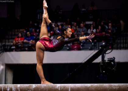
Alaska: 6.525
. @hopenelsonn was great for the Seawolves on beam at the meet against SPU and Sac State! #leowatch #ncaagym pic.twitter.com/qR5G8Xdyu0
— Emily Howell-Forbes (@Emilykhf) February 26, 2018
| Design | Fabric/
Sparkle |
School
Spirit |
Overall
Appearance |
Total | |
| Caroline | 2.0/3 | 0.8/2 | 1.9/2 | 1.7/3 | 6.4/10 |
| Christina | 1.6/3 | 1.1/2 | 1.6/2 | 1.7/3 | 6.0/10 |
| Elizabeth | 1.8/3 | 1.2/2 | 1.8/2 | 1.9/3 | 6.7/10 |
| Emily M | 2.0/3 | 1.0/2 | 1.9/2 | 2.1/3 | 7.0/10 |
Caroline: Kudos to Alaska for figuring out how to work with that seafoam green and yellow combo and the complicated Seawolf logo. That said, I’m not a fan with the way the white cuts into the arms, especially in the shoulders and the armpit. Draws too much attention to that awkward juncture.
Christina: Alaska has some tough colors to work with, but the shades of yellow and green here are a bit…too much. I wish they were more subdued. The design is okay, and the logo on the front is a nice touch. It’s a decent leo but nothing memorable.
Elizabeth: I don’t hate this one. The yellow color used isn’t my fave, but I do like it paired with the green. I also like the incorporation of the Seawolf on the front. Not too shabby from Alaska here.
Emily M: Alaska has, in my opinion, the toughest colors to work with of any team, but this yellow against the almost seafoam green is a little jarring. I like the cut, though, and the rhinestone logo on the front is a nice touch.
Bowling Green (2): 6.175

| Design | Fabric/
Sparkle |
Pink
Spirit |
Overall
Appearance |
Total | |
| Caroline | 1.7/3 | 1.4/2 | 1.7/2 | 1.6/3 | 6.4/10 |
| Christina | 1.5/3 | 1.0/2 | 1.5/2 | 1.4/3 | 5.4/10 |
| Elizabeth | 1.7/3 | 1.1/2 | 1.6/2 | 1.8/3 | 6.2/10 |
| Emily M | 2.1/3 | 1.3/2 | 1.8/2 | 1.5/3 | 6.7/10 |
Caroline: The front is meh. I appreciate the attempt at an interesting design with the use of positive/negative space, but I much prefer the back. I love the school logo depicted in pink sparkle, and I actually like the shiny pink sleeves. They give it that pop of color that actually does grab my attention.
Christina: Again with the random squiggles… Hmmmm, no. The front is super random, and I’m really not a fan of the off-center and unsymmetrical design. The solid pink sleeves are also a meh for me. The back is alright, and points for school spirit.
Elizabeth: Meh. I’m really not feeling the random, off-centered design on the front. But I do like the back and the school spirit incorporated with the pink. Overall, it’s an underwhelming leo for me but a good effort.
Emily M: Again with the random swirls! No no no. I like the sparkly BG logo on the back, but the neon pink sleeves cut at a bit of a strange angle. Not my favorite.
Ball State: 6.1
https://twitter.com/tia_kiaku33/status/967183090652254209
| Design | Fabric/
Sparkle |
School
Spirit |
Overall
Appearance |
Total | |
| Caroline | 1.9/3 | 1.3/2 | 1.1/2 | 1.8/3 | 6.1/10 |
| Christina | 1.5/3 | 1.0/2 | 0.7/2 | 1.4/3 | 4.6/10 |
| Elizabeth | 2.2/3 | 1.3/2 | 1.3/2 | 2.3/3 | 7.1/10 |
| Emily M | 2.8/3 | 1.0/2 | 0.8/2 | 2/3 | 6.6/10 |
Caroline: This looks like it started out as a cool concept but stopped halfway through! I think this design could have benefitted from a contrasting color outlining the darker red. That said, I actually kind of like the asymmetry of it, and I appreciate that the design seems to continue on the red sleeve as well.
Christina: I dislike this one. It looks unfinished and like a fifth grader drew the design. The off-symmetry on the front bothers me a lot, but I think it’s also because it doesn’t look cleanly done. The colors and the two shades of red are nice, but yeah, I just can’t get past the weird design.
Elizabeth: I’m really into the two-tone red used on this leo. Plus, paired with white, it’s a really flattering design for me. My only issue is it doesn’t scream Ball State. Of course, I don’t know what’s on the back, but for now, this could be any old generic leo.
Emily M: Love love love the two shades of red here. That could have gone horribly wrong, but I’m glad Ball State got it to work! I also like that this leo has horizontal symmetry, rather than vertical like most of the leos we see. I need to see the back, where I’m hoping there’s the Ball State bird? It could use some sparkle, too.
Air Force: 5.9
Simple yet classy leos from Air Force tonight! #NCAAgym #LeoWatch pic.twitter.com/bHAK8Yml1p
— NCAA Gym News (@NCAAGymNews) February 25, 2018
| Design | Fabric/
Sparkle |
School
Spirit |
Overall
Appearance |
Total | |
| Caroline | 1.3/3 | 1.0/2 | 1.3/2 | 1.6/3 | 5.2/10 |
| Christina | 1.6/3 | 1.0/2 | 1.5/2 | 1.7/3 | 5.8/10 |
| Elizabeth | 1.7/3 | 1.0/2 | 1.5/2 | 1.8/3 | 6.0/10 |
| Emily M | 1.9/3 | 1.5/2 | 1.6/2 | 1.6/3 | 6.6/10 |
Caroline: This just looks… meh. Sometimes the all-black look can work, but there’s not enough here to draw my interest. I feel like the intention was to draw the eye with the off-kilter bands around the stomach, but a) that’s an odd place to draw attention to, and b) it looks more messy than anything else. Not a fan.
Christina: This is alright, but I feel we’ve seen this design a billion times already although it’s slightly different here. I’m not a fan of the all-black look. School spirit is good, though, but again, I wish it incorporated more colors.
Elizabeth: This is a similar design to the leo we see from a TON of teams but with Lycra rather than the mystique style fabric. I like the simplicity of it but think it’s a little too simple. The Falcons on the front and Air Force on the back are nice additions of school spirit, though.
Emily M: This is a lot of black. I’m a fan of monochrome if it has a lot of visual interest, but I feel like this one is missing something, maybe some ombre sleeves or different fabric types on the body. I do like the use of Falcons/Air Force with those intense sparkles, though! Bonus points for that.
Want to receive the latest collegiate gymnastics news in your inbox? Sign up for the NCAA Gym NewsLetter here.


