By Christina Marmet, Elizabeth Grimsley and Caroline Medley
Since we certainly loved judging leos every week, we decided to keep it going during the off season by looking back at some throwback competitions and what the fashion choices looked like back then. With the recent comeback of Courtney Kupets and Suzanne Yoculan at Georgia, what better meet to start with than their last official one in 2009 before retirement?!
The criteria is the same as during the season. But to refresh your memories: up to three points for design; two points for fabric, sparkle, etc.; and two points for school spirit; three points for overall appearance.
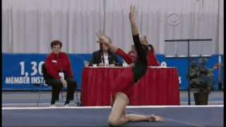
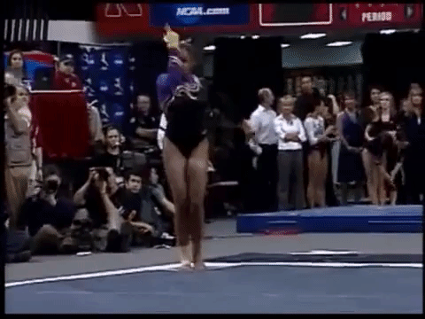
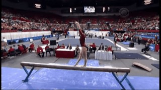
Georgia: 8.333
|
Caroline
Design: 2.3/3 Fabric/Sparkle: 1.5/2 School Spirit: 1.7/2 Overall Appearance: 2.4/3 Total: 7.9/10 This is definitely different than what we’ve come to expect from Georgia these last few years. I love the simplistic script along the neckline, and it looks great in motion. Close up, it actually has more sparkle than I first realized, which is kind of cool, like there are different layers to the design the more you look at it. |
Christina
Design: 2.7/3 Fabric/Sparkle: 1.8/2 School Spirit: 1.9/2 Overall Appearance: 2.6/3 Total: 9.0/10 I really like this one, and it’s quite original for the time and compared to the other teams’ leos full of swirls and random shapes. I like the simplicity of the red and black, but my favorite is the sparkly ‘Georgia’ in this handwritten-like font at the split between the two colors. I also like that the G is in solid white. The swirly design in the back is a nice touch so the leo doesn’t get too boring. |
Elizabeth
Design: 2.5/3 Fabric/Sparkle: 1.4/2 School Spirit: 1.8/2 Overall Appearance: 2.4/3 Total: 8.1/10 I like this one! The Georgia on the front isn’t too bold. The design on the back is a nice surprise and goes with the front and there’s just enough red and black—and accent-y white/silver—to make it not overly school colors. |
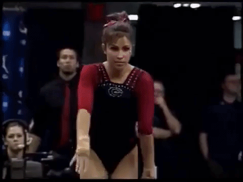
Alabama: 8.133
|
Caroline
Design: 2.2/3 Fabric/Sparkle: 1.3/2 School Spirit: 1.8/2 Overall Appearance: 2.1/3 Total: 7.4/10 Alabama today could totally wear this. The school spirit is nice, but I do miss the sparkle, and while the big A is a cool design, the fact that Alabama has so many of those feels like a little overkill. |
Christina
Design: 2.4/3 Fabric/Sparkle: 1.6/2 School Spirit: 2/2 Overall Appearance: 2.4/3 Total: 8.4/10 I love that Alabama’s style basically hasn’t changed all these years with the gigantic “A” and overwhelmingly crimson leos. Just add a little more sparkles and ombre, and you are in 2017. Overall though, I do like it. School spirit is obviously there, and I like the two different kind of fabric (shiny and mesh) used here. My only issue with it is that I don’t find that the ‘A’ creates a flattering look on the gymnasts. |
Elizabeth
Design: 2.6/3 Fabric/Sparkle: 1.5/2 School Spirit: 1.9/2 Overall Appearance: 2.6/3 Total: 8.6/10 This leotard screams school spirit! And it’s funny how Alabama’s style of leo is basically the same but with a few less sparkles. The use of crimson is great, the big A actually doesn’t overwhelm the front and the design on the back is just enough. I do wish there was just a little bit more white, though. |
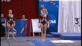
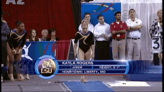
LSU (Event Finals: 8.133
|
Caroline
Design: 2.5/3 Fabric/Sparkle: 1.5/2 School Spirit: 1.4/2 Overall Appearance: 2.6/3 Total: 8.0/10 Now this is what I call a leo! School colors, some sparkle and shine, and an interesting, eye-catching design. Bonus points for a design with a purpose and for one that flatters all body types. |
Christina
Design: 2.4/3 Fabric/Sparkle: 1.7/2 School Spirit: 1.6/2 Overall Appearance: 2.5/3 Total: 8.2/10 I like this one a lot more than LSU’s Super Six leo. It still has too much black for my liking, but I really like the gold swirly design going across the shoulders and the upper body. I like the purple mesh and the flame-y design on the mesh cuffs. It still is a bit too dark for me to really love this, but I find it much more ‘cheerful’ than the Super Six one. |
Elizabeth
Design: 2.5/3 Fabric/Sparkle: 1.6/2 School Spirit: 1.7/2 Overall Appearance: 2.4/3 Total: 8.2/10 I miss ACK! As for the leo, I like this one! The purple is really nice, there’s just enough gold and the design is very LSU to me for some reason. This should have been the Super Six leo. |
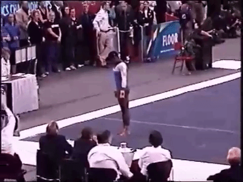
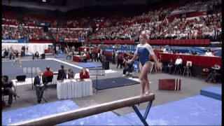
Georgia (Event Finals): 7.867
|
Caroline
Design: 1.7/3 Fabric/Sparkle: 1.4/2 School Spirit: 1.8/2 Overall Appearance: 1.8/3 Total: 6.7/10 The neckline totally cuts off the gymnasts’ lines at the shoulders, and the bodice is very plain. School spirit is high, as usual for Georgia, but that’s like the only high point for me. |
Christina
Design: 2.6/3 Fabric/Sparkle: 1.4/2 School Spirit: 1.8/2 Overall Appearance: 2.5/3 Total: 8.3/10 This is a nice look. I feel like I’m repeating myself here, but so much black. The red, mesh sleeves are a nice touch though, and I like the small “G” in sparkles on the front. I do like the Adidas-y look with the black stripes intermittently spaced with red mesh on the upper body. All in all, I’m a big fan of the upper body design (essentially where everything is), but the rest of the leo is just too simple for me. |
Elizabeth
Design: 2.5/3 Fabric/Sparkle: 1.7/2 School Spirit: 1.8/2 Overall Appearance: 2.6/3 Total: 8.6/10 I’ve always liked this one. The small sparkly G on the front is the perfect size, the red mesh sleeves are great and pair well with the dark body and the small line detailing on the shoulders is a great little addition as well. |
UCLA: 7.367
|
Caroline
Design: 1.9/3 Fabric/Sparkle: 1.3/2 School Spirit: 1.5/2 Overall Appearance: 2.1/3 Total: 6.8/10 The only thing saving this design from being identical to Florida’s level of blah is the daring V necklines in back and front. Also, I miss when UCLA wore real solid leos! |
Christina
Design: 2.4/3 Fabric/Sparkle: 1.6/2 School Spirit: 1.8/2 Overall Appearance: 2.3/3 Total: 8.1/10 I love the color combo and this shade of blue. I also like how they went all “risqué” with the open V neckline. Because UCLA, always. However, I hate where the white and blue meet and it’s such a sharp transition. I feel like it’s at such an awkward place right across the boobs and it just cuts the entire figure. It’s hard to tell from the GIF, but the sleeves also have some swirls of glitters on them and it’s a nice touch at times where leos had very minimal sparkles on them. |
Elizabeth
Design: 2.0/3 Fabric/Sparkle: 1.4/2 School Spirit: 1.5/2 Overall Appearance: 2.1/3 Total: 7.0/10 I love this blue color and wish present-day UCLA wore it more. It goes well with the white arms. But aside from that, the design isn’t much better than Florida’s. |
Arkansas: 7.233
|
Caroline
Design: 2.4/3 Fabric/Sparkle: 1.3/2 School Spirit: 1.6/2 Overall Appearance: 2.1/3 Total: 7.4/10 This is kind of different than what we say from Arkansas nowadays, but I really like it! The diagonal ribbon and sparkle down the center make the neckline a little more interesting and emphasize the school name up there as well. Not my favorite, but absolutely one worth talking about. |
Christina
Design: 2.1/3 Fabric/Sparkle: 1/2 School Spirit: 1.6/2 Overall Appearance: 2.2/3 Total: 6.9/10 Hmmmm, it’s a bit too dark for me, and I wish there were more red other than the ribbon-like design. That said I do like that ribbon and how it connects with the back. I do like this sporty look, and the diagonal glittery-rain on the front is fun with the “Gymbacks” is nicely incorporated on there. |
Elizabeth
Design: 2.3/3 Fabric/Sparkle: 1.3/2 School Spirit: 1.6/2 Overall Appearance: 2.2/3 Total: 7.4/10 I really like this one! The red makes a sort of A and I love how the word Razorbacks flows down from the shoulder to blend with the rest of the rest of the sparkle design. I wish there was some more red, but overall it’s a good one for me. |
Utah: 7.1
|
Caroline
Design: 2.2/3 Fabric/Sparkle: 1.6/2 School Spirit: 1.4/2 Overall Appearance: 2.4/3 Total: 7.6/10 This feels very unlike Utah, but I actually kind of dig it. The color combination is cool, and the flame design is unique in what seems to be a sea of expected patterns. It could use a little more school spirit, but overall it’s a win for me. |
Christina
Design: 1.6/3 Fabric/Sparkle: 1.6/2 School Spirit: 1.3/2 Overall Appearance: 1.9/3 Total: 6.4/10 I am torn on this one. I like the color combo and this shade of red used, but I can’t get myself to like the half-scalloped, half-flamey design. I guess they were going for the firey, hot Red Rock look? This actually makes me think more of a desert almost and not of Utah. Anyways, overall I’m leaning towards liking it, but it’s another leo I don’t think looks flattering on the gymnasts. |
Elizabeth
Design: 2.3/3 Fabric/Sparkle: 1.4/2 School Spirit: 1.4/2 Overall Appearance: 2.2/3 Total: 7.3/10 This leo is so not Utah! I thought Christina told us the wrong minutes for the video at first! It definitely looks more like Denver than the bright red of the Red Rocks. But nevertheless, I like the gold on there. The crimson color is nice as well, and I like it paired with the black. I don’t love how the design kind of cuts the front and back in half, but it’s not terrible. |
LSU: 6.333
|
Caroline
Design: 2/3 Fabric/Sparkle: 1/2 School Spirit: 1.4/2 Overall Appearance: 2/3 Total: 6.4/10 So I feel like this design got an upgrade and became this leo of today’s competition. The ‘09 version just doesn’t have enough sparkle or pizzazz to really make it exciting in any way for me. And the squiggles are random, and not really flattering either. |
Christina
Design: 1.8/3 Fabric/Sparkle: 1.5/2 School Spirit: 1.3/2 Overall Appearance: 1.9/3 Total: 6.5/10 A simple design for LSU (oh how times have changed!). I wish there was a little less black though as it makes the whole look much somber than it needs to be. I am also not so sure about the pitchfork-like design on the front. Nice touch on having both school colors on there though, but again, a bit too much black for my liking and underwhelming on the school spirit front. |
Elizabeth
Design: 1.8/3 Fabric/Sparkle: 1.0/2 School Spirit: 1.3/2 Overall Appearance: 2.0/3 Total: 6.1/10 I also wish there was more purple and gold on this one. But I do appreciate the use of the school colors—all of them.But other than that, I wish there was more school spirit. The design is a bit simple for me. |
Florida: 6.3
|
Caroline
Design: 1.8/3 Fabric/Sparkle: 1.3/2 School Spirit: 1.2/2 Overall Appearance: 2/3 Total: 6.3/10 Good to see Florida never changes either. Honestly I found the black and blue more interesting than this white/blue combo, I guess risk-taking in leos just isn’t a priority there. The straight neckline, the easy sleeve/bodice combo, it’s a classic look but after judging so many this season, it feels a little tired. |
Christina
Design: 2/3 Fabric/Sparkle: 1.7/2 School Spirit: 1.5/2 Overall Appearance: 2.4/3 Total: 7.6/10 Aaaah the times of blue and white Florida leos. I like this clean look with just the right amount of sparkles on the chest. I am however not a big fan of this straight-cut neckline on the front; it’s just so simple and not flattering to me. I wish it had been a sweetheart of a small V-neck maybe. The back is nice however. I also do like the nice touch of blue along the neck and the cuffs. Overall I really like this soft color combo, but the design is a bit boring to me. |
Elizabeth
Design: 1.2/3 Fabric/Sparkle: 1.2/2 School Spirit: 1.2/2 Overall Appearance: 1.4/3 Total: 5.0/10 Oh, Florida. Some things never change. I like the blue and white, sure. But the design is so boring. Is there a Florida or Gators I can’t see? Even if there is, could this design get simpler? |
Have a throwback meet you want us to judge? Stick it in the comments or hit us up on Twitter, and we’ll try to get to it in the coming weeks!