By Elizabeth Grimsley, Christina Marmet and Caroline Medley
There were so many good pink leos this season that we couldn’t fit them all in one post! So rather than an extremely long post, or leaving out good leos, we decided to treat you to another round of pink leo judging! The criteria is the same as normal meets except school spirit is replaced by pink meet spirit. And to refresh your memory on the other criteria: up to three points for design; two points for fabric, sparkle, etc.; and two points for spirit; three points for overall appearance. After assigning points to each category, we’ll tally up the scores and average them with the previous week’s. So by the end of the season, we’ll know for sure which team has the best leotards (according to us) and which teams not so much. We want to know what you thought too (or if we forgot one of your favorites from this weekend)! Let us know in the comments below or on Twitter. And make sure to vote in our poll at the bottom of the page to make your opinion heard in the fan vote, new this season.
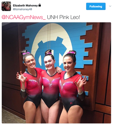
New Hampshire: 8.833
|
Caroline
Design: 2.5/3 Fabric/Sparkle: 1.7/2 Pink Meet Spirit: 1.7/2 Overall Appearance: 2.6/3 Total: 8.5/10Ombre pink leo!!! How did we not know about this before? I love this pink to black transition, though I would’ve liked it slightly more blended. It kinda looks like it’s in layers rather than a full on blend. I also like the burst of sparkle right at the dip of the V, that’s a cool touch. I wish I could see what the back looks like, I feel like it has to be even better but I can’t judge what I can’t see. Also love that the ombre continues into the sleeves! |
Christina
Design: 2.5/3 Fabric/Sparkle: 1.8/2 Pink Meet Spirit: 1.8/2 Overall Appearance: 2.7/3 Total: 8.8/10This is gorgeous! A pink ombre is (surprisingly) not something we’ve seen much this season, so this is lovely to see. My only pet peeve with this one is that I wish the ombre transition into the black was a bit smoother; it kinda cuts to black rather sharply on the bodice and the sleeves. I love the sweetheart neckline with the sparkles all around it. Overall, a very pretty look. |
Elizabeth
Design: 2.7/3 Fabric/Sparkle: 1.9/2 Pink Meet Spirit: 1.8/2 Overall Appearance: 2.8/3 Total: 9.2/10Love! I wish all teams put this much effort into their pink leos. I LOVE the ombre and the color of pink and the sparkles around the neckline making the sweetheart style and the mesh sleeves. I can’t even really find anything I don’t like about it. GREAT job, New Hampshire! |
N.C. State: 8.733
@NCAAGymNews_ @PackGymnastics pic.twitter.com/HShuMOQoEz
— Megan Fillard (@meganfillard) March 31, 2017
|
Caroline
Design: 2.3/3 Fabric/Sparkle: 1.6/2 Pink Meet Spirit: 1.9/2 Overall Appearance: 2.4/3 Total: 8.2/10So I love ombre in general, and though this is close, I do like UNH’s better, but this is nice! I love the focus on the ribbon. Using that as the central design I think is really important, in order to actually focus on the meaning of doing a pink meet and not just being trendy or cute. I’m not totally sold on the white sleeves, but I do like the way the pink school logo stands out against the white background on the arm! That was a really nice detail, and you know how I love my details. |
Christina
Design: 2.8/3 Fabric/Sparkle: 1.7/2 Pink Meet Spirit: 2/2 Overall Appearance: 2.8/3 Total: 9.3/10This might be my favorite pink leo this season. Love the pink to black ombre on the bodice, and the white on the upper body that also goes into ombre on the sleeves. The NC State logo on the sleeve in pink sparkles is perfect. I also dig the ribbon in the center of the leo, but I also feel like it would have been fine without it. Love, love this one! |
Elizabeth
Design: 2.6/3 Fabric/Sparkle: 1.6/2 Pink Meet Spirit: 1.9/2 Overall Appearance: 2.6/3 Total: 8.7/10Another great pink leo! Why is is the non-top teams have the best pink leos?? We know the others have the resources, so let’s step the pink game up! I love the ombre on this and the symmetrical design with the ribbon on the front. I also really like the NCSU on the sleeve in rhinestones as well. My one issue is the neckline. The V makes it look like the curve is trying to be a sweetheart but isn’t. I wish it was a real sweetheart to send it over the edge for me. |
Brown: 7.733
GYM: Congrats to @BrownGymnastics‘ 16 @ECACSports All-Academic Team honorees! https://t.co/N86BkfZO2C #GoBruno pic.twitter.com/dUWy0T4GxM
— Brown Athletics (@BrownAthletics) March 31, 2017
|
Caroline
Design: 2.4/3 Fabric/Sparkle: 1.7/2 Pink Meet Spirit: 1.5/2 Overall Appearance: 2.4/3 Total: 8.0/10So this one is a lot darker than the other ombres, but I kinda like it! It’s very different, and it still centers on the ribbon, which I like. I like that they incorporate the ivy, that’s kinda cool. And I like the ombre on the sleeves, and the sparkle cuffs. I wish there were more on the bottom, whether the design were larger or there were more sparkle radiating out, but it’s a clean, solid design. |
Christina
Design: 2.2/3 Fabric/Sparkle: 1.4/2 Pink Meet Spirit: 1.8/2 Overall Appearance: 2.1/3 Total: 7.5/10This one is pretty as well (so many pink ombre leos this week!), but it’s a bit too dark for me. Of course I like the ombre, duh, but I wish the pink continued a bit lower onto the bodice. I LOVE how the ribbon is incorporated around the ivy just like the Brown athletics logo. This is such a nice touch of school spirit mixed in with pink meet spirit. Anyways, this is another strong one but again, I wish it had less black. |
Elizabeth
Design: 2.3/3 Fabric/Sparkle: 1.4/2 Pink Meet Spirit: 1.6/2 Overall Appearance: 2.4/3 Total: 7.7/10Another strong ombre pink leo! I really like how this one is mostly black as well as the color of pink used on the top part. The area where the ombre switches colors seems like an odd place—I wish it was a bit lower. But I do like how the ribbon featured on the front isn’t super bold but still stands out well. |
Arkansas: 7.633
|
Caroline
Design: 2.2/3 Fabric/Sparkle: 1.4/2 Pink Meet Spirit: 1.5/2 Overall Appearance: 2.1/3 Total: 7.2/10I really like the contrast between the baby pink and black here, I think it’s a super classic look. The big A isn’t flattering on everyone in all pictures, as it kinda bunches under the chest area, but when extended I actually really like the clean, simple lines it provides. I also see the baby pink cuff they did on the sleeve, that’s a nice little detail that you almost miss if you’re not looking for it, and the hog on the solid sleeve is just subtle enough to be seen but not overtake the design. The sparkle outlines are okay, they serve their purpose, but the single mesh sleeve strategically and specifically dotted with sparkles isn’t my favorite. Overall a nice one from the Razorbacks though! |
Christina
Design: 2.3/3 Fabric/Sparkle: 1.1/2 Pink Meet Spirit: 1.8/2 Overall Appearance: 2.2/3 Total: 7.4/10We are back into the more classical pink leo shades here with the black and pink, but I really like how they incorporated the A on the front, which then turns into a ribbon on the back. Great way to showcase both school and pink meet spirit. I am not a fan of the mismatched sleeves where one is in solid black and the other mesh, and I wish this leo overall had more sparkles. A nice, unique pink leo. |
Elizabeth
Design: 2.6/3 Fabric/Sparkle: 1.4/2 Pink Meet Spirit: 1.8/2 Overall Appearance: 2.5/3 Total: 8.3/10I really like this one. I love how the A on the front wraps around and kind of transforms into the ribbon on the back. I also like the one mesh sleeve and how it’s sparkly but not overwhelming. I also appreciate the color of pink used—it’s nice and not too in your face. I also like how the hog is featured on the sleeve. It’s not too big but still there to represent school spirit despite the main theme being pink. |
Towson: 7.066
@NCAAGymNews_ you missed @Towson_GYM new pink leo! pic.twitter.com/7Cq8W3jk1X
— Towson Gymnastics (@Towson_GYM) March 30, 2017
|
Caroline
Design: 2/3 Fabric/Sparkle: 1.3/2 Pink Meet Spirit: 1.5/2 Overall Appearance: 1.9/3 Total: 6.7/10This is a very sporty look, which I kinda like. Very different from most other pink leos we see. I love that they put the Tiger in pink and that there’s a tiger stripe design underneath, that’s really cool. I wish there was more sparkle, but I do appreciate the use of shiny fabric. Overall a nice look, but maybe not as elegant as I typically like. |
Christina
Design: 1.8/3 Fabric/Sparkle: 1.3/2 Pink Meet Spirit: 1.8/2 Overall Appearance: 1.7/3 Total: 6.6/10This is alright, and a refreshing change from some of the pink leos we usually see. I like the underlying tiger stripes effect on the black bodice, and that the school logo is all in pink. It doesn’t rank among my favorite pink leos, but it’s definitely a unique look. |
Elizabeth
Design: 2.2/3 Fabric/Sparkle: 1.5/2 Pink Meet Spirit: 1.9/2 Overall Appearance: 2.3/3 Total: 7.9/10I kind of dig this one. While it’s not my favorite as a leotard, I think it’s unique in terms of pinks leotards go. The Tiger on the body is nice off-center and the Towson + pink ribbon on the sleeves add that touch of school spirit to the pink meet spirit. I also like the shininess of the white/silver on the fabric and the sequins at the top. There’s just enough pink, too. I think more would have been too much. Plus, the underlying tiger stripe detailing on the fabric is a neat feature as well. |
Florida A: 6.133
|
Caroline
Design: 1.4/3 Fabric/Sparkle: 1.3/2 Pink Meet Spirit: 1.1/2 Overall Appearance: 1.7/3 Total: 5.5/10So after scouring their Instagram for pictures of this, I also found one of a leo Florida used to wear like this but with orange sparkles? So I think that’s where this random squiggle design comes from. That said, that doesn’t really explain it, it just gives me two leos with random purposeless squiggles from Florida. Boo to that. The random baby strap is odd to me, and the pink ribbon on the sleeve kinda feels like an afterthought, which is kinda sad considering bringing cancer awareness should be at the forefront of these meets, and thus the leos too. Or at least in my mind it should be. You know how I’m all about the symbolism. |
Christina
Design: 1.5/3 Fabric/Sparkle: 1.3/2 Pink Meet Spirit: 1.4/2 Overall Appearance: 1.8/3 Total: 6.0/10Meh. The design on the front is a bit bland and just random, and that tiny pink strap is also so random and bothers me especially since it’s not the same shade of pink as the hot pink mesh sleeve. Overall, this is very blah to me. |
Elizabeth
Design: 1.9/3 Fabric/Sparkle: 1.4/2 Pink Meet Spirit: 1.6/2 Overall Appearance: 2.0/3 Total: 6.9/10Since Florida has SO MANY pink leos, why not judge them all. I think this one is my least favorite of the three it wore this year. I like the color of pink used but the random strap is, well, random. I also needed the front design to stand out more. But I do like the off-center, mesh sleeve look, as well as the style of the pink ribbon on the sleeve. |
Yale: 6.066
|
Caroline
Design: 1.7/3 Fabric/Sparkle: 1/2 Pink Meet Spirit: 1.4/2 Overall Appearance: 1.5/3 Total: 5.6/10Like Towson, this is a sportier look, but it doesn’t really have enough to it, whether in main design or interesting details, to really draw me in. I appreciate the different choice in making the pink almost a side cutout (which unlike Christina, I don’t mind), and the little splash of pink in the back is cool! Otherwise it’s just kinda plain. Also – more sparkle!! Always more sparkle! |
Christina
Design: 1.6/3 Fabric/Sparkle: 1/2 Pink Meet Spirit: 1.3/2 Overall Appearance: 1.5/3 Total: 5.4/10This is a different look from any pink-leo we’ve seen, so it’s nice. The athletic-y look is fine, but I didn’t think it was flattering. I like the pink touch on the back straps, but overall this is a bit too simple and sporty-looking for my taste. |
Elizabeth
Design: 2.1/3 Fabric/Sparkle: 1.3/2 Pink Meet Spirit: 1.6/2 Overall Appearance: 2.2/3 Total: 7.2/10I like this one! It’s a different design from any other team I’ve seen, and I like the color of pink used as well as the splash of it on the back. However, I’m not a huge fan of the pink and navy design, although I applaud the Bulldogs on getting that school spirit in there. But overall, it’s a good leo for a pink meet without going overboard. |
Boise State: 5.266
|
Caroline
Design: 1.7/3 Fabric/Sparkle: 1.1/2 Pink Meet Spirit: 1.7/2 Overall Appearance: 1.6/3 Total: 6.1/10I like that they took the risk and did a fully pink leo, rather than something with pink accents like a lot of teams do… but I don’t really like this shade, and the front design is a hot mess. Like what is that? I do appreciate the inclusion of the ribbon on the back, and I like the way the back looks in motion. Not my favorite though. |
Christina
Design: 1/3 Fabric/Sparkle: 0.5/2 Pink Meet Spirit: 1.7/2 Overall Appearance: 1/3 Total: 4.2/10No, thank you. I’m having 2008 flashbacks to Nastia’s leo, which I didn’t like then, and I still don’t like. I can’t get behind the all pepto-bismol pink look here. The sparkly ribbon is a nice touch on the back, but it just looks weird on the front where it just creates sort of a circle on their bellies? Not a flattering look at all. Nope, nope, donate it to Nastia’s closet already. |
Elizabeth
Design: 1.4/3 Fabric/Sparkle: 0.8/2 Pink Meet Spirit: 1.8/2 Overall Appearance: 1.5/3 Total: 5.5/10I’m baffled by something on this leo. It’s almost like the design is backwards. The ribbon is on the back and snakes around to end on the front, which is kind of weird. I wish it was the opposite. That plus the pepto bismol color used is not doing it for me. |
Florida B: 5.2
|
Caroline
Design: 1.8/3 Fabric/Sparkle: 1.3/2 Pink Meet Spirit: 1/2 Overall Appearance: 1.6/3 Total: 5.7/10This pink does not create enough contrast with the black to work, especially in photos or not-high-res videos. There’s also no ribbon that I can see, which lowers points in the spirit category, and I don’t really understand the design itself? Are these flames, or like a heartbeat monitor sort of thing? I don’t really get it, and since the sparkle is the only design there is, it just isn’t enough. |
Christina
Design: 1.4/3 Fabric/Sparkle: 0.6/2 Pink Meet Spirit: 0.9/2 Overall Appearance: 1.5/3 Total: 4.4/10Another meh for Florida from me. The pink glitters don’t stand out enough and it’s almost hard to see them or the design they supposedly form (pink boobies flames?). The design is overall just so simple and boring, and it gives a bit of a dated vibe. |
Elizabeth
Design: 2.2/3 Fabric/Sparkle: 0.7/2 Pink Meet Spirit: 0.9/2 Overall Appearance: 1.7/3 Total: 5.5/10Meh. This one’s alright, but the pink sequins all over the leo don’t stand out super well. You can’t even see them or the design that well on a photo, which is where I normally go to tell what a design is. I like the hot pink on black look but this one is too muted for me. Maybe if rhinestones had been used instead of sequins? |