The criteria is the same as last season. But to refresh your memories: up to three points for design; two points for fabric, sparkle, etc.; and two points for school spirit; three points for overall appearance. After assigning points to each category, we’ll tally up the scores and average them with the previous week’s. So by the end of the season, we’ll know for sure which team has the best leotards (according to us) and which teams not so much. We want to know what you thought too (or if we forgot one of your favorites from this weekend)! Let us know in the comments below or on Twitter. And make sure to vote in our poll at the bottom of the page to make your opinion heard in the fan vote, new this season.
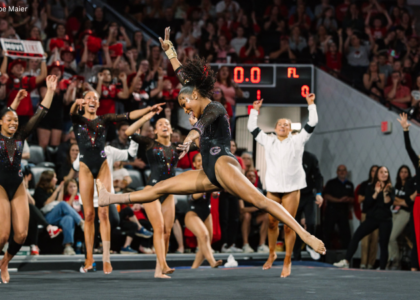
Olivia Karas talks her amazing vault, having fun on floor and the team scoring high vs. Nebraska today. #GoBlue pic.twitter.com/AwbP7axhIE
— Michigan Gymnastics (@UMichWGym) January 29, 2017
|
Caroline
Design: 2.6/3 Fabric/Sparkle: 1.8/2 School Spirit: 1.7/2 Overall Appearance: 2.5/3 Total: 8.6/10 Holy cow, I love this! I think my favorite thing is the waterfall cascade of sparkles coming down from the neckline, but the stripes are placed well and I like that the sleeves are white instead of navy. The big M and the use of school colors is solid, and the lattice in the back is a cute bonus! Probably my favorite leo this week. |
Christina
Design: 2.7/3 Fabric/Sparkle: 1.6/2 School Spirit: 1.8/2 Overall Appearance: 2.8/3 Total: 8.9/10 This is one of my favorite Michigan leos I think! I love the colors, the Adidas-like yellow stripes going around the sides and down the sleeves, the “M” in the front and the amount of sparkles is just right. I’m a big fan of the small criss-cross back as well. |
Elizabeth
Design: 2.8/3 Fabric/Sparkle: 1.9/2 School Spirit: 1.9/2 Overall Appearance: 2.8/3 Total: 9.4/10 Love this one! I want to take two whole points off for the dab, though. Enough already! Anyway, this is one of my favorite Michigan leos. I like how the stripes on the front are incorporated and extend tot he cross cross straps on the back. The white sleeves look lovely with the navy and there’s just enough yellow and sparkle. |
Just BEAUTIFUL □
□” Watch: https://t.co/ZLABag9Ytt https://t.co/2pSgNT4Ade
— Pac-12 Network (@Pac12Network) January 28, 2017
|
Caroline
Design: 1.7/3 Fabric/Sparkle: 1.5/2 School Spirit: 1.4/2 Overall Appearance: 2.4/3 Total: 7.0/10 Overall, very pretty, just blah. Never a fan of the random squigglies, but I like that they got all the colors in and that the squigglies at least come from somewhere. I want to see them do something different though, they rely a lot on the black and white bodice with little orange accents. |
Christina
Design: 2.4/3 Fabric/Sparkle: 1.5/2 School Spirit: 1.6/2 Overall Appearance: 2.4/3 Total: 7.9/10 This is a nice one from the Beavs. I like the combination of all three colors, and the orange swirls coming out of the neck looks nice to me. The design is simple but overall it looks nice and looked good in motion. |
Elizabeth
Design: 2.6/3 Fabric/Sparkle: 1.7/2 School Spirit: 1.7/2 Overall Appearance: 2.7/3 Total: 8.7/10 Nice going Oregon State! I’m always a fan of mostly black and white, and the touch of orange is just enough to scream school spirit but not too much to say HALLOWEEN. The design on the front looks nice and doesn’t overpower the chest or neck either. |
|
Caroline
Design: 2.3/3 Fabric/Sparkle: 1.8/2 School Spirit: 1.4/2 Overall Appearance: 2.5/3 Total: 8.0/10 I strangely like this one, I like that they do something different and include the silver. It photographs nicely, it doesn’t warp the color on the broadcast, and it gives a little extra sparkle and shine. I love the big Bama “A” in the center and the V in the back is nice too. I think this was the stronger of the two this weekend for the Tide. |
Christina
Design: 2.2/3 Fabric/Sparkle: 1.4/2 School Spirit: 1.6/2 Overall Appearance: 2.4/3 Total: 7.6/10This isn’t a new leo for the Tide, and I still can’t really get behind it. The design is nice and I like the V in the back. I am just not a fan of this dark grey shade on the upper part of the leo. It’s too bad because I really like the shade of crimson. The “A” is nicely incorporated in the design as well. Overall, a nice leo but I really wish the grey was just not there. |
Elizabeth
Design: 2.2/3 Fabric/Sparkle: 1.5/2 School Spirit: 1.5/2 Overall Appearance: 2.3/3 Total: 7.5/10Unlike Christina, I like the dark silver on the arms and top. It is just enough shiny and silver to not be overwhelming and it looks good with the crimson. I like the design overall as a whole too with the V in the back and the rhinestone detailing. It’s not my favorite Alabama leo but it’s a solid one. |
Tonight’s leo! ✨ pic.twitter.com/zFMzkFNW7P
— Oklahoma Women’s Gym (@OU_WGymnastics) January 28, 2017
|
Caroline
Design: 1.9/3 Fabric/Sparkle: 1.3/2 School Spirit: 1.3/2 Overall Appearance: 2.1/3 Total: 6.6/10Wow, the front of this is plain. Weirdly plain, particularly for OU. The back I love, with the V design with the sparkles and OU at the pinnacle, but the front looks like there was just zero effort put in. And I have to take points off for that. |
Christina
Design: 2.2/3 Fabric/Sparkle: 1.7/2 School Spirit: 1.6/2 Overall Appearance: 2.4/3 Total: 7.9/10OU always does seem to have unique designs. This is another leo I overall like, particularly the shade and the V in the back with the glittery circles and the OU so subtly incorporated. In the front, I’m not too keen on the rounded neckline on the chest separating the glittery mesh from the rest of the bodice. I don’t find it super flattering on anybody. The front is also a bit too simple for me and I wish we could find the same sort of design we have going on in the back in the front as well. Love the back, boring front. |
Elizabeth
Design: 2.1/3 Fabric/Sparkle: 1.6/2 School Spirit: 1.4/2 Overall Appearance: 2.4/3 Total: 7.5/10Well we wanted them to change it up, so I’ll give em that. I like this as a whole, but there’s no one thing that I love about it. The shape is nice, with the sweetheart neckline and the v in the back, but the OU is a bit to subtle for me and the front kind of boring. I love the color, though! |
Here we go floor! pic.twitter.com/cI9f2ZTk5D
— Ana Jaworski (@AnaJaws) January 28, 2017
|
Caroline
Design: 2.1/3 Fabric/Sparkle: 1.4/2 School Spirit: 1.2/2 Overall Appearance: 2.2/3 Total: 6.9/10You know how I feel about the random squigglies. I do like that white is the main bodice color, and it’s kinda cool how one of the black squiggles on the back leads into the all-black sparkly sleeve. I would like to see more school spirit here, school logo or mascot or something. |
Christina
Design: 2.4/3 Fabric/Sparkle: 1.5/2 School Spirit: 1.2/2 Overall Appearance: 2.3/3 Total: 7.4/10I kinda dig this. We don’t see leos with white as the dominant color much, so this is a nice change. The design is simple but elegant, and I do like the swirls in both black and red. It’s hard to tell with this photo, but I wish it incorporated a little something more for school spirit. It may be there though, and we can’t tell with this shot. |
Elizabeth
Design: 2.0/3 Fabric/Sparkle: 1.5/2 School Spirit: 1.2/2 Overall Appearance: 2.2/3 Total: 6.9/10I’m 50/50 on this one. I love the use of shiny white with black and red thrown in but I don’t like the black design on the front how the one swirl goes around the boob area weirdly. I do like the red ribbons all over and overall it looks good on all the gymnasts. But the design is kind of tired? Like it could easily be a JO leo and no one would notice. |
A few of our favorite shots from tonight.
Gallery: https://t.co/n9NY7fdKY4 pic.twitter.com/FmD3C4yan0
— Kentucky Gymnastics (@UKGymnastics) January 28, 2017
\n
|
Caroline
Design: 2.3/3 Fabric/Sparkle: 1.6/2 School Spirit: 1.4/2 Overall Appearance: 2.5/3 Total: 7.8/10I really like the lace overlay of this, but I feel like it makes everyone look heavier on top, which isn’t exactly ideal. The sparkle photographs really well, though, and I love how the lace incorporates blue intertwined with the black. I do wish it had something bigger that said UK or Wildcats or something, but I do appreciate the little hip logo. |
Christina
Design: 2.6/3 Fabric/Sparkle: 1.6/2 School Spirit: 1.5/2 Overall Appearance: 2.6/3 Total: 8.3/10It is one of my favorite Kentucky leos. The lace is incorporated in a nice way and it’s so shiny I love it. I also like the “belt” of sparkles going around the waist and the neck, and I’m a big fan of the round opening in the back. It is a nice shade of blue as well. |
Elizabeth
Design: 1.2/3 Fabric/Sparkle: 0.8/2 School Spirit: 1.4/2 Overall Appearance: 1.6/3 Total: 5.0/10Nope. I do not like the lace over the regular leo material at the top. I looks like they’re wearing a crop cardigan over their leos. Plus I don’t really like lace all that much to begin with. The blue color’s nice though, and the back is cool… |
|
Caroline
Design: 1.8/3 Fabric/Sparkle: 1.6/2 School Spirit: 0.4/2 Overall Appearance: 2.2/3 Total: 6.0/10While this is a beautiful leo with many things that I like, I literally would not have known this was a Nebraska leo if I didn’t recognize Ashley Lambert in this picture. Major thumbs down in the school spirit category. I also took some points off on design because I feel like we’ve seen a number of teams do this wavey squiggle on the chest already. |
Christina
Design: 2.2/3 Fabric/Sparkle: 1.4/2 School Spirit: 0.5/2 Overall Appearance: 2.1/3 Total: 6.1/10This is a nice ombre leo, but I wish it incorporated Nebraska’s colors a bit better. Give me some more red! The white into grey-ish is alright, but it didn’t really stand out that much on video. The shiny strappy design on the breast area is a bit weird, mostly because well.. It’s only there and doesn’t really extend to the rest of the leo. Overall a nice leo but it would be hard to know to figure who the team is by just looking at the leo. Anybody could have been wearing this really, so it can definitely be improved on the school spirit side. |
Elizabeth
Design: 2.8/3 Fabric/Sparkle: 1.7/2 School Spirit: 1.6/2 Overall Appearance: 2.8/3 Total: 8.9/10This is one of my fave Nebraska leos! I honestly don’t think every leo a team has needs to incorporate every school color. It gets to be overkill and boring. So I’m not bothered by the little use of red—some of the rhinestones are red, right? Anyway, I love the ombré from white to black, it looks so classy. And the rhinestone design is great too and not overpowering at all. |
|
|
|
Caroline
Design: 1.7/3 Fabric/Sparkle: 1.6/2 School Spirit: 1.2/2 Overall Appearance: 2.1/3 Total: 6.6/10I don’t hate it? But I’m not a super fan either. I think it would work if they were going for a blackout meet, but seeing Stanford’s leos, I don’t think that’s the case. I would’ve appreciated some more use of the school colors for sure, but for an all-black leo (channeling Catalina Ponor a little bit?) I do like it. The squiggles of sparkle may be random, but they actually help to accentuate the gymnasts’ curves without being overkill, and I like the true V-neck style using the switch from mesh into solid fabric. |
Christina
Design: 1.6/3 Fabric/Sparkle: 1.0/2 School Spirit: 1.3/2 Overall Appearance: 1.8/3 Total: 5.7/10This is an interesting one, and not a style I was expecting to see from Arizona. The design is quite simple but I feel like there is something missing in the front for me. I am not a fan of this sort of V-neck line, or I guess I wish it was better outlined with some sparkles. That’s probably it! I want to move all these swirls of sparkles and redesign them all so it goes around the solid black fabric of the bodice. All the school spirit was in the back with the (too) big sparkly “A”, but I wish something could have been added to the front (some hints of blue or red maybe?). Overall I don’t really know what to think of this one…It’s dark, shiny, and could be perfect for a blackout meet, but I wish it had been done better. |
Elizabeth
Design: 2.6/3 Fabric/Sparkle: 1.7/2 School Spirit: 1.8/2 Overall Appearance: 2.6/3 Total: 8.7/10I like this one! It’s not super loud like a lot of other Arizona leotards. The front design is lovely and really flattering, I like the pointy-sweetheart-V neckline and the little bit of sparkle is just enough too, but I would have liked for those rhinestones to be red and blue, maybe, to add some color? I don’t think the A on the back is too big because anything smaller wouldn’t have really stood out, and I also liked the color of the arm mesh as it was black black but seemed to have sort of a brownish hue too? |
#LEOWATCH Auburn will debut its 3rd new @UnderArmour leo of the season today vs Alabama. Navy and Orange #WarEagle pic.twitter.com/FQpDN69ohF
— Auburn Gymnastics (@AuburnGym) January 29, 2017
|
Caroline
Design: 1.9/3 Fabric/Sparkle: 1.3/2 School Spirit: 1.7/2 Overall Appearance: 2.1/3 Total: 7.1/10I think it looks familiar, though obviously there are things about it that are uniquely Auburn. It’s a lot of random squiggles, but it almost looks like a flower… blossoming out of the armpit? It’s late and I might be seeing things but that’s what I see! I actually think I might like it better that way though, rather it just being random ribbons and brushstrokes. I like the Auburn logo on the sleeve and obviously the use of school colors is excellent, but I’m underwhelmed. Personally, my favorite of the three new Auburn leos is the tiger stripes, not this one. |
Christina
Design: 2.3/3 Fabric/Sparkle: 1.4/2 School Spirit: 1.7/2 Overall Appearance: 2.4/3 Total: 7.8/10I know it’s a nice leo, but the design rings a bell to me and looks familiar. I don’t know if maybe it looks like some other Auburn leos, or the overall idea is similar to some stuff I’ve seen on Illinois (who basically has the same colors). It’s a bit busy but I like it. I’m a big fan of the off-center neckline as it’s not something we see very often these days. It incorporates the school colors nicely but I wish there was a little bit less orange, or maybe not this big blob of orange on the one side of leo. All in all, nice leo but I can’t get past the feeling that it’s already been done and is more or less the same as some previous leos. |
Elizabeth
Design: 1.9/3 Fabric/Sparkle: 1.0/2 School Spirit: 1.4/2 Overall Appearance: 2.0/3 Total: 5.3/10This basically looks like every other Auburn leo: mostly navy body, splash of orange, some white. I was hoping with this new leo was revealed it would be more excited, but I’m underwhelmed. I do like the off-centered neckline though. |
Highlights from this weekend’s meet against Utah, where the team scored a season-high 196.300! #StickHuskies #GymDawgs pic.twitter.com/pIqjx7bVU0
— UW Gymnastics (@UWGymnastics) January 30, 2017
|
Caroline
Design: 2.2/3 Fabric/Sparkle: 1.5/2 School Spirit: 1.5/2 Overall Appearance: 2.1/3 Total: 7.3/10Okay, so this may seem like I’m contradicting myself, but I like the simple, clean look of this design. I like that the sleeves are black rather than continuing the purple, I love the Huskies across the back, and I like that the sparkle contribute to giving the bodice a shape rather than just placing them willy-nilly. I also think it really flatters all of the gymnasts, and it makes good use of the school colors. |
Christina
Design: 2.0/3 Fabric/Sparkle: 1.3/2 School Spirit: 1.4/2 Overall Appearance: 2.0/3 Total: 6.7/10I like this leo although I do find the design a bit too simple, especially in the front. The cut is nice and I like all the sparkles, but I wish there was just something else there. The “Huskies” in the back is alright, it’s a bit big but at least it adds something to the leo so it’s really not just plain front and back. The black and purple shading is nice, but overall I wish they had more with this leo. |
Elizabeth
Design: 1.7/3 Fabric/Sparkle: 1.1/2 School Spirit: 1.3/2 Overall Appearance: 1.8/3 Total: 5.9/10This one’s pretty plain. I wish it had another colors incorporated that stood out more. I like the HUSKIES and the shape of the neck, as well as how the arms look separate from the body (if that makes any sense). But it’s a bit one note. However, it does look good on everybody! |
That double pike last pass from @MadisonKocian is effortless. #GoBruins pic.twitter.com/v1FnI5zk21
— UCLA Gymnastics (@uclagymnastics) January 28, 2017
|
Caroline
Design: 2.4/3 Fabric/Sparkle: 1.7/2 School Spirit: 1.3/2 Overall Appearance: 2.6/3 Total: 8.0/10Obviously this leo is very divisive—but I love it! Call me crazy, but the electric blue fishnet actually looks really cool in motion, and it’s very creative. Being different is worth bonus points for me right now. I also love the sparkle pattern along the neckline and the V in the back gives each of them a great shape. Kinda lacking in the school spirit department, but I find that’s often the case with UCLA designs, unfortunately. |
Christina
Design: 2.2/3 Fabric/Sparkle: 1.2/2 School Spirit: 1.2/2 Overall Appearance: 2.3/3 Total: 6.9/10Aaah the infamous fishnet leo…I can’t get behind this version. I really like the bodice and the open back, but the blue of the mesh is just so bright. It bugs me that it’s not even remotely close to the blue of the bodice. Plus, I didn’t find it flattering on some of the gymnasts. |
Elizabeth
Design: 1.0/3 Fabric/Sparkle: 0.7/2 School Spirit:1.2/2 Overall Appearance: 1.4/3 Total: 4.2/10Let’s not. I’ll start with the positives. I like contrast between the light blue and dark, and the leo made the gymnasts’ backs look really great with that deep V. But that’s basically it. Fish net on a leo? Better not. |
Tonight’s leos! □□□ pic.twitter.com/V8uQRz2UDU
— Razorback Gymnastics (@RazorbackGym) January 28, 2017
|
Caroline
Design: 1.2/3 Fabric/Sparkle: 1.4/2 School Spirit: 1.7/2 Overall Appearance: 1.4/3 Total: 4.7/10Especially since our first time seeing this leo was on the broadcast, both my boyfriend and I said “oh noooooo” out loud when we saw this leo. The black underboob line is not flattering on anybody, and the fact that it’s in such a contrasting color to the rest of the bodice doesn’t help. I do like the diamond design in the back, and the use of sparkle is solid, but I can’t get over the front. |
Christina
Design: 1.9/3 Fabric/Sparkle: 1.3/2 School Spirit: 1.6/2 Overall Appearance: 2.0/3 Total: 6.8/10This is okay but a bit lackluster to me. I do like the design especially in the back, but I wish they had used something else than white mesh. The design is simple but it works, and school spirit is definitely there! I will say it does look better in motion than here. |
Elizabeth
Design: 2.2/3 Fabric/Sparkle: 1.4/2 School Spirit: 1.6/2 Overall Appearance: 2.3/3 Total: 7.5/10I’m always a fan of white mesh sleeves, especially paired with red, but there’s just something about this leo that’s missing. I think it needs something in the diamond on the back—maybe a logo or… I don’t know. It’s just missing something. I do like it overall though. |
Cincinnati roared when @lpriessman2016 scored a 9.925! Lexie has more than 100 friends and family here, including her grandma, Dana. pic.twitter.com/ELp235vxSQ
— LSU Gymnastics (@LSUgym) January 28, 2017
|
Caroline
Design: 1.9/3 Fabric/Sparkle: 1.5/2 School Spirit: 1.3/2 Overall Appearance: 2.1/3 Total: 6.8/10I actually really like this design, it reminds me of flames, which was appropriate for the commentators’ constant repetition of D-D’s “fire breathing dragon” characterization of her gymnasts. I also like the use of a few different fabric style, including the sparkly lavender/silver-y overlay between the gold flames on the bodice. It gives a little more body and depth to the color palette. I’m still waiting for LSU to pull out some of its big guns as far as leotard designs are concerned, though. |
Christina
Design: 1.8/3 Fabric/Sparkle: 1.2/2 School Spirit: 1.7/2 Overall Appearance: 1.9/3 Total: 6.6/10Eh this is alright. I don’t hate it, but I don’t love it. It does incorporate the school colors nicely, and I like the sparkles on the top and sleeves. Other than that, nothing extraordinary. |
Elizabeth
Design: 1.8/3 Fabric/Sparkle: 1.2/2 School Spirit: 1.3/2 Overall Appearance: 2.1/3 Total: 5.4/10Hmm, I like the use of gold but there’s too much of it and it’s not spread out enough. From afar, it kind of looks like the whole top is gold and then cuts off to purple for the bottom. Not great. Good try at incorporating both school colors, but it could have been better. |
Check out the highlights from tonight’s win over BYU! #BleedBlue pic.twitter.com/9g81JTnN3i
— Boise State Gym (@BroncoSportsGYM) January 28, 2017
|
Caroline
Design: 1.4/3 Fabric/Sparkle: 1/2 School Spirit: 1.3/2 Overall Appearance: 1.3/3 Total: 5/10This is not, in fact, the leo where the squiggles make a Bronco (that one can be found in their Twitter header image), but I feel like the squiggles here look deliberate enough that they should form a pattern? But they don’t? So that’s slightly irksome. I feel like it’s doable to have a mostly-orange leo, and that more teams should try it, but this isn’t it. There’s also far less sparkle than I usually like, and no identifying team logo or name visible. |
Christina
Design: 1.3/3 Fabric/Sparkle: 0.8/2 School Spirit: 1.4/2 Overall Appearance: 1.1/3 Total: 4.6/10Noooo no no nope. So much orange, shiny orange, too much orange, why? I understand you want your school colors on your leo, but you could have gone the other way around. Or include the orange more subtly like some other schools with orange have been doing. The design itself isn’t great either, it’s just so simple and basically consists of two swirls going around the leo. I don’t find this one flattering at all either. So I guess thumbs up for showing off your school colors, but thumbs down for everything else. |
Elizabeth
Design: 1.3/3 Fabric/Sparkle: 1.1/2 School Spirit: 1.5/2 Overall Appearance:1.5/3 Total: 5.4/10I actually want to applaud Boise for doing things differently and using orange as the main color in this leo. We’ve seen too many mostly blue Leo’s with a little bit of orange, that I’m tired of it. I’ve been waiting years for Florida to go all orange. Anyway, is this the leo where the swirls make a bronco? I don’t think so, but I like that concept too. The execution just needs to be better. |