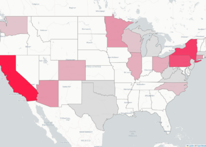
Have you ever wondered about the geography of college gymnastics? You’re not the only one! This is the third installment of a new monthly series, where we’ll answer all of your gymnastics geography questions. These maps will range from informative, to analytical, to light-hearted and fun.
This month, we wanted to see which teams recruit in-state athletes most often. Each circle on the map represents a team, and the size of the circle is proportional to the percentage of its freshmen who are in-state. A larger circle means that a higher percentage of the team’s freshmen listed hometowns that are in the same state as the school, relative to other teams. This map includes data from 2015 through 2025 rosters. Hover over or click on a circle to see the team’s name and its percentage of freshmen who are from its state.
READ THIS NEXT: Data Deep Dive: The Fastest 10s Earned in College Gymnastics in the Last 10 Seasons
Article by Jill Walsh