

Gymnastics fans love leotards, it’s just a fact. We love seeing new designs, creating our own, and especially judging them. That’s why we’re back for another season of leotard rankings! Each week we’re analyzing new designs to find our weekly faves. Here’s the rubric we’re working with:
- Design (3): How strong the overall design is in terms of color, balance, composition, and visual flow. Does it feel intentional and cohesive?
- Construction (2): Quality of materials, fit, finish, and sparkle application. Does the leotard look well-made and flattering in motion and on camera?
- Concept & Identity (2): How successfully the leotard communicates a clear concept or identity through design choices — balancing team branding with creativity and cohesion. Does it feel like this team in a good way?
- Overall Appearance (3): The general visual impression: Does the leotard stand out (positively) on the floor? Is it polished, elegant, and memorable?

Don’t agree with our ranking? Make your opinion heard by voting in the fan poll at the end of the article each week or by voicing your thoughts on social media!
Iowa: 9.600

View a video of this leotard here.
Elizabeth: 9.400
Design 2.7/3, Construction 1.9/2, Concept & Identity 2.0/2, Overall Appearance 2.8/3
LOVE. This is very similar to a Washington leo, which makes sense since I assume Jen Llewellyn designed both. The matte white looks great with the sparkly black Hawkeye logo, really allowing it to pop. I also love the gold detailing and the geometric rhinestone lines. I don’t normally love when solid fabric is used on the ends of mesh sleeves, but it works here.
Julianna: 9.400
Design 2.8/3, Construction 1.9/2, Concept & Identity 2.0/2, Overall Appearance 2.7/3
This is stunning and such an excellent addition to the Hawkeyes’ wardrobe! It’s giving Wonder Woman in the best possible way. I love the mesh sleeves rather than having the entire sleeve be black and just bringing it in to line up with the bottom half of the leo. This just looks really clean cut, and really pops. Definitely a favorite of the weekend!
Jill: 10.000
Design 3.0/3, Construction 2.0/2, Concept & Identity 2.0/2, Overall Appearance 3.0/3
I absolutely love this; I’m giving full points! Black, white, and gold go so well together here and make this stand out from other superhero-esque leotards. The black rhinestones on the logo and the more subtle rhinestone outline around it really make it pop and take up the right amount of space. The solid part of the sleeves are a great height, and I love that the rhinestone pattern matches the pattern on the rest of the leo.
Penn State: 8.600
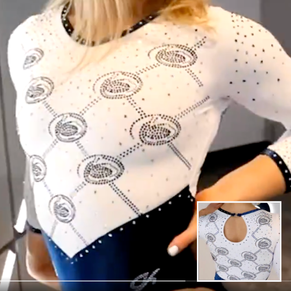
View a video of this leotard here.
Elizabeth: 8.500
Design 2.3/3, Construction 1.8/2, Concept & Identity 2.0/2, Overall Appearance 2.4/3
The velvet, of course, is my favorite part here, but I also love the little Nittany Lion logos all over the top half. To me, this type of school spirit is so fun because it’s plentiful without being cheesy or too over the top.
Julianna: 8.900
Design 2.7/3, Construction 1.7/2, Concept & Identity 2.0/2, Overall Appearance 2.5/3
I really love this! I appreciate how much Penn State leans into the Nittany Lions on this leotard, and this is a really fun addition to what Penn State has. I think we are all a sucker for a velvet leo and this definitely adds to that love. The shade of blue is perfect and I like that the open keyhole on the back breaks up the top so it’s not so overwhelming with the logos.
Jill: 8.400
Design 2.5/3, Construction 1.5/2, Concept & Identity 1.9/2, Overall Appearance 2.5/3
Also love the velvet! I like the blue on the sleeves and neckline, and simplicity lets the Nittany Lions steal the show. The logo itself loses some clarity in this rhinestone design, but you can still tell what it is, and I love the concept.
Utica: 8.366

View images of this leotard here.
Elizabeth: 8.200
Design 2.2/3, Construction 1.8/2, Concept & Identity 1.8/2, Overall Appearance 2.4/3
Full velvet! I like this. The stripe on top of the sleeve trend is one I’m fond of, and the back is nice here, too. A good one from Utica.
Julianna: 8.500
Design 2.3/3, Construction 1.8/2, Concept & Identity 1.9/2, Overall Appearance 2.5/3
This is so pretty!! I love the inclusion of all the school colors, and that this isn’t too overwhelming in terms of bling. I like the bottom being untouched and just a solid base, and the rest of the design happening on the top. The back design is fun and different from anything Utica has and this is a really elevated addition to what the team already has!
Jill: 8.400
Design 2.3/3, Construction 1.8/2, Concept & Identity 1.8/2, Overall Appearance 2.5/3
I like this a lot! Utica has great colors and incorporates them wonderfully here. I love the orange stripes. The rhinestone pattern on the belt feels sort of throwback too. I wish UTICA stood out a little more, but otherwise, this is awesome.
San Jose State: 8.266
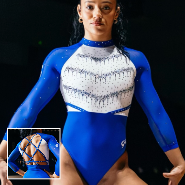
View a video of this leotard here and images here.
Elizabeth: 9.200
Design 2.7/3, Construction 1.9/2, Concept & Identity 1.8/2, Overall Appearance 2.8/3
This may be one of my favorites of the week if not the season! I love the matter white, especially the rhinestone pattern on top. I also love the back. Thin straps always look so good to me, and I love when rhinestones are added on top. My only wish is that this leo had some small touch of yellow. Maybe even the logo being in color rather than just white, or alternatively some yellow rhinestones sprinkled in with the blue ones on the chest.
Julianna: 7.600
Design 2.0/3, Construction 1.6/2, Concept & Identity 1.8/2, Overall Appearance 2.2/3
I do like this, but something about it is so overwhelming at first glance. I love the back design, and I love the layers of dripping diamonds down the chest, but this aspect, I wish went lower. The stark cut right to the blue across the stomach is the only thing that throws me about this, I wish there was more of a transition from the white to blue. Other than that, I really love this for San Jose State!
Jill: 8.000
Design 2.3/3, Construction 1.5/2, Concept & Identity 1.8/2, Overall Appearance 2.4/3
I agree that this is overwhelming at first, but it definitely grew on me. I really love the rhinestone pattern & colors. I don’t love the shape of the back or the thin strips, but the straps do pull it together. I liked the warmup version of this too.
Maryland: 8.166
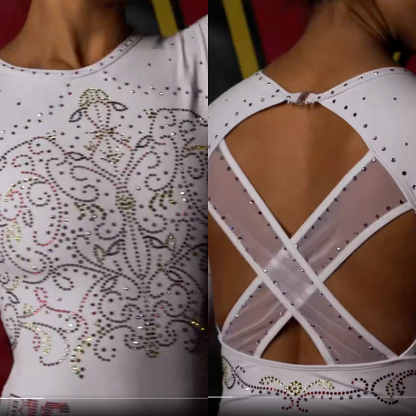
View a video of this leotard here.
Elizabeth: 9.200
Design 2.7/3, Construction 1.8/2, Concept & Identity 1.9/2, Overall Appearance 2.8/3
This is a great Maryland leo! I liked it a lot when I first saw it, and as I saw it more and more, my fondness continued to grow. I love the concept of a plain white base with colored rhinestones, really allowing the design to shine. My only wish is that the colors of those rhinestones stood out more from afar, but I don’t know if that’s something colored rhinestones are even capable of.
Julianna: 9.000
Design 2.6/3, Construction 1.8/2, Concept & Identity 1.9/2, Overall Appearance 2.7/3
This is stunning! The addition of the different colored gems in the design is really a wonderful addition to the plain white base. I also love that the design continues onto the back under the cutout. The only thing I wish was that the two mesh straps in the back weren’t there and the whole back was open, logistically I know that may be difficult, but I think it would’ve just added to the simple beauty of the overall look.
Jill: 6.300
Design 1.5/3, Construction 1.8/2, Concept & Identity 1.5/2, Overall Appearance 1.5/3
I’m definitely the outlier here and don’t love this one. I’m not a huge fan of white leos, though. I think the rhinestone pattern looked nice from afar, and I like the straps on the back too. The rhinestone pattern is a little busy for me and the Maryland on the arm doesn’t fit the vibe of the rest of the leo.
Rutgers: 7.666

View a video of this leotard here.
Elizabeth: 7.100
Design 1.8/3, Construction 1.7/2, Concept & Identity 1.6/2, Overall Appearance 2.0/3
I’m not a huge fan of flame designs, but this one isn’t too bad. The back is my favorite part, though. It sort of mirrors the flames in a fun way while not being too open.
Julianna: 7.200
Design 2.0/3, Construction 1.6/2, Concept & Identity 1.2/2, Overall Appearance 2.4/3
I love the way this looks, but nothing about this screams Rutgers to me other than the color palette. I like the open back cut outs and it looks really nice in motion, but I’m not getting how this relates to the team and that’s the biggest aspect throwing me off.
Jill: 8.700
Design 2.5/3, Construction 1.7/2, Concept & Identity 1.7/2, Overall Appearance 2.8/3
I love the flames! This might be one of my favorite Rutgers leos. I love that they leaned into the red and black, and the rhinestones make the flames stand out without creating a secondary focus. The shape of the cutouts on the back is unique and works well here.
Air Force: 7.433
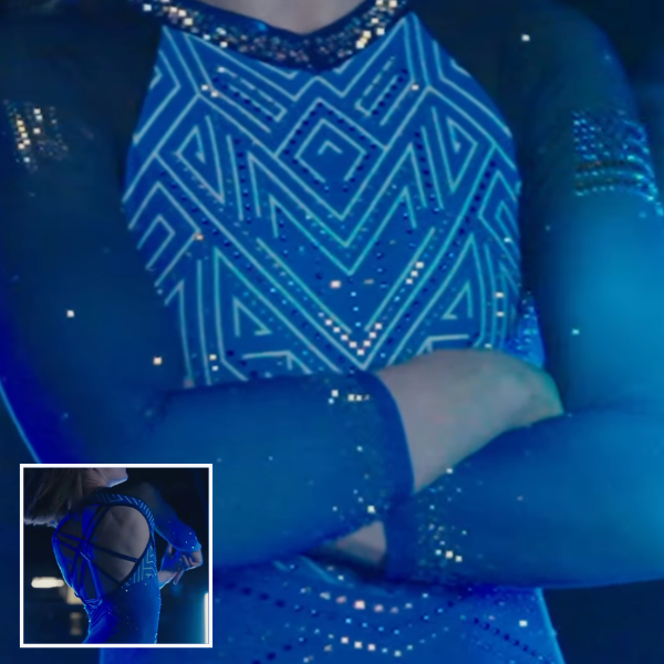
View a video of this leotard here.
Elizabeth: 6.900
Design 1.9/3, Construction 1.5/2, Concept & Identity 1.5/2, Overall Appearance 2.0/3
I like the shade of blue and the design on the bodice. It’s very similar to BYU’s recent new leotard. However, when I saw this leo in action on the meet stream, I didn’t like how the ombre sleeves looked with the overall design. The ombre was a bit too stark, and I think there wasn’t quite enough black, so it all looked a bit too blocky.
Julianna: 7.800
Design 2.0/3, Construction 1.5/2, Concept & Identity 1.8/2, Overall Appearance 2.0/3
I really like how different this is for Air Force, and I love the story about the legacy behind this design. I do like the two blue shades–they complement one another well–and I like that this leotard is a brighter addition to its wardrobe. I do wish there was something other than the sleeve embellishments that showed it was for the Falcons, but there are certainly aspects I really love about it.
Jill: 7.600
Design 2.2/3, Construction 1.5/2, Concept & Identity 1.7/2, Overall Appearance 2.2/3
I was reminded of BYU too. I like how bright and geometric this is for Air Force. I think the open back goes too far wide and the triangular rhinestone section below the rhinestone belt isn’t really needed here, but I like this for Air Force overall.
Nebraska: 7.133
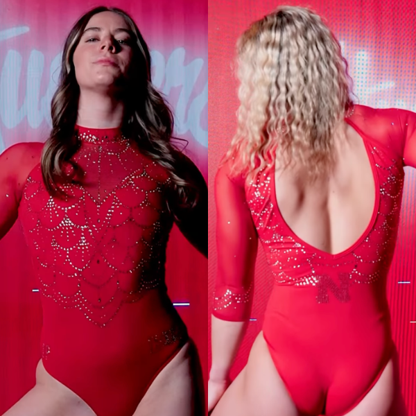
View a video of this leotard here.
Elizabeth: 7.500
Design 2.0/3, Construction 1.8/2, Concept & Identity 1.7/2, Overall Appearance 2.0/3
When you have a leo that’s all one color, it can only be so interesting. That being said, I do like the shade of red, the rhinestone pattern on the bodice, and the shape of the back. It’s a simple yet effective design.
Julianna: 6.800
Design 1.8/3, Construction 1.5/2, Concept & Identity 1.5/2, Overall Appearance 2.0/3
It’s so red, but I like it. It’s not my favorite of the week, mainly because it doesn’t really stand out as anything different for the Huskers, but I absolutely love the open back shape. The sparkle factor of this is pretty, but it is a bit hard to see the intricacy of the design with no break in the color.
Jill: 7.100
Design 1.8/3, Construction 1.8/2, Concept & Identity 1.5/2, Overall Appearance 2.0/3
I also like this one. The pattern of the rhinestones is pretty, and I like that it is reflected on the back and sleeves too, although I agree with Julianna that it is hard to see the details of the design. The mesh sleeves break up the solid red a bit.
Oregon State: 6.633
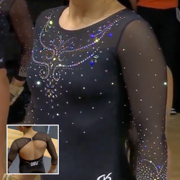
View a video of this leotard here.
Elizabeth: 6.900
Design 1.8/3, Construction 1.6/2, Concept & Identity 1.5/2, Overall Appearance 2.0/3
It’s fine. It’s a solid black design to add to the closet, but it’s also nothing exciting. I like the back and how the rhinestone design on the front goes from the solid fabric to the mesh. However, I don’t like how a lot of the rhinestones give off a blue hue, which doesn’t make a lot of sense for Oregon State.
Julianna: 6.600
Design 1.5/3, Construction 1.8/2, Concept & Identity 1.3/2, Overall Appearance 2.0/3
I really love the back, but the front of this is lacking the wow factor. With just the design at the top of the chest really being anything different, it’s a good, simple leotard to add to the collection, but not something that really stands out amongst the other pretty designs Oregon State has debuted.
Jill: 6.400
Design 1.3/3, Construction 1.8/2, Concept & Identity 1.5/2, Overall Appearance 1.8/3
I love that OSU stands out on the back in a solid contrasting color. The mesh continuing on to the back and the rhinestones at the ends of the sleeves add a lot to this design too. I definitely appreciate a solid black leo, but I think the rhinestone pattern on the chest takes away from this one. I wish it continued lower down the front or included some orange rhinestones.
Towson: 6.133

View an image of the front of this leotard here.
Elizabeth: 5.800
Design 1.6/3, Construction 1.2/2, Concept & Identity 1.3/2, Overall Appearance 1.7/3
This reminds me a lot of a West Virginia leo, despite the base being black and not navy. The hole is a little random, and the white diamond more so. The sleeves in action are nice, and I like how the back straps are lined with rhinestones; however, I don’t care for the fabric under those straps. Towson has a lot of good leos, but this one is a bit underwhelming.
Julianna: 6.100
Design 1.5/3, Construction 1.4/2, Concept & Identity 1.4/2, Overall Appearance 1.8/3
There are elements I like of this, but it’s not my favorite leotard of the weekend. I actually love the placement of the gems across the chest and the yellow strips makes it more Towson Tiger-esque, but I don’t like the white diamond in the middle of the chest, or on the sides. The addition of the white messes up the fluidity of the design for me, but I do like the rest of the elements, like the back straps overlaying on the base of the leotard and the V-cut with Towson on the back a lot.
Jill: 6.500
Design 1.8/3, Construction 1.2/2, Concept & Identity 1.5/2, Overall Appearance 2.0/3
The yellow sleeves are a fun addition here and I like how much sparkle it has. I also don’t love the fabric under the straps and the white diamonds. The hole on the front and the strappy back give me 2016 vibes.
Fan Poll
Congrats to Arizona for winning last week’s fan poll! Vote for your favorite design from this week here.
READ THIS NEXT: NCAA Gymnastics Power Rankings: Top Transfers
Judged by Elizabeth Grimsley, Julianna Roland, and Jill Walsh
“amongst the other pretty designs Oregon has debuted.”
it’s Oregon ‘State.’ please don’t call them Oregon!