Gymnastics fans love leotards, it’s just a fact. We love seeing new designs, creating our own, and especially judging them. That’s why we’re back for another season of leotard rankings! Each week we’re analyzing new designs to find our weekly faves. Here’s the rubric we’re working with:
- Design (3): How strong the overall design is in terms of color, balance, composition, and visual flow. Does it feel intentional and cohesive?
- Construction (2): Quality of materials, fit, finish, and sparkle application. Does the leotard look well-made and flattering in motion and on camera?
- Concept & Identity (2): How successfully the leotard communicates a clear concept or identity through design choices — balancing team branding with creativity and cohesion. Does it feel like this team in a good way?
- Overall Appearance (3): The general visual impression: Does the leotard stand out (positively) on the floor? Is it polished, elegant, and memorable?

Don’t agree with our ranking? Make your opinion heard by voting in the fan poll at the end of the article each week or by voicing your thoughts on social media!
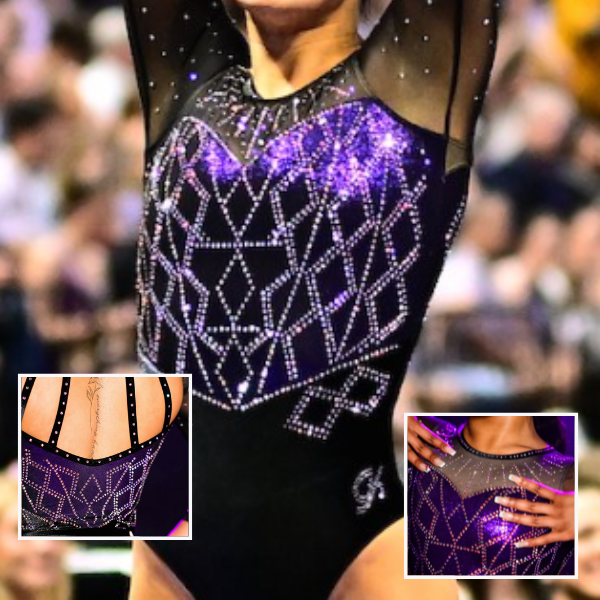
Florida: 9.475
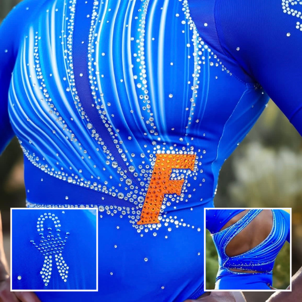
View more photos of the leotard here.
Elizabeth: 9.100
Design 2.6/3, Construction 1.9/2, Concept & Identity 1.9/2, Overall Appearance 2.7/3
Without the orange F, I would be saying just another boring blue leotard from Florida. But that pop of color makes such a difference! This is what I’ve been asking for all along! I love the wave-like design, the swooping back straps, and the incorporation of BOTH school colors in a significant way.
Emma: 9.800
Design 2.8/3, Construction 2/2, Concept & Identity 2/2, Overall Appearance 3/3
This is one of my favorite Florida designs ever. The back is so unique and so flattering, the orange F ties the entire design together, and the rhinestone design is perfect. They knocked it out of the park.
Jill: 9.600
Design 3.0/3, Construction 1.9/2, Concept & Identity 1.9/2, Overall Appearance 2.8/3
Love this one! The orange F is my favorite part. The bright ombre blue and orange work so well together. I like that the stripes swoop into the same sections on the front and the back, and that the back cutouts work with the wave pattern too rather than just being a big hole.
Sarah: 9.400
Design 2.8/3, Construction 1.9/2, Concept & Identity 1.9/2, Overall Appearance 2.8/3
This is a standout design from Florida. The back is legitimately so cool, and is something I haven’t seen in any other leo designs. The leo plays really well with color, and blends the different shades of blue really nicely while also accommodating the pop of orange seamlessly. I love this!
Ohio State: 8.725

View a video of the leotard here.
Elizabeth: 9.100
Design 2.7/3, Construction 1.8/2, Concept & Identity 1.9/2, Overall Appearance 2.7/3
I love a mascot leotard!!! The pose of this particular mascot is a little weird for a gymnastics leotard, but I’m not thinking too hard about it. Additionally, I love the shade of red, the matte fabric, and the relatively simple sleeves.
Emma: 8.400
Design 2.4/3, Construction 1.8/2, Concept & Identity 2.0/2, Overall Appearance 2.2/3
My only gripe with this leotard is the chunky arm rhinestones. Otherwise, Ohio State pulled off this mascot leotard so well. I love the rhinestone Buckeyes on the back and how striking the shade of red is.
Jill: 9.200
Design 2.6/3, Construction 1.8/2, Concept & Identity 2.0/2, Overall Appearance 2.8/3
Is Brutus starting his run down the vault runway? I love how fun, bright, and sparkly this is. The sleeves pair so well with this iteration of Brutus. The Buckeyes on the back blends into the red, but that’s the only thing that falls a bit flat here.
Sarah: 8.200
Design 2.3/3, Construction 1.8/2, Concept & Identity 1.8/2, Overall Appearance 2.3/3
The sleeves on this are truly my favorite part – the polka dot-like effect of the rhinestones plays so well with the fun mascot design. The Ohio State logo also feels so seamlessly included within the design, rather than being merely inserted in. I like the back design overall, but I’m not sure the script font works entirely with the rest of the leotard.
Utah State: 8.650

View more photos of the leotard here.
Elizabeth: 9.100
Design 2.2/3, Construction 1.7/2, Concept & Identity 3/2, Overall Appearance 2.2/3
I am obsessed with the idea behind this leotard, and for that I’m giving it a rare bonus point because I make the rules and can do what I want. As for the design itself, I always liked this Iowa State leotard, especially for the shimmery gold-red fabric it has, and I’m pleased the shimmery silver-blue gives the same effect.
Emma: 8.400
Design 2.4/3, Construction 1.8/2, Concept & Identity 2/2, Overall Appearance 2.2/3
This design is so well executed and works so well with a shimmery navy. Utah State is always exceptional at incorporating school spirit into their more “simple” leotards, and the Aggies text on the strap pairs very nicely with the back design.
Jill: 8.500
Design 2.5/3, Construction 1.8/2, Concept & Identity 2.0/2, Overall Appearance 2.2/3
This is an amazing concept executed very well. I love it in red and these shades of blue translate nicely. The rhinestones along the back cutout are a great touch, and Aggies across it is a fun way to add more school spirit.
Sarah: 8.600
Design 2.5/3, Construction 1.6/2, Concept & Identity 2/2, Overall Appearance 2.5/3
What a fantastic and thoughtful concept. I absolutely love how this design was adapted into Utah State’s colors. The shimmering blue is gorgeous, and I really like the rhinestoned collar as well. The back of this is also super cool, and ties the whole leotard together.
Michigan State: 8.325

View more photos of the leotard here.
Elizabeth: 8.300
Design 2.4/3, Construction 1.6/2, Concept & Identity 1.8/2, Overall Appearance 2.5/3
Up close, it’s not the best leotard I’ve ever seen, but taking a step back, it’s great. I love the athletic look the mesh gives, while the rhinestones keep things modern. The shade of green and the matte fabric used also work really nice together. It’s a simple leotard yet super effective.
Emma: 8.000
Design 2.3/3, Construction 1.6/2, Concept & Identity 1.8/2, Overall Appearance 2.3/3
I initially didn’t like this leotard, but it grew on me after actually seeing it in motion. It had a very elegant presence on screen. I really adore the rhinestone placement and how the black horizontal mesh isn’t too distracting.
Jill: 9.000
Design 2.7/3, Construction 1.7/2, Concept & Identity 1.8/2, Overall Appearance 2.8/3
I love this! The matte green and mesh have enough contrast to keep this design interesting even though it’s relatively straightforward. The cascading rhinestones are beautiful and the closed back suits them really well.
Sarah: 8.000
Design 2.4/3, Construction 1.6/2, Concept & Identity 1.6/2, Overall Appearance 2.4/3
First and foremost, the green base here is absolutely gorgeous. I wasn’t convinced of the black mesh striping across the top of the leo at first, but after seeing it in motion, I actually really like it. It also enables the unique rhinestone pattern, which stands out nicely.
Nebraska: 8.325
View more images of the leotard here.
Elizabeth: 8.600
Design 2.4/3, Construction 1.8/2, Concept & Identity 1.8/2, Overall Appearance 2.6/3
I really love this! The red and black ombre paired with the lined and rhinestone pattern on top pair well together, and I really like how the rhinestones on the mesh give almost a stars-in-the-night-sky-type look.
Emma: 8.600
Design 2.5/3, Construction 1.8/2, Concept & Identity 1.7/2, Overall Appearance 2.6/3
This is a gorgeous leotard that is super flattering in motion. I love the mesh clasps on the back and how seamless the front design is. It reminds me a little bit of the musical Moulin Rouge.
Jill: 7.300
Design 2.1/3, Construction 1.6/2, Concept & Identity 1.8/2, Overall Appearance 2.4/3
This looks busy to me up close, but I thought it looked great during the meet. The red and black still stand out behind the rhinestones. I wish the lines on the front and back connected.
Sarah: 8.800
Design 2.5/3, Construction 1.8/2, Concept & Identity 1.8/2, Overall Appearance 2.7/3
This is stunning! The rhinestone placement is so unique, and I feel that the design balances the red ombre with the black and white elements nicely. The mesh blends with the regular fabric very seamlessly as well.
Minnesota: 8.225
View more photos and videos of the leotard here.
Elizabeth: 7.800
Design 2.2/3, Construction 1.6/2, Concept & Identity 1.8/2, Overall Appearance 2.2/3
I’ve always loved this shimmery fabric. It’s a cool way of incorporating multiple school colors. The design here in still images is confusing, but in motion/in person, you can’t see the details as much, so it doesn’t really matter. I like the shape it gives to the leotard as a whole.
Emma: 8.300
Design 2.3/3, Construction 1.7/2, Concept & Identity 1.8/2, Overall Appearance 2.5/3
This is similar to a couple other Minnesota leotards, but this design is so gorgeous that I don’t care. Minnesota always does a great job of incorporating both maroon and gold into the leotards, and I adore the asymmetrical cutouts with the shimmery fabric. This leotard was so pretty in motion and I can’t wait to see it worn for seasons to come.
Jill: 8.600
Design 2.5/3, Construction 1.8/2, Concept & Identity 1.8/2, Overall Appearance 2.5/3
I really like this! The shimmery fabric, colorful rhinestones, and mesh sleeves manage to look cohesive here. The combination of the v-shaped shimmery shapes with the circular rhinestone patterns add dimension.
Sarah: 8.200
Design 2.4/3, Construction 1.6/2, Concept & Identity 1.8/2, Overall Appearance 2.4/3
This is so fun! The asymmetrical design works well throughout the leo, and the rhinestone placement and coloring on this is excellent. I like the choice to use a contrasting shimmery fabric rather than mesh throughout the torso.
Kentucky: 8.175
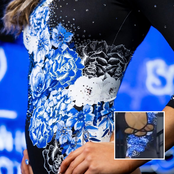
View a video of the leotard here.
Elizabeth: 9.100
Design 2.7/3, Construction 1.8/2, Concept & Identity 1.8/2, Overall Appearance 2.8/3
I really love this, and I’m not normally a fan of flowers on designs. The pattern looks great here, though, and the blue really pops with the white on black. I also love the unique back straps.
Emma: 7.500
Design 2.3/3, Construction 1.3/2, Concept & Identity 1.7/2, Overall Appearance 2.2/3
I am not a huge fan of flower designs like this, but this leotard overall works well. I love the looped back openings and the asymmetry of the flower design. I wish the flowers had less detailing to make this design less busy.
Jill: 8.300
Design 2.5/3, Construction 1.5/2, Concept & Identity 1.8/2, Overall Appearance 2.5/3
I’m also not usually a fan of floral designs but I do like this overall. Keeping the colors pretty simple helped and the blue stands out, making it still feel like a Kentucky leo.
Sarah: 7.800
Design 2.4/3, Construction 1.6/2, Concept & Identity 1.5/2, Overall Appearance 2.3/3
The color palette Kentucky utilized here did wonders for this design. I love black as the base for the design, and the blue is really nicely accentuated. I unfortunately do not love the strap/keyhole detailing on the back. It doesn’t feel completely coherent with the rest of the design, and I think a more simple back would have worked better here.
Air Force: 7.425
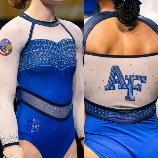
View this leotard in action here.
Elizabeth: 7.500
Design 2.0/3, Construction 1.6/2, Concept & Identity 1.7/2, Overall Appearance 2.2/3
This design feels very different than what Air Force normally wears, but I like it. The white sleeves go great with the various shades of blue. The belt looks a bit weird to me from farther back, but I like the pattern on it up close, as well as the rhinestone pattern on the chest.
Emma: 8.100
Design 2.2/3, Construction 1.6/2, Concept & Identity 1.9/2, Overall Appearance 2.4/3
This is so pretty and so uniquely Air Force. I absolutely adore the Falcons rhinestones on the front, especially in pairing with the studded waistband and black chest gems. This is a very flattering leotard that I hope Maggie Slife will rewear at nationals.
Jill: 7.200
Design 1.8/3, Construction 1.6/2, Concept & Identity 1.8/2, Overall Appearance 2.0/3
During the broadcast, I thought the rhinestone pattern was just circular but it’s very creative now that I can see that it says Falcons. I agree that the belt is disjointed but I like this overall. I like the AF against the white background on the back.
Sarah: 6.900
Design 1.8/3, Construction 1.5/2, Concept & Identity 1.8/2, Overall Appearance 1.8/3
The rhinestones spelling out “Falcons” is such a fun added touch! I don’t love the fabric contrast with the belt, but beyond that, this is a cohesive design that feels very distinctly Air Force.
Arizona State: 7.325
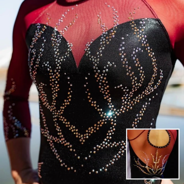
View more images of the leotard here.
Elizabeth: 6.800
Design 1.7/3, Construction 1.7/2, Concept & Identity 1.6/2, Overall Appearance 1.8/3
For some reason, whenever Arizona State does black and maroon, I feel bored. I do like the rhinestone pattern on the body, though, and how the silver and gold rhinestones are working together.
Emma: 7.000
Design 1.8/3, Construction 1.6/2, Concept & Identity 1.5/2, Overall Appearance 2.1/3
The front design leaves something to be desired, but the back is gorgeous and so perfectly shimmery. I feel like this is an Arizona State leotard that I’ve seen before, but it’s still an elegant leotard that looked great on camera.
Jill: 8.500
Design 2.7/3, Construction 1.8/2, Concept & Identity 1.5/2, Overall Appearance 2.5/3
I love the maroon mesh paired with black here, as well as the multicolored rhinestones for added sparkle. I like that the rhinestone pattern on the back connects over the solid and mesh portions. This leo is called Ignite, but the rhinestone pattern reminds me of kelp or an under-the-sea image instead of flames.
Sarah: 7.000
Design 1.8/3, Construction 1.8/2, Concept & Identity 1.6/2, Overall Appearance 1.8/3
This isn’t anything groundbreaking, but it’s a nice design overall. I really like the pitchfork design on the back, and how it matches pattern-wise with the rhinestones on the sleeves. I don’t love the sweetheart neckline, but otherwise, this is solid.
Oregon State: 7.325

View the video for the leotard here.
Elizabeth: 7.600
Design 2.1/3, Construction 1.6/2, Concept & Identity 1.7/2, Overall Appearance 2.2/3
I waited to write my thoughts until I saw this one in person, and I’m glad I did. While the gray and black don’t really seem to work together, they looked more cohesive at the meet. I also like the rhinestone pattern.
Emma: 5.800
Design 1.6/3, Construction 1.5/2, Concept & Identity 1.0/2, Overall Appearance 1.7/3
Meh. I don’t enjoy the slate gray, especially in combination with the two other shades of gray on the chest and arms. I wish they had incorporated more orange, maybe on the sleeves, to give this leotard more school spirit.
Jill: 8.200
Design 2.5/3, Construction 1.6/2, Concept & Identity 1.7/2, Overall Appearance 2.4/3
I love the diagonal split of designs here. The black and gray stand out just enough from each other and the orange rhinestones are a nice touch to add a bit of color.
Sarah: 7.700
Design 2.1/3, Construction 1.8/2, Concept & Identity 1.7/2, Overall Appearance 2.1/3
The different contrasts within this leotard work really well together without the design feeling overcrowded. The contrasting colors of rhinestones pop out nicely, and the shifts between the different designs are well-constructed and seamless. I like this a lot!
LSU: 7.200
View more photos and videos of the leotard here.
Elizabeth: 7.200
Design 2.0/3, Construction 1.7/2, Concept & Identity 1.5/2, Overall Appearance 2.0/3
LSU loves to debut a relatively boring black and purple leotard for the regional final, doesn’t it? This is fine. There’s nothing super special about it, though. I like the diamond pattern and the understated colors used.
Emma: 7.400
Design 2.0/3, Construction 1.6/2, Concept & Identity 1.4/2, Overall Appearance 2.4/3
Again, I feel like I’ve seen this LSU leotard before. This is a very pretty design and I enjoy how pink the rhinestones look in the light, adding depth to the shimmery purple fabric. This isn’t groundbreaking, but the different components of this leotard work well together to create a polished look.
Jill: 7.200
Design 2.0/3, Construction 1.6/2, Concept & Identity 1.6/2, Overall Appearance 2.0/3
This is a nice new black and purple leo for LSU but I agree that it isn’t groundbreaking. I like the shimmery purple and that the neckline adds a little extra sparkle.
Sarah: 7.000
Design 2.1/3, Construction 1.4/2, Concept & Identity 1.5/2, Overall Appearance 2.0/3
The first thing I noticed on this leo was that the rhinestoning doesn’t fully wrap around the sides, which made this feel a bit incomplete for me. I prefer the back to the front of this design, and I think it utilizes the back straps really nicely. The subtle purple is pretty too.
BYU: 6.750

View photos and videos of the leotard here.
Elizabeth: 7.800
Design 2.2/3, Construction 1.5/2, Concept & Identity 1.8/2, Overall Appearance 2.3/3
I really like this! It’s pretty similar to another BYU leo from a couple years ago, but I liked that one as well, so I’m not going to complain too much. Some of the black lines are placed in weird spots, but as a whole, this is a good leo.
Emma: 6.300
Design 1.7/3, Construction 1.4/2, Concept & Identity 1.7/2, Overall Appearance 1.5/3
There is a lot going on here, but I’m not too mad about it. I really dislike the horizontal black line on the back, but otherwise the black decals work well to break up the front design and make it more striking on screen. This is very BYU.
Jill: 6.000
Design 1.5/3, Construction 1.5/2, Concept & Identity 2.0/2, Overall Appearance 1.0/3
This is unmistakenly BYU. The colors and ombres of the lines create an almost 3-D effect, and the placement of them works well. I don’t think it needed so many black lines and piping, especially the horizontal line across the top of the back.
Sarah: 6.900
Design 1.9/3, Construction 1.5/2, Concept & Identity 1.6/2, Overall Appearance 1.9/3
BYU sure loves itself a geometric leo. There’s a lot going on here, but it somehow all works. The use of the black piping to accentuate the neckline and the cutout in the back is really cool, and provides a sharp contrast against the blue and white ombre.
Missouri: 6.625
View more pictures and videos of the leotard here.
Elizabeth: 6.100
Design 1.7/3, Construction 1.0/2, Concept & Identity 1.6/2, Overall Appearance 1.8/3
The execution is poor, and it’s the first thing I notice. Those sleeve seams are just not it and could have easily been avoided. The design itself is fine. I’m not shouting about it or anything, but it’s not bad either. I do like Mizzou and Tigers on the cuffs, though.
Emma: 6.700
Design 2.0/3, Construction 1.2/2, Concept & Identity 1.5/2, Overall Appearance 2.0/3
This is simple but ultimately very pretty. I love the black mesh paired with the black rhinestones, as well as the text on the cuffs. I do wish the back cutout was smaller so it could incorporate some extra school spirit, like putting Mizzou in rhinestones on the lower back.
Jill: 6.500
Design 2.0/3, Construction 1.2/2, Concept & Identity 1.6/2, Overall Appearance 1.7/3
I like this design a lot but a few aspects detract from it. The mesh could’ve stopped at the sleeve seams to avoid that overlap. I love the rhinestone pattern on the front and the sleeves. I wish those lines were used on the back instead of it going so round. It feels disjointed.
Sarah: 7.200
Design 2.2/3, Construction 1.3/2, Concept & Identity 1.7/2, Overall Appearance 2.0/3
The front of this leo is gorgeous. I love the placement and coloring of the rhinestones, and the center cutout works nicely here to elevate the design. The seams do unfortunately stand out, but I really like the front overall. I feel less strongly about the back, and maybe would have preferred a closed design rather than the large cutout.
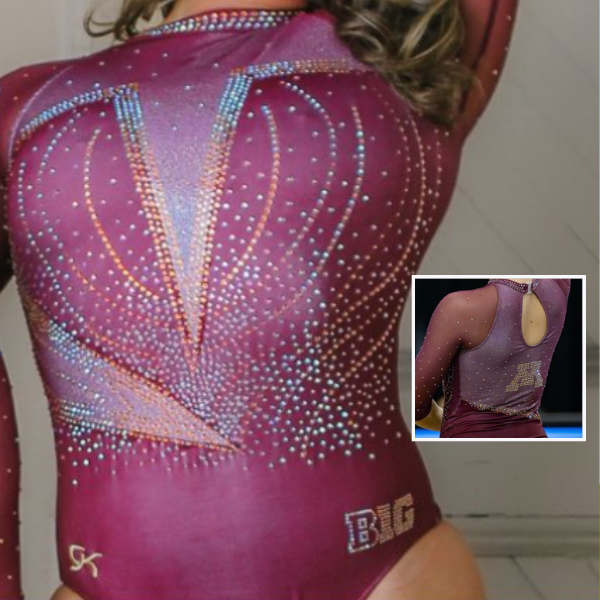
Michigan State: 6.600

View a video of the leotard here.
Elizabeth: 7.000
Design 1.8/3, Construction 1.6/2, Concept & Identity 1.7/2, Overall Appearance 1.9/3
I truly don’t know how to feel about this leotard, but what I do know is that it’s a lot. I also know I don’t like the belt, but I’m not sure if removing it would improve the leotard at all?
Emma: 5.900
Design 1.5/3, Construction 1.4/2, Concept & Identity 1.6/2, Overall Appearance 1.3/3
This is a fun concept that was ultimately not great in motion. The random Sylvia P logo, the horizontal belt, and the monochrome design all make for a busy design that doesn’t quite fit together. I do love the curved decals and the different sizes of rhinestones.
Jill: 7.100
Design 1.8/3, Construction 1.6/2, Concept & Identity 1.9/2, Overall Appearance 1.8/3
I love the vertical split between the pattern and the solid black and that it’s highlighted by the rhinestone pattern along the seam. I think it’s the combination of the belt and mesh cutout that pushes this from unique and fun to too many cooks in the kitchen. I also don’t like the SP logo placement. Without the belt and with solid black instead of mesh, this would be a favorite. I’d also love to see it in green.
Sarah: 6.100
Design 1.5/3, Construction 1.4/2, Concept & Identity 1.6/2, Overall Appearance 1.6/3
For me, the mesh cutout at the waist is the part of this design that pushes it over the line from bold to overcrowded. It doesn’t really need to be there, and in combination with the belt, makes it so there’s just a bit too much to process on this design. I do really like the contrasting patterns, though, and how the design extends to the sleeves.
Michigan: 6.475
View a video of the leotard here.
Elizabeth: 6.700
Design 1.9/3, Construction 1.3/2, Concept & Identity 1.6/2, Overall Appearance 2.0/3
It’s fine. The yellow rhinestones are good, and I like the use of the lighter shade of blue than on the other leotard Michigan debuted with it earlier this season. The back isn’t my favorite, but I like the thicker ribbon used vs. thinner like two leos had with this concept last season.
Emma: 6.400
Design 1.8/3, Construction 1.3/2, Concept & Identity 1.6/2, Overall Appearance 1.7/3
I really love the color scheme of this leotard, especially the silver decal that makes the rhinestones pop. I don’t know how I feel about a tie back, especially because it looks like the ties would flail around mid-air. I would’ve liked this leotard more with a keyhole back.
Jill: 6.500
Design 1.6/3, Construction 1.3/2, Concept & Identity 1.8/2, Overall Appearance 1.8/3
The front of this is very pretty, I love this shade of blue with the yellow rhinestones. The back would be better off without the adjustable bow. The fabric was too long, making it look floppy, and seeing it bounce around during routines was distracting and unnecessary. I like the crisscross straps though.
Sarah: 6.300
Design 1.7/3, Construction 1.4/2, Concept & Identity 1.5/2, Overall Appearance 1.7/3
I really like the front of this leo – it’s so elegant, and the design successfully balances the blue and yellow in a way that feels very intentional. However, I do not like the bow in the back. The design simply doesn’t need it, and having an adjustable loose element on a leo feels unnecessarily stressful.
UCLA: 6.425

View more photos and video of the leotard here.
Elizabeth: 7.500
Design 2.1/3, Construction 1.6/2, Concept & Identity 1.6/2, Overall Appearance 2.2/3
UCLA is starting to fall into the Florida trap of “just another blue leotard.” The design itself is fine, and I like how the back mirrors the front, but I’m not a fan of the floral pattern or the placement of it. This is just OK for me.
Emma: 6.600
Design 2.1/3, Construction 1.1/2, Concept & Identity 1.4/2, Overall Appearance 2.0/3
This design works in theory but didn’t stun me on the screen. The white waist design is very flattering in motion, but the white neckline makes the leotard feel heavy and unbalanced. I do appreciate the use of gold rhinestones to incorporate some school spirit, but I wish they had been incorporated more onto the sleeves.
Jill: 4.900
Design 1.0/3, Construction 1.4/2, Concept & Identity 1.5/2, Overall Appearance 1.0/3
I like the back of this more than the front. The white neckline stood out more on screen and I’m surprised it looks so blue in the pictures. It feels very costume-y to me.
Sarah: 6.700
Design 1.8/3, Construction 1.6/2, Concept & Identity 1.5/2, Overall Appearance 1.8/3
This doesn’t quite work for me. The floral design looks like an airbrush painting to me, and I dislike it on the torso (but oddly, I don’t mind it on the sleeves). I really do not like the twisting keyhole of sorts in the front, particularly against the mesh. The approach to the design on the back is a bit more well-placed.
LSU: 6.050
View more photos and videos of the leotard here.
Elizabeth: 5.400
Design 1.5/3, Construction 1.2/2, Concept & Identity 1.2/2, Overall Appearance 1.5/3
The gold looks like an afterthought, and the back straps, despite being a continuation of the front design, don’t feel like they fit with the design. This is a miss for me.
Emma: 5.200
Design 1.6/3, Construction 1.2/2, Concept & Identity 1/2, Overall Appearance 1.4/3
If you told me that LSU pulled this out of their closet of old leotards, I would’ve believed you. I feel like I’ve seen this before, which isn’t super exciting compared to some of the other designs of the weekend. I do enjoy the asymmetric gold straps, which bring a nice twist to the back.
Jill: 7.800
Design 2.3/3, Construction 1.6/2, Concept & Identity 1.7/2, Overall Appearance 2.2/3
I like this! It’s not the most exciting leo for LSU, but I like this shade of purple with the gold, and that the asymmetry on the front is reflected with the straps on the back.
Sarah: 5.800
Design 1.6/3, Construction 1.4/2, Concept & Identity 1.4/2, Overall Appearance 1.4/3
I really like the pop of gold in the leo, and I love the geometric design on the front with the contrasting rhinestone patterns. I’m not a fan of the asymmetrical mesh along the neckline, nor do I love the back straps. I feel like the design would have worked perfectly fine without them, and they’re kind of just there.
Denver: 4.750

View a video of this leotard here.
Elizabeth: 5.100
Design 1.2/3, Construction 1.2/2, Concept & Identity 1.2/2, Overall Appearance 1.5/3
Yeah, no. This looks like that leotard that both Air Force and Iowa State have/had but executed less well. The gold rhinestones didn’t even pop that much in person. Also, there’s way too much mesh.
Emma: 4.900
Design 1.0/3, Construction 0.9/2, Concept & Identity 2.0/2, Overall Appearance 1.0/3
I would remove several elements of this leotard, including the brown-appearing rhinestones, the underlying nude mesh, the chunky turtle neck, and the Denver decal on the back. The horizontal strappy design isn’t terrible, but needs some serious sparkle and color to truly mesh together.
Jill: 4.300
Design 1.0/3, Construction 1.0/2, Concept & Identity 1.4/2, Overall Appearance 1.0/3
This is a nope. The mesh horizontal lines just don’t work, and the collar looks too chunky.
Sarah: 4.700
Design 1.2/3, Construction 1.0/2, Concept & Identity 1.3/2, Overall Appearance 1.2/3
Not my favorite at all. The contrast between the lined and unlined mesh on the torso is poorly executed, and I honestly feel like this design would have worked far better if the leo utilized the black fabric throughout. The seams stick out so significantly as well.
Fan Poll
Congrats to Michigan State for winning the conference championships fan poll! Vote for your favorite design from this week here.
READ THIS NEXT: “We Kicked Down the Door:” Fisk Gymnastics Ends After Four Years
Judged by Elizabeth Grimsley, Emma Hammerstrom, Jill Walsh, and Sarah Smith