Another season finished, another full set of new leos to look back on. And we had so many to choose from! With the season now officially over, it’s time for each of our judges to choose their top 10 (and honorable mentions).
Elizabeth
10. Lindenwood’s library stained glass: This may be the Lions’ best design in program history, and it’s a great way to go out. I love the gold, the stained glass pattern on the chest, and the library inspiration.
9. Penn’s athletic red and white: I love an athletic look, and Penn’s take is fantastic. The red-and-white design with blue accents really make it stand out.
8. San Jose State’s blue with yellow: While I like the design and different fabrics and patterns used on this leo, I think what really sets it apart are the colors. The shades of blue and yellow just work so well together.
7. Stanford’s strappy red ombre with white: Of course I love the matte white, but my favorite part of this leo is the thick back straps with varying shades of red.
6. Arkansas’ candy cane sparkle hog: Everything about this design is great, from the matte base and the ombre to the diagonally cut sleeves and the unique strappy back.
5. Stanford’s angry tree: When I saw the angry tree warmup leo at nationals in 2023, I demanded a competition version. My dreams came true and were better than I ever could have imagined.
4. Michigan State’s geometric white: It’s pretty obvious why I love this one; it includes all of my favorite things—matte white, geometric designs, and a unique strappy back.
3. Michigan State’s galaxy: Everyone should be proud of me for only including two MSU leos on my list. I love this one most because of the clever mirroring of the straps on the front and back, and the swirly space design on the body.
2. Temple’s geometric red: I love a geometric design, and paired with the red and matte white makes it pretty perfect. Add in the sparkles and I’m sold.
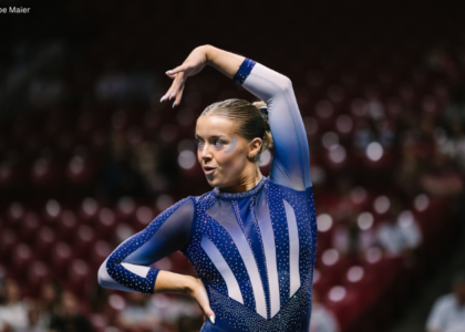
1. Oregon State’s throwback Benny: This leo is close to flawless. I love the white, the throwback vibe, and subtle orange ombre, but especially the cute little Benny logo on the front.
Honorable mentions: Clemson’s tiger stripe sides, Brockport’s emerald green, LSU’s regal white, Talladega’s blue to red ombre, Iowa’s yellow, Alaska’s Northern Lights, Rutgers’ red on red
Peri
10. Northern Illinois’s royal drip: NIU knows the level of detail not to cross, and toes it very gracefully with this leo. The matte torso packs in tons of legible detail, and still allows for the stoned Husky and torso sparkles to take center stage.
9. Arizona’s retro leo: There’s so much going on, and yet none of the elements are competing for attention. The level of detail in this leo is top notch, and the thick red bands complement the retro motif.
8. San Jose State’s blue and yellow: San Jose State is no stranger to blue with tasteful flashes of yellow, and this iteration is my favorite of theirs. The open back, white ombre, and variations in the stones cement this in my top ten.
7. Alaska’s Northern Lights: With Turn outfitting so many MGYM teams, I’m tickled pink to see their sister company Erin come up with this beauty. What separates this landscape leo from others we’ve seen is the deep v-neck serving as a foreground, working with–instead of against–the triangles.
6. Michigan State’s brilliance: The ends of the sleeves are a reverse of the torso. The open back has geometric straps to match the geometric patterning. Need I say more?
5. Illinois’ all orange: The tamest of Illinois’ designs in recent years, and my favorite in its current rotation. The orange mystique is a bold move that paid off, and embellishing the white wrists with their block I is a clever addition.
4. Stanford’s fear the tree: My younger sister grew up in ballet, and has impressed on me that any back straps need to be functional. It’s like Stanford heard her when it finalized this one, and the tree is perfect here in how it compliments the shape of the strap.
3. Bowling Green’s matte gray: Big fan of the matte gray and how it softens the transition from lycra to mesh. It looks incredibly comfortable, without sacrificing the sparkle factor to get there.
2. California’s butterfly: I was fooled in the first two rotations, and didn’t even notice this leo is navy! It’s the perfect tone to let the stones do the talking, and talk they did.
1. Stanford’s retro s: Sylvia P strikes again! The front and back’s red stripes fit together seamlessly, and the stones really help sell the ombre with their placement. Stanford has cracked the code on using Cardinal Red and black without the two tones competing with each other.
Honorable mentions: Lindenwood’s stained glass, Iowa State, Fisk, UW-La Crosse, Nebraska
Katie
10. Alaska’s Northern Lights: my first ever ‘favorite NCAA leotard’ was the original Utah skyline one so I have a huge soft spot for leotards with this vibe. The matte black is fantastic and I love the wolf claw mark detail on the arms.
9.UCLA’s geometric pride: I love this one. The multicolor, the shade of blue, and the art Nouveau vibes are great and the different sizes of rhinestones give it a really great dimension. All of these things together make this a fantastic leotard.
8. Ohio State’s red chandelier: I love this leotard. It’s so classy and looks so great in motion, it’s super sparkly with lots of texture and dimension. The back straps are gorgeous and it feels like something very different for Ohio State.
7. Arizona State’s gold cut out with red to black ombre: This gives me Captain Marvel vibes, and I absolutely love the cutouts and the dynamic flow created by the rhinestones. ASU has fantastic colors to work with and I think they almost always do a great job!
6. Oklahoma’s Sooner: If you told me I’d be putting an Oklahoma leotard as one of my top 10 of the season I would have laughed you out of Norman, but I just love this one. Given what happened in it I’m sure it won’t see the light of day again, but it managed to perfectly balance the ‘busy’ pattern with all the other subtle little design elements. Possibly my fave ever OU leotard.
5. LSU’s Wonder Woman V2: I loved the original, I love this one. The subtle Vs throughout which are the Roman numeral five which represents the five years since their last SEC win add another cool dimension.
4. Arizona’s retro cactus: Similar to the Alaska Northern Lights I love the incorporation of the mountains, sun, and cactus. The lines running through the landscape make it not too ‘blocky’ and it makes me think of a cool Patagonia fleece.
3. Michigan State’s brilliance : The geometry, the colors, the ombre, the stunning strappy back. It’s just all a yes.
2. Stanford’s retro s: Stanford killed the Leo game this year with my top two and this is just such a classy design. The matte white, the perfect placing of the Stanford logo on the chest, and to top it all off those beautiful thick red back straps in four different colors and sparkles to boot. Oh it’s just *chefs kiss*!
1. Stanford’s Angry Tree: The perfect leo does not exi… It does now.
Honorable mentions: UW La-Crosse’s white to red ombre, UCLA’s ‘spirit’ sky blue and white, Ohio State’s maze, UC Davis’ brushstrokes on navy
Claire
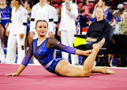
10. Temple’s EAGL championship leo: Odds are that Temple will eventually roll out a leo I don’t like, but not this year! I love the relatively simple geometric red and white offset by the super heavy crystals. This doesn’t look a thing like its other designs, but still has that unmistakable Temple flair.
9. Florida’s semifinal fit: Yes, it’s another pretty blue leo, but the Gator scales on the body and rhinestone teeth on the sleeves give this one extra bite.
8. Talladega in the snow: One of the primary goals for any new program is to establish its identity, and the Tornadoes proved themselves to be bold, brilliant, and fearless.
7. Boise State’s fire and ice: Florida take note: orange and blue is a killer combination! This works so well because it’s a simple understated silhouette—the crystals provide all the necessary drama.
6. Clemson’s leo one: I’ve waited a long time for this leotard, and it lived up to all of my expectations: It’s sporty, it’s sparkly, and it screams, “CLEMSON!”
5. Kentucky’s butterfly: I think part of the reason I love this so much is because it was so unexpected. You’re so focused on how gorgeous the marbled body is and then you notice the asymmetrical back straps!
4. Ohio State is a-maze-ing: This design could have gone off the rails very easily. Because every detail is so precise, so intentional, we get one of the coolest, most unexpected leos of the year.
3. Lindenwood’s stained glass finale: Because it wasn’t enough for Lindenwood gymnastics to go out as national champions (again), they did so in one of the year’s most stunning leos.
2. Stanford’s angry tree: The Cardinal churned out some bangers this year, including the retro s and fear the tree, but the angry tree (and the championship swag it inspired) achieved immediate cult status. I’m not saying that’s why they did so well at NCAA championships, but I’m not not saying that either.
1. Michigan State’s galaxy and brilliance: I know I’m stretching the rules by picking both, but I figured it’s OK since the Spartans wore them both at regionals. Associate head coach Nicole Jones has done an outstanding job thanks to an impeccable eye for detail and seemingly-infinite supply of surprising, fresh design concepts.
Honorable Mention: All the great throwbacks (OSU’s retro Benny, Penn’s senior night, Arkansas’ sparkle hog), animal references (Maryland’s turtle, LSU’s crawdad, Clemson’s tiger stripes), and Iowa’s long-awaited yellow moment.
Katherine
10. Michigan’s nationals white: Come at me. This kind of goes against my usual icks because I normally don’t like “3D” elements on leos. However, I think the design looks nice in motion; the all white body with the subtle blue and maize sparkles really pop. It’s the most unique Michigan leo I’ve seen in a while, so props to the Wolverines for that, too.
9. Florida’s equality night: It’s quite the contrast to UCLA’s pride leo (discussed below) but I love the subtle rainbow accents on this, from the piping to the sparkles. Against the black design, which is fairly typical for Florida, they stand out and call more attention to the design. It’s a cool mixing of elements.
8. Iowa State’s Big 12s design: I love all the school’s colors being incorporated here, and the zig zag on the front is more intricate than meets the eye. There’s also plenty going on on the back, but it works well. It’s a new era for Iowa State, and this leo feels like it represents that.
7. Utah’s nationals red: I don’t recall ever seeing sparkles this big and chunky, and I love it. And there’s so many of them! There’s also something about a solid red design that I tend to love. The inspiration is a nice touch, too. Can more teams say what the inspiration for their designs are? That is really a huge part of why I love this.
6. Arkansas’s razorback spirit: Unlike some programs whose vintage logo is more unique and interesting than the current one, the iconic hog stands out as it is, and I like to see it as the centerpiece of this design. The most recent time we saw that was with this 2020 design, and I like this 2024 version way better with the updated ombre.
5. UCLA’s geometric pride: UCLA always puts out incredibly unique and intricate pride designs. I love them all but this is my favorite I’ve seen from the Bruins. The geometric pattern in so many different colors is like an optical illusion; it reminds me of an ocean filled with colorful fish. The attention to detail makes this a top five leo of the season for me.
4. Michigan State’s royalty: I know, two MSU leos and they’re not very spaced apart. You’ll see that’s kind of a theme in this article, and I just couldn’t go any lower for this one. Like so many have said, it’s basically perfect, and the royal vibes here are like no other leo I can recall that’s tried to do the same.
3. Arizona’s vintage cactus: Arizona rarely disappoints! This is such a fun and cheeky design with the cactus, and I’m always a fan of leos that stay true to vintage roots while keeping it modern and fresh. The all open back is also very bold.
2. Stanford’s retro s: The angry tree leo got most of the attention this season, but this was definitely my favorite of Stanford’s in a long time. The color scheme and sparkles are perfect, but my favorite part has to be the back. It debuted earlier in the season, but I’m glad it was worn at nationals because it was a perfect design to cap off the Cardinal’s incredible season.
1. Michigan State’s 1988: MSU debuted several popular designs in 2024, but its first new one of the season was my favorite of all of them, as well as out of all new leos this year, and maybe literally ever. It has everything: beautiful colors and design, subtle motifs, and school significance, all incorporated in such a unique way.
Honorable mentions: Talladega’s dripping diamonds, Bowling Green’s matte gray, Temple’s geometric red
Julianna
10. Bridgeport’s butterfly cut: This is so different from anything Bridgeport has in its collection, and really embodies the new era of this program in the elegance of the design. All the little details are really beautiful and well thought out. In person it’s even more stunning!
9. San Jose State blue and yellow open back: This is so beautiful. It really checks all the boxes. The use of the yellow is so nice, and I am the biggest fan of the open back. I love how simple and elegant this looks, definitely at the top of the list for me for SJSU.
8. Michigan State’s brilliance: Typically I’m scared of a white leo but this is stunning. MSU really did the most this year with all its new debuts, and this leotard is no exception! Everything about this is so good, from the ombre sleeves, to the open back. I love it.
7. Utah King’s Peak: This is my favorite Utah leotard to date. Utah always does such a good job with its photoshoots and leotard debuts in the mountains, so having this leotard debuting with this backdrop, my mouth dropped. Everything about this is so stunning; I love the rhinestones across the back, and all of the little details throughout. This embodies ‘Utah’ and I hope this becomes more of a staple in the years to come.
6. Arizona State’s gold high neck: I feel like Arizona State’s leotards fly under the radar, but WOW, this is so good! The design in the rhinestones is so pretty, and I do really like the high-neck cut outs lined with the gold. The maroon down the arms is the perfect shade, and I love the Sun Devil logo on the arm. This is definitely one that didn’t get enough hype this year!
5. Lindenwood’s stained glass: This is such a legacy leo and I am so here for it. I think this leotard is so beautiful and meaningful to the final Lindenwood team and to the University overall. Definitely one of my favorites of the year.
4. Oregon State’s retro Benny: This gives me the same vibes as the ‘angry tree’ and I love it!! To me this is so cute, and I wish more teams would do this (if they are able to) with their mascots! I also really love the ‘v’ cut of the orange and black, I think it adds such a good pop of color and a flattering cut to this leotard.
3. Stanford’s retro s: Everything about this is perfect. From the different shades of red, to the cluster of sparkles, and the cut of the white all the way down to the black. This is SO good, every time I see this, I love it more!
2.Michigan State’s royalty: This is a ten for me. This is just too good. The vibes about this leotard just scream Michigan State from both the intensity and elegance of the design, and I love it. (Also this leo reveal, SO good.)
1. Stanford’s angry tree: No notes. This is my favorite. This leo so embodies the way Stanford finished the year; the aggressive, ‘pouty’ face of the tree emulating the attitude of Stanford heading into the postseason and finishing the year on such a strong note is just too iconic. Obsessed.
Honorable mentions: Temple geometric red, Penn’s athletic revamp, all orange Illinois, Maryland’s all black cut outs
Aaron
10. Townon’s racetrack leotard: Black and yellow can be tricky to pull off well, but this one is it! I love the checkered strap in the back, too! I’ve never seen a school do something like that before and Towson did it well.
9. UCLA’s galaxy leotard: The dark Bruin blue mixed with the white rhinestone is just a perfect combination. The design of the rhinestones in the front remind me of fireworks and it fits well with the theme of the leotard.
8. Auburn’s galaxy leotard: The mix between the navy blue and orange is so well done. I’m also a fan of the strap on the back. It’s nothing too special, but it’s striking and beautiful.
7. Stanford’s fear the tree: This leotard was a hit and definitely deserves to be recognized as one of the best leotards to come out this year. The angry tree in the middle is cute, and the all-black fabric gives it the edge that it needs.
6. Michigan State’s royalty: This might be my favorite Michigan State leotard of all time. Like the name suggests, this leotard is elegant yet powerful. The pattern of the rhinestones resemble a crown, which looks stunning.
5. Sacramento State’s honeycomb: This leotard definitely did not receive the hype it deserves! The honeycomb design lying on top of the dark shade of green is beautiful, and the hints of black pull it all together.
4. Lindenwood’s the finale: For the final leotard design for the Lindenwood gymnastics program, they decided to go out with a bang. The gold and yellow tones are just stunning and the broken glass design is unique and eye-catching.
3. Florida’s nationals semifinals: The gator skin rhinestone design on this leotard caught my eye immediately, and it is stunning. On top of that, the shade of blue that Florida chose for the leotard is striking and meshes well with the hint of black.
2. Oklahoma’s nationals semifinals: This leotard was different for Oklahoma and it paid off. The geometric deisng is unique and meshes perfectly with the other aspects of the leotard
1. Clemson’s purple tiger stripes: This might be a controversial first pick, but I LOVE this leotard! The purple tiger stripes amongst the orange and white surprisingly worked so well. Clemon started their leotard game off strong!
Honorable mentions: Boise State’s fire and ice leotard
Naomi
10. Boise State’s fire and ice: It’s sleek, it’s athletic, it’s unique, and I’m obsessed. This leo really stood out from the crowd this season. My favorite part is the crystallized back straps.
9. Illinois’ all orange: This is probably the simplest leo on my favorites list but I love the way the orange mystique pops and the block I on the sleeves.
8. Utah’s King Peak: Nothing screams Utah quite like this. The colors, the big U with the mountains, the crystals imitating snowflakes, and the back design all come together to create a near-perfect leo.
7. Michigan State’s brilliance: I was hesitant when I saw the reveal but I fell in love seeing this in motion. White and green look great together as is, and the color blocking and pattern of this leo elevate that combination to new heights.
6. Arkansas’s razorback spirit: Splashy mascot designs were a trend this year, and to that, I say yes! This is one of my favorite versions of that trend, with the effortless white to red ombre, the open back, and of course, the hog on the chest.
5. Alaska’s Northern Lights: This leo always makes me go “ooohh” whenever I see it. The Northern Lights design in the center is elegant and beautifully done and the claw marks on the sleeves are a nice touch.
4. Stanford’s retro s: The design concept is straightforward but the execution is top notch. I am absolutely obsessed with the crystallized red ombré back straps and the halter neck look, the big S in the center is great, and this leo looks phenomenal in motion.
3. UCLA’s geometric pride: Despite the design opportunities provided by pride leos, they can often get a bit same-y. Not so here! This is a gorgeous design that I honestly can’t stop looking at. It’s so detailed and carefully considered while still feeling both like a UCLA leo and like a pride leo. Love it!
2. Michigan State’s royalty: I mean, this is practically perfection. It’s my favorite Michigan State leo, which is saying a lot because Michigan State might just have the best leo wardrobe in the NCAA. It’s classy, elegant, and more than lives up to its name.
1. Stanford’s angry tree: Everything about this is perfect. I want Stanford to wear this all the time. Clearly it’s a lucky leo based on its appearances this season, and we should all take care to FEAR THE TREE in 2025.
Honorable mentions: Talladega’s dripping diamonds, Rutgers’ red on red, UW La-Crosse’s white to red ombre, Alabama’s Elegance
Tara
10. Auburn’s navy with ombre sleeves: I love the contrast of the navy body with the orange and white ombre sleeves and how the rhinestones accent the overall design.
9. Iowa’s yellow: We’ve been waiting for a good yellow Iowa leo for years, and this one delivered. The ombre is lovely and the yellow is present without being overpowering.
8. Temple’s geometric red: I love a good geometric design and this one delivered! The rhinestone accents are the icing on the cake.
7. Oregon State’s orange and white: It’s hard to do orange, but Oregon State nailed it with this one. The triangles and use of white balance out the design, and I love the ombre sleeves.
6. Lindenwood’s library stained glass: Lindenwood is one of the best teams at using gold effectively, and this is no different. The balance of gold to black and white is great. I love the design as well and the geometric stained glass feels paired with the ombre.
5. San Jose State’s blue with yellow: Accenting the blue with yellow is super smart as to not overpower with yellow. I love the unique design and touch of ombre, too. I was lucky enough to see this one in person and loved it even more.
4. Minnesota’s ombre: The maroon to gold ombre is absolutely lovely! The strappy back seals the deal.
3. Michigan State’s royalty: I love the balance between green and black as well as the ombre. What really does it for me, though, is the rhinestone placement down the shoulders and arms.
2. Maryland’s elegant terrapin: I love the all-black with a pop of red look. The strappy back is lovely, and I’m still obsessed with the way Maryland incorporated turtle elements into the leo.
1. Stanford’s strappy red ombre with white: The deep V accentuates the Stanford logo nicely and I’m obsessed with the variegated red stripes going into the strappy back. Near perfection from Stanford!
Honorable mentions: Stanford’s angry tree, Utah’s reimagined mountains, Nebraska’s geometric, North Carolina’s deep V, Penn State’s modern retro, Denver’s black and silver
Mariah
10. Temple’s geometric red: The bold geometric pattern and the barrage of sparkles manages to create a design that is both athletic and regal at the same time. Temple has a lot of solid leo designs, and I don’t think they get the credit they deserve.
9. Iowa’s ball gown: I know most people will probably have Iowa’s yellow leo on their list, but I think this one should not be overshadowed. It’s very elegant and does include at least some yellow. The neckline and sparkle design is reminiscent of a formal gown.
8. UCLA’s blue velvet: Admittedly, this leotard doesn’t really scream UCLA and could easily pass as a Florida look, but it’s still very pretty. I especially love the shade of blue, the velvet, and the back design.
7. Nebraska’s swirly design: I actually really liked every leotard Nebraska debuted this season. I feel like we see a lot of bold geometric designs from the Huskers, so I like that this one is a bit more understated and delicate.
6. Auburn’s deep v: Although this isn’t particularly unique for Auburn, it’s beautiful. I’m a sucker for orange/navy ombre and a whole lot of sparkle, so this one checks a lot of boxes for me. It’s a truly timeless design that will look good for years to come.
5. Ohio State’s chandelier: This leotard just looks so luxurious! Despite being monochromatic, nothing about this look is simple or boring. Instead, it’s extremely elaborate and packs a lot of punch.
4. Utah’s King’s Peak: I have always loved mountain designs, including the original one Utah debuted several years ago (and also the Utah State one from this season just to sneak in another). I will always support a team incorporating school spirit in an unconventional way.
3. Kentucky’s butterfly: I don’t always like asymmetry, but it works so well here, and the design, especially the back, is truly unique.
2. Oregon State’s retro Benny: I gave this leotard a perfect 10.0 when it debuted and I still think it’s fantastic. It has the perfect mix of retro school spirit, athletic design, and sparkle. I wouldn’t change a thing.
1. Everything Michigan State: I know I’m cheating, but Michigan State didn’t miss this season. The galaxy and brilliance designs from regionals were especially excellent. Fun fact, Michigan State also took the top spot in my rankings last season, so I think it’s safe to say they have the best leotard closet in the NCAA.
Honorable mentions: Penn State’s modern retro, Sac State’s honeycomb, Bowling Green’s matte gray, Stanford’s angry tree, Clemson’s athletic purple, Talladega’s blue/red ombre, Illinois’ all orange, Utica’s orange crisscross
Savanna
10. Iowa’s yellow: We’ve waited for a yellow moment to appear for Iowa and this design did not disappoint! Bonus points for the teaser they put out beforehand, it definitely made the anticipation grow.
9. Maryland’s turtle shell: This one is high on the list simply for the back design. Finding a way to incorporate the terrapin into the design brought this leo to a whole other level for me.
8. UC Davis’ paint splotches: This was a design that was super unique to me and it was definitely one of my favorites from the Aggies this season. I hope to see them use gold more in future seasons!
7. San Jose State’s blue with yellow: San Jose State has some unique designs in its closet thanks to using Spektrum, and this is one that stood out this season. From the wave design to the colored rhinestones, this was a winner through and through.
6. Auburn’s deep v: This was such a fun design and I loved it all the more getting to see it in person. The deep V combined with the back design and the ombre sleeves all worked together brilliantly.
5. LSU’s regal white: The leo that broke the “white leo” curse and gave the Tigers their first national championship could not NOT make my list. I normally hate white too, but this was a special one.
4. Michigan State’s brilliance: I really thought the Spartans missed with this design at first and was about to be so upset, but man, this one was amazing! I’m crazy for thinking it was a miss to start with.
3. Oregon State’s Benny the beaver: The athletic designs were heavy this season, but add in a little animated mascot and you win my approval. This was fun.
2. Michigan State’s galaxy: Yes, I put two Michigan State designs in my top five, but can you blame me?? This was so nice and I am a sucker for a good swirl pattern.
1. Stanford’s angry tree: I mean, come on. It’s a sparkly tree with boxing gloves and ended up being the leo Stanford wore to advance to its first nationals under the new format. How could I put this anywhere but number 1?
Honorable mentions: Lindenwood’s the finale, Southern Connecticut’s velvet, Sacramento State’s honeycomb, Alaska’s Northern Lights, Clemson’s paw print, LSU’s Wonder Woman 2.0, Arkansas’s athletic razorback, Boise State’s fire and ice, BYU’s watercolor
READ THIS NEXT: Behind the Design: Creating College Gym Leotards
Article by the leotard judges of College Gym News