
When the college gymnastics season rolls around, some fans are excited for perfect 10s while others look forward to difficult skills and fun choreography. But we’re not going to lie. While those things are great, we love the leos most of all. And so, we’re back for another season of leotard rankings!
Each week we’re analyzing new designs to find our weekly faves. As always, leos can earn up to three points for design, up to one point each for fabric, sparkle, school spirit, and uniqueness, and up to three points for overall appearance. This week Rebecca S, Katie, and Izzi are joining editor-in-chief Elizabeth for judging. And, reminder that each season we save all the NCGA and USAG new team leos to judge together at the end of each division’s respective postseason, so be on the lookout for our thoughts on those then!
Don’t agree with our ranking? Make your opinion heard by voting in the fan poll at the end of the article each week or by voicing your thoughts on social media!
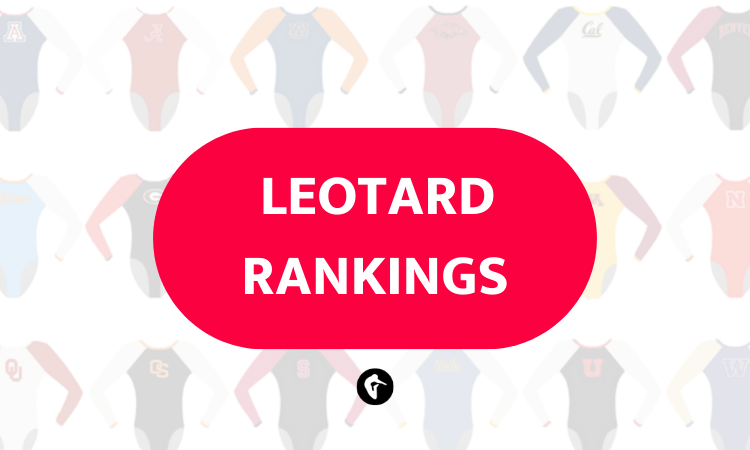
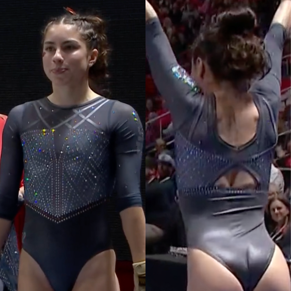
UCLA: 8.400
View a video of this leotard here.
 Elizabeth: 8.000
Design 2.5/3, Fabric 0.7/1, Sparkle 0.7/1, Theme Spirit 0.8/1, Uniqueness 1.0/1, Overall Appearance 2.3/3
I love the concept, but I think I would have liked it even more if the base was black rather than blue. But I also get why it’s blue, so I can’t be too bothered. I love the stained glass design, and the colors used for it. I think I still prefer UCLA’s other Pride leo more, but this is another good one.
 Rebecca S: 7.100
Design 1.9/3, Fabric 0.7/1, Sparkle 0.7/1, Theme Spirit 0.5/1, Uniqueness 1/1, Overall Appearance 2.3/3
This one bothers me for the same reason that most Pride leos, including all three of UCLA’s, bother me: I just don’t think it’s rainbow-y enough to really call to mind the rainbow flag. I wouldn’t know what the theme was if I wasn’t told, which detracts from its convincingness for me. I do think it’s very fun to look at, and purely as a fashion choice, it’s one of my favorite active UCLA leotards.
 Katie: 9.000
Design 2.8/3, Fabric 1/1, Sparkle 0.8/1, Theme Spirit 0.7/1, Uniqueness 1/1, Overall Appearance 2.7/3
I know this one has divided Twitter, but I am a massive fan. I love Art Nouveau, and it immediately made me think of Gaudí’s architecture in Barcelona, specifically his mosaics in Park Güell. I love how the shape of the mesh draws your eye along the more angular shapes in the pattern, and the (liberal) use of different sized rhinestones makes it really dynamic. As a pride leo, it fits the theme without being too obviously in your face. Hang it in the Louvre (or the Prado if you must!).
 Izzi: 9.500
Design 2.8/3, Fabric 1.0/1, Sparkle 1.0/1, Theme Spirit 0.7/1, Uniqueness 1.0/1, Overall Appearance 3.0/3
I’m honored to be on the judging panel for the UCLA Pride leo. I love that UCLA continues to make new Pride leos! (Florida: This is not a request to make another pink leo.) My only issue with this design is that in motion, we didn’t see much of the actual rainbow—the red/orange/green ended up under the armpit. I’m not sure if the pink/blue is supposed to be the trans flag or not, but I hope so!
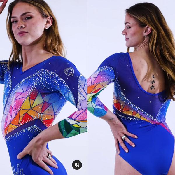
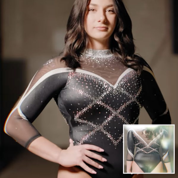
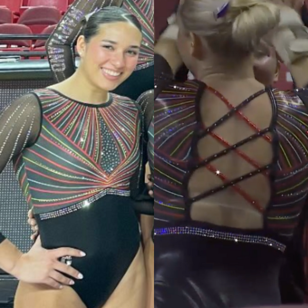
Fisk: 8.000
View a video of this leotard here.
Elizabeth: 8.100
Design 2.5/3, Fabric 0.8/1, Sparkle 0.8/1, School Spirit 0.7/1, Uniqueness 0.8/1, Overall Appearance 2.5/3
This may be my favorite Fisk leo yet. I love the front design, as well as how the back straps are lined with rhinestones to really make them pop. I also love the shades of blue used, and how yellow is used mostly as an accent color. This one looked great on the competition floor!
Rebecca S: 7.700
Design 1.8/3, Fabric 1/1, Sparkle 1/1, School Spirit 0.7/1, Uniqueness 0.9/1, Overall Appearance 2.3/3
There’s a lot that’s really great about this leotard and one thing that’s not. That ombre back up to gray on the upper chest really clashes with the light blue neck and sleeves to my eye, and I don’t understand the shaping choice. Apart from that, it’s nearly perfect. The sparkle-lined back straps are stunning.
Katie: 7.500
Design 2.4/3, Fabric 0.7/1, Sparkle 0.7/1, School Spirit 0.6/1, Uniqueness 0.5/1, Overall Appearance 2.6/3
Classy, simple, and effective. Two thumbs up for this one. The back could look quite basic, but the sparkles level it up. I especially like how the criss-cross straps are lined with the rhinestones, giving it definition and pop. Another solid design in the books for Fisk.
Izzi: 8.700
Design 2.6/3, Fabric 0.9/1, Sparkle 1.0/1, School Spirit 0.8/1, Uniqueness 0.7/1, Overall Appearance 2.7/3
Fisk is taking this gorgeous color combo and running with it. I love the subtle ombre on every part of the leo, from the body to the sleeves to the back straps! My tiny complaint is the neckline; those little brighter blue triangles before the ombre starts are distracting. The sparkles on the back straps make them look polished, which I didn’t even know was something I wanted until seeing this leo.
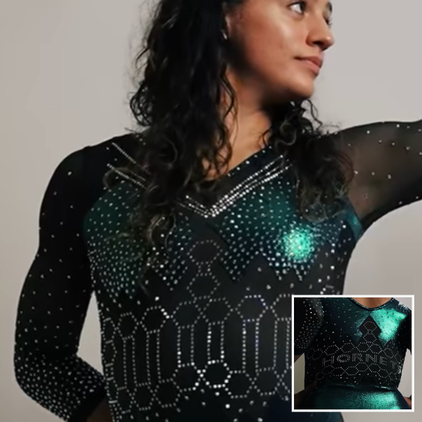
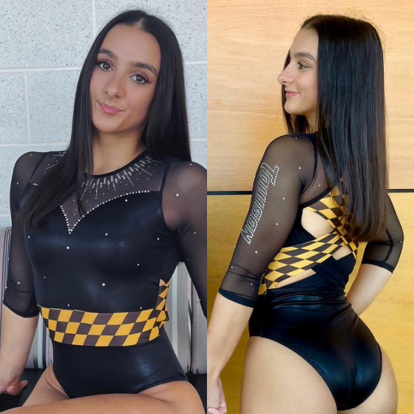
Sacramento State: 7.525
View a video of this leotard here.
Elizabeth: 8.400
Design 2.5/3, Fabric 0.8/1, Sparkle 0.8/1, School Spirit 1.0/1, Uniqueness 0.8/1, Overall Appearance 2.5/3
It’s a stock design, but I love how Sac State used it to its advantage with the hexagon pattern and relation to the Hornets mascot. I also adore this shade of green, and some of the other rhinestone details. One of my favorite Sac State leos!
Rebecca S: 6.900
Design 1.5/3, Fabric 0.7/1, Sparkle 0.7/1, School Spirit 1.0/1, Uniqueness 0.5/1, Overall Appearance 2.2/3
This leotard made me Google whether hornets actually build hexagonal cells in their hives (they do), and it gets bonus school spirit points for that. I am pretty tired of this stock design even with some original elements. The sparkle neckline is also distracting to me, but those are small things.
Katie: 7.100
Design 2/3, Fabric 0.6/1, Sparkle 0.7/1, School Spirit 0.6/1, Uniqueness 0.5/1, Overall Appearance 2.4/3
I really like the shimmery foil material and how the leo incorporated school spirit into the hexagonal design. This color of green is also beautiful, and the placement of “Hornets” is just right.
Izzi: 7.700
Design 2.1/3, Fabric 0.9/1, Sparkle 1.0/1, School Spirit 0.9/1, Uniqueness 0.3/1, Overall Appearance 2.5/3
I think this is my favorite version of this stock design so far. The color is fabulous, and the hexagonal pattern is such a fun school detail.
Oregon State: 6.825
View a video of this leotard here.
Elizabeth: 7.700
Design 2.3/3, Fabric 0.9/1, Sparkle 0.7/1, School Spirit 0.7/1, Uniqueness 0.8/1, Overall Appearance 2.3/3
I love a gray leo, and I’m glad Oregon State’s been leaning into it as a color some lately. The front design is also nice, but it might have been nice if the leo incorporated a few more orange rhinestones to add a bit more color and make the school spirit pop just a bit more.
Rebecca S: 6.800
Design 2.3/3, Fabric 1/1, Sparkle 0.3/1, School Spirit 0.5/1, Uniqueness 0.9/1, Overall Appearance 1.8/3
I absolutely love gray, but I wish there was a little more vibrance in this one to offset it. The orange sparkles have a lot of potential, but they’re not the easiest to see. I love the creative direction Oregon State is going in this year, though.
Katie: 6.600
Design 2/3, Fabric 0.6/1, Sparkle 0.8/1, School Spirit 0.3/1, Uniqueness 0.9/1, Overall Appearance 2/3
This leotard is just very meh for me. There’s nothing bad about it, but there’s also nothing that makes me love it either. I like the cutout on the back, and I don’t mind the corset style body, but there really is nothing here that wows me. I’ve given uniqueness points for the gray color; it’s not one that’s utilized often, and it works here.
Izzi: 6.200
Design 1.9/3, Fabric 0.7/1, Sparkle 1.0/1, School Spirit 0.2/1, Uniqueness 0.4/1, Overall Appearance 2.0/3
This is so close to something I’d really love, but they added a couple too many elements. The criss-cross on the chest looks like it comes off of a totally different leo design, and the back hole is honestly perplexing. You don’t need to cut a hole in the back of every single leotard! I think we’re going to look back on this trend and cringe.
Iowa: 6.825
View a video of this leotard here.
Elizabeth: 7.400
Design 2.2/3, Fabric 0.8/1, Sparkle 0.8/1, School Spirit 0.6/1, Uniqueness 0.6/1, Overall Appearance 2.4/3
It’s very Iowa, and quite simple, but I like it. The off-the-shoulder look is much more well done than Penn’s version, and I like the sparkle pattern on the front.
Rebecca S: 5.000
Design 1.8/3, Fabric 0.2/1, Sparkle 0.8/1, School Spirit 0.2/1, Uniqueness 0.3/1, Overall Appearance 1.7/3
Some raters regularly dock Florida for leotards that are good but look like every other Florida leotard because they’re just so over the predictability. That’s how I feel about Iowa pretending its colors are black and white. I will never not feel disappointed by an Iowa leotard without yellow. I’m also not a fan of off-shoulder designs in general, but this one does look relatively good for what it is.
Katie: 8.000
Design 2.4/3, Fabric 1/1, Sparkle 1/1, School Spirit 0.6/1, Uniqueness 0.7/1, Overall Appearance 2.3/3
Classic Iowa. I like this because on first glance it looks quite simple but the design elements actually mesh together well to make it a really cohesive design. I like the way the mesh tapers to above the elbow and then widens again on the forearm. The criss-cross of sparkles on the front is in a flattering position, and the assorted rhinestone sizes give it depth. Overall a really nice, classy, and elegant design for Iowa, if a bit predictable for them.
Izzi: 6.900
Design 2.0/3, Fabric 1.0/1, Sparkle 1.0/1, School Spirit 0.2/1, Uniqueness 0.5/1, Overall Appearance 2.2/3
Another week, another black and white Iowa leo. *shrug* I generally don’t like the faux off-the-shoulder look, but this is one of the best versions of it I’ve seen. Bonus points for the sparkle pattern continuing the line of the fabric pattern.
Towson: 6.650
View images of the front of this leo here and the back here.
Elizabeth: 6.700
Design 1.5/3, Fabric 0.7/1, Sparkle 0.8/1, School Spirit 0.9/1, Uniqueness 0.8/1, Overall Appearance 2.0/3
I love literally everything about this EXCEPT the belly band! Especially how it doesn’t line up with the back straps on the side seam. That may bug me the most. But the rest of the leo is fab. I love the creativity with the strap design, the rhinestone necklace, and the otherwise plain design.
Rebecca S: 7.700
Design 2.2/3, Fabric 0.8/1, Sparkle 0.9/1, School Spirit 0.7/1, Uniqueness 0.8/1, Overall Appearance 2.3/3
I love the concept, but the execution doesn’t live up to it, particularly on the sides. I really like the interaction of the two different kinds of back strap, and I appreciate the restraint with sparkles, making them really stand out in the areas where they’re important to the design.
Katie: 7.100
Design 2/3, Fabric 0.8/1, Sparkle 0.8/1, School Spirit 0.7/1, Uniqueness 0.8/1, Overall Appearance 2.0/3
I love the shape of the mesh on the front, and the rhinestone neckline is gorgeous. The belly band is making me think of Formula One racing, but I don’t actually hate it. I like the creativity on the back, and overall I think this is a really flattering and solid leotard design.
Izzi: 5.100
Design 2.0/3, Fabric 0.5/1, Sparkle 0.4/1, School Spirit 0.7/1, Uniqueness 0.5/1, Overall Appearance 1.0/3
Vroom vroom! I actually don’t mind the pattern, but it looks totally out of place paired with the delicate neckline and rhinestone pattern. I like it on the back, though, and the busier back design goes well with the simple front.
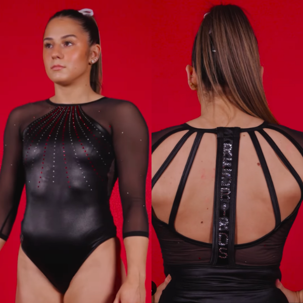
Illinois State: 6.250
View a video of this leotard here.
Elizabeth: 6.400
Design 2.0/3, Fabric 0.7/1, Sparkle 0.7/1, School Spirit 0.5/1, Uniqueness 0.5/1, Overall Appearance 2.0/3
It’s simple, but it’s done well. I like the material used on the body, as well as how it pairs with the mesh. I also like the use of colored rhinestones to bring out red without straying from the black-out theme. The back is clever, too, with how it hides the neckline clip.
Rebecca S: 6.300
Design 1.7/3, Fabric 0.5/1, Sparkle 0.8/1, School Spirit 0.7/1, Uniqueness 0.6/1, Overall Appearance 2.0/3
In a world where so many leotards are bordering on too much, I appreciate the restraint here. The use of colored sparkles gives it character. A little bit of colored fabric, maybe white or red straps on the back, would have made it more memorable.
Katie: 6.000
Design 2.0/3, Fabric 0.8/1, Sparkle 0.3/1, School Spirit 0.5/1, Uniqueness 0.4/1, Overall Appearance 2.0/3
Simple and effective. I like the contrast between the wet-look body and the mesh arms. I would have liked a few more sparkles on the arms to really make this pop in motion, but as a black-out concept leotard, it’s fine.
Izzi: 6.300
Design 2.2/3, Fabric 0.8/1, Sparkle 0.5/1, School Spirit 0.5/1, Uniqueness 0.2/1, Overall Appearance 2.1/3
Something about this is giving American Girl leo to me, at least from the front. That’s a compliment! It’s simple and classic. I even like the back straps and how they mirror the sparkle pattern on the front. The thicker back strap unfortunately interrupts the elegance of the more delicate design.
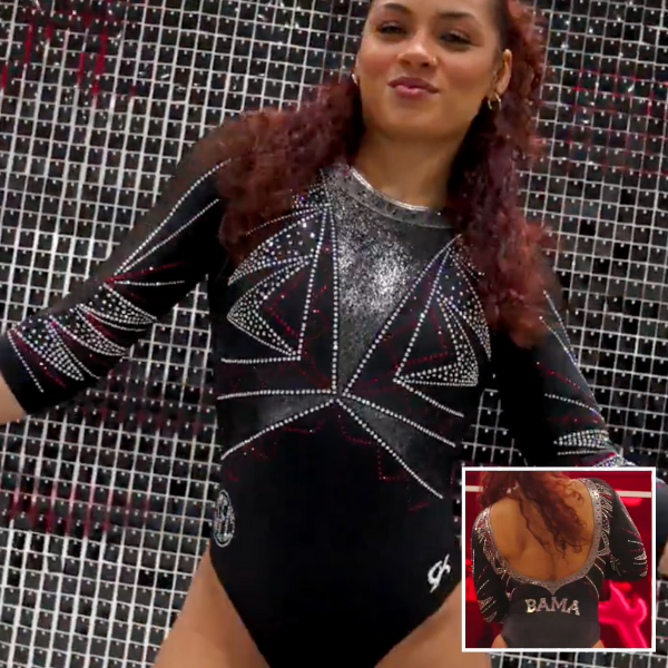
Alabama: 6.175
View a video of this leotard here.
Elizabeth: 8.100
Design 2.5/3, Fabric 0.8/1, Sparkle 0.8/1, School Spirit 0.6/1, Uniqueness 0.9/1, Overall Appearance 2.5/3
I actually really like this! I love a low back moment, and I love silver, so this leo is right up my alley. My only gripe is that it’s not very “Alabama.” But that’s a minor negative if that.
Rebecca S: 5.200
Design 1.4/3, Fabric 0.6/1, Sparkle 0.6/1, School Spirit 0.4/1, Uniqueness 0.5/1, Overall Appearance 1.7/3
I wasn’t sure whether I liked this at first and ultimately decided there’s just too much going on. I appreciate the use of the gunmetal fabric and the red sparkles, but I feel more overwhelmed than anything looking at it as a whole.
Katie: 6.800
Design 2/3, Fabric 0.6/1, Sparkle 0.7/1, School Spirit 0.5/1, Uniqueness 0.7/1, Overall Appearance 2.3/3
Would I know this was an Alabama leotard? Probably not. But I like that they’ve done something a bit different. It seems to be all about the angles this week, and I really like the shimmery triangular shapes on this one. I have questions about the back… I think it looks pretty, but I did find myself wondering if anyone was going to have a wardrobe malfunction, which distracts from the gymnasts and their routines; the purpose of a leotard should be to add to them.
Izzi: 4.600
Design 1.2/3, Fabric 0.4/1, Sparkle 0.4/1, School Spirit 0.2/1, Uniqueness 0.4/1, Overall Appearance 2.0/3
I feel like almost any design that doesn’t take advantage of Alabama’s excellent crimson and cream color combo is a waste. I usually like geometric designs, but this one feels very average. I can’t quite decide what I think about the open back—part of me thinks it’s pretty, but something about it feels so unathletic that I don’t love it for a leo.
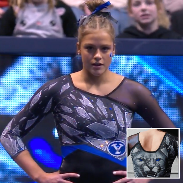
BYU: 6.125
View a video of this leotard here and images here.
Elizabeth: 7.100
Design 1.5/3, Fabric 0.9/1, Sparkle 0.7/1, School Spirit 1.0/1, Uniqueness 1.0/1, Overall Appearance 2.0/3
This leo almost makes me mad because I actually really like the front but the back is…the back. The left arm fabric is neat because it gives a shimmery, iridescent look, and the asymmetric design is very flattering on the gymnasts. I even like the breaking glass design of the pattern. But the back! The cougar is just SO big! I may have nightmares about it tonight. I will say, though, that it’s just so very BYU-leos-of-old, which isn’t necessarily a bad thing.
Rebecca S: 3.700
Design 0.1/3, Fabric 0.5/1, Sparkle 0.4/1, School Spirit 1/1, Uniqueness 1/1, Overall Appearance 0.5/3
Commitment to the bit doesn’t outweigh the overall ridiculousness for me, unfortunately. I don’t even particularly like the front, though I understand why some people do.
Katie: 6.000
Design 1/3, Fabric 0.5/1, Sparkle 0.7/1, School Spirit 1/1, Uniqueness 1/1, Overall Appearance 1.8/3
I’m almost speechless with this one. I don’t know if I want to give the concept a standing ovation or throw it into a canyon in Provo! I like the shattered glass effect, but I’m not a fan of asymmetric leotards, so that’s a negative from me. It does look flattering on the gymnasts in motion and I absolutely love the sparkles, but you do have to deal with the jumpscare on the back every time!
Izzi: 7.700
Design 1.8/3, Fabric 0.7/1, Sparkle 0.8/1, School Spirit 1.0/1, Uniqueness 1.0/1, Overall Appearance 2.4/3
Look, you have to appreciate the commitment to the bit. My interpretation is that the cougar on the back leapt through the wall of ice on the front, breaking it into shards.
Maryland: 4.675
View a video of leotard here.
Elizabeth: 5.100
Design 1.0/3, Fabric 0.5/1, Sparkle 0.8/1, School Spirit 0.8/1, Uniqueness 0.5/1, Overall Appearance 1.5/3
One of my least favorite stock designs strikes again. I do like how this incorporates Maryland’s colors, and I like the more elevated strappy back. However, I this this is a leo I just don’t prefer in stills and only works (for me) in action as the sparkles take over and you can’t see any of the details.
Rebecca S: 4.500
Design 1.5/3, Fabric 0.2/1, Sparkle 0.6/1, School Spirit 0.6/1, Uniqueness 0.4/1, Overall Appearance 1.2/3
I was so excited for this one in the close shots, and it just doesn’t pan out as a full leotard. In the meet clips, the colors all blended out to brownish mush. Sadly a miss.
Katie: 4.800
Design 1.3/3, Fabric 0.6/1, Sparkle 0.8/1, School Spirit 0.4/1, Uniqueness 0.4/1, Overall Appearance 1.5/3
This just looks like a level 10 region leotard to me. It’s one of the prettier stock designs, and it does incorporate school colors, but there’s nothing here that really makes me interested in anything but a cursory glance at it. The sparkles do look fantastic in motion, so it’s got that going for it.
Izzi: 4.300
Design 1.1/3, Fabric 0.2/1, Sparkle 1.0/1, School Spirit 0.6/1, Uniqueness 0.2/1, Overall Appearance 1.2/3
In general, I think it’s hard to make printed patterns work, and this stock leo often shows that. The colored stripes look faded next to the jet black of the bottom half. The back is fun though; the crisscross straps are a fun continuation of the pattern.
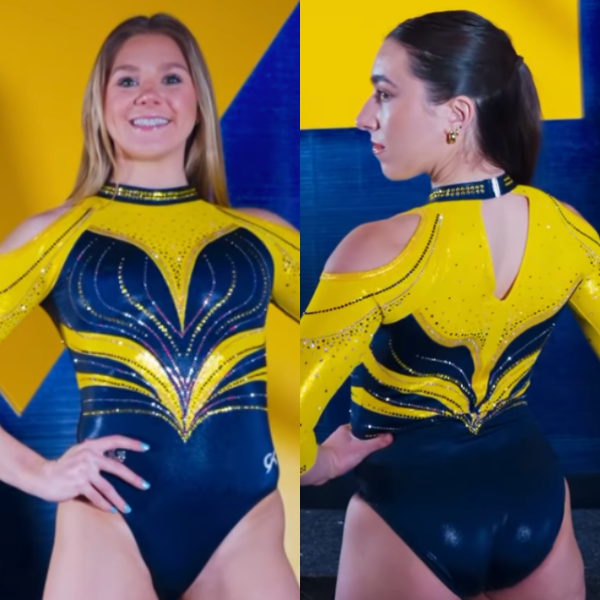
Michigan: 4.625
View a video of this leotard here.
Elizabeth: 4.500
Design 1.0/3, Fabric 0.3/1, Sparkle 0.5/1, School Spirit 0.9/1, Uniqueness 0.8/1, Overall Appearance 1.0/3
There is so much going on here. The bright yellow is very Michigan Adidas era, which I liked, but it’s way too in-your-face for me here. I also just cannot with the shoulder holes. Although I will give it to them… There’s no need to match nude mesh to skin tones if you just have holes instead.
Rebecca S: 4.400
Design 0.5/3, Fabric 1/1, Sparkle 0.5/1, School Spirit 0.8/1, Uniqueness 0.8/1, Overall Appearance 0.8/3
I love the bright yellow, I really do. It’s rich and vibrant and sunshiney and looked right at home in a Crisler packed with bright yellow decor and fan gear. Pity about the other choices that were made here. Theoretically, there might somewhere be a team edgy enough to pull off bilateral cold shoulders. Michigan is not that team.
Katie: 6.000
Design 1.5/3, Fabric 0.5/1, Sparkle 0.5/1, School Spirit 1/1, Uniqueness 1/1, Overall Appearance 1.5/3
Is it weird to feel in the middle about a marmite leotard like this? All the chatter I’ve seen online has been overwhelmingly negative, but I’m not as repulsed by this as others seem to be. The shoulders are giving shades of Vanessa Ferrari in 2012, which is one of my least favorite leotards ever worn in a major competition, so I should hate it but yet… It’s bold, it’s undeniably Michigan, and I like the way the body pattern looks like a heart and has plenty of motion and movement within the lines of the design. Points also for the choker sparkles on the neckline—I do have a soft spot for those.
Izzi: 3.600
Design 0.8/3, Fabric 0.4/1, Sparkle 0.5/1, School Spirit 0.8/1, Uniqueness 0.6/1, Overall Appearance 0.5/3
Without the cold shoulder, this is a boring, 2010-esque Michigan leo. With the cold shoulder, it’s a top from the plus-size juniors section at Macys in 2005 (I say this from experience). Neither of those two options are necessarily great, but I’d choose the former any day.
Fan Poll
Congrats to Clemson for winning last week’s fan poll! Vote for your favorite design from this week here.
READ THIS NEXT: Leotard Rankings: Week 4
Article by Elizabeth Grimsley, Rebecca Scally, Katie Couldrey, and Izzi Baskin
They are all horrible.
I think I would’ve loved the Alabama leos if Georgia or Utah or maybe even NC State had been wearing them, but the dark gray/black leos never feel quite Bama to me
I’m really torn on all of the intricate straps this year. In action, they often look loose or uncomfortable. I do like the asymetrical neck line on the front of front of BYU’s leo – and the whole front really. The back – ackkkk! Ugh.
Also, most of the glitter-bomb wording on leos – either with school names, abbreviations of names, or mascots, tend to be really hard to read. I prefer how Fisk did it – just in yellow – you can clearly read that it says Fisk – vs. how Illinois State put what I *think* says Redbirds in all glitter.
Honest feedback- I know (or at least I think I know) that this is supposed to be a lighted hearted post but for me it has become redundant and predictable. I knew even before reading it which leos would be near the top and which would be near the bottom. Partially because there is little variation in the ‘judges’ year to year (and personal styles seldom change). Also there is little acknowledgement for thinking outside the box. Also the theme of the page in general (other posts) can tell you which schools are the favorites and that spills over to things like this as well.
yes
The BYU leos looked amazing under the lights. I sat in the back with my grandpa in a wheelchair way up high and the ‘glass’ did look shattered with the placement of silver rhinestones. The cougar on back could be seen from far away and made an it interesting. Why rave about an angry tree or giant, plain paw print, but an angry cougar is a ‘bit’. This leo was so unique and the gymnasts looked great in it from all angles. Bailey is right.