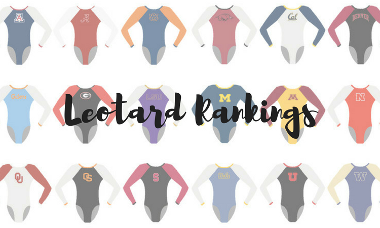
Teams just keep bringing the fire this season with gorgeous leotards. We narrowed it down to some of our favorites this week, but, like always, it was hard to pick a winner. Which ones were your faves? The criteria is the same as always: up to three points for design; two points for fabric, sparkle, etc.; and two points for school spirit; three points for overall appearance. This week’s guest judge is Amy, our Pac-12 associate editor!
Penn State: 8.45
We loved @PennStateWGYM's leos from yesterday! #LeoWatch #NCAAgym pic.twitter.com/B91PYstmZ9
— NCAA Gym News (@NCAAGymNews) January 28, 2018
| Design | Fabric/
Sparkle |
School
Spirit |
Overall
Appearance |
Total | |
| Caroline | 2.1/3 | 1.7/2 | 2.0/2 | 2.3/3 | 8.1/10 |
| Christina | 2.2/3 | 1.8/2 | 2.0/2 | 2.2/3 | 8.2/10 |
| Elizabeth | 2.3/3 | 1.8/2 | 2.0/2 | 2.5/3 | 8.6/10 |
| Amy | 2.5/3 | 1.8/2 | 2.0/2 | 2.6/3 | 8.9/10 |
Caroline: Talk about spirit! Making the school the focus of the design is definitely giving PSU some bonus points here. The ombre is lovely, but I definitely could have used a little more something on the back, even if it was just more sparkles.
Christina: This is a simple one, but it gets the point across! All the school spirit! I love the full-body ombre, and the amount of sparkles is just right. The huge logo on the front and the ‘Penn State’ on the back are a bit redundant, but once again, you can’t go wrong guessing who it is here.
Elizabeth: I love the full-body ombre! The colors blended together are lovely, and I’m really digging the “Penn State” on the back as well. I don’t love the huge logo on the front, but I also don’t hate it.
Amy: This full-body ombre is stunning! I’m usually not the biggest fan of huge logos on leotards but I actually kinda like this one. It has just the right amount of sparkle to make it really stand out on the ombre. And as if the big logo on the front wasn’t enough school spirit, they added in a nice little sparkly “Penn State” on the back.
Arkansas: 8.175
https://twitter.com/RazorbackGym/status/956938084502958082
| Design | Fabric/
Sparkle |
School
Spirit |
Overall
Appearance |
Total | |
| Caroline | 2.4/3 | 1.5/2 | 1.7/2 | 2.4/3 | 8.0/10 |
| Christina | 2.3/3 | 1.5/2 | 1.7/2 | 2.5/3 | 8.0/10 |
| Elizabeth | 2.5/3 | 1.4/2 | 1.7/2 | 2.6/3 | 8.2/10 |
| Amy | 2.5/3 | 1.7/2 | 1.7/2 | 2.6/3 | 8.5/10 |
Caroline: This is a super classy design with lots of bling and lots of spirit. It hits all our categories without going over the top, and the baby V neckline and the side cuts echo each other nicely. Plus, there’s just enough sparkle to make them shine on broadcast.
Christina: I really liked this one, and I am glad we are finally seeing something other than all-red. I like the neckline, and for once, I also do like the side splits. A simple yet very elegant leo.
Elizabeth: This is what I’m talking about, Arkansas! Similar to one of my favorite Central Michigan leos, I love the white paired with the red and the side splits in the design. I also think there’s just enough added sparkle where it doesn’t go overboard.
Amy: Yes, Arkansas! I have really been enjoying the new designs they have debuted so far this season, and this one is no exception. The simplicity is stunning. I am a big fan of the sparkles and small “v” that decorate the neckline. Incorporating the simple red sparkly “Arkansas” on the back is just the right amount of school spirit to really make this one stand out. I’m not the biggest fan of the strip of white down the side but with that aside, this design is beautiful.
California: 8.15
.@sylvieseilnacht with a season high and career-tying 9.90 on vault!
Tune into @Pac12Network now to see the rest of our vault rotation. pic.twitter.com/PgBFYsUSnh
— Cal Gymnastics (@CalWGym) January 28, 2018
| Design | Fabric/
Sparkle |
School
Spirit |
Overall
Appearance |
Total | |
| Caroline | 2.1/3 | 1.6/2 | 1.7/2 | 2.3/3 | 7.7/10 |
| Christina | 2.2/3 | 1.8/2 | 1.8/2 | 2.4/3 | 8.2/10 |
| Elizabeth | 2.2/3 | 1.7/2 | 1.9/2 | 2.4/3 | 8.2/10 |
| Amy | 2.5/3 | 1.7/2 | 1.8/2 | 2.5/3 | 8.5/10 |
Caroline: This looks a lot better in motion and on broadcast than standing still in pictures. I love all the little school logos in different places and the ombre is nice, though the neckline isn’t my favorite. They do round it though, unlike some other schools with the opposite triangles neckline, which makes it less awkward.
Christina: I really liked this one, and it looks great in motion. The ombre is lovely, and it’s a nice change from what we’ve seen so far with this one being mostly white. I don’t like this type of rounded, reverse-V neckline, but the back is nice with the small stripe.
Elizabeth: Another good one from Cal (although they’re all starting to blend together a bit—aka I thought this was a repeat at first). Anyway, I love the ombre and how the stripe was incorporated on the back. I don’t love the neckline, but that’s really my only beef.
Amy: Cal is killing the leotard design game this season. Its school colors make for some of the most beautiful ombre I have ever seen. I love the small and simple school logos that are a staple in each of the new designs. I am also slightly obsessed with the shade of blue on the sleeves—ahh so pretty!
Iowa State: 8.1
*spots bae from across room* pic.twitter.com/FTjy8n4aYc
— Haylee Young (@hforeveryoung) January 29, 2018
| Design | Fabric/
Sparkle |
School
Spirit |
Overall
Appearance |
Total | |
| Caroline | 2.1/3 | 1.7/2 | 1.7/2 | 2.5/3 | 8.0/10 |
| Christina | 2.2/3 | 1.8/2 | 1.7/2 | 2.3/3 | 8.0/10 |
| Elizabeth | 2.3/3 | 1.7/2 | 1.8/2 | 2.2/3 | 8.0/10 |
| Amy | 2.4/3 | 1.8/2 | 1.8/2 | 2.4/3 | 8.4/10 |
Caroline: I am definitely here for the shiny ombre and sparkly school logo! I almost thought this was a pink leo at first due to the lack of gold, but I see now it’s going for the school maroon into white. I do love the sparkles on the cuffs, and I would love to know what the back looks like.
Christina: I really like this one! It’s a nice and refreshing change from what we’re used to seeing from Iowa State. Just like literally every single leo this week, I love the ombre and it works well here in full-body. The big logo on the front is a nice addition, but I do wish it popped out a little more.
Elizabeth: This is definitely different than other Iowa State leos, and I’m really digging it. I love the shiny ombre and the red paired with the whitish silver. I do wish some gold was still incorporated, though. Maybe in the front logo or even gold ombre instead of white?
Amy: Ooh such a shiny ombre, I am really into it! The red paired with the shiny white is a great combination. I also really love the sparkly logo on the chest. It’s not too big like some of the others we have seen. My one wish is that they had used gold for the logo rather than the silver it looks like they used. It would add even more school spirit and I feel like it would give the logo that little extra pop.
Penn: 8.075
https://twitter.com/PennGym/status/956998639041368070
| Design | Fabric/
Sparkle |
School
Spirit |
Overall
Appearance |
Total | |
| Caroline | 1.8/3 | 1.6/2 | 1.8/2 | 1.9/3 | 7.1/10 |
| Christina | 2.0/3 | 1.7/2 | 1.9/2 | 2.3/3 | 7.9/10 |
| Elizabeth | 2.2/3 | 1.8/2 | 1.9/2 | 2.3/3 | 8.2/10 |
| Amy | 2.7/3 | 1.8/2 | 2/2 | 2.6/3 | 9.1/10 |
Caroline: I’m not a fan of the opposing triangles neckline, it’s not flattering on anyone and it breaks everyone’s lines. The ombre is a fun concept, but I don’t think it was executed well, particularly on the back. And the mesh on the shoulders has almost a yellow or green tinge to it for some reason; it’s not true white like the sleeves.
Christina: Gah I love this ombre! It’s the perfect combination of school colors and a color gradient that works extremely well. That said, I really dislike the opposite-V neckline, and I’ve never found it flattering on anybody. Overall, though, nice one Penn!
Elizabeth: I’m loving this one and how shiny the ombre is. I think I love the back gradient best, but overall it’s lovely. The only thing I’d change is the opposite-V neckline.
Amy: I am completely in love with this one. It manages to incorporate school colors along with the Penn “P” in a beautifully seamless way. I am really digging the shiny ombre and the point where the red and blue meet to make a bit of purple in the middle. The slight ombre on the sleeves is a nice touch as well.
Nebraska: 7.675
https://twitter.com/HuskersWGym/status/957337973736996864
| Design | Fabric/
Sparkle |
School
Spirit |
Overall
Appearance |
Total | |
| Caroline | 2.4/3 | 1.8/2 | 1.4/2 | 2.1/3 | 7.7/10 |
| Christina | 2.0/3 | 1.4/2 | 1.4/2 | 2.0/3 | 6.8/10 |
| Elizabeth | 2.7/3 | 2.0/2 | 1.7/2 | 2.8/3 | 9.2/10 |
| Amy | 2/3 | 1.5/2 | 1.5/2 | 2/3 | 7/10 |
Caroline: My only issue with this leo is that the V is too wide—not even too deep, just too wide. The cut doesn’t go with the wearer’s body lines, so it ends up look like a little odd. But the rest I love—the open back, all the sparkle placement and design, the ombre. Absolutely gorgeous.
Christina: I hate the front but am obsessed with the back. Overall, I do love the ombre, but the front just isn’t pretty to me. It’s like a deep plunging vest design, and I don’t find it flattering at all. I also really dislike the criss crossing sparkles in the middle. I do however love the big, open back.
Elizabeth: I LOVE THIS. X1000. The black to red ombre is to die for, the back is GORGEOUS and the low v with the sparkle detail is stunning. I only wish there was an N on the hip or something—you have B1G but no school logo?
Amy: I really like the ombre on the sleeves. But the front seems like a bizarre, sparkly, formal vest to me. I would like it a lot better if it was either entirely ombre or the shiny black design on the front. The mix of the two is just too weird for my liking. Also where is the school spirit?? Or the corn?
Arizona State: 7.65
https://www.instagram.com/p/BegOF-MAkul/
| Design | Fabric/
Sparkle |
School
Spirit |
Overall
Appearance |
Total | |
| Caroline | 2.2/3 | 1.5/2 | 1.7/2 | 2.2/3 | 7.6/10 |
| Christina | 1.8/3 | 1.6/2 | 1.7/2 | 2.0/3 | 7.1/10 |
| Elizabeth | 2.1/3 | 1.4/2 | 1.8/2 | 2.2/3 | 7.5/10 |
| Amy | 2.3/3 | 1.6/2 | 2/2 | 2.5/3 | 8.4/10 |
Caroline: ASU is really checking all the boxes, I’m so pleased. The ombre is nice, the back is so fun and its still sporting solid school spirit! I do wish it was blingier in general though and that maybe the pitchfork was a little more visible from any angle other than straight-on in bright light. That particular color of sparkle makes it a little hard to see sometimes.
Christina: I feel like I’m a broken record in all of this week’s leos, but again, I love the ombre. The front is a bit too… solid black for me, but the sparkly pitch fork is a nice way to add a little something to the front. The back is alright but I’m not a fan of the spider web-like design.
Elizabeth: I like! It’s not my favorite of ASU’s recent new leos, but I do still really enjoy it. The color is gorgeous, and I love the not-too-in-your-face sparkly pitch fork on the front. I also like the back design but wish it was gold-er?
Amy: Add ASU to list of schools killing the new leotard game. The ombre is beautiful, and I love the addition of the gold trimming on the back. I also really love how the stripes on the top of the shoulders look like they make a pitchfork?? The black front with the subtle sparkly pitchfork is just the right amount of bling and has all of the school spirit.
LSU: 7.6
The hometown girl, @ReagzC, showing off our leotard for tonight! pic.twitter.com/8yVfRWslYN
— LSU Gymnastics (@LSUgym) January 28, 2018
| Design | Fabric/
Sparkle |
School
Spirit |
Overall
Appearance |
Total | |
| Caroline | 2.4/3 | 1.6/2 | 1.3/2 | 2.5/3 | 7.8/10 |
| Christina | 2.2/3 | 1.5/2 | 1.5/2 | 2.3/3 | 7.5/10 |
| Elizabeth | 2.1/3 | 1.5/2 | 1.5/2 | 2.4/3 | 7.5/10 |
| Amy | 2.1/3 | 1.6/2 | 1.4/2 | 2.5/3 | 7.6/10 |
Caroline: Ooh, it’s so shin-ay! I love the cascade of sparkle over the deep V. I do wish there had been some contrasting color somewhere (maybe a gold trim on the cuffs or neck hole?), but this is definitely one of my favorites.
Christina: This one is so shiny on video and the gymnasts are just one gigantic Swarovski sparkle. I like the deep V neckline and the rain of sparkles, and the back is nice with the keyhole and the sparkly bands going outwards. The only thing that bothers me a little on this one is the high neck, but it’s not that big of a deal either.
Elizabeth: Is this new? I still haven’t been able to figure it out. Either way, I like it. I like how the top looks like all one piece and flows really well from shoulders to sleeves. I don’t really love the higher neck because I imagine it’s constricting to do gymnastics in, but overall I like.
Amy: Okay LSU, I really like this one. Aside from the slightly weird cutoff on the front, I am really liking this one. If I am being really picky, I would also love for the mesh to be a bit darker, maybe it is just the lighting but it isn’t the most appealing. I am obsessed with the back of this design though, the sparkly stripes leading to and surrounding the small cutout is a really nice addition in my opinion.
Pittsburgh: 7.55
https://twitter.com/Pitt_GYM/status/957331361085485056
| Design | Fabric/
Sparkle |
Pink Meet
Spirit |
Overall
Appearance |
Total | |
| Caroline | 2.0/3 | 1.3/2 | 1.7/2 | 2.0/3 | 7.0/10 |
| Christina | 2.2/3 | 1.5/2 | 1.8/2 | 2.1/3 | 7.6/10 |
| Elizabeth | 2.0/3 | 1.5/2 | 1.8/2 | 2.2/3 | 7.5/10 |
| Amy | 2.5/3 | 1.7/2 | 1.8/2 | 2.1/3 | 8.1/10 |
Caroline: The front just looks to be plain pink with some scattered sparkle, which doesn’t work for me—design includes front AND back. The sickly Pepto pink also isn’t my favorite, though I do like the contrast it provides with the black.
Christina: I am really not a fan of the Pepto pink. I do love the originality of the the design on the back, and the ombre black to pink on the sleeves is gorgeous. Again, I could do with a different shade, but it’s a nice change from what we usually see in terms of pink leos.
Elizabeth: For a pink leo, I like this one’s originality. The back design is fresh and the sleeves are gorgeous. I don’t love the shade of pink used, but it’s not horrible either.
Amy: In a world full of very similar and sometimes plain pink meet leos, I greatly appreciate seeing a new design. It reminds me a lot of the kind of sparkly pink leotard we would see at the Nastia Liukin Cup, and I love it. My only complaint is that I kinda wish the pink was a little bit of a lighter shade, but overall I am a big fan of this one.
Arizona: 7.3
.@ArizonaGymCats' Payton Bellows sticks it for a 9️⃣.9️⃣5️⃣ on vault! pic.twitter.com/mz2MATyLfT
— Pac-12 Network (@Pac12Network) January 27, 2018
| Design | Fabric/
Sparkle |
School
Spirit |
Overall
Appearance |
Total | |
| Caroline | 2.1/3 | 1.5/2 | 1.5/2 | 2.2/3 | 7.3/10 |
| Christina | 2.2/3 | 1.5/2 | 1.5/2 | 2.4/3 | 7.6/10 |
| Elizabeth | 2.0/3 | 1.3/2 | 1.6/2 | 2.0/3 | 6.9/10 |
| Amy | 2.1/3 | 1.5/2 | 1.6/2 | 2.2/3 | 7.4/10 |
Caroline: This ombre is lovely, especially in contrast to the white trim. It could use a little more sparkle and I’m not a super fan of the busy back, but overall it’s a strong showing.
Christina: I loved it when they debuted it last year, and I still love it. It’s probably my favorite leo from Arizona. I am obsessed with the ombre. The back is nice, but I wish it had been either the white crossing straps, or the small band going across with “Arizona” on it. Both makes it busy. I could also do without the white stripes all over the leo, but I guess it could count as school spirit. But the ombre is a win for me!
Elizabeth: I’m really digging the red to blue ombre some teams are showing lately, and, while the back isn’t my all time favorite, I do appreciate the uniqueness of it.
Amy: I am really loving the body of this design. The shiny ombre is really well done and the bit of sparkles on the red portion are a nice touch. I don’t really get the shiny sparkly white stripes on the top part of the design? Oooh I hadn’t noticed the back of this one before. In a world full of an increasing number of open back designs I am really liking the mixture of the thin cross back with the small band that says “Arizona” in sparkly letters.
N.C. State: 7.25
Ready for our meet tonight!
Reminder the Metroplex Challenge starts at 7⃣:4⃣5⃣ p.m. (ET) and the @FloGymnastics stream can be found here: https://t.co/tWhcUCGjut #STATEment pic.twitter.com/JHcDzFSNmK
— NC State Gymnastics (@PackGymnastics) January 27, 2018
| Design | Fabric/
Sparkle |
School
Spirit |
Overall
Appearance |
Total | |
| Caroline | 2.1/3 | 1.6/2 | 1.8/2 | 2.3/3 | 7.8/10 |
| Christina | 1.6/3 | 1.4/2 | 1.8/2 | 1.7/3 | 6.5/10 |
| Elizabeth | 1.7/3 | 1.5/2 | 1.7/2 | 1.8/3 | 6.7/10 |
| Amy | 2.2/3 | 1.6/2 | 2/2 | 2.2/3 | 8.0/10 |
Caroline: The claw mark design is actually really fun and a great way to pay tribute to the school mascot. And I love the blinged out logo on the sleeve. Upon a closer look, the design doesn’t hold up quite as well, and the two different-colored sleeves is a bit odd looking.
Christina: These are fun, but I wish the colors were more subdued and blended better. The design is alright although it’s nothing out of the ordinary. The sparkly sleeve logo is a nice add though.
Elizabeth: This is almost too much for me. I love the shiny white and the shiny red and the black mesh but all paired together and split so harshly is over the top. It almost reminds me of bird feathers, but NCSU is the Wolfpack, so it doesn’t really fit. I like the sleeve logo though!
Amy: I can’t really explain why but I love the design on this one. I love the shiny red/white mixed with the black mesh and the subtle sparkles all over. I find the mesh cutoff to be a little weird on the white side but besides that, I really enjoy this one. The logo on the sleeve is beautiful! So sparkly yet so simple, I love.
Florida: 7.15
https://twitter.com/NCAAGymNews/status/957078440447942656
| Design | Fabric/
Sparkle |
School
Spirit |
Overall
Appearance |
Total | |
| Caroline | 2.3/3 | 1.5/2 | 1.6/2 | 2.2/3 | 7.6/10 |
| Christina | 1.9/3 | 1.5/2 | 1.5/2 | 2.0/3 | 6.9/10 |
| Elizabeth | 2.1/3 | 1.4/2 | 1.4/2 | 2.2/3 | 7.1/10 |
| Amy | 1.9/3 | 1.4/2 | 1.4/2 | 2.3/3 | 7/10 |
Caroline: I love the geometric patterns on this leo, and the rich blue color looked gorgeous in the arena. I also appreciate the inclusion of some orange sparkle, especially in the lattice design on the cuffs. The tribute to honorary Gator Bailey on the arm is just too precious. Definitely a favorite this week.
Christina: I have mixed feelings about this one that I can’t really pinpoint. I do like the originality of the design, the shade of blue used and the use of orange sparkles as to incorporate both school colors. I think the neckline is what’s bugging me, both on the front and back, with a mix of square neckline, mesh, sparkles and V-necklines. I do love the sparkles on the cuffs though.
Elizabeth: I love Florida mixing things up with the mostly blue design this week. The square neckline in the back plus the uniquely placed mesh is also great. Plus, supporting young gymnast Bailey with the ribbon on the sleeve is a nice touch.
Amy: I love this shade of blue and all of the sparkles (especially the slight hint of orange) on this design! The small ribbon and crown on the sleeve in support of young Bailey is a really beautiful touch. If the back design was a bit different I would really love this design. But I am not a big fan of the combination of a square neckline, mesh and the wide “v” made where mesh meets fabric. Would like it a lot better if the back neckline were a bit more like the front one.
Minnesota: 6.825
We are donning some new apparel for the first road meet of the season today. Along with our new leo we will be wearing teal pins the rest of the season to bring awareness to those affected by sexual assault. #Gophers #WeStandByYou pic.twitter.com/vjEoMl7baL
— Minnesota W Gym (@GopherWGym) January 27, 2018
| Design | Fabric/
Sparkle |
School
Spirit |
Overall
Appearance |
Total | |
| Caroline | 1.9/3 | 1.2/2 | 2/2 | 1.5/3 | 6.6/10 |
| Christina | 1.3/3 | 1.6/2 | 2/2 | 1.7/3 | 6.6/10 |
| Elizabeth | 1.9/3 | 1.6/2 | 1.9/2 | 2.3/3 | 6.7/10 |
| Amy | 1.8/3 | 1.5/2 | 2/2 | 2.1/3 | 7.4/10 |
Caroline: So my problem isn’t with the flame design, but the fabric they used for the flame on top of the mesh makes it look like it was applied as an afterthought by an amateur, rather than a professionally sewn design. It looks like it’s too heavy to be supported by the rest of the fabric. Other than that, I really like this! Cool concept, poor execution.
Christina: I like this one, but I don’t at the same time. I just can’t with the flamey design. It’s awkward and makes the whole thing look… older. The solid cut offs on the sleeves are weird, especially on the front. However, I really like the ombre, and the “Ski-u-mah” is an original way to include school spirit on a leo.
Elizabeth: I like this one for the most part however the right sleeve and the way the flame cuts off on it is a touch awkward. I do like the flame concept, though, as well as the Minnesota “ski-u-mah.” And of course I love the ombre.
Amy: Oooh this is a really nice ombre. If it weren’t for the weird cutoffs on the sleeves and the chest, I would really love this one. I am in love with the idea of flames but the cutoff on the front is a bit too weird for my liking. However the back is really nice, the cutoff is still a little weird to me but the ombre and sparkles are beautiful.
Want to receive the latest collegiate gymnastics news in your inbox? Sign up for the NCAA Gym NewsLetter here.
Article by Elizabeth Grimsley, Caroline Medley, Christina Marmet and Amy Courchaine