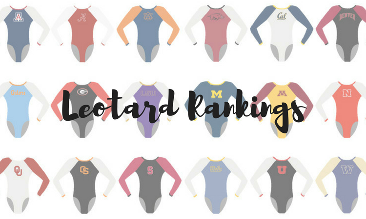
There were a bunch of new and gorgeous leotards again this week! So much so that it was once again hard to narrow it down. From DIII designs to sparkles galore, we make an effort to narrow down and rank the best of week three. The criteria is the same as always: up to three points for design; two points for fabric, sparkle, etc.; and two points for school spirit; three points for overall appearance. This week’s guest judge is Rebecca, our DII and DIII editor.
Oklahoma: 8.95
https://www.instagram.com/p/BeOd1y1hbNT/
| Design | Fabric/
Sparkle |
School
Spirit |
Overall
Appearance |
Total | |
| Caroline | 2.3/3 | 1.7/2 | 2.0/2 | 2.4/3 | 8.4/10 |
| Christina | 2.7/3 | 1.8/2 | 2.0/2 | 2.8/3 | 9.3/10 |
| Elizabeth | 2.9/3 | 1.9/2 | 2.0/2 | 2.9/3 | 9.7/10 |
| Rebecca | 2.4/3 | 1.7/2 | 1.8/2 | 2.5/3 | 8.4/10 |
Caroline: I like that we’re seeing new leos from Oklahoma finally! The lines design on the sleeves is interesting—maybe not my favorite but not bad. The “Boomer Sooner” on the back is a cool concept, I just wish it had been in a different font. But I like the placement along the open back. I’m not a super fan of the belt of sparkles under the back hole, though; it’s oddly placed.
Christina: Well, I’m going to need that one sent to me, too. I am OBSESSED. OU always comes up with unique ideas, and they almost always look amazing. I love, love, the open back with the belt of sparkles at the bottom and the “Boomer Sooner” on the shoulder blades. The front is not too busy, and the combo of the simple crimson bodice with the sticks design on the shoulders works great. If I had to be very nitpicky, I’d say three “OU” across the leo is a bit much. But eh, this is this week’s winner for me!
Elizabeth: TAKE ALL MY 10s! I LOVE THIS. I don’t know how OU continues to come up with creative and fresh designs, but it somehow does. I love the crimson color of course, and the incorporation of silver is really nice. I also like the kind of pick-up sticks design on the sleeves plus the fact that the sleeves are an unusual shimmery white. But my favorite part is the back. It’s unusual yet still open, and the Boomer Sooner isn’t overboard. LOVE.
Rebecca: I’m not always the biggest fan of OU leos but this one is pretty great. I like the abstract pattern on the white and the shimmery red. I’m not a fan of the random matte red patches on the back though… And the boomer sooner is too much for me. Overall still great, though.
Nebraska: 8.5
Time to shine ✨
Come check out the #Huskers new leotards‼️ pic.twitter.com/YStooR86iv
— Nebraska Women's Gym (@HuskersWGym) January 21, 2018
| Design | Fabric/
Sparkle |
School
Spirit |
Overall
Appearance |
Total | |
| Caroline | 2.7/3 | 1.9/2 | 1.5/2 | 2.8/3 | 8.9/10 |
| Christina | 2.6/3 | 1.7/2 | 1.6/2 | 2.7/3 | 8.6/10 |
| Elizabeth | 2.8/3 | 1.7/2 | 1.7/2 | 2.7/3 | 8.9/10 |
| Rebecca | 2.0/3 | 2.0/2 | 1.6/2 | 2.0/3 | 7.6/10 |
Caroline: I’m obsessed with this! The back is so different and cool, so bonus points in my book. I love the contrast between the red and black, and the deep V neck is really dramatic. So pretty!
Christina: Oh, this one is awesome! I love the originality, and I am obsessed, OBSESSED, with the back. I always love intricate back designs. The very deep V on the front works well, and all the sparkles are perfect. Great one, Nebraska!
Elizabeth: Nebraska is known for its interestingly designed leos, and this one is no different. I love the back—like I adore it. It really accentuates the gymnasts’ back muscles, and the shiny red is great paired with the black mesh. I also love the super deep v and all the sparkles.
Rebecca: I really, really hate fake deep V-necks. But the colors couldn’t be better, and I love the sparkles placement and the open back.
California: 8.475
How we feel about finishing strong on vault: pic.twitter.com/ppTEYzN1Bi
— Cal Gymnastics (@CalWGym) January 20, 2018
| Design | Fabric/
Sparkle |
School
Spirit |
Overall
Appearance |
Total | |
| Caroline | 2.2/3 | 1.7/2 | 1.7/2 | 2.3/3 | 7.9/10 |
| Christina | 2.5/3 | 1.8/2 | 1.8/2 | 2.6/3 | 8.7/10 |
| Elizabeth | 2.6/3 | 1.7/2 | 1.8/2 | 2.6/3 | 8.7/10 |
| Rebecca | 2.6/3 | 1.7/2 | 1.7/2 | 2.6/3 | 8.6/10 |
Caroline: So I know the stripe is a Cal thing, but I cannot explain to you how disappointed I was to see the bandage back on this leo, because the rest of it is so great! It just kind of ruins it for me.
Christina: Cal has just been flawless with the leos this year so far. This one is beautiful and very elegant. The front is fairly simple, but I love all the sparkles and the sweetheart neckline. The back is awesome, once again nicely incorporating the Sather Stripe.
Elizabeth: I don’t like this design as much as the first two Cal debuted, but it’s still really really nice. The stripe in incorporated well with the neat back design, and the front is classic and elegant. Plus, it makes the whole team look so elegant. Let’s just cross our fingers UCLA’s new UA leos next year will be half as good…
Rebecca: Cal is next level this season. I got to see this one in person, and it was great. The sparkle sweetheart neck is a bit generic but still a good feature, and I’m a big fan of the trademark Cal back band.
New Hampshire: 7.925
https://www.instagram.com/p/BeLpSy1nQ-X/
| Design | Fabric/
Sparkle |
School
Spirit |
Overall
Appearance |
Total | |
| Caroline | 2.4/3 | 1.6/2 | 1.5/2 | 2.5/3 | 8.0/10 |
| Christina | 2.1/3 | 1.5/2 | 1.7/2 | 2.2/3 | 7.5/10 |
| Elizabeth | 2.4/3 | 1.6/2 | 1.7/2 | 2.5/3 | 8.2/10 |
| Rebecca | 2.3/3 | 1.7/2 | 1.7/2 | 2.3/3 | 8.0/10 |
Caroline: This is gorgeous! The blues all go together really nicely, and I love the contrast between the darkest and the lightest shades. The vest/shoulder wrap design isn’t my favorite, but it’s not as bad as it could be.
Christina: I love all these shades of blue, especially the lighter ones. This leo is quite original, but the first time I saw it, I could see some sort of matador jacket design on the front and I can’t unsee it.
Elizabeth: YAS. I love all these blues together—they remind me of the ocean—and the school spirit on the arm is great. I also don’t mind the vest-like design as it kind of shows off the rhinestones better in my opinion.
Rebecca: The colors on this one are soooo nice. The shape of the stripes is a little odd, but I’ll forgive it because they didn’t try anything crazy and it came out looking classy and normal. Compared to some of this week’s that’s very appreciated.
Missouri: 7.75
https://twitter.com/MizzouGym/status/954783046695256069
| Design | Fabric/
Sparkle |
Pink
Spirit |
Overall
Appearance |
Total | |
| Caroline | 2.1/3 | 1.5/2 | 2.0/2 | 2.0/3 | 7.6/10 |
| Christina | 2.5/3 | 1.6/2 | 2.0/2 | 2./3 | 8.5/10 |
| Elizabeth | 2.4/3 | 1.5/2 | 1.9/2 | 2.3/3 | 7.9/10 |
| Rebecca | 2.0/3 | 1.5/2 | 2.0/2 | 1.5/3 | 7.0/10 |
Caroline: The illusion V-neck with the pink and white is a really nice touch here, and I like the little ribbons on the sleeves. Overall, it does come off a little bit generic, but it’s nice.
Christina: Nice one! The design on the front and the neckline are lovely, and the mix of black, white and pink creates an elegant line. The small pink ribbons on the sleeves are a great, neat addition too.
Elizabeth: Compared to Missouri’s past pink leos, this one should be given a 1,000 out of 10. I love the design in particular as it looks really good on all the gymnasts. I also like the sparkly sleeves and the rhinestones on the body. I don’t love the ribbons all over the sleeves, but I don’t hate them either.
Rebecca: I find this one a little generic, and I have mixed feelings about the ribbons on the sleeves too… But it could be a lot worse.
Arizona: 7.45
https://twitter.com/ArizonaGymCats/status/954821467652239360
| Design | Fabric/
Sparkle |
School
Spirit |
Overall
Appearance |
Total | |
| Caroline | 2.2/3 | 1.4/2 | 1.8/2 | 2.4/3 | 7.8/10 |
| Christina | 1.6/3 | 1.3/2 | 1.7/2 | 1.9/3 | 6.5/10 |
| Elizabeth | 2.0/3 | 1.4/2 | 1.8/2 | 2.1/3 | 7.3/10 |
| Rebecca | 2.4/3 | 1.7/2 | 1.7/2 | 2.4/3 | 8.2/10 |
Caroline: I actually dig this one! The armor look across the chest can either go really wrong or really right, and I think it went really right here. The color combination is striking—it broadcast pretty well—and I love the “Beardown” slogan as a spirit alternative to a school name or mascot name.
Christina: This one is alright. The design is not original, but I do like the color combination and the “Beardown” in sparkles on the sleeves. So it’s nice, but nothing out of the ordinary.
Elizabeth: I have mixed emotions about this one. The body design has been done before, but Arizona changes it up with the nice red mesh sleeves. I also like “Beardown” on the sleeve in the sequins, and the blue paired with the red isn’t too bad either.
Rebecca: I really like this one—it’s better for its simplicity. It’s really easy to overdo things with a bolder color combination. If they’d tried ombre sleeves or something, it would have been too much. As it is, it’s classy and bold, and it looked great in motion.
Utah: 7.4
We are proud to represent the Ute Indian Tribe. Be there Friday at 7pm as we debut this new leotard when we face Oregon State in our first-ever Ute Proud meet. https://t.co/xv6GU7KR59 pic.twitter.com/Vnk2LCcfzZ
— Utah Gymnastics (@UtahGymnastics) January 16, 2018
| Design | Fabric/
Sparkle |
School
Spirit |
Overall
Appearance |
Total | |
| Caroline | 2.3/3 | 1.3/2 | 2.0/2 | 2.1/3 | 7.7/10 |
| Christina | 2.5/3 | 1.6/2 | 2.0/2 | 2.4/3 | 8.5/10 |
| Elizabeth | 2.4/3 | 1.5/2 | 2.0/2 | 2.5/3 | 8.4/10 |
| Rebecca | 1.0/3 | 1.0/2 | 2.0/2 | 1.0/3 | 5.0/10 |
Caroline: At first, I was not a fan of this leo. It was too bright, too busy and didn’t reflect what I thought to be an authentic tribute to the Ute tribe. But after further research, including finding out that the Utes had a hand in designing it, as well as more time looking at it, I actually don’t hate it? The sleeves are really cool, and I appreciate the “different” sort of framing of the U on the chest.
Christina: I was a bit worried when Utah announced a ‘Ute Proud’ leo, but this worked out really well. I love the colors, the design, the sleeve cuffs and the story behind it. It looked fantastic in motion, too. My one pet peeve is the mesh on the side, as usual.
Elizabeth: Unlike Christina, I’m really digging the mesh on the side of this leo. But I do have to agree about everything else. I love the effort to represent the Ute Tribe in a traditional way, and I think the design turned out great! I love the color combination on the sleeves especially.
Rebecca: I really like the principle of having a leotard design honoring the Ute tribe, especially after we learned that it was actually approved by it. But basically everything about the execution is a no from me. The colors and the design just give me a headache. If the pink were more coral instead of the flaming hot variety, I’d be a little more into it but… It’s not.
Winona State: 7.2
| Design | Fabric/
Sparkle |
School
Spirit |
Overall
Appearance |
Total | |
| Caroline | 2.1/3 | 1.6/2 | 1.4/2 | 2.0/3 | 7.1/10 |
| Christina | 2.0/3 | 1.7/2 | 1.4/2 | 2.0/3 | 7.1/10 |
| Elizabeth | 2.4/3 | 1.7/2 | 1.5/2 | 2.5/3 | 8.1/10 |
| Rebecca | 2.0/3 | 1.5/2 | 1.2/2 | 1.8/3 | 6.5/10 |
Caroline: This is lovely! That shade of purple is really nice, though I do wish they’d been consistent with the fabric between the neckline and the shoulders. The glitter waterfall is very elegant, too.
Christina: I love that shade of purple! The glittery bands on the front reminds me a lot of the “Monster” logo leo from OU. The neckline is lovely here, but those vertical bands are a bit odd.
Elizabeth: LOVE. Good job, Winona. I, too, love this shade of purple, and it looks really nice paired with the solid black. I also love the icicle rhinestone design on the body and the v/sweetheart neckline is really nice as well.
Rebecca: Sweetheart necklines are my favorite, and I really like the sparkles dotted into the mesh. It really bugs me that the two purples aren’t the same though… And I agree with Christina that the glitter icicles are just clunky and awkward.
Brockport: 7.125
https://www.instagram.com/p/BeByOE6jUgE/
| Design | Fabric/
Sparkle |
School
Spirit |
Overall
Appearance |
Total | |
| Caroline | 2.1/3 | 1.3/2 | 1.3/2 | 2.3/3 | 7.0/10 |
| Christina | 1.7/3 | 1.6/2 | 1.4/2 | 2.1/3 | 6.8/10 |
| Elizabeth | 1.9/3 | 1.5/2 | 1.5/2 | 2.1/3 | 7.0/10 |
| Rebecca | 2.4/3 | 1.5/2 | 1.4/2 | 2.4/3 | 7.7/10 |
Caroline: So I actually have a very similar vine-swirl design envisioned for a mural I’m planning in my house—weird coincidence, but that speaks to how much I love this pattern! It’s a flattering, elegant shape, the ombre is lovely and the B on the arm is a nice touch. I do wish there were more sparkle other than the shiny swirls.
Christina: This is actually quite original, but I dislike how disconnected the swirls on the front are from the bodice. I do love the deep V neckline on the front and back, and that ombre is to die for! School spirit is subtle but well done, although I had somehow honestly completely missed the B on the sleeve at first glance.
Elizabeth: I really like this one! The ombre is gorg and the classic black looks good on everyone. I also love the use of gold but wish the design of it was a bit less in your face. I also like the touch of school spirit on the sleeve with the B for Brockport.
Rebecca: Love love love. Black and white ombre is so classy and the swirlies give me a bit of an Irish dance vibe, in a good way. Only negative is the deep neckline—I find those a bit weird.
Illinois: 6.65
Balthazor, Hodan and Meeks earn four individual event titles as Illinois drops contest with Michigan.
➡️ https://t.co/V2rbURbUfd#Illini pic.twitter.com/FOPIW6g9oc
— Illini W Gym (@IlliniWGym) January 20, 2018
| Design | Fabric/
Sparkle |
School
Spirit |
Overall
Appearance |
Total | |
| Caroline | 1.9/3 | 0.9/2 | 2.0/2 | 1.8/3 | 6.6/10 |
| Christina | 1.9/3 | 1.0/2 | 1.8/2 | 1.8/3 | 6.5/10 |
| Elizabeth | 1.6/3 | 1.1/2 | 1.8/2 | 1.7/3 | 6.2/10 |
| Rebecca | 2.0/3 | 1.5/2 | 1.8/2 | 2.0/3 | 7.3/10 |
Caroline: Okay, Illinois, you heard my cries about too many similar orange and blue leos and gave us something different! I appreciate that… But this isn’t exactly what I meant. I can appreciate the camo and the Illini script, but it doesn’t really feel like it all comes together anywhere. Also, where’s the bling?
Christina: This is super original. I kind of like it, but give me moooooore sparkles. The camo with the school colors is fun. The ‘Fighting Illini’ on the side gets points for school spirit, but I wish it were a bit smaller. But seriously, sparkles.
Elizabeth: I kind of wish this leo design was split into two separate leos: one with the sides that say “Fighting Illini” and another with camo sleeves. I’m not a huge fan of the asymmetrical look, but overall, I do like the concept. Also, sparkles.
Rebecca: OK, going to get a little heretical here… I like that it’s not sparkly. The solid colour panel and the team name makes it feel sort of retro. I’m not a believer in camo on leotards, but overall this could have been much worse.
Boise State: 6.625
https://www.instagram.com/p/BeJ16mABIy-/
| Design | Fabric/
Sparkle |
School
Spirit |
Overall
Appearance |
Total | |
| Caroline | 2.3/3 | 1.6/2 | 2.0/2 | 1.7/3 | 7.6/10 |
| Christina | 1.8/3 | 1.4/2 | 2.0/2 | 2.1/3 | 7.3/10 |
| Elizabeth | 2.1/3 | 1.4/2 | 1.9/2 | 2.2/3 | 7.6/10 |
| Rebecca | 0.5/3 | 0.5/2 | 2.0/2 | 1.0/3 | 4.0/10 |
Caroline: So I kind of love the idea of this? I just don’t think it was executed properly. I don’t mind words along the front of the leo, especially in a pretty script like this, and an off-the-shoulder illusion is something I would love to see in the future. But they don’t really go together for me. The rest of the leo—the ombre, the arm swirls—I actually kind of love.
Christina: This is a bit too busy for me, but I love the “Broncos” nicely incorporated in the middle of all the swirls, and the mix of school colors work great here. The tan mesh is meh, and I’m really irrationally bugged by the fact that it continues ever so slightly onto the shoulders.
Elizabeth: You know I love a good nude mesh, so this one’s a win for me. It’s WAY different than Boise’s other leos, and there’s no giant horse in the design, so A+. I love the Broncos incorporated into the design as well, but, like Christina, wish it didn’t go onto the shoulders like it does—makes me just see “RONCO” at first.
Rebecca: I hate every nude mesh (sorry Elizabeth!) and nude mesh that goes onto the shoulders is a serious no. And writing an entire team name on the front of a leotard is also a serious no. Besides all of that, it’s so busy. Not a fan. And I usually like Boise leotards!
Washington: 6.45
Only ended up taking a handful of shots on my second camera today, but I loooove this one! #NCAAGym pic.twitter.com/1K9xmfedAM
— SplitPrecision Photo (@SplitPrecision) January 21, 2018
| Design | Fabric/
Sparkle |
School
Spirit |
Overall
Appearance |
Total | |
| Caroline | 2.0/3 | 1.5/2 | 1.3/2 | 2.2/3 | 7.0/10 |
| Christina | 1.6/3 | 1.0/2 | 1.4/2 | 1.7/3 | 5.7/10 |
| Elizabeth | 1.9/3 | 1.3/2 | 1.5/2 | 2.0/3 | 6.5/10 |
| Rebecca | 1.7/3 | 1.4/2 | 1.5/2 | 2.0/3 | 6.6/10 |
Caroline: So the random swirlies aren’t my favorite, but I actually really liked the way this looked on the broadcast! The contrast between the purple and white is nice and the use of sparkle is solid.
Christina: This just has an “old” feel to it, and I’m pretty sure it’s not a recent one. The random swirls design has been done before, and I really dislike the plain white fabric used. The shade of purple is lovely, however. Just a blah one on this one for me.
Elizabeth: So this one’s pretty old for Washington, but it’s one of the better ones in my opinion. I don’t love the random swirly design, but the “plain” white fabric mixed with the shiny purple creates a nice contrast. I almost wish the sparkles were smaller but there were more of them if that makes any sense?
Rebecca: To be honest, any Washington leo with minimal to no gold on it is a win for me. The swirlies are OK-not-great, but I like the fabric choices. And it’s always fun when a leo we haven’t seen in a few years comes out of the vault.
Arkansas: 5.95
https://www.instagram.com/p/BeHP_LZBJf0/
| Design | Fabric/
Sparkle |
Pink
Spirit |
Overall
Appearance |
Total | |
| Caroline | 1.9/3 | 1.4/2 | 1.4/2 | 2.0/3 | 6.7/10 |
| Christina | 1.8/3 | 0.7/2 | 1.4/2 | 1.6/3 | 5.5/10 |
| Elizabeth | 1.6/3 | 1.2/2 | 1.6/2 | 1.8/3 | 6.2/10 |
| Rebecca | 1.9/3 | 0.5/2 | 1.5/2 | 1.5/3 | 5.4/10 |
Caroline: So the random swoops around the top aren’t my favorite, though they’re certainly not the worst I’ve seen. I actually like the use of the pink mesh, it’s different than what most teams do. Even some of the sparkle is pink!
Christina: The combination of Pepto pink and grey is a no for me. The design itself is fairly nice although not original, but the color combo ruins it for me. This is a bit disappointing as the last two new leos from Arkansas were lovely.
Elizabeth: So I like it in the sneak peek video than I did seeing it on the meet broadcast. The grey is nice and I actually don’t hate the shade of pink. Maybe it’s the design that needs a bit more creativity.
Rebecca: To me this is approximately the worst shade of pink possible, but the silver and the tastefully small sparkle pig save it a bit. Not my favorite, but not as bad as pink meet leos can be.
Want to receive the latest collegiate gymnastics news in your inbox? Sign up for the NCAA Gym NewsLetter here.
Article by Elizabeth Grimsley, Christina Marmet, Caroline Medley and Rebecca Scally