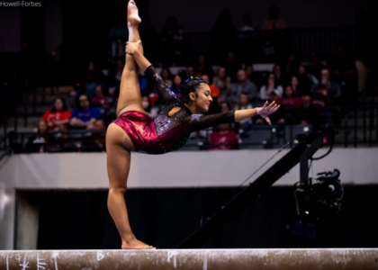
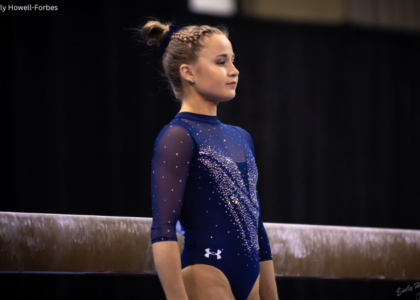
Kids (and adults, to be honest) love to get their favorite team’s poster and put it up on their wall at home. Every year, we anticipate what each school with come up with next. This year, we collected as many team posters as we could find and judged our favorites. Which team had the most creative design in 2016? Read on to find out and let us know your favorite poster in the comments or on Twitter!
|
Georgia
Score: 8.7 Casey Creativity: 2.8/3 Execution of idea: 2.8/3 School Spirit: 1.4/2 Representation of Team: 1.8/2 Total: 8.8/10This shoot is awesome! Came out great. Love it all. Elizabeth I loved this shoot when I saw it on Twitter. I just wish they’d done something a little more creative with the execution on the actual poster (although the calendar does highlight more of the water pictures). I also wish the shots had the girls’ names under. |
|
|
Arkansas
Score: 8.45 Casey Creativity: 2.6/3 Execution of idea: 2.4/3 School Spirit: 1.6/2 Representation of Team: 1.6/2 Total: 8.2/10 I like their “Best Show In Town” tagline they have been using all season. The gymnasts in the lettering is unique too! Elizabeth I like the slogan and the fact that there’s no giant hogs anywhere. The gymnasts inside the letters is also a creative idea. |
|
Oklahoma
Score: 8.45 Casey Creativity: 2.6/3 Execution of idea: 2.6/3 School Spirit: 1.6/2 Representation of Team: 1.7/2 Total: 8.5/10 Their opening video is gorgeous and all these poses are excellent. Great branding from them this season. Elizabeth This paint splatter shoot was so cool and super creative. There’s just something about the poster, though, that I don’t love. I can’t figure it out though. Maybe it’s the white leos on white? I don’t know, but overall it’s great. |
|
|
Kentucky
Score: 8.3 Casey Creativity: 2.2/3 Execution of idea: 2.8/3 School Spirit: 1.6/2 Representation of Team: 1.7/2 Total: 8.3/10 I like how everyone is in a different leo. I also LOVE the glittery lettering #sparkles Elizabeth I like the glitter and sparkle. I just wish instead of a super huge SHINE it said Kentucky or Wildcats or something. I also wish instead of having two posters, they just figured out how to work the whole team into one. |
|
|
Michigan
Score: 8.3 Casey Creativity: 2.8/3 Execution of idea: 2.8/3 School Spirit: 1.8/2 Representation of Team: 1.2/2 Total: 8.6/10 I like the headshots with signature, and the geometric design! Just needs more gymnasts. Elizabeth I do know there are multiple versions of this poster, so I’m taking that into account. I like the aux-signature on there and the geometric shapes. I also like that there’s headshots of the girls and action shots. If they were going to multiple posters, maybe group them by class instead of randomly? |
|
|
Eastern Michigan
Score: 8.25 Casey Creativity: 2.5/3 Execution of idea: 2.2/3 School Spirit: 1.8/2 Representation of Team: 1.7/2 Total: 8.2/10If Slytherin had a gymnastics team this would be their poster. I love the green cloud. Elizabeth I love the green cloud/smoke and how it kind of looks like a cape on the one girl. The group shot and the four posed girls in the cloud are kind of not-related. I wish it was either one or the other. but overall love. |
|
|
Utah
Score: 7.15 Casey Creativity: 2/3 Execution of idea: 2.4/3 School Spirit: 1.6/2 Representation of Team: 1.7/2 Total: 7.7/10 Love how the poses are all different but with a similar overall shape. They look great together. Shout out to Sabrina Schwab looking fierce on the end! Elizabeth This kind of boring to me. I like the different size of the poster — how it’s more of a panorama than just a plain rectangle. The black leo on white background looks classic too. |
|
|
LSU
Score: 7.05 Casey Creativity: 1.5/3 Execution of idea: 2.5/3 School Spirit: 1.4/2 Representation of Team: 1.7/2 Total: 7.1/10 I like the symmetry of the poses! Also the photoshopped lens flare is a nice touch. Elizabeth I just noticed the symmetry, which makes me like this a bit more. The yellow color is meh but I like the leo used and the lens flare giving it a bit more pizazz. |
|
|
Denver
Score: 7.05 Casey Creativity: 1.8/3 Execution of idea: 2.2/3 School Spirit: 1.6/2 Representation of Team: 1.5/2 Total: 7.1/10 Good dynamic poses, but nothing too special about this one. Elizabeth I like the Denver words and landscape in the background. But it’s kind of boring like Utah’s. The dynamic poses work better for me than alls tationary to me though. |
|
|
Boise State
Score: 7.05 Casey Creativity: 1.8/3 Execution of idea: 2.4/3 School Spirit: 1.6/2 Representation of Team: 1.2/2 Total: 7.0/10 Nothing too exciting but I like the black and white background imagery. Highlights the seniors. Elizabeth I like the white background with the darker leos on top. The faded group action shots are a nice touch as well. I just wish the whole team was on there in some way, but highlighting the seniors is cool. |
|
UCLA
Score: 6.8 Casey Creativity: 1.8/3 Execution of idea: 1.8/3 School Spirit: 1.8/2 Representation of Team: 1.7/2 Total: 7.1/10 Feels a bit busy with everyone overlapping and in different sizes. Elizabeth Why is Peng so big? And everyone else much smaller? I need consistency. And also maybe have UCLA Gymnastics big and Bruin Strong smaller? The lens flare and skyline in the background are cool though. |
|
|
Auburn
Score: 6.45 Casey Creativity: 2.6/3 Execution of idea: 2.4/3 School Spirit: 1.1/2 Representation of Team: 1.1/2 Total: 7.2/10 Love the action shots! Great photography. Just wish we could see more girls. Elizabeth I like the concept of a different poster for each home meet. However, coming from someone who hung posters ALL over her wall growing up, it’s logistically impractical. I wish more of the team was represented but the photography is nice. |
|
|
Iowa State
Score: 6.1 Casey Creativity: 1/3 Execution of idea: 2.2/3 School Spirit: 1.3/2 Representation of Team: 1.7/2 Total: 6.2/10 This is a basic poster and what I imagine to be pretty generic for any team. I like how the seniors are on top though! Elizabeth I like the leo choice and how the seniors are featured at the top. But like Casey said, it’s very basic and your standard team poster. |
|
|
Oregon State
Score: 6.1 Casey Creativity: 1.6/3 Execution of idea: 1.5/3 School Spirit: 1.4/2 Representation of Team: 1.2/2 Total: 5.7/10 Not sure what effect they are going for on the seniors pictures… chalk? Elizabeth I like the concept, but the chalk clouds around the girls just look like they forgot to shave or something. The dramatic photography is cool though. |
|
|
Florida
Score: 4.75 Casey Creativity: 0.8/3 Execution of idea: 2.2/3 School Spirit: 1.8/2 Representation of Team: 0.2/2 Total: 5/10 Florida has so many stars, but none are on this poster. Makes me sad. Elizabeth Do more Florida. Yes, Bridget Sloan is the star, but unless you know the team well, you can’t even tell this is her. Where are the other girls? I thought NCAA gym prided itself on being a team sport? Also there was that little “where’s the rest of my leg” photoshop incident. |
|


