Gymnastics fans love leotards; it’s just a fact. We love seeing new designs, creating our own, and especially judging them. That’s why we’re back for another season of leotard rankings! Each week we’re analyzing new designs to find our weekly faves. Here’s the rubric we’re working with:
- Design (3): How strong the overall design is in terms of color, balance, composition, and visual flow. Does it feel intentional and cohesive?
- Construction (2): Quality of materials, fit, finish, and sparkle application. Does the leotard look well-made and flattering in motion and on camera?
- Concept & Identity (2): How successfully the leotard communicates a clear concept or identity through design choices — balancing team branding with creativity and cohesion. Does it feel like this team in a good way?
- Overall Appearance (3): The general visual impression: Does the leotard stand out (positively) on the floor? Is it polished, elegant, and memorable?


Don’t agree with our ranking? Make your opinion heard by voting in the fan poll at the end of the article each week or by voicing your thoughts on social media!
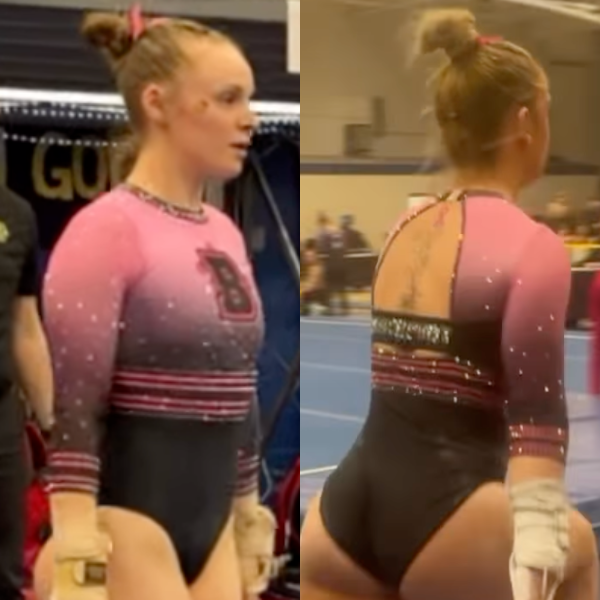
Brockport: 8.275
Elizabeth: 8.900
Design 2.6/3, Construction 1.8/2, Concept & Identity 1.8/2, Overall Appearance 2.7/3
This is a phenomenal pink leo. I love the shade of pink, especially paired with black. The stripes are flattering and add a fun touch, and the back is fun without being too much. Overall, a really great one from Brockport!
Jessica N: 8.500
Design 2.7/3, Construction 1.7/2, Concept & Identity 1.5/2, Overall Appearance 2.6/3
I’m a fan of this color combination, and Brockport created a pink and black leotard that doesn’t look like it came from the Nastia Liukin Cup. The ombre on the chest and sleeves helps the colors blend rather than collide. The small cutout in the back seems unnecessary, as if the designer was afraid of doing too little, when it would have been just right.
Tara: 7.100
Design 1.8/3, Construction 1.7/2, Concept & Identity 1.6/2, Overall Appearance 2.0/3
I think what’s throwing me off on this one is the way the belt sort of cuts off the ombre. It is a nice pink leo, though!
Katherine: 8.600
Design 2.7/3, Construction 1.8/2, Concept & Identity 1.5/2, Overall Appearance 2.6/3
Love this design! I like the “varsity” look of the logo above the band (reminds me of the back of this one from Utah). I also absolutely love the back with the “Brockport” on the single black band right over the continuation of the thin lines band. It’s overall very reminiscent of a Nastia Cup leo, just with the Brockport logo on it.
North Carolina: 8.250

View a video of this leotard here.
Elizabeth: 9.600
Design 2.8/3, Construction 1.9/2, Concept & Identity 2.0/2, Overall Appearance 2.9/3
I love it. I can’t remember the last time North Carolina missed with a leo—if it ever has. Yes, the full “Targyle” is bold, but the fact that there’s not much else going on with the design really allows that element to shine. I also love the subtle incorporation of the argyle into the sleeve cuffs, and the script Carolina on the neckline is also superb.
Jessica N: 4.800
Design 1.2/3, Construction 1.3/2, Concept & Identity 1.0/2, Overall Appearance 1.3/3
I don’t mind argyle as a throwback to eras gone by, but when you include it in a leotard with three different shades of blue, sparkly mesh sleeves, and two-toned straps, it’s too much. The elements are nice on their own, but shouldn’t have been put together into this mishmash.
Tara: 9.200
Design 2.6/3, Construction 1.8/2, Concept & Identity 2.0/2, Overall Appearance 2.8/3
I didn’t think UNC could top its other new leo this season, but this is right up there with it. The argyle paired with darker sequins makes it stand out, and it’s balanced out by the light blue mesh sleeves. I didn’t notice the “Carolina” on the neckline when I was watching the meet, but I love that touch as well.
Katherine: 9.400
Design 2.8/3, Construction 1.8/2, Concept & Identity 2.0/2, Overall Appearance 2.8/3
This is my favorite design of the week. I feel like the Carolina blue really pops out on this one compared to the others in North Carolina’s closet. The sleeves are also absolutely stunning; I love that color too, and I like the different colored sparkles. Finally, I can’t recall ever seeing the name of the mascot on the collar; I don’t always like a thick one like the one here, but that makes it unique here.
Missouri: 8.100
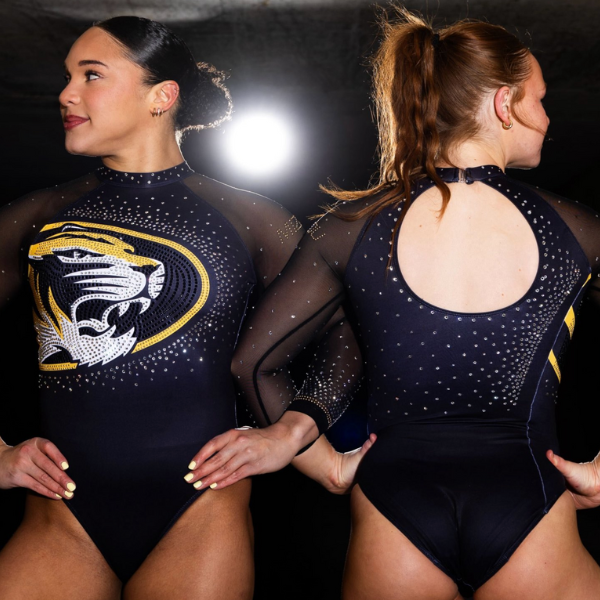
View images and a video of this leotard here.
Elizabeth: 8.800
Design 2.5/3, Construction 1.7/2, Concept & Identity 2.0/2, Overall Appearance 2.6/3
This is really nice. I love when teams update or do odes to old leotards. The high-neck look really works here and is flattering on all the gymnasts. Plus, you all know by now how much I love when a design eliminates the need for shoulder seams. Plus, the otherwise simple design really lets the logo pop.
Jessica N: 8.600
Design 2.5/3, Construction 1.8/2, Concept & Identity 1.7/2, Overall Appearance 2.6/3
This is the leotard version of the maxim “go big or go home.” I generally like mascot leotards, and this one is no exception. The tiger looks fierce and the colors are bold. The placement of the rhinestones on the back is a bit blah, but other than that, no complaints.
Tara: 7.500
Design 2.4/3, Construction 1.2/2, Concept & Identity 1.7/2, Overall Appearance 2.2/3
The Missouri logo really pops, which is great. I’m usually a fan of asymmetry, but it’s not working for me here. Still a solid leo overall!
Katherine: 7.500
Design 2.4/3, Construction 1.1/2, Concept & Identity 1.7/2, Overall Appearance 2.3/3
I absolutely love the school spirit element, but my biggest issue with it is the fact that the logo did not stretch all the way around to the back; I didn’t just want to see half of the design. Why not maximize the school spirit? I do like the encrusted sparkles around the circular part.
Utah State: 7.950

View a video of this leotard here.
Elizabeth: 8.200
Design 2.3/3, Construction 1.7/2, Concept & Identity 1.7/2, Overall Appearance 2.5/3
I really like this. The navy is a nice solid base to let the silver rhinestone design shine. The rhinestone design itself is also great. I like the zig-zag pattern, as well as the sort of reverse cascading effect on the bodice.
Jessica N: 7.700
Design 2.4/3, Construction 1.7/2, Concept & Identity 1.8/2, Overall Appearance 1.8/3
This deep blue color showed up well under the lights of the arena and the sparkles were eye catching, rather than looking like flashbulbs going off. The triangles evoke the mountains of Utah and Native American art motifs of the region–symbolism even I can pick up on.
Tara: 8.000
Design 2.2/3, Construction 1.7/2, Concept & Identity 1.7/2, Overall Appearance 2.4/3
Utah State has quietly killed the leotard game recently. The zig-zag pattern is lovely, and the way it is used on the belt reminds me of the mountains Utah is known for. All of the rhinestones also pop nicely against the navy bodice. The “USU” on the front gives it school spirit without being overwhelming.
Katherine: 7.900
Design 2.4/3, Construction 1.7/2, Concept & Identity 1.8/2, Overall Appearance 2.0/3
I love the deep, royal blue color of this design. I also always love a triangle/geometric moment, so I love the middle band of this. I love the sparkles encrusted over the band, as well. Stop me if you’ve heard this before, but the one thing I’d change is add a strap or two to the back to make it more interesting, but I like the classiness of this design overall.
Stanford: 7.900
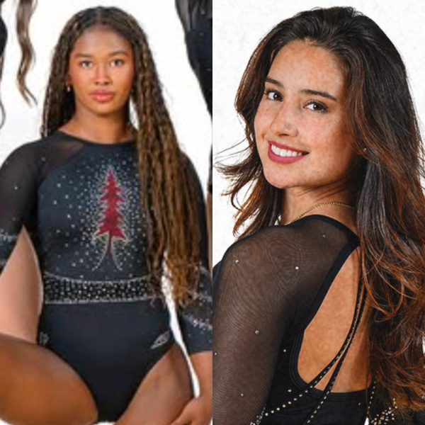
View a video of this leotard here.
Elizabeth: 8.200
Design 2.4/3, Construction 1.6/2, Concept & Identity 1.8/2, Overall Appearance 2.4/3
I really like this. It’s a black leotard, but it’s not boring. The red tree really pops, and I like the rhinestone design on the arms. The back is fine; I don’t love the long straps that continue onto the solid fabric, but it’s a minor gripe.
Jessica N: 7.000
Design 1.9/3, Construction 1.8/2, Concept & Identity 1.5/2, Overall Appearance 1.8/3
Cocktail party in the back, Christmas party in the front. I know this is supposed to be a redwood tree, but with all the sparkles that look like snowflakes and tinsel, I can’t help but think Christmas tree. Stanford was going for “unshakable” with this design, which isn’t coming across to me.
Tara: 8.200
Design 2.3/3, Construction 1.6/2, Concept & Identity 1.8/2, Overall Appearance 2.5/3
Angry tree but make it elegant and refined. This is great! The open, crossy back pairs well with the front, too. I know there are likely fabric and construction reasons for the belt not being completely continuous, but that’s my only gripe with this leo.
Katherine: 8.200
Design 2.4/3, Construction 1.8/2, Concept & Identity 1.7/2, Overall Appearance 2.3/3
If the Angry Tree leo was a quirky take on the Cardinal’s tree motif, this is a classy take on it, and I love it. It’s very pretty and artistic. In addition to the tree itself, other elements I love are the belt band and the stripes on the sleeves.
Arizona State: 7.275

View images and a video of this leotard here.
Elizabeth: 7.500
Design 2.0/3, Construction 1.5/2, Concept & Identity 1.7/2, Overall Appearance 2.3/3
I like the idea here, but it somehow feels like it’s missing something. Maybe a touch of yellow or gold? I do love the back, though, as well as the little rhinestone pitchforks.
Jessica N: 6.800
Design 1.8/3, Construction 1.4/2, Concept & Identity 1.6/2, Overall Appearance 2.0/3
This is one of those leotards that relies on good fit for the angular elements of the back to show off well. On some gymnasts the design looked crisp, and on others, the lower back looked amorphous. It may have been wiser to forego the bottom cut out.
Tara: 7.600
Design 2.0/3, Construction 1.6/2, Concept & Identity 1.7/2, Overall Appearance 2.3/3
I thought this looked a lot better in motion. I absolutely love the back and it works well with the pattern on the front, too.
Katherine: 7.200
Design 1.8/3, Construction 1.4/2, Concept & Identity 1.6/2, Overall Appearance 2.4/3
I think this is a great, unique design. The pitchfork design is very creative and a great way to show school spirit that looks cool even if you have no idea what the school’s mascot is. I love the strappy back and the motif of having the two words of the mascot on either side, and I like that the sparkles don’t stop on the sleeves. This is a fun one.
Texas Woman’s: 7.050
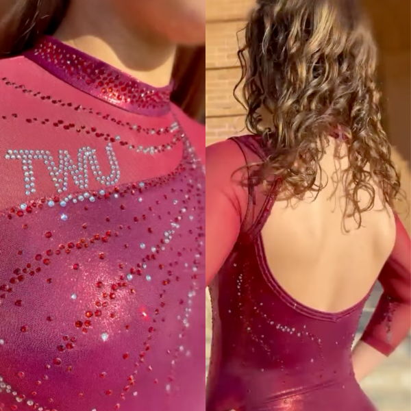
View a video of this leotard here.
Elizabeth: 7.200
Design 2.0/3, Construction 1.6/2, Concept & Identity 1.6/2, Overall Appearance 2.0/3
A lot of teams that normally only get one new design a year have gotten two in 2026, and I’m here for it! Texas Woman’s is one of those teams, and this isn’t a bad second design at all. I love the TWU on the wave on the chest, as well as the multi-colored rhinestones flowing from the sleeves to the shoulder.
Jessica N: 6.900
Design 1.8/3, Construction 1.8/2, Concept & Identity 1.5/2, Overall Appearance 1.8/3
This leotard is named “Merlot Muse,” which evokes a solitary woman crying into her wine glass, so I can’t help but feel a little sad when I look at it. The open back provides the drama, because there’s not much going on in the front. On the positive side, I prefer the monochrome color to the usual TWU leo that mixes merlot with white.
Tara: 7.300
Design 2.0/3, Construction 1.6/2, Concept & Identity 1.7/2, Overall Appearance 2.0/3
This isn’t anything super special, but it also totally fits with the TWU leo brand. The asymmetry gives this a needed flair with it being an all-maroon leo. The “TWU” along the fabric line is also a nice touch.
Katherine: 6.800
Design 1.8/3, Construction 1.5/2, Concept & Identity 1.5/2, Overall Appearance 2.0/3
This is another one where I feel like it’s not very unique at all, but I don’t want that to take away from the decency of the design. It’s also another one with a unique way to get the school’s name or mascot onto the design. The only thing I would change is add straps to the back. I’m realizing that we got a lot of plain backs this week.
Yale: 6.750
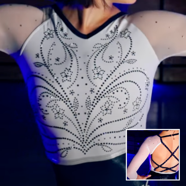
View a video of this leotard here.
Elizabeth: 7.200
Design 2.0/3, Construction 1.7/2, Concept & Identity 1.5/2, Overall Appearance 2.0/3
The back is my favorite part. It reminds me of some of my favorite Penn State designs. I also like Yale leaning into matte white—something it hasn’t really done much of in the past. It adds a touch of variety to an otherwise very navy closet.
Jessica N: 6.200
Design 1.5/3, Construction 1.7/2, Concept & Identity 1.3/2, Overall Appearance 1.7/3
Another leotard joining the category of fine, but nothing special. This arrangement of back straps is one we haven’t seen before, so I like that aspect, but the very open back left the gymnasts’ clear bra straps showing, which is never a good thing in my book.
Tara: 7.000
Design 1.8/3, Construction 1.7/2, Concept & Identity 1.4/2, Overall Appearance 2.1/3
Normally I don’t love floral designs, but I don’t hate it here. The navy rhinestones work well with the rest of the leo, and, of course, I love the strappy back.
Katherine: 6.600
Design 1.7/3, Construction 1.7/2, Concept & Identity 1.3/2, Overall Appearance 1.9/3
The front design feels like it’s been done before, but that doesn’t mean it doesn’t look good here. I also always love a strappy back. I would have liked to see a bit more sparkle on the sleeves in addition to the front design, but other than that, this is perfectly respectable.
La Crosse: 6.600
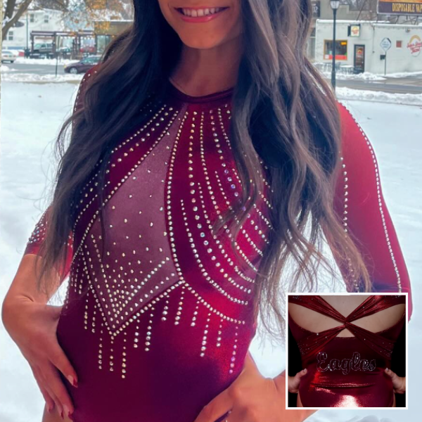
View a video of this leotard here.
Elizabeth: 6.900
Design 1.8/3, Construction 1.7/2, Concept & Identity 1.4/2, Overall Appearance 2.0/3
I like the back a lot. It’s unique but also not over the top. The front isn’t my favorite because it reminds me a bit of UCLA’s boob sling leo, but the all-red look works way better because that design feature isn’t super obvious. I’m also choosing to ignore the name of the leo being Sexxy Red… Apparently, that spelling is also the name of a rapper, and I just have a lot of questions about the whole thing, with the first being why.
Jessica N: 6.300
Design 1.7/3, Construction 1.8/2, Concept & Identity 1/2, Overall Appearance 1.8/3
I liked this design better in motion than in still photographs. When the gymnasts were performing, the color and the sheen stood out, rather than any detailing. One detail I could do without is the crossed-back ribbon that makes humans look like gift-wrapped packages.
Tara: 7.300
Design 2.2/3, Construction 1.7/2, Concept & Identity 1.2/2, Overall Appearance 2.2/3
This is very well done! The back is great and the pattern on the front is nice too. It also looks to be well-constructed.
Katherine: 5.900
Design 1.8/3, Construction 1.5/2, Concept & Identity 1.4/2, Overall Appearance 1.2/3
I don’t strongly like or dislike anything about this design. It’s truly about as neutral as you can get for me, feelings-wise. Is it the most unique design? No. Is it a really solid output for a DIII team? Absolutely. I just am struggling to feel any type of other, stronger way about it.
Southern Utah: 6.600

View a video of this leotard here and images here.
Elizabeth: 7.500
Design 2.1/3, Construction 1.6/2, Concept & Identity 1.6/2, Overall Appearance 2.2/3
I love the shade of red, and the lightning element. I think it ties in nicely with the Thunderbirds nickname. I wish there was something to add a bit of dimension to the overall look, but regardless, this is a good one.
Jessica N: 5.100
Design 1.4/3, Construction 1.1/2, Concept & Identity 1.1/2, Overall Appearance 1.5/3
From the photos, I thought this leotard would look a lot more vibrant in action. Maybe the ribbed fabric absorbs light instead of reflecting it, lessening the impact of the color. I had trouble discerning what the design on the front and the sleeve is. (It’s thunder for the Thunderbirds, in case you didn’t catch that either.) A big comedown from their week 2 stunner.
Tara: 8.400
Design 2.3/3, Construction 1.8/2, Concept & Identity 1.8/2, Overall Appearance 2.5/3
This is so different from what Southern Utah usually does and I’m here for it. The lightning is a great, subtle reference to the Thunderbirds and the scattered rhinestones on the front mesh work a lot better than the version with less. The collar also works well on this!
Katherine: 5.400
Design 1.4/3, Construction 0.9/2, Concept & Identity 1.2/2, Overall Appearance 1.9/3
I like the zig zag pattern on the front; it’s a unique way to do sparkles for sure, and a very subtle way to display school spirit. Other than that, it’s just a little boring; the back especially, but as a whole, nothing really pops out of the design otherwise. I’m also not a fan of the thick collar.
Alabama: 6.550

View images and a video of this leotard here.
Elizabeth: 7.700
Design 2.2/3, Construction 1.7/2, Concept & Identity 1.5/2, Overall Appearance 2.3/3
When I first saw this leotard, I thought it was very Arkansas, and while the bottom looks more Crimson in motion than it does in these pictures above, I think I would have preferred even more of a deep red to really help it scream Alabama. Otherwise, I do really like the rhinestone pattern and how it extends onto the red as well as leaves some negative space near the faux V neckline. The back is also a nice touch, tying things together.
Jessica N: 4.400
Design 1.3/3, Construction 0.8/2, Concept & Identity 1.0/2, Overall Appearance 1.4/3
Somebody’s glue gun needs to be restrained. There’s way too much bedazzling going on here, although I do like the portion around the waist. The crosses on the back look like blades on a ceiling fan and something went wrong with the bust support.
Tara: 6.200
Design 1.6/3, Construction 1.5/2, Concept & Identity 1.4/2, Overall Appearance 1.7/3
I love the back, but the front isn’t my cup of tea. It’s too squiggly and appears busy.
Katherine: 7.900
Design 2.4/3, Construction 1.7/2, Concept & Identity 1.5/2, Overall Appearance 2.3/3
This is pretty and feels like a departure from Bama’s usual, so I love the uniqueness. You see schools with similar color schemes, like my alma mater, Temple, lean more into the white portion of it more than Bama almost ever does; I feel the way the Tide did so here was very Temple-esque in the best way. The front is beautifully designed without being too busy, and I really like the back.
Clemson: 5.800

View a video of this leotard here.
Elizabeth: 6.000
Design 1.7/3, Construction 1.0/2, Concept & Identity 1.4/2, Overall Appearance 1.9/3
In theory, I really like this leotard. But there’s something about the way the sides of it are designed that makes it kind of unflattering on the gymnasts for some reason. I do love the shade of purple and the silver rhinestones on the sleeves, though.
Jessica N: 4.800
Design 1.3/3, Construction 1.0/2, Concept & Identity 1.2/2, Overall Appearance 1.3/3
The design on the front of this leotard is a little too reminiscent of a bikini top for me. Also, the way it’s cut is unflattering on the athletes, though I can’t really pinpoint the exact element that causes it. Overall, not a win for Clemson.
Tara: 6.400
Design 2.1/3, Construction 1.2/2, Concept & Identity 1.3/2, Overall Appearance 1.8/3
The mesh sides are a no from me, which is a shame because I really love the rest of this leo, from the purple and white to the chandelier-esque rhinestone design on the front.
Katherine: 6.000
Design 2.9/3, Construction 1.0/2, Concept & Identity 1.2/2, Overall Appearance 1.8/3
I like all of the different uses of sparkles on this design. I also like the font of “Clemson” on the back. The purple and white of it all is a bit boring, but I keep forgetting that boring is a good thing when it comes to this year’s (and frankly all future) Clemson leos. It’s not my favorite from the Tigers, but it’s not a terrible design at all.
Fan Poll
Congrats to Illinois for winning last week’s fan poll! Vote for your favorite design from this week here.
READ THIS NEXT: Extended Depth Motivates LSU In Quest for Second Title
Judged by Elizabeth Grimsley, Jessica Needle, Tara Graeve, and Katherine Weaver