Gymnastics fans love leotards—it’s just a fact. We love seeing new designs, creating our own, and especially judging them. That’s why we’re back for another season of leotard rankings! Each week we’re analyzing new designs to find our weekly faves. Here’s the rubric we’re working with:
- Design (3): How strong the overall design is in terms of color, balance, composition, and visual flow. Does it feel intentional and cohesive?
- Construction (2): Quality of materials, fit, finish, and sparkle application. Does the leotard look well-made and flattering in motion and on camera?
- Concept & Identity (2): How successfully the leotard communicates a clear concept or identity through design choices – balancing team branding with creativity and cohesion. Does it feel like this team in a good way?
- Overall Appearance (3): The general visual impression: Does the leotard stand out (positively) on the floor? Is it polished, elegant, and memorable?

Don’t agree with our rankings? Make your opinion heard by voting in the fan poll at the end of the article each week or by voicing your thoughts on social media!
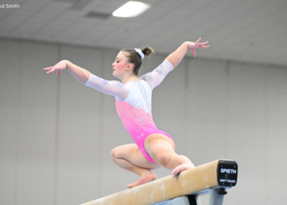
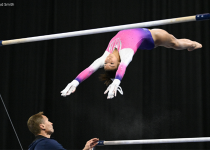
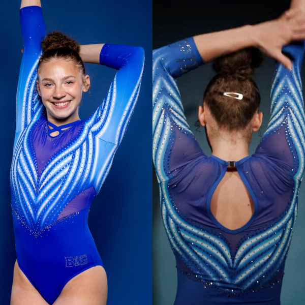
Stanford: 9.525

View images and a video of this leotard here.
Elizabeth: 9.500
Design 2.7/3, Construction 2.0/2, Concept & Identity 2.0/2, Overall Appearance 2.8/3
THIS is how you do a design based on meaningful architecture. The back straps (and sleeve cuff holes) imitating the Main Quad are so clever, and I can actually tell what the front rhinestone pattern is. And thank you to Stanford for being conscious of construction where the mesh meets the solid fabric—no unnecessary seams!
Frances: 9.150
Design 3.0/3, Construction 1.75/2, Concept & Identity 1.9/2, Overall Appearance 2.5/3
Yes yes yes! Another leo with a well-executed concept. It’s a homage to the architecture, yet not too building-like. And a nice arch detail on the sleeves, too! I’m fairly sure there’s velvet on the top half, which I wish was continued all the way down. Also, the back straps being loose in the photos is slightly off-putting, but I will forgive it since this looks like a high-quality leo.
Jill: 9.750
Design 3.0/3, Construction 2.0/2, Concept & Identity 2.0/2, Overall Appearance 2.75/3
This is so creative! The back straps are a unique and clever way to incorporate the architectural theme. I love that this reflects the Main Quad while still standing on its own as a strong design. More campus-inspired leos, please!
Sarah: 9.700
Design 2.9/3, Construction 1.9/2, Concept & Identity 2.0/2, Overall Appearance 2.9/3
The attention to detail on this leo is fantastic. The cutouts on the sleeves and the uniqueness of the back straps really make this stand out and feel very uniquely Stanford! The rhinestone belt breaks up the red and black parts of the bodice nicely too. Everything on this leo feels intentional and meaningful, which I love!
Air Force: 8.875

View a video of this leotard here and details here.
Elizabeth: 7.700
Design 2.2/3, Construction 1.4/2, Concept & Identity 1.7/2, Overall Appearance 2.4/3
This leotard is one that really grew on me once I saw it on the gymnasts at the meet. The little star clusters gave the body a cool look from afar, and the sleeves sort of look like the Air Force lightning bolt.
Frances: 9.300
Design 2.75/3, Construction 2/2, Concept & Identity 1.8/2, Overall Appearance 2.75/3
So, I love this leo. The black with the royal blue accents is compelling and leans into the night sky look to represent the Space Force. There’s clearly a strong proof of concept behind the symbolism, and it’s decorated in a way that reminds me of a uniform. Also, it looks indestructible.
Jill: 9.200
Design 2.8/3, Construction 1.6/2, Concept & Identity 2.0/2, Overall Appearance 2.8/3
This is stellar. The blue stands out enough while keeping a very spacey color scheme. The piping, the lightning bolt sleeves, and the belt look cohesive and keep the design interesting. And the delta logo translates well into rhinestones.
Sarah: 9.300
Design 2.7/3, Construction 1.8/2, Concept & Identity 2.0/2, Overall Appearance 2.8/3
This is absolutely stunning! I love the blue-on-black design, and the entire look of this leo makes complete sense with the concept Air Force had in mind. The slight hint of purple that comes off of the rhinestones when watching the leo in motion is gorgeous too. I think that a closed back with more details would have made this feel a bit more cohesive though, especially since the front is so great!
Whitewater: 7.413
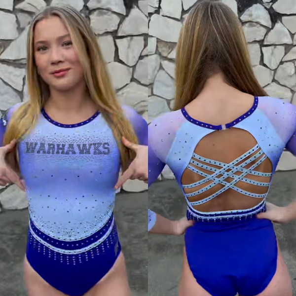
View video of this leotard here.
Elizabeth: 7.800
Design 2.2/3, Construction 1.5/2, Concept & Identity 1.6/2, Overall Appearance 2.5/3
This is really nice. I love the shade of purple, as well as the shimmery purply white up top. Plus, “Warhawks” really stands out on the chest, and the back straps tie everything together really well.
Frances: 7.050
Design 2.0/3, Construction 1.8/2, Concept & Identity 1.25/2, Overall Appearance 2/3
The solid purple with the ombre white is a nice contrast, though the misaligned placement of the ombre on the bodice versus the sleeves is strange to me. This is a rare moment when I do like the back straps; it looks like they won’t flop around in motion. And I love the double belt situation with the icicle motif.
Jill: 7.500
Design 2.0/3, Construction 1.5/2, Concept & Identity 1.5/2, Overall Appearance 2.5/3
I like this a lot. The purple ombre and rhinestone placement on the front look really balanced. The back straps make the back a little too busy for me though, throwing the leotard as a whole off balance.
Sarah: 7.300
Design 2/3, Construction 1.5/2, Concept & Identity 1.5/2, Overall Appearance 2.3/3
The back straps are my favorite part of the design. The darker rhinestones provide a really nice contrast and make the straps feel more purposeful. I’m not a big fan of the lower belt in the front though, and I think the design would have worked better without it, especially since it just drops off halfway around the leotard.
UCLA: 7.175
View images and a video of this leotard here.
Elizabeth: 6.400
Design 2.0/3, Construction 1.2/2, Concept & Identity 1.2/2, Overall Appearance 2.0/3
Look, don’t get me wrong. I like this sort of ombre stripe pattern, but it loses some of its uniqueness when three teams in the past two weeks have used it. Otherwise, the shades of blue here are good, but I dislike the neck straps. They look far too high up to be any sort of comfortable. The design as a whole is also pretty boring and similar to quite a number of other UCLA leos in the closet already.
Frances: 7.500
Design 2.25/3, Construction 1.5/2, Concept & Identity 1.5/2, Overall Appearance 2.25/3
This might be UCLA’s bluest leo yet. While it’s certainly a lot of blue, the color absolutely glowed on screen. The pattern is OK—it reminds me of butterfly wings—and I like the micro-ombre happening in each stripe. I have a bit of a problem with the high-neck cross strap on the front. It looks uncomfortable to me, and it’s reminiscent of the 2016 era V-neck shirts with lace-up straps. Just in time for the 2016 trend, I see.
Jill: 7.000
Design 2.2/3, Construction 1.5/2, Concept & Identity 1.3/2, Overall Appearance 2.0/3
I love the combination of colors on this. The bright shade of blue blends really well with the white in the stripes. Though I’m not a fan of the butterfly vibe, I appreciate that the pattern continues onto the sleeves, which helps the design come together and stand out from the other ombre-striped leos we’ve seen lately.
Sarah: 7.800
Design 2.3/3, Construction 1.6/2, Concept & Identity 1.3/2, Overall Appearance 2.6/3
This leo was beautiful in motion! The brightness of the blue really made it stand out. I also really like the mesh detailing on the shoulders. It helps the design continue beyond the bodice of the leotard, and makes the whole leo feel more cohesive. To make this leo look more seamless the front neck straps could have been removed altogether.
Clemson: 6.938

View a video of this leotard here.
Elizabeth: 6.800
Design 1.8/3, Construction 1.4/2, Concept & Identity 1.6/2, Overall Appearance 2.0/3
I love the purple, I love the shape of the neckline, and I even love the giant “Clemson” down the sleeve. The tiger stripe pattern underneath the orange is a really fun touch, but I wish the orange was incorporated in a different way. As it is now, it’s a bit busy for me.
Frances: 6.850
Design 2.1/3, Construction 1.5/2, Concept & Identity 1.5/2, Overall Appearance 1.75/3
I will preface this by saying I am definitely biased toward the purple and orange color combination. For this leo, I love the starburst design layered over the subtle tiger stripes, and the rhinestones really shimmer in motion. The big “Clemson” lettering down the sleeve is a lot, but it succeeds in its boldness. And an open back is an open back—what can you even really say about it?
Jill: 6.700
Design 2.0/3, Construction 1.5/2, Concept & Identity 1.5/2, Overall Appearance 1.7/3
I like the orange starburst pattern a lot, but wish the tiger stripes behind it were just a solid purple. The detail at the end of the sleeves is a nice touch too. Overall, a solid addition to the Clemson closet!
Sarah: 7.400
Design 2.0/3, Construction 1.5/2, Concept & Identity 1.7/2, Overall Appearance 2.2/3
The open back is…a bit too open. With that being said, I love the combination of patterns within this leo, and the use of the tiger stripes feels intentional without being overbearing. I really like the subtle belting detail on this, and I think it breaks up the solid part of the leo from the patterns very well. The “Clemson” on the sleeve isn’t my favorite, and I think this leo is more than Clemson-specific enough on its own without it.
Nebraska: 6.875
View a video of this leotard here.
Elizabeth: 7.700
Design 2.2/3, Construction 1.6/2, Concept & Identity 1.4/2, Overall Appearance 2.5/3
This is really nice, but the pattern does remind me of both another Nebraska leo as well as Arkansas’ new design from last week. Of course, they aren’t the same, but they’re similar. Either way, I like the red and white paired together, as well as the thicker red neckline, the rhinestone pattern on the arms, and the hidden corn as always. I do wish “Nebraska” on the back was more visible, though.
Frances: 6.000
Design 1.5/3, Construction 1.75/2, Concept & Identity 0.75/2, Overall Appearance 2.0/3
I feel like Nebraska had some really bold and graphic leos last year (this and this are un-ironically some of my favorites), but this one definitely leans more mainstream. I’m not obsessed with the front design, and the shade of red almost feels too bright for Nebraska. One thing I do like is the pattern on the back, and I think I’d like the leo better if it was continued on the front. Also…I live blogged this meet and didn’t even notice it said “Nebraska” on the back. Whoops.
Jill: 6.100
Design 1.2/3, Construction 1.7/2, Concept & Identity 1.2/2, Overall Appearance 2.0/3
This is bright and fun! I agree with Frances that the pattern on the back should continue to the front. As it is, the front feels like the lines are moving in too many directions, giving the leo a busy feel. I like the combination of the red neckline and the white band though.
Sarah: 7.700
Design 2.0/3, Construction 1.7/2, Concept & Identity 1.3/2, Overall Appearance 2.7/3
I love the thick bright banding at the neckline and waist of the leo, and I think that the detailing there really makes this pop! I like the different designs on the front and back—the patterns are similar enough that they don’t feel at odds with each other, but still provide a contrast that makes this leo feel really unique. The rhinestoning is great too, and ties the whole leo together.
Washington: 6.813
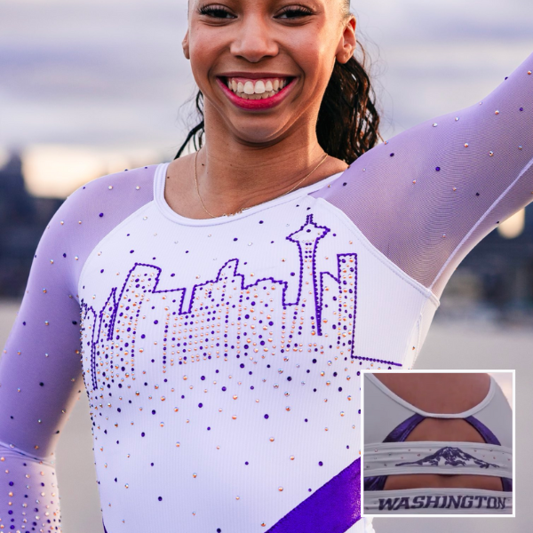
View images of this leotard here, a video here, and details here.
Elizabeth: 7.000
Design 2.0/3, Construction 1.0/2, Concept & Identity 2.0/2, Overall Appearance 2.0/3
I love the concept. The skyline is clear and easily identifiable, and Mount Rainier on the back is such a nice bonus. The light purple sleeves also go well with the white body. What I don’t prefer is the darker purple band on the body. I like how it wraps around to the back, but something about its placement and how angular it is brings the attention to all the wrong places. I would have preferred a plain white body or another type of belt.
Frances: 7.750
Design 2.5/3, Construction 1.5/2, Concept & Identity 1.75/2, Overall Appearance 2/3
The more I look at this leo, the more it grows on me. An all-white bodice from a team that normally goes full purple is really refreshing, and the ribbed fabric is unusual in the best way. The mesh sleeves could go either way for me, but the skyline and Mount Rainier concept works. I like it, but I do think there could be a touch more going on. Overall, though, it’s very solid.
Jill: 6.000
Design 1.5/3, Construction 1.5/2, Concept & Identity 2.0/2, Overall Appearance 1/3
I like a lot about this, but I don’t fully love it overall. The concept is a 10/10 for me. The rhinestones on the buildings give a nice window effect. Both the skyline and Mount Rainier could have taken up more vertical space though, and I wish the purple band and the purple on the sleeves were the same shade.
Sarah: 6.500
Design 1.75/3, Construction 1.0/2, Concept & Identity 2.0/2, Overall Appearance 1.75/3
The concept is fantastic! I think matching the seams to the purple band would have looked cool, as well as further emphasized the transition from the bodice to the sleeves. I also would have liked if the rhinestones were more even within the skyline design, as some of the building tops look slanted. Mount Rainer on the back is my favorite part of this leo—it’s subtle, but it’s a great detail that only Washington could include!
Oklahoma: 5.488

View a video of this leotard here.
Elizabeth: 5.800
Design 1.8/3, Construction 1.0/2, Concept & Identity 1.0/2, Overall Appearance 2.0/3
I like it, but it’s also nothing exciting. Oklahoma always has at least one leo each season that’s just the standard crimson body and white sleeves with maybe some ombre thrown in. I like the rhinestones and how they vary in shape and size. What I don’t like is how the darkest part of the ombre looks more brown on video than crimson. It clashes with the crimson body, in my opinion.
Frances: 5.250
Design 1.0/3, Construction 1.5/2, Concept & Identity 1.0/2, Overall Appearance 1.75/3
Oklahoma tends to play it safe with new leos, and for me, this one doesn’t break tradition. I like the trickle effect from the rhinestones done in different sizes and shapes, and the loose-type “Sooners” is interesting, and therefore appeals to me. I don’t love the wave design, especially in the front where it slices awkwardly down the bodice. I also agree with Elizabeth that the colors of the ombre don’t work. It’s overall OK, but not my favorite Oklahoma leo by far.
Jill: 5.600
Design 1.3/3, Construction 1.5/2, Concept & Identity 1.0/2, Overall Appearance 1.8/3
I like the wave design, but I wish it came to a point lower on the front and didn’t connect to the high neckline. I agree that the ombre looks brown. A solid white color instead would have brought attention to the more interesting parts of this leo.
Sarah: 5.300
Design 1.3/3, Construction 1.4/2, Concept & Identity 1.0/2, Overall Appearance 1.6/3
The front of this is pretty, but doesn’t feel very unique to me. The wave cutouts on the sides aren’t my favorite, and the “Sooners” on the back is a bit too crammed in (and is also the only part of this leo that really differentiates this as being Oklahoma’s). I really like the rhinestone pattern on the collar, and I think that the ombre works well on the sleeves, but not really on the bodice.
West Virginia: 5.225

View a video of this leotard here and images here.
Elizabeth: 6.000
Design 1.5/3, Construction 1.6/2, Concept & Identity 1.4/2, Overall Appearance 1.5/3
I love the rhinestone pattern on the chest, especially how it’s defined with different colors of sparkles. The neckline and how the yellow fabric piping flows into the back are also well-executed concepts. The shimmery nude/gold I don’t get. I wish the leo was just fully white with more of the rhinestone pattern, because as it is, it looks sort of weird.
Frances: 5.000
Design 1/3, Construction 1.5/2, Concept & Identity 1/2, Overall Appearance 1.5/3
I’m conflicted with this because I want to like it—I really do!—but the two tones in the yellow piping versus the shimmery gold don’t work at all, and the swirly rhinestone design clashes with the cross-strap pattern on the back. I love a white leo, but I think simpler would have been better for this one.
Jill: 4.900
Design 1.2/3, Construction 1.5/2, Concept & Identity 1.0/2, Overall Appearance 1.2/3
This rhinestone pattern is truly lovely, and I like that the piping on the front and the back connect. Unfortunately this gets overshadowed by the bright yellow of the piping and straps, and especially by the gold band.
Sarah: 5.000
Design 1.2/3, Construction 1.4/2, Concept & Identity 1.2/2, Overall Appearance 1.2/3
The neckline here is not my favorite. I really like the cross straps in the back, and I think that the strap detailing by itself would have been sufficient for “structuring” this leo. The contrast between the piping and the metallic fabric is not great, and the nude metallic color isn’t winning for me either. However, the rhinestone spirals are truly stunning, and I wish that they were the first thing my eyes were drawn to on this leo.
UC Davis: 5.200
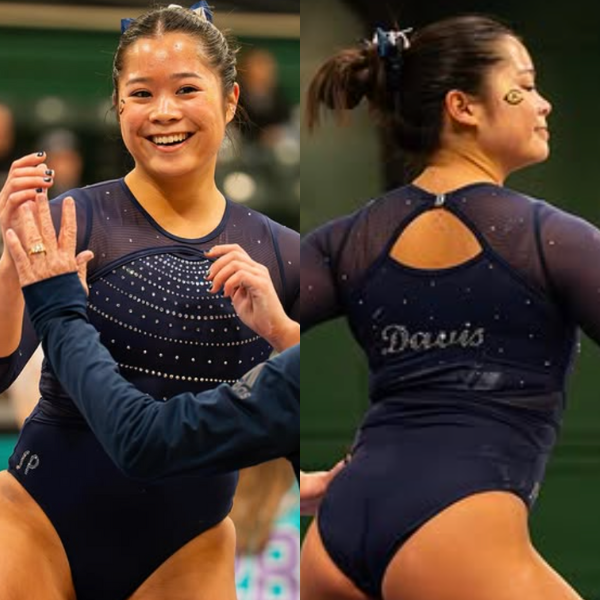
View images of this leotard here.
Elizabeth: 6.000
Design 1.7/3, Construction 1.0/2, Concept & Identity 1.5/2, Overall Appearance 1.8/3
It’s fine? It’s sort of funny how UC Davis hyped up its new leo last week (for good reason), but there was zero mention that this one was also new. I am not normally a rounded neckline kind of leotard lover, but it works here with the rhinestone pattern. The tiny hole between the solid fabric and the mesh, though, is weird because of just how tiny it is. Why have it there at all?
Frances: 5.000
Design 1.25/3, Construction 1.25/2, Concept & Identity 0.75/2, Overall Appearance 1.75/3
I like it, but it doesn’t stand out to me or scream UC Davis. The sleeves look like they’re put on over the leo, similar to those cardigan shirts that are just meant to be sleeves. I’d like to have seen the rhinestone design on the front continued onto the back, but I don’t mind the “Davis” lettering, either.
Jill: 5.500
Design 1.5/3, Construction 1.0/2, Concept & Identity 1.0/2, Overall Appearance 2.0/3
This looks nice overall, but I agree that it doesn’t stand out much. I like that the mesh sleeves look like a separate piece, but I wish there was more cohesion between the front and the back. It’s a solid option to have, but definitely isn’t UC Davis’ best.
Sarah: 4.300
Design 1.1/3, Construction 1.2/2, Concept & Identity 0.6/2, Overall Appearance 1.4/3
UC Davis tends to have really unique and school-specific leos, but this feels pretty generic compared to its other recent debuts. The seams throughout the leo stick out significantly, and take away from the overall design. I agree with Elizabeth that the hole in the front feels unnecessary. I like the subtle rhinestoning on the back, but it doesn’t really match the front of the leo.
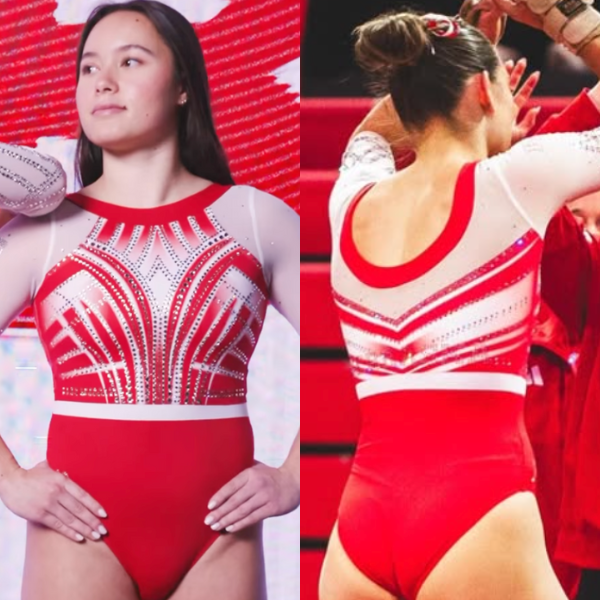
Cortland & Utica: 4.638
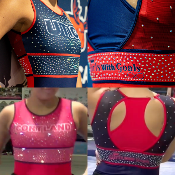
View images and a video of this leotard here. Note: Cortland’s leotard is identical but with red and blue, as well as “Cortland” on the chest.
Elizabeth: 4.400
Design 1.2/3, Construction 1.5/2, Concept & Identity 0.7/2, Overall Appearance 1.0/3
I like the dual color design, and the “Utica” on the chest stands out. I also like the idea of both teams wearing the same leo in their team colors for this theme. I’ll let the “Girls with Goals” on the back slide because it’s there for a reason.
Frances: 4.750
Design 1.5/3, Construction 1.5/2, Concept & Identity 0.5/2, Overall Appearance 1.5/3
These designs are fine! I like the color-blocked front and back with the opposing colors, and the pearlescent rhinestones are pretty. The font for “Girls with Goals” on the back is just meh. The racerback within the open back is a little strange, but we see so many vastly open backs these days that it’s at least different. And I’m not sure why there’s a clip involved, and just on one side; it feels like an unnecessary asymmetry.
Jill: 4.800
Design 1.5/3, Construction 1.3/2, Concept & Identity 1.0/2, Overall Appearance 1.0/3
I like the opposite colors on the back and front. I also like that the teams matched, but I don’t think this worked as well for Cortland. Utica’s shorter name and its colors look better in this design.
Sarah: 4.600
Design 1.2/3, Construction 1.3/2, Concept & Identity 0.9/2, Overall Appearance 1.2/3
I like that the teams wore matching leos! The design popped more in Utica’s colors for sure. I am not a fan of the colors swapping from back to front—it’s sort of jarring to me, and I feel like the design would look much more cohesive if they stuck with the same base color on both sides of the leo. I like the racerback design; I think it looks wonderful on tank leos like these!
Alaska: 4.038
Elizabeth: 4.000
Design 1.0/3, Construction 0.5/2, Concept & Identity 1.0/2, Overall Appearance 1.5/3
Uhh… Yeah… No… Honestly, I would really like this leo if it were a black bottom, white top, and colored Seawolves logo on the chest. Actually, I would call it a really good leo in that case. But while I like the intention, the colored ribbons all over this design are just not it for me. I also don’t like how the ribbons that happen to be near the seams are cut off or partial.
Frances: 4.250
Design 1.5/3, Construction 0.5/2, Concept & Identity 0.75/2, Overall Appearance 1.5/3
Honestly, I don’t mind a fully black and white leo. But the ribbons? I’m certain that they have meaning and I am very curious as to what that may be. But with no word from the designer, the ribbons being scattered everywhere comes off as a fabric I would avoid from the craft store… And extra points off for the pattern not lining up. Despite that, I love the massive Seawolves logo on the chest and how it reads well from far away.
Jill: 4.200
Design 1.2/3, Construction 0.5/2, Concept & Identity 1.0/2, Overall Appearance 1.5/3
I’d like this so much without the ribbons! There are other ways to incorporate their colors and meaning. With the busyness of the design, it took me a minute to even notice the straps on the back.
Sarah: 3.700
Design 1.0/3, Construction 0.5/2, Concept & Identity 1.2/2, Overall Appearance 1/3
Not my favorite. I appreciate the meaning behind the leotard, but it feels messy to me. The Seawolves logo and the ribbons don’t quite go together, and I think going with one or the other here would have helped this design feel more intentional. I also agree that the ribbons being cut off by the seams doesn’t really work, and likely led to the leos not matching with each other as well.
Fan Poll
Congrats to Arizona State for winning last week’s fan poll! Vote for your favorite design from this week here.
READ THIS NEXT: The Dismount: Week 4
Judged by Elizabeth Grimsley, Frances Leadman, Jill Walsh, and Sarah Smith