

The criteria is a little different this season as we tweak some of our point totals to better analyze the designs. There will be up to three points for design, up to one point each for fabric and sparkle, school spirit and uniqueness and up to three points for overall appearance. This week Brandis, Emily M and Tara are joining Elizabeth to help judge.
San Jose State: 8.725
Elizabeth: 8.900
Design 2.6/3, Fabric 0.9/1, Sparkle 0.9/1, School Spirit 0.9/1, Uniqueness 0.8/1, Overall Appearance 2.8/3
I love this. Every element works SO well together. The front design is just enough, and the sparkles do a great job emphasizing the right parts. I also love the touch of yellow on the sleeves. Any more and it would be too much or too much like Pitt. My favorite part is the back with those thick straps. I can’t get enough of this leo!
Tara: 9.200
Design 2.8/3, Fabric 0.9/1, Sparkle 0.9/1, School Spirit 0.8/1, Uniqueness 0.9/1, Overall Appearance 2.9/3
I’m in LOVE. The ombre body and incorporating yellow into the sleeves with ombre is gorgeous, the strappy back is to die for and the design on the front is great.
Emily M: 8.500
Design 2.7/3, Fabric 0.8/1, Sparkle 0.7/1, School Spirit 0.7/1, Uniqueness 0.8/1, Overall Appearance 2.8/3
This is so lovely. The strappy back is exquisite, and the ombre yellow really adds something special. The blue-grey of the bottom looked great on camera, and the sparkles were just enough for a real pop of shimmer. I’d add just a touch of yellow to the crystals on the body to make it my ideal.
Brandis: 8.300
Design 2.5/3, Fabric 0.8/1, Sparkle 0.8/1, School Spirit 0.8/1, Uniqueness 0.8/1, Overall Appearance 2.6/3
The touch of yellow at the end of the ombre sleeves is what takes this leo to the next level for me. I’m not in love with the strappy back as much as some of my fellow editors, but overall this is a great look.
Pittsburgh: 8.475
Elizabeth: 8.100
Design 2.2/3, Fabric 0.9/1, Sparkle 0.9/1, School Spirit 0.8/1, Uniqueness 0.9/1, Overall Appearance 2.4/3
I adore this. You’d think it would be way too busy, but all the elements work together well. A lot of people have said it’s similar to LSU’s scalloped leo, but in comparison, LSU’s looks absolutely boring. I love how the overlaid fabrics and designs and rhinestones gives the top an iridescent look, and the pattern is so regal. Might be my favorite Pitt leo of all time?
Tara: 8.000
Design 2.2/3, Fabric 0.9/1, Sparkle 0.9/1, School Spirit 0.8/1, Uniqueness 0.9/1, Overall Appearance 2.3/3
I really enjoy this. It’s almost too much going on, but somehow it works. It does remind me of that one LSU leo, but this one is definitely better. Props to Pitt!
Emily M: 9.000
Design 2.8/3, Fabric 1.0/1, Sparkle 1.0/1, School Spirit 0.7/1, Uniqueness 0.9/1, Overall Appearance 2.6/3
The details on this beauty! It’s so intricate without being busy. It’s just really elegant. The double-O back is unique, and the belt (for once!) makes sense with the design. I do wish the the neckline were cut a touch wider—it makes absolutely everyone look very shoulder-y—but that is my one and only complaint. This is very out of left field as far as my favorite types of leos, but it is up there.
Brandis: 8.800
Design 2.6/3, Fabric 1.0/1, Sparkle 1.0/1, School Spirit 0.8/1, Uniqueness 0.9/1, Overall Appearance 2.5/3
I love this leotard. Everything on it looks so intentionally placed, and we don’t often get to see a leo giving off the layered look. It borders right on the line of possibly being too busy, but for me it stays on the good side of that line.
Rutgers: 7.575
Elizabeth: 7.700
Design 2.2/3, Fabric 0.8/1, Sparkle 0.8/1, School Spirit 0.7/1, Uniqueness 0.8/1, Overall Appearance 2.4/3
I love that Rutgers is leaning into RED and white leos. This design is fantastic. I love the shade of red, and paired with the white accents it’s *chef’s kiss.* I especially like the cross-cross sparkle ribbons on the front and back.
Tara: 7.400
Design 2.1/3, Fabric 0.8/1, Sparkle 0.7/1, School Spirit 0.7/1, Uniqueness 0.9/1, Overall Appearance 2.2/3
I love the criss-cross front-to-back design, and red and white is always a classic combo. The pattern is super abstract, but it works.
Emily M: 8.000
Design 2.3/3, Fabric 0.9/1, Sparkle 0.9/1, School Spirit 0.6/1, Uniqueness 0.9/1, Overall Appearance 2.4/3
Agree with Elizabeth, the color choices here are on point. This would stand out even in a meet full of teams in red leos. The sort of doily lace pattern is really feminine, and used in this small quantity I think it elevates the look a lot without being overwhelming. The back is nice, the cut around the middle is nice, the sleeves are unique—a winner.
Brandis: 7.200
Design 2.0/3, Fabric 0.8/1, Sparkle 0.7/1, School Spirit 0.7/1, Uniqueness 0.9/1, Overall Appearance 2.1/3
The white design on the front is so elegant and intricate, but unfortunately it gets lost on the backside of the leo with all the other things going on. Not a fan of the stripe down the sleeves either, but like Elizabeth said, I hope Rutgers continues to lean into the red and white leos more often.
Stanford: 7.375

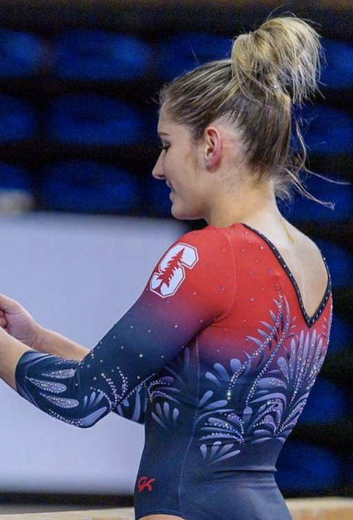
Photos/@rachaelflam, Instagram
Note: This leo debuted in 2020, but we never got good enough pics of it.
Elizabeth: 7.600
Design 2.2/3, Fabric 0.8/1, Sparkle 0.8/1, School Spirit 0.7/1, Uniqueness 0.7/1, Overall Appearance 2.4/3
I actually really like this. The pattern is nice and not too bold, the ombre is obviously fantastic and I love the use of the matte fabric to really make the sparkles stand out.
Tara: 6.800
Design 1.8/3, Fabric 0.7/1, Sparkle 0.7/1, School Spirit 0.8/1, Uniqueness 0.8/1, Overall Appearance 2.0/3
I’m not a fan of the chest or back pattern, though I like the rest. The ombre is pretty and the addition of the logo on the shoulder is a nice touch.
Emily M: 7.500
Design 2.5/3, Fabric 0.8/1, Sparkle 0.5/1, School Spirit 0.6/1, Uniqueness 0.6/1, Overall Appearance 2.5/3
This is lovely. The very small ombre really makes the red pop. I don’t mind the pattern, and especially like the way it is echoed on the sleeves. It’s really quite flattering, if missing a little extra pizzazz.
Brandis: 7.600
Design 2.4/3, Fabric 0.7/1, Sparkle 0.6/1, School Spirit 0.7/1, Uniqueness 0.8/1, Overall Appearance 2.4/3
Like Emily said, the black to red ombre really makes the color pop, which I love. I also like how creative the design is, but I think this leo needs a little bit more sparkle to make it truly stand out.
Utah: 7.075
Elizabeth: 6.800
Design 2.0/3, Fabric 0.7/1, Sparkle 0.7/1, School Spirit 0.6/1, Uniqueness 0.7/1, Overall Appearance 2.1/3
This grew on me as I watched the meet. I like the use of white, which isn’t something Utah has done since the mid-2010s. I also like the subtle red accents that were incorporated. But my favorite part is the swooping low back. It looked great on the gymnasts. I will note that I hope Utah’s leo trend isn’t black body with white accents moving forward because that can get pretty boring pretty quickly.
Tara: 7.000
Design 1.9/3, Fabric 0.8/1, Sparkle 0.7/1, School Spirit 0.6/1, Uniqueness 0.8/1, Overall Appearance 2.2/3
Like Elizabeth, this one grew on me. Ideally I’d love more red, but I do love the red accents. The design isn’t too over the top, though it’s getting there. Also seconding the “please don’t make black and white a new trend” sentiment.
Emily M: 7.200
Design 1.5/3, Fabric 0.8/1, Sparkle 1.0/1, School Spirit 0.8/1, Uniqueness 0.9/1, Overall Appearance 2.2/3
Hmmm. This is solid, but I’m frustrated. Utah has given us such creative looks over the past few years, and for 2021 we get…white on black. It’s not bad by any means! I’ve just come to expect more from the Utes I guess. I do love the use of red crystals, and that low scoop back is stunning.
Brandis: 7.300
Design 2.0/3, Fabric 0.8/1, Sparkle 0.8/1, School Spirit 0.5/1, Uniqueness 0.8/1, Overall Appearance 2.4/3
While I like the big contrast of the white on black design, I wish there was some more red throughout to give it more of a Utah feel. The red rhinestones are a great touch, but you can’t tell they’re there until you get a closeup shot. Overall though, this leo is still beautiful.
Stanford: 6.400


Elizabeth: 6.400
Design 1.8/3, Fabric 0.6/1, Sparkle 0.7/1, School Spirit 0.7/1, Uniqueness 0.8/1, Overall Appearance 1.8/3
There is a LOT going on here. Too much. I like some of the elements on their own, but added all together makes this leo way too busy. I think the back is my favorite part. Maybe if it was similar on the front, it would be better?
Tara: 7.000
Design 2.1/3, Fabric 0.6/1, Sparkle 0.8/1, School Spirit 0.7/1, Uniqueness 0.7/1, Overall Appearance 2.1/3
The back is my favorite part; I love the red bands on top of black with the sparkle accents and the logo built into the sparkles. I like the deep v and sparkle accents around it on the front, but I don’t love how the black appears cut out near the shoulders. It’s just a little much and doesn’t seem to fit with the rest of the design.
Emily M: 5.900
Design 1.5/3, Fabric 0.4/1, Sparkle 0.9/1, School Spirit 0.8/1, Uniqueness 0.7/1, Overall Appearance 1.6/3
…oh. There’s a real leather vest vibe to the front of this that I just can’t shake. I really, deeply hate that the black deep V line continues up the shoulders like that. It just cuts everything off. There’s just also something about this particular shade of red with this black that hurts my brain. The back is nice and the sparkles are solid.
Brandis: 6.300
Design 1.8/3, Fabric 0.5/1, Sparkle 0.7/1, School Spirit 0.8/1, Uniqueness 0.7/1, Overall Appearance 1.8/3
Per usual, I enjoy the contrast of red on black, but this design is a little too busy. The back of the leo is the best part, but overall it goes a little overboard with the colors and rhinestones upon rhinestones.
UCLA: 6.225
Elizabeth: 5.700
Design 1.7/3, Fabric 0.4/1, Sparkle 0.5/1, School Spirit 0.7/1, Uniqueness 0.8/1, Overall Appearance 1.6/3
Meh. The body is trying to be tie dye, but it just looks like they got chalk on themselves and didn’t wipe it off. It needed to go all out or not do it at all. I also don’t really like those two shades of blue together, but I do appreciate the attempt at incorporating gold. The back is nice, though.
Tara: 7.200
Design 2.2/3, Fabric 0.8/1, Sparkle 0.8/1, School Spirit 0.7/1, Uniqueness 0.7/1, Overall Appearance 2.0/3
I actually really like the front of this–I love the deep V and the gold accents (plus the gold helps break up the 2 shades of blue and makes them bearable together). I like the concept of the open back, but I don’t love how it looks overall–it’s so plain compared to the front and really exaggerates the two blues not working together well.
Emily M: 6.300
Design 1.9/3, Fabric 0.5/1, Sparkle 0.8/1, School Spirit 0.4/1, Uniqueness 0.8/1, Overall Appearance 1.9/3
I like parts of this and detest others. Like Elizabeth, I just see…chalky mess on the bottom. The sleeve ombre is so subtle and a nice effect, and I like the flowery crystal pattern and the back, but the blues are just not quite different enough to really make this pop. It’s fine.
Brandis: 5.700
Design 1.7/3, Fabric 0.5/1, Sparkle 0.7/1, School Spirit 0.4/1, Uniqueness 0.7/1, Overall Appearance 1.7/3
The body and sleeves of the leo are nice, but I am not a fan of the back. With how detailed the front and sleeves are with the deep V and different patterns of blue, the back almost looks like it was forgotten about during the design process.
Kent State: 4.475


Note: This leo isn’t new, but we’ve never judged it before.
Elizabeth: 4.900
Design 1.5/3, Fabric 0.5/1, Sparkle 0.4/1, School Spirit 0.5/1, Uniqueness 0.5/1, Overall Appearance 1.5/3
This is fine for a throwback. I don’t really like the high neck, but the matte navy with shiny gold has a certain something about it that is nice when worn.
Tara: 4.200
Design 1.4/3, Fabric 0.4/1, Sparkle 0.2/1, School Spirit 0.4/1, Uniqueness 0.4/1, Overall Appearance 1.4/3
This is fine, but nothing special. I definitely don’t love it, but I can appreciate the throwback factor. The back hole is nice, it just lacks pizzazz overall.
Emily M: 4.500
Design 1.4/3, Fabric 0.5/1, Sparkle 0.2/1, School Spirit 0.4/1, Uniqueness 0.5/1, Overall Appearance1.5/3
One look at that keyhole back is all you need to date this leo. I love that. The swoopies are old school, but one of those old school trends I really never liked.
Brandis: 4.300
Design 1.5/3, Fabric 0.5/1, Sparkle 0.3/1, School Spirit 0.3/1, Uniqueness 0.4/1, Overall Appearance 1.3/3
This leo definitely served its purpose as a throwback, but it could really use some updating. There’s nothing really that makes this leo special.
BONUS! Pittsburgh: 7.425
Elizabeth: 7.300
Design 2.0/3, Fabric 0.8/1, Sparkle 0.7/1, School Spirit 1.0/1, Uniqueness 0.8/1, Overall Appearance 2.0/3
This is perfect for a training leo. I love the strappy back, and the big bold script Pitt on the front is wild but so much fun.
Tara: 7.800
Design 2.2/3, Fabric 0.8/1, Sparkle 0.7/1, School Spirit 1.0/1, Uniqueness 0.9/1, Overall Appearance 2.2/3
I love the back of this! The script Pitt on the front is a lot, but it works on a training leo and fits into the overall design nicely.
Emily M: 7.500
Design 2.0/3, Fabric 0.9/1, Sparkle 0.5/1, School Spirit 1.0/1, Uniqueness 0.8/1, Overall Appearance 2.3/3
I’m absolutely in love with the back! This is bright, fun and looks comfortable—really everything you want in a training leo. The gigantic “PITT” isn’t my cup of tea, but I do get it.
Brandis: 7.100
Design 2.0/3, Fabric 0.7/1, Sparkle 0.5/1, School Spirit 1.0/1, Uniqueness 0.8/1, Overall Appearance 2.1/3
This bright design that screams school spirit makes for a great training leo. The yellow immediately catches your eye, and the ombre on the front is a nice offset to the giant school logo.
READ THIS NEXT: Leotard Rankings: Week 9
Article by Elizabeth Grimsley, Brandis Heffner, Emily Minehart and Tara Graeve
Like what you see? Consider donating to support our efforts throughout the year! [wpedon id=”13158″]
When I first saw Rutger’s leo I thought the lace area was an attempt at blood spatter. I’m not 100% sure the lace is better.