By Christina Marmet, Elizabeth Grimsley and Caroline Medley
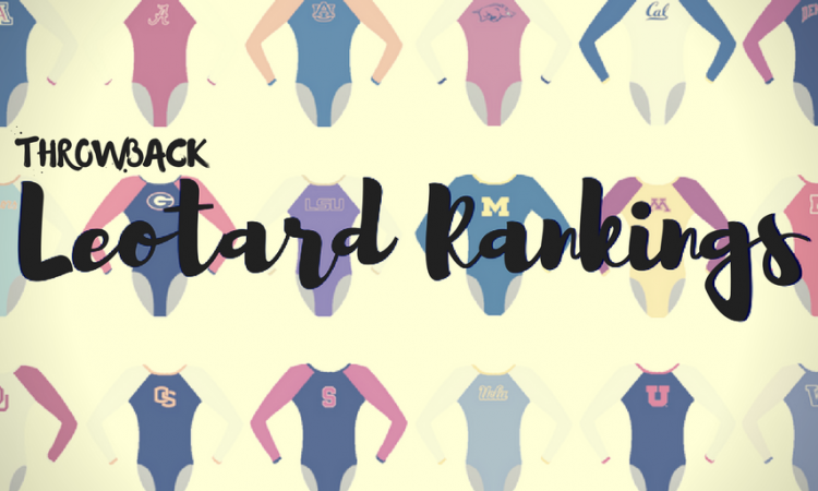
Continuing with the throwback leotard theme, this week we’re taking a look back at the fashion at the 1999 national championships. There was lots of VELVET ALL THE VELVET. Thanks to @1InsanePerson on Twitter for suggesting the meet!
The criteria is the same as during the season. But to refresh your memory: up to three points for design; two points for fabric, sparkle, etc.; and two points for school spirit; three points for overall appearance. But we want to know your thoughts too! Make sure to vote in our poll at the bottom of the page.
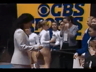
UCLA: 8.2
|
Caroline
Design: 2.2/3 Fabric/Sparkle: 1.6/2 School Spirit: 1.5/2 Overall Appearance: 2.3/3 Total: 7.6/10 Wow! Talk about a stark contrast! UCLA’s bold logo across the chest with the sparkle cascade underneath is almost something I’d expect to see later in the game, almost transitioning into a style of today’s leotards. The white is also very daring and different, which is so Miss Val. If only their leos now were so inspired… |
Christina
Design: 2.4/3 Fabric/Sparkle: 1.9/2 School Spirit: 1.8/2 Overall Appearance: 2.7/3 Total: 8.8/10 I absolutely LOVE the boldness of this one, especially when you look at all the others that are a lot more somber and in velvet. Of course UCLA would be ahead of its time in the leo department, both in fabric and color. Who even wears white leos anymore? I’m obsessed. I really like it, it’s a change from everybody else, makes the gymnasts and team stand out, and the UCLA in golden letters on the front is just perfect. |
Elizabeth
Design: 2.4/3 Fabric/Sparkle: 1.6/2 School Spirit: 1.7/2 Overall Appearance: 2.5/3 Total: 8.2/10 I’m kind of really digging this one. I love the white with the bold UCLA on the front in school colors. The minimal sparkles coming out of the lettering is nice, too, and adds that little bit of extra touch to keep it being just a plain white leo. Plus, this leo stands out at the meet where nearly all the other teams are in dark-colored velvet. |
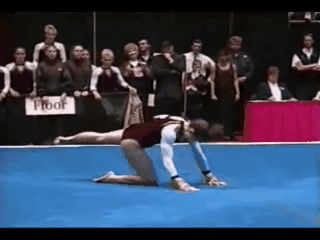
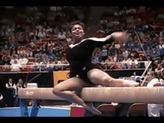
Arizona State: 7.366
|
Caroline
Design: 2.6/3 Fabric/Sparkle: 1.5/2 School Spirit: 1.3/2 Overall Appearance: 2.5/3 Total: 7.9/10 I love this! It’s such a daring design, it’s a fun color and it’s velvet. It almost reminds me of a Catalina Ponor leotard, with the collar neck and keyhole neckline. It’s also got a cool metallic thread detailing around the neck area, which is very different and right up my alley. And the simple white sleeves were a good choice to balance out the rest of the design. Go ASU! |
Christina
Design: 2.7/3 Fabric/Sparkle: 1.6/2 School Spirit: 1.5/2 Overall Appearance: 2.6/3 Total: 8.4/10 ASU in the Super Six, what! This actually might be one of my favorites of the evening along with UCLA. I especially think it looks fantastic in motion and from a distance. The sparkles alongside the neckline and the upper back look great. I love the colors chosen, especially the burgundy velvet for the bodice. The design on the front looks very Ponor/Dominatrix-esque, but it works here and it is very 90s-esque. The choker collar style was so in fashion back then (and is totally making a comeback). I just wish we had a tad more school spirit on there, but overall I really dig the look. |
Elizabeth
Design: 1.5/3 Fabric/Sparkle: 1.4/2 School Spirit: 1.3/2 Overall Appearance: 1.6/3 Total: 5.8/10 Hmm… I have mixed feelings about this one. I like that the design is unlike any other leo in this competition. However, the neckline is SO high and the design looks weird with the maroon band around the neck but the white triangle part of the design on the front. I wish it was a V instead that went down? Also I can only see an M in the front design, which obviously doesn’t go with ASU, so not great on that front either. I do like the maroon sleeve cuffs, though, as they break up the plain white sleeves from being too… plain white… But I do like the back design and the small use of rhinestones so it’s not just two colored fabrics. |
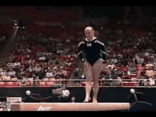
Michigan: 6.533
|
Caroline
Design: 1.9/3 Fabric/Sparkle: 1.1/2 School Spirit: 1.6/2 Overall Appearance: 1.7/3 Total: 6.3/10 …I have no idea whether this is black and white, blue and white, blue and yellow? Anybody? Part of designing leos in today’s gymnastics is thinking about how they look on broadcast, but clearly that didn’t come into play here. However, I do dig the velvet, and this is honestly the most school spirit we’ve seen so I can’t really be that mad. Overall a decent showing. |
Christina
Design: 2.2/3 Fabric/Sparkle: 1.4/2 School Spirit: 1.6/2 Overall Appearance: 2.3/3 Total: 7.5/10 This is decent. I love that Michigan basically never strayed away from putting the ‘M’ on the front of its leos. I like the swirls around the sleeves and it’s a nice change of design from the other teams. The navy velvet looks nice, but I do wish the swirls were in a stronger gold. They almost look silver here, but it might just be a video issue. |
Elizabeth
Design: 1.4/3 Fabric/Sparkle: 1.3/2 School Spirit: 1.5/2 Overall Appearance: 1.6/3 Total: 5.8/10 Oh my. Candy cane arms aren’t doing it for me. It makes her arms look huge and bulky but that’s also partly because of the velvet. I wish the color was more blue and the white was instead yellow, but it’s hard to know the availability of different colored fabrics in 1999. However, this is one with one of the best displays of school spirit, with the block M on the chest for all to see. |
Nebraska: 6.4

|
Caroline
Design: 1.6/3 Fabric/Sparkle: 1.2/2 School Spirit: 1.3/2 Overall Appearance: 1.8/3 Total: 5.9/10 There’s almost nothing to this design, and the faux straight neckline cut is just unflattering. However, I love the bold red and white combination, which adds a nice dose of school spirit as well, and there’s a good shimmer on the sleeves that I like. |
Christina
Design: 2.2/3 Fabric/Sparkle: 1.6/2 School Spirit: 1.6/2 Overall Appearance: 2.4/3 Total: 7.8/10 Ah, I love the bright red! Way to stand out and include the school colors. I am not a fan of the cut on the front; I’ve said it before and I am also 100% aware that this was essentially the fashion back in the day, but it really is not flattering to have that straight line going across the chest. I do like that the neckline is a bit more open than some of the other leos of this competition. Overall though it’s a nice look, and I appreciate the lighter colors and this shade of red. Also, Heather Brink! |
Elizabeth
Design: 1.2/3 Fabric/Sparkle: 1.4/2 School Spirit: 1.4/2 Overall Appearance: 1.5/3 Total: 5.5/10 I, too, love the bright red, as well as the shiny white. However, the design of the neckline and where the colors meet is a big no from me. It makes the gymnasts look way too boxy and not in a good way (can boxy ever be good?). Also, I need more school spirit. Maybe a block N somewhere. |
Alabama: 6.3
|
Caroline
Design: 1.7/3 Fabric/Sparkle: 1.5/2 School Spirit: 1.2/2 Overall Appearance: 1.8/3 Total: 6.2/10 Okay so I had a hard time telling on my screen but that is actually a dark red velvet rather than a black for most of the bodice, which I can appreciate. Got to love those ‘90s trends! The scalloped neckline I could kind of take or leave, but the contrast of the white is really nice all the way down the sleeve. Could’ve done with some more bling or some more school spirit, but a step in the right direction for me. |
Christina
Design: 2.1/3 Fabric/Sparkle: 1.5/2 School Spirit: 1/2 Overall Appearance: 1.8/3 Total: 6.4/10 This is quite dark for me and for Bama (granted I’m comparing to what I’ve been to seeing over the years). I am not a fan of the scalloped design around the neckline in the front, but I really like the back cut with the small hole on the shoulder blades. I do like the use of two different fabrics from what it looks like (velvet darker bodice and shimmery white fabric for the upper body). Overall I do wish it was a bit lighter, but it still is a nice, clean look for Bama. |
Elizabeth
Design: 1.7/3 Fabric/Sparkle: 1.4/2 School Spirit: 1.3/2 Overall Appearance: 1.9/3 Total: 6.3/10 It’s hard to do a light-colored velvet without it looking B.A.D. So I get the kind of mauve/crimson used. However, I had to stare for a second to confirm it was a reddish color and not black on the body of the leo. However, after deciding it isn’t black, I think it looks good with the white on the sleeves. But I don’t like the scalloped design. Also, I need more school spirit. They may be a Bama on the hip or something but even so, more! |
Georgia: 5.733

|
Caroline
Design: 1.6/3 Fabric/Sparkle: 1.3/2 School Spirit: 1.4/2 Overall Appearance: 1.6/3 Total: 5.9/10 This leo is super blah, honestly. The black/silver contrast gets lost with the mesh up top, it’s hard to tell whether that’s an actual difference in fabric or just a reflection in the lighting. There’s also no red in there, so it makes it hard to tell that this is even a Georgia leo. Didn’t impress me. |
Christina
Design: 1.4/3 Fabric/Sparkle: 1.2/2 School Spirit: 1.6/2 Overall Appearance: 1.5/3 Total: 5.7/10 Well, my opinion on silvery, shiny fabric hasn’t changed, but I guess it goes with its time (hello 90s!). Anyways, this is very underwhelming and almost boring to me. I am not a fan of the color schemes, and the design is so simple. Are the sleeves silver mesh or silver solid? I can’t even tell. That said, points for adding the ‘Georgia’ on the front however, or else I honestly wouldn’t have been able to tell which school it was simply by looking at the leo. I wish it had a touch of red or a lighter color somewhere. Overall a bit of a bland look to me. |
Elizabeth
Design: 1.3/3 Fabric/Sparkle: 1.2/2 School Spirit: 1.3/2 Overall Appearance: 1.8/3 Total: 5.6/10 This is brilliant. While the leo doesn’t do much for me as a whole, the fact that it’s SO 1990s is amazing. The small cursive Georgia on the chest, the black VELVET and the shiny arms all pair together to make one fantastic hot mess. While I wish there was some red on there (maybe the shiny be red shiny instead?), overall it’s not terrible. |
Have a throwback meet you want us to judge? Stick it in the comments or hit us up on Twitter, and we’ll try to get to it in the coming weeks!