Gymnastics fans love leotards, it’s just a fact. We love seeing new designs, creating our own, and especially judging them. That’s why we’re back for another season of leotard rankings! Each week we’re analyzing new designs to find our weekly faves. Here’s the rubric we’re working with:
- Design (3): How strong the overall design is in terms of color, balance, composition, and visual flow. Does it feel intentional and cohesive?
- Construction (2): Quality of materials, fit, finish, and sparkle application. Does the leotard look well-made and flattering in motion and on camera?
- Concept & Identity (2): How successfully the leotard communicates a clear concept or identity through design choices — balancing team branding with creativity and cohesion. Does it feel like this team in a good way?
- Overall Appearance (3): The general visual impression: Does the leotard stand out (positively) on the floor? Is it polished, elegant, and memorable?

Don’t agree with our ranking? Make your opinion heard by voting in the fan poll at the end of the article each week or by voicing your thoughts on social media!
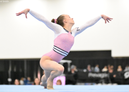
Florida: 8.675

View images of this leotard here.
Elizabeth: 8.900
Design 2.5/3, Construction 2.0/2, Concept & Identity 1.9/2, Overall Appearance 2.5/3
This might be my favorite leotard of nationals. Me? Liking a Florida leo? I’m as shocked as you. But I love the firework design and how the blue, orange, and silver rhinestones play with each other. Plus, the cut is really flattering on all the gymnasts.
Rebecca S: 9.100
Design 2.8/3, Construction 1.7/2, Concept & Identity 1.9/2, Overall Appearance 2.7/3
This leotard stays true to what we expect Florida leotards to look like while still being different enough to be exciting. The colored sparkles just glow and something about the way the bigger gems are placed gives it a bit of luxury. It’s restrained but still flashy enough to be fun. I love it.
Frances: 9.000
Design 2.6/3, Construction 2.0/2, Concept & Identity 1.8/2, Overall Appearance 2.6/3
I heartily declared this one as my favorite at finals. I like an all-black moment and the starburst pattern is pretty. While it’s not exactly a standout for me in the grand scheme, there’s really nothing I don’t like about this leo.
Mary Emma: 7.700
Design 2.0/3, Construction 1.8/2, Concept & Identity 1.8/2, Overall Appearance 2.1/3
It’s not my favorite leotard, but it’s not bad or anything. The firework pattern is cool and makes the design stand out from other black leotards.
Air Force: 8.275

View a video of this leotard here and images here.
Elizabeth: 7.500
Design 2.0/3, Construction 1.7/2, Concept & Identity 1.8/2, Overall Appearance 2.0/3
I love a special one-off leo to mark the special occasion of an individual making nationals (or regionals). I also love how Air Force has leaned into tangentially related divisions this season with its designs. This leotard in particular is a good one. I like how the black and blue pair together.
Rebecca S: 7.900
Design 2.1/3, Construction 1.6/2, Concept & Identity 2.0/2, Overall Appearance 2.2/3
You can’t fault Air Force on commitment. I find this one a smidge clunky in execution, with details like the upper chest ‘necklace’ and collar not quite making sense to me, and the logo a bit heavy handed for my aesthetic taste. But you can’t fault this one on school pride, and for a first time nationals experience, that’s a good thing.
Frances: 8.900
Design 2.3/3, Construction 2.0/2, Concept & Identity 2.0/2, Overall Appearance 2.6/3
The density of the rhinestones makes the symbol and text on the back really stand out, which is key for a dedication leo. Otherwise, the decor is well-balanced, and all elements feel like they have a place.
Mary Emma: 8.800
Design 2.5/3, Construction 1.8/2, Concept & Identity 2.0/2, Overall Appearance 2.5/3
I love it when teams let an individual debut a leotard at nationals, especially with this being a dedication leo. Overall, I love this one! I love the blue ombré sleeves, and it was a great touch to use the rhinestones for the symbol on the back.
LSU: 7.975

View a video and images of this leotard here.
Elizabeth: 7.800
Design 2.2/3, Construction 1.6/2, Concept & Identity 1.7/2, Overall Appearance 2.3/3
Very similar to LSU’s nationals-winning leotard from 2024, which I believe has been retired now. Just like with Oklahoma, it feels like more of a design for the final yet it was worn for the semifinal! For the design itself, though, I like the white, the purple accents, and the ombre sleeves.
Rebecca S: 8.000
Design 2.6/3, Construction 1.6/2, Concept & Identity 1.4/2, Overall Appearance 2.4/3
This is very pretty. It’s also similar enough to this one that I probably wouldn’t have noticed it was new if I wasn’t told. The ombre against the cleanness of the white is lovely, and the sparkle swoops are distinct without being chunky and overdone. I’m just missing a bit of excitement.
Frances: 7.300
Design 1.9/3, Construction 1.8/2, Concept & Identity 1.6/2, Overall Appearance 2.0/3
The draping gem pattern is regal, perfect for a nationals leo. I am personally not a fan of the illusion halter neckline shape because I don’t feel like it’s flattering on anyone. But overall, it’s a nice yet simple take on a white leo.
Mary Emma: 8.800
Design 2.6/3, Construction 1.8/2, Concept & Identity 1.8/2, Overall Appearance 2.6/3
I love this one! The chandelier design on the front is pretty, and I love the purple ombré sleeves. The neck isn’t my favorite, but overall, this is a good one.
LSU: 7.925

View images and a video of this leotard here.
Elizabeth: 7.800
Design 2.2/3, Construction 1.4/2, Concept & Identity 2.0/2, Overall Appearance 2.2/3
I like when teams base their designs on other aspects of their campus or peers. The design itself isn’t my favorite, but I do like the purple paired with a black base (thank god they didn’t try to do white and gold). However, I can’t unsee the poor execution around the shoulder seams. I get what it was going for with trying to go past the boundary into the mesh, but you already had a perfect stopping point and chose to ignore it.
Rebecca S: 6.700
Design 1.8/3, Construction 1.3/2, Concept & Identity 1.7/2, Overall Appearance 1.9/3
This is just a bit heavy handed for me, and a lot of the details don’t make sense to my eye, like the upper body shaping (why not just leave the matte black all the way out to the shoulder seams and avoid that line?) and the fact that the two shades of purple don’t match at all. It’s bold and different and memorable, so points for that.
Frances: 8.600
Design 2.6/3, Construction 1.5/2, Concept & Identity 2.0/2, Overall Appearance 2.5/3
I appreciate the boldness of the purple against the black base and as a whole I like this leo. The pattern on the front is very Louisiana. But though it’s not super complex, the overall design is somehow a tad busy.
Mary Emma: 8.600
Design 2.6/3, Construction 1.4/2, Concept & Identity 2.0/2, Overall Appearance 2.6/3
Love this! The purple really pops on the black, and of course I love the ombré sleeves. I really like when schools pay homage to something that is unique to them.
UCLA: 7.800

View a video and images of this leotard here.
Elizabeth: 7.400
Design 2.4/3, Construction 1.2/2, Concept & Identity 1.7/2, Overall Appearance 2.1/3
I have a mixed reaction to this design. I love whenever UCLA uses gold, especially gold fabric, because in my opinion, gold rhinestones don’t do a good enough job of popping on a leotard in motion. However, those back straps make the leotard fit kind of weird on the gymnasts around the sides, which I feel like isn’t normally an issue, even with leotards with similar backs. But here, it makes it look like the leotards don’t fit properly. Or maybe they just don’t fit properly.
Rebecca S: 9.000
Design 2.6/3, Construction 1.7/2, Concept & Identity 1.9/2, Overall Appearance 2.8/3
I’m nostalgic for UCLA being a permanently navy team and I love metallics, so this checks a lot of the boxes for me. This feels more “UCLA” to me than any other leotard of the Janelle era. I agree that this one was a smidge bunchy and I don’t necessarily understand what we were going for with the sleeves. But the back is lovely and the gold really shone on TV. I think the variety of sparkles used here is really well thought-out, too.
Frances: 8.300
Design 2.5/3, Construction 1.5/2, Concept & Identity 1.8/2, Overall Appearance 2.5/3
I really like the use of a deeper shade of blue with gold accents, and that’s not something we always see from UCLA. I appreciate the density of the rhinestones. The overall design is effective.
Mary Emma: 6.500
Design 1.5/3, Construction 1.6/2, Concept & Identity 1.6/2, Overall Appearance 1.8/3
I like the shade of blue, but I’m not a huge fan of the pattern of the gold accents. I like that they pop, but they are just a little bit too much for my liking.
Oklahoma: 7.525

View a video of this leotard here and images here.
Elizabeth: 7.800
Design 2.1/3, Construction 1.8/2, Concept & Identity 1.7/2, Overall Appearance 2.2/3
I really like the sleeves with the solid part on top of the mesh. This style of collar is never my favorite, though. It’s a fine leotard, but it doesn’t knock my socks off.
Rebecca S: 6.900
Design 1.8/3, Construction 1.5/2, Concept & Identity 1.6/2, Overall Appearance 2.0/3
This one is just OK to me, which makes it a bit of a disappointment as a championship leotard. As someone who usually hates very chunky sparkle density, the red over the bust weirdly does work for me. The shaping of the white mesh vs matte white around the shoulders doesn’t. From a distance, it’s fine but nothing to write home about.
Frances: 7.700
Design 2.2/3, Construction 1.7/2, Concept & Identity 1.5/2, Overall Appearance 2.3/3
This one feels like a collection of parts that don’t exactly align, but I don’t hate it. The rhinestones deliver a nice shade of red, and I’m a fan of a color-block. I’m not sure about the pointy shapes down the sleeves, but at least it’s matched on the front.
Mary Emma: 7.700
Design 2.3/3, Construction 1.8/2, Concept & Identity 1.6/2, Overall Appearance 2.0/3
I really like this one! The white really makes the red bodice pop. Honestly though it doesn’t feel like a championship leotard to me, but it’s solid overall.
Oklahoma: 7.350

View a video of this leotard here and images here.
Elizabeth: 8.400
Design 2.4/3, Construction 1.7/2, Concept & Identity 1.8/2, Overall Appearance 2.5/3
This sleeves-over-body style is popular this year, apparently. I’m still not a fan, but I think I like this iteration OK. Honestly, my real beef with this leotard is that it felt like a title-winning team final design! Not necessarily a bad thing, just an observation.
Rebecca S: 6.500
Design 1.4/3, Construction 1.7/2, Concept & Identity 1.8/2, Overall Appearance 1.6/3
When will the chest hole trend end!! This is a well thought-out and carefully executed iteration of a concept that I just don’t like. This could never be anything but an Oklahoma leotard, so points for visual identity, I guess.
Frances: 8.200
Design 2.5/3, Construction 1.8/2, Concept & Identity 1.5/2, Overall Appearance 2.4/3
I LOVE the look of the upper section. More of that, please. What I don’t love is that as a whole the piece doesn’t feel cohesive. The arched shape of the lower half cuts off strangely anyway so maybe it would have been better off without it.
Mary Emma: 6.300
Design 1.5/3, Construction 1.5/2, Concept & Identity 1.5/2, Overall Appearance 1.8/3
I’m not really a fan of the sleeves over the bodice look. It just doesn’t look very cohesive. And it also has a sternum hole which is one of my biggest pet peeves. It’s very Oklahoma, but I’m not a huge fan.
Georgia: 6.950

View a video and images of this leotard here.
Elizabeth: 7.500
Design 2.0/3, Construction 1.7/2, Concept & Identity 1.7/2, Overall Appearance 2.1/3
I like the horizontal design here, as well as the square rhinestones used. Otherwise, it wasn’t quite as flashy as I wanted it to be in person. The rhinestones weren’t sparkly or plentiful enough to pop, making it skew a tad more toward the boring side for a brand-new design brought out for nationals.
Rebecca S: 6.100
Design 1.4/3, Construction 1.6/2, Concept & Identity 1.6/2, Overall Appearance 1.5/3
I don’t like the horizontal concept, honestly. I don’t find it visually interesting or flattering. I do really like that the red sparkles stand out on an otherwise black & white design, and using square gems for contrast is clever. The upper chest shaping and neckline sparkle cluster doesn’t make a lot of sense to me.
Frances: 8.000
Design 2.4/3, Construction 1.6/2, Concept & Identity 1.5/2, Overall Appearance 2.5/3
I agree with Elizabeth that there should be more bling, but for me, this is a solid design. Something nitpicky is the fact that the gymnasts felt like they had to tape the hook on the collar to keep it clasped. It sort of ruins the look of the design.
Mary Emma: 6.200
Design 1.5/3, Construction 1.4/2, Concept & Identity 1.5/2, Overall Appearance 1.8/3
Another day, another black Georgia leo. I do like how the red pops on the black, but overall it’s kind of boring to me.
Fan Poll
Congrats to Florida for winning last week’s fan poll! Vote for your favorite design from this week here.
READ THIS NEXT: The Gophers Are Truly Golden: History-Making Competition Ends With Minnesota’s First National Final Berth
Judged by Elizabeth Grimsley, Rebecca Scally, Frances Leadman, and Mary Emma Brambila