Gymnastics fans love leotards; it’s just a fact. We love seeing new designs, creating our own, and especially judging them. That’s why we’re back for another season of leotard rankings! Each week we’re analyzing new designs to find our weekly faves. Here’s the rubric we’re working with:
- Design (3): How strong the overall design is in terms of color, balance, composition, and visual flow. Does it feel intentional and cohesive?
- Construction (2): Quality of materials, fit, finish, and sparkle application. Does the leotard look well-made and flattering in motion and on camera?
- Concept & Identity (2): How successfully the leotard communicates a clear concept or identity through design choices — balancing team branding with creativity and cohesion. Does it feel like this team in a good way?
- Overall Appearance (3): The general visual impression: Does the leotard stand out (positively) on the floor? Is it polished, elegant, and memorable?

Don’t agree with our ranking? Make your opinion heard by voting in the fan poll at the end of the article each week or by voicing your thoughts on social media!
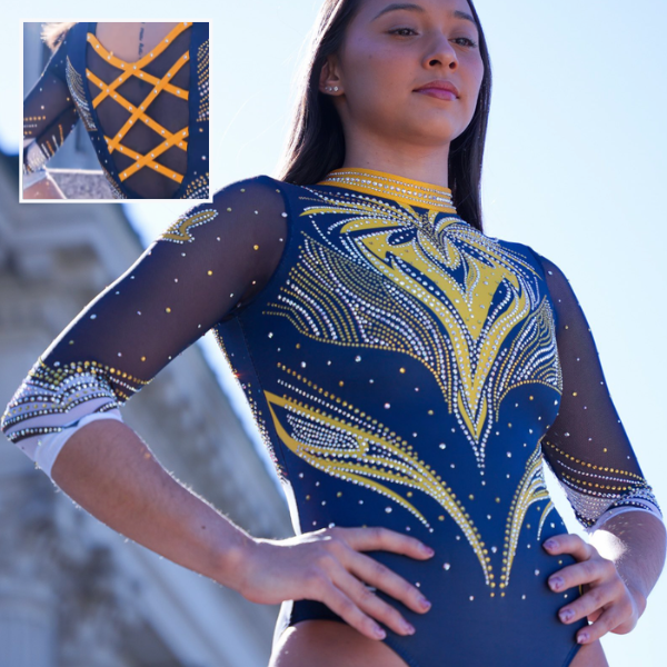
Southern Connecticut: 8.150
View a video of this leotard here.
Elizabeth: 7.800
Design 2.2/3, Construction 1.7/2, Concept & Identity 1.7/2, Overall Appearance 2.2/3
This is really nice! I feel like in the past, SCSU has stuck mostly to neutrals with pops of colors, so it’s a nice change of pace to see such a vibrant design. I like the shades of blue, the pattern on the chest, and the subtle nod to school spirit on the back.
Sarah: 7.600
Design 2.1/3, Construction 1.8/2, Concept & Identity 1.6/2, Overall Appearance 2.1/3
This is so pretty! I absolutely love the use of color here, and the silver detailing is absolutely stunning. I also think the neckline and back straps function really well with the design. This is a nice, reliable design that SCSU will be able to use for years to come.
Katherine: 8.000
Design 2.4/3, Construction 1.7/2, Concept & Identity 1.5/2, Overall Appearance 2.0/3
This is very pretty and I like the understated ombre on the body, but it gives UCLA vibes with the shade of blue and tendril design. One thing I would have changed is removing the band on the front, but that’s a small complaint.
Mary Emma: 9.200
Design 2.8/3, Construction 1.8/2, Concept & Identity 1.8/2, Overall Appearance 2.8/3
This is fun! I really like the swirly design on the front, and the strappy back is fun. Plus, the shade of blue is really pretty.
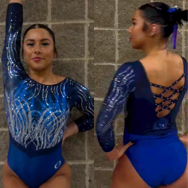
Utah: 8.100
View images of this leotard here and a video here.
Elizabeth: 7.400
Design 2.0/3, Construction 1.6/2, Concept & Identity 1.8/2, Overall Appearance 2.0/3
One strike for the stock design, then an additional 15 for the cartoon hands; it just gives off such a cheesy vibe. I mean, I like the concept in general, but I also can’t think of how it could have been done in a better way. Maybe just a smaller visual on the sleeve? What annoys me most, though, is that this could have been a pretty good leo otherwise.
Sarah: 7.800
Design 2.1/3, Construction 1.8/2, Concept & Identity 1.9/2, Overall Appearance 2.0/3
I love the rhinestone choice on this, and I think the sleeves are really cool, particularly the Go Utes, which stands out nicely. The Utah-specific details of this leotard feel very intentional, and the meaning comes off well, but I agree that I don’t love the U hands on the back. It contrasts a lot from what is otherwise a very elegant leo.
Katherine: 8.200
Design 2.4/3, Construction 1.7/2, Concept & Identity 1.8/2, Overall Appearance 2.3/3
The U hands are so ridiculous that they work for me as a concept on their own, but I would have liked to see them on a design that is less “elegant” overall, because they take away from the rest of it even though they’re on the back. Ohio State’s Venom/”Buckeye” and Stanford’s Angry Tree are two designs that achieved what I would have liked to see with the hands here. Otherwise, I do like the leo for the most part.
Mary Emma: 9.000
Design 2.6/3, Construction 1.8/2, Concept & Identity 1.8/2, Overall Appearance 2.8/3
It’s definitely a stock design, but it’s a good one, though I do feel like the straps on the front are a little too thick. The red rhinestones really pop on the white, and the U hands on the back are a fun addition.
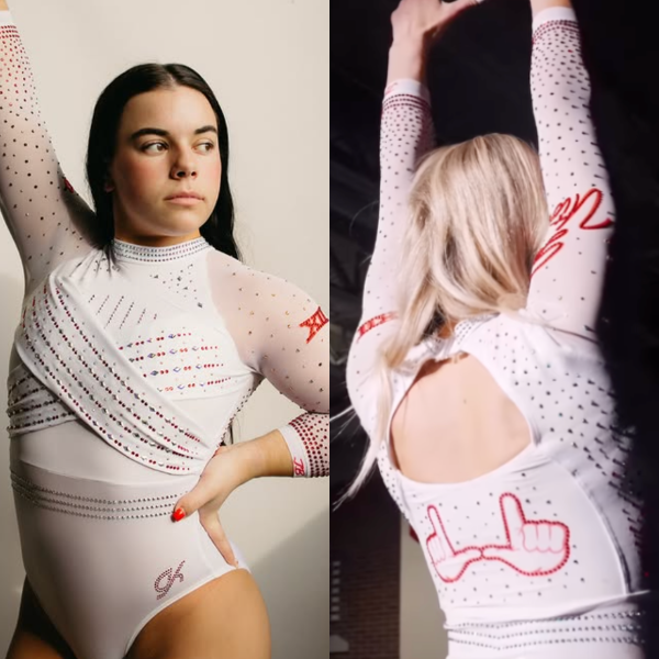
Temple: 7.850
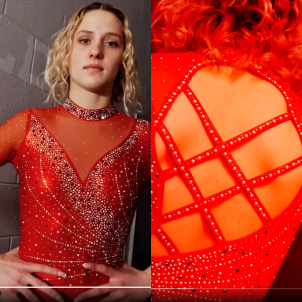
View a video of this leotard here.
Elizabeth: 8.000
Design 2.2/3, Construction 1.8/2, Concept & Identity 1.6/2, Overall Appearance 2.4/3
The sheer amount of rhinestones takes this from being a boring plain red leo to something more. The varying-sized and colored rhinestones create a cool effect and really help the design stand out. I also love how the back hole swoops to the side to mirror the front. The thick collar is a fun touch to tie in with the thicker pattern along the border with the mesh.
Sarah: 7.000
Design 1.8/3, Construction 1.7/2, Concept & Identity 1.6/2, Overall Appearance 1.9/3
This is a really fun design. The rhinestones feel very intentional and well-placed, and I like the use of different colored rhinestones as well. The mesh on the front isn’t my favorite, but I do like how it creates contrast between the bodice and the sleeves.
Katherine: 9.100
Design 2.8/3, Construction 1.7/2, Concept & Identity 1.8/2, Overall Appearance 2.8/3
This feels like a brighter and more vibrant red than we usually see from Temple’s “cherry” color palette, maybe because it’s on the entire design instead of just a few elements like on this one from last season. The contrasting sparkles look really pretty, and I love how they encrust on the front. Another winner for the Owls!
Mary Emma: 7.300
Design 2.0/3, Construction 1.5/2, Concept & Identity 1.6/2, Overall Appearance 2.2/3
There’s nothing bad about it, but it doesn’t scream Temple to me. The asymmetrical back is nice though, and different from most other strappy backs. I’m not a huge fan of the high collar, but the rhinestone swirl pattern is pretty.
Oregon State: 7.225

View a video of this leotard here.
Elizabeth: 7.500
Design 2.0/3, Construction 1.8/2, Concept & Identity 1.6/2, Overall Appearance 2.1/3
This is what I want from a black leo that still incorporates a little bit of color. I love how bright and bold the orange is, as well as how it transitions from the front to back. The front pattern isn’t my favorite, but I do like it in motion.
Sarah: 7.800
Design 2.1/3, Construction 1.7/2, Concept & Identity 1.7/2, Overall Appearance 2.3/3
I love the placement of the orange and white on this. The contrasting directions of the “arrows” on the front are really unique and make this stand out nicely. I wish the placement of the rhinestones aligned more with the arrows, but I really like this overall!
Katherine: 6.200
Design 2.1/3, Construction 1.4/2, Concept & Identity 1.1/2, Overall Appearance 1.6/3
Um, is that really orange? Before I saw “OSU” on the back and the Pac-12 logo on the front, my very first glance at this leo made me think it was a Georgia design, because I see red when I look at that color. Notwithstanding that cognitive dissonance, there’s not much that stands out about this design. It also feels a little dated, like it belongs in 2017 or 2018. I normally really like Oregon State’s leos, but this one is too boring to hit the mark for me.
Mary Emma: 7.400
Design 2.2/3, Construction 1.5/2, Concept & Identity 1.5/2, Overall Appearance 2.2/3
This is nice! I like how the orange and white pop on the black. And the strappy back is pretty.
California: 6.450
View videos and images of this leotard here.
Elizabeth: 6.100
Design 1.6/3, Construction 1.5/2, Concept & Identity 1.2/2, Overall Appearance 1.8/3
This reads Michigan to me. While I like the colored rhinestones, I don’t really care for the design itself. It’s a bit too busy and chaotic for my taste.
Sarah: 6.200
Design 1.5/3, Construction 1.5/2, Concept & Identity 1.5/2, Overall Appearance 1.7/3
I love the sleeves and the contrasting rhinestone colors throughout, and I think the strappy back is a unique approach to a high-neck leo. However, the front doesn’t completely mesh with the rest of the design for me. California doesn’t use the bright gold much in its designs, though, so it is nice to see it here.
Katherine: 5.400
Design 1.3/3, Construction 1.3/2, Concept & Identity 1.1/2, Overall Appearance 1.8/3
I feel like I should like this more than I do, but I’m not the biggest fan. The flame design could have turned out more vibrant, and I would have rather seen the back without the mesh between the straps.
Mary Emma: 8.100
Design 2.5/3, Construction 1.5/2, Concept & Identity 1.5/2, Overall Appearance 2.6/3
I definitely thought this was a Michigan leo when I first saw it, but it’s a good one from Cal! Definitely pretty busy, but I think it works well here.
Arkansas: 6.625

View a video of this leotard here.
Elizabeth: 6.800
Design 2.0/3, Construction 1.6/2, Concept & Identity 1.2/2, Overall Appearance 2.0/3
My first thought was, “Another red leotard, how original.” And while it has grown on me and there are elements I like (the darker red playing with the lighter shade, the multi-sized rhinestones), it’s still pretty boring.
Sarah: 6.600
Design 1.9/3, Construction 1.7/2, Concept & Identity 1.0/2, Overall Appearance 2.0/3
This doesn’t really stand out much from Arkansas’ other designs for me. It’s pretty, and I do like the contrast between the shades of red, but there’s nothing to distinguish it as being distinctly Arkansas besides the mascot on the sleeve.
Katherine: 6.300
Design 1.9/3, Construction 1.7/2, Concept & Identity 10.8/2, Overall Appearance 1.9/3
There’s nothing really wrong with it, but it’s pretty dull and just like a typical leo we’d see from Arkansas; I would not have guessed it was new. I wish the back incorporated some straps as well. One element I do feel is a cut above is the extra sparkles clustered at various parts of the body and neck.
Mary Emma: 6.800
Design 2.0/3, Construction 1.2/2, Concept & Identity 1.6/2, Overall Appearance 2.0/3
Meh, it’s fine. I know colorwise Arkansas doesn’t have a lot to work with, but all its leos just blend together for me. The swirly rhinestone design is nice and does make this one stand out more though.
Utica: 5.475
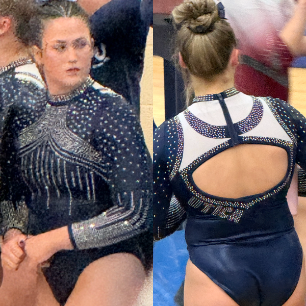
Elizabeth: 5.600
Design 1.5/3, Construction 1.3/2, Concept & Identity 1.3/2, Overall Appearance 1.5/3
This is a leo I like better from afar. But up close, I don’t think I really get some of the design choices. Is the navy semi-circle part on the back supposed to mean something? If not, it’s very random. The white is also pretty random. I like the back hole and Utica on the side, as well as the incredible amount of rhinestones on the front. Overall though it just feels like a pretty disjointed design that doesn’t scream Utica.
Sarah: 5.700
Design 1.5/3, Construction 1.2/2, Concept & Identity 1.4/2, Overall Appearance 1.6/3
I really love the back of this leotard! The white provides a color contrast that stands out in a good way. Unfortunately, the back and the front feel like they should be two different leotards. I would have loved them both separately, but I’m not convinced that they entirely work as one piece.
Katherine: 4.700
Design 1.3/3, Construction 1.0/2, Concept & Identity 1.3/2, Overall Appearance 1.4/3
The different sparkle patterns on the front are just too much all together for this design to work for me, but the back is better. At first I wasn’t sure how I felt about Utica only being on one side of the back and the resulting asymmetry, but I think I landed on it being OK, and it’s definitely a different way to do school spirit.
Mary Emma: 5.900
Design 1.5/3, Construction 1.3/2, Concept & Identity 1.6/2, Overall Appearance 1.5/3
This is very blinged out for a DIII leotard and different from anything I’ve seen. I’m not sure I love the design on the front, but the back is pretty cool and unique.
BONUS: Nastia Liukin Cup: 8.550
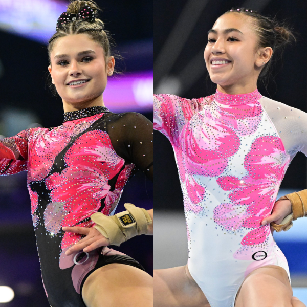
View images of this leotard here.
Elizabeth: 8.000
Design 2.4/3, Construction 1.5/2, Concept & Identity 1.7/2, Overall Appearance 2.4/3
I’m actually pleasantly surprised with the designs this year. The past couple haven’t been my cup of tea, probably because that dusty baby pink looks good on so few people. But these are quite nice. I like the varying shades of pink in the sort of abstract floral pattern, as well as the asymmetric design with one mesh sleeve and one solid, colored one. I also love a return to lots of black for the seniors.
Sarah: 8.400
Design 2.5/3, Construction 1.7/2, Concept & Identity 1.6/2, Overall Appearance 2.6/3
The black version of the leo is absolutely gorgeous. The collar design and the rhinestoning throughout are amazing, and the mesh sort of cutting through the design on the patterned sleeve is really unique. The junior version doesn’t pop as much to me but is still really nice.
Katherine: 8.800
Design 2.7/3, Construction 1.7/2, Concept & Identity 1.7/2, Overall Appearance 2.7/3
These are my favorite designs of the week, and they’re not even from a college team. I love the watercolor-effect flowers; that is a very in design right now that they were clever to include here. The flowers look great with all the other elements too. I like the black version better because it feels so unique, even though the seniors wear a black and pink design every year; something about the hot pink and black feels different than what we’ve ever seen before.
Mary Emma: 9.000
Design 2.7/3, Construction 1.7/2, Concept & Identity 1.8/2, Overall Appearance 2.8/3
LOVE. I usually like the Nastia Cup design anyway, but this is definitely one of my favorites! The watercolor flower design is lovely and really stands out on the black/white background.
Fan Poll
Congrats to Iowa for winning last week’s fan poll! Vote for your favorite design from this week here.
READ THIS NEXT: The Dismount: Week 10
Judged by Elizabeth Grimsley, Sarah Smith, Katherine Weaver, and Mary Emma Brambila