Gymnastics fans love leotards; it’s just a fact. We love seeing new designs, creating our own, and especially judging them. That’s why we’re back for another season of leotard rankings! Each week we’re analyzing new designs to find our weekly faves. Here’s the rubric we’re working with:
- Design (3): How strong the overall design is in terms of color, balance, composition, and visual flow. Does it feel intentional and cohesive?
- Construction (2): Quality of materials, fit, finish, and sparkle application. Does the leotard look well-made and flattering in motion and on camera?
- Concept & Identity (2): How successfully the leotard communicates a clear concept or identity through design choices—balancing team branding with creativity and cohesion. Does it feel like this team in a good way?
- Overall Appearance (3): The general visual impression: Does the leotard stand out (positively) on the floor? Is it polished, elegant, and memorable?

Don’t agree with our ranking? Make your opinion heard by voting in the fan poll at the end of the article each week or by voicing your thoughts on social media!
Illinois: 9.025

View a video of this leotard here.
Elizabeth: 8.900
Design 2.6/3, Construction 1.7/2, Concept & Identity 1.9/2, Overall Appearance 2.7/3
I looove this! Everything from the matte white to the stripes gives it such an athletic yet polished look. The rhinestones elevate the look without taking away from the Illinois script. The back straps are so fun and tie in with the rest of the design well.
Peri Goodman: 9.300
Design 2.8/3, Construction 1.8/2, Concept & Identity 1.9/2, Overall Appearance 2.8/3
I’m. In. Love. Everything on this leo serves a purpose, and each choice looks very deliberate. The cherry on top for me is the sublimated Illinois script on the ribbed fabric, and how its flat texture allows the stones and mystique underneath to come into the foreground with their definition.
Julianna: 9.200
Design 2.8/3, Construction 1.7/2, Concept & Identity 1.9/2, Overall Appearance 2.8/3
I love that more teams are adding this type of leotard to their collections; I’m obsessed with the athletic, almost jersey-like leotard! The detailing is beautiful, from the placement of the orange throughout to the gem detailing, especially on the back panelling. The Illinois script is really nice; it’s a large text, but not overwhelming. Really love this addition!
Rebecca S: 8.700
Design 2.4/3, Construction 1.8/2, Concept & Identity 2/2, Overall Appearance 2.5/3
I’m intrigued by the mix of fabrics: We’ve seen more of this ribbed fabric this year, and it looks really comfy. The Illinois colors are an advantage here, as they are bold but not gaudy, and the athletic concept works.
Missouri: 8.550
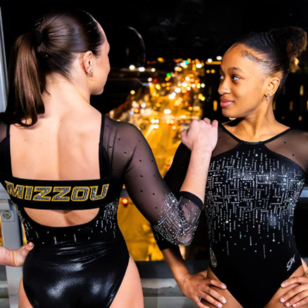
View a video and images of this leotard here.
Elizabeth: 8.700
Design 2.4/3, Construction 1.9/2, Concept & Identity 1.8/2, Overall Appearance 2.6/3
When I first saw the teaser, I was worried I would be a bit underwhelmed by this leotard, but I’m pleasantly surprised. Sure, it’s not the most interesting in the world, but I really like the rhinestone design, the big, bold Mizzou on the back, the cut of the neckline, and how it’s designed with no shoulder seams.
Peri Goodman: 8.700
Design 2.5/3, Construction 2.0/2, Concept & Identity 1.5/2, Overall Appearance 2.7/3
If Iowa got to design a Missouri leotard, I’m fairly convinced it’d look like this. I’m a fan of how the rhinestone pattern dials in on being geometric without coming off as gimmicky, and that it carries through the back and the sleeves. The back strap also looks like it’s structurally part of the leotard rather than added on—that’s got to be way more comfortable!
Julianna: 8.800
Design 2.5/3, Construction 1.8/2, Concept & Identity 1.8/2, Overall Appearance 2.7/3
LOVE this! This leotard fits seamlessly into the rest of Mizzou’s collection, and is perfect for any competition. I do wish it was a little more unique since the Tigers have come up with such great concepts in the past, but nonetheless this is really beautiful and sleek. I love the Mizzou across the back and how the front is kept simple with the one color and gems, I just wish the leo had a little more somewhere else.
Rebecca S: 8.000
Design 2.2/3, Construction 1.8/2, Concept & Identity 1.6/2, Overall Appearance 2.4/3
Simple, but it works. I like to have a pop of color somewhere on black and white designs, and the team name on the back of this leotard does this nicely. My nitpick is that the sparkles on the arm are a bit odd; they seem to start quite abruptly at the elbow. I’m not sure if the idea was to have a cuff design or something.
SEMO: 8.200

View images of this leotard here.
Elizabeth: 8.200
Design 2.4/3, Construction 1.7/2, Concept & Identity 1.6/2, Overall Appearance 2.5/3
I love a good red and white combo. The bodice design has everything I want—sweetheart neckline, multicolored rhinestones, matte white. I also love the thicker collar-style neck, and the open back. A good one!
Peri Goodman: 7.300
Design 2.0/3, Construction 1.5/2, Concept & Identity 1.5/2, Overall Appearance 2.3/3
It’s tricky to reinvent the red and white split, but SEMO understands that and sticks to what’s tried and true. The stones carry this look across multiple sizes and colors, while still working along with where the fabric changes and at the open back.
Julianna: 8.000
Design 2.3/3, Construction 1.6/2, Concept & Identity 1.5/2, Overall Appearance 2.6/3
This is nice! It’s giving Arkansas with the red and white color blocking, but I really like the sweetheart neckline that goes into the mesh high neck. I also really like the back, and that it is open but still embellished with the different size gems. SEMO took something that could have been boring and really added a lot of intricate pieces to it, and it came out stunning.
Rebecca S: 9.300
Design 2.8/3, Construction 1.9/2, Concept & Identity 1.7/2, Overall Appearance 2.9/3
This is lovely. The white looks beautiful and clean in this design, with not too much to distract from it but not too little that it’s boring. The use of red sparkles is very effectual. Maybe not a revolutionary design, but an elegant and thoughtful one.
Kent State: 8.175
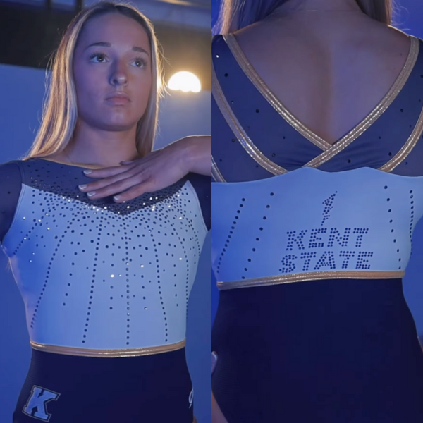
View a video of this leotard here.
Elizabeth: 8.600
Design 2.5/3, Construction 1.8/2, Concept & Identity 1.8/2, Overall Appearance 2.5/3
Another new Kent State leo?! And it’s gorgeous?! I love the vibes of the new Kent State designs this season. The white matte is great, I love the shades of gold and blue used, and the little rhinestone lightning bolt is so fun. This reminds me a bit of one of UC Davis’ newer designs (and that’s a good thing). Kent State is stepping up its game!
Peri Goodman: 8.900
Design 2.6/3, Construction 2.0/2, Concept & Identity 1.7/2, Overall Appearance 2.6/3
This leo looks way better without the blue lighting from the reveal video, and I’m so excited seeing this team now have two new leos in the same season that match the school’s current athletics branding. It’s a clean mix of fabrics and sparkle, while still following along with the less-is-more approach.
Julianna: 8.800
Design 2.7/3, Construction 1.7/2, Concept & Identity 1.7/2, Overall Appearance 2.7 /3
Only week five and Kent State has put out some stunning leos! I love how the white body on the front that comes to a point at the top of the chest also has that same subtle point detailing on the back. The shimmer is just enough, and I appreciate the inclusion of all the school’s colors. This is really well done and looked beautiful in action.
Rebecca S: 6.400
Design 1.9/3, Construction 1.2/2, Concept & Identity 1.2/2, Overall Appearance 2.1/3
There’s a lot about this that I like. The gold piping works really well, although I wonder if Kent State could have used a bit more of it to handle the fact that the way the white bodice joins the blue mesh is a bit awkward in places.
George Washington: 7.950

View images of this leotard here.
Elizabeth: 8.200
Design 2.3/3, Construction 1.8/2, Concept & Identity 1.7/2, Overall Appearance 2.4/3
This second iteration of the Alex deMoura tribute leo is a good one. I love how the gold piping on the back flows into the back straps, as well as the rhinestone pattern on the bodice and how it sort of surrounds the GW logo.
Peri Goodman: 6.400
Design 2.0/3, Construction 1.5/2, Concept & Identity 1.7/2, Overall Appearance 2.2/3
My eye goes right away to how the shape of the gold back straps look like a jewel, and that it can do so without being out of place relative to the rest of the design. GW has shown us over the last few years that it knows how to pair dark blue with its beige-shifted gold, and this is no different. In an ideal world, I’d love to see a design element that joins the sleeves with the shoulders to further sell the connection between the two.
Julianna: 8.800
Design 2.5/3, Construction 1.6/2, Concept & Identity 2.0/2, Overall Appearance 2.7/ 3
I love that George Washington is continuing this tradition with its second Alex deMoura leotard. I’m especially a fan of the angled back straps and the gem placement on the front. This is a really beautiful leotard with an even more wonderful dedication, and fits great into what George Washington already has in its wardrobe.
Rebecca S: 8.400
Design 2.2/3, Construction 1.8/2, Concept & Identity 2/2, Overall Appearance 2.4/3
Definitely a winner! This expresses the team’s visual identity really beautifully while also just being a nice piece of clothing. The many different ways that lines and angles are used in this design complement each other nicely and make the leotard visually interesting without being too busy.
Wilberforce: 7.750

Elizabeth: 8.600
Design 2.5/3, Construction 1.8/2, Concept & Identity 1.8/2, Overall Appearance 2.5/3
I know this is a swing, but I really like it. The shade of yellow is warm and sunny, and I love the green accents. To me, it’s not too much. I actually can’t think of much I would change; maybe slightly more green?
Peri Goodman: 8.200
Design 2.4/3, Construction 1.5/2, Concept & Identity 1.8/2, Overall Appearance 2.5/3
I give Wilberforce credit for using yellow as the base; it reminds me of Team Brazil! Going bold with the color allows the design elements to be less flashy, and it looks amazing in motion.
Julianna: 7.300
Design 2.0/3, Construction 1.5/2, Concept & Identity 1.8/2, Overall Appearance 2.0/3
This really screams Wilberforce, and I’m not mad about it. At first the yellow is very overpowering, but the actual design of the leotard is beautifully detailed. The slight green accents are nice. I wish there was something else to break up the yellow a bit more, though.
Rebecca S: 6.900
Design 2.2/3, Construction 1.4/2, Concept & Identity 1.6/2, Overall Appearance 1.7/3
I’m team yellow, and I love how this leotard uses green accents too. This is bold, but to me it stops short of too far. I actually don’t love the necklace design, but that’s definitely not what I’m going to be remembering about this leotard.
Denver: 6.375

View a video and images here.
Elizabeth: 6.600
Design 2.0/3, Construction 1.2/2, Concept & Identity 1.4/2, Overall Appearance 2.0/3
I love Denver going for a black and white look. The black body allows the rhinestone design to pop, and the ombre sleeves are a nice touch. I’m not in love with the thicker, shimmery white piping around the seams and neckline, as well as the snaps up the back, but they aren’t so bad they ruin the entire leotard for me. I just feel like those elements could have been executed a bit better.
Peri Goodman: 7.400
Design 2.5/3, Construction 1.4/2, Concept & Identity 1.0/2, Overall Appearance 2.5/3
I’m kicking myself for saying it twice in one week, but this looks like if Iowa got to design one of Denver’s leos! The thick neckline has grown on me since its initial reveal, and it also gains sentimental points from me for looking so similar to one of the Canadian national team leos from last quad. The mix of stoning patterns gives the overall design a well-rounded feel, and helps the design flow across the entire mesh section.
Julianna: 6.100
Design 1.9/ 3, Construction 1.2/ 2, Concept & Identity 1.2/2, Overall Appearance 1.8/ 3
I really like a lot of this leo, but the upper half/neckline is really throwing me off. I think a different neckline rather than the halter would’ve been better. The rest of this is very nice—the back especially is really fun and unique—but the top, the harsh cut to the arms, and the patterning aren’t my favorite.
Rebecca S: 5.400
Design 1.8/3, Construction 1.2/2, Concept & Identity 0.9/2, Overall Appearance 1.5/3
The ombre sleeves are so pretty, but the rest is not my favorite. I agree with the others that the neckline doesn’t work well, and I think the hourglass sparkle design on the front was meant to be flattering, but to me it is not effectual. I’m also not sure what’s going on with the snaps on the back when there are so many less-visible closure options.
Oshkosh: 5.650

View a video of this leotard here.
Elizabeth: 6.800
Design 1.6/3, Construction 1.2/2, Concept & Identity 1.2/2, Overall Appearance 1.8/3
It’s almost there. I like the corset concept, but I don’t care for the execution. The faux bra shape isn’t really doing it for me, although I do like how boldly the design stands out. The back is fine, albeit boring. It looks pretty similar to the backs on a number of other Oshkosh leos. I feel like they could mix it up a bit while still sticking to something simple.
Peri Goodman: 5.900
Design 1.5/3, Construction 1.3/2, Concept & Identity 1.3/2, Overall Appearance 1.8/3
I’m a big fan of how it looks in motion, which is hard for something we see as often as an all-black leo. The corset design goes nicely with the high, sparkly neckline, but I’m not loving it in images because there’s no way it sits the same on each athlete’s ribcage.
Julianna: 5.300
Design 1.5/3, Construction 1.3/2, Concept & Identity 1./2, Overall Appearance 1.5/3
Okay, at first glance, I really like this. As I look a little more, I think there could have been some editing to the design, but only with the top part. This has all the makings to be beautiful, from the sleek black to the sparkly aspects, but the corset design just isn’t my favorite.
Rebecca S: 4.600
Design 1.4/3, Construction 0.9/2, Concept & Identity 1.1/2, Overall Appearance 1.2/3
This is a lot, maybe a bit too much. The outlined borders of the corset design are too bold for me, and the silver upper chest is definitely a miss. I appreciate that it’s not too plain though, as black leotards sometimes can be.
Fan Poll
Congrats to Air Force for winning last week’s fan poll! Vote for your favorite design from this week here.
READ THIS NEXT: The Dismount: Week 5
Judged by Elizabeth Grimsley, Peri Goodman, Julianna Roland, and Rebecca Scally