When the college gymnastics season rolls around, some fans are excited for perfect 10s while others look forward to difficult skills and fun choreography. But we’re not going to lie. While those things are great, we love the leos most of all. And so, we’re back for another season of leotard rankings!
Each week we’re analyzing new designs to find our weekly faves. As always, leos can earn up to three points for design, up to one point each for fabric, sparkle, school spirit, and uniqueness, and up to three points for overall appearance. This week Emily L, Katie, Mary Emma, and Katherine are joining editor-in-chief Elizabeth for judging.
Don’t agree with our ranking? Make your opinion heard by voting in the fan poll at the end of the article each week or by voicing your thoughts on social media!
Stanford: 9.600
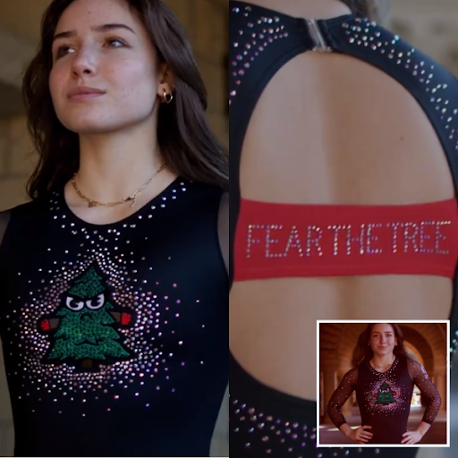
View a video of the leotard here.
 Elizabeth: 9.800
Design 2.8/3, Fabric 1.0/1, Sparkle 1.0/1, School Spirit 1.0/1, Uniqueness 1.0/1, Overall Appearance 3.0/3
Excellent. No notes. It’s everything I wanted when I saw the training leo at nationals last year—and more. I maybe don’t love the back as the red seems a bit out of place, but the front is superb.
 Emily L: 9.000
Design 2.5/3, Fabric 1/1, Sparkle 1/1, School Spirit 1/1, Uniqueness 1/1, Overall Appearance 2.5/3
This leo made me laugh out loud when I saw it, and I mean that in the best way possible! It’s so goofy and I love it. The only thing I don’t absolutely love is the “Fear the Tree” on the back, but I don’t hate it. Good job, Stanford!
 Katie: 9.800
Design 3/3, Fabric 1/1, Sparkle 1/1, School Spirit 1/1, Uniqueness 1/1, Overall Appearance 2.8/3
Everything about this leotard is what I want NCAA gymnastics to be. Fun, filled with school spirit, and not taking itself too seriously. But putting all the fun aside this is just a really well-executed leotard. I love the translucent sleeves as well as the length on the arm and the strip on the back is just the right width and the contrast color makes it pop.
 Mary Emma: 10.000
Design 3.0/3, Fabric 1.0/1, Sparkle 1.0/1, School Spirit 1.0/1, Uniqueness 1.0/1, Overall Appearance 3.0/3
Perfection, absolute perfection. To say that my jaw dropped when I saw this leo would be an understatement. I’ve been waiting for a team to lean into its goofy mascot, and this did not disappoint. Now I just need Nebraska to do an all out corn leo…
 Katherine: 9.4000
Design _3.0/3, Fabric 0.9/1, Sparkle _0.7/1, School Spirit 1.0/1, Uniqueness 1.0/1, Overall Appearance 2.8/3
It feels like everyone is describing this as campy and goofy, but I don’t even think those qualifiers are needed; it’s just plain good! The use of the tree reminds me of schools leaning into their old school, cartoonish designs of the past (this Michigan warmup comes to mind), even if this one isn’t that old. It’s a fun design and everything around it (the sparkles and red strap in the back) works, too. No notes from me.
Rutgers: 8.250
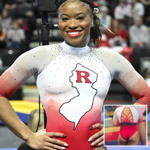
View picture of leotard here.
 Elizabeth: 7.500
Design 1.8/3, Fabric 0.8/1, Sparkle 0.7/1, School Spirit 1.0/1, Uniqueness 0.8/1, Overall Appearance 2.4/3
Love! The watercolor effect to create the ombre is awesome (although I will admit in this case with the use of red it almost looks like blood that has faded after using a Tide to Go stick on it to try to get it out). Love the state shape, too, of course, but I think I prefer the original state leo a touch more. The back annoys me because the black strip is so unnecessary. Remove it and I’m in the 9-plus score range.
 Emily L: 9.400
Design 2.7/3, Fabric 1/1, Sparkle 1/1, School Spirit 1/1, Uniqueness 1/1, Overall Appearance 2.7/3
I really like it! I love the high neck and the use of sparkles, but my favorite part is the ombre that kind of looks like watercolor paints seeping together. I would love it even without the New Jersey outline in the middle.
 Katie: 8.600
Design 2.4/3, Fabric 1/1, Sparkle 0.9/1, School Spirit 1/1, Uniqueness 0.8/1, Overall Appearance 2.5/3
Yes to the watercolor ombre, yes to the New Jersey shape, but no to the black strap on the back; it’s a bit jarring and lacks cohesion with the more delicate elements on the rest of the leotard. The fabric looks really soft and comfortable and I think the crystal placement is fantastic.
 Mary Emma: 9.100
Design 2.8/3, Fabric 1.0/1, Sparkle 0.7/1, School Spirit 1.0/1, Uniqueness 0.8/1, Overall Appearance 2.8/3
Oh, I love this! Rutgers did a similar New Jersey leo a few years ago, but I like this one even better. At first, I thought the ombre was just a normal ombre, but looking at it closer, I see there’s a watercolor effect to it which is really cool. The strappy back is also great.
 Katherine: 6.700
Design 1.8/3, Fabric 0.7/1, Sparkle 0.6/1, School Spirit 1/1, Uniqueness 0.4/1, Overall Appearance 2.2/3
It’s been some time since I ranked my favorite leos of all time for CGN, but I think I’d still rank Rutgers’s OG New Jersey leo as my favorite leo ever. This doesn’t quite hit the same for me, but I do still like it for the most part. The only element I’m going back and forth on is the patchy watercolor motif. I think it’s fine.
Utah: 8.100
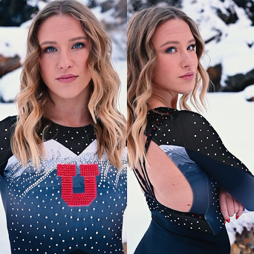
See video of leotard here.
 Elizabeth: 8.200
Design 2.4/3, Fabric 0.7/1, Sparkle 0.8/1, School Spirit 1.0/1, Uniqueness 0.9/1, Overall Appearance 2.4/3
Yes! So glad Utah made a new mountain leo. I love how the rhinestones, especially on the peaks, make a snow effect, and the back is neat too. In action, I didn’t love how busy the sleeves/cuffs looked—the mountains there plus the red rhinestone U’s looked a bit too busy, but the rest is phenomenal.
 Emily L: 9.000
Design 2.6/3, Fabric 1/1, Sparkle 1/1, School Spirit 1/1, Uniqueness 0.8/1, Overall Appearance 2.6/3
I like it! There’s not too much happening so I can appreciate that aspect. My favorite part is how the sparkles look like snow falling onto the mountains. I don’t know if that was their intention, but that’s what I immediately thought!
 Katie: 8.800
Design 2.7/3, Fabric 0.8/1, Sparkle 0.7/1, School Spirit 1/1, Uniqueness 0.9/1, Overall Appearance 2.7/3
The original version of this leotard was worn by Utah in one of the first ever NCAA meets I watched and I remember thinking it was the coolest thing ever. This is a great follow-up, but I do think I prefer the original. The sparkles looked fantastic in motion and I really like that the mountain design wraps around and is continued onto the back panel. I did notice that the straps on the back moved around a little when the gymnasts were competing so I hope it’s comfortable, but for me this is a beautiful leotard, it’s well executed, and the back straps make it feel more modern than the original.
 Mary Emma: 8.300
Design 2.5/3, Fabric 0.8/1, Sparkle 0.8/1, School Spirit 1.0/1, Uniqueness 0.7/1, Overall Appearance 2.5/3
Love this! I do think I slightly prefer the original, but this one is great too! I love seeing Utah lean into the mountains that are such a huge part of the Salt Lake City skyline.
 Katherine: 6.300
Design 2.1/3, Fabric 0.7/1, Sparkle 0.4/1, School Spirit 0.6/1, Uniqueness 0.4/1, Overall Appearance 2.1/3
I definitely prefer the original mountain leo, but this is a decent follow-up. I like the subtle details of the snowcaps on the mountains. If I could change one thing, it would probably be less sparkles on the body. I just don’t like the evenly spaced out pattern.
Nebraska: 7.900
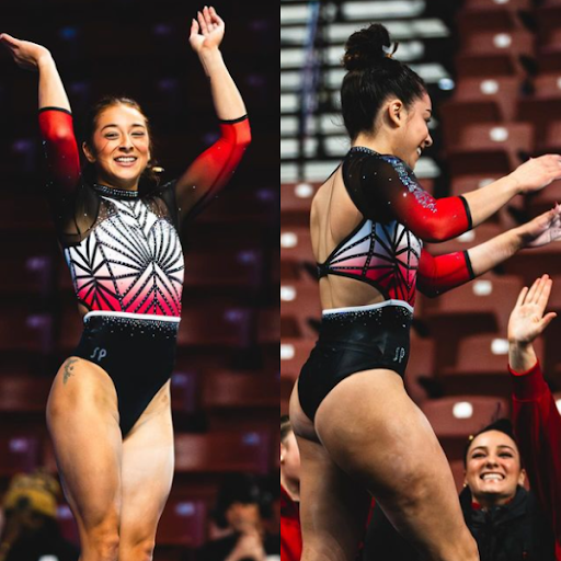
View video of leotard here.
 Elizabeth: 8.500
Design 2.7/3, Fabric 0.8/1, Sparkle 0.8/1, School Spirit 0.8/1, Uniqueness 0.7/1, Overall Appearance 2.7/3
I love this! This sort of geometric design on the front is very Nebraska, and I love how the ombre is incorporated. I don’t even care that it’s similar to another Nebraska leo. The incorporation and shape of the back strap is also fun and unique.
 Emily L: 8.300
Design 2.5/3, Fabric 0.5/1, Sparkle 1/1, School Spirit 0.8/1, Uniqueness 1/1, Overall Appearance 2.5/3
There’s a lot going on with this leo, and I kind of like it. I like the complex design in the middle mixed with the white to red ombre. The back is a little weird, but I don’t mind too much.
 Katie: 7.900
Design 2.4/3, Fabric 0.8/1, Sparkle 0.8/1, School Spirit 0.8/1, Uniqueness 0.5/1, Overall Appearance 2.6/3
Yes, I’m a big fan. I especially love the white belt with the sparkles waterfalling down from it. I think I could have done without the lower cutout on the back but the sparkle and geometric design of this has completely won me over. Even though I agree with everyone else that it’s nothing too radically different from their other leotards, I think this might be one of my favorites.
 Mary Emma: 8.100
Design 2.5/3, Fabric 0.9/1, Sparkle 0.8/1, School Spirit 0.8/1, Uniqueness 0.6/1, Overall Appearance 2.5/3
I love this! I’m a sucker for both ombre and weird patterns, and this has both. It reminds me a lot of this Nebraska leo, so it’s not the most unique, but I still really like it
 Katherine: 6.800
Design 2.4/3, Fabric 0.7/1, Sparkle 0.6/1, School Spirit 0.6/1, Uniqueness 0.4/1, Overall Appearance 2.1/3
I think I’m letting the fact that Nebraska already has a leotard just like this distract from the fact that I do enjoy the design. I always like the use of the lighter red we see in the middle, and the geometric design across the front is cool. It just feels a little “been there done that.”
Talladega: 7.700
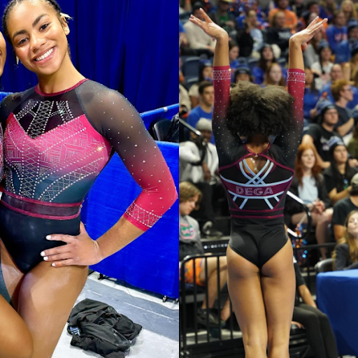
View video of leotard here.
 Elizabeth: 7.400
Design 2.3/3, Fabric 0.7/1, Sparkle 0.7/1, School Spirit 0.7/1, Uniqueness 0.7/1, Overall Appearance 2.3/3
I was worried when I saw the first video because the pink on the body seemed not only to not match the red band and leo back but kind of clash. However, at the competition it looked more cohesive. A good design and solid first leo for Dega!
 Emily L: 9.300
Design 2.8/3, Fabric 1/1, Sparkle 0.9/1, School Spirit 1/1, Uniqueness 0.8/1, Overall Appearance 2.8/3
I really like this one! The design in the middle is super interesting, and I really like the back! This is a great debut leo and I can’t wait to see what else Talladega comes up with.
 Katie: 7.200
Design 2.5/3, Fabric 0.7/1, Sparkle 0.7/1, School Spirit 0.7/1, Uniqueness 0.7/1, Overall Appearance 2.6/3
I haven’t loved the trend toward really open, strappy backs on leos so I really appreciate the back panel underneath the criss cross on this one. The front is great and although there are quite a few different elements on it I think they all work really well together. This is a really solid first leotard for them.
 Mary Emma: 7.600
Design 2.3/3, Fabric 0.8/1, Sparkle 0.8/1, School Spirit 0.8/1, Uniqueness 0.6/1, Overall Appearance 2.3/3
I really like this! The ombre is great, and the strappy back is cool, though I do wish it didn’t have the extra fabric underneath and was just an open back. The lighting in the video makes it look pink, but it definitely looked more red on the broadcast.
 Katherine: 7.00
Design 2.1/3, Fabric 0.5/1, Sparkle 0.8/1, School Spirit 0.8/1, Uniqueness 0.5/1, Overall Appearance 2.3/3
Great first leo for Talladega! The sparkle pattern is very intricate and pretty. I also like everything going on on the back, especially the abbreviation/nickname of “DEGA.”
Utah State: 7.100
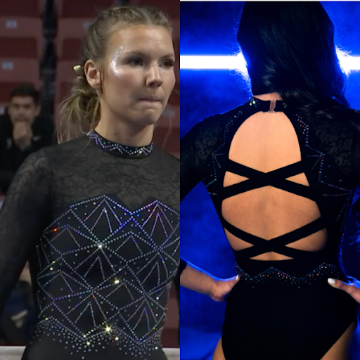
View video and picture of leotard here.
 Elizabeth: 7.200
Design 2.0/3, Fabric 0.7/1, Sparkle 0.8/1, School Spirit 0.8/1, Uniqueness 0.7/1, Overall Appearance 2.2/3
When I first saw the video, I was wary. I never love lace, especially when the design is printed on. However, once I saw this leo in action at the competition, I had a more favorable view. The overall black look is really nice and makes the other busier elements pop. Plus, the rhinestones, while not blue, give off a blue shimmer which does a lot to bring in the school spirit. Plus, I love the geometric “mountain” design to cap off the look.
 Emily L: 8.3
Design 2.5/3, Fabric 1/1, Sparkle 1/1, School Spirit 0.7/1, Uniqueness 0.6/1, Overall Appearance 2.5/3
Overall I think this one works! I like the design and the distribution and sizing of the sparkles. I think this is one of my favorite Utah State leos that I’ve seen.
 Katie: 5.400
Design 1.8/3, Fabric 0.3/1, Sparkle 0.8/1, School Spirit 0.4/1, Uniqueness 0.5/1, Overall Appearance 1.6/3
No. I’m sorry! I know the lace is subtle and I can see how you could come around to it, but lace does not belong on leotards. The collar is kind of giving 90s choker vibes, but I don’t hate it and I’m actually surprised how much I love the straps on the back. The sparkle saves this from being my least favorite of the week, but I’m still not a fan- apologies.
 Mary Emma: 7.300
Design 2.2/3, Fabric 0.7/1, Sparkle 0.8/1, School Spirit 0.5/1, Uniqueness 0.8/1, Overall Appearance 2.3/3
Surprisingly I like this! The lace actually looks good, and I LOVE the back. I do think the neckline looks a little weird, but this is very different from anything Utah State has done.
 Katherine: 7.100
Design 2.4/3, Fabric 0.6/1, Sparkle 0.8/1, School Spirit 0.3/1, Uniqueness 0.7/1, Overall Appearance 2.3/3
I did a 180 on this leo. At first I didn’t like the lace with the rest of the design at all, but I kind of settled on being fine with it because of how much I love the geometric body. I’m willing to justify the slight pattern clashing because that part is so good. It’s not very Utah State, but I still really like it.
Florida: 7.000
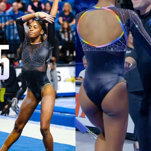
View picture of leotard here.
 Elizabeth: 7.800
Design 2.6/3, Fabric 0.7/1, Sparkle 0.9/1, Theme Spirit 0.8/1, Uniqueness 0.8/1, Overall Appearance 2.6/3
I don’t care for the side mesh, but the rest is pretty flawless. I love how the rainbow is used as an accent. Despite it being a minor element, it really pops on the otherwise black body. Plus, the use of rhinestones to create a design is really nice, too.
 Emily L: 8.200
Design 2.5/3, Fabric 0.7/1, Sparkle 1/1, Theme Spirit 1/1, Uniqueness 0.5/1, Overall Appearance 2.5/3
I like it! I really like how it’s mostly black with just some rainbow accents scattered throughout so it isn’t too much. Great pride leo!
 Katie: 6.000
Design 2/3, Fabric 0.5/1, Sparkle 0.5/1, Theme Spirit 0.7/1, Uniqueness 0.5/1, Overall Appearance 1.8/3
I really loved this when I saw the first teaser image because I love the rainbow piping, but I was a bit disappointed on the broadcast as it just felt a little flat. It’s a very classy leotard and I actually really like the shape of the back cutout as well as the mesh on the sides, but overall just a bit safe for me.
 Mary Emma: 6.300
Design 2.0/3, Fabric 0.6/1, Sparkle 0.6/1, Theme Spirit 0.8/1, Uniqueness 0.5/1, Overall Appearance 1.8/3
This is exactly how I would picture a Florida pride leo—sticking to their usual basic black/dark blue and adding a small pop of color. I think it’s overall well done, but I still find the front a bit boring.
 Katherine: 6.600
Design 2.2/3, Fabric 0.5/1, Sparkle 0.6/1, Theme Spirit 0.5/1, Uniqueness 0.5/1, Overall Appearance 2.3/3
Solid equality leo! The rainbow accents are subtle but get the point across. I like how they’re a little different on each leotard. I also really like the sparkle design on this one, especially under the back cutout.
Bowling Green: 6.900
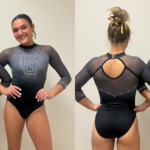
View picture of leotard here.
 Elizabeth: 7.300
Design 2.0/3, Fabric 0.9/1, Sparkle 0.8/1, School Spirit 0.7/1, Uniqueness 0.7/1, Overall Appearance 2.2/3
This is great! I’m loving the SP era for Bowling Green so far, especially since a lot of the Falcons’ older leos were not amazing. This one is pretty simple, but that’s why I like it. The orange rhinestone accents are my favorite part.
 Emily L: 6.700
Design 2/3, Fabric 1/1, Sparkle 0.7/1, School Spirit 0.8/1, Uniqueness 0.2/1, Overall Appearance 2/3
I’m always a fan of the high-neck leo designs so I like this one, it’s just a little plain. It’s cute, and it’s definitely not bad, there’s just not much going on. I wish there was something on the back along that line of sparkles that gave it some more school spirit.
 Katie: 5.700
Design 1.5/3, Fabric 0.6/1, Sparkle 0.7/1, School Spirit 0.8/1, Uniqueness 0.3/1, Overall Appearance 1.8/3
I looked at this and didn’t know if it was new or not because it’s so similar to a lot of the other leotards Bowling Green has. I appreciate the colored sparkles; variation in sizes isn’t utilized often enough, so that’s a bonus here. I’m not sure about the neckline or the crystals on it though.
 Mary Emma: 5.700
Design 1.7/3, Fabric 0.8/1, Sparkle 0.6/1, School Spirit 0.7/1, Uniqueness 0.4/1, Overall Appearance 1.5/3
I love the ombre, but overall this leo is a bit boring to me. As Katie said, it looks a lot like other Bowling Green leos. There’s nothing I dislike about it, but it doesn’t wow me either.
 Katherine: 9.000
Design 2.6/3, Fabric 0.9/1, Sparkle _0.8/1, School Spirit 1.0/1, Uniqueness 1.0/1, Overall Appearance 2.8/3
I always like this kind of matte gray, and I’m a sucker for encrusted sparkles, especially at the ends of the sleeves. This is a dark horse candidate for my favorite of the week.
Clemson: 6.750
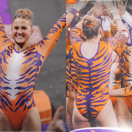
View a video of the leotard here.
 Elizabeth: 5.700
Design 1.6/3, Fabric 0.6/1, Sparkle 0.5/1, School Spirit 1.0/1, Uniqueness 1.0/1, Overall Appearance 1.6/3
I wanted tiger stripes, but this is a bit too much for me. I can’t stop staring at how the stripes continue all the way down the butt, which I’m sure isn’t the intention, and the white front just kind of reminds me of Tony the Tiger. I typically like kitschy, but this is too much, even for me. Would be better as a training leo.
 Emily L: 5.900
Design 1/3, Fabric 1/1, Sparkle 1/1, School Spirit 1/1, Uniqueness 0.9/1, Overall Appearance 1/3
I really want to love this one since I’ve been so excited to see Clemson’s leos for so long, but unfortunately I just don’t. I really do appreciate the school spirit aspect of it, but it’s just a little too much for me overall.
 Katie: 7.700
Design 2.4/3, Fabric 0.7/1, Sparkle 0.8/1, School Spirit 1/1, Uniqueness 0.8/1, Overall Appearance 2.0/3
I’m so torn on this one. They’ve absolutely nailed the school spirit; it’s a very bold use of the orange color and the design is cohesive. But for me, and admittedly I am not a fan of animal print in fashion, this is a bit too cartoon or mascot like. I think of Tony the Tiger on frosted flakes cartons. I respect that they’ve really committed to the tiger, but personally I don’t love it.
 Mary Emma: 7.600
Design 2.3/3, Fabric 0.8/1, Sparkle 0.8/1, School Spirit 1.0/1, Uniqueness 0.7/1, Overall Appearance 2.0/3
When I first saw it, I didn’t love it, but it definitely grew on me as the meet went on. If nothing else it definitely stood out because both my husband and sister came into the room while I was watching the meet and said “oh wow, cool leo,” so props to Clemson for making a big statement at its first ever meet.
 Katherine: 6.800
Design 1.8/3, Fabric 0.6/1, Sparkle 0.5/1, School Spirit 1.0/1, Uniqueness 0.8/1, Overall Appearance 2.1/3
So, I love the front, and the whole idea of this was definitely bold and made a statement for Clemson’s first meet. That said, I just wish the back incorporated some white as well, because in its current form it reminds me of a onesie or pajamas. Alternatively, maybe opening up the back would have been a better choice? Overall, I respect it.
Illinois: 6.100
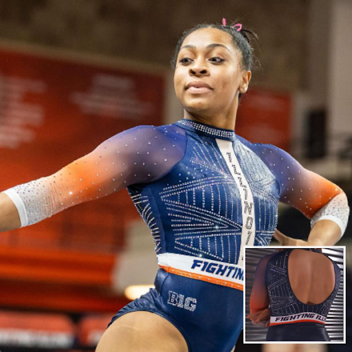
View picture of leotard here.
 Elizabeth: 8.100
Design 2.4/3, Fabric 0.7/1, Sparkle 0.7/1, School Spirit 0.9/1, Uniqueness 0.8/1, Overall Appearance 2.6/3
This is so close to being really good. I wish “Fighting Illini” was only on the back and not also the front, but otherwise I love everything about it—the solid navy body, the orange ombre arms, the geometric rhinestone design on the chest, the Illinois down the sternum.
 Emily L: 7.600
Design 1.8/3, Fabric 1/1, Sparkle 1/1, School Spirit 1/1, Uniqueness 1/1, Overall Appearance 1.8/3
I’d really like it if it weren’t for the “Fighting Illini” on the front. But other than that, I really like the ombre sleeves and the design on the front.
 Katie: 8.100
Design 2.4/3, Fabric 0.8/1, Sparkle 1/1, School Spirit 0.8/1, Uniqueness 0.6/1, Overall Appearance 2.5/3
This is nearly an outstanding leotard, but why oh why did they have to repeat the ‘Fighting Illini’ on the front as well as the back? I like it on the back, it adds a unique twist and ups the school spirit but the rhinestone ‘Illinois’ going vertically contrasted with the solid color slogan going horizontally on the front just makes it too busy for me. The ombre sleeves are gorgeous and I love all the sparkle placement.
 Mary Emma: 6.500
Design 1.8/3, Fabric 0.7/1, Sparkle 0.7/1, School Spirit 0.8/1, Uniqueness 0.5/1, Overall Appearance 2.0/3
This is one of those leos that would get a much higher rating from me if it wasn’t for one thing—the words on the front. I don’t mind the “Fighting Illini” on the back, but it seems out of place on the front. I do like the leo overall, especially the ombre sleeves, but this seems very similar to a lot of other Illinois leos.
 Katherine: 6.300
Design 1.8/3, Fabric 0.5/1, Sparkle 0.6/1, School Spirit 0.8/1, Uniqueness 0.4/1, Overall Appearance 2.2/3
This is okay. I actually do like the words on the front, but like I’ve been saying for (I feel like) a lot of these, the whole thing is not very unique for Illinois. I always like orange ombre, so I’m not mad about it, but it doesn’t feel particularly special.
LIU: 6.100
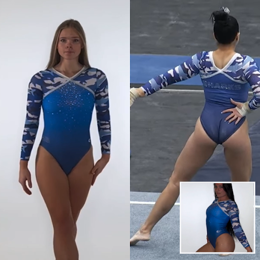
View video of leotard here.
 Elizabeth: 4.000
Design 0.5/3, Fabric 0.5/1, Sparkle 0.5/1, School Spirit 1.0/1, Uniqueness 0.5/1, Overall Appearance 1.0/3
I hate camo in general, but I gave LIU the benefit of the doubt the first time it did it because I thought it was super clever to do it with sharks. This time, I’m tired. Plus, I never like the inverted V neckline used here.
 Emily L: 6.200
Design 1.5/3, Fabric 1/1, Sparkle 0.5/1, School Spirit 1/1, Uniqueness 0.7/1, Overall Appearance 1.5/3
The shark camo brings my score up, but other than that this leo just doesn’t stick out to me. Once you get below the shark camo it’s just too plain for me.
 Katie: 6.200
Design 2/3, Fabric 0.5/1, Sparkle 0.4/1, School Spirit 0.8/1, Uniqueness 0.5/1, Overall Appearance 2/3
I really loved how clever the shark camo print was on their other leotard that uses this pattern, but overall this is a more refined design. The ombre looks classy and I really like where the pattern finishes on the back. If I was to change one thing I would make the neckline on the front different to the back just to give it that ‘something’ to elevate it to the next level.
 Mary Emma: 7.600
Design 2.3/3, Fabric 0.7/1, Sparkle 0.7/1, School Spirit 0.8/1, Uniqueness 0.8/1, Overall Appearance 2.3/3
I like this! I’m not normally a huge fan of camo on leos, but this is that same shark camo pattern from this leo that I think is really cool. I’m not a huge fan of the neckline, but the ombré body is nice.
 Katherine: 6.400
Design 1.4/3, Fabric 0.7/1, Sparkle 0.7/1, School Spirit 0.8/1, Uniqueness 0.7/1, Overall Appearance 2.1/3
LIU has kind of adopted the shark camo as its unofficial print, so I appreciate the continuous use of that spirit. However, I agree that the rest is a little too plain; sure, the camo makes it busy enough on the sleeves, but a few extra sparkles couldn’t have hurt.
UCLA: 6.100
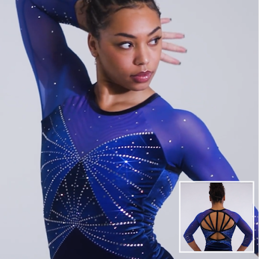
See video of leotard here
 Elizabeth: 5.700
Design 1.6/3, Fabric 0.8/1, Sparkle 0.5/1, School Spirit 0.5/1, Uniqueness 0.7/1, Overall Appearance 1.6/3
This looks more like a Florida leo to me, which is fine but makes it go down in terms of school spirit. I love the velvet, but it almost doesn’t work for this leo design? I also don’t love the belly button spider web. The back is awesome, though.
 Emily L: 4.800
Design 1/3, Fabric 0.5/1, Sparkle 1/1, School Spirit 0.5/1, Uniqueness 0.8/1, Overall Appearance 1/3
I am not a huge fan of velvet leos so this one is not my favorite. I also don’t like the front, it feels like there are two different designs that are competing with each other instead of it being one cohesive design.
 Katie: 6.900
Design 2/3, Fabric 0.8/1, Sparkle 1/1, School Spirit 0.4/1, Uniqueness 0.4/1, Overall Appearance 2.3/3
It’s velvet so that’s an automatic yes in my books. But aside from that I’m actually a little bit underwhelmed by the rest of the design. It’s lovely, just nothing to really make it stand out as a Bruins leotard for me, the pattern made me think of this Alabama one which I call ‘the radar’. I have to say that the rhinestones on the bodice looked incredible on the broadcast so full marks for sparkle.
 Mary Emma: 7.000
Design 2.0/3, Fabric 1.0/1, Sparkle 0.7/1, School Spirit 0.5/1, Uniqueness 0.6/1, Overall Appearance 2.2/3
The velvet redeems what would be a fine but not amazing design. I didn’t realize how much this looks like a Florida leo rather than UCLA until I saw Nya Reed wearing it and for a second I almost forgot she transferred. Like with the Bowling Green leo, there’s not really anything I dislike about it, I just don’t LOVE it.
 Katherine: 6.100
Design 2.2/3, Fabric 0.5/1, Sparkle 0.4/1, School Spirit 0.4/1, Uniqueness 0.4/1, Overall Appearance 2.2/3
I like the butterfly design and the back. Velvet isn’t normally my favorite, but it’s hard to tell that’s what this material is. I like it, but as Mary Emma said, it’s not very UCLA.
Oklahoma: 5.750
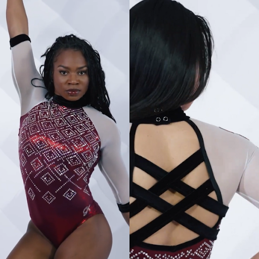
View video of leotard here.
 Elizabeth: 6.800
Design 2.0/3, Fabric 0.7/1, Sparkle 0.7/1, School Spirit 0.7/1, Uniqueness 0.7/1, Overall Appearance 2.0/3
I love everything about this but the collar. It’s too thick, and I HATE the closing mechanism on the back. It looks cheap with the way you can see the silver snaps. I kind of can’t believe KJ would create a leo with an element that looks that unpolished.
 Emily L: 6.800
Design 2/3, Fabric 0.6/1, Sparkle 0.8/1, School Spirit 1/1, Uniqueness 0.4/1, Overall Appearance 2/3
This one feels very Alabama to me. I like the front, but I think the black straps in the back are a little too thick and too plain.
 Katie: 5.300
Design 1.5/3, Fabric 0.4/1, Sparkle 0.7/1, School Spirit 0.5/1, Uniqueness 0.4/1, Overall Appearance 1.8/3
This is one of the better Oklahoma leotards, but maybe that’s because it’s so plain compared to their normal sensory assaults! I don’t really know what’s going on with the clasp on the neck, it all just feels a little bit clunky and there’s nothing that makes it standout and really wow me. I also much prefer sleeves on a competition leotard to be longer than elbow length so these are a bit short for me.
 Mary Emma: 5.400
Design 1.5/3, Fabric 0.7/1, Sparkle 0.7/1, School Spirit 0.6/1, Uniqueness 0.2/1, Overall Appearance 1.7/3
I wouldn’t have realized this was a new Oklahoma leo if I wasn’t part of CGN, that’s how similar this is to all its other leos. It’s not bad, there’s just nothing about it that wows me. I do wish the collar was not so thick because I don’t think it fits well in the design.
 Katherine: 4.400
Design 1.2/3, Fabric 0.6/1, Sparkle 0.4/1, School Spirit 0.5/1, Uniqueness 0.3/1, Overall Appearance 1.4/3
I don’t like the black accents on this at ALL, especially the collar. They feel completely disjointed from the rest of the design. Speaking of the design, it feels pretty similar to a lot of other OU designs lately. I like it, but it’s not very unique.
Fan Poll
Congrats to Denver for winning last week’s fan poll! Vote for your favorite design from this week here.
READ THIS NEXT: Leotard Rankings: Week 1
Article by Elizabeth Grimsley, Emily Lockard, Katie Couldrey, Mary Emma Brambilla, and Katherine Weaver



Utah isn’t on the fan poll
Thanks for the heads up! We will add it.
Not putting wcu is crazyyyyyyy
All new USAG team leos get judged together after USAG nationals in April! Stay tuned!
As a fan of muted colors, I like the Bowling Green leo from the front. From the back, the angles don’t line up quite right. It seems like someone designed the back using a computer program, without considering how it would look on a human body.