
When college gymnastics season rolls around, some fans are excited for perfect 10s, while others look forward to difficult skills and fun choreography. But we’re not going to lie. While those things are great, we love the leos most of all. And so, we’re back for another season of leotard rankings!
Each week we’re analyzing new designs to find our weekly faves. As always, leos can earn up to three points for design, up to one point each for fabric, sparkle, school spirit, and uniqueness, and up to three points for overall appearance. This week Rebecca S, Savanna, Naomi, and Claire B are joining editor-in-chief Elizabeth for judging.
Don’t agree with our ranking? Make your opinion heard by voting in the fan poll at the end of the article each week or by voicing your thoughts on social media!
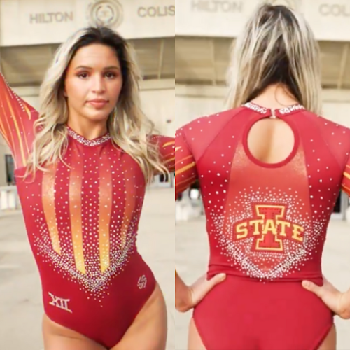
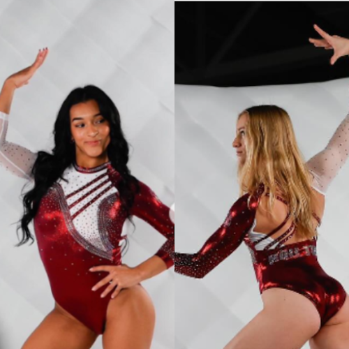
Iowa State: 7.700
View a video of this leotard here.
 Elizabeth: 7.100
Design 2.3/3, Fabric 0.7/1, Sparkle 0.7/1, School Spirit 0.8/1, Uniqueness 0.7/1, Overall Appearance 2.4/3
Lovely! Iowa State has been a hit-or-miss leo team over the years, but I’m pleased to see the Ashley Greig era is starting off on a strong note. The red to yellow ombre parts are absolutely lovely, and the design somehow isn’t too circus tent. I’ve never been a fan of printed designs like on the sleeves here, but it’s not bad. A good one from the Cyclones!
 Rebecca S: 8.400
Design 2.5/3, Fabric 0.8/1, Sparkle 0.8/1, School Spirit 1/1, Uniqueness 1/1, Overall Appearance 2.3/3
Iowa State is historically not great at using its colors in leotard design, which makes this all the more refreshing. I absolutely love the interplay of the cardinal and gold on the front as well as on the sleeves, and I appreciate how well the colors match the school logo. That’s not always easy to do working with a limited palette of fabrics supplied by a leotard designer. Going with a bold color pattern, they avoided overpowering it with other bold design features. My only real complaint here is that the back panel containing the school logo doesn’t match the rest, but that’s minor.
 Savanna: 7.500
Design 1.8/3, Fabric 0.7/1, Sparkle 0.8/1, School Spirit 1/1, Uniqueness 0.7/1, Overall Appearance 2.5/3
This is reminiscent of the leotard in honor of Jack Trice, but I love the incorporation of the gold color. The only thing that gives me a bit of an ick is the design on the sleeves, but I can overlook that because of the sparkle (even if I do wish there were just a little more).
 Naomi: 7.800
Design 2.2/3, Fabric 0.8/1, Sparkle 0.7/1, School Spirit 1/1, Uniqueness 0.6/1, Overall Appearance 2.5/3
I love the red to yellow mesh ombre! The stripy sleeves make me think of McDonald’s french fry packs, but everything else about this leo makes me very happy. There’s plenty of school spirit, I like the small back cutout, and the big logo in the back somehow blends with the overall aesthetic of this leotard.
 Claire B: 7.700
Design 2.2/3, Fabric 0.5/1, Sparkle 1/1, School Spirit 1/1, Uniqueness 0.5/1, Overall Appearance 2.5/3
Sublimated designs generally aren’t my favorite, but this is very well-executed. They didn’t back down from what can be an unforgiving combination of school colors, and the leo is that much more memorable and distinctive as a result. The crystals blend seamlessly into the design, enhancing the overall aesthetic without overpowering it.
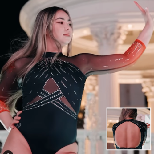
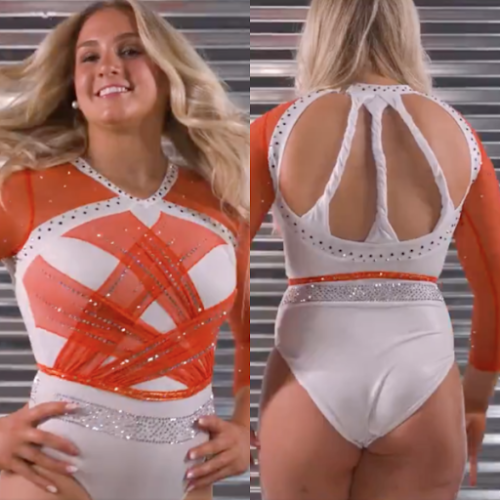
Oregon State: 7.500
View a video of the leotard here.
Elizabeth: 6.700
Design 1.8/3, Fabric 0.8/1, Sparkle 0.7/1, School Spirit 0.7/1, Uniqueness 0.7/1, Overall Appearance 2.0/3
Normally I don’t like the faux halter top look, but it works here, perhaps because of the black. I love the ombre arms of course, and I don’t even mind the mesh bits on the chest/stomach. Overall good but not fantastic.
Rebecca S: 8.300
Design 2.6/3, Fabric 1/1, Sparkle 1/1, School Spirit 0.7/1, Uniqueness 0.6/1, Overall Appearance 2.4/3
This might not be absolutely revolutionary for Oregon State, but it’s really solid. Elegant, flattering, not overboard. I also really appreciate the thoughtful use of different sizes of sparkles on this leotard: It’s an underutilized design strategy when most teams would choose to just spam a thousand of the smallest size. Big sparkles definitely can look a little chunky, but I don’t find that at all on this one. There was maybe potential to do a little more with the back, but I’m not mad about keeping it simple either. Props to Sydney Gonzales, she did great work here.
Savanna: 7.300
Design 2.3/3, Fabric 0.8/1, Sparkle 0.7/1, School Spirit 0.6/1, Uniqueness 0.6/1, Overall Appearance 2.3/3
This is what I wish Illinois would’ve done with the back of its leotard! I love the ombre on the sleeves and even the sparkle on the front. My only complaint is the mesh in the middle, but even that is done well to the point that this leotard is a winner for me!
Naomi: 7.800
Design 2.5/3, Fabric 0.8/1, Sparkle 0.9/1, School Spirit 0.6/1, Uniqueness 0.6/1, Overall Appearance 2.4/3
I am obsessed with the sleeves, and while I’m normally not a fan of mesh cutouts, these are executed well enough that I can overlook it. The open back is fabulous, and the sparkle placement is excellent. Overall, a great leo!
Claire B: 7.100
Design 2/3, Fabric 0.7/1, Sparkle 1/1, School Spirit 0.5/1, Uniqueness 0.7/1, Overall Appearance 2.2/3
I love, love, love the crystals, and the open back, but the midriff cutouts feel like an afterthought. That said, this leo looked pretty spectacular in motion.
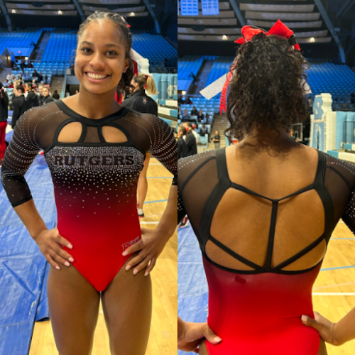
Rutgers: 7.100
View additional pictures of the leotard here.
Elizabeth: 7.300
Design 2.2/3, Fabric 0.8/1, Sparkle 0.8/1, School Spirit 0.7/1, Uniqueness 0.8/1, Overall Appearance 2.5/3
This is a leo that really grew on me the more I looked at it. When I first saw it, I hated the front. But as I got better and better looks, I started to like it more and more. The back is absolutely lovely, as is the fabric, ombre, and arm design. Really the only thing I don’t love is the chest holes/design, but they’re not bad enough where I can’t get over them.
Rebecca S: 6.200
Design 1.6/3, Fabric 0.7/1, Sparkle 0.7/1, School Spirit 0.7/1, Uniqueness 1/1, Overall Appearance 1.5/3
When I first heard the phrase “two chest holes” I will admit to feeling some skepticism, and while the cutout design is definitely a little dramatic for my personal tastes, it really could have been a lot worse. I like the ombre, and like Iowa State, they made one bold choice and then used some restraint with other features to avoid making it too busy.
Savanna: 7.200
Design 1.9/3, Fabric 0.7/1, Sparkle 0.7/1, School Spirit 0.9/1, Uniqueness 0.8/1, Overall Appearance 2.2/3
Oh, now this is fun! The ombre from black to red flows well and I enjoy the sparkle design throughout the front. I wish it was incorporated more into the back because it is a little TOO plain for my liking, but I’m not the one that has to wear it, so it’s not up to me. The strappy back absolutely makes up for the lack of sparkle. Overall a solid leo for Rutgers!
Naomi: 6.200
Design 1.7/3, Fabric 0.6/1, Sparkle 0.8/1, School Spirit 0.8/1, Uniqueness 0.8/1, Overall Appearance 1.5/3
The black to red ombre is seamless, and I love the sparkle design. And the big “Rutgers” across the front manages to feel a little bit classy and not at all cheesy. However, the chest cutouts hurt me. They make the leo look way too tight across the bust and throw off the leo’s overall elegant look.
Claire B: 8.700
Design 2.5/3, Fabric 1/1, Sparkle 1/1, School Spirit 0.7/1, Uniqueness 0.8/1, Overall Appearance 2.7/3
I’ve made my feelings about sternum cutouts abundantly clear over the years, but these actually aren’t all that bad (I think the piping helps). The negative space “Rutgers” popping out of that sparkle field is an outstanding touch, and the back is pure drama. Overall, this is a great look for the Scarlet Knights.
Alabama: 6.100
View a video of leotard here.
Elizabeth: 6.000
Design 1.7/3, Fabric 0.7/1, Sparkle 0.6/1, School Spirit 0.6/1, Uniqueness 0.7/1, Overall Appearance 1.7/3
I like the asymmetric nature of this one, but I wish it had continued onto the back with the straps. I like the matte white paired with the mystique crimson, but overall it’s nothing super special. It’s a good leo, don’t get me wrong, but there’s nothing about it that makes me go, “WOW!”
Rebecca S: 5.800
Design 1.1/3, Fabric 1/1, Sparkle 1/1, School Spirit 0.7/1, Uniqueness 0.6/1, Overall Appearance 1.4/3
If the theories that this was the intended nationals leotard last year are true, maybe it’s for the best that Alabama didn’t qualify. Bama is usually one of my favorite leotard teams, but this one just isn’t working for me. The colors are great, the sparkle usage is fine, but the design bugs me. I think it comes down to how oddly shaped the white patch on the front is. I just feel confused looking at this.
Savanna: 6.500
Design 1.3/3, Fabric 1/1, Sparkle 1/1, School Spirit 0.9/1, Uniqueness 0.5/1, Overall Appearance 1.8/3
Meh. It’s fine, the sparkle is fine and I don’t even mind the asymmetrical design of it, but I agree with Elizabeth; it should have continued onto the back. I wish they would’ve stuck with two red sleeves and not one red, one white. It’s a typical Alabama leo, but it’s nothing special.
Naomi: 6.600
Design 1.7/3, Fabric 1/1, Sparkle 0.7/1, School Spirit 0.9/1, Uniqueness 0.5/1, Overall Appearance 1.8/3
2012 called, they want this leo back. Maybe it’s just the reflective fabric. I like the general idea of the asymmetry, and the white mesh and the crimson, but I find this leotard rather dull. I also don’t love the white fabric underneath the strappy back, it makes it look as though the leotard didn’t fit the gymnasts properly.
Claire B: 5.700
Design 1.3/3, Fabric 0.6/1, Sparkle 1/1, School Spirit 0.7/1, Uniqueness 0.6/1, Overall Appearance 1.5/3
Is there such a thing as an AI leotard generator? Like Rebecca, I typically like Alabama’s style, but this is overwhelmingly chaotic.
Illinois: 5.700
View a video of this leotard here.
Elizabeth: 5.200
Design 1.5/3, Fabric 0.3/1, Sparkle 0.5/1, School Spirit 0.7/1, Uniqueness 0.7/1, Overall Appearance 1.5/3
When I first saw the teaser video, I got excited because of all the orange and matte white. But the design just misses the mark. The front looks like backstraps, and the back looks like toilet paper or a wrung-out washcloth. This could have been really really good, but instead it totally misses the mark.
Rebecca S: 6.500
Design 1.4/3, Fabric 0.9/1, Sparkle 0.9/1, School Spirit 0.7/1, Uniqueness 1/1, Overall Appearance 1.6/3
I agree that the twisted back straps really aren’t good, and I’m not a fan of the placement of the sparkle waistband either. That said, I really like the front design, and the colors go some way toward redeeming this too. I have a lot of appreciation for the use of colored sparkles on white, which is a design feature I wish I saw more.
Savanna: 6.000
Design 1.8/3, Fabric 0.6/1, Sparkle 0.4/1, School Spirit 0.8/1, Uniqueness 0.5/1, Overall Appearance 1.9/3
Orange is such a hard color to pull off in leotards, so props to Illinois for making it work. However, the back leaves a little to be desired. If the twists weren’t there, I think I’d like it a little more.
Naomi: 5.000
Design 1.5/3, Fabric 0.4/1, Sparkle 0.4/1, School Spirit 0.7/1, Uniqueness 0.5/1, Overall Appearance 1.5/3
Um…I feel like there’s a lot here that could be good but the combination isn’t working. The back strap twists just make me think of toilet paper. The weird silver rhinestones around the belly button aren’t flattering. I like the orange strips over the white, but the pattern looks more like the back of a leo than the front. The color combination is nice, and I suppose that should count for something.
Claire B: 5.700
Design 1.5/3, Fabric 0.5/1, Sparkle 0.7/1, School Spirit 0.5/1, Uniqueness 0.7/1, Overall Appearance 1.8/3
This is a gorgeous shade of orange, though I wish they’d used the studded mesh criss-cross on the back instead of those inexplicable twisted straps. The colored crystals are the best part, I just wish there were more!
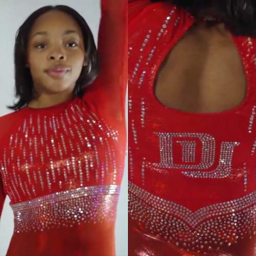
Denver: 4.800
View a video of the leotard here.
Elizabeth: 4.000
Design 1.0/3, Fabric 0.5/1, Sparkle 0.5/1, School Spirit 0.6/1, Uniqueness 0.4/1, Overall Appearance 1.0/3
I don’t hate this, but I don’t like it either. It’s SO boring. The design is nothing special or exciting, and the colors are obviously very one-note. I know this shade of red is now being transitioned in as a school-wide thing, but I prefer the old crimson.
Rebecca S: 2.200
Design 0.7/3, Fabric 0/1, Sparkle 0.7/1, School Spirit 0.3/1, Uniqueness 0/1, Overall Appearance 0.5/3
I hate this. Designs that are just sparkles on mystique are always a miss for me, but this is one of the worst. It’s one thing if you don’t have the budget for anything else, but Denver really has no excuse. It’s a boring, soulless design that you would never guess in a million years belonged to Denver. The top and bottom are distinctly different colors, which looks awful on television. The sparkle waistband is clunky and unflattering. I just don’t understand how the team that created masterpieces like this could come up with something so lazy.
Savanna: 6.500
Design 1.9/3, Fabric 0.6/1, Sparkle 0.8/1, School Spirit 0.7/1, Uniqueness 0.6/1, Overall Appearance 1.9/3
Admittedly, I wasn’t the biggest fan of this at first, but now that I recognize that this is the new shade of crimson, I actually don’t hate this. It has just the right amount of sparkle and it looked good in motion. I’m not the biggest fan of the cut at the neck though.
Naomi: 6.700
Design 2/3, Fabric 0.5/1, Sparkle 0.7/1, School Spirit 0.8/1, Uniqueness 0.4/1, Overall Appearance 2.3/3
I love the back! The crystal placement and big DU look great. I am less of a fan of the rhinestone belt around the ribs, it feels like the overall design of the leotard just gets cut off. The new shade of crimson upsets me, but there’s nothing to be done about it.
Claire B: 4.700
Design 1.5/3, Fabric 0.2/1, Sparkle 0.7/1, School Spirit 0.5/1, Uniqueness 0.3/1, Overall Appearance 1.5/3
There’s nothing wrong with this leo, per se, but there’s nothing special about it, either. If you told me this belonged to literally any other NCAA team whose school color is red, I’d have no reason to doubt you. Even the crystal DU on the back isn’t immediately recognizable as the school’s logo.
Fan Poll
Vote for your favorite design from this week here.
READ THIS NEXT: Leotard Rankings: The Best of 2023
Article by Elizabeth Grimsley, Rebecca Scally, Savanna Whitten, Naomi Stephenson, and Claire Billman
The new Denver colour is so wrong….. why would do this to themselves? It’s like the most basic non descript “sport red” colour, where as their previous shade was easily identified and had a distinguished, dynasty feel.