
It’s NCAA gymnastics season and the leotards are as sparkly as ever. And with new designs comes your favorite series: Leotard Rankings! Each week we’re analyzing leotard debuts to find our weekly faves. There will be up to three points for design, up to one point each for fabric, sparkle, school spirit and uniqueness, and up to three points for overall appearance. This week Rebecca S, Christina and Katherine are joining our editor-in-chief, Elizabeth, to help judge.
Don’t agree with our ranking? Make your opinion heard by voting in the fan poll at the end of the article each week or voicing your thoughts on social media. And, wondering where the new NCGA and USAG team leos are? Check out our ranking of those leotards the week after each respective national championship at the end of the season.
Washington: 8.675

View a video of this leotard here.
 Elizabeth: 9.300
Design 2.7/3, Fabric 0.9/1, Sparkle 0.9/1, School Spirit 1.0/1, Uniqueness 0.9/1, Overall Appearance 2.9/3
This is absolutely fantastic. I love the matte white, the mesh sleeves, the sparkly block W and the accented use of purple. And of course the best part is the skyline on the back. I just wish the bottom was purple instead of black, but I still like the black so it’s a minor complaint.
 Rebecca S: 9.300
Design 3.0/3, Fabric 1.0/1, Sparkle 0.5/1, School Spirit 1.0/1, Uniqueness 0.9/1, Overall Appearance 2.9/3
Gorgeous gorgeous gorgeous. I went to UW and I’m not afraid to slander the Huskies when they get it wrong, but this one really works for me. Local pride in leotards is one of my favorite things, and this helps fill the hole in my heart left by the news that Utah has retired the most beautiful leotard it’s ever worn. I was uncertain about the sleeves, but most gymnasts roll mesh up to their elbows anyway, so it doesn’t look any different in action. If I have any criticism, it’s that I think the silver sparkles on the white area are slightly overkill.
 Christina: 9.300
Design 2.8/3, Fabric 0.8/1, Sparkle 1.0/1, School Spirit 1.0/1, Uniqueness 0.9/1, Overall Appearance 2.8/3
Washington has been killing it this season. I love everything about this look, mostly the Seattle skyline on the back. Like Elizabeth, it would have been nice not to have the bottom black, but it still works incredibly well.
 Katherine: 6.800
Design 2.3/3, Fabric 0.5/1, Sparkle 0.6/1, School Spirit 0.8/1, Uniqueness 0.4/1, Overall Appearance 2.2/3
I feel like I haven’t been as obsessed with Washington’s new leos as everyone else seems to be, but this is decent. I actually like the black bottom in contrast to the lighter top; it reminds me of my favorite recent OU design. The rest, skyline included, is just fine.
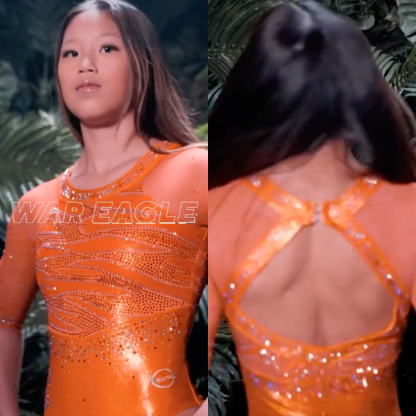
Auburn: 8.400
View a video of this leotard here.
Elizabeth: 8.600
Design 2.5/3, Fabric 0.8/1, Sparkle 0.8/1, School Spirit 1.0/1, Uniqueness 1.0/1, Overall Appearance 2.5/3
I love this! Finally an all-orange leo! The back is fantastic, and I actually sort of like how the orange mesh sleeves are a slightly different shade than the body; it gives a bit more depth to the overall look, which could have gotten boring with it all being one color. I also like the subtle tiger stripes on the body with varying fabrics and rhinestones. An overall good leo!
Rebecca S: 7.500
Design 2.2/3, Fabric 0.4/1, Sparkle 1/1, School Spirit 0.8/1, Uniqueness 1/1, Overall Appearance 2.1/3
I’m not as obsessed with this as most people; I tend not to love single-color leotards: They look a little flat to me, even if the color in question is an unusual one. An ombre with white or something would have made this. I do like the mix of orange and white sparkles and how the tiger stripes were incorporated into the design.
Christina: 8.500
Design 2.4/3, Fabric 0.8/1, Sparkle 0.9/1, School Spirit 1.0/1, Uniqueness 0.9/1, Overall Appearance 2.6/3
An all-orange look is probably not so easy to make successfully, but this one looked great. I love the open back, the mesh sleeves and the tiger stripes on the front. It looked so, so great on TV.
Katherine: 9.000
Design 2.7/3, Fabric 1/1, Sparkle 0.8/1, School Spirit 0.7/1, Uniqueness 1/1, Overall Appearance 2.8/3
My favorite of the week, no cap. I’ve always liked orange accents, and I’m so happy a team leaned into it all the way. Auburn could have put some crazy design on it and I’d have had no problem because #JusticeForOrange. I’m obsessed.
Oregon State: 7.500

View a video of this leotard here and an image of the front here.
Elizabeth: 8.000
Design 2.2/3, Fabric 1.0/1, Sparkle 0.8/1, School Spirit 0.7/1, Uniqueness 0.9/1, Overall Appearance 2.4/3
I LOVE this shade of gray. I also love the back, and the use of matte white. The orange accents also really work here. The only thing I’d improve is the rhinestone design on the body. It’s not bad. It’s just not my cup of tea.
Rebecca S: 8.800
Design 2.7/3, Fabric 1.0/1, Sparkle 1.0/1, School Spirit 0.6/1, Uniqueness 0.9/1, Overall Appearance 2.6/3
I freaking love this. Gray is my favorite leotard color. (Christina and I have been fighting about this for years.) I’m not a huge fan of most Beaver leotards, but this one is really speaking my language. The rhinestone design is elegant and actually shows some restraint, which is rare these days, the double neckline isn’t actively weird, which is also rare, and the ombre is so smooth and velvety. If I had one area for improvement, it’s that I think more could have been done with the back.
Christina: 7.700
Design 2.5/3, Fabric 0.7/1, Sparkle 0.7/1, School Spirit 0.4/1, Uniqueness 0.8/1, Overall Appearance 2.6/3
I’m usually not a huge fan of gray leos, but this one is lovely. I love the ombré, the orange accents with the sparkles, and the open back. The only thing that bugs me is that small part of mesh on the sides between the open back and the gray bodice, but it’s minor. Good one!
Katherine: 5.500
Design 2.2/3, Fabric 0.5/1, Sparkle 0.4/1, School Spirit 0.3/1, Uniqueness 0.6/1, Overall Appearance 1.5/3
The gray color and back are the only things I love about this; the rest is just meh. The front feels like a missed opportunity to have done something more with the sparkles. And maybe it’s just me, but I don’t see Oregon State in it AT ALL.
Bowling Green: 7.500

View a video of this leotard here.
Elizabeth: 8.600
Design 2.7/3, Fabric 0.9/1, Sparkle 0.9/1, School Spirit 0.6/1, Uniqueness 0.7/1, Overall Appearance 2.8/3
Go off, Bowling Green! I’m obsessed with this. What did we do to deserve two great orange leos in one week?! I looove matte white, and it looks fantastic paired with the shade of orange here. Plus, the back is great, too. I just wish there was a sparkle BGSU or Falcon logo somewhere prominent to make it a bit more Bowling Green and a bit less Illinois.
Rebecca S: 6.700
Design 1.9/3, Fabric 1/1, Sparkle 0.8/1, School Spirit 0.3/1, Uniqueness 0.3/1, Overall Appearance 2.3/3
This is definitely just a stock design that was not really given any distinctive features of the team in any way at all, but the colors are lovely, and because BGSU’s leotard collection is overall relatively dated, I’m really happy for it to get something this shiny and modern.
Christina: 7.700
Design 2.4/3, Fabric 0.9/1, Sparkle 0.7/1, School Spirit 0.4/1, Uniqueness 0.6/1, Overall Appearance 2.7/3
Orange and white with some ombré? Yes please! A lovely look. I do wish the split between mesh and solid had been better highlighted, maybe with some sparkles along the edges. But honestly one of my favorite BGSU leos.
Katherine: 7.000
Design 2.5/3, Fabric 0.8/1, Sparkle 0.4/1, School Spirit 0.4/1, Uniqueness 0.5/1, Overall Appearance 2.4/3
I’ve already opined on how much I appreciate the use of orange in leos. But I need to look at this design in a vacuum to appreciate it, because at first glance, it’s so similar to the Illinois creamsicle design that it feels boring. But it’s just as pretty as that one, so I’ll give it good marks. Plus, orange.
San Jose State: 7.050

View a video of this leotard here, images of the details here, and an image of the front here.
Elizabeth: 8.000
Design 2.4/3, Fabric 0.8/1, Sparkle 0.8/1, School Spirit 0.7/1, Uniqueness 0.7/1, Overall Appearance 2.6/3
San Jose recently has come out with some great leos! I love the subtle yellow ombre in the center V, the subtle blue piping, and the back straps. Although, speaking of the back, the straps may be a bit overboard, but that’s a minor thing for me.
Rebecca S: 7.200
Design 2.0/3, Fabric 0.8/1, Sparkle 0.9/1, School Spirit 0.8/1, Uniqueness 0.4/1, Overall Appearance 2.3/3
Very pretty—quite ornate without being too much. I agree that the yellow V is just a little odd, but it’s the right amount of yellow overall for a leotard that makes the school colors look vibrant by setting them against matte black. It’s not groundbreaking, but it is just nice.
Christina: 6.700
Design 2.1/3, Fabric 0.6/1, Sparkle 0.8/1, School Spirit 0.7/1, Uniqueness 0.5/1, Overall Appearance 2.0/3
Overall, I like this one, but I can’t figure out how I feel about the yellow in the center V. Maybe I wish it had been a bit more subtle? Otherwise, it’s a great look. I do agree with the straps on the back being overboard, especially since they are only there for fashion and over solid fabric.
Katherine: 6.300
Design 2/3, Fabric 0.4/1, Sparkle 0.6/1, School Spirit 0.7/1, Uniqueness 0.5/1, Overall Appearance 2.1/3
This would be a great design if not for the yellow V in the center. It’s too much of a departure from the rest of the leo. I might have made the V the same blue as the collar and made some of the surrounding sparkles yellow instead.
Florida: 6.950

View a video of this leotard here and an image of the front here.
Elizabeth: 6.100
Design 1.5/3, Fabric 0.7/1, Sparkle 0.8/1, Theme Spirit 0.7/1, Uniqueness 0.8/1, Overall Appearance 1.6/3
I think I was less frustrated with Florida pink leos when it was a cheap GK stock design because at least it didn’t cost a ton of money. But you know these SP leos with tons of rhinestones are expensive. However, even if Florida got these for absolutely free, I would still be mad. It’s such a waste! Anyway, This is fine. I don’t really like the lace-up back, and the front isn’t all that flattering on most of the gymnasts. The rhinestones on the shoulders are nice, though.
Rebecca S: 8.200
Design 2.7/3, Fabric 1/1, Sparkle 0.8/1, Theme Spirit 0.7/1, Uniqueness 0.2/1, Overall Appearance 2.6/3
I honestly think this one is really pretty. The lace-up back is cute, and I love the colors and the top sparkle design. It’s actually elegant, which so few pink leos are. I know Florida has too many pink leos yada yada, but this is definitely one of my favorite pink leos in the country right now.
Christina: 6.400
Design 1.9/3, Fabric 0.6/1, Sparkle 0.7/1, Theme Spirit 0.5/1, Uniqueness 0.7/1, Overall Appearance 2.0/3
I have one question for you Florida: Where do all your other only-worn-once pink leo go? I saw this and literally said out loud, “Again?” The lace-up back is so 2004 synchronized swimming. But anyway, it’s not so bad, and even if I hated it, it’s not like I’m going to see it ever again anyway. I do wish that hot pink belt wasn’t there and the leo just continued into some sort of ombré, but oh well.
Katherine: 7.100
Design 2.1/3, Fabric 0.5/1, Sparkle 0.5/1, Theme Spirit 1/1, Uniqueness 0.7/1, Overall Appearance 2.2/3
I don’t really have an issue with the Gators getting a new pink leo every year because it’s the only time they consistently do something different. I like the combination of lighter pink and white because it’s a departure from the normal pink and black we see from most teams (except Temple, who did it first and best). I would not have added the darker pink band, but the rest is good.
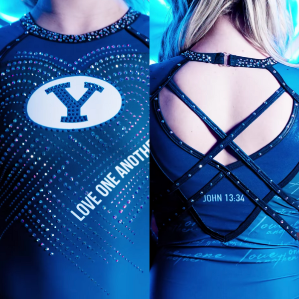
BYU: 6.300
View a video of this leotard here.
Elizabeth: 6.600
Design 2.0/3, Fabric 0.7/1, Sparkle 0.8/1, School Spirit 1.0/1, Uniqueness 0.9/1, Overall Appearance 1.2/3
Oh I’m sure this leotard won’t be controversial at all… The design itself—taking religion completely out of it—is nice. I like the back design, the sparkles on the front that create a subtle heart, and the colors. The original intent is also a good one, condemning the racist event that happened a few months ago at the BYU-Duke volleyball game. However, it’s a big hell no from me on having a literal bible verse on it. I get it. It’s BYU. But I don’t need it on a leo. Especially when the school itself doesn’t actually stand for loving one another in other senses.
Rebecca S: 7.200
Design 1.7/3, Fabric 0.7/1, Sparkle 1/1, School Spirit 1/1, Uniqueness 1/1, Overall Appearance 1.9/3
Oh wow, they really went there. It’s a pretty leotard, and this particular verse became part of BYU Athletics’ ethos as part of a team’s condemnation of a racist incident in their own crowd, which certainly could be a lot worse as a rationale. It’s really just a choice, though. Very pretty from a distance.
Christina: 4.500
Design 1.0/3, Fabric 0.5/1, Sparkle 0.6/1, School Spirit 1.0/1, Uniqueness 0.9/1, Overall Appearance 0.5/3
*Laughs in French* I lived in the U.S. for 10 years and yet I still get surprised by these shove-it-in-your-face religious displays. Can anything be more American than this? Well, maybe I don’t want an answer to that question. Anyway, this is absurd.
Katherine: 6.900
Design 2.3/3, Fabric 0.4/1, Sparkle 0.5/1, School Spirit 1/1, Uniqueness 1/1, Overall Appearance 1.7/3
It’s BYU. What do you expect? It has to be a full one out of one for school spirit, and frankly the same for uniqueness because when has this ever been done before? But the rest of the design is just alright.
Arizona: 5.825

View a video of this leotard here and pictures of the details here.
Elizabeth: 6.200
Design 1.3/3, Fabric 0.6/1, Sparkle 0.7/1, Theme Spirit 0.9/1, Uniqueness 1.0/1, Overall Appearance 1.7/3
I like the idea behind this design, but I don’t like the actual design, if that makes sense. The leopard print into ombre is really cool, and I like the patterned back straps. I just don’t like the huge ribbon or the execution of the design as a whole.
Rebecca S: 4.100
Design 0.3/3, Fabric 0.4/1, Sparkle 1.0/1, Theme Spirit 1.0/1, Uniqueness 1.0/1, Overall Appearance 0.4/3
It’s not boring. It is incredibly gaudy and juvenile and looks like something you might have dressed your Barbie doll in in 2003. It makes my eyes hurt. But it’s not boring. Full points for uniqueness.
Christina: 5.200
Design 1.0/3, Fabric 0.5/1, Sparkle 0.6/1, Theme Spirit 1.0/1, Uniqueness 0.6/1, Overall Appearance 1.5/3
I just saw this and sighed. I’m a bit over the pink leo looks in general. Or maybe it’s the giant pink ribbons. I do appreciate the school spirit touch with the ombré leopard print, as well as the ombré straps on the back. But I’m just meh overall on this one. Maybe there’s a bit too much going on?
Katherine: 7.800
Design 2.5/3, Fabric 0.5/1, Sparkle 0.8/1, Theme Spirit 1/1, Uniqueness 0.7/1, Overall Appearance 2.3/3
This is really cool and unique. The big pink ribbon feels a little vintage as far as pink leos go (it feels like teams used to be more obvious about the cause instead of just doing a pink design), but the rest is really fresh. I like the spots and the criss-cross back.
Ohio State: 5.275

View a video of this leotard here.
Elizabeth: 6.000
Design 1.0/3, Fabric 0.8/1, Sparkle 0.8/1, School Spirit 1.0/1, Uniqueness 0.9/1, Overall Appearance 1.5/3
The only thing I like about this is the sparkle design on the front and the ombre. The rest is a big no. I hate this type of inverted V neckline, and the back is way too kitschy for me. I know spelling out O-H-I-O with your arms is an Ohio State thing, but please don’t put it on a leotard, I’m begging. Especially since the figured look like obnoxious football fans haha
Rebecca S: 4.300
Design 0.6/3, Fabric 0.4/1, Sparkle 0.6/1, School Spirit 1/1, Uniqueness 1/1, Overall Appearance 0.7/3
Ohio State. Sweetie. I get what you were going for, but this was too much. I also find the front really odd… The sleeves being so very red really washes out the sparkle pattern, and the boundaries of the black section are really stark. I’m all for incorporating school spirit in ways that border on the absurd, but this is just goofy.
Christina: 5.700
Design 1.2/3, Fabric 0.6/1, Sparkle 0.9/1, School Spirit 1.0/1, Uniqueness 1.0/1, Overall Appearance 1.0/3
The reveal video started out so well. I was intrigued and was really liking the sparkle sweetheart design on the front. And then, I couldn’t help but laugh out loud when I saw the back. Come on. This is ridiculous and slightly obnoxious.
Katherine: 5.100
Design 1/3, Fabric 0.6/1, Sparkle 0.6/1, School Spirit 0.8/1, Uniqueness 1/1, Overall Appearance 1.1/3
The front feels like one of those optical illusions where your brain is either wired to see it or it’s not. Mine is not wired to see whatever Ohio State was trying to do. The people are also a no for me. I usually love Ohio State leos, but there are just so many better ways to have captured the spirit of the school than this.
Alabama: 5.250

View a video of the leotard in action here and a video of the front here.
Elizabeth: 6.100
Design 1.5/3, Fabric 0.7/1, Sparkle 0.7/1, School Spirit 0.8/1, Uniqueness 0.8/1, Overall Appearance 1.6/3
This leo is weird. As we learned with Florida’s unique sleeves earlier this season, these sleeve holes are too tight and have an unflattering effect on the gymnasts’ arms. The front is fine but pretty boring.
Rebecca S: 4.100
Design 0.9/3, Fabric 0.6/1, Sparkle 0.5/1, School Spirit 0.7/1, Uniqueness 0.7/1, Overall Appearance 0.7/3
It’s been a second since Bama has had a real miss, but this is one. The sleeve holes would be easier to ignore if the rest of the leo wasn’t so freaking boring. This leotard asks the question, “What if we took the forgettable parts of 2010 and made them weirder for some reason?”
Christina: 5.200
Design 1.0/3, Fabric 0.6/1, Sparkle 0.8/1, School Spirit 0.7/1, Uniqueness 0.6/1, Overall Appearance 1.5/3
I didn’t even know this leo was new until I had to rate it. The sleeves are atrocious. The front is rather standard and again, I’m pretty sure Alabama has a leo looking exactly the same. I could get behind the design on the back if it fit more with the rest of the design, but it’s just… odd. A nope from me.
Katherine: 5.600
Design 1.2/3, Fabric 0.3/1, Sparkle 0.6/1, School Spirit 0.6/1, Uniqueness 0.5/1, Overall Appearance 1.4/3
The sleeves are just AWFUL. Cutouts can be cute on more loose clothing, but they aren’t flattering whatsoever on a leo. This also doesn’t feel new. As to everything except school spirit… Thanks, I hate it.
Penn: 4.825

View a video of this leotard here.
Elizabeth: 4.000
Design 0.7/3, Fabric 0.3/1, Sparkle 0.7/1, School Spirit 0.7/1, Uniqueness 0.8/1, Overall Appearance 0.8/3
In the video, I thought this was great, then I got a better look at the front. It’s so bad. The off-the-shoulder look already isn’t my favorite, but the way the shoulder seam and fabric are poorly designed absolutely ruins the whole thing. Way to ruin what could have actually been a good leo.
Rebecca S: 4.000
Design 1.4/3, Fabric 0.2/1, Sparkle 0.4/1, School Spirit 0.4/1, Uniqueness 0.7/1, Overall Appearance 0.9/3
Swing and a miss. I can see how you would design this on paper and that it would look really nice, but it didn’t come together in real life. The fact that the shoulders aren’t lined the same as the torso produces an incredibly distracting color change, the red doesn’t show up from a distance at all, and the off-shoulder design might have been designed to invoke “ballgown” but what it’s really giving is “falling off.”
Christina: 4.300
Design 0.9/3, Fabric 0.5/1, Sparkle 0.6/1, School Spirit 0.6/1, Uniqueness 0.7/1, Overall Appearance 1.0/3
In the unveiling video, it looked beautiful. But on TV, not so much. The overall execution could have been much better. I do like the colors and how the design makes it look like there’s a cascade of sparkles. However, I’m really not a fan of the off-the-shoulder look. And why is the shoulder mesh not the same as the torso mesh? If you can’t have the same mesh, don’t go for the off-the-shoulder. Disappointing in the end.
Katherine: 7.000
Design 1.9/3, Fabric 0.6/1, Sparkle 0.7/1, School Spirit 0.8/1, Uniqueness 0.8/1, Overall Appearance 2.2/3
Don’t throw tomatoes…I like this a lot. It’s definitely unique, and I always like the cascading sparkles design. I’m also a sucker for a sparkle-encrusted collar like this. The cutouts aren’t my favorite, but the fact that they’re covered by mesh makes up for it.
Iowa State: 4.575

View a video of this leotard here.
Elizabeth: 3.500
Design 0.2/3, Fabric 0.4/1, Sparkle 0.5/1, School Spirit 1.0/1, Uniqueness 0.9/1, Overall Appearance 0.5/3
I’d like to start out by saying I love the sentiment here by representing Jack Trice during Black History Month. That being said, the execution on the front is absolutely horrid. The red only being around the armpits and the gigantic Iowa State logo on the back are big nos from me—and I don’t even want to talk about the front. It looks SO bad from far away, and up close/in better quality it’s even worse. It’s like they said let’s recreate Trice’s famous uniform, but then only put in about 30% effort and slapped some white lines on the stomach. Either way, I encourage you to read more about Trice. The story of his life and death isn’t something I knew before.
Rebecca S: 6.600
Design 1.9/3, Fabric 0.6/1, Sparkle 0.6/1, School Spirit 1/1, Uniqueness 0.8/1, Overall Appearance 1.7/3
I don’t hate this at all. I don’t find this design that different from several stock designs that are super widespread right now; it certainly doesn’t register as unusual or actively ugly to me. I also love the red parts—I find them really smooth and well-integrated. Plus, it’s meaningful, timely, and very rooted in school history. (The football stadium is named after Trice!) If anything, my biggest complaint is that the ISU logo on the back is so big for no reason.
Christina: 3.100
Design 0.1/3, Fabric 0.5/1, Sparkle 0.4/1, School Spirit 0.8/1, Uniqueness 0.9/1, Overall Appearance 0.4/3
The front is horrendous and so distracting. Nothing matches in this leo, and the red armpits really bug me. Anyway, Elizabeth said it all.
Katherine: 5.100
Design 1.3/3, Fabric 0.5/1, Sparkle 0.7/1, School Spirit 0.8/1, Uniqueness 0.7/1, Overall Appearance 1.1/3
Nice sentiment, poor execution. Most of it isn’t bad, but the black and white on the front just distracts from everything else. It doesn’t match the rest at all.
Fan Poll
Congrats to UCLA for winning the Week 5 fan poll! Vote for your favorite from Week 6 here.
READ THIS NEXT: Leotard Rankings: Week 5
Article by Elizabeth Grimsley, Rebecca Scally, Christina Marmet and Katherine Weaver
Like what you see? Consider donating to support our efforts throughout the year! [wpedon id=”13158″]

Upset about BYU’s leo, but all the Pride ones are fine? Do better CGN!
Wait a minute here.
BYU can’t have a leo with a Bible verse on it, but other colleges can have Pride leos?
How does that make sense?
EXACTLY!!!
BYU is just expressing what they believe in, which is what a school is doing when they wear a pride leo. You can disagree with something, without tearing it down. This is supposed to be a fun article about leotard DESIGNS. If someone said anything like that about a pride leo, you guys wouldn’t like that very much. You can be respectful without having to agree.
My exception to the comments is that when the investigation into the “incident” was conducted by the school and an outside source they were unable to find any evidence of the racial slur. Strange how it was not detectable by any news source recording, a mass of cell phones or other team mates on the floor. And for part 2 when the police officer was stationed next to the section in question and he could not hear it either. The news media dropped it like a hot potato. With something that inconclusive and questionable and toxic I hate that you bring it up again. Do I like the leo, no I hate it but not as much as fanning the flames of an inconclusive incident.
I personally like that BYU has the Bible verse on the leo. We know what BYU stands for already, so why is that offensive? We have Black Lives Matters leotards, Pride leotards, etc. To each his own, right?