Many factors can play into what makes an objectively timeless leotard, from fabric and color to sleeve length and logos. Throwing that goal away, what goes into a leotard that’s meant to be indicative of its time? While it’s up to you to decide if it missed the mark in your books or not, here are some thoughts on leotard designs that I’m predicting we won’t see stock replications of any time soon. Will you be interpreting this list as leotard outliers, or a shoutout to your favorite team’s creativity?
Southern Connecticut’s Split Leo (2022)
On first glance this leotard reminded me of black and white cookies, which were a staple in my family come holiday time. The owl logo looks great on the left shoulder—a tricky thing to pull off in black stones, but they’ve made it work. It’s a fun take on the half-and-half concept we’ve seen (largely through faux belts) over the last few years, but may present an issue with highlighting incomplete twists. The color choices that make up the half-and-half split stand out as well, since ‘all black with school colored stoning’ reads as mid-to-late 2010s, but the exact same thing in white is indicative of 2020 onwards.
Arizona State’s Pitchfork Sleeve (2016)
Reminiscent of some early 2010s Italian leotards, this Sun Devils design has one three quarter length sleeve and a pitchfork that forms three spaghetti straps. While it’s a clever way to include school spirit into the design, we don’t see the strategy of “this design element is also the end of the leotard” from other teams. Take Michigan for example, which often incorporates a stylized block M into the upper torso, while continuing the base color of the leotard beyond the M reference.
UC Davis’ Faux Tie Leo (2022)
Not unlike Arizona State (and Stanford)’s faux cardigan leotard, the main distracting element on this one is how we infer non-leotard clothing items in the design. If we omit the tie element and leave it as a collared keyhole leotard, this would likely be in even heavier rotation. The open back’s thin rhinestone straps do a great job carrying the mid back’s pattern up to the collar—it’s just that this element is interrupted by how thick and dark the tie is.
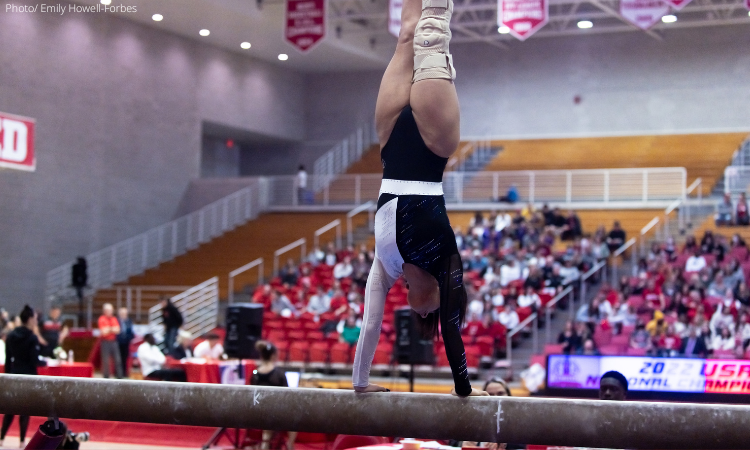
Air Force’s Tricolor (2022)
Air Force only recently began to wear red, so seeing red in the sleeve reads more as service school pride than for the athletic department. It makes sense on paper, but the service academies that have men’s gymnastics programs only compete in their school colors and haven’t ventured into red, white and blue territory. I appreciate their willingness to make the flag a design element by using it across the otherwise open back, but along the same vein, I can’t help but wonder if that goes against American flag etiquette by stretching it.
Florida’s Capped Sleeve ( 2021)
The capped sleeves caused a small uproar to fans who are on constant leotard watch. We’ve only seen the Gators wear it once, and it will likely be a while until we see them—or anyone else—wear this sleeve length again.
OU’s Statement Pieces (2019)
It’s the scallops for some, it’s the open back for others and it’s the loose tie dying for most. The combination of these along with Oklahoma’s trademark stoning warrants being labeled a balagan—literally translating from the Hebrew I grew up surrounded by to mean a mess or chaos. To their credit, the Sooners are known for multiple accents on the same leotard, so this wasn’t deviating from their brand too far. It looked great in motion, but up close has too many statement areas.
Auburn’s Ruffle Leo (2020)
Auburn introduced a textural element to the game we likely won’t be seeing any time soon, putting two ruffles across the front of this design. While it was the texture itself that peeved fans, my personal qualm with it is how the ruffle doesn’t continue onto the back of the design.
BYU’s Football Leo (2018)
The late 2010’s saw few teams try to make ball sports leotards, and even fewer stayed in rotation after the pandemic. BYU’s rendition had the key jersey features: faux mesh print, a sternum logo and large varsity font numbers. The choice to put a 10 on each athlete is an easy nod for gymnastics fans to pick up on, but why not stretch it further? This could’ve been an opportunity to include the year the school was founded, how long they’ve had gymnastics or even taking a page out of Illinois mens gymnastics’ book and giving each athlete their own number.
UCLA’s Departure From Navy (2019)
If there were ever an alternate universe where Oklahoma wore blue, we’d find this in its leotard rotation. The patterning is small enough that the eye doesn’t try to immediately decipher it, which made this leotard great in motion. When still, it’s a different story though—on top of how this was at the end of a rather simple and overwhelmingly navy leotard era for the Bruins.
Honorable mention: Margzetta Frazier’s Operation Peacock Leo (2019)
Operation Peacock was sure to make an appearance on the list, having its roots in a literal costumed routine to help UCLA’s floor lineup tap into its performances. Frazier’s in 2019 took the form of a custom leotard, with a glittery cropped cardigan (complete with a real knot) for her disco medley routine. It’s important to note this leotard didn’t miss the mark at all—it complemented Frazier’s routine quite well, and for that it lands as an honorable mention rather than being in the list. However, it’s so specialized that had it been worn by a full team, there’d surely be some stir from fans.
READ THIS NEXT: Leotard Rankings: The Best of 2022
Article by Peri Goodman
Like what you see? Consider donating to support our efforts throughout the year! [wpedon id=”13158″]