
This summer we’re continuing our team-specific throwback leotard rankings. Rather than looking at single meets, we’re taking a trip down memory lane for individual teams, taking into account a wide range of leos from different eras and finding our all-time favorites from a single program, as well as illustrating how designs have changed over the years.
Here’s how it’ll work: Our judges for the week will choose their top 10 and rank them based on their personal preferences. Plus, you’ll get a chance to tell us your thoughts! Did we leave out your all-time fave from the team? Let us know in the comments or on social media.
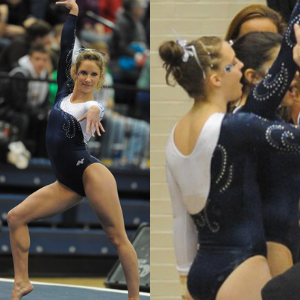
This week, we’re taking on Penn State with Emily M and Katherine joining Elizabeth for the rundown.
Elizabeth

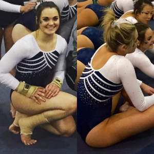
No. 1: I can’t get enough of this leo because of the use of white, velvet and shiny blue fabrics. Normally I don’t like a belted design, but this leo is just excellent. Great job.

No. 2: Everyone knows by now the path to my heart in leotard form is ombre + funky back, so of course this leo is high on my list. I also love the use of silver to be an accent element in the design.

No. 3: The more I look at this leo, the more I like it. I don’t typically go for shiny white because I don’t think it’s that flattering, but I like this leo. The back of course is fantastic, and I love how the straps kind of flow into the side triangles.
No. 4: Ombre is such a bold design element it normally doesn’t need much else to make a good leo. So a full ombre, matte fabric leo with a large logo is great and why this design is No. 4 on my list.
No. 5: I honestly don’t know why I like this leo so much. It has a cleavage hole for goodness sake! But there’s just something about it I enjoy. The white and blue work well together and maybe the hole being oval is better than a big wide open circle?
No. 6: I’m all about geometric rhinestone patterns, so I like the diamond incorporated on this leo with the sweetheart neckline and design mainly illustrated with sparkles.
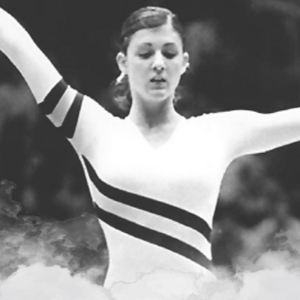
No. 7: I think I’ve included this stock design on every team’s top 10 that has a version. I love the stripe design with white sleeves. It’s just so great, and it reminds me of Adidas designs that I spent my time in gymnastics coveting.

No. 8: This is just the kind of athletic throwback that I love. It’s simple yet blocky and looks flattering on everyone. While I like the super flashy, sparkly designs, I’ll always go for an athletic leotard as well.
No. 9: I don’t normally go for stock designs, but this is a good one and the blue and white just look so good together. The silver and white accents on the body tie everything together perfectly.
No. 10: I almost didn’t include this on my top 10, but I felt like I couldn’t leave it off because of the ombre and the fact that the overall design is a good one. But it sits at No. 10 for the straight neckline, which I don’t care for as much.
I realized when going through the archives to find leos for us to look through and select out top 10 from that Penn State is an underrated leo team. That being said, there were three “overflow” leos I like but that wouldn’t fit in my official top 10. I still feel like they need some recognition, so I’m listing them here as honorable mentions instead: shiny light blue ombre, simple black, white and blue and throwback floral explosion.
Emily M

No. 1: Listen, blue to white ombre will always be a favorite for me. The big Nittany Lion on the chest is a lot, but it works for me because the leo is otherwise pretty simple and because the logo has been such a part of Penn State looks for so long. If you have an identity, go with it, right?!
No. 2: This one is all about that back. Coupled with the ombre sleeves and all that sparkle? Yes.

No. 3: Simple, classy school spirit without screaming in your face: A winning combination.
No. 4: Yeah, we’re going waaaaaaay way back. I love the old tradition of continuing the bodice pattern onto a sleeve! I imagine those stripes are in Penn State blue, and that the body is a matte white. Yes please.
No. 5: Blue and white is such a classic, classy combination, but Penn State really elevates that with the white-on-white here. The detailing almost looks like a fancy necklace being worn over a sweetheart neckline gown. It’s so sophisticated.
No. 6: Full body blue velvet! Hello, old friend. With those mystique sleeves? Mmm yes.

No. 7: I didn’t love this one at first; I think because of the cut around the sleeves, but it has really grown on me. It’s a departure for Penn State to have this much pattern going on, and I like it.
No. 8: BLACK!? I’ve looked at a lot of Penn State leos here, and I think this is the only black. And it WORKS, especially with that more vibrant shade of blue.
No. 9: It’s old school. It’s athletic. It’s simple but fun. I wish it had a touch more sparkle, but I’m into it.
No. 10: I love 90 percent of this one. The multi-tone blue-on-blue, the velvet detailing, the open back. I don’t love the mesh belt, but otherwise this is a real winner.
Katherine
No. 1: I love patterns like this. If it can also be worn on a top to go out, I’ll probably be a fan. It’s also very unlike the rest of Penn State’s recent designs, which are also nice. But this one gets the most points for uniqueness.

No. 2: YASSSS to this, it’s gorgeous! All the sparkles are here, but it’s so organized and clean looking. The back is awesome too. This is a home run and surely one of 2020’s best (except I just went back onto my tops of 2020 list and this wasn’t on it, so…pay no attention to that).

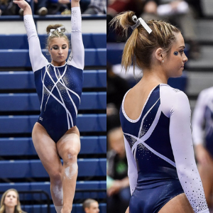
No. 3: These sleeves are stunning! Their subtle complexity compared to the plainness of the front is a nice contrast, and the cutout of the neck is also unique and interesting. I’m a big fan of this one.
No. 4: Growing up in Pennsylvania, I saw this logo around me all the time. So maybe it’s a nostalgia thing, but I’ve always kind of liked it. This leo is pretty straightforward otherwise, but it looks really utilitarian and gets the job done. I’d be here for them bringing it back as a throwback.
No. 5: Similar to my third pick, the color and fabric go so well on this one that I don’t mind the plainness overall. The sleeve material is always my favorite. It’s a simple but very attractive leo.
No. 6: Big fan of the front! I always love ombré and the sparkles enhance it here. I also like the delicate sparkles on the collar and how they go onto the back. The sleeves don’t quite fit, but it looks good nonetheless.
No. 7: The buildup to this one was exciting because we knew a white design was coming. And it does look lovely, but…those blue triangles in the side :// It’s like they were afraid to go all the way. It’s still really pretty, but the sides break the aesthetic for me.
No. 8: Another design that can’t really go wrong for me. It’s just detailed enough to be exciting but still looks clean and put together. This is a “throwback” detail I wouldn’t mind seeing again.

No. 9: I like the ropey design. It doesn’t have the most school spirit, but it’s aesthetically pleasing. This was probably what passed as stepping outside the box back in the day, and it was a valiant attempt.
No. 10: The different design on each sleeve is interesting. I also like motif of the school initials or logo on a sleeve. I haven’t mentioned the body yet because, well, there’s nothing there, but the sleeves are enough for this to round out my top ten.
READ THIS NEXT: Designing Leos for Teams We Wish Had Gym
Article by Elizabeth Grimsley, Emily Minehart and Katherine Weaver
Like what you see? Consider donating to support our efforts throughout the year! [wpedon id=”13158″]


One comment
Comments are closed.