The criteria is the same as always: up to three points for design, two points for fabric and sparkle, two points for school spirit and three points for overall appearance. This week Jenna and Katherine are joining Editor-in-Chief Elizabeth to help judge.
Penn State: 9.1
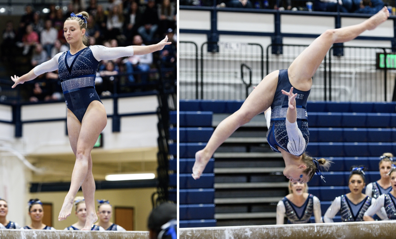
Photo: @StrongSportsPho, Twitter
| Design | Fabric/
Sparkle |
School
Spirit |
Overall
Appearance |
Total | |
| Elizabeth | 2.7/3 | 1.8/2 | 1.7/2 | 2.8/3 | 9.0/10 |
| Jenna | 2.8/3 | 1.8/2 | 2.0/2 | 2.8/3 | 9.4/10 |
| Katherine | 2.8/3 | 1.6/2 | 1.6/2 | 2.9/3 | 8.9/10 |
Elizabeth: After seeing actual pics of this leo from the meet, I’m really in love with it. The white sleeves pop, and the shimmery blue band around the stomach actually looks great on the design as a whole. But I think my favorite part is the chest sparkles. They look great in motion and really pack a punch. Plus, peep the VELVET border fabric outlining the design.
Jenna: This is a fantastic design! The white sleeves contrast amazingly well with the navy body, and the faux V-neck and sparkles are beautiful. This is one of my favorite leos of the year!
Katherine: One of my tops of the week for sure. I love all the different elements on the front; the sparkles, V neck and shimmery band all come together nicely. I’ll even accept the velvet material. This is more out of the box for Penn State, and I love it.
UW-La Crosse: 8.900

Photo: @uwlgymnastics, Instagram
| Design | Fabric/
Sparkle |
School
Spirit |
Overall
Appearance |
Total | |
| Elizabeth | 2.6/3 | 1.7/2 | 1.6/2 | 2.7/3 | 8.6/10 |
| Jenna | 3.0/3 | 1.6/2 | 1.6/2 | 2.8/3 | 9.0/10 |
| Katherine | 2.8/3 | 1.8/2 | 1.7/2 | 2.8/3 | 9.1/10 |
Elizabeth: I want to give a shout out to La Crosse for always debuting unique designs that are almost always stunning and never boring. I love the design here, which is odd since I don’t normally care for swirlies like that. The ombre sleeves are also to-die-for. The back is also one of my favorite elements. This leo is just *chef’s kiss* perfection.
Jenna: This is such an original leo! I love the ombre, of course, but I also really enjoy the criss-cross design on the back. I don’t even know how to describe the front except to say that it’s fantastic!
Katherine: This is so amazing. The front is absolutely gorgeous; the swirls look like butterfly wings. The criss-cross back is also super cool and the heart on the side is a nice touch. Plus, ombré! Obviously, I pretty much like everything about it.
California: 8.733
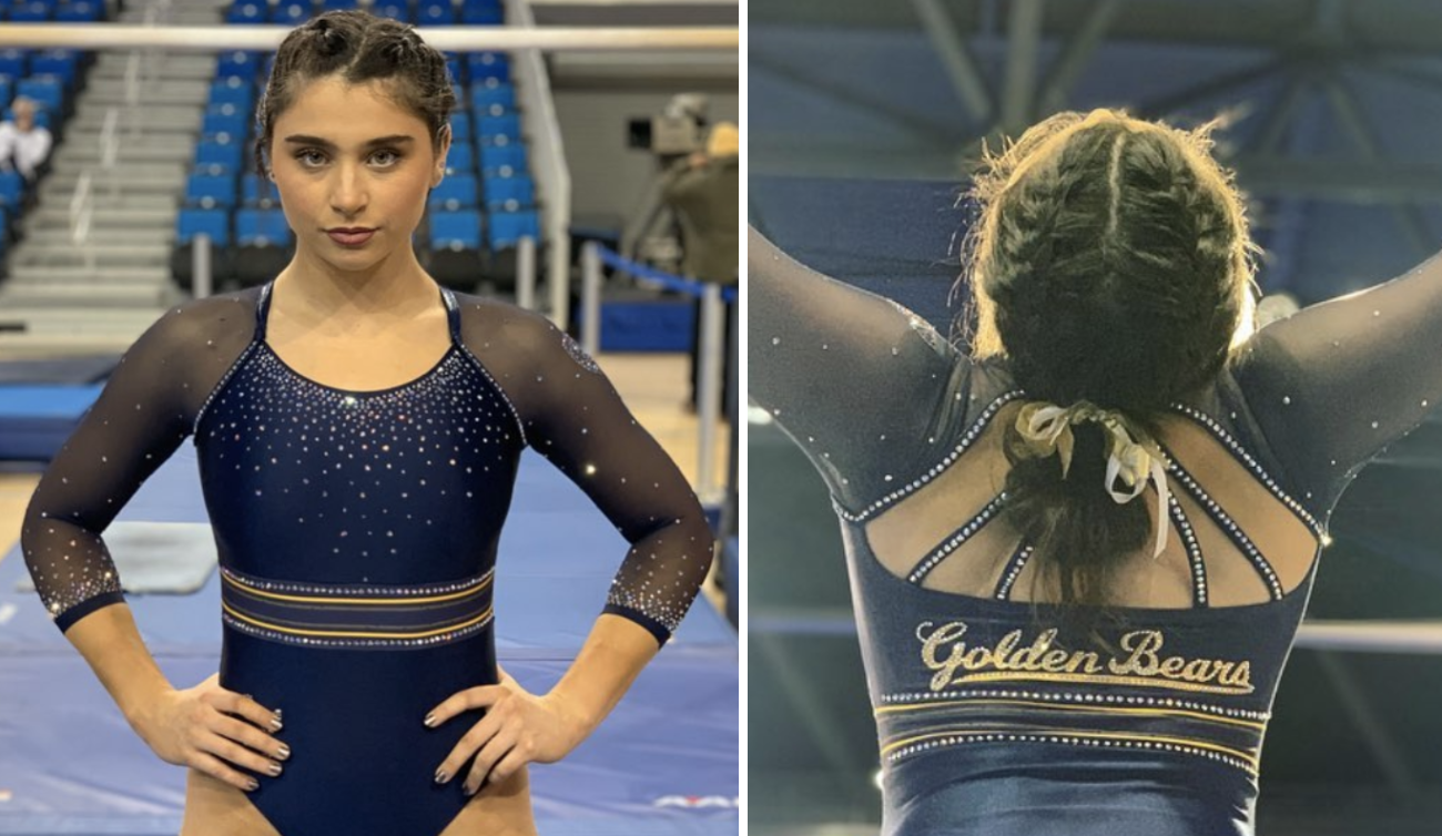
Photo: @calwgym, Instagram
| Design | Fabric/
Sparkle |
School
Spirit |
Overall
Appearance |
Total | |
| Elizabeth | 2.6/3 | 1.7/2 | 1.7/2 | 2.7/3 | 8.7/10 |
| Jenna | 2.8/3 | 1.6/2 | 2.0/2 | 2.5/3 | 8.9/10 |
| Katherine | 2.6/3 | 1.7/2 | 1.8/2 | 2.5/3 | 8.6/10 |
Elizabeth: Again, the back on this is fantastic! I love the strappiness of it paired with the script Golden Bears underneath. I also love the subtle band—sather stripe—around the bust, outlined with yellow. Also, the cut of the mesh to the solid fabric is in the perfect place and doesn’t create any weird seams.
Jenna: This is beautiful! My favorite part is the band around the waist, plus the script Golden Bears on the back. The bedazzled straps are also very classy. I’m not normally a fan of mesh sleeves but they work in this design.
Katherine: This is simple but very elegant. I don’t love the “Golden Bears” script (too vintage for me), but the rest is a nice combination of understated elements. Though the colors were similar to that of the home team’s (UCLA), this felt uniquely “California.”
Pittsburgh: 8.633
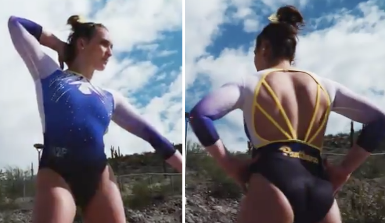
Photo: @Pitt_GYM, Twitter
| Design | Fabric/
Sparkle |
School
Spirit |
Overall
Appearance |
Total | |
| Elizabeth | 2.8/3 | 1.7/2 | 1.9/2 | 2.8/3 | 9.2/10 |
| Jenna | 2.4/3 | 1.5/2 | 2.0/2 | 2.5/3 | 8.4/10 |
| Katherine | 2.6/3 | 1.4/2 | 1.8/2 | 2.5/3 | 8.3/10 |
Elizabeth: YAS PITTSBURGH. I had a feeling that training leo I loved so much would be turned into a comp design later in the season, and I’m not disappointed. The back is the best part. I adore it. I also love the white with the new Pitt color scheme. This leo is basically perfection.
Jenna: The back is so great! I love the color and angle of the straps. I kind of with the ombre from the front made it onto the back as well, but that’s being picky.
Katherine: The front is really pretty; I love the angular design of the sparkles. I’m also always here for some nice ombré sleeves. I’d like to see a little more detail on the back.
Iowa State: 8.433
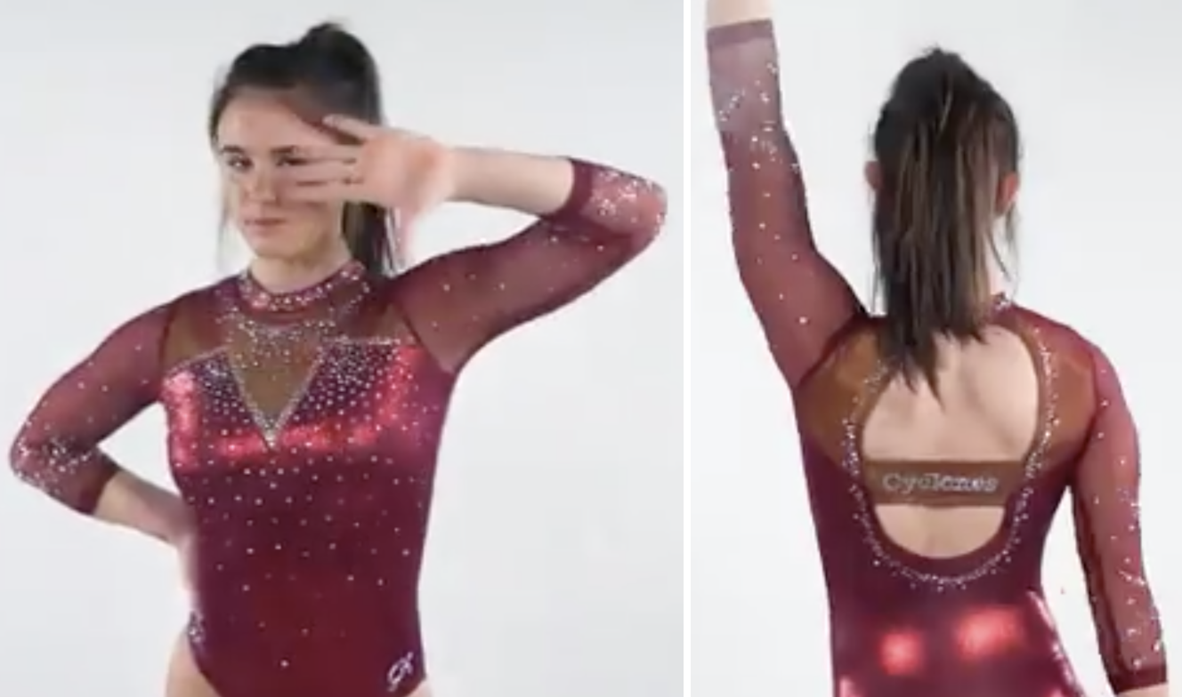
Photo: @CycloneGYM, Twitter
| Design | Fabric/
Sparkle |
School
Spirit |
Overall
Appearance |
Total | |
| Elizabeth | 2.4/3 | 1.8/2 | 1.7/2 | 2.6/3 | 8.5/10 |
| Jenna | 2.5/3 | 1.8/2 | 1.8/2 | 2.8/3 | 8.9/10 |
| Katherine | 2.2/3 | 1.7/2 | 1.6/2 | 2.4/3 | 7.9/10 |
Elizabeth: I LOVE when Iowa State uses that shimmery red/gold fabric on its leos. I wish more teams would do that with their colors. Overall, this is a fantastic leo from the Cyclones. The back is open yet still provides support and the pointy V-neck is one of my favorite styles.
Jenna: This is pretty close to a perfect leo for me. I love the rust color on the upper torso—my only complaint is I wish there were more of it in other areas of the leotard.
Katherine: I also love the red/gold fabric; it really shimmers and sparkles with the rest. The open back is very daring. But the whole thing just feels par for the course for Iowa State. I would like to see the Cyclones step out of the box a bit more with their designs.
Illinois: 7.700
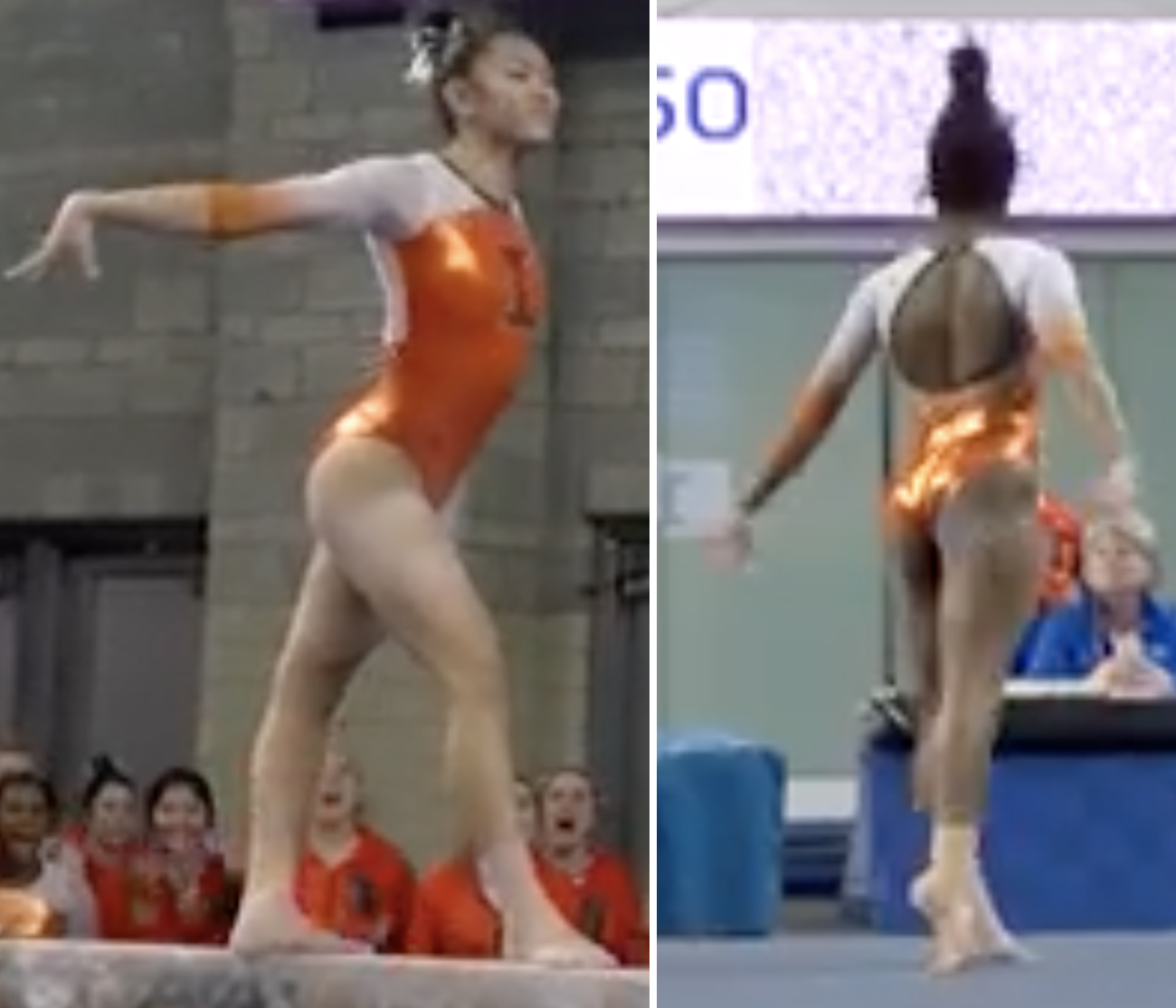
Photo: @IlliniWGym, Twitter
| Design | Fabric/
Sparkle |
School
Spirit |
Overall
Appearance |
Total | |
| Elizabeth | 2.0/3 | 1.5/2 | 1.7/2 | 2.1/3 | 7.4/10 |
| Jenna | 2.4/3 | 1.7/2 | 2.0/2 | 2.5/3 | 8.6/10 |
| Katherine | 2.0/3 | 1.6/2 | 1.5/2 | 2.0/3 | 7.1/10 |
Elizabeth: I’m not normally a fan of shiny orange fabric, but it works here, especially with the more “delicate” mesh white sleeves. I also really appreciate the addition of navy but also the fact that it doesn’t go over the top. I’m not a fan of the color combo in general, but this is a perfect balance.
Jenna: I really like the orange Illinois used in this design, and the big block “I” is great for school spirit. The open back is also well executed.
Katherine: This is probably my least favorite Illinois leo I’ve seen in awhile, but it’s not terrible. It’s just a little dull compared to some of its others. The orange on the front really shimmers and pops; I just wish the “I” did the same.
UCLA: 7.567
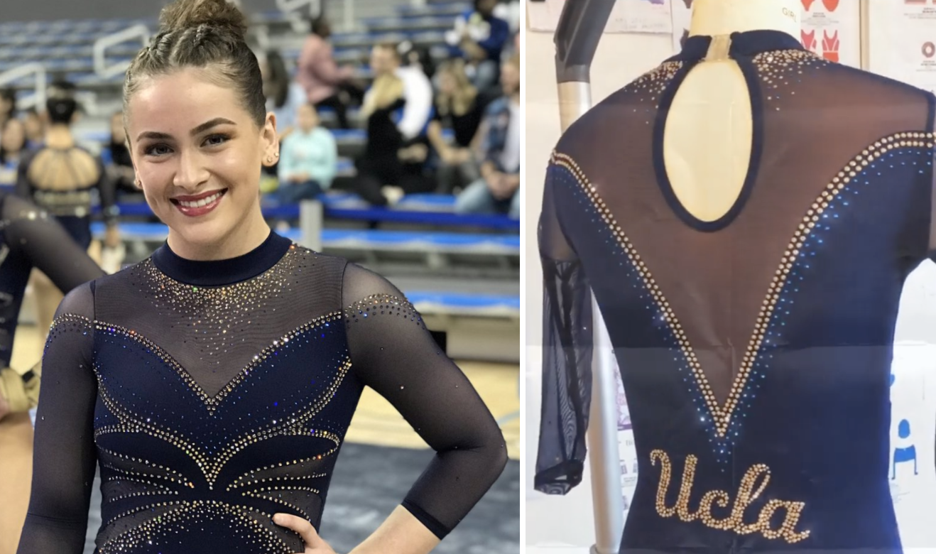
Photo: @uclagymnastics, Twitter
| Design | Fabric/
Sparkle |
School
Spirit |
Overall
Appearance |
Total | |
| Elizabeth | 2.0/3 | 1.5/2 | 1.6/2 | 2.1/3 | 7.2/10 |
| Jenna | 2.5/3 | 1.7/2 | 1.5/2 | 2.5/3 | 8.2/10 |
| Katherine | 2.1/3 | 1.4/2 | 1.6/2 | 2.2/3 | 7.3/10 |
Elizabeth: The story behind this leo is that the team saw Norah’s custom design for Meet the Bruins and recreated it for the whole team with a few minor tweaks. I appreciate that one of those tweaks was lessening the underboob effect. I also really like the use of gold rhinestones. Overall, though, this leo is just fine to me. More fine than Oregon State’s but still sort of blah.
Jenna: I loved this leo when I rated it after Meet the Bruins, and I’m sticking with that now. Do I wish it used a lighter blue to match UCLA’s school colors? Yes. Do I wish it had more gold? Yes. But it’s still beautiful.
Katherine: I feel like I should really like this, but there’s something holding me back. For one, it should’ve been a regular UCLA leo all along, because there’s not much “custom” about it. The blue and gold would be nice separately, but together it feels a bit…old fashioned.
Towson: 6.600
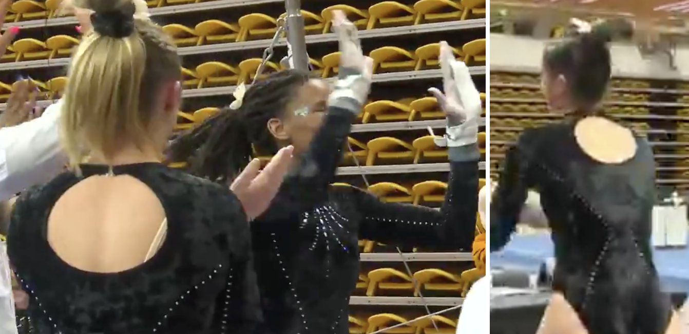
Photo: @Towson_TSN, Twitter
| Design | Fabric/
Sparkle |
School
Spirit |
Overall
Appearance |
Total | |
| Elizabeth | 1.7/3 | 1.8/2 | 1.4/2 | 1.8/3 | 6.7/10 |
| Jenna | 2.0/3 | 1.7/2 | 1.0/2 | 2.2/3 | 6.9/10 |
| Katherine | 1.6/3 | 1.5/2 | 1.3/2 | 1.8/3 | 6.2/10 |
Elizabeth: More teams wearing throwback leos!!! The crushed velvet on this is so great it hurts, and I love the keyhole back. I wish there was a bit more contrast in the design so it popped more, but overall this is classic throwback.
Jenna: This is a good throwback leo. I’m not normally a huge velvet fan but it works really well in this case! I like the design of the sparkles, but it’s a little bit boring overall.
Katherine: As far as throwbacks go, I don’t hate it. The velvet looks really classy, and I love the design of the sparkles down the middle. But I agree with Elizabeth that the lack of contrast makes it a little boring.
Oregon State: 6.400

Photo: Emily Howell-Forbes
| Design | Fabric/
Sparkle |
School
Spirit |
Overall
Appearance |
Total | |
| Elizabeth | 1.7/3 | 1.4/2 | 1.5/2 | 1.8/3 | 6.4/10 |
| Jenna | 2.0/3 | 1.5/2 | 1.0/2 | 2.2/3 | 6.7/10 |
| Katherine | 2.2/3 | 1.3/2 | 0.6/2 | 2.0/3 | 6.1/10 |
Elizabeth: This reminds me of that Florida leo the individuals wore at nationals last year. It’s…fine? But I’ve never really been a fan of the off-the-shoulder look. I also wish there was more orange incorporated.
Jenna: This is a super elegant design in the front, but the back is a bit of a letdown. I wish there were more orange!
Katherine: I actually love the off the shoulder look on this. It’s a very elegant design overall. But there’s almost nothing that says “Oregon State” to me, other than the Beaver logo, which doesn’t really stand out. I also don’t much like the back.
N.C. State: 6.167
| Design | Fabric/
Sparkle |
School
Spirit |
Overall
Appearance |
Total | |
| Elizabeth | 1.6/3 | 1.5/2 | 1.6/2 | 1.8/3 | 6.5/10 |
| Jenna | 1.5/3 | 1.2/2 | 1.8/2 | 1.5/3 | 6.0/10 |
| Katherine | 1.5/3 | 1.4/2 | 1.5/2 | 1.6/3 | 6.0/10 |
Elizabeth: This reminds me a lot of the new Nebraska leo from this year. I like that N.C. State went in a different direction with this design, as well as the use of that particular mascot logo on the back—but I do wish it popped a bit more.
Jenna: This is a nice, simple design but it feels like it’s missing something. More sparkle on the back would be a great place to start.
Katherine: Not really a fan…there’s just nothing special about it, other than the sparkle on the sleeves. It seems like a nice design in theory, but I agree with Elizabeth—it doesn’t have the “pop” factor.
READ THIS NEXT: Leotard Rankings: Week 9
Article by Elizabeth Grimsley, Jenna King, Katherine Weaver
Like what you see? Consider donating to support our efforts throughout the year! [wpedon id=”13158″]

