

The criteria is the same as always: up to three points for design, two points for fabric and sparkle, two points for school spirit and three points for overall appearance. This week Rebecca and Tara are joining Editor-in-Chief Elizabeth to help judge.
SOUTHERN CONNECTICUT: 9.467
| Design | Fabric/
Sparkle |
School
Spirit |
Overall
Appearance |
Total | |
| Elizabeth | 2.8/3 | 1.9/2 | 1.7/2 | 2.9/3 | 9.3/10 |
| Rebecca | 2.9/3 | 2.0/2 | 1.7/2 | 2.9/3 | 9.5/10 |
| Tara | 2.9/3 | 2.0/2 | 1.8/2 | 2.9/3 | 9.6/10 |
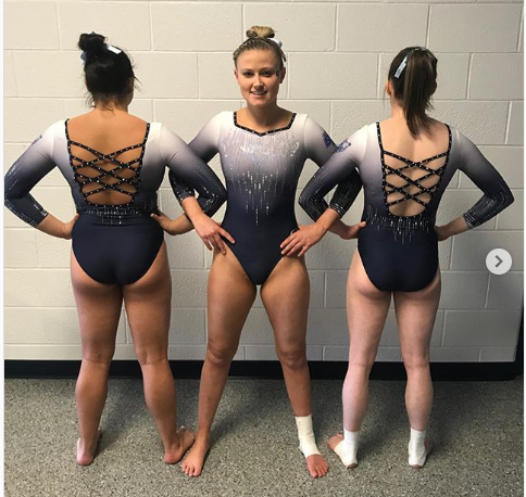
Elizabeth: This is a darn near perfect leotard. The ombré is fantastic, the sparkle pattern just enough and the back just can’t be described merely with words. Plus, I’m really digging the screen printed logo on the sleeve. My only question: Is the bottom part of the ombré black or a dark SCSU blue?
Rebecca: In answer to Elizabeth, I’m pretty sure it’s blue, and in any case it’s just great. Good, good leotard. And it looks great in motion to boot! The little SCSU applique on the shoulder is a nice touch.
Tara: Hello, SCSU! This is AMAZING and I love it. Basically everything is perfect, from the ombre to the sparkles and the crossy back. The SCSU on the shoulder is a great touch of school spirit, also.
FLORIDA: 8.533

| Design | Fabric/
Sparkle |
School
Spirit |
Overall
Appearance |
Total | |
| Elizabeth | 2.6/3 | 1.6/2 | 1.7/2 | 2.8/3 | 8.7/10 |
| Rebecca | 2.5/3 | 1.3/2 | 1.7/2 | 2.5/3 | 8.0/10 |
| Tara | 2.7/3 | 1.7/2 | 1.7/2 | 2.8/3 | 8.9/10 |
Elizabeth: I’m going to pretend Florida heard my rant and didn’t already have this leo created before season even began. I love the design! The black is classy, and the ombré sleeves are a delight. Plus, the orange rhinestones are a GREAT touch and really popped in person. Plus, you guys know how I love a fun back. My only wish would have been maybe black to orange to blue ombré sleeves, but I can’t complain too much.
Rebecca: I like this. It’s simple and it’s nice and there’s nothing about it that’s glaringly horrible which is all I really want. The shade of blue on the sleeves is not quite for me, but I like the orange sparkles and the back a lot.
Tara: I love this! The black paired with the subtle orange and blue is great. The back is lovely, and I love the ombre sleeves. Great job, Florida!
CALIFORNIA: 7.933
| Design | Fabric/
Sparkle |
School
Spirit |
Overall
Appearance |
Total | |
| Elizabeth | 2.6/3 | 1.7/2 | 1.7/2 | 2.8/3 | 8.8/10 |
| Rebecca | 2.0/3 | 1.7/2 | 1.7/2 | 2.2/3 | 7.6/10 |
| Tara | 2.0/3 | 1.6/2 | 1.7/2 | 2.1/3 | 7.4/10 |
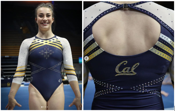
Elizabeth: I absolutely adore this. A lot of recent Cal leos are mostly blue with very slight yellow details, and I love this change. The criss-cross yellow stripes are athletic yet sort of regal? Is that even possible? And I love how the stripes are mirrored on the sleeves. I might have preferred Cal on the chest rather than the random design, but it works for me on the back (which by the way is also gorg), too. Plus, I’m really into hidden motivational sayings on leos, especially when they’re not big, glaring and confusing as to why they’re there or what they are.
Rebecca: This is definitely a little funky, but I like it. I don’t know if I think the star pattern on the front makes much sense with the rest of it, but I can accept it. I REALLY like yellow being featured more prominently than on most Cal leotards, the stripes really work here. There is a little sparkle “Cal” on the back.
Tara: I like most of this! I don’t love the sparkle design on the chest, but that’s about all I dislike about it. I really love the crossy design, incorporation of yellow and the use of the team motto on the sleeve. Plus, I love the sparkle “Cal” on the back.
STANFORD: 7.833
| Design | Fabric/
Sparkle |
School
Spirit |
Overall
Appearance |
Total | |
| Elizabeth | 1.8/3 | 1.7/2 | 1.6/2 | 2.4/3 | 7.5/10 |
| Rebecca | 2.2/3 | 2.0/2 | 1.9/2 | 2.4/3 | 8.4/10 |
| Tara | 1.8/3 | 1.8/2 | 1.7/2 | 2.3/3 | 7.6/10 |
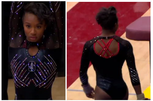
Elizabeth: I’ll get the bad out of the way first: I hate the cleavage hole trend. Stop. It’s not cute. This one isn’t that bad, but I still prefer it not to be there. Anyway, I love love love the rhinestone pattern on the chest and sleeves. It’s very striking. I also like the red incorporated in the back straps. Overall a good leo.
Rebecca: Stanford is really heading in a new stylistic direction this year, and that direction is Hundreds Of Sparkles Everywhere. I really liked its last new one from California Grand and I really like this–it’s glamorous and sort of indulgent without being tacky. But like everyone else says, using this particular base pattern is just silly and unnecessary.
Tara: OK, the cleavage hole trend can die, like, now please. But other than that, this is actually really nice. The front sparkle design is great; I love how the Stanford logo is incorporated in there as well. I love the criss cross back and how red is incorporated, and the sparkles on the sleeves seal the deal.
AIR FORCE: 7.633
| Design | Fabric/
Sparkle |
School
Spirit |
Overall
Appearance |
Total | |
| Elizabeth | 2.2/3 | 1.6/2 | 1.8/2 | 2.4/3 | 8.0/10 |
| Rebecca | 1.5/3 | 1.5/2 | 2.0/2 | 1.7/3 | 6.7/10 |
| Tara | 2.3/3 | 1.6/2 | 1.9/2 | 2.4/3 | 8.2/10 |
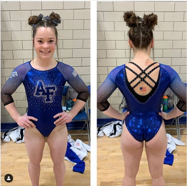
Elizabeth: Air Force has been nailing its new leos these past couple of years, and I love this one as well. The ombré arms with the grey incorporated are beauts, the blue body is pleasing to the eyes and the strappy back unique. I especially love how the flag tattoo is placed to sort of peek out between the straps. Speaking of the back, that thicker black band that swoops down with the neckline is my jam.
Rebecca: This is… fine. It’s one that is neutral enough and far enough within Air Force’s usual range that if they hadn’t told me it was new, I wouldn’t have noticed. I like the lightning bolt a lot and the back is fun but it’s just not exciting.
Tara: Air Force’s new leo game is strong! I love the ombre and the sparkle chest, while large, is something I enjoy. The strappy back is the icing on the cake.
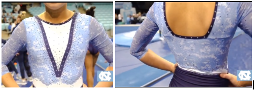
NORTH CAROLINA: 5.767
| Design | Fabric/
Sparkle |
School
Spirit |
Overall
Appearance |
Total | |
| Elizabeth | 2.0/3 | 1.3/2 | 1.7/2 | 2.2/3 | 7.2/10 |
| Rebecca | 1.0/3 | 1.2/2 | 1.7/2 | 0.8/3 | 4.7/10 |
| Tara | 1.2/3 | 1.1/2 | 1.7/2 | 1.4/3 | 5.4/10 |
Elizabeth: OK, I have some thoughts. I think overall I like this, but I’m not sure how I feel about the faux lace. I might prefer it to real lace actually? Anyway, the colors used are great—I love the Carolina blue—and the use of white with the solid dark blue in the V is nice. I could take or leave the almost sweater-with-briefs look, but it’s not horrible.
Rebecca: I don’t hate this I just don’t want to talk. I don’t get it. I don’t understand, you know? The top is fine, the lace is pretty, I get the concept. But the execution is iffy in some weird ways, most notably THE COLOR CHANGES BEING MISALIGNED ON THE SIDES which I refuse to get over.
Tara: I have lots of questions about this…The overall concept is fine, but I don’t love the execution. Each individual element is good on its own, but they just don’t come together well. Also, like Rebecca pointed out, I can’t get over the fact that the color changes don’t line up.
One comment
Comments are closed.