

The criteria is the same as always: up to three points for design, two points for fabric and sparkle, two points for school spirit and three points for overall appearance. This week Brandis and Claire are joining Editor-in-Chief Elizabeth to help judge.
New Hampshire: 8.766
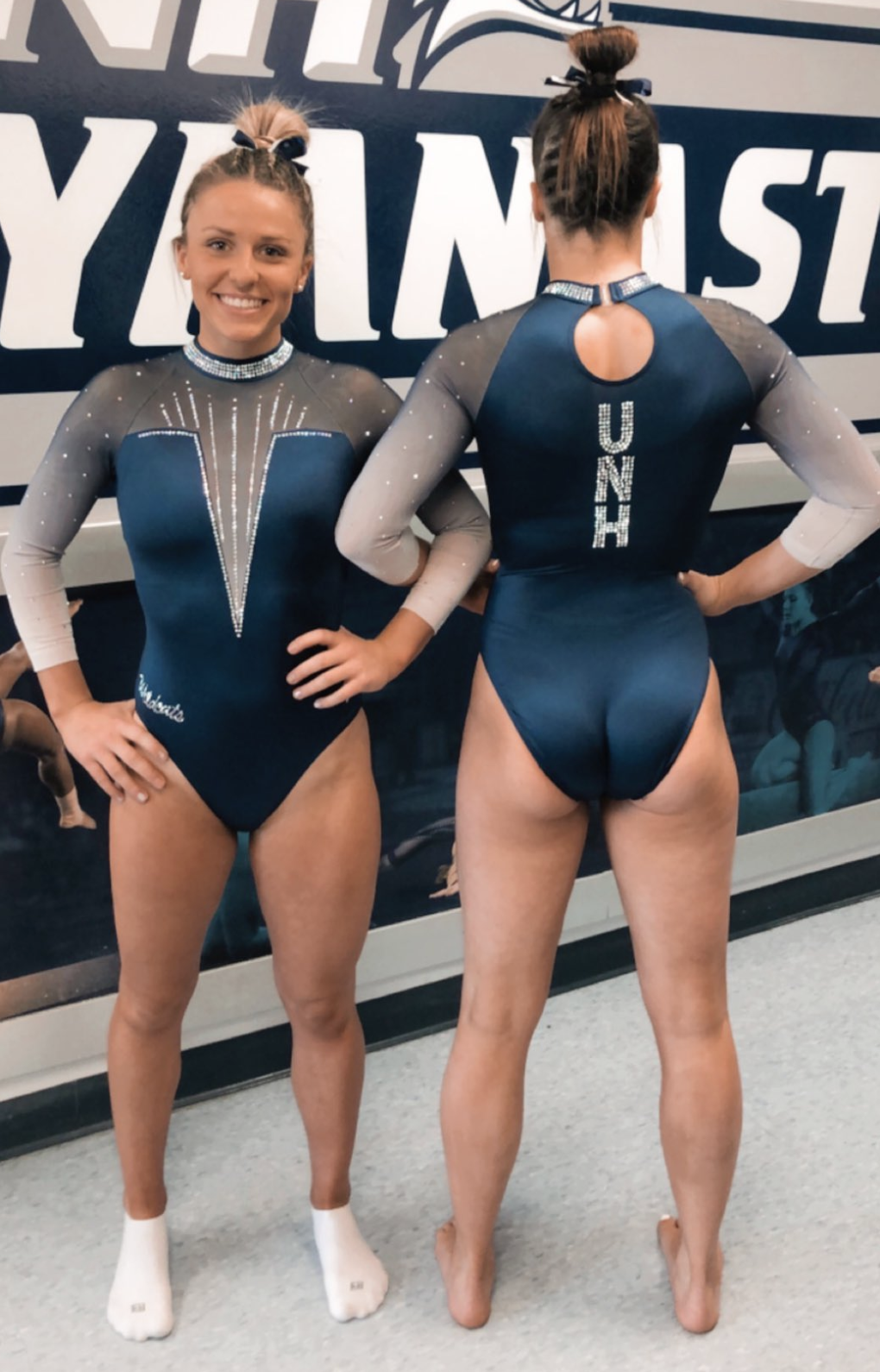
Photo: @UNHGymnastics, Twitter
| Design | Fabric/
Sparkle |
School
Spirit |
Overall
Appearance |
Total | |
| Elizabeth | 2.6/3 | 1.8/2 | 1.8/2 | 2.8/3 | 9.0/10 |
| Brandis | 2.5/3 | 1.5/2 | 1.7/2 | 2.5/3 | 8.2/10 |
| Claire | 2.8/3 | 2/2 | 1.5/2 | 2.8/3 | 9.1/10 |
Elizabeth: This is really, really, really nice! From the ombre sleeves and the matte blue body to the deep V to the small keyhole back, it’s perfect.
Brandis: The velvety blue that encompasses most of this leo is so elegant. They get bonus points from me due to my love of ombre, but like Florida’s leo, I could do without the collar.
Claire: This is the definition of “less is more.” The matte blue is gorgeous and sets off the ombre sleeves and shoulders beautifully. The relatively simple sparkle details on front and back are used to great effect, making the gymnasts look longer. I also really love the collar; it punches up the glam factor and provides some much-needed definition in all the ombre.
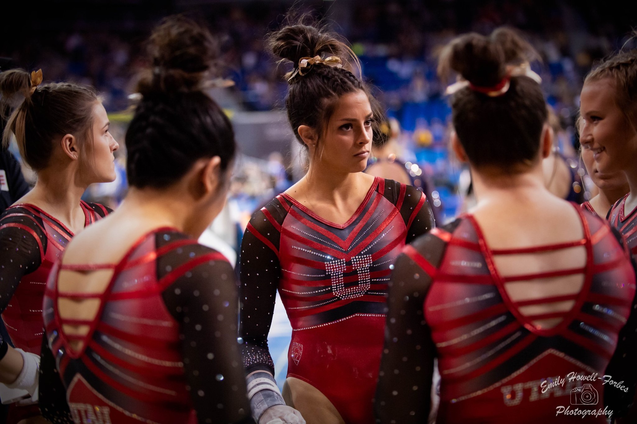
Utah: 8.600
| Design | Fabric/
Sparkle |
School
Spirit |
Overall
Appearance |
Total | |
| Elizabeth | 2.5/3 | 1.7/2 | 1.9/2 | 2.6/3 | 8.5/10 |
| Brandis | 2.4/3 | 1.6/2 | 2.0/2 | 2.7/3 | 8.7/10 |
| Claire | 2.3/3 | 1.8/2 | 2/2 | 2.5/3 | 8.6/10 |
Elizabeth: A good one for Utah! This reminds me of one of Nebraska’s new leos from this season. The red on back design is great, and I absolutely love how the line design continues into the straps on the back.
Brandis: I spy some subtle ombre in between the red stripes on the chest! I like the original design with the signature vibrant red that exudes Utah spirit. However, it is a bit busy, and some of the details can get lost amongst all that is going on in this leo.
Claire: They’ve done a really nice job of balancing glamour and athleticism here. The stripes are a fun element, and I love that they’re continuous not only front-to-back but also on the sleeves. The crystal U on the chest gets a bit lost in the stripes and ombre (though it does show up well at a distance); the comparatively simple sleeves might have been a better place for it.
UC Davis: 8.400
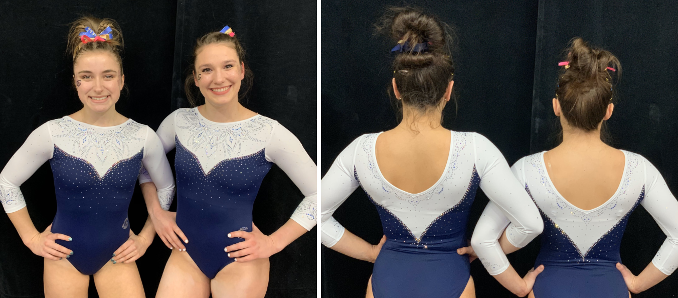
Photo: @ucdavisgym, Twitter
| Design | Fabric/
Sparkle |
School
Spirit |
Overall
Appearance |
Total | |
| Elizabeth | 2.0/3 | 1.7/2 | 1.4/2 | 2.0/3 | 7.1/10 |
| Brandis | 2.8/3 | 1.8/2 | 1.7/2 | 2.8/3 | 9.1/10 |
| Claire | 3.0/3 | 2.0/2 | 1.0/2 | 3.0/3 | 9.0/10 |
Elizabeth: This is pretty good! I always like the use of white, but the flower rhinestone design is just OK with me. I do love a good matte fabric though.
Brandis: Not sure how it looked from afar in the crowd, but the design on the chest is stunning! It is so intricate but not too busy, and the mini versions of it on the sleeves are beautiful too.
Claire: Blending so many different colors and sizes into such an intricate design was a risk, and it was well worth it. This is one of the best uses of rhinestones I’ve ever seen. Paired with the tulip-shaped bodice, it’s just perfection! They were also really smart to go simple for the materials and back/neckline, giving the sparkles a chance to shine.
Arkansas: 8.266
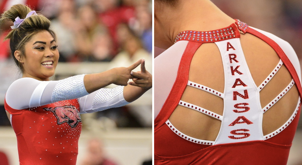
Photo: @razorbackgym, Instagram
| Design | Fabric/
Sparkle |
School
Spirit |
Overall
Appearance |
Total | |
| Elizabeth | 2.0/3 | 1.5/2 | 1.9/2 | 2.1/3 | 7.5/10 |
| Brandis | 2.4/3 | 1.7/2 | 2.0/2 | 2.0/3 | 8.1/10 |
| Claire | 2.7/3 | 2.0/2 | 2.0/2 | 2.5/3 | 9.2/10 |
Elizabeth: I love the back a LOT, and the front actually isn’t that bad despite me being firmly against putting giant hogs on women’s chests. However, I don’t really like the sleeves at all. I would have been fine with plain white mesh.
Brandis: I can get behind sparkle hog! This leo screams school spirit with both the Razorback on the front and Arkansas down the back. I think if there were less rhinestones on the chest, the hog would stand out even more, but it’s still a good look.
Claire: My grandmother always says, “You can’t make a silk purse out of a sow’s ear,” but apparently you can make a pretty fabulous leo out of a sparkle hog! That’s not the easiest mascot to glam up, but the Razorbacks pulled it off. They’ve let the pig be the focus, making sure the other rhinestones complement—not compete—with it. The back is also very cool, again adding interesting elements that don’t overwhelm the focal pig, er, point. The only drawback for me are the sleeves. The crystals remind me of an Easter ham stuck with cloves (although, to be fair, that’s not totally off theme); I agree with Elizabeth that simple white mesh would have been just enough.
Michigan State: 7.966
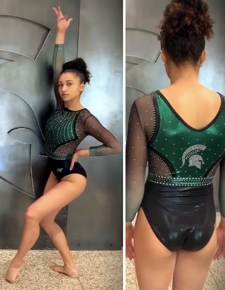
Photo: @msugymnastics, Instagram
| Design | Fabric/
Sparkle |
School
Spirit |
Overall
Appearance |
Total | |
| Elizabeth | 2.4/3 | 1.8/2 | 1.7/2 | 2.5/3 | 8.4/10 |
| Brandis | 2.4/3 | 1.8/2 | 1.8/2 | 2.4/3 | 8.4/10 |
| Claire | 1.9/3 | 1.7/2 | 1.5/2 | 2.0/3 | 7.1/10 |
Elizabeth: This is an unpopular opinion among most of my CGN peers, but I really like this one. I wish the solid fabric covered a bit more, but the ombre mesh sleeves are great, and I love the shade of green used.
Brandis: Usually I’m not a fan of all that mesh, but Michigan State makes it work here. Bordering the green with the black makes it stand out, and the rhinestone and green belt wraps it all together.
Claire: This one has grown on me since first glance.The mesh looks a little less tan and a little more black in action, which allows that poisonous green to really stand out. Also, big shock, I’m in love with the black-to-green ombre sleeves. The cutouts are a little much for my taste (there’s literally nothing connecting the front and back bodice), but the crystals on the green shield and waistband are well done.
Arizona: 7.700

Photo: @arizonagymnastics, Instagram
| Design | Fabric/
Sparkle |
School
Spirit |
Overall
Appearance |
Total | |
| Elizabeth | 2.4/3 | 1.6/2 | 1.5/2 | 2.5/3 | 8.0/10 |
| Brandis | 2.5/3 | 1.8/2 | 1.0/2 | 2.7/3 | 8.0/10 |
| Claire | 2.1/3 | 1.8/2 | 0.7/2 | 2.5/3 | 7.1/10 |
Elizabeth: I like this! The pointy V neckline is really nice, and I like the cross-hatching on the sleeves with rhinestones. Overall this is a good leo (especially the back!), but it doesn’t scream Arizona. That’s a minor thing though.
Brandis: It doesn’t make me think Arizona, but it sure is pretty. The rhinestone patterns and borders along the mesh are beautiful and really stand out on the shade of deep blue.
Claire: This is an interesting one… Absolutely nothing about it makes me think “Arizona,” but it’s a really cool leo. The cross-hatching on the sleeves is so unique, as is the little “necklace” patch coming off the collar. I really like that the rhinestones outlining the deep V neckline continue into a second deep V on the back.
Arizona State: 7.666
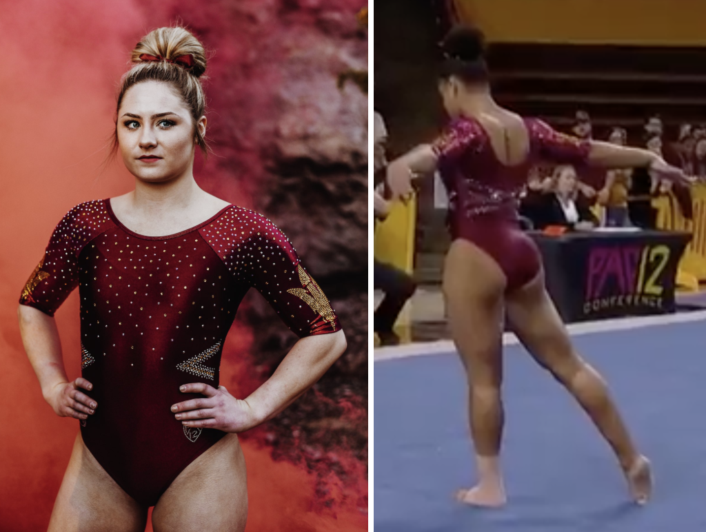
Photo: @sundevilgym, Twitter
| Design | Fabric/
Sparkle |
School
Spirit |
Overall
Appearance |
Total | |
| Elizabeth | 2.0/3 | 1.6/2 | 1.8/2 | 2.4/3 | 7.8/10 |
| Brandis | 2.2/3 | 1.7/2 | 1.6/2 | 2.0/3 | 7.5/10 |
| Claire | 2.2/3 | 1.7/2 | 1.5/2 | 2.3/3 | 7.7/10 |
Elizabeth: I love this. The essentially short sleeves on the leo are a little too short for me, but I love the simple all-maroon body with the gold accents. It’s fabulous.
Brandis: It’s simple but nice. The maroon is beautiful, and the rhinestones all over the top half add some flair too. I also like the design on the back, but wish it continued across the front too.
Claire: Love the color, love the sleeves, love the back! The only thing keeping this from being an absolute knockout is the too-simple bodice.The lattice design and pitchfork designs are so striking; there needs to be something on the chest to balance those out. Also—as with Auburn’s leo—mixing rhinestone colors really makes the designs pop. Other teams take note!
LSU: 7.333

| Design | Fabric/
Sparkle |
School
Spirit |
Overall
Appearance |
Total | |
| Elizabeth | 1.8/3 | 1.4/2 | 1.4/2 | 2.2/3 | 6.8/10 |
| Brandis | 2.5/3 | 1.8/2 | 1.7/2 | 2.5/3 | 8.5/10 |
| Claire | 2/3 | 1.4/2 | 1.0/2 | 2.3/3 | 6.7/10 |
Elizabeth: I actually didn’t realize this leo was new from afar until it was pointed out to me because it looks very similar to another LSU leo. However, I’m more OK with that than Florida’s closet full of nearly identical leos because the shade of purple on the sleeves is so nice. This is a good one overall, but I might have liked some gold somewhere to up the school spirit factor.
Brandis: The lighter shade of purple contrasts with the black so nicely. The subtle designs along the sleeves are also a welcome touch.
Claire: This is quite a departure for LSU, but that’s not necessarily a bad thing. This is a sweet, pretty (if somewhat forgettable) design; there isn’t a whole lot not to like! The lilac sleeves and crystal embellishments give just enough sparkle without being overwhelming, and I like how they’re a continuation of the bodice design.
Rutgers: 7.066
| Design | Fabric/
Sparkle |
School
Spirit |
Overall
Appearance |
Total | |
| Elizabeth | 2.4/3 | 1.6/2 | 1.8/2 | 2.6/3 | 8.4/10 |
| Brandis | 1.6/3 | 1.6/2 | 1.6/2 | 1.6/3 | 6.4/10 |
| Claire | 1.4/3 | 1.6/2 | 1.6/2 | 1.8/3 | 6.4/10 |
Elizabeth: I love metallic silver! Paired with the black and red, it’s gorgeous! This leo is so great, and my only hang up is the bathing suit-like strap around the neck that I could take or leave.
Brandis: The metallic silver and the red together don’t work for me. The design is a bit basic too, but I think with the color scheme shuffled around a bit it could be a decent looking Rutgers leo.
Claire: I actually like this liquidy, gunmetal fabric, I just think there’s too much of it. I’m also not crazy about the waist cutout; it drags the eye to the wrong place. The opening, straps, and piping in the back are my favorite part.
Penn State: 6.966
Photo: @pennstatewgym, Instagram
| Design | Fabric/
Sparkle |
School
Spirit |
Overall
Appearance |
Total | |
| Elizabeth | 2.3/3 | 1.6/2 | 1.5/2 | 2.4/3 | 7.8/10 |
| Brandis | 2.2/3 | 1.4/2 | 1.3/2 | 2.0/3 | 6.9/10 |
| Claire | 1.4/3 | 1.4/2 | 1.4/2 | 2/3 | 6.2/10 |
Elizabeth: I should hate this based on other leos, but I’m actually kind of digging it. The white floral pattern just works, and I like the cut and design.
Brandis: The pattern is fun, but there’s a lot going on here. Between that, the mesh and the back cutout, it gets really busy. The school spirit gets a little lost too, with the school logo at the top of the left sleeve becoming mute against the pattern.
Claire: You know the old saying: “Greater than the sum of its parts?” This leo’s parts are all pretty solid, but the overall effect falls flat. The blue and white damask is lovely but doesn’t go with the giant blue piping which doesn’t match the color of the bottom. Throw in the busy sleeves (which completely obscure the Nittany lion), and it’s all a bit overwhelming.
Florida: 6.533
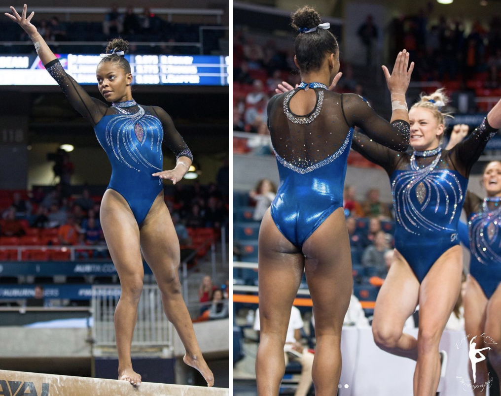
Photo: @gatorgym_pics, Instagram
| Design | Fabric/
Sparkle |
School
Spirit |
Overall
Appearance |
Total | |
| Elizabeth | 1.0/3 | 0.7/2 | 1.3/2 | 1.2/3 | 4.2/10 |
| Brandis | 2.5/3 | 1.8/2 | 1.5/2 | 2.2/3 | 8.0/10 |
| Claire | 2.2/3 | 2.0/2 | 0.7/2 | 2.5/3 | 7.4/10 |
Elizabeth: I refuse to judge any more Florida leos until the start looking different than literally every single one that came before them. In all seriousness, this is fine. But it’s boring and ordinary and not unique. Let’s put in some more effort next time please.
Brandis: Yes to the shade of blue, yes to the design, but no to the collar and rhinestone chest cutout. The movement in the leo is great, but I wish there was a touch of orange somewhere to give it a little more school spirit.
Claire: Team USA wore a red version of this at 2015 Worlds, but I like this even better. The black mesh sleeves offer a nice contrast to the blue bodice, and the crystals add a dreamy touch without being overwhelming. I especially love the collar. I wish they’d integrated some orange piping or crystals to make this look more obviously Florida—but it’s still pretty spectacular.
UCLA: 6.366
| Design | Fabric/
Sparkle |
School
Spirit |
Overall
Appearance |
Total | |
| Elizabeth | 1.4/3 | 1.4/2 | 1.4/2 | 1.6/3 | 5.8/10 |
| Brandis | 1.7/3 | 1.6/2 | 1.3/2 | 2.0/3 | 6.6/10 |
| Claire | 1.7/3 | 1.7/2 | 1.3/2 | 2/3 | 6.7/10 |
Elizabeth: This leo isn’t for me. The mesh side cutouts are unnecessary—and I normally don’t mind side cutouts!—the sparkle design looks like either veins or tree branches and the weird abrupt stop in the rhinestone collar has an unfinished look. Not my fave.
Brandis: This design reminds me of diagrams of the vascular system from high school. It’s definitely unique and original, but it’s not for me. I do like the rhinestones being gold though, it gives it just an added touch of school spirit.
Claire: I agree that the rhinestones look like veins, but that’s honestly my favorite part of the leo! I like the high collar, but it really bugs me that the sparkles just stop abruptly and leave that gap. I really like the sparkles on the sleeves, but the blue mesh kind of blends into the bodice. All in all, it’s inoffensive but ultimately forgettable.
Iowa: 5.633
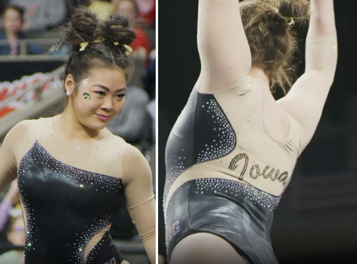
Photo: @iowagymnastics, Instagram
| Design | Fabric/
Sparkle |
School
Spirit |
Overall
Appearance |
Total | |
| Elizabeth | 1.6/3 | 1.4/2 | 1.6/2 | 1.8/3 | 6.4/10 |
| Brandis | 1.8/3 | 1.3/2 | 1.4/2 | 2.0/3 | 6.5/10 |
| Claire | 1.0/3 | 1.0/2 | 1.0/2 | 1.0/3 | 4.0/10 |
Elizabeth: This isn’t bad. Iowa has some better leos that use nude mesh, but I don’t hate it or nude mesh like some people do. Otherwise, it’s a fairly simple leo.
Brandis: As an Iowa alum I have become used to the typical Iowa look, but I wish that it would swap the tan for yellow. I think it would make for more bold and exciting leotard designs in addition to adding more school spirit. This leo is just so boring.
Claire: I don’t get this. Are the sleeves mesh or tan fabric? Either way, it looks like a ripped training leo.
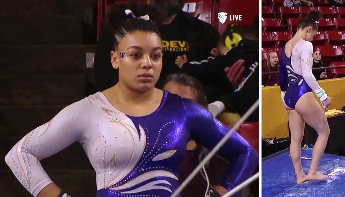
Washington: 5.433
| Design | Fabric/
Sparkle |
School
Spirit |
Overall
Appearance |
Total | |
| Elizabeth | 0.5/3 | 0.8/2 | 1.7/2 | 1.0/3 | 4.0/10 |
| Brandis | 2.2/3 | 1.5/2 | 1.7/2 | 2.4/3 | 7.8/10 |
| Claire | 1/3 | 1/2 | 1/2 | 1.5/3 | 4.5/10 |
Elizabeth: Washington, why would you get a new leo only to recreate a design from the early 2000s… I’m mad at the laziness of this leotard, but I can appreciate the use of actual gold. But you so rarely get new leos, why not really go for it in the design and not use a stock model I saw people wearing in club competitions when I was competing.
Brandis: There’s nothing too special about this leo, but it’s nice and clean and I like it. The purple and the white contrast so well, and I enjoy the golden outlines of the white patches throughout the design.
Claire: Meh… The only way this could be any more peak 2003 is if the team were wearing slicked back ponytails with multiple hair clips. I also really don’t understand why the appliques and the sleeves are both white. Even the gold outline can’t keep them from getting lost. Just making both sleeves purple would have been a big improvement.
Auburn: 5.266
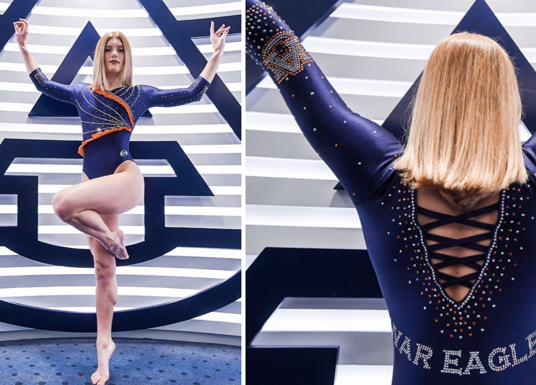
Photo: @auburngymnastics, Instagram
| Design | Fabric/
Sparkle |
School
Spirit |
Overall
Appearance |
Total | |
| Elizabeth | 1.2/3 | 0.2/2 | 1.5/2 | 1.0/3 | 3.9/10 |
| Brandis | 1.5/3 | 1.0/2 | 2.0/2 | 1.5/3 | 6.0/10 |
| Claire | 1.2/3 | 2.0/2 | 1.7/2 | 1.0/3 | 5.9/10 |
Elizabeth: This leo sans ruffles is very UCLA. This leo with ruffles? I think I wore something like it for my pool party birthday when I was 5 years old. I know most of the gymnasts liked this one, but it’s definitely not for me.
Brandis: I just can’t with the ruffles… I love everything else about this leo: the simplistic design between the ruffles, the gorgeous orange rhinestones, the “War Eagle” along the back and the rhinestone logos on the cuffs. If those ruffles were just orange bands, we may haven’t been flirting with a perfect score.
Claire: I love so much about this leo: The coupling of orange and white rhinestones against the dark blue fabric POPS, and the scalloped back with straps are a risk that pays dividends. And then there’s the ruffles… Props to Auburn for trying something different, but it’s so out of place and just kills the overall aesthetic.
READ THIS NEXT: Leotard Rankings: MKD Designs
Article by Elizabeth Grimsley, Brandis Heffner and Claire Billman
Like what you see? Consider donating to support our efforts throughout the year!
Someone needs to tell UCLA, that the patterns on their leotards are gross. Sometimes less is more.