A few new leos mixed with some old but good ones highlight our leo rankings this week. The criteria is the same as always: up to three points for design; two points for fabric and sparkle; two points for school spirit; and three points for overall appearance. This week’s guest judges are Emily M, our managing editor, and Christina, our senior Pac-12 editor.
Michigan State: 9.133
https://twitter.com/MSUgymnastics/status/1107313042621112320
| Design | Fabric/
Sparkle |
School
Spirit |
Overall
Appearance |
Total | |
| Elizabeth | 2.6/3 | 1.8/2 | 1.9/2 | 2.7/3 | 9.0/10 |
| Emily M | 2.8/3 | 1.9/2 | 2.0/2 | 2.7/3 | 9.4/10 |
| Christina | 2.7/3 | 1.7/2 | 1.9/2 | 2.7/3 | 9.0/10 |
Elizabeth: I like this one a lot. The Spartan Key print looks great and gives a cool effect when in motion. I also love the use of the emerald green, the amount of sparkle and the low, open back.
Emily M: OK, MSU! I love a black leo, and MSU’s are some of my favorites. The shade of green is solid, and I love incorporating school spirit with the Greek key pattern that MSU has adopted. Plus, those sparkles!
Christina: I love the details on this one, and the sparkles are great. The front is a bit too dark for me with all this solid black—and I’m not a fan of the neckline (or lack thereof)—but I am obsessed with the back. I wish the look had been complete without the clasp at the neck, but comfort and support first!
UCLA: 8.067
https://twitter.com/Pac12Network/status/1107697065067372544
| Design | Fabric/
Sparkle |
School
Spirit |
Overall
Appearance |
Total | |
| Elizabeth | 2.3/3 | 1.8/2 | 1.6/2 | 2.4/3 | 8.1/10 |
| Emily M | 2.6/3 | 1.9/2 | 1.3/2 | 2.4/3 | 8.2/10 |
| Christina | 2.5/3 | 1.7/2 | 1.2/2 | 2.5/3 | 7.9/10 |
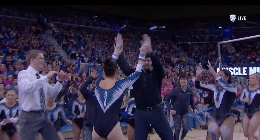
Elizabeth: This is one of the best UCLA leos I’ve seen in a while. I really like the extreme amount of sparkle on it as it’s unusual for UCLA to have a leo this sparkly. I also really like the use of mesh and the keyhole back—staying in that same open-back style we’ve come to know well with the Bruins yet not going overboard. My only complaint is that it got just a touch cleavage-y, so much so that the team had to tell one of the girls to pull it up a bit after her routine.
Emily M: I love that UCLA went with a brighter blue than the navy leos we’ve seen so much of! I agree with Elizabeth about the cleavage issue; the deep mesh is maybe a little too deep.
Christina: I really like this, even though this is so non-UCLA. I do appreciate the full coverage and the absence of fear from something slipping out. I love the sparkle and the asymmetric design on the front. I didn’t mind so much the two different fabrics for the sleeves, but this makes it look like a dance leo. The cleavage is also my only criticism, and it once more looks like a band was added at the last minute to cover things up.
Lindenwood: 8.000
https://twitter.com/LionsGymnastics/status/1106288707647213570
| Design | Fabric/
Sparkle |
School
Spirit |
Overall
Appearance |
Total | |
| Elizabeth | 2.3/3 | 1.7/2 | 1.7/2 | 2.4/3 | 8.1/10 |
| Emily M | 2.4/3 | 1.4/2 | 1.7/2 | 2.5/3 | 8.1/10 |
| Christina | 2.2/3 | 1.5/2 | 1.8/2 | 2.3/3 | 7.8/10 |
Elizabeth: Lindenwood with another winner this year! I love the front he most about this, with the diamond-y design, sparkles and the use of the gold. I also like the school spirit on the back and the mesh sleeves. Overall, I don’t like it as much as last year’s debut, but it’s still a great leo.
Emily M: This leo is very Iowa to me, which is a compliment. I love a well-executed black leo, and this one is lovely. The gold is subtle, and I agree with Christina that the symmetry is pleasing to the eye.
Christina: I really like the symmetry in the front and the sharp angles. The design overall is quite nice, and I like the use of gold here. It’s not my most favorite LU leo, but it is definitely a nice one.
William & Mary: 7.567
| Design | Fabric/
Sparkle |
School
Spirit |
Overall
Appearance |
Total | |
| Elizabeth | 1.9/3 | 1.5/2 | 1.8/2 | 2.0/3 | 7.2/10 |
| Emily M | 2.4/3 | 1.6/2 | 1.9/2 | 2.5/3 | 8.4/10 |
| Christina | 1.8/3 | 1.3/2 | 1.9/2 | 2.1/3 | 7.1/10 |
Elizabeth: This isn’t a half-bad leo for the Tribe. I like the school spirit, and the emerald green on the sides. I also like the amount of sparkle. William & Mary has worse leos, but it also has one better.
Emily M: Oooh this is an intriguing combination of sporty and mesh. I like the sleeves, and using the white to sort of hide the sleeve/body seam really works; mesh sleeve seems can get super weird, so kudos to the Tribe for thinking about that. I like this a lot.
Christina: This is alright. I do like the athletic look, but it’s overall a bit too dark for me. As usual, I’m not a big fan of side cutouts, but the white band sort of hides it.
Oklahoma: 7.433
| Design | Fabric/
Sparkle |
School
Spirit |
Overall
Appearance |
Total | |
| Elizabeth | 2.0/3 | 1.6/2 | 1.7/2 | 2.1/3 | 7.4/10 |
| Emily M | 1.9/3 | 1.4/2 | 1.8/2 | 1.9/3 | 7.0/10 |
| Christina | 2.3/3 | 1.6/2 | 1.8/2 | 2.2/3 | 7.9/10 |
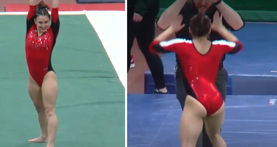
Elizabeth: This was a definite throwback for the Sooners, but I like it. The design is way more athletic-looking than Oklahoma’s typical style, and the stripes are reminiscent of Adidas’ trademark look. Plus, it’s classic crimson and white Oklahoma.
Emily M: I really enjoy it when Oklahoma incorporates some white! Very solid. I’m not a huge fan of the straight line of crystals that falls right on the bust; not the best look. That said, I agree with Elizabeth that the athletic look really works here.
Christina: I am digging this throwback and am so happy this leo made a comeback! I love the athletic look, the sheer white on the shoulders and arms with the rest of the bodice solid crimson.
Ball State: 6.100

| Design | Fabric/
Sparkle |
School
Spirit |
Overall
Appearance |
Total | |
| Elizabeth | 1.8/3 | 1.3/2 | 1.5/2 | 1.9/3 | 6.5/10 |
| Emily M | 1.6/3 | 1.7/2 | 1.4/2 | 2.1/3 | 6.8/10 |
| Christina | 1.2/3 | 1.3/2 | 1.0/2 | 1.5/3 | 5.0/10 |
Elizabeth: I like this I think. It’s at least better than most of Ball State’s leos. The geometric look is nice, and this design as a whole is pretty simple yet classy. There’s just the right amount of sparkle too.
Emily M: This is a really athletic look, and it works! I’m not sure I love the white stripes on the shoulders, and the way the black and red cuts together on the sleeve is a little odd, but overall I appreciate the bold red look and side panels.
Christina: I like the athletic look usually, but this one is a meh for me. The design is a bit too simple, and I’m not a fan of the black cuts on the sides nor the random white ones across the arms and shoulders. It’s far from being a hideous leo, but I’m just not feeling it.
Utah State: 6.067

| Design | Fabric/
Sparkle |
School
Spirit |
Overall
Appearance |
Total | |
| Elizabeth | 1.7/3 | 1.3/2 | 1.7/2 | 1.8/3 | 6.5/10 |
| Emily M | 1.5/3 | 1.5/2 | 1.8/2 | 1.6/3 | 6.4/10 |
| Christina | 1.0/3 | 1.3/2 | 1.6/2 | 1.4/3 | 5.3/10 |
Elizabeth: I like this better than some leos Utah State has, and overall it’s not a bad leo. It’s just not my favorite when comparing to other designs and team’s I’ve seen. I do like the sort of feathered look with the white/grey, and the “Aggies” on the back.
Emily M: I just can’t make my mind up about this one. I like the blue and black and the symmetry of the Vs on the front and back, but I just feel weirdly about the white teeth? They look like shark teeth, and I can’t unsee it.
Christina: Oh, no. They look like they have a spiked fence all across their bodies, or yes, shark teeth. I can’t get past it.
Seattle Pacific: 5.733
| Design | Fabric/
Sparkle |
School
Spirit |
Overall
Appearance |
Total | |
| Elizabeth | 1.0/3 | 1.0/2 | 1.9/2 | 1.4/3 | 5.3/10 |
| Emily M | 1.5/3 | 1.4/2 | 2.0/2 | 1.7/3 | 6.6/10 |
| Christina | 1.1/3 | 1.0/2 | 1.9/2 | 1.3/3 | 5.3/10 |
Elizabeth: This isn’t a new leo, but it never should have come out of the closet again. The gold and red are at least good on school spirit, but the combo isn’t my favorite. The Falcons logo on the side is also way too big.
Emily M: Oh hmm. That color combo is rough. I suppose there’s not much Seattle Pacific can do about that, but I love it when they stick to neutrals in combination with the crimson, rather than going all-in like this. To be honest, I don’t hate the falcon logo. Sure, it’s big, but if you’re going to put a bird on your leo, really go for it.
Christina: Oh this color combo is a no. The logo is also just way too big for my taste, and I’m not a big fan of the gold band cutting across the chest.
READ THIS NEXT: Leotard Rankings: Week 10
Article by Elizabeth Grimsley, Emily Minehart and Christina Marmet
Like what you see? Consider donating to support our efforts throughout the year! [wpedon id=”13158″]


Um, that video clip wasn’t the new UCLA leo …
Hi R, The clip actually does show the new UCLA leo. The first part of the video is of Kyla Ross’ perfect 10 routine from the meet where the Bruins wore the new design. Thanks for reading!
FYI Nicole Jones (Curler) gets complete credit for our Leo designs! Yeah, we’re pretty excited about them!
She hit this one out of the park! Thanks for reading!
Funny how you only like the top teams leotards. Very very biased
Hi Jen, We rate every new leo that debuts in college gymnastics and keep an open mind no matter what school wore it. This week’s faves from our judges happened to be UCLA, the defending national champs, but also Michigan State, ranked No. 40 in the country, and Lindenwood, a Division II program. We love sharing our opinions on the designs, and would love to hear yours anytime you wish to share it. Thanks for reading!
Was Arizona’s not a new leo? I thought it was awesome how it incorporated state flag. Also, huge shout out to my Spartans for theirs this week! Wish they’d do more all green ones sand maybe even a white but the one featured this week is rocking!