Few new leos were debuted this week, but the ones that were, were good ones thanks to senior nights and other high-profile matchups. The criteria for judging is the same as always: up to three points for design; two points for fabric and sparkle; two points for school spirit; and three points for overall appearance. This week’s guest judges are Brandis Heffner, our men’s editor, and Emily HF, our senior photographer.
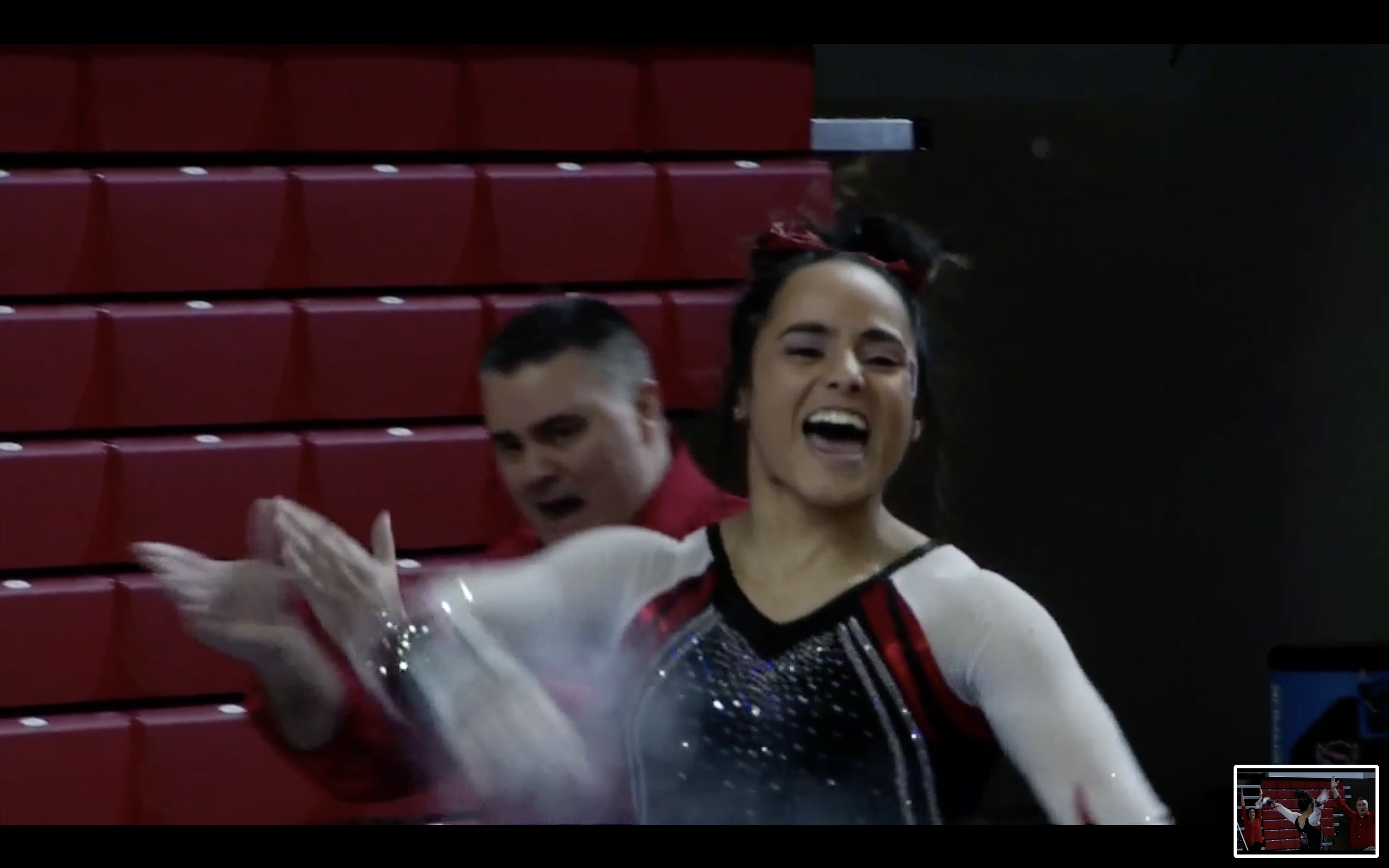
Michigan: 8.633
Maddie Mariani leads us off with a 9.850!! #GoBlue pic.twitter.com/G9dNztJWgU
— Michigan Women’s Gymnastics (@UMichWGym) March 9, 2019
| Design | Fabric/
Sparkle |
School
Spirit |
Overall
Appearance |
Total | |
| Elizabeth | 2.5/3 | 1.8/2 | 1.8/2 | 2.5/3 | 8.6/10 |
| Brandis | 2.5/3 | 1.7/2 | 1.8/2 | 2.5/3 | 8.5/10 |
| Emily HF | 2.5/3 | 1.9/2 | 1.8/2 | 2.6/3 | 8.8/10 |
Elizabeth: I loved the silvery, sparkly bust fabric when I saw it for the first time. Plus, the velvet bottom is a great touch of retro in the design. I also love the use of yellow rhinestones, adding school spirit without being YELLOW. The only thing I could do without is the weird sternum hole, but as a whole it doesn’t really detract from the leo so I almost don’t even mind it.
Brandis: Not going to lie, I’m usually not a fan of Michigan’s leos. This one, however, I really like. The sparkles and the muted yellow on the torso are beautiful, and the design is intricate but not over the top.
Emily HF: This is another great one this week. The yellow/gold rhinestones take it to the next level, and the velvet on the bottom is amazing. Even the weird little “sternum hole,” as Elizabeth called it, isn’t super noticeable and not really at all when in motion.
New Hampshire: 8.533
https://twitter.com/UNHGymnastics/status/1104199135224311809
| Design | Fabric/
Sparkle |
School
Spirit |
Overall
Appearance |
Total | |
| Elizabeth | 1.8/3 | 1.7/2 | 2.0/2 | 1.9/3 | 7.4/10 |
| Brandis | 2.8/3 | 1.7/2 | 1.8/2 | 2.6/3 | 8.9/10 |
| Emily HF | 2.8/3 | 1.9/2 | 2.0/2 | 2.5/3 | 9.3/10 |
Elizabeth: This is good, but overall it’s just medium to me. I like the school spirit, and the ombre of course. Maybe it’s just a bit too plain otherwise for me?
Brandis: The ombre going diagonally on this leo instead of vertical like usual takes this to the next level. It’s a little simple and I wish the scratch marks continued onto the back as well, but I’m a big fan of this for New Hampshire.
Emily HF: LOVE. The ombre is great and the scratch marks are a cool element of school spirit without being too much. I agree I wish they continued on to the back, but other than that this is easily one of my favorites of the week.
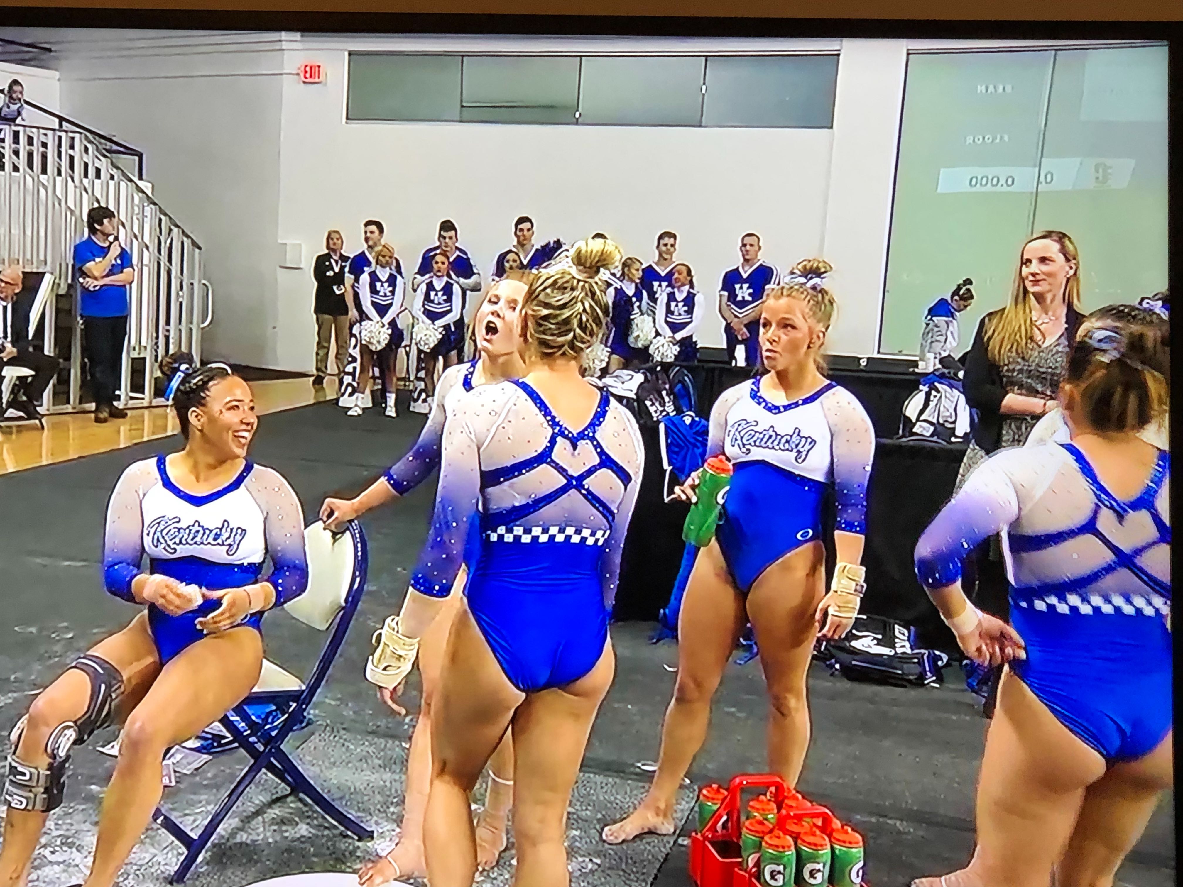
Kentucky: 8.000
| Design | Fabric/
Sparkle |
School
Spirit |
Overall
Appearance |
Total | |
| Elizabeth | 2.4/3 | 1.7/2 | 1.9/2 | 2.6/3 | 8.6/10 |
| Brandis | 2.7/3 | 1.6/2 | 2.0/2 | 2.6/3 | 8.9/10 |
| Emily HF | 1.5/3 | 1.0/2 | 2.0/2 | 2.0/3 | 6.5/10 |
Elizabeth: I really like this one! The design is very Kentucky to me for some reason, and I love the incorporation of the checkered stripe that we see a lot in the team’s football and basketball uniforms. I also really like the ombre, the back and the “Kentucky” on the chest. The only thing I think could have been executed better is the random hangy-downy part on the middle of the back neckline. I’m assuming it’s from a clip or something, but it looks sloppy.
Brandis: Yay for ombre! The little strip of checker on the back is super fun and screams Kentucky. Keeping it to two colors makes this leo clean and one of my favorites of the week.
Emily HF: I’m going to be the odd man out here, but I really wish they’d ombred the front too. The white to blue with no transitional element isn’t working for me. And the Kentucky on the chest is just too much. I’m not as hard as Rebecca on no words, but I don’t want it to be the first thing I notice on a leo. I love the sleeves and the back though.
Penn State: 7.600
https://twitter.com/PennStateWGYM/status/1104157135728975872
| Design | Fabric/
Sparkle |
School
Spirit |
Overall
Appearance |
Total | |
| Elizabeth | 2.6/3 | 1.6/2 | 1.7/2 | 2.7/3 | 8.6/10 |
| Brandis | 1.5/3 | 1.2/2 | 2.0/2 | 1.5/3 | 6.2/10 |
| Emily HF | 2.3/3 | 1.7/2 | 2.0/2 | 2.0/3 | 8.0/10 |
Elizabeth: I love this! I don’t like many white leos, but this is a win. I also don’t often like side designs, but I like how the blue triangle/diamonds on this leo are sort of a continuation of the back. Speaking of the back, I’m obsessed. Overall, this is an excellent leo from Penn State that definitely doesn’t look like any of its others.
Brandis: Not a big fan of this one. I like the idea of a retro look, but this is just too simple. It looks to me like they went plain on the front and tried to do an interesting back, but it doesn’t work for me. This leo does make me think Penn State though, so A+ for that.
Emily HF: I’m torn. I generally dislike side triangles on principle, but they are a continuation of the design and from what I saw fairly flattering. The back is amazing (as long as we’re ignoring the inherent issues that come with open backs like this), and it looked good on everyone in the pictures and video I saw—so that’s a definite plus.
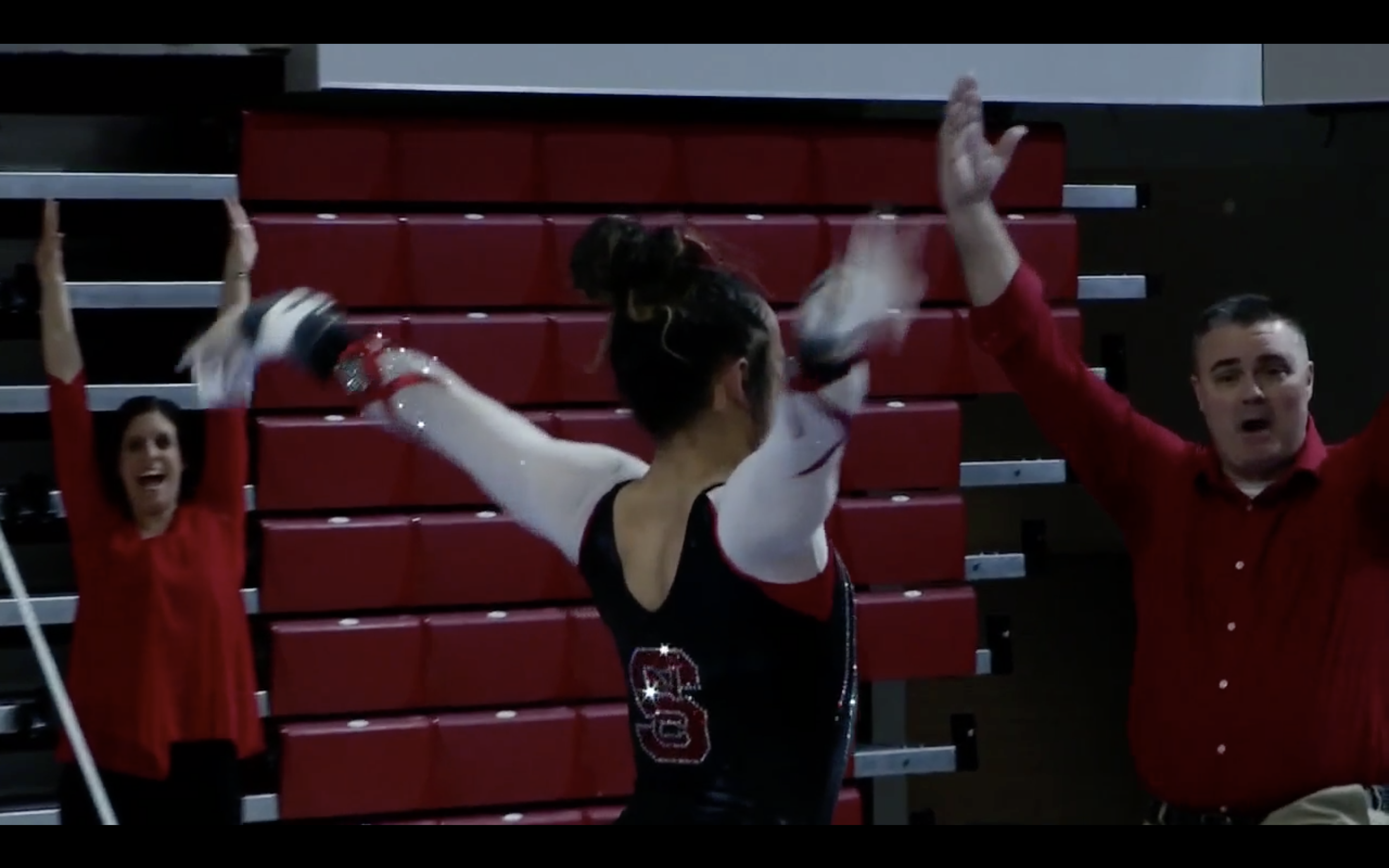
N.C. State: 7.433
| Design | Fabric/
Sparkle |
School
Spirit |
Overall
Appearance |
Total | |
| Elizabeth | 2.0/3 | 1.6/2 | 1.8/2 | 2.1/3 | 7.5/10 |
| Brandis | 2.0/3 | 1.4/2 | 1.7/2 | 2.1/3 | 7.2/10 |
| Emily HF | 2.0/3 | 1.5/2 | 1.8/2 | 2.3/3 | 7.6/10 |
Elizabeth: This is way different than any other leo N.C. State has in its lineup, and I’m not upset. I like the mesh white arms paired with the solid black body. Plus, the sparkly NCSU logo looks great on the back. I don’t love the cuff design, but overall it’s a good leo.
Brandis: I’m a big fan of the sleeves and the design on the front of this leo. The back leaves a little to be desired, but the way the red pops on the white draws me in.
Emily HF: I don’t love the random red lines at the end of the sleeves, but other than that this is great. The front is super pretty, and I love how it incorporates the red that continues onto the back of the leo.
Florida: 6.466
A final bow at home for senior @gymdiva02!
She set her collegiate-best on floor with a 9⃣.9⃣7⃣5⃣#GoGators pic.twitter.com/X3HRjtLqM0
— Gators Gymnastics (@GatorsGym) March 9, 2019
| Design | Fabric/
Sparkle |
School
Spirit |
Overall
Appearance |
Total | |
| Elizabeth | 1.6/3 | 0.8/2 | 1.5/2 | 1.8/3 | 5.7/10 |
| Brandis | 2.2/3 | 1.5/2 | 1.6/2 | 2.4/3 | 7.7/10 |
| Emily HF | 1.5/3 | 1.5/2 | 1.5/2 | 1.5/3 | 6.0/10 |
Elizabeth: Meh. This leo looked pretty dull, actually, in pics, and while the video version was better, it’s just not my favorite overall. I don’t really like the random mesh and black, and the color blue used is oddly dark. It’s definitely not even close to one of my favorite Florida designs.
Brandis: I’m not usually big on cutouts, but these look good! It’s a little monotone with only the single color paired with the sparkles, but the unique design makes up for that in my eyes.
Emily HF: I’m always a fan of this color blue, but what is with the trend of placing a band of some kind below the ribcage on leos this year. It cuts lines weird, and I don’t find it flattering.
READ THIS NEXT: Leotard Rankings: Week Nine
Article by Elizabeth Grimsley, Brandis Heffner and Emily Howell-Forbes
Like what you see? Consider donating to support our efforts throughout the year! [wpedon id=”13158″]