
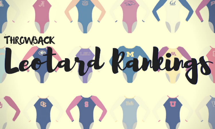
It’s the final throwback leotard rankings of the offseason! The criteria is the same as always: up to three points for design; two points for fabric, sparkle, etc.; and two points for school spirit; three points for overall appearance. Guest judges this week will be Emily HF, our senior photographer, Emily M, our managing editor and Rebecca, our senior editor. The meet? We’re jumping allll the way back to the 1983 NCAA Championships.
Alabama: 7.400
| Design | Fabric/
Sparkle |
School
Spirit |
Overall
Appearance |
Total | |
| Elizabeth | 1.4/3 | 1.2/2 | 1.6/2 | 1.6/3 | 5.8/10 |
| Emily HF | 2.0/3 | 1.5/2 | 1.5/2 | 2.0/3 | 7.0/10 |
| Emily M | 2.4/3 | 1.3/2 | 1.5/2 | 2.6/3 | 7.8/10 |
| Rebecca | 2.9/3 | 1.8/2 | 1.6/2 | 2.7/3 | 9.0/10 |
Elizabeth: To be honest, this is one of the best of the bunch, but that isn’t saying much considering most of the others are horrid. I like the red and the small amount of white piping. I wish it was a little more crimson than red though.
Emily HF: Best leo of them all. It may be my screen but the stripes look kind of yellow to me, and I thought it was an ASU leo for a second. I’d love to see them in actual yellow.
Emily M: I love this. The strange cut of that white stripe really works for me, and I can’t put my finger on why. I love how athletic it is and that Alabama went full RED. The candy cane stripe look was its thing back in the day too, and I like that this leo is different but fits the theme.
Rebecca: Yep yes thank you delete every leotard from 2018 and replace it with this. Two nice colors, simple pattern, matte—done and done. I agree that it could have gone a little more maroon than brick red, but I’m not mad about it.
Arizona State: 6.075

| Design | Fabric/
Sparkle |
School
Spirit |
Overall
Appearance |
Total | |
| Elizabeth | 1.6/3 | 1.2/2 | 1.5/2 | 1.7/3 | 6.0/10 |
| Emily HF | 1.5/3 | 1.0/2 | 1.0/2 | 2.0/3 | 5.5/10 |
| Emily M | 1.5/3 | 1.3/2 | 0.5/2 | 2.5/3 | 5.8/10 |
| Rebecca | 2.1/3 | 1.4/2 | 1.0/2 | 2.5/3 | 7.0/10 |
Elizabeth: This actually isn’t half bad. I like the colors, but the random pink is interesting. I also kind of like the gradient-style of the design.
Emily HF: OK but what is with these patterns? I just cannot with the upside down boob V.
Emily M: Maroon! I love the color, and I like the almost ombre it gets with the pinks, but what is this pattern? I can’t figure it out.
Rebecca: This vaguely reminds me of that odd patchwork club leo that Arizona Sunrays wears. I really like the maroon and orange combination, honestly. It would look really odd in 2018, but I can’t find much to complain about. I like it.
Cal State Fullerton: 5.000

| Design | Fabric/
Sparkle |
School
Spirit |
Overall
Appearance |
Total | |
| Elizabeth | 1.0/3 | 1.2/2 | 1.0/2 | 1.2/3 | 4.4/10 |
| Emily HF | 1.5/3 | 1.4/2 | 1.0/2 | 2.0/3 | 5.9/10 |
| Emily M | 1.2/3 | 1.3/2 | 0.5/2 | 2.6/3 | 5.6/10 |
| Rebecca | 0.8/3 | 1.0/2 | 1.0/2 | 1.3/3 | 4.1/10 |
Elizabeth: This could have been good but…isn’t. The red is nice, and I don’t even mind the floral design. But the placement of the flowers is bad.
Emily HF: Um… it’s… not horrible? I am also confused by the flowers being there, and it might not look good on other body types? But again not bad.
Emily M: Oh boy. Is the white pattern flowers? Why? Why are they on that low diagonal? I’m so confused. I don’t hate it, but I also don’t get it.
Rebecca: Skipping past the flowers, let’s talk about the diagonal pattern of dots that may be small white squares on the upper body.
Florida: 4.825

| Design | Fabric/
Sparkle |
School
Spirit |
Overall
Appearance |
Total | |
| Elizabeth | 0.9/3 | 0.8/2 | 1.6/2 | 1.0/3 | 4.3/10 |
| Emily HF | 1.0/3 | 0.5/2 | 1.5/2 | 1.0/3 | 4.0/10 |
| Emily M | 1.0/3 | 1.3/2 | 1.9/2 | 1.3/3 | 5.5/10 |
| Rebecca | 1.0/3 | 1.5/2 | 1.5/2 | 1.5/3 | 5.5/10 |
Elizabeth: I’m digging this old-school Florida logo on the front, but I’m not a fan of the all white in that type of fabric. It shows all the body’s imperfections/makes up imperfections these athletes don’t have. I also am not a fan of the names on the back. This isn’t football.
Emily HF: This looks like someone just took a big circle sticker and stuck it on the front…. And the names? Why?!
Emily M: HaHA. I enjoy a white leo, and I even like the double V on front and back. But why the names? What exactly is that Florida logo? Oh dear.
Rebecca: I’m actually into the names, but the logo looks like my mom put it there with iron-on transfer paper. Actually, my mom’s homemade T-shirts were significantly less clunky.
Utah: 2.450

| Design | Fabric/
Sparkle |
School
Spirit |
Overall
Appearance |
Total | |
| Elizabeth | 0.8/3 | 1.2/2 | 0.1/2 | 0.9/3 | 3.0/10 |
| Emily HF | 0.5/3 | 1.0/2 | 0.1/2 | .5/3 | 2.1/10 |
| Emily M | 0.6/3 | 1.3/2 | 0.5/2 | 0.8/3 | 3.2/10 |
| Rebecca | 0.0/3 | 1.0/2 | 0.0/2 | 0.5/3 | 1.5/10 |
Elizabeth: I like the color? That’s all I can really say about this because I just don’t understand the rest.
Emily HF: This…. Looks like maybe you could play some kind of board game on it? Multi purpose? But just no for a leo.
Emily M: No no nonononono. No. I like a purple leo, but what is happening here? Why the lavender with that …square? Thing? Made up of a black (dark purple?) and yellow checkerboard? I’m also not a fan of the crotch-proximity of the bottom bit of that stripe, either.
Rebecca: What? I’ve got nothing. The color’s nice, I guess.
READ THIS NEXT: Leotard Rankings: 1997 NCAAs
Article by Elizabeth Grimsley, Emily Howell-Forbes, Emily Minehart and Rebecca Scally
Like what you see? Consider donating to support our efforts throughout the year! [wpedon id=”13158″]
One comment
Comments are closed.