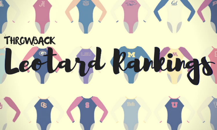
We’re bringing back throwback leo rankings this offseason to tide you over until 2019 arrives! The criteria is the same as always: up to three points for design; two points for fabric, sparkle, etc.; and two points for school spirit; three points for overall appearance. Guest judges this week will be Katherine, our new (!) SEC editor and Mary Emma, our new (!) EAGL and ECAC editor. The meet? We’re jumping 11 years back to the 1997 NCAA championships.
Michigan: 7.733

| Design | Fabric/
Sparkle |
School
Spirit |
Overall
Appearance |
Total | |
| Elizabeth | 2.1/3 | 1.5/2 | 1.8/2 | 2.2/3 | 7.6/10 |
| Katherine | 2.0/3 | 1.9/2 | 1.5/2 | 1.9/3 | 7.3/10 |
| Mary Emma | 2.3/3 | 1.7/2 | 2.0/2 | 2.3/3 | 8.3/10 |
Elizabeth: I’ve decided I’m really digging this leo, especially compared to some others in this competition. The navy velvet is simple but classic, and the rhinestones around the collar and sleeves are a nice added touch. My favorite part of the design is the big-but-not-too-big Michigan on the chest.
Katherine: I’ve always found navy blue to be really classy, and the simplicity of this design adds to that—the rhinestones are just enough to make it stand out. But I really can’t get with the “Michigan” on the chest… The font looks like it should be on the poster for “The Greatest Showman,” not on a leo!
Mary Emma: I really like the classic navy design with the sparkles on the collar. It’s simple but not too simple for my liking. The one thing I’m not too crazy about is the Michigan on the chest. I’m not a big fan of words on the chest, but it does show a lot of school spirit!
UCLA: 7.067
| Design | Fabric/
Sparkle |
School
Spirit |
Overall
Appearance |
Total | |
| Elizabeth | 1.8/3 | 1.3/2 | 1.3/2 | 1.9/3 | 6.3/10 |
| Katherine | 2.4/3 | 1.9/2 | 0.8/2 | 2.2/3 | 7.3/10 |
| Mary Emma | 2.3/3 | 1.5/2 | 1.3/2 | 2.5/3 | 7.6/10 |
Elizabeth: This leo is so classic UCLA in the way that all of its elements are so strange and no sane person would have chosen them but it somehow works. The arm fabric has a checkerboard pattern but it’s barely noticeable and the shimmer actually looks pretty nice. It works well with the navy mesh (and can we appreciate the use of two blue colors?). The one thing I don’t care for is where the two fabrics change. Right in the middle of the boob isn’t too attractive.
Katherine: I wasn’t a fan at first glance, but I realize I actually like the simplicity of this design. The two fabrics complement each other nicely. And the top half is just shiny and shimmery enough to look pretty without causing vision impairment. Other than the school name on the hip, though, I would not look at this leo and immediately associate it with UCLA.
Mary Emma: I really like this one! I love the light blue shimmery sleeves, and the UCLA on the hip is a nice touch. The only thing I dislike is the cut between the light blue and the dark blue. It’s an odd placement and would look better if it was either a little higher or a sweetheart cut.
Florida: 6.933

| Design | Fabric/
Sparkle |
School
Spirit |
Overall
Appearance |
Total | |
| Elizabeth | 1.6/3 | 1.1/2 | 1.8/2 | 1.7/3 | 6.2/10 |
| Katherine | 1.9/3 | 1.2/2 | 1.9/2 | 1.8/3 | 6.8/10 |
| Mary Emma | 2.3/3 | 1.4/2 | 2.0/2 | 2.1/3 | 7.8/10 |
Elizabeth: This is alright. The blue and orange colors aren’t a good combo for me, especially with the mostly white. I do like all the school spirit though, with the Gators on one sleeve and Florida on the other, and the actual use of both school colors. I also enjoy the back design as it’s not just a whole or just plain but semi-unique.
Katherine: A much better use of the school and mascot name on this one than the others; love the location and it’s a nice font. The colors look nice too, but I would have liked to see them come together a little more cohesively—the white doesn’t really fit. Maybe get rid of the white and make it sparkly?
Mary Emma: A Florida leo with orange! I love the orange and blue combo, and I think the white complements it nicely. I can’t quite put my finger on it, but there’s something about it that makes me not quite love it. It might be because I’m not a big fan of overly white leos, so maybe if the blue and white were reversed, I would like it more.
Arizona State: 6.800

| Design | Fabric/
Sparkle |
School
Spirit |
Overall
Appearance |
Total | |
| Elizabeth | 2.1/3 | 1.3/2 | 1.6/2 | 2.2/3 | 7.2/10 |
| Katherine | 1.9/3 | 1.1/2 | 1.3/2 | 1.9/3 | 6.2/10 |
| Mary Emma | 2.2/3 | 1.3/2 | 1.5/2 | 2.0/3 | 7.0/10 |
Elizabeth: This is nice! ASU often uses the flame design, but it actually makes sense with the Sun Devils mascot so I’m fine with it. I also like the use of “real” gold vs. crappy yellow. The shade of red and back hole complete the look.
Katherine: Maybe it’s hard to tell because of the video quality, but these colors just seem really dull. The flame design is well-executed—and I like that it’s a subtle nod to the mascot—but I would have liked to see a color scheme that made it pop out a little more.
Mary Emma: I love the flame design. The only things I’m not crazy about are the flames on the sleeves. I kind of wish the gold on the sleeves was a little more bold, but overall this is a nice one.
Can we also pause to appreciate ASU’s Elizabeth Reid’s amazing bar routine?

Georgia: 6.533

| Design | Fabric/
Sparkle |
School
Spirit |
Overall
Appearance |
Total | |
| Elizabeth | 1.9/3 | 1.2/2 | 1.5/2 | 2.0/3 | 6.6/10 |
| Katherine | 1.8/3 | 1.5/2 | 1.5/2 | 1.7/3 | 6.5/10 |
| Mary Emma | 2.0/3 | 0.8/2 | 1.7/2 | 2.0/3 | 6.5/10 |
Elizabeth: I don’t know how to feel about this. For the most part, I like it. The black velvet is classy and pairs well with the “mystique” white. I like the back hole but the front collar thing reminds me of Ruth Bader Ginsburg… Plus, there’s just enough school spirit that it doesn’t go overboard.
Katherine: It’s not terrible, but something about the Georgia logo paired with the collar feels awkward and mismatched. I’d prefer it if it just had one of those things—either or. I do like the black, but these elements together are a deal breaker for me.
Mary Emma: I think the black design looks classy, and I really like the simple Georgia logo on the shoulder. I just wish it had a little more going on. The white collar is a little odd and makes me think of a preacher from the 1600s, but it’s kind of starting to grow on me the more I look at it. Overall it’s nice but a little too simple for my tastes.
Nebraska: 4.400

| Design | Fabric/
Sparkle |
School
Spirit |
Overall
Appearance |
Total | |
| Elizabeth | 1.0/3 | 0.8/2 | 1.4/2 | 1.1/3 | 4.3/10 |
| Katherine | 1.0/3 | 1.2/2 | 1.4/2 | 1.3/3 | 4.9/10 |
| Mary Emma | 1.0/3 | 0.5/2 | 1.3/2 | 1.2/3 | 4.0/10 |
Elizabeth: Hmm. This is a little blah to me. The front is alright, although I don’t like how low the red to black switch is on her body. I also hate how the back is solid back with a harsh switch to red sleeves. The keyhole is fine, but overall not a favorite from Nebraska for me.
Katherine: I definitely get “Nebraska” from this leo, but it’s just such a simple design. And the way that the color changes towards the chest looks kind of sloppy. I feel like, with a little more attention to that pattern shift, it could work really well.
Mary Emma: This one is kind of boring to me. I’m not a big fan of the red and black combo, and the cut between the fabric on the front just doesn’t do it for me. I wish the back had some red on it because the transition between the front and the solid black back looks weird.
READ THIS NEXT: Leotard Rankings: 2014 EAGL Championship
Article by Elizabeth Grimsley, Katherine Weaver and Mary Emma Burton
Like what you see? Consider donating to support our efforts throughout the year! [wpedon id=”13158″]