We’re bringing back throwback leo rankings this offseason to tide you over until 2019 arrives! The criteria is the same as always: up to three points for design; two points for fabric, sparkle, etc.; and two points for school spirit; three points for overall appearance. Guest judges this week will be Alicia, our EAGL and ECAC editor and Brandis, our Men’s Big Ten and Elite in the NCAA editor. The meet? We’re jumping a few years into the past to take a look at the 2014 EAGL Championships, the last year that Maryland and Rutgers were members of the conference.
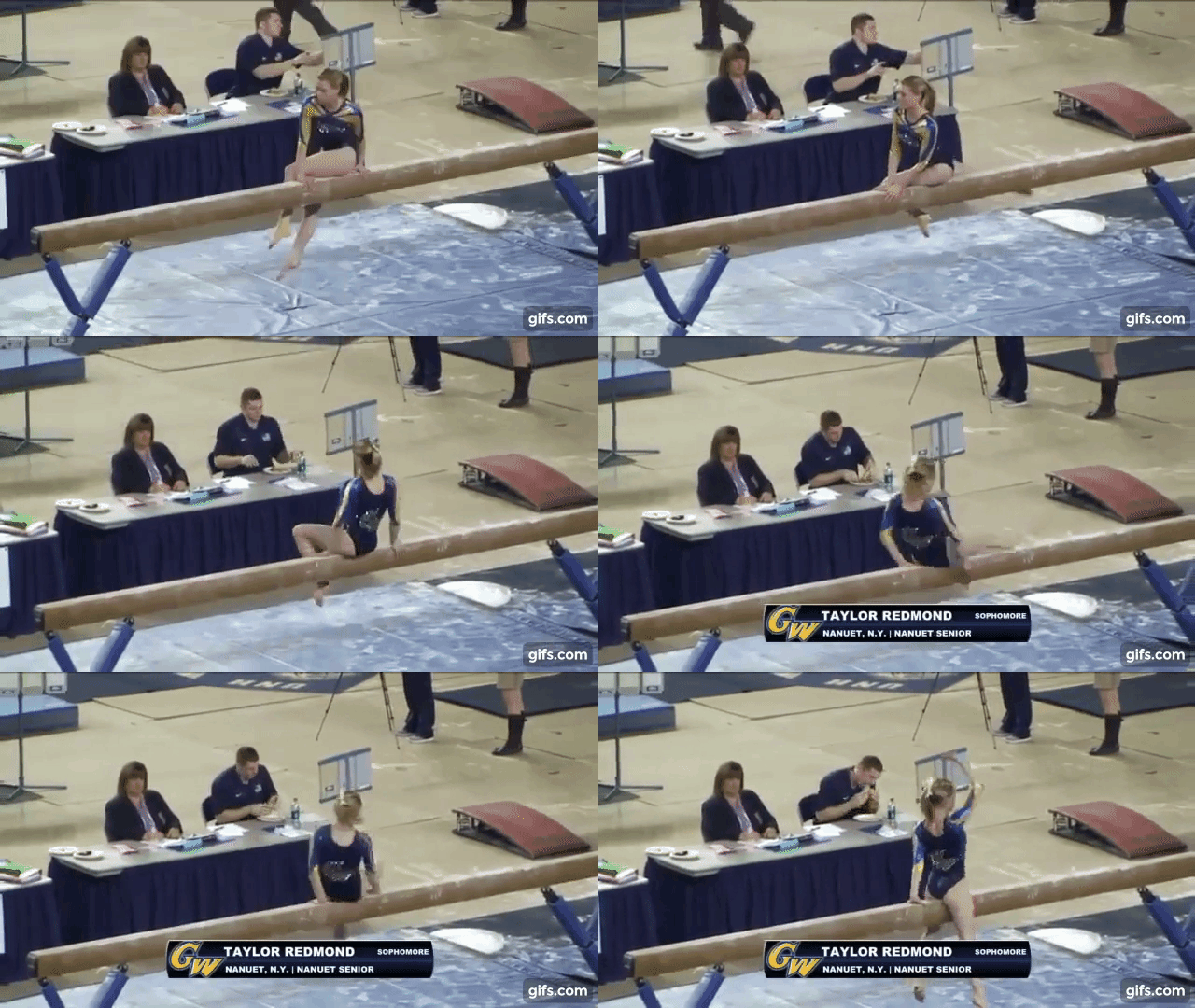
George Washington: 8.567
| Design | Fabric/
Sparkle |
School
Spirit |
Overall
Appearance |
Total | |
| Alicia | 2.3/3 | 1.8/2 | 2.0/2 | 2.6/3 | 8.7/10 |
| Brandis | 2.5/3 | 1.7/2 | 2.0/2 | 2.5/3 | 8.7/10 |
| Emily M | 2.4/3 | 1.6/2 | 1.9/2 | 2.4/3 | 8.3/10 |
Alicia: I actually love this. Dare I say I love it more than a lot of GW’s currently leos? This isn’t what I would have expected from the Colonials. I love this color blue and the gold isn’t so overwhelming that it overtakes the rest of the leo. I love the use of GW on the back and the front. A really solid piece from this team.
Brandis: I think this is a good example of a leo that doesn’t go overboard with school spirit but still clearly represents your school proudly. I think the “GW” looks really good on the back and the stripes down the arms give the leo some character without being too distracting. To me it looks like the blue in the sleeves is a little lighter than the blue on the body, which isn’t my favorite and I wish they just stuck with the same blue throughout.
Emily M: At first glance, I thought this was purple. I like the placement of the “GW” on the lower back, and the pattern of sparkles on the front is nice. I’m just not sure about the stripes down the sleeves, though.
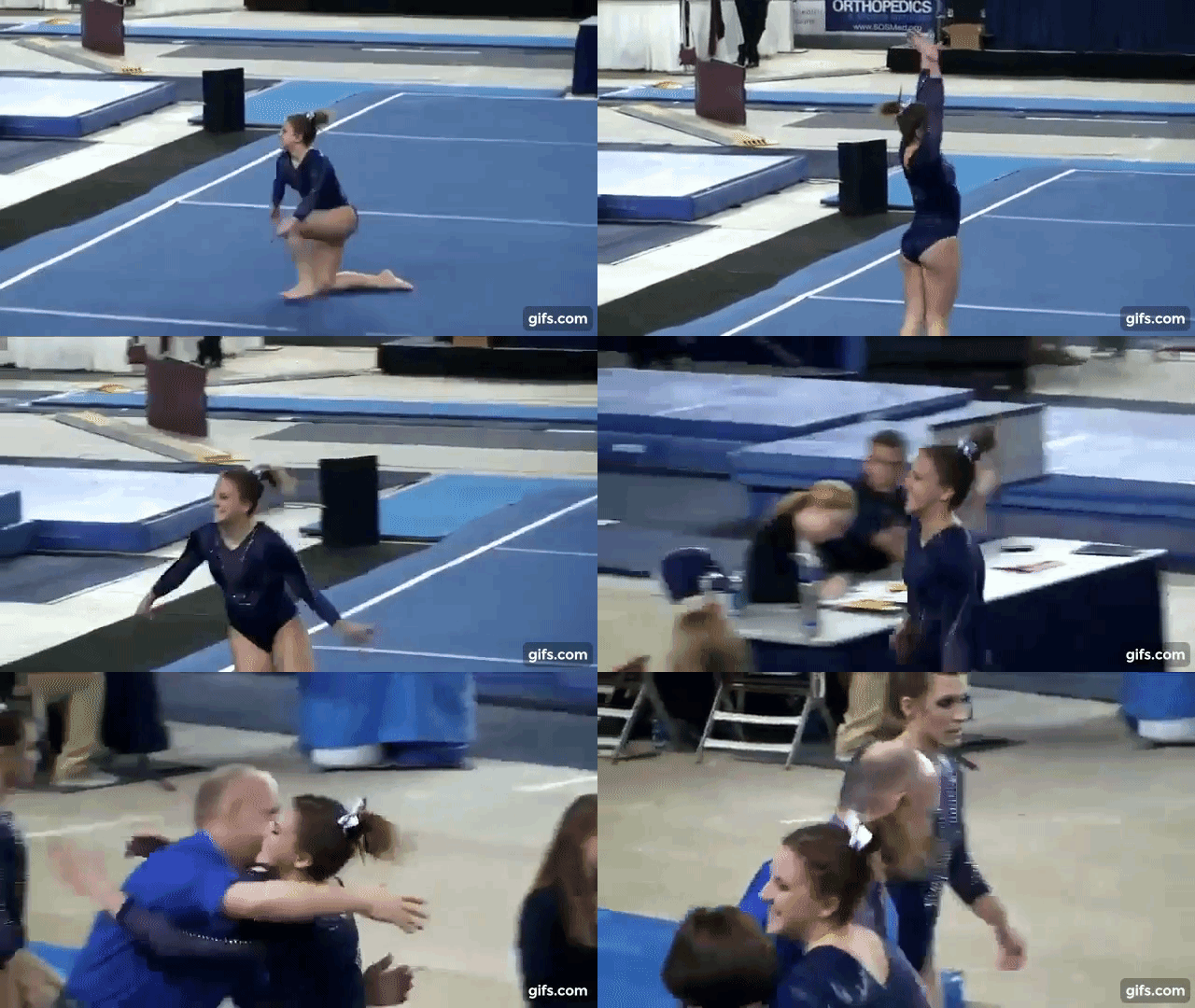
New Hampshire: 8.100
| Design | Fabric/
Sparkle |
School
Spirit |
Overall
Appearance |
Total | |
| Alicia | 2.6/3 | 1.6/2 | 1.9/2 | 2.7/3 | 8.8/10 |
| Brandis | 2.2/3 | 1.3/2 | 1.7/2 | 2.5/3 | 7.7/10 |
| Emily M | 2.1/3 | 1.4/2 | 1.8/2 | 2.5/3 | 7.8/10 |
Alicia: I love this shade of blue so much! I love the Wildcat on the back of this, such a nice homage to its mascot! I actually do like this mesh, probably because it’s a bit more subtle than some so the typically odd shapes work well.
Brandis: I agree with Emily, it totally reminds me of the 2012 national team leos. The mesh works really well in this leo, but I wish some of that carried over to the back of the leo in some way. This is another simplistic leo done really well.
Emily M: Hmmm this reminds me very much of a 2012 London-era US national team look. I like how subtle the mesh cutouts look on the deep shade of blue, and I appreciate the logo on the lower back. Overall, I’m not a fan of mesh cutouts, but they work alright here.
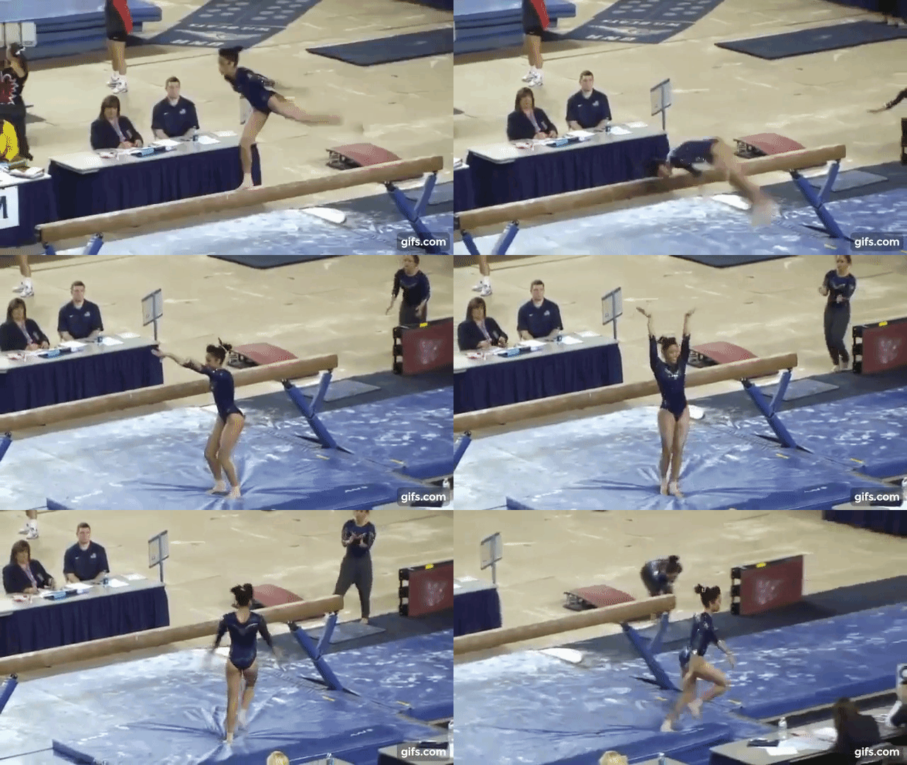
Pittsburgh: 8.033
| Design | Fabric/
Sparkle |
School
Spirit |
Overall
Appearance |
Total | |
| Alicia | 2.4/3 | 1.3/2 | 1.7/2 | 2.5/3 | 7.9/10 |
| Brandis | 2.7/3 | 1.4/2 | 1.5/2 | 2.8/3 | 8.4/10 |
| Emily M | 2.4/3 | 1.3/2 | 1.6/2 | 2.5/3 | 7.8/10 |
Alicia: Simplistic leos are hard to pull off, as many times it looks uninspired. However, I think this is a nice, elegant leo from Pitt. I do however thing the sparkles in the front could be a tad bit brighter, though. Otherwise, it’s clean and flattering!
Brandis: I love the simplicity of this design. It looks classy and professional and like Pitt is here to take care of business at EAGL Championships. I like the subtle sparkles in different places all over the leo as well.
Emily M: This is a simple but pretty leo. I like that the pattern of sparkles from the front is echoed on the back, and I’m pretty sure there’s a small “PITT” on one hip. Maybe a touch too simplistic, but definitely a solid look.
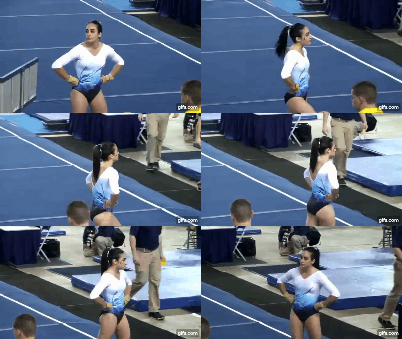
North Carolina: 7.867
| Design | Fabric/
Sparkle |
School
Spirit |
Overall
Appearance |
Total | |
| Alicia | 2.3/3 | 1.5/2 | 1.0/2 | 2.5/3 | 7.3/10 |
| Brandis | 2.8/3 | 1.5/2 | 1.3/2 | 2.7/3 | 8.3/10 |
| Emily M | 2.8/3 | 1.6/2 | 1.0/2 | 2.6/3 | 8.0/10 |
Alicia: Oh, I’m always a sucker for ombre. The blues are beautiful, the cut of this is unique and something we don’t see as often anymore. I wish the design was something a bit different and a little more UNC, but the colors make up for it!
Brandis: I think this color combination and design is gorgeous. While it doesn’t necessarily scream UNC, it still incorporates that signature Carolina Blue alongside some other colors that compliment it very well. I also love that this design is a bit away from the norm.
Emily M: Oooh doing blue to white ombre before it was cool. I love these colors, and the V neck with a deeper V on the back is a great look. I can’t quite figure out what this design on one side is, though, and I don’t like that two of those darker stripes end right at the bust.
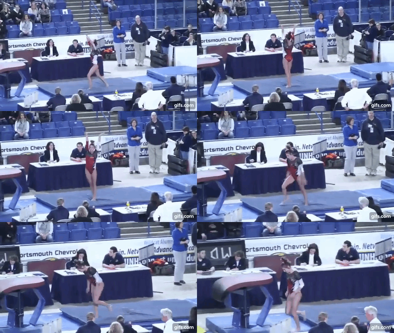
N.C. State: 7.333
| Design | Fabric/
Sparkle |
School
Spirit |
Overall
Appearance |
Total | |
| Alicia | 1.3/3 | 1.6/2 | 1.7/2 | 1.5/3 | 6.1/10 |
| Brandis | 2.5/3 | 1.5/2 | 1.5/2 | 2.5/3 | 8.0/10 |
| Emily M | 2.1/3 | 1.8/2 | 1.6/2 | 2.4/3 | 7.9/10 |
Alicia: I want to like this so much more than I do. I love the red and black of this leo and I wish that design continued on throughout the entire piece, but that white…ugh. It feels like someone ran out of fabric and stitched it together with the white and while it has that school spirit, I wish it were incorporated better.
Brandis: I’m a big fan of the body of this leo, but not so much the sleeves. I wish they had just kept the sleeves that sparkly mesh instead of transitioning back to the red and white, but overall I think this leo works very well!
Emily M: Hmm. I like how bright that white looks, it really makes the leo pop. I’m not sure about that random zig zag pattern, though. I do appreciate that the pattern from the body continues on the sleeves.
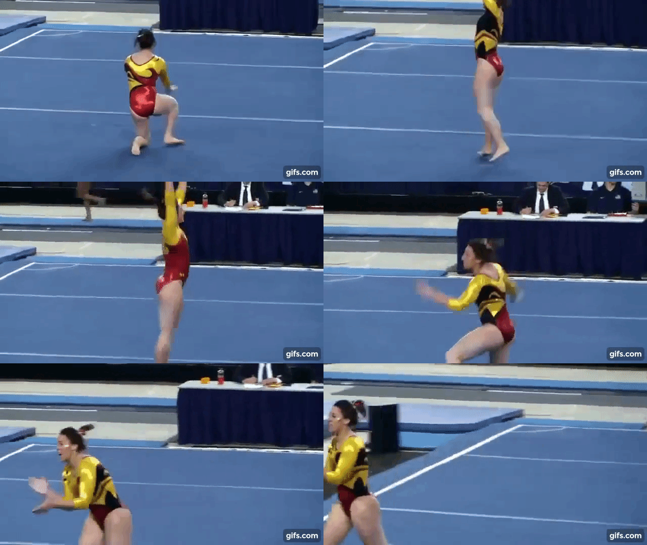
Maryland: 6.700
| Design | Fabric/
Sparkle |
School
Spirit |
Overall
Appearance |
Total | |
| Alicia | 1.3/3 | 1.6/2 | 1.8/2 | 2.0/3 | 6.7/10 |
| Brandis | 1.2/3 | 1.5/2 | 2.0/2 | 2.0/3 | 6.7/10 |
| Emily M | 1.4/3 | 1.6/2 | 1.6/2 | 2.1/3 | 6.7/10 |
Alicia: Maryland has the unenviable task of trying to incorporate every part of its school design into one leo. Sometimes it works, but this isn’t one of the Terps’ better ones. I wish this leo was more red and black than yellow and nixed the random swirls – it would have been fun and bright without being too overbearing.
Brandis: Poor Maryland, in every sport they try to put the state flag on their uniforms and sometimes it works and other times… it doesn’t. However, this leo isn’t even close to being the worst Maryland themed uniform I’ve seen. You can’t fault them for going all-out with the school spirit, but this leo for me is a little too busy.
Emily M: This is…a lot. Maryland has done some very interesting things with that bright yellow over the years, and sometimes it works better than others. The random swirls and wild colors are a little too much for me. This did really stand out against all the blue on the rest of the teams, though, I’ll give the Terps that.
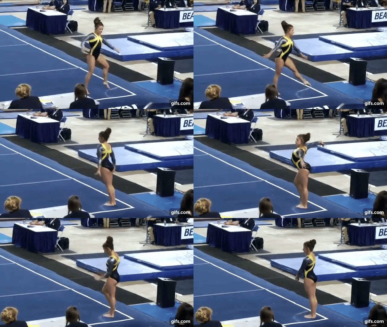
Towson: 6.200
| Design | Fabric/
Sparkle |
School
Spirit |
Overall
Appearance |
Total | |
| Alicia | 2.2/3 | 1.2/2 | 1.0/2 | 2.0/3 | 6.4/10 |
| Brandis | 2.0/3 | 1.0/2 | 1.0/2 | 1.5/3 | 5.5/10 |
| Emily M | 2.5/3 | 1.0/2 | 0.9/2 | 2.3/3 | 6.7/10 |
Alicia: Towson is one of the rare teams that typically pull off yellow really well, but this leo slightly misses the mark. I think it would have worked better if the entire leo was black with yellow stripes, or even if the stripes were thinner. I think the silver top is unique though and I love the shine.
Brandis: Similar to my comments about Rutgers’ leos, I think Towson needed a little more school spirit on their leos for a conference championship. The shine on the silver part of the leo is lovely, but other than that it’s overall quite dull.
Emily M: Wow, that yellow and gunmetal color combination is something. I like the cut and design of this one, but that shade of yellow is throwing me off.
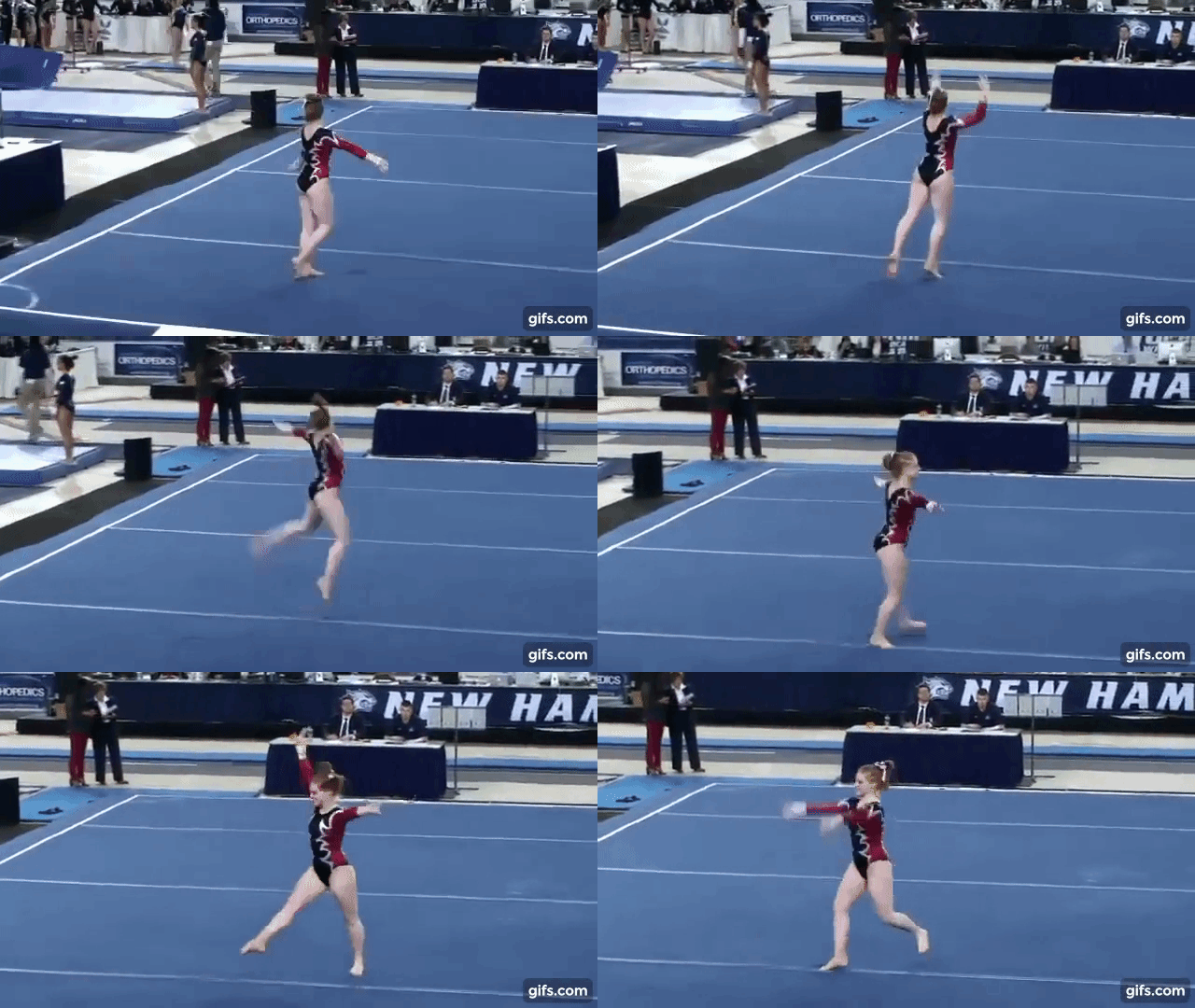
Rutgers: 5.067
| Design | Fabric/
Sparkle |
School
Spirit |
Overall
Appearance |
Total | |
| Alicia | 1.2/3 | 1.3/2 | 1.0/2 | 1.3/3 | 4.8/10 |
| Brandis | 1.5/3 | 1.3/2 | 1.0/2 | 1.5/3 | 5.3/10 |
| Emily M | 1.2/3 | 1.4/2 | 0.5/2 | 2.0/3 | 5.1/10 |
Alicia: The return of the zig zags. I probably wouldn’t have minded these zig zags if the white border wasn’t so bold. I love that it’s symmetrical, but I don’t really see “Rutgers” here.
Brandis: I’m not totally against this leo, but I don’t think it’s right for a conference championship meet. It doesn’t really make me think “Rutgers” when I see it, which is a shame when it’s being worn at one of their biggest meets of the season.
Emily M: Oh, Rutgers. More random zig zags and just about nothing original going on here.
Article by Emily Minehart, Alicia Bettano and Brandis Heffner



One comment