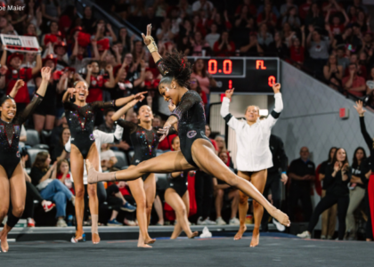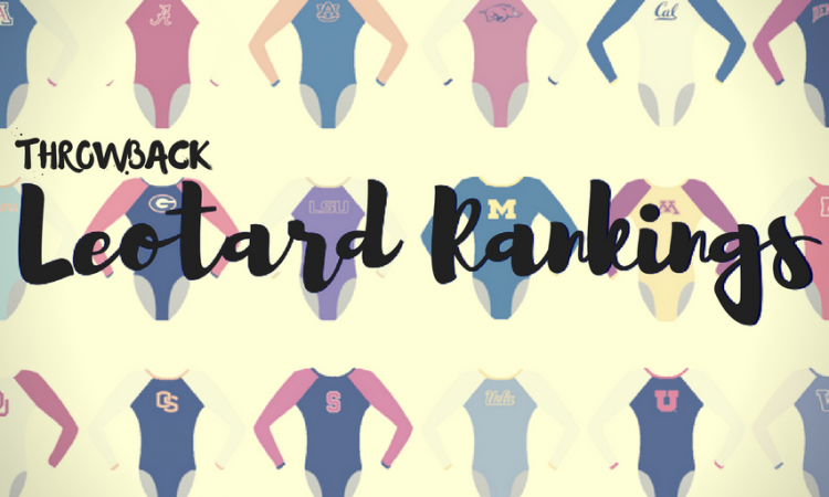
We’re bringing back throwback leo rankings this offseason to tide you over until 2019 arrives! The criteria is the same as always: up to three points for design; two points for fabric, sparkle, etc.; and two points for school spirit; three points for overall appearance. Guest judges this week will be Morgan, our DIII editor, Rebecca, our MPSF and DII editor, and Tara, our Big 12 and MRGC editor. The meet? We’re taking it back to the 2000 NCAA championships—a preview of our throwback feature going live next week!
Georgia: 7.175

| Design | Fabric/
Sparkle |
School
Spirit |
Overall
Appearance |
Total | |
| Elizabeth | 2.0/3 | 1.6/2 | 1.7/2 | 2.2/3 | 7.5/10 |
| Morgan | 2.2/3 | 1.3/2 | 1.8/2 | 2.0/3 | 7.3/10 |
| Rebecca | 1.7/3 | 1.6/2 | 1.5/2 | 2.0/3 | 6.8/10 |
| Tara | 2.1/3 | 1.2/2 | 1.8/2 | 2.0/3 | 7.1/10 |
Elizabeth: See, Nebraska, this is a similar design but FITS the gymnasts. I’m kind of digging the fishnet/dots/large mesh fabric on the arms as it incorporates black without being super dark. I also like the red color used, and the simple yet effective “Georgia” on the chest.
Morgan: For the most part, I actually really like this leo! The color is bright enough that the design stands out, and I love the Georgia written across the front. The style of the leo is also really athletic and flattering. I am not a huge fan of the fabric with dots used on the arms—it is a bit to obscure for me, but it does work nicely with the leo.
Rebecca: Loving the mesh sleeves here! Red and black is hard to screw up, and this is great. If you’re a big Leotard Rankings reader, you’ll know that I have a Thing about words on leotards… but at least the word is small.
Tara: Not bad, Georgia, not bad. I like the “Georgia” on the chest, and the school colors are well balanced. I actually like the mesh sleeves, too, which is something I don’t say often. Overall nice job, Georgia!
UCLA: 6.750

| Design | Fabric/
Sparkle |
School
Spirit |
Overall
Appearance |
Total | |
| Elizabeth | 1.6/3 | 1.4/2 | 1.5/2 | 1.7/3 | 6.2/10 |
| Morgan | 2.0/3 | 1.8/2 | 1.8/2 | 2.5/3 | 8.1/10 |
| Rebecca | 1.7/3 | 1.6/2 | 1.7/2 | 2.2/3 | 7.2/10 |
| Tara | 1.3/3 | 1.2/2 | 1.4/2 | 1.6/3 | 5.5/10 |
Elizabeth: Alllll the crushed velvet, and in actual UCLA blue? The area where the fabrics switch falls in an odd and slightly unflattering place, but I like the use of rhinestones for the neckline and “UCLA.” Overall, I don’t love this, but it’s so ‘90s/early ‘00s, it hurts, so I kind of have to love it anyway?
Morgan: Yes! I love that UCLA is using light blue! The crushed velvet and font of the “UCLA” is so ‘90s, but I love it. I do wish the light blue had extended a bit longer so the cut wasn’t awkward, but overall a relatively flattering and superfun leo.
Rebecca: Agreed with everyone else that the fabric cut needs to be a bit lower, but the velvet is just so perfect. I don’t love the two shades of blue together either, but I can’t summon any aggression about it. It’s its own thing.
Tara: The crushed velvet is a classic for this era. I don’t love where the fabric transitions—it just seems awkward—and I’m not a fan of using the two different blues together. I do appreciate the use of “UCLA,” and the rhinestones are a nice touch, though.
Michigan: 6.700

| Design | Fabric/
Sparkle |
School
Spirit |
Overall
Appearance |
Total | |
| Elizabeth | 1.8/3 | 1.4/2 | 1.4/2 | 2.0/3 | 6.6/10 |
| Morgan | 1.5/3 | 1.8/2 | 1.5/2 | 1.5/3 | 6.3/10 |
| Rebecca | 1.8/3 | 1.5/2 | 1.4/2 | 1.9/3 | 6.6/10 |
| Tara | 1.9/3 | 1.8/2 | 1.5/2 | 2.1/3 | 7.3/10 |
Elizabeth: This isn’t a half-bad leo, but what in the world is that yellow part on the hip/stomach??? I like the deep blue and the cross-hatching sparkle design on the arms, as well as the keyhole back.
Morgan: A classic Michigan leo! I love the blue velvet, but I am not sure what is going on with the yellow on the hip and stomach, it is odd and doesn’t quite seem to fit with the rest of the leo. Additionally, the cut on this leo is not as flattering as it could be with the high neck, but I do love the sparkles near the chest.
Rebecca: Classic Michigan is a lot of solid navy, so this isn’t incredibly exciting but is expected. I’m sort of thinking the yellow bit is a cursive “Michigan,” but I’m really not sure. The shaping is classical and really pretty.
Tara: I like this overall, but I wish the yellow was more incorporated. It kind of seems like it’s just there with no purpose. This is simple yet elegant and looks good. And it has the right amount of sparkle.
Utah: 6.475

| Design | Fabric/
Sparkle |
School
Spirit |
Overall
Appearance |
Total | |
| Elizabeth | 1.9/3 | 1.6/2 | 1.5/2 | 2.0/3 | 7.0/10 |
| Morgan | 1.5/3 | 1.6/2 | 1.5/2 | 1.5/3 | 6.1/10 |
| Rebecca | 1.2/3 | 1.4/2 | 1.2/2 | 1.4/3 | 5.2/10 |
| Tara | 2.2/3 | 1.5/2 | 1.6/2 | 2.3/3 | 7.6/10 |
Elizabeth: I know this is leotard judging, but can we talk about Utah’s warm up jackets for a second? They’re right out of Zenon, and I’m here for it. Anyway, at first glance, I thought this was Nebraska because I’ve grown so accustomed to seeing Utah in pink over the past few throwback judgings. I like white fabric and how it shimmers but the design is a bit odd for my tastes. Not an overall bad leo, though.
Morgan: Oh man, the design in this one is really odd. I dislike the cut around the arms and the small font of the “Utah”. However, the design on the back is nice, and I do like the fabric.
Rebecca: All I can look at is the weird inverse scoop color transition under the arms. What is that? Why were any of these choices made? I feel like they need to put on some baggy sweats with elastic ankles and teach an aerobics class on a VHS tape.
Tara: I like this! I enjoy the v-shaped design here, and Utah is actually using red and white in this leo instead of the pink it tended to use back in the ‘90s. The Utah on the front is a great touch of spirit as well. The only negative for me is where the fabric changes colors at the arms; it’s a bit abrupt.
Nebraska: 6.100

| Design | Fabric/
Sparkle |
School
Spirit |
Overall
Appearance |
Total | |
| Elizabeth | 1.5/3 | 1.6/2 | 1.3/2 | 1.3/3 | 5.7/10 |
| Morgan | 2.2/3 | 1.8/2 | 1.0/2 | 2.2/3 | 7.2/10 |
| Rebecca | 1.4/3 | 1.5/2 | 1.0/2 | 1.2/3 | 5.1/10 |
| Tara | 1.8/3 | 1.7/2 | 1.0/2 | 1.9/3 | 6.4/10 |
Elizabeth: I can’t get past how this leo doesn’t fit properly. Maybe that’s the design they intended, but it looks bad. Once I’ve managed to overlook the poor fit, I do like the sparkly black velvet, and it’s pairing with shiny white sleeves. The design is kind of meh, though.
Morgan: I actually kind of like the bunching of the sleeves in this leo, I think it was intended, and for some reason I find it kind of pretty and makes the leo look elegant. I also like the cut of the back of the leo but wish there was more school spirit and that the design had a bit more going on.
Rebecca: The bunchy sleeves are a noooo. It’s so pre-ballet-wearing-my-big-sister’s-old-leotard. The colours are nice, I guess? It’s a bit bland but not objectionable except for the sleeves.
Tara: I like the concept, but not the execution. The sleeves are actually a visually appealing design for me. I just wish it had more color—some red that tells me it’s a Nebraska leo. If I didn’t know it was Nebraska, I would’ve guessed Penn State because the black is almost navy-colored.
Alabama: 5.675

| Design | Fabric/
Sparkle |
School
Spirit |
Overall
Appearance |
Total | |
| Elizabeth | 1.8/3 | 1.1/2 | 1.3/2 | 2.0/3 | 6.2/10 |
| Morgan | 1.5/3 | 1.0/2 | 1.0/2 | 1.5/3 | 5.0/10 |
| Rebecca | 2.1/3 | 1.2/2 | 1.2/2 | 2.2/3 | 6.7/10 |
| Tara | 1.5/3 | 1.1/2 | 0.8/2 | 1.4/3 | 4.8/10 |
Elizabeth: Well this leo is certainly something. Back in the days when Alabama used more of a purple color than actual crimson. I don’t mind the sort of mesh/crossed arm design, and the back hole is pretty flattering to their athletic shoulder muscles. I don’t love the random sparkle design on the chest—I wish it was an A or something more school spirit-y—but overall, this isn’t a bad leo.
Morgan: Alabama’s colors are so different here! I am a fan of the back hole, but the rest of the leo is a no for me. The fabric is not my favorite, and I don’t particularly like the random sparkle design on the front, I wish it had something more to do with Alabama to increase the school spirit. However, the leo is flattering and athletic, which is nice!
Rebecca: I actually really like this one. The curly chest pattern is really elegant, and it feels understated to me though it might just be that I can’t really see the details. The mauve-y color is gorgeous.
Tara: Um, well this is definitely something. I like the bones of the design, but the rest is so confusing and odd to me. And the chest sparkles are…interesting…to say the least. I appreciate the sparkle, but this isn’t the best execution of that.
Article by Elizabeth Grimsley, Rebecca Scally, Tara Graeve and Morgan Bradford