
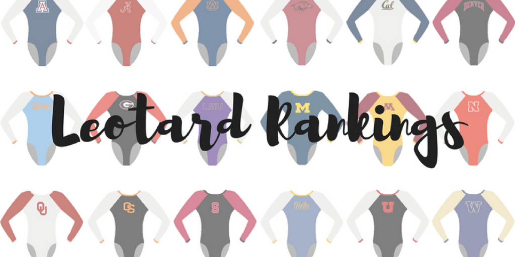
The criteria is the same as last season. But to refresh your memories: up to three points for design; two points for fabric, sparkle, etc.; and two points for school spirit; three points for overall appearance. After assigning points to each category, we’ll tally up the scores and average them with the previous week’s. So by the end of the season, we’ll know for sure which team has the best leotards (according to us) and which teams not so much. We want to know what you thought too (or if we forgot one of your favorites from this weekend)! Let us know in the comments below or on Twitter. And make sure to vote in our poll at the bottom of the page to make your opinion heard in the fan vote, new this season.
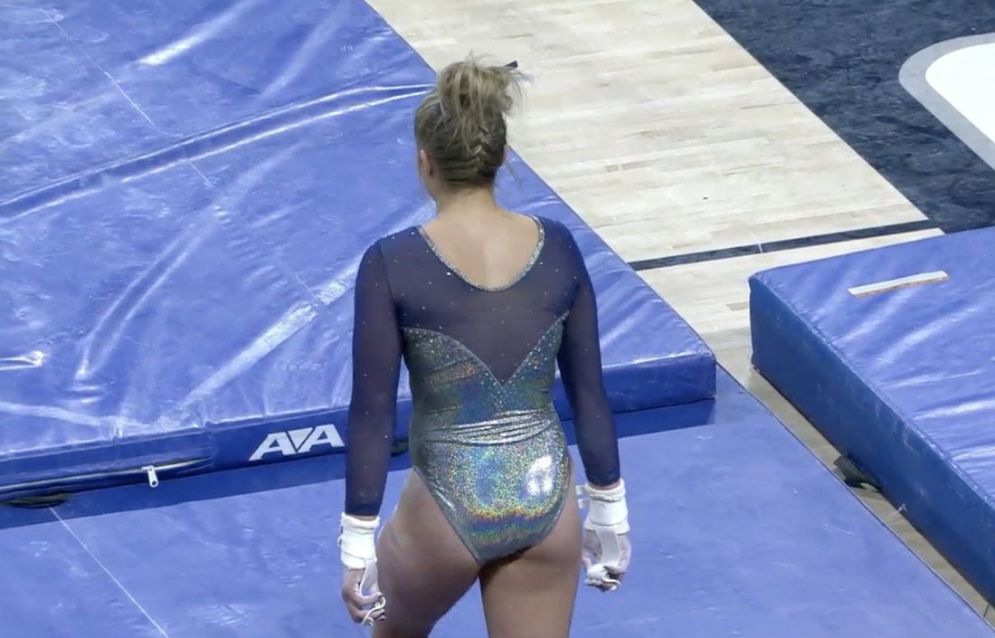
Leo sneak peek. The ombre leos are back! #GoBruins #leotardwatch pic.twitter.com/99KoMvGULS
— UCLA Gymnastics (@uclagymnastics) February 19, 2017
|
Caroline
Design: 2.6/3 Fabric/Sparkle: 1.9/2 School Spirit: 1.3/2 Overall: 2.7/3 Total: 8.5/10 Hands down, my favorite UCLA leo I’ve ever seen. Love the ombré, the sweetheart neckline, just the whole package. Could have used an itty bitty bit more sparkle but I love the glitter probably a little too much! |
Christina
Design: 2.5/3 Fabric/Sparkle: 1.6/2 School Spirit: 1.6/2 Overall Appearance: 2.6/3 Total: 8.3/10This is one of my favorite UCLA leos, and I remember drooling over it the first time it unveiled it. I still do, sort of. I love this light ombre shading going from white to darker blue. This is like a beautiful spring sky, but in leo form. Blue is my favorite color as well, so I might be slightly biased here. Anyways, I love it. It The neckline is lovely and has the right amount of sparkles. The sort-of-not-really plunging neckline in the back is lovely as well, and I’m glad the Bruins went for this style rather than a “boring” back. A simple ombre leo that works really well for me. |
Elizabeth
Design: 2.9/3 Fabric/Sparkle: 1.8/2 School Spirit: 1.7/2 Overall Appearance: 2.7/3 Total: 9.1/10Fave UCLA leo hands down. I love the blue ombre. It’s so pretty. And the white sleeves look great with it. The leo as a whole just screams UCLA. I also really like the lower back and V between the ombre and white. My only thing I don’t like, though, is how the arms on a lot of the girls were bunchy and looked like it didn’t fit well at the top. |
You voted and here’s the results! For today’s competition we’re wearing our beautiful new “Ombré” leos! #SeniorSaturday #EmbraceTheJourney pic.twitter.com/rGySDPppQS
— Air Force Gymnastics (@AFAgymnastics) February 19, 2017
|
Caroline
Design: 2.6/3 Fabric/Sparkle: 1.6/2 School Spirit: 1.5/2 Overall Appearance: 2.4/3 Total: 8.1/10I’m in love with this!! USAFA totally stepped up their game with this, being super on-trend with the ombre and the sleeve text. I think the sparkle swoops work, they kinda look like wings now that I think about it. Like Falcon wings? From what little I saw, I think the back could be more decorated, maybe continuing the wing design there as well. I really like that they put the US flag on their leos, I think that gives it a really cool touch as the only Armed Forces academy with a varsity gymnastics team. |
Christina
Design: 2.3/3 Fabric/Sparkle: 1.1/2 School Spirit: 1.7/2 Overall Appearance: 2.4/3 Total: 7.5/10Of course, I like the ombre. The sweetheart neckline in the front is nice, and I find the deep V in the back lovely as well. I’m having trouble adjusting to the armpit-boob-sparkles-swirly-explosion. I am glad there are sparkles on this leo, but maybe I wouldn’t have gone with this design. That said, it’s still quite a nice leo and Air Force really did step up its game with this one. |
Elizabeth
Design: 2.7/3 Fabric/Sparkle: 1.8/2 School Spirit: 1.8/2 Overall Appearance: 2.7/3 Total: 9.0/10I really love this one—especially since Air Force’s typical leos are a bit lackluster. From the ombre to the sweetheart backline and the rhinestone detailing on the chest… I can’t find fault in this one. I also like how Falcons was incorporated on the arm and, of course, the American flag on the other side. |
|
Caroline
Design: 2.6/3 Fabric/Sparkle: 1.6/2 School Spirit: 1.5/2 Overall: 2.6/3 Total: 8.3/10In love with this!!! I actually loved the velvet trend back in the day so I would not be mad if this made a comeback. That said, I think this is the best way to do alumni night. Make it a throwback, make it a tribute, and truly honor them with your gymnastics. This is so cool. Just more sparkles next time! |
Christina
Design: 2.5/3 Fabric/Sparkle: 1.6/2 School Spirit: 1.4/2 Overall Appearance: 2.6/3 Total: 8.1/10The power of the crushed velvet! I loved that TWU brought this back, and on top of that, it won the meet and scored a 196.000 over three D-I teams. I appreciate the initiative and really wish more teams were willing to bring back throwback leos like this. The leo in itself is not mind-blowing and severely lacks in sparkles, but I guess that was the style back in the day! I adore the stitched-on TWU in the front—so vintage. The mix of velvet and lycra is to die for, and the random little key hole in the front just is the cherry on top. Unattractively amazing. |
Elizabeth
Design: 2.9/3 Fabric/Sparkle: 1.9/2 School Spirit: 1.6/2 Overall Appearance: 2.7/3 Total: 9.1/10YAS THIS LEO. I have been saying for YEARS that teams should do throwback meets in conjunction with the alumni coming to visit, and TWU finally listened to me! Or so I’d like to think… Anyway, this leo is perfect (and obviously has to be judged as a throwback leo and not a typical one). It’s so ugly, it’s beautiful. I love everything from the crushed velvet mixed with lycra and stitched-on script “TWU” to the clip in the back and the high neckline. Also, the low hip cut and random triangular hole on the chest are killing me. |
Senior @A_Bugs_Lyfe tied for the floor title with a 9.975! #AllHeart pic.twitter.com/veYwFhQgdX
— LSU Gymnastics (@LSUgym) February 18, 2017
|
Caroline
Design: 2.5/3 Fabric/Sparkle: 1.4/2 School Spirit: 1.8/2 Overall Appearance: 2.4/3 Total: 8.1/10The whole concept of a Mardi Gras leo for LSU is just fantastic. It’s a great way to connect to your school spirit without using letters or the name of a mascot, which can get tired after as many leos as a team typically wears in a season. Representing the community and state is pretty awesome too! I love the interplay of colors in the design and the way the lines and color bursts are almost reminiscent of fireworks. I could actually do with some more sparkle on the design itself, and a little more contrast between the black and the purple fabrics. It may just be the lighting in this particular photo, but the purple gets lost in the sea of black in some places. |
Christina
Design: 2.7/3 Fabric/Sparkle: 1.7/2 School Spirit: 1.6/2 Overall Appearance: 2.8/3 Total: 8.8/10This is without a doubt my favorite LSU leo. I love it each time the team wears it, which unfortunately is mostly only once a year. I love the design on the front and back, and the colors scream Mardi Gras and Louisiana state pride. It has the right amount of sparkles spread out around the design, the sleeves and all over the leo. I also really like the subtle touch of purple again along the neckline. The only thing that’s slightly bothering me (but I’m really being picky here) is the abrupt end (or start depending on how you see it) of the design on the right side, and I wish it continued onto the back a little. But really, it’s no big deal. Lovely, lovely leo! I’m a big fan. |
Elizabeth
Design: 2.0/3 Fabric/Sparkle: 1.4/2 School Spirit: 1.8/2 Overall Appearance: 2.2/3 Total: 7.4/10I like that LSU has a Mardi Gras leo. That’s so LSU. But if I was creating a Mardi Gras leo, it would be bigger and have “more.” I think the design on the front is very representative of Mardi Gras but is a bit random. And I do like how the rest is simple because adding more than the front and you just get way too busy. |
Malory Rose starts it off for the #GymDawgs with a 9.85 on beam.
Watch: @Pac12Network https://t.co/rRFdzr1mfY
— UW Gymnastics (@UWGymnastics) February 19, 2017
|
Caroline
2.4/3 1.5/2 1.2/2 2.5/3 Total: 7.6/10Okay I think we’ve all established how much we love ombré now, but this purple to white one with the contrasting black is excellent! I could’ve used a little more bling and obviously some more school spirit, but other than that, keep it. It’s fabulous. |
Christina
Design: 2.2/3 Fabric/Sparkle: 1.6/2 School Spirit: 1.7/2 Overall Appearance: 2.5/3 Total: 8.0/10I am obsessed with this shade of purple ombre. It’s gorgeous. The sweetheart neckline is lovely as well. At first I wasn’t too much of a fan of the dark, mesh sleeves, but overall it’s growing on me and it does mesh well with the ombre. A very clean look. |
Elizabeth
Design: 2.3/3 Fabric/Sparkle: 1.8/2 School Spirit: 1.7/2 Overall Appearance: 2.6/3 Total: 8.4/10This shade of purple is to die for. I’m obsessed. The light purple mixed with the sweetheart neckline and the mesh sleeves all worked so well together and made for a great leo to hit a season high in. Plus, the subtle ombre and the Huskies down the one arm are nice touches as well. |
|
Caroline
Design: 2.3/3 Fabric/Sparkle: 1.3/2 School Spirit: 1.6/2 Overall Appearance: 2.1/3 Total: 7.3/10So I know I’ve been all over like every single ombre leo… but the three tone diagonal I’m just not a fan of. There’s not a whole lot of blend between the colors anyway, especially the white to red. I also think the G in the middle feels out of place with the ombre over top of it. I do love the sparkle, though, and the square neck is a welcome change. |
Christina
Design: 2.4/3 Fabric/Sparkle: 1.5/2 School Spirit: 1.5/2 Overall Appearance: 2.3/3 Total: 7.7/10I like this one from Georgia, as it followed the ombre trend but added its own twist to it with the ombre going sideways. The square neckline is also different from what we usually see, but it worked out well here. This leo has the right amount of sparkles and doesn’t overwhelm too much, especially since the ombre shading is so dominant. I could have gone without the huge “G” in the front though, but I know Georgia does commit to the G…(see what I did there?). Anyways, I would have gone for a smaller “G” placed elsewhere, maybe on the hip or on a sleeve. School spirit is already very much present with the colors of the leo, so this gigantic G isn’t justified in my opinion and doesn’t mesh well with the ombre. Other than that, it’s still a nice leo (duh, ombre!) that looks good in motion. |
Elizabeth
Design: 2.6/3 Fabric/Sparkle: 1.5/2 School Spirit: 1.7/2 Overall Appearance: 2.6/3 Total: 8.4/10I like it. Georgia doesn’t do a lot of the typical trends the other teams are doing, but I’m glad it hopped on the ombre train. However, it still stuck to the Georgia way, making a typical ombre leo unique with the square neckline, diagonal ombre and three-tones with the black, red and white. I like the shininess factor too as well as the simple-but-not-boring Super G in rhinestones on the front. I think without it there, the front would be too plain. |
Tonight’s leo! ✨ pic.twitter.com/2TBvVLMzvP
— Oklahoma Women’s Gym (@OU_WGymnastics) February 18, 2017
|
Caroline
Design: 2.2/3 Fabric/Sparkle: 1.5/2 School Spirit: 1.8/2 Overall Appearance: 2.3/3 Total: 7.8/10Considering I thought we’d ranked this leo already this season, I think it’s safe to say the OU leos are running together for me. I feel like all of them feature the same colors, a whole lot of school spirit and a massive amount of bling. Granted, those are the biggest things we’re looking for, but when leos all start to look the same, it’s time to mix it up a little. That said, I do like the ombre, and I like that the OU and Sooners are outlined by sparkle rather than made of sparkle. |
Christina
Design: 2.4/3 Fabric/Sparkle: 1.4/2 School Spirit: 2.0/2 Overall Appearance: 2.3/3 Total: 8.1/10I feel like I saw this leo so much last season now I like it less and less. I’m just kind of over it. Objectively, it is still a nice leo, and I love the ombre sleeves. School spirit is all over, between the gigantic sparkly OU in the front and the “Sooners” in the back. I actually do like the back a lot more than the front, with the sort-of deep V-neck cut but with the three mesh cutouts underneath the “Sooners”. Anyways, this one is not among my favorite Sooners leo, but it’s still a very nice one to look at (does OU even have an ‘ugly’ leo?!). |
Elizabeth
Design: 2.2/3 Fabric/Sparkle: 1.4/2 School Spirit: 1.7/2 Overall Appearance: 2.2/3 Total: 7.5/10I like it, but it could be better. I like the ombre, duh, but I don’t care for how the front neckline is not only rounded but seems to not match the sleeves and ombre design well. It’s too harsh, if that makes sense? I do like the “cutouts” on the back with the mesh and shiny fabric as well as the sooners in inverse sparkles rather than your typical in-sparkle look. |
Something new is HERE. The Red Rocks will be rockin’ new REDOUT leotards against UCLA tomorrow night! □□ #GoUtes pic.twitter.com/8g01HXv0Gf
— Utah Gymnastics (@UtahGymnastics) February 17, 2017
|
Caroline
Design: 2.2/3 Fabric/Sparkle: 1.8/2 School Spirit: 1.7/2 Overall: 2.1/3 Total: 7.8/10I really liked the Red Out leo! I thought the sparkly squiggles could have had more purpose to them, but they focused nicely around the U logo, and I like that they kept it one color. It focused on the theme of the meet better that way. |
Christina
Design: 2.3/3 Fabric/Sparkle: 1.1/2 School Spirit: 1.8/2 Overall Appearance: 2.2/3 Total: 7.4/10I was very underwhelmed with this one, maybe because Utah hyped it so much with all the teasing and the preview videos. I knew it would be an all-red leo for the “Redout Meet,” but ugh, it’s just so simple in the end. The design isn’t very intricate, and neither are the sparkles. It is a nice leo, but I was disappointed. I did like the Utah logo on the front though. |
Elizabeth
Design: 2.5/3 Fabric/Sparkle: 1.2/2 School Spirit: 1.7/2 Overall Appearance: 2.2/3 Total: 7.6/10When I hear “new leo” I always get excited. But this one underwhelmed me. I need it to be more. I get that it was a red out meet, but this leo is too red. The sparkle design was nice and reminded me of that purply-pink leo USA elites wore all the time. But the sparkles needed to stand out more for me. Maybe if they threw in some black rhinestones too to add some dimension? I do like how they chose to go with the Ute logo rather than just the U on this one. |
This is what we think of Lauren’s beam!! pic.twitter.com/9PMOXSH9X3
— Michigan Gymnastics (@UMichWGym) February 18, 2017
|
Caroline
Design: 2.2/3 Fabric/Sparkle: 1.3/2 School Spirit: 1.4/2 Overall Appearance: 2.2/3 Total: 7.1/10Man, all the Michigan leos are running together for me too. The front looks very similar to at least two designs we’ve previously judged, though I do like how the lines fully cross over and connect to make the criss-cross in the back. The little silver M on the hip is a nice touch, and I really like that they make full use of their rich blue and yellow colors. Still, I need a shake up, Michigan. Give us something new next week! |
Christina
Design: 2.4/3 Fabric/Sparkle: 1.4/2 School Spirit: 1.6/2 Overall Appearance: 2.3/3 Total: 7.7/10This is a simple yet well-done leo for Michigan. I really like that the golden criss-cross design is linked between the front and the back, and I love that it’s basically symmetrical. I love symmetrical things, always. I appreciate that they went for the criss-cross in the front neckline too, as usually it’s something we see only in the back. So, thumbs up for originality. The sparkly, mesh sleeves are nice as well. Overall, I like it, even though I’m not blown away by anything specifically. It works well, shows the school colors, and is simple yet not too simple. |
Elizabeth
Design: 2.3/3 Fabric/Sparkle: 1.4/2 School Spirit: 1.6/2 Overall Appearance: 2.3/3 Total: 7.6/10I really like this Michigan leo, but I wish it wasn’t so blue. Maybe if the top and sleeves were white and the rest stayed the same? I do like the yellow ribbon design and how it goes on the front and back, as well as the shade of blue used. Overall it’s a solid leo. |
|
Caroline
Design: 2/3 Fabric/Sparkle: 1.6/2 School Spirit: 1.6/2 Overall Appearance: 1.8/3 Total: 7.0/10I’m so torn on this one. The front is gorgeous, but the ace bandage style back is not a look I can get behind. I really like the rich colors though, and the sparkle design on the front is really eye-catching. |
Christina
Design: 2.1/3 Fabric/Sparkle: 1.4/2 School Spirit: 1.7/2 Overall Appearance: 2.2/3 Total: 7.4/10I love that this is such a unique design, and not something we see very often, especially the back. I love the front very much. The colors blend well, it has the perfect amount of sparkles to me and overall just looks nice. The back…. I can’t decide how to feel about it. I like the kinda rounded-triangular hole above the “bandeau” with West Virginia on it, as again it’s fairly unusual. It is a nice shape, but I am not a big fan that we see the bra kind of popping out, although I am not sure if it did that on all the gymnasts. Additionally, I am not a big fan of the bandeau design. Maybe I would have liked to see it in another color, or with more glitter? From this photo, it looks like the white of the bandeau isn’t the same shade as the white of the leo, and it bothers me. I don’t know, I feel like it was almost added at the last minute and doesn’t blend in too well with the rest of this colorful leo. It just doesn’t make for a clean look. Anyways, all in all I love the front, but I am just meh on the back. |
Elizabeth
Design: 2.7/3 Fabric/Sparkle: 1.1/2 School Spirit: 1.7/2 Overall Appearance: 2.4/3 Total: 7.9/10I kind of love this. The design is so unusual and makes the gymnasts look so athletic, that I can’t not like it. I don’t, however, like the pee-yellow color. Maybe if it was more gold, I’d be sold. But that’s really my only gripe. |
Bears have worked on their landings & it shows! Career-highs for 3 Bears, including THIS 9.925 by @AliciaGallarzo ⬇️https://t.co/ijsy8CDnJe
— Cal W Gymnastics (@calwgym) February 19, 2017
|
Caroline
Design: 1.7/3 Fabric/Sparkle: 1.4/2 School Spirit: 1.5/2 Overall: 2.1/3 Total: 6.7/10This is another front/back split for me. The front is very classic looking, though I could definitely use some more gold in the blinged out design. I like this bandeau back better than the others we’ve seen so far, but I’m still not a fan. |
Christina
Design: 2.4/3 Fabric/Sparkle: 1.4/2 School Spirit: 1.5/2 Overall Appearance: 2.5/3 Total: 7.8/10Yet another all navy blue look for Cal that I wish had more hints of gold. I mean, I get that all blue leos are nice, but I feel like it’s the majority of Cal’s leos these days. That said, this is a lovely leo that I have always liked. I like the open back with the bandeau that says “California” all in glitter. It’s simple, yet shows get school spirit and looks nice. The front is also very elegant with the sweetheart neckline surrounded by a lovely design of sparkles and twirls. It’s a nice leo, but again I wish it included a touch of gold somewhere and wasn’t so monotonous in the shading. |
Elizabeth
Design: 2.3/3 Fabric/Sparkle: 1.5/2 School Spirit: 1.5/2 Overall Appearance: 2.4/3 Total: 7.7/10Again, I love the back, but the front needs more. However, this one’s better. I like how the back band isn’t plain but has California in sparkles on it. I also like the front sparkle design. I think it needs another color introduced though, but I think the mesh sleeves are a step in the right direction. |
|
|
|
Caroline
Design: 2.1/3 Fabric/Sparkle: 1.3/2 School Spirit: 1.7/2 Overall Appearance: 2.2/3 Total: 7.3/10Purple is awesome! I love the risk they took by making it all purple. I think they could’ve done more with it and I wasn’t a big fan of the back, but solid effort from a non-usual team! |
Christina
Design: 1.7/3 Fabric/Sparkle: 1.3/2 School Spirit: 1.7/2 Overall Appearance: 2.0/3 Total: 6.7/10I really like the front and this shade of purple, and surprisingly did not mind the big “UB” in all glitter. I can’t get myself to like the tan band in the back however. I like the overall design of the back, almost open, but that tan is just not meshing well to me, especially in motion. It almost makes the leo look like a secondhand one. So in the end, I’m torn. It still looks very nice from the front, but I wish I liked the back more. |
Elizabeth
Design: 2.1/3 Fabric/Sparkle: 1.3/2 School Spirit: 1.7/2 Overall Appearance: 2.2/3 Total: 7.3/10I really love this shade of purple. It pops. I also like the inverse rhinestone technique on the logo on the front. The back is cool too, and it’s neat how they used a tan color to make it there but seem like it’s not really. Adding Knights on that added a touch more sparkle and school spirit to top it off. |
.@MyiaChristine with a brilliant bars routine and a STUCK landing for a 9.925. pic.twitter.com/BYttYUwpHM
— LSU Gymnastics (@LSUgym) February 19, 2017
|
Caroline
2.7/3 1.4/2 1.3/2 2.4/3 Total: 7.8/10I’m always a fan of using your mascot to inspire your leo design, so I love this. I do wish that there were some gold in it somewhere, rather than just white and purple. Maybe some gold stones would’ve made it work. But other than that it’s one of my favorites this week. |
Christina
Design: 1.7/3 Fabric/Sparkle: 1.0/2 School Spirit: 1.5/2 Overall Appearance: 1.6/3 Total: 5.8/10Eh. The design is fairly standard, and I don’t know how to feel with the white as the dominant color. LSU has done white leos in the past, but I feel like they were much better than this. This is just so simple and almost gives out the vibe of “this is a leo for lesser meets.” I get it’s an older one, especially since it has zero sparkles and I’m a sucker for sparkles everywhere. Anyways, I was also bugged since we can clearly see the leo tags. Small details matter, guys. Anyways, just feeling indifferent on this one. I don’t mind it, but LSU has much better leos to offer. |
Elizabeth
Design: 2.4/3 Fabric/Sparkle: 1.2/2 School Spirit: 1.4/2 Overall Appearance: 1.7/3 Total: 6.7/10I like the purple and white combo, but I wish on this leo the colors were switched in the design. There’s too much white that shows too much of what’s under the leo like brief and bra lines and tags even (which is why I chose this picture specifically because you can see the leo tag clearly). I do like the design, though, and how it kind of looks like Tiger claw marks. Throw in a little gold in there too as well as switching the colors and this would actually be a pretty successful leo. |
would @TheBBSituation expect anything less from the “hipster” team? pic.twitter.com/wDXM0B6hLo
— Jenna Horner (@Jenna_Horner) February 20, 2017
|
Caroline
Design: 1.5/3 Fabric/Sparkle: 1.6/2 School Spirit: 2/2 Overall Appearance: 2.1/3 Total: 7.2/10So I don’t hate this. I take massive design points for the hashtag, but I love the swirl of the colors and the use of sparkle around the neckline. And obviously, the school spirit is super high – maybe even a little over the top? I actually didn’t notice the hashtag at first though, which is why I can’t ding the overall appearance category that much. |
Christina
Design: 1.0/3 Fabric/Sparkle: 0.9/2 School Spirit: 1.8/2 Overall Appearance: 1.2/3 Total: 4.9/10What is happening here, and what were you on when you came up with this design? It’s so psychedelic and there is just way too much going on… The swirly white and blue design in the fabric itself, the thick rhinestone neckline as well as some random threads of glitters on the front and back, the gigantic GW Colonials in all yellow and glitters. And to top it all of, the hashtag in the back. Nope. Just…too much. At least the shades of blue are nice, I guess? |
Elizabeth
Design: 1.9/3 Fabric/Sparkle: 1.4/2 School Spirit: 1.9/2 Overall Appearance: 2.0/3 Total: 7.2/10I don’t not like this. It’s a tad busy with the overall swirly design plus the big “GW Colonials” in rhinestones. Although I do like the rhinestone cuffs and that the yellow is brought in on the front in rhinestones rather than on the fabric. But the back… Oh, GW… What did we say about hashtags on leos? |
|
|
|
Caroline
Design: 2.2/3 Fabric/Sparkle: 1.7/2 School Spirit: 1.1/2 Overall Appearance: 2.3/3 Total: 7.3/10I know lots of other teams, even outside of NCAA, have used this design, but I’m in love with this leo, mostly due to the colors. The bluey-purple mesh is a really great complement to the rainbow-shiny silver, and I really like the two-tone V-neck and how it almost looks like two separate layers to the design. I could use a little more shine in the bling on the mesh part. I can see that it’s there but it didn’t really photograph shiny at all. And then obviously an Aggies or a USU somewhere would be nice. |
Christina
Design: 1.6/3 Fabric/Sparkle: 0.7/2 School Spirit: 1.0/2 Overall Appearance: 1.4/3 Total: 4.7/10This is a design we’ve seen on a lot of teams already (LSU and Lindenwood for sure, and probably some more I can’t remember), as well as in the elite and JO competitions… So originality isn’t there. I do like this design objectively, and I find the front simple yet original, and the deep V neck in the back is gorgeous. That said, we have just seen it so many times in all the different variations that I almost feel indifferent to it. Plus, I am not a fan of the colors at all, but I guess they don’t have much choice in regards to their school colors. |
Elizabeth
Design: 2.2/3 Fabric/Sparkle: 1.3/2 School Spirit: 1.4/2 Overall Appearance: 2.1/3 Total: 7.0/10I kind of like how the silver has a rainbow effect? But it’s not my favorite silver fabric that ever existed. I do like the mesh sleeves and the blue color used for those as well as the double V in the front using two different colors. It is a design used by some other teams, but I like this take on it. |
Here is Haylee Young’s beam routine earning a 9.900! pic.twitter.com/aPh3rzFUYe
— Cyclone Gymnastics (@CycloneGYM) February 18, 2017
|
Caroline
Design: 1.8/3 Fabric/Sparkle: 1.3/2 School Spirit: 1/2 Overall Appearance: 1.9/3 Total: 6.0/10This design is really simple, which normally I don’t mind. Minimalism isn’t necessarily a bad thing, but between the dark colors, the minimal sparkle and the almost non-existent design, this takes it to an extreme. I like how it looks, don’t get me wrong, but as far as leo fashion, it only hits the most basic of marks. I do like the darker sparkle lines coming down on the back, that’s kind of a neat touch, but it’s so subtle it’s hard to see unless you zero in on that area. |
Christina
Design: 1.3/3 Fabric/Sparkle: 0.5/2 School Spirit: 0.6/2 Overall Appearance: 1.0/3 Total: 3.4/10This is such a dark leo, I really wish it included some gold somewhere, anywhere! The dark-grey silver bodice is just very overwhelming and almost gloomy. The shade of red mesh is also on the darker side, and doesn’t make the gymnasts or anything stand out for that matter. The design in itself is simple and nothing new, and almost reminds me of the USU leo from this week, just slightly different in the front. The back has some red-ish straps going out from the neckline to the dark-grey part but they are so hard to see! I honestly didn’t even see them at first. Anyways, I don’t like this leo much. Simple design, way too dark (where is the gold?!), and not much school spirit. |
Elizabeth
Design: 2.8/3 Fabric/Sparkle: 1.8/2 School Spirit: 1.6/2 Overall Appearance: 2.8/3 Total: 9.2/10Ooolala! I adore this one! I love the dark, gun metal color paired with the crimson sleeves. I also love how the sparkles on the curved-in v neckline really make that stand out, as well as the sparkle line design on the mesh, making it more than plain mesh without going over the top with swirls or something. The only thing I can think of it lacking is a touch of school spirit. |
|
Caroline
Design: 1.8/3 Fabric/Sparkle: 1.2/2 School Spirit: 1.2/2 Overall Appearance: 2.2/3 Total: 6.4/10Ahh, the random squigglies return. These aren’t the worst random squigglies we’ve had though, and I actually kinda like the ones on the back, as they swoop down and define the shape of the leo more than if the two colors just came together there. I could definitely use more sparkle, and there’s nothing really to keep this from being a club leo rather than an NCSU leo. State is usually so full of school spirit—let’s see it on the leos! |
Christina
Design: 1.5/3 Fabric/Sparkle: 0.8/2 School Spirit: 1.0/2 Overall Appearance: 1.5/3 Total: 4.8/10Eh. This is not outright ugly, but it’s not the prettiest either. This feels like such an old leo and design. I mean… been there, done that—kind of? There is nothing new or interesting to see. The school colors are there though, and the white swirly part is a nice way to separate the red and black. I also like that the design continues onto the back and is “one piece” basically. But yeah, I’m just kind of “meh” on this one. It severely lacks in sparkles in the front, and since black is the dominant shade, it feels very lackluster. |
Elizabeth
Design: 1.5/3 Fabric/Sparkle: 1.0/2 School Spirit: 1.0/2 Overall Appearance: 1.6/3 Total: 5.1/10Meh. I’m bored. This reminds me of a leo a club gymnast would wear. The design isn’t anything new, but I do like the color combo. Maybe if the front and back were different I would like it more? |
The Price is right!
Elizabeth Price scores a 9.95 on the bars for @StanfordWGym!
Watch: https://t.co/YfMNDWtSGW https://t.co/brsNkO0qqp
— Pac-12 Network (@Pac12Network) February 18, 2017
|
Caroline
Design: 1.6/3 Fabric/Sparkle: 1.5/2 School Spirit: 0.5/2 Overall Appearance: 1.9/3 Total: 5.5/10I know a lot of teams have this design too, but in basic black, this leo just falls totally flat. I like that the sparkles outline the slices in the bodice, but that’s kind of all I like about it? There’s no school spirit (except for the fact that Stanford is sorta known for going with all black leos) and the design is very basic. We know Stanford can do better, we just need to see it! |
Christina
Design: 1.5/3 Fabric/Sparkle: 1.0/2 School Spirit: 0.2/2 Overall Appearance: 1.4/3 Total: 4.1/10Is this the week of “old leos/everybody has this design but we don’t care” – theme? Just like USU, this design has been used by everybody and their mothers in both NCAA and elite (Utah has the exact same one, color, sparkles and all). Moreover, this is an old one from Stanford… I remember it from the Ashley Morgan days. This is alright. I mean, it was fun and original when we first saw it five years ago, but now it’s just been overused. Besides, it’s very black, school spirit is essentially non-existent, and I’m not a big fan of having mesh in the belly area of any leo, as small as it is here. Anyways, it’s alright but boring; I don’t dislike it but I am not fanning over it either. I’ve just seen it in so many variations that I’m over it. |
Elizabeth
Design: 1.6/3 Fabric/Sparkle: 0.8/2 School Spirit: 0.2/2 Overall Appearance: 1.4/3 Total: 4.0/10I don’t like how much mesh there is all over the place. It need to be centralized somewhere. Also, the lining under the body mesh is lighter so it makes that stand out more than the arms and it looks weird, but that might just be me. But this needs more. I would have had no idea it was a Stanford leo if you had just hung it up and put it on the rack and said, “Pick.” |
Victoria Ortiz: CLUTCH. □
The junior scores a 9.950 for @AZGymnastics on the bars!
WATCH: https://t.co/ZLABag9Ytthttps://t.co/614MdZCZWd
— Pac-12 Network (@Pac12Network) February 19, 2017
|
Caroline
Design: 1.1/3 Fabric/Sparkle: 1.2/2 School Spirit: 0.8/2 Overall Appearance: 1.3/3 Total: 4.4/10Oh dear, so many things going on here. Firstly, this isn’t an Arizona leo. This is a Pac-12 problem leo – Cal, UCLA, and Arizona now are all doing the thing with the generic navy leotard and essentially no distinguishing markings whatsoever. That’s a problem, not just in the school spirit category, but as far as originality is concerned as well. Secondly, the lace line across the back cutting the top into a sports bra shape is… a hot mess. I would have much preferred it if they had kept the side cutout as just a side cutout. Mirror on the back what was done on the front and leave it at that. Thirdly… where’s the bling? You get points for using lace, but there’s hardly any sparkle in it and no sparkle is just sad. |
Christina
Design: 0.5/3 Fabric/Sparkle: 1.0/2 School Spirit: 0.9/2 Overall Appearance: 0.6/3 Total: 3.0/10Nooooope, no. Why? This leo literally has all of our pet peeves in one: lace, side cutouts, random back design. What were you thinking Arizona? From far away and in motion it actually looks decent (which is not necessarily what you want in a leo), but from close-up it’s just…no. I am usually keen on the lace, but I can’t get behind this one, mostly because it’s so poorly designed. The lace kinda continues on the back but not really, and instead turns the entire back into a sports bra sort of design. Not pretty. I wish they had gone all out with the lace in the back instead of having this random patch of solid navy fabric. As you may have noticed a trend, I dislike side mesh cutouts very much, so it doesn’t work here for me at all. You get it: a big nope from me. |
Elizabeth
Design: 0.6/3 Fabric/Sparkle: 1.3/2 School Spirit: 1.4/2 Overall Appearance: 0.7/3 Total: 4.0/10Oh Arizona… This has potential. I, of course, am not a fan of the lace, but I do like that it chose to use red rhinestones on there to make it pop more and make it less plain blue on blue. But then you get to the back and you’re like, “Is this a sports bra or a leotard?” That back design is SO random, I wonder what Tabitha or whoever designed it was thinking. And how the lace cutout around the midsection goes around to the front but not really? Just no… I do like the little A on the hip though. |


Maybe it’s the multiple shades of blue, maybe it’s the pink trim, maybe, OK who am I kidding, it’s probably the fact that they broke 198 in them, but I prefer the leos that UCLA wore against Stanford earlier this season.