Overall, there were some pretty nice leos this week and not too many that made us want to close our eyes. Some schools debuted new designs while others brought back old favorites. As always, we’ve got some simple criteria for judging the leos: up to three points for design; two points for fabric, sparkle, etc.; and two points for school spirit; three points for overall appearance. We’ll be looking at leotards we saw that caught our eye — in either a good way or a bad one. Then we’ll tally up the scores and average them with the previous week’s. So by the end of the season, we’ll know for sure which team has the best leotards (according to us) and which teams not to much. We want to know what you thought too (or if we forgot one of your favorites from this weekend)! Let us know in the comments below or on Twitter.
|
Nebraska
Score: 8.65 Emily Design: 2.7/3 Fabric/Sparkle: 1.7/2 School Spirit: 1.2/2 Overall Appearance: 2.9/3 Total: 8.5/10 I love this. Other than the fact I can’t tell which team this leo belongs to, it’s great. I like the design on the front and the ombre is great. Any red probably would have ruined this for me. Elizabeth Love. This leo is stunning. I love the ombre and the rhinestone detailing on the chest. Up close you can see that a little bit of red is brought in. It’s subtle but looks nice. It might not be the most school-spirited leotard Nebraska has, but I really love it so who even cares. |
|
|
Iowa State
Score: 7.55 Emily Design: 1.9/3 Fabric/Sparkle: 1.6/2 School Spirit: 1.4/2 Overall Appearance: 1.9/3 Total: 6.8/10 This is OK. The gold part on the shoulder is a little odd, but I like the overall sparkliness. I like the ISU on the back too. Elizabeth I really like this leo. The goldish, reddish shimmery shoulders are pretty and the red color on the sleeves and sides is nice too. The cut is athletic and looks good on. There’s also just the right amount of rhinestones. The only weird thing for me is the two random black stripes on the sides. |
|
|
LSU
Score: 7.55 Emily Design: 2.1/3 Fabric/Sparkle: 1.5/2 School Spirit: 1.7/2 Overall Appearance: 2.1/3 Total: 7.4/10 I like the spirit. This is a different way to bring Louisiana into the leo, and I like it. I love purple, and I especially like the way the purple looks here. On TV, this one looked a little too sparkly. Elizabeth I like it. It’s definitely different. The shimmering of the fleur-de-lis is pretty and the purple color is nice too. I like that it’s showing state-spirit as well as school spirit. And despite being quite big on the chest, it’s not overwhelming. |
|
|
Penn State
Score: 7.4 Emily Design: 2.3/3 Fabric/Sparkle: 1.7/2 School Spirit: 1.3/2 Overall Appearance: 2.4/3 Total: 7.7/10 Woah, I really like this. I love the criss-cross thing that’s happening on the front and the rhinestones on the front are nice too. The PSU looks good, and I surprisingly like the rhinestone cuffs even though I usually don’t. Elizabeth I like this blue color, and the criss-cross design on the front is nice. The mesh isn’t too much and the PSU on the arm isn’t too big or obvious. |
|
|
Denver
Score: 7.3 Emily Design: 2.2//3 Fabric/Sparkle: 1.5/2 School Spirit: 1.3/2 Overall Appearance: 2.2/3 Total: 7.2/10 I like this one. The red parts look great and I like the rhinestones on the front. It somehow looks sporty and elegant at the same time, which is cool. Elizabeth It’s not my favorite Denver leotard, but I still really like it. It’s simple but still elegant. I like the criss-cross design and the rhinestones on the chest that follow the shape of the fabric at the top. The red color is really pretty and goes well with the black. |
Photos/Elizabeth Grimsley
|
|
Oklahoma
Score: 7.15 Emily Design: 1.9/3 Fabric/Sparkle: 1.4/2 School Spirit: 1.6/2 Overall Appearance: 2.1/3 Total: 7.0/10The stripes are kind of odd, and I don’t know why there is a stripe of rhinestones intersecting in the OU on the back. Still, it’s an Oklahoma leo so naturally it’s pretty good overall. Elizabeth This one reminds me of an Adidas knock-off leo with the two stripes everywhere. It’s definitely more athletic-looking than some of Oklahoma’s others but it still has the elegance-factor with the white mesh and sparkles. I don’t hate it, but I don’t absolutely love it either. |
|
|
Arkansas
Score: 7.0 Emily Design: 1.8/3 Fabric/Sparkle: 1.2/2 School Spirit: 1.5/2 Overall Appearance: 1.6/3 Total: 6.1/10 I like the back way better than the front. I think I wish the front had more to it than just the A. Maybe a little more like Alabama does sometimes with rhinestones oozing out of the A. I do like how the all-red front transitions to the back. Elizabeth I liked this one. There’s no giant hog or the word hogs so that’s an automatic plus. The A and red and black is just the right amount of school spirit and the cut is flattering and makes the girls look athletic without it being too overpowering. |
|
|
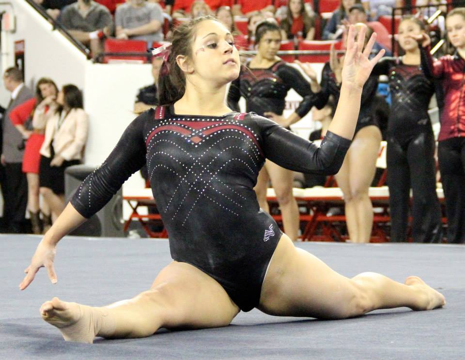
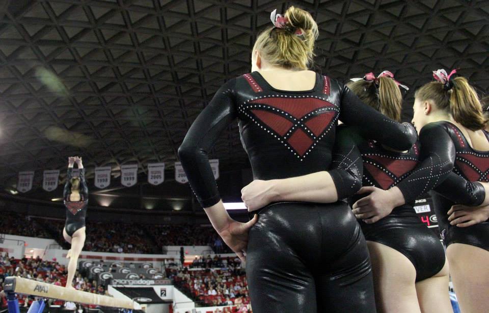
Georgia
Score: 6.4 Emily Design: 2.1/3 Fabric/Sparkle: 1.1/2 School Spirit: 1.3/2 Overall Appearance: 2.0/3 Total: 6.5/10 I like this. I also am a big fan of the font that Georgia usually uses when it writes its name on leos. I almost feel like this was too much nude for me. I do really like the front design. Elizabeth This leo is nice. I’m always a fan of nude mesh. However, this isn’t my favorite Georgia leo out there. I don’t care for the sternum hole or how the red extends to the back like a one-shouldered top, but the small amount of color on the sleeves and the Georgia on the back are nice touches. |
|
|
Kentucky
Score: 6.15 Emily Design: 1.7/3 Fabric/Sparkle: 1.2/2 School Spirit: 1.1/2 Overall Appearance: 1.6/3 Total: 5.6/10 This picture makes it look OK, but on TV it looked like this leo had way too much sparkle. I’m fine with the white portion, but the blue part is kind of boring. I also don’t really like the neckline. But as a whole, it isn’t awful. Elizabeth I like the almost yin-yang look of this leo. The white side is brought up from boring with the swirls and the blue is brought up with just the right amount of sparkle. Definitely one of Kentucky’s better designs. |
|
|
Alabama
Score: 5.85 Emily Design: 2.1/3 Fabric/Sparkle: 1.2/2 School Spirit: 1.7/2 Overall Appearance: 1.9/3 Total: 6.9/10 I really like this design on the front, apart from the A inside the hole. That felt too forced. The tiny As are a neat idea, but I can’t really decide how I feel about them. The arms would have been better if they were solid mesh without more of the design. Elizabeth Without the Script A on the back and rhinestone As all over the sleeves, this could be any team’s. The random resh on the side doesn’t belong and the As all over the sleeves are too much. I like how the white ribbons turn into the Script A on the back but the random white diamond on near the elbow is weird. it’s like it could have been a good leo but there’s random parts that make me question what the designer was thinking. |
|
|
Michigan
Score: 5.6 Emily Design: 1.8/3 Fabric/Sparkle: 1.1/2 School Spirit: 1.5/2 Overall Appearance: 1.7/3 Total: 6.1/10 This is kind of weird. I don’t like the gold tint to the sleeve and the one strap on the back is weird. I think I like the front design, but the whole thing is just too much at once. Elizabeth Michigan’s leos just aren’t doing it for me this season. I like the yellow-y shine to the sleeves and the back is cool with the V and single strap, but the rhinestone design is weird and there’s way too much of it on the back. The design as a whole is too busy. |
|
|
Florida
Score: 5.25 Emily Design: 1.5/3 Fabric/Sparkle: 1.1/2 School Spirit: 1.2/2 Overall Appearance: 1.3/3 Total: 5.1/10 This leo makes the blue and orange color combination look really rough. Maybe if there was a little less orange it would look better. Doesn’t look like a typical Florida at all, which is probably a lot of the reason why I have a hard time liking this one. Elizabeth When I first saw this leo in a pic from the SEC Network shoot I my first thought was that it looked like a level 10 leotard that Legacy Elite would wear. I still think that. It’s not like the leos Florida typically does, and I guess that makes sense since Jenny Rowland designed this one. It does look like something Auburn might wear. It just doesn’t look “college” to me. More J.O. I do appreciate Florida finally wearing blue and orange instead of just blue all the time. |
|

