There were more meets this weekend which means there’s more leotards to judge and rank! From some beautiful ones to others that left us wanting more, we talk about the good, the bad and the ugly from this week in NCAA gymnastics.
There’s some simple criteria we use for judging leos: up to three points for design; two points for fabric, sparkle, etc.; and two points for school spirit; three points for overall appearance. We’ll be looking at leotards we saw that caught our eye — in either a good way or a bad one. Then we’ll tally up the scores and average them with the previous week’s. So by the end of the season, we’ll know for sure which team has the best leotards (according to us) and which teams not to much. We want to know what you thought too (or if we forgot one of your favorites from this weekend)! Let us know in the comments below or on Twitter.
|
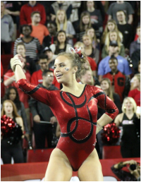
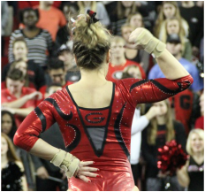
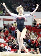
Georgia
Score: 8.65 Emily Design: 2.4/3 Fabric/Sparkle: 1.8/2 School Spirit: 1.9/2 Overall Appearance: 2.6/3 Total: 8.7/10 I love this. I am all about teams having their name almost unnoticeably woven into the design. I also like the all red. This is clearly a Georgia leo, so that’s always good. Elizabeth I really like this Georgia leo. It’s mostly red, which is a good change from the mostly-back ones they typically wear. The back is unique and the mesh works, I think. The script G on the front shows school spirit without being overkill and the small Super G on the back is a nice little edition. I also like the boxy cut of the back. |
|
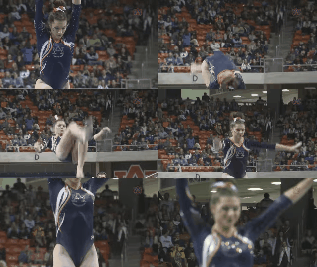
Auburn
Score: 8.05 Emily Design: 2.4/3 Fabric/Sparkle: 1.7/2 School Spirit: 1.4/2 Overall Appearance: 2.2/3 Total: 7.7/10I like it. I like the funky swirls. It’s not just the typical boring Auburn leo. I am also a fan of the mesh. It works well here, and the orange cuffs tie it together nicely. Elizabeth I said the Tigers’ Friday night leo was my fave of theirs, but this one takes the cake. I was waiting for the Tigers to do something other than navy mystique fabric with orange accents and got this beauty. The orange swirls are just enough of the color without being overkill and the crystal-y “UA” is flattering. And the “War” and “Eagle” along the sides of the V in the back. I also love the mesh. Good job, Auburn. |
|
|
Oklahoma
Score: 7.9 Emily Design: 2.3/3 Fabric/Sparkle: 1.5/2 School Spirit: 1.7/2 Overall Appearance: 2.2/3 Total: 7.7/10I love the ombre, but I’m not a fan of how the white cuts straight to the maroon on the front. It’s all perfectly blended and then BOOM. I also don’t think the word Sooners on the back was necessary. It could have been a nice, simple back, and the front could have adequately taken care of school spirit. Elizabeth I first saw this leotard and was like, “Oooooo.” Then I studied it more and didn’t like it as much. The back is my favorite part. It blends well and the ombre sleeve are gorgeous. I also like the Sooners across the shoulders like a jersey. The front is nice. I just wish the divide between the mesh and body went together better? Like I don’t want it to be so noticeable. I don’t know… Also the “OU” is a tad too big for my liking. |
|
|
Alabama
Score: 7.85 Emily Design: 2.1/3 Fabric/Sparkle: 1.1/2 School Spirit: 1.4/2 Overall Appearance: 2.2/3 Total: 6.8/10I like this design, but I don’t know how much I like the mass of rhinestones on the side. But if it wasn’t there, I would say this leo is too boring, so I guess you just can’t win. I like this color red when it’s in this fabric. Elizabeth This is my favorite Alabama leotard by a mile. It’s so different from all of the team’s other leos, so that’s probably why I like it. It also reminds me of an Oklahoma style, so that’s probably also part of it. The full-out rhinestones on the side are lovely and the diagonal design of the fabric makes the gymnasts look good. The Script A on the sleeve isn’t too big or too small either. I’m wondering what it would look like with white mesh sleeves rather than solid white. |
Note: This picture was not taken at this weekend’s competition but does show the same leotard worn by Alabama there.
|
|
Oklahoma
Score: 7.6 Emily Design: 1.8/3 Fabric/Sparkle: 1.7/2 School Spirit: 1.7/2 Overall Appearance: 2.1/3 Total: 7.3/10I like this, but the overwhelming bump shapes are driving me crazy. They’re everywhere. I love the back though. The white mesh looks great. It would have been fine to just have either the word Oklahoma or the OU. I don’t think we needed both. Elizabeth This leo is classic Oklahoma. I don’t love the scalloped neckline, but it’s not bad. I like the “Oklahoma” and “OU” on the back and the continuation of the scalloped pattern on the arms. Overall, it’s nice. And by now you know I like a good mesh sleeve. |
|
|
Auburn
Score: 7.55 Emily Design: 2.2/3 Fabric/Sparkle: 1.4/2 School Spirit: 1.4/2 Overall Appearance: 2.0/3 Total: 7.0/10 I like this, especially the design and the AU logo. The orange and white parts are nice too. To me this seems more elegant than Auburn’s typical sporty Under Armour leos, and I like that. Nothing super awesome here though. Elizabeth I always almost like Auburn’s leotards. The Tigers are working from a deficit with their color scheme, but the navy and orange isn’t too bad here. I like the side ribbon things and the AU symbol on the chest. There’s just enough going on for it to be a cool design. |
|
Stanford
Score: 6.95 Emily Design: 2.1/3 Fabric/Sparkle: 1.5/2 School Spirit: 1.1/2 Overall Appearance: 1.9/3 Total: 6.6/10 This is an OK leo. I like the colors, and the rhinestones work fairly well. It does look a little odd where it cuts from maroon to black when a gymnast’s arms are up. Elizabeth I like this leo from Stanford. Its outfits tend to be pretty boring sometimes, so I was happy with the selection for the meet. The color combo is nice, and the crystals making a noticeable design that mimics the fabric is pretty neat as well. |
|
Arkansas
Score: 6.6 Emily Design: 1.8/3 Fabric/Sparkle: 1.1/2 School Spirit: 1.0/2 Overall Appearance: 2.1/3 Total: 6.0/10 This is not a bad leotard. I really like the back, but the front is a little too boring for me. Still, solid effort and better than a massive hog design. Elizabeth I mostly like this one, you know, white mesh sleeves and all. The back is also unusual and not like any others I’ve seen, so that’s a plus too. The small amount of red is a nice touch as well. I just wish it was more Arkansas-y. As it is, it could be any red and black team. |
Note: This picture was not taken at this weekend’s competition but does show the same leotard worn by Arkansas there.
|
|
Denver
Score: 6.5 Emily Design: 2.0/3 Fabric/Sparkle: 1.7/2 School Spirit: 0.6/2 Overall Appearance: 2.2/3 Total: 6.5/10 I like this one. My only complaint is that the V is a little too deep, but I really like the design around the V. I like the mesh too. The more I look at this, the more I like it. Elizabeth This leo isn’t bad. The deep V and mesh don’t really bother me and the design around the neckline is nice. The color is pretty too. There’s just not much else to say about it. |
|
|
UCLA
Score: 6.5 Emily Design: 1.7/3 Fabric/Sparkle: 1.4/2 School Spirit: 0.6/2 Overall Appearance: 1.8/3 Total: 5.5/10Overall, I’m not a huge fan of this one. I do like the criss cross rhinestones, but I’m not crazy about the mesh part. The color is nice. Elizabeth This has always been one of my favorite UCLA leos. It’s simple but intricate at the same time. The mesh goes a bit low in the front for me, but I like pretty much everything else. The boxy neckline is also flattering on almost everyone. |
|
Boise State
Score: 6.25 Emily Design: 1.8/3 Fabric/Sparkle: 1.4/2 School Spirit: 1.7/2 Overall Appearance: 1.5/3 Total: 6.4/10 I guess this is a clever design with how it incorporates the Bronco. But it still feels like something I would see at a level 6 meet. I like the colors though. Elizabeth A+ for school spirit. I mean, there’s a horse on your leotard, so good job. I like how the horse comes from that sleeve. That’s… different. The leotard isn’t actually bad. I just can’t find anything I love about it. |
Note: This picture was not taken at this weekend’s competition but does show the same leotard worn by Boise State there.
|
|
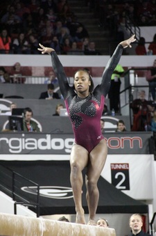
Georgia
Score: 6.1 Emily Design: 2.0/3 Fabric/Sparkle: 1.7/2 School Spirit: 1.3/2 Overall Appearance: 2.0/3 Total: 7.0/10 I really like this. I love the back. I’m not sure if we needed the word on the front. It almost feels awkward. I do love the rhinestones. I feel like Georgia always does a nice job with that. Elizabeth This Georgia to me is just fine. There’s a G, there’s “Georgia,” there’s red and black, so it hits all the bases. It’s just not super exciting. The mesh top and sleeves look good on and the red Super G pops. |
|
|
Michigan
Score: 6.1 Emily Design: 1.8/3 Fabric/Sparkle: 1.1/2 School Spirit: 1.4/2 Overall Appearance: 1.7/3 Total: 6.0/10This looks super athletic, which is cool. I’m not a fan of the yellow straps on the back though. I like the M too. I don’t have a ton of complaints but there’s nothing incredible about this. Elizabeth Michigan always has unusual leos, and this is no exception. I don’t hate it though. I just don’t love it either. The yellow is a bit too bright. I do like it being relegated to the sides. It should have stopped there, though, and not continued into the “almost M” on the back. I also don’t care for the yellow thin straps. The front is nice. I see where they’re going with the silver kind-of-M above the real Block M, but it looks weird. |
|
|
Arkansas
Score: 6.05 Emily Design: 2.1/3 Fabric/Sparkle: 1.1/2 School Spirit: 1.3/2 Overall Appearance: 1.7/3 Total: 6.2/10 I like the lace much better with red than with the green like Michigan State’s. But it’s too much. If it had been a smaller section on the front, I think it could have really worked. I like the idea of the back, but it’s too big. I also agree with Elizabeth that the word Arkansas is much nicer than a giant hog. Elizabeth So much lace. I think I like this one a bit better than Michigan State’s mainly because of the front. The sweetheart neckline is nice, but the collar goes a bit too high for me. I do love the back. Open backs are always nice. And the “Arkansas” is a good way to show school spirit without having “HOGS” or an actual rhinestone hog on your chest *cough cough*. |
Note: This picture of the back was not taken at this weekend’s competition but does show the same leotard worn by Arkansas there.
|
|
Florida
Score: 5.9 Emily Design: 1.7/3 Fabric/Sparkle: 1.4/2 School Spirit: 0.8/2 Overall Appearance: 2.0/3 Total: 5.9/10I don’t think I like the back. I love the white mesh and I really like this color of blue. It does just feel like a classic Florida leo, but nothing wrong with that. Elizabeth Not my Favorite Florida leo but not bad either. I always like white mesh sleeves, and the blue color is nice. I don’t like the blue collar thing on the front, but the design on the back is appealing. Overall, it’s just another blue and white Florida leo — nothing special. |
|
Alabama
Score: 5.7 Emily Design: 1.4/3 Fabric/Sparkle: 1.5/2 School Spirit: 1.6/2 Overall Appearance: 1.3/3 Total: 5.8/10 I think this is a solid Alabama leo. I’m not sure how I feel about the mesh, but I do like the massive rhinestone A. I almost think I would have liked if this was a solid red leo with just the A and no mesh sleeve. It might have been boring, but as long as they had worn the same ribbon, it could have worked fine. Elizabeth It’s not as good as the one they wore on Friday but better than the first week’s. The Script A is a tad big for me, but I do like the shimmery-ish top part. But is one sleeve mesh and the other solid? No thanks. Go all in or not at all. |
Note: This picture was not taken at this weekend’s competition but does show the same leotard worn by Alabama there.
|
|
Michigan State
Score: 5.3 Emily Design: 1.8/3 Fabric/Sparkle: 1.1/2 School Spirit: 0.8/2 Overall Appearance: 1.9/3 Total: 5.6/10 I honestly don’t hate the lace, but I’m not sure how I feel about it with green. When I imagine the color green, I just don’t think of lace. The green design isn’t too shabby. Elizabeth So many teams are doing lace now that I’m tired of it. I never loved it to begin with actually. I do, however, like the green Michigan State uses. It’s a nice shade and looks good in most combinations. The deep side-V thing, though isn’t doing it for me. I do like the back of the leo though. |
Note: This picture was not taken at this weekend’s competition but does show the same leotard worn by Michigan State there.
|
|
Iowa
Score: 4.9 Emily Design: 1.5/3 Fabric/Sparkle: 1.0/2 School Spirit: 1.3/2 Overall Appearance: 1.2/3 Total: 5.0/10 I think I would have liked this if the sleeves had been white. It’s simple. Nothing crazy here, but nothing crazy bad either. Elizabeth I don’t like this nude and black version nearly as much as last week’s. It’s kind of boring and you can barely tell there’s sleeves at all. I am also not a fan of the way the black around the collar comes up. Looks like a weird halter top. The “IOWA” on the chest is fine, and I like the crystal cuffs on the sleeves. |
Note: This picture was not taken at this weekend’s competition but does show the same leotard worn by Iowa there.
|
|
Iowa
Score: 4.55 Emily Design: 1.1/3 Fabric/Sparkle: 1.2/2 School Spirit: 0.7/2 Overall Appearance: 1.3/3 Total: 4.3/10 OK, this is just boring. It’s a black leotard with some sparkles. I like the word Iowa on the back, though. Elizabeth This leotard is basically the same as Iowa’s Saturday one, but in mostly black with shimmery black sleeves. I like the shimmery sleeves, but the rest is kind of boring. There’s nothing that makes me go, “Ooo.” And the “Iowa” on the back is pretty much the only thing making it a Hawkeye leo and not literally any other team in the country’s. |
|





Is that a little homerism I smell in the leotard rankings coming from the UGA student and grad? 😛
Nooooo… The other Georgia leos we ranked (one last week, another this week) weren’t nearly as high!