There may not have been a lot of teams competing to open the 2020 season, but those that did brought their leo A-game. We saw the debut of a new era of UCLA gymnastics leos, as well as fresh designs from teams that don’t get five new ones every season. The criteria for judging is the same as always: up to three points for design, two points for fabric and sparkle, two points for school spirit and three points for overall appearance. This week senior editors Brandis and Christina are joining Editor-in-Chief Elizabeth to help judge.
Don’t agree with our rankings? Let us know your favorite new leo of the week in the comments or on social media!
Illinois: 8.4
— Illinois W Gym (@IlliniWGym) January 4, 2020
| Design | Fabric/
Sparkle |
School
Spirit |
Overall
Appearance |
Total | |
| Elizabeth | 2.5/3 | 1.5/2 | 1.8/2 | 2.6/3 | 8.4/10 |
| Brandis | 2.3/3 | 1.8/2 | 2.0/2 | 2.5/3 | 8.6/10 |
| Christina | 2.3/3 | 1.6/2 | 2.0/2 | 2.3/3 | 8.2/10 |
Elizabeth: Illinois keeps killing it with the new leos! I love this mostly navy design with accents of white and orange. The ombre is fantastic, the back straps unique and the sparkles just enough.
Brandis: There’s nothing about this leo that doesn’t scream Illinois. Tons of blue and orange—including the straps across the back—ombre sleeves, the logo on the chest and even “Fighting Illini” down the sleeves! It’s a dream leo for an Illinois fan.
Christina: Oh this is nice! I love the front, even though it’s fairly simple in itself but it works so well with the ombre sleeves, the logo on the chest, the rhinestones and the touches of orange. The straps on the back are nice as well, although I’d have liked to see them a bit wider with a more open back so it doesn’t look so tight.
UCLA: 8.267
https://www.instagram.com/p/B68oZ_gguRg/
| Design | Fabric/
Sparkle |
School
Spirit |
Overall
Appearance |
Total | |
| Elizabeth | 2.5/3 | 1.6/2 | 1.8/2 | 2.6/3 | 8.5/10 |
| Brandis | 2.7/3 | 1.5/2 | 1.4/2 | 2.3/3 | 7.9/10 |
| Christina | 2.7/3 | 1.5/2 | 1.6/2 | 2.6/3 | 8.4/10 |
Elizabeth: This leo grows on me the more I look at it. I love the use of UCLA blue and YELLOW! Plus, those colors pair really well with the white mesh sleeves, and it screams UCLA.
Brandis: At first look I hated it, but it’s definitely growing on me too. I don’t LOVE it, but I like the creativity and I think the yellow compliments the varying shades of blue very well.
Christina: I really like it because it’s so different from what UCLA used to wear, but at the same time it’s so UCLA. I love the use of yellow (finally!), and the shades of blue are lovely. The feather-like design is beautiful and quite flattering on everybody.
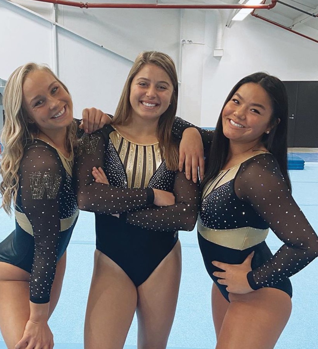
Western Michigan: 8.200

| Design | Fabric/
Sparkle |
School
Spirit |
Overall
Appearance |
Total | |
| Elizabeth | 2.4/3 | 1.5/2 | 1.6/2 | 2.5/3 | 8.0/10 |
| Brandis | 2.5/3 | 1.7/2 | 1.5/2 | 2.5/3 | 8.2/10 |
| Christina | 2.6/3 | 1.6/2 | 1.6/2 | 2.6/3 | 8.4/10 |
Elizabeth: This is a really good one for Western Michigan, whose leos can get a bit brown and monotonous. However, I love the “real” gold color used, and the armor-esque design at the top. The shade of gold just works so well with black.
Brandis: Like Elizabeth, I really like Western Michigan’s use of gold in this leo, especially the golden belt separating the dark mesh from the black fabric. My only wish would be that the rhinestone “W” on the sleeve would be more prominent instead of blending in.
Christina: I love the colors used here, it’s so elegant and works really well. I love the armor-like design on the front, and the vertical stripes are growing on me. A great look for WMU!
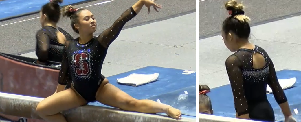
Stanford: 7.800

| Design | Fabric/
Sparkle |
School
Spirit |
Overall
Appearance |
Total | |
| Elizabeth | 2.3/3 | 1.6/2 | 1.9/2 | 2.4/3 | 8.2/10 |
| Brandis | 2.4/3 | 1.4/2 | 1.8/2 | 2.3/3 | 7.9/10 |
| Christina | 2.0/3 | 1.2/2 | 2.0/2 | 2.1/3 | 7.3/10 |
Elizabeth: This leo is fairly tame, but that’s what I like about it because too busy a design would have clashed with the large sparkle logo on the front—which I’m really digging. Pair it with mesh sleeves and a cool back and I’m sold.
Brandis: The design is relatively simple, but the cutout on the back and the raining rhinestones help elevate the overall look. I love the giant logo on the front and how it screams Stanford with the sparkles really making it pop.
Christina: All the sparkles! The front is a bit too simple for my tastes, even though it looks nice with the large logo. I do like the small cutout in the back a lot though, although I wish more space on the back was used. Maybe continue the raining rhinestones a bit more?
SEMO: 6.933
| Design | Fabric/
Sparkle |
School
Spirit |
Overall
Appearance |
Total | |
| Elizabeth | 2.3/3 | 1.5/2 | 1.4/2 | 2.4/3 | 7.6/10 |
| Brandis | 2.0/3 | 1.4/2 | 1.3/2 | 2.0/3 | 6.7/10 |
| Christina | 1.7/3 | 1.5/2 | 1.5/2 | 1.8/3 | 6.5/10 |
Elizabeth: I love the shade of red used on this one, plus the big open back is fantastic and makes the gymnasts look extra athletic. The sparkle triangles on the arms are a little strange, but overall this is a great one for SEMO.
Brandis: I don’t love the large open back, but I do like the red border around it. Overall, the design isn’t for me, but I like the color scheme and bringing a good amount of white into the design.
Christina: LOVE the open back, but I dislike the front with the big band of red going down straight in the middle of the chest and the small jacket-like look created as a result. The color scheme is nice though, but the back of the leo really saves the whole look for me.
Denver: 6.633
Best season opener in program history: ✅#PioneerTogether | #GoPios pic.twitter.com/H1zcw9qXtB
— Denver Gymnastics (@DU_Gymnastics) January 5, 2020
| Design | Fabric/
Sparkle |
School
Spirit |
Overall
Appearance |
Total | |
| Elizabeth | 2.0/3 | 1.3/2 | 1.3/2 | 2.1/3 | 6.7/10 |
| Brandis | 2.0/3 | 1.5/2 | 1.0/2 | 2.0/3 | 6.5/10 |
| Christina | 2.1/3 | 1.3/2 | 1.0/2 | 2.3/3 | 6.7/10 |
Elizabeth: This is fine, especially compared to some of the older leos we looked at when doing the throwback rankings this offseason. However, to me it’s nothing special—just a black leo with some sparkle designs on the body. Also, Rebecca compared the sparkle design to Limited Too clothes she’d get as a kid, and now I can’t unsee it.
Brandis: It’s a pretty leo, but there’s nothing too special about it. The heavy rhinestones contrasted to the black look elegant, but nothing other than the logo on the back would indicate to me what school was wearing this leo.
Christina: Overall I like the look, but I do agree that something is missing. Maybe using a bit more popping colors, or less solid black? The details with the rhinestones are gorgeous though, but this could be worn by anybody.
Nebraska: 6.533
https://www.instagram.com/p/B66xh-apRLN/
| Design | Fabric/
Sparkle |
School
Spirit |
Overall
Appearance |
Total | |
| Elizabeth | 1.8/3 | 1.4/2 | 1.4/2 | 1.9/3 | 6.5/10 |
| Brandis | 2.6/3 | 1.0/2 | 1.4/2 | 2.0/3 | 7.0/10 |
| Christina | 1.7/3 | 1.2/2 | 1.5/2 | 1.7/3 | 6.1/10 |
Elizabeth: I’m a tad disappointed because this design looks kind of like a stock leo while Nebraska is known for its outward originality. However, it’s not a bad leo by any means; the shade of red is nice and it pairs well with black mesh sleeves.
Brandis: I actually really like the design, but it’s just too much mesh for me. The different shades of mesh are helpful, and the rhinestone wristbands are a nice touch too.
Christina: Ah, Nebraska and its love for mesh… This is a fine look, although as usual I really dislike the mesh on the sides like this. The shade of red is lovely, and the neckline is beautiful, but I do have to agree with Brandis that there is maybe too much mesh.
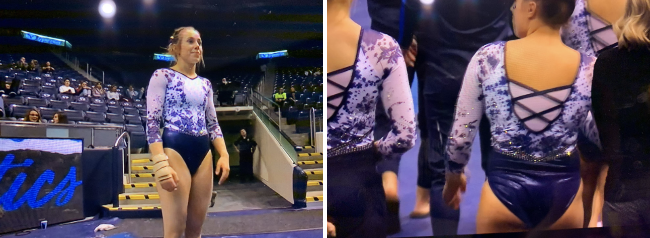
BYU: 6.500

| Design | Fabric/
Sparkle |
School
Spirit |
Overall
Appearance |
Total | |
| Elizabeth | 2.2/3 | 1.5/2 | 1.6/2 | 2.3/3 | 7.6/10 |
| Brandis | 1.5/3 | 1.0/2 | 1.3/2 | 1.5/3 | 5.3/10 |
| Christina | 1.8/3 | 1.3/2 | 1.5/2 | 2.0/3 | 6.6/10 |
Elizabeth: I don’t hate this. I’m used to BYU’s crazy by now, and for some reason this leo works. The blue and white look great together; I especially love the amount of white used. I also like how the flower pattern isn’t super bold or in your face.
Brandis: I’m not a fan. The flower pattern is too busy for me, and I’m being nitpicky, but it bothers me that the sleeves and the body aren’t the same color. I do like how there’s mesh or fabric between the straps on the back. I think it’s interesting and more could be done with that.
Christina: I’m not really a fan, but this is very much on brand for BYU. The flowers are fine, and I like the use of blue and white here. The front is a bit odd with the faux neckline, and I’d rather have it entirely filled with the flower pattern. I do like the back, but again I could have gone without the white mesh and just hd the straps.
READ THIS NEXT: Throwback Leotard Rankings
Article by Elizabeth Grimsley, Brandis Heffner and Christina Marmet
Like what you see? Consider donating to support our efforts throughout the year! [wpedon id=”13158″]


One comment