

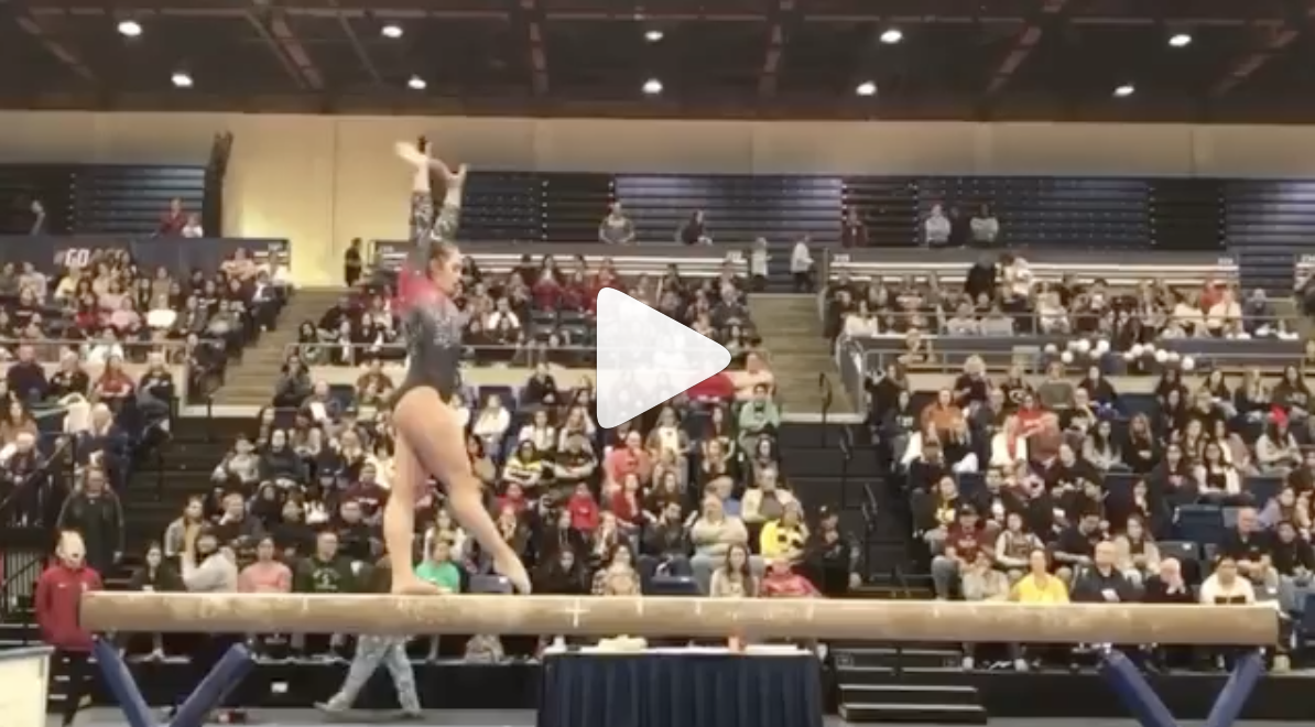
There were SO many new leos this week, most of which were stunning. So many in fact that we can’t judge them all in one ranking. Instead, we are holding some of the DIII (and the second Alaska) designs for future weeks as those squads typically only have one new leo a season. Stay tuned for a future leotard ranking to hear our thoughts on Ursinus, Brockport, Rhode Island College, Centenary, UW-La Crosse and UW-Oshkosh (and the second new Alaska number).
Nevertheless, the criteria is the same as always: up to three points for design, two points for fabric and sparkle, two points for school spirit and three points for overall appearance. This week Emily M and Claire are joining Editor-in-Chief Elizabeth to help judge.
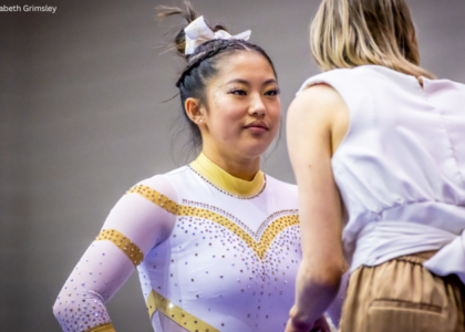
Arizona: 9.033
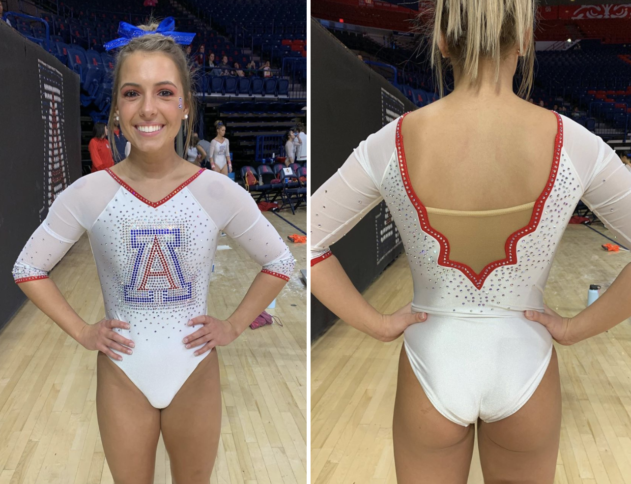
Photos: @arizonagymnastics, Instagram
| Design | Fabric/
Sparkle |
School
Spirit |
Overall
Appearance |
Total | |
| Elizabeth | 2.7/3 | 1.8/2 | 2.0/2 | 2.8/3 | 9.3/10 |
| Emily M | 2.1/3 | 1.8/2 | 2.0/2 | 2.4/3 | 8.3/10 |
| Claire | 3.0/3 | 2.0/2 | 2.0/2 | 2.5/3 | 9.5/10 |
Elizabeth: I LOVE this leo. I’m not normally a white fan because more often than not it makes the gymnasts look like they have bellies when they don’t. But this leo doesn’t do that. I love how simple and classy it looks, and the back neckline design is the best part.
Emily M: Wow yep. I’ve said it before: I totally get why white leos are hell for a gymnast. I wore leos once, I feel that. But damn if they don’t look so crisp and good. Love the back, love the “A”, love the in-your-face crystal punch.
Claire: These are so cool! THIS is how you do a throwback leo. They avoided most of the white leo pitfalls by lining the bodice and leaving the sleeves mesh. The scalloped back is amazing, so much more interesting than the standard open back or deep V. The crystal game is on point, especially that crystal logo. Y’all know I’m a piping snob, and this is as good as it gets.
Ohio State: 8.800
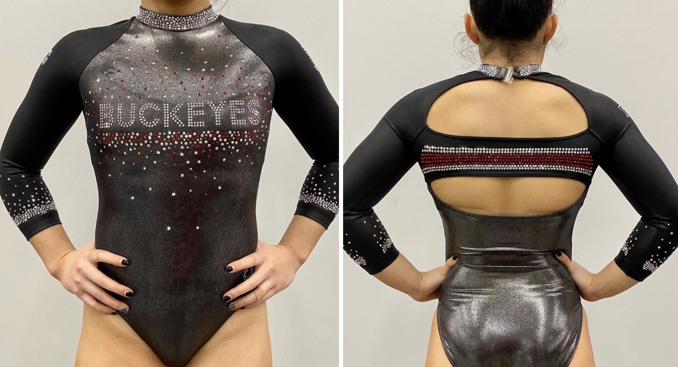
Photos: @ohiostatewgymnastics, Instagram
| Design | Fabric/
Sparkle |
School
Spirit |
Overall
Appearance |
Total | |
| Elizabeth | 2.7/3 | 1.8/2 | 1.7/2 | 2.8/3 | 9.0/10 |
| Emily M | 2.8/3 | 2/2 | 1.8/2 | 2.8/3 | 9.4/10 |
| Claire | 2.5/3 | 2.0/2 | 0.5/2 | 3.0/3 | 8.0/10 |
Fun Fact: The band design featured on the back of the leo is the official Ohio State stripe that appears on the back of football helmets and on other uniforms.
Elizabeth: I’m obsessed. I LOVE when leos have this shiny silver, and paired with the cool back? Perfection. The only thing I can think of to improve is perhaps adding a little bit more red.
Emily M: I love this. That gunmetal, shiny silver is essentially an Ohio State throwback. This leo was beautiful on the broadcast. Chef’s kiss. Perfection. Plus, that back band in crystals? Yes.
Claire: I’m torn… This is a phenomenal leo, but nothing about it says “Ohio State.” If it didn’t literally say Buckeyes on the bodice, you’d never know which team it belonged to. That being said, it’s a gorgeous design. The black and gunmetal fabrics play really well off each other, and the band across the keyhole back is such a great touch (excellent use of crystals).
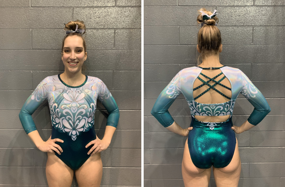
Sacramento State: 8.667
| Design | Fabric/
Sparkle |
School
Spirit |
Overall
Appearance |
Total | |
| Elizabeth | 2.5/3 | 1.9/2 | 1.6/2 | 2.6/3 | 8.6/10 |
| Emily M | 2.4/3 | 2.0/2 | 1.4/2 | 2.6/3 | 8.4/10 |
| Claire | 2.5/3 | 2.0/2 | 1.5/2 | 3.0/3 | 9.0/10 |
Elizabeth: I’m obsessed with this leotard. It’s great in a static pic, and it’s great in motion (even better actually). The back is quirky enough without being too much, and the front design isn’t too busy. Plus, Sac State is finally learning how to use that amazing green color to its advantage!
Emily M: This is stunning. I love the intricate (yet practical!) back, the ombre, and even the pattern. Plus, it achieves that contrast between top and bottom without adding some sort of belt around the middle. It looked great in motion and in stills. Really gorgeous.
Claire: The Hornets really knocked this out of the park. The shade of green is fabulous, the floral pattern is excellent and the holographic material adds the funky edge that Sac State is known for. I’m such a proud MPSF editor right now!
Nebraska: 8.567
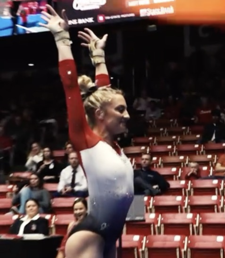
Photo/video: @huskerswgymnastics, Instagram
| Design | Fabric/
Sparkle |
School
Spirit |
Overall
Appearance |
Total | |
| Elizabeth | 2.3/3 | 1.7/2 | 1.7/2 | 2.4/3 | 8.1/10 |
| Emily M | 2.2/3 | 1.8/2 | 2/2 | 2.6/3 | 8.6/10 |
| Claire | 2.5/3 | 2/2 | 2/2 | 2.5/3 | 9.0/10 |
Elizabeth: When I first saw this, I didn’t love it. To me the red sleeves didn’t quite work directly next to the white. However, it’s really grown on me. I like the ombre, I like the back design and I like how the colors work together.
Emily M: This combines elements from two of my favorite Nebraska leos: the pattern work down the back and the black and white ombre. It looked spectacular on the broadcast, even from far away. A very solid look and very Nebraska.
Claire: I adore this one! The red mesh adds a nice contrast to the black and white ombre, and the openings in the back are a unique touch. The crystals on the bodice really punch up the wow factor, especially in motion. I feel like this is what Iowa was going for, but didn’t quite pull off.
Yale: 7.933

Photo: @aimee.leeee, Instagram
| Design | Fabric/
Sparkle |
School
Spirit |
Overall
Appearance |
Total | |
| Elizabeth | 2.1/3 | 1.5/2 | 1.6/2 | 2.2/3 | 8.4/10 |
| Emily M | 1.5/3 | 1.6/2 | 1.8/2 | 2/3 | 6.9/10 |
| Claire | 2.0/3 | 2.0/2 | 2.0/2 | 2.5/3 | 8.5/10 |
Elizabeth: This leo is great! Normally I don’t like gathered material like that, but it works so well here with the ombre and design. A+ work from Yale.
Emily M: Oh, yes. I’m not the biggest fan of the faux belt look with crystals, but it almost works here, and the ombre at the top makes up for it.
Claire: This is gorgeous! The only drawback for me is the mesh window on the bodice. Otherwise, this is a pretty fabulous design.
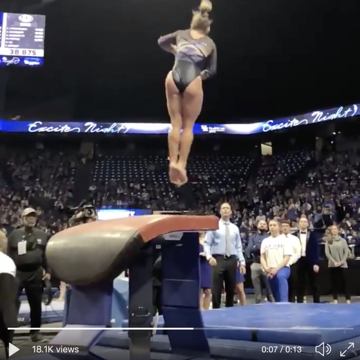
Stanford: 7.367
Video: @stanfordgymnastics, Instagram
| Design | Fabric/
Sparkle |
School
Spirit |
Overall
Appearance |
Total | |
| Elizabeth | 2.6/3 | 1.9/2 | 1.5/2 | 2.7/3 | 8.7/10 |
| Emily M | 1.6/3 | 1.4/2 | 1.4/2 | 2.0/3 | 6.4/10 |
| Claire | 2.0/3 | 2.0/2 | 1.0/2 | 2.0/3 | 7.0/10 |
Elizabeth: This leo is so unlike Stanford, but I’m in love! I love the almost pinkish-red and black ombre and the front and back designs made of sparkles is just the right touch to tie it all together. My only dislike is the solid white Stanford S. it looks fine in static images but kind of looks like a patch that wasn’t applied properly when in motion or from afar.
Emily M: When I first saw this I had to check four times that it really was Stanford. Where is the giant tree S?! It’s there, tiny on the sleeve. Really threw me. I like the ombre, but if Stanford is really going to step out of its box, I want it to go further than this.
Claire: This is really pretty and a bit of a departure for the Cardinal. I like that the ombre incorporates the sleeves and the bodice, and the level of sparkle is good. The big white logo is kind of jarring, especially given how delicate the rest of the design is.
Kentucky: 7.367
Video: @UKGymnastics, Twitter
| Design | Fabric/
Sparkle |
School
Spirit |
Overall
Appearance |
Total | |
| Elizabeth | 1.7/3 | 1.4/2 | 1.8/2 | 1.8/3 | 7.7/10 |
| Emily M | 1.4/3 | 1.6/2 | 1.8/2 | 2.1/3 | 6.9/10 |
| Claire | 2.0/3 | 1.5/2 | 2.0/2 | 2.0/3 | 7.5/10 |
Elizabeth: This leo is better in motion where you can’t see the front detail, which looks more like it has a sheen than being three strips of color like it is in real life. I love the back though; the criss-cross and the back with the ombre is great.
Emily M: I don’t know. I do love the back very much, but I’m just not sure about the front detailing. That said, Kentucky blue and black are always a rocking combo.
Claire: The back is fantastic, interesting and ornate without sacrificing functionality. Unfortunately, the front doesn’t photograph quite as well as it looked in real time; on the broadcast, it absolutely POPPED (especially the ombre mesh). All-in-all, a nice design.
Alaska: 6.900 
| Design | Fabric/
Sparkle |
School
Spirit |
Overall
Appearance |
Total | |
| Elizabeth | 1.7/3 | 1.6/2 | 1.6/2 | 1.8/3 | 6.7/10 |
| Emily M | 1.6/3 | 1.8/2 | 1.6/2 | 2/3 | 7.0/10 |
| Claire | 2.0/3 | 1.0/2 | 2.0/2 | 2.0/3 | 7.0/10 |
Elizabeth: This leo is awesome, especially when compared to some it has in its closet. I kind of wish it had done the green body and white sleeves and left it at that. The design of the yellow just doesn’t work for me, but I appreciate the effort.
Emily M: This is a rare moment when I don’t hate side insets.These are placed just right to flatter everyone, and thankfully they aren’t mesh. Alaska has tough colors to work with, and this balances that violent yellow just right.
Claire: The Seawolves don’t have the most flattering color palette to work with, but they’ve done a good job here. I really love the tapered yellow insets; they add a bold touch without chopping up the overall concept. Also, they have the coolest logo ever, so I’m glad to see it incorporated. I do wish the sleeves weren’t quite so stark.
Rutgers: 6.767
| Design | Fabric/
Sparkle |
School
Spirit |
Overall
Appearance |
Total | |
| Elizabeth | 1.9/3 | 1.7/2 | 1.6/2 | 2.0/3 | 7.2/10 |
| Emily M | 1.4/3 | 1.8/2 | 1.6/2 | 1.3/3 | 6.1/10 |
| Claire | 1.5/3 | 2.0/2 | 2.0/2 | 1.5/3 | 7.0/10 |
Elizabeth: This leo is so close to one of my all-time favorite Arkansas designs, I just think it wasn’t 100% executed right. I love the use of a duller white with the black, giving the leo more of a throwback look. And the sparkles are understated yet just enough.
Emily M: Hmm. I just don’t know about that faux deep V. Like Elizabeth said, it’s very much an old school throwback, but why do it in that nude color?! Otherwise, I quite like this, but I don’t know that I can get past the V.
Claire: The combo of red and white crystals is pretty great, I wish they’d used it on the sleeves, too. The red band around the wrists adds the perfect contrast. The back also really works for me. Pairing the deep scoop with the white panel and crystal logo is a really clever and unexpected twist. I wish they’d echoed that in front. The V and sparkles are too “sternum and ribs” for my taste.
Pittsburgh: 5.967
| Design | Fabric/
Sparkle |
School
Spirit |
Overall
Appearance |
Total | |
| Elizabeth | 1.4/3 | 1.3/2 | 1.8/2 | 1.5/3 | 6.0/10 |
| Emily M | 1.4/3 | 1.6/2 | 1.8/2 | 1.6/3 | 6.4/10 |
| Claire | 1.5/3 | 1.5/2 | 1.0/2 | 1.5/3 | 5.5/10 |
Elizabeth: Meh. It’s OK. The design is kind of boring and reminds me of a stock design even if it isn’t necessarily. I do like the script Panthers though.
Emily M: Oh hmmm. I like a black leo! But the bright yellow on the black is a little stark. I do like the crystal pattern a lot and the back script.
Claire: I absolutely love the sleeves (those cutouts are awesome) and the “Panthers” across the back. The bodice is thoroughly blah, though. I’m not a fan of design elements not carrying through to the back, so the yellow and blue bands stopping abruptly at the shoulders really bugs me.
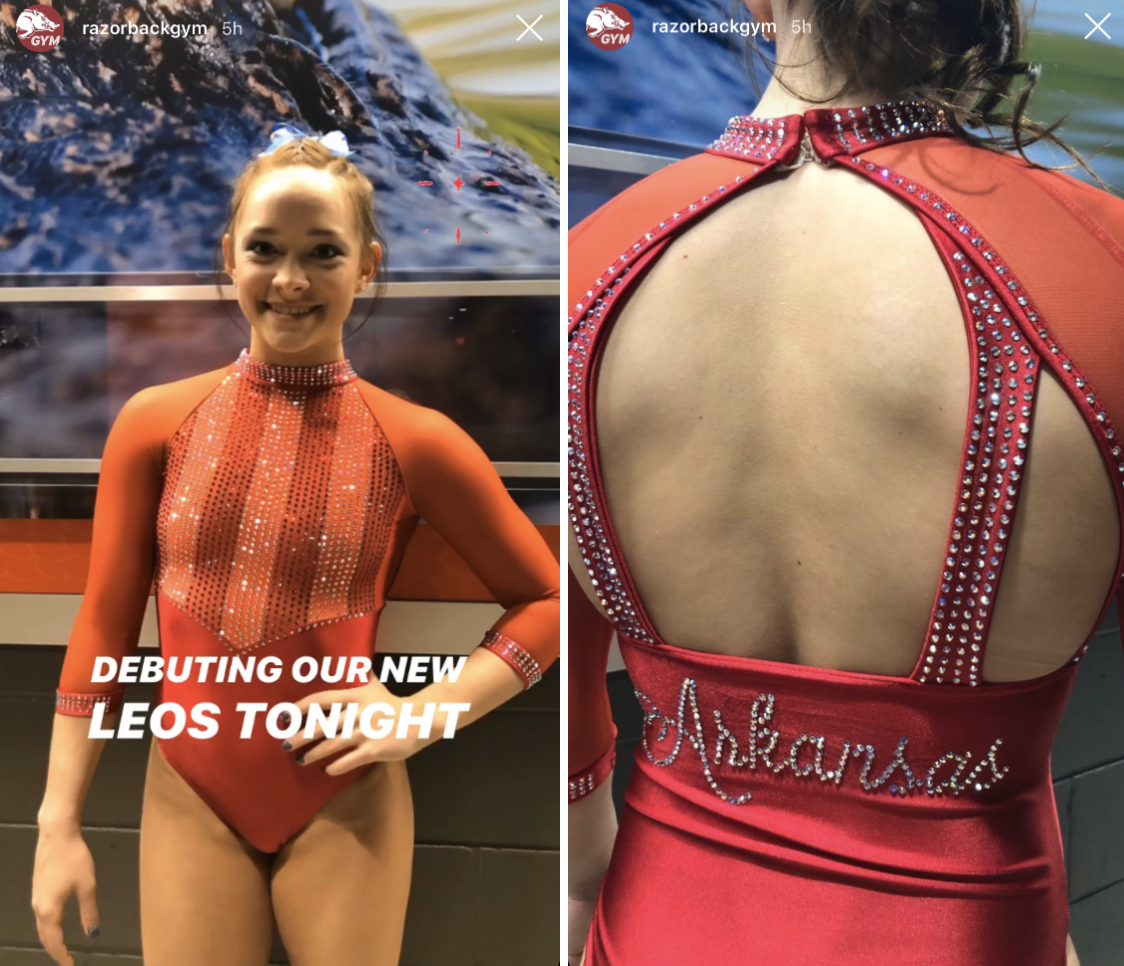
Arkansas: 5.900
| Design | Fabric/
Sparkle |
School
Spirit |
Overall
Appearance |
Total | |
| Elizabeth | 1.6/3 | 1.2/2 | 1.5/2 | 1.7/3 | 6.0/10 |
| Emily M | 1.4/3 | 1.8/2 | 1.6/2 | 1.4/3 | 6.2/10 |
| Claire | 1.0/3 | 1.0/2 | 2.0/2 | 1.5/3 | 5.5/10 |
Elizabeth: This leo is nice in motion but looking at it in a static image makes me think of something you’d get from Party City for Halloween (SORRY). The back is really really great though, and again, in motion it’s way better. I’m interested to see what else Arkansas has in store for leos this season.
Emily M: This is one of those looks that just slightly misses in all aspects for me. The script feels a little lopsided, the vertical stripes are not quite right? I just don’t know?
Claire: There are a lot of elements about this I really like: The high neck, the “Arkansas” script and the crystal stripes on the bodice are fun. Something about the sum of the parts just doesn’t work for me, though…
Utah State: 5.167
| Design | Fabric/
Sparkle |
School
Spirit |
Overall
Appearance |
Total | |
| Elizabeth | 1.7/3 | 1.6/2 | 1.5/2 | 2.0/3 | 6.8/10 |
| Emily M | 1/3 | 0.6/2 | 0.5/2 | 1.6/3 | 3.7/10 |
| Claire | 1.5/3 | 1.0/2 | 1.0/2 | 1.5/3 | 5.0/10 |
Elizabeth: I actually don’t hate this. The shade of blue is nice and works well with the white. I also like the matte fabric used over shiny. The starburst may not be my favorite, but overall this isn’t a bad leo.
Emily M: I just don’t know. This looks more Air Force than Utah State to me. That starburst pattern is a little odd, and I’m not sure about the material. I’m underwhelmed, I guess.
Claire: This is aggressively okay. For starters, I wish they’d inverted the colors, using blue as the primary color in the bodice and white for the sleeves. There’s not enough contrast between the grey and the white, so the main design ends up looking muddled. Also could use more sparkle.
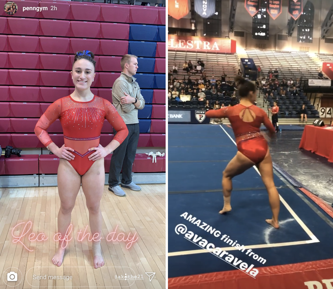
Penn: 4.967
| Design | Fabric/
Sparkle |
School
Spirit |
Overall
Appearance |
Total | |
| Elizabeth | 1.0/3 | 1.5/2 | 1.5/2 | 1.2/3 | 5.2/10 |
| Emily M | 1.2/3 | 1.6/2 | 1/2 | 1.9/3 | 5.7/10 |
| Claire | 1.0/3 | 1.0/2 | 1.0/2 | 1.0/3 | 4.0/10 |
Elizabeth: Umm… The back is great. It’s unique and the sparkle belt is in a good spot. However, the front is not good. I hate how low the mesh goes. It looks like a bathing suit someone would wear who wants to wear a bikini but also wants to be super conservative about it so they made the top and bottoms super big then added mesh over all the rest of the exposed skin.
Emily M: Why is there a WWE mesh belt on this leo?! No. Walk away.
Claire: I’m with Elizabeth on this: The back is great, the front is not. I do like the little pop of blue around the weird mesh stomach belt, though. I wish they’d used more of that.
Iowa: 4.333
The #Hawkeyes are beaming!#FightForIowa pic.twitter.com/aJHOsJnn3s
— Iowa Gymnastics (@IowaGymnastics) January 12, 2020
| Design | Fabric/
Sparkle |
School
Spirit |
Overall
Appearance |
Total | |
| Elizabeth | 0.8/3 | 1.0/2 | 1.6/2 | 1.0/3 | 4.4/10 |
| Emily M | 1.0/3 | 1.2/2 | 1.0/2 | 1.4/3 | 4.6/10 |
| Claire | 1.0/3 | 1.0/2 | 1.0/2 | 1.0/3 | 4.0/10 |
Elizabeth: Oh Iowa… How did you manage to absolutely ruin white and black ombre? At least this is better than that all white leo with the nude sleeves it wore at TWU one year… That one really was the worst.
Emily M: Iowa. Why with the nude mesh sleeves. I like the little offset Hawkeye on the back and the ombre a great deal, but I will never be okay with these faux sleeveless looks. They wig me out.
Claire: Nope… The black-to-white ombre is nice and the Hawkeye on the back is cool, but that’s about it. Why are there slashes around the neck? Why don’t the crystal designs on the sleeves match? And why are the sleeves nude mesh?!
READ THIS NEXT: Leotard Rankings: Week 1
Article by Elizabeth Grimsley, Emily Minehart and Claire Billman
Like what you see? Consider donating to support our efforts throughout the year!
One comment