Gymnastics fans love leotards; it’s just a fact. We love seeing new designs, creating our own, and especially judging them. That’s why we’re back for another season of leotard rankings! Each week we’re analyzing new designs to find our weekly faves. Here’s the rubric we’re working with:
- Design (3): How strong the overall design is in terms of color, balance, composition, and visual flow. Does it feel intentional and cohesive?
- Construction (2): Quality of materials, fit, finish, and sparkle application. Does the leotard look well-made and flattering in motion and on camera?
- Concept & Identity (2): How successfully the leotard communicates a clear concept or identity through design choices — balancing team branding with creativity and cohesion. Does it feel like this team in a good way?
- Overall Appearance (3): The general visual impression: Does the leotard stand out (positively) on the floor? Is it polished, elegant, and memorable?

Don’t agree with our ranking? Make your opinion heard by voting in the fan poll at the end of the article each week or by voicing your thoughts on social media!
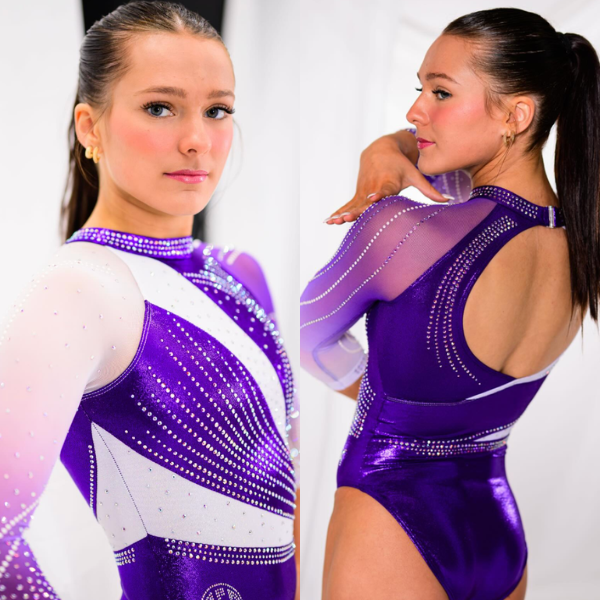
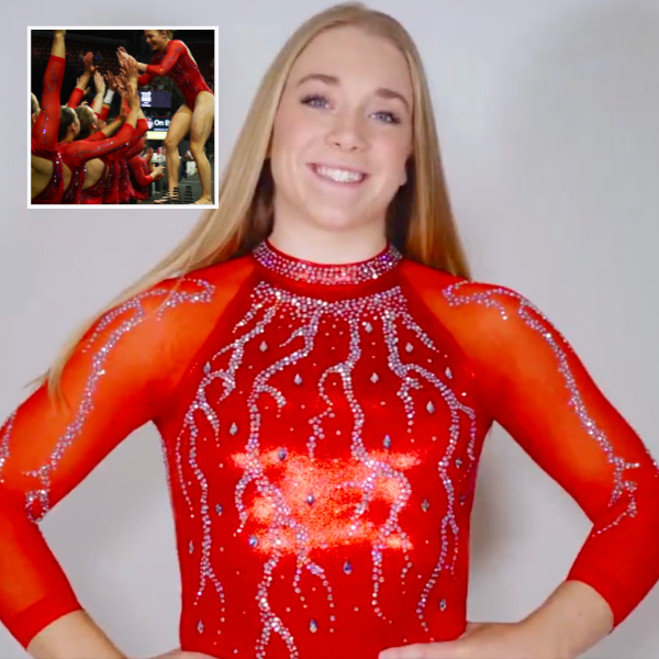
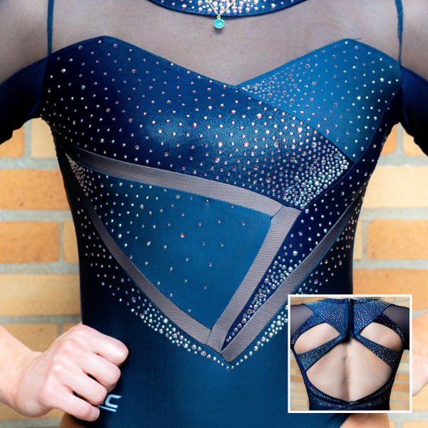
Michigan State: 9.250
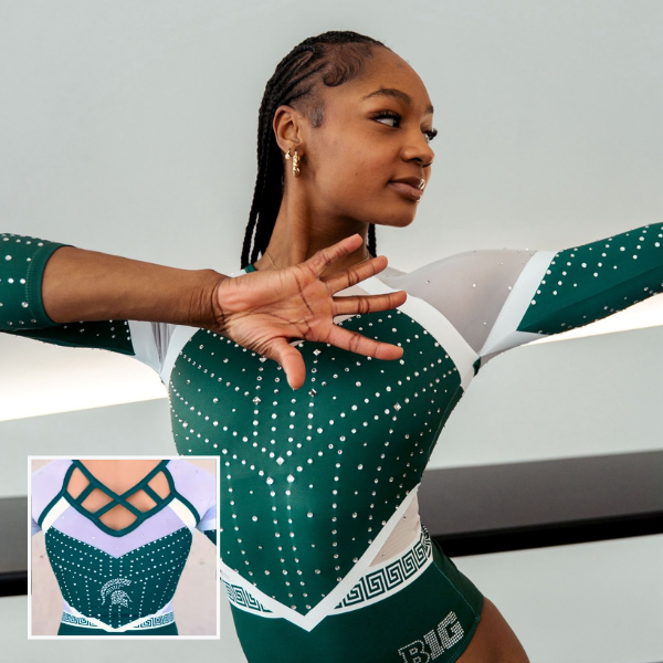
View a video and an image of this leotard here.
Elizabeth: 8.800
Design 2.6/3, Construction 1.8/2, Concept & Identity 2.0/2, Overall Appearance 2.4/3
I love this! I don’t know how Nicole Curler keeps coming up with new and fresh ideas, but she does! I love how the top part of the design on the body gives the look of overlapping with the bottom. I also love the use of the signature MSU pattern. My only gripe is with the matte white elements. I really need to see this design in person, because I feel like they would look less stark and contrasting, but in pictures, they stand out in an awkward, clashing way.
Savanna: 9.500
Design 2.8/3, Construction 1.9/2, Concept & Identity 2.0/2, Overall Appearance 2.8/3
Michigan State continues to slay the leotard game. I actually like the mix of mesh and matte fabric; it gives an interesting look to the design that I don’t think I would’ve liked if it was one over the other. The rhinestone design is beautiful and the bedazzled Spartan on the back is the perfect dose of school spirit without being too much.
Mariah: 8.900
Design 2.6/3, Construction 1.8/2, Concept & Identity 1.9/2, Overall Appearance 2.6/3
What a lovely shade of green! Another hit from Michigan State as usual. I’m not sure how I feel about the patterned belt being straight across while the rest of the bodice design makes a V at the waist, but that’s a minor complaint. I think this design is excellent.
Frances: 9.800
Design 2.9/3, Construction 2/2, Concept & Identity 2/2, Overall Appearance 2.9/3
I love when Michigan State uses this lighter shade of green. The gem pattern calls to armor, fitting for the Spartans and not at all overbearing. I don’t think this leo even needed the mesh; a solid white fabric instead on the shoulders to go with the existing white seams would have really popped. But I love this!
Central Michigan: 8.850

Elizabeth: 9.100
Design 2.6/3, Construction 1.9/2, Concept & Identity 1.8/2, Overall Appearance 2.8/3
Maybe my favorite Central Michigan leotard of all time. The sleeves are to-die-for, and I love the subtle gold/yellow rhinestones used in the pattern on the body. The back is also such a unique design, and the “C” logo made with negative space adds school spirit without being over the top.
Savanna: 9.400
Design 2.8/3, Construction 1.9/2, Concept & Identity 1.9/2, Overall Appearance 2.8/3
Obsessed. The maroon base with a subtle ombre on the sleeves is perfectly coordinated with the rhinestone colors. And the back?? So unique and stands out in the crowd of leotards from this weekend.
Mariah: 8.400
Design 2.5/3, Construction 1.9/2, Concept & Identity 1.5/2, Overall Appearance 2.5/3
This is so so pretty! The ombre on the sleeves is great and the yellow stones stand out really well on the maroon fabric. I don’t particularly love the top of the sparkle design on the front, but the fact that it is mimicked on the back makes me appreciate it. This is a very well-done design. I hope they wear it again at regionals.
Frances: 8.500
Design 2.4/3, Construction 1.9/2, Concept & Identity 1.5/2, Overall Appearance 2.7/3
I like this! It has the perfect maroon to gold ratio and employs lots of colorful bling. I particularly enjoy that the cutout pattern on the back is continued in the design on the front.
Florida: 8.550

View images of this leotard here.
Elizabeth: 8.500
Design 2.3/3, Construction 1.7/2, Concept & Identity 2.0/2, Overall Appearance 2.5/3
Finally, an orange leo! And a winning one at that. This design definitely grew on me as the meet went on. I love the shade, the relatively simple back, and what I recently found out are orange blossoms on the body. I wish the shade of orange was a bit more *Florida,* but I’m not going to complain too much after years of asking for this.
Savanna: 8.500
Design 2.4/3, Construction 1.7/2, Concept & Identity 1.9/2, Overall Appearance 2.5/3
This is a fun design! Florida finally listened to the calls for an updated mostly-orange leotard and this is really pretty. The orange blossoms are a nice nod to the state, but I wish they were made of darker blue rhinestones because you couldn’t really see the design on television. Overall, this is still a stunning leotard.
Mariah: 8.900
Design 2.5/3, Construction 1.8/2, Concept & Identity 1.9/2, Overall Appearance 2.7/3
I thought I was dreaming when I saw this! I truly never thought Florida would do all orange, but I’m glad it did. The flowers are really subtle and delicate in the photos, although they don’t come across well on video. I also really like the shade of orange that was used. The one downside for me is the neck cutouts.
Frances: 8.300
Design 2.3/3, Construction 1.6/2, Concept & Identity 1.8/2, Overall Appearance 2.6/3
Let’s talk about it! Florida rarely incorporates orange, and this is its first all-orange leo since 2007. I legitimately did a triple take when I first saw this. Florals can be cheesy on a leo, but this was subtle enough and calls to the state’s tropical location. Also, the distance and cameras didn’t allow for a proper capture of the flower design on TV. I don’t love the neck cutouts, and think that there could be more going on with the straps in the back.
Northern Illinois: 8.550

View pictures of this leotard here.
Elizabeth: 9.300
Design 2.8/3, Construction 1.9/2, Concept & Identity 1.8/2, Overall Appearance 2.8/3
LOVE. I knew Northern Illinois was due for a new leotard since it hasn’t had one since 2024, but this exceeded all the expectations I had. I love the elaborate stoning on the front, but I also love the thicker back straps highlighted with rhinestones on top. Excellent!
Savanna: 7.400
Design 2.1/3, Construction 1.7/2, Concept & Identity 1.2/2, Overall Appearance 2.4/3
Holy rhinestones, Batman! This is such an intricate design and has so much going for it. Similar to another leo I ranked, though, without the “Huskies” on the back, I would have no clue it’s an NIU leotard. And as painstaking as it would’ve been, I would have really liked to see the design continue just to the edge of the back. Overall, though, this is stunning and props to NIU for going bold with this design.
Mariah: 8.800
Design 2.6/3, Construction 1.9/2, Concept & Identity 1.6/2, Overall Appearance 2.7/3
Wow! This is STUNNING! The back is a bit clunky compared to the rest of the design and I would’ve liked to see the pattern carry over to the back as well, but those are minor complaints. The sparkle design is beautiful and I know I would personally be thrilled if I got to wear this.
Frances: 8.700
Design 2.5/3, Construction 1.8/2, Concept & Identity 1.5/2, Overall Appearance 2.9/3
I’m blown away by the detail work on this one. At first glance, it looked like a printed design. Nope—it’s rhinestones! Take away the bling and it’s a regular black leo, but the sheer ambition with this pattern is admirable. The huge open back is probably so they wouldn’t have to continue the design, but honestly? I’m okay with it. Here, Northern Illinois blends elegance and athletics. And that’s very gymnastics of it.
Arizona State: 8.525
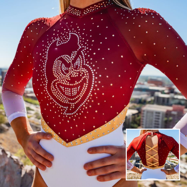
View a video and images of this leotard here and additional images here.
Elizabeth: 8.000
Design 2.1/3, Construction 1.8/2, Concept & Identity 1.9/2, Overall Appearance 2.2/3
This design has grown on me since I first saw it. Normally, I don’t care for leotards with a white bottom that changes into the upper color in a stark way because it gives diaper. However, the gold belt breaks things up here in a way that works. I also love the ombre sleeves and Sparky on the chest.
Savanna: 8.200
Design 2.1/3, Construction 1.8/2, Concept & Identity 1.9/2, Overall Appearance 2.4/3
The color combination is spot on and I love the strappy back. I’m not a fan of white on the bottom when it just comes across as a sparkly diaper but the v-shape of the waistline helps it not look like a diaper in this case. A solid mascot leo for the Sun Devils to add to their collection!
Mariah: 8.700
Design 2.5/3, Construction 1.9/2, Concept & Identity 1.8/2, Overall Appearance 2.5/3
I agree with the other editors that this definitely had the potential to look like a diaper but managed not to. It’s a relatively simple design, but there are a lot of subtle details to appreciate. I like that the gold belt continues to the back and is even lined up at the side seams. The slight V-neck at the collar mimics the cut of the belt nicely as well.
Frances: 9.200
Design 2.9/3, Construction 2/2, Concept & Identity 1.7/2, Overall Appearance 2.6/3
I need to see this indoors, but the specific shade of red is gorgeous and I LOVE the incorporation of Sparky (in rhinestones, no less). I’d like to see it with solid red sleeves—the ombre feels unnecessary when the rest of the leo is intentionally colorblocked. As a whole, it feels well-balanced.
Pittsburgh: 8.375

View a video of this leotard here.
Elizabeth: 7.300
Design 1.8/3, Construction 1.8/2, Concept & Identity 1.7/2, Overall Appearance 2.0/3
I will always celebrate when velvet is used. However, for this design specifically, it’s just fine. I like the rhinestone pattern on the sleeves, as well as the use of yellow/gold rhinestones. There’s just something about the pattern on the front I don’t care for.
Savanna: 7.700
Design 2.1/3, Construction 1.5/2, Concept & Identity 1.8/2, Overall Appearance 2.3/3
I’m disagreeing with Elizabeth here because the front pattern is actually my favorite part of this leotard. I love the mix of blues and the use of the gold and silver rhinestones to add more color to an already pretty design. Plus, it’s velvet.
Mariah: 8.700
Design 2.5/3, Construction 1.8/2, Concept & Identity 1.8/2, Overall Appearance 2.6/3
This is so pretty! I’ve never seen a chain motif used on a leotard, but it works here. Everything in the design flows well together and the variation in gems and fabrics used keeps the look interesting despite being monochromatic.
Frances: 9.800
Design 3.0/3, Construction 1.8/2, Concept & Identity 2.0/2, Overall Appearance 3.0/3
I’m always happy to see velvet being used, and I absolutely can’t get enough of the gem pattern. The chains are gorgeous and interesting, reminding me of both dainty jewelry and Pittsburgh’s history as an industrial city. The only nitpick I have is some fabric bunching on the straps. But to me this is nearly a perfect leo.
Nebraska: 8.225
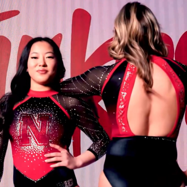
View a video of this leotard here.
Elizabeth: 7.900
Design 2.1/3, Construction 1.8/2, Concept & Identity 1.8/2, Overall Appearance 2.2/3
There are elements I love, and elements I would have left off. I love the ombre, as well as the rhinestone pattern on the sleeves. I don’t care for the bright red, the matte collar, or the armpit straps. They feel out of place. I think the leo would have been superb otherwise.
Savanna: 8.300
Design 2.3/3, Construction 1.9/2, Concept & Identity 1.8/2, Overall Appearance 2.3/3
This is a really nice design! I love the front design and how the “N” logo goes along with the ombre. The sparkle throughout the entire leo is great and the “Nebraska Huskers” on the back is a nice extra touch of spirit.
Mariah: 8.700
Design 2.5/3, Construction 1.9/2, Concept & Identity 1.8/2, Overall Appearance 2.5/3
This isn’t terribly unique, but I really like it. The colors are bold and the sparkle pattern on the arms is interesting without making the design look busy. I think every team needs a good logo leo.
Frances: 8.000
Design 2.5/3, Construction 2/2, Concept & Identity 1/2, Overall Appearance 2.5/3
This is a good staple leo for Nebraska. It’s blingy, bold in the contrast, and looks sturdy, although it’s not the most unique leo Nebraska has put out. I appreciate the herringbone pattern created on the sides of the sleeves and I love a giant logo moment.
New Hampshire: 8.075

View a video of this leotard here.
Elizabeth: 7.900
Design 2.1/3, Construction 1.8/2, Concept & Identity 1.8/2, Overall Appearance 2.2/3
This may be controversial, but I love this funky collar because it gives such an athletic look. The rest of the design tries to lean into that athletic vibe, with the white mesh “stripe” on the top of the sleeves and the logo on the chest, but I feel like it could lean in even more to make a perfect leo.
Savanna: 7.200
Design 1.7/3, Construction 1.5/2, Concept & Identity 1.9/2, Overall Appearance 2.1/3
The collar is neither here nor there for me, but it does work with the tiny v-neck. I like how the cat stands out in the center, but the white stripes on the back kind of kill it for me.
Mariah: 8.100
Design 2.2/3, Construction 1.8/2, Concept & Identity 1.8/2, Overall Appearance 2.3/3
There’s a lot I like about this! I’m not crazy about the collar and I think the cuffs are far too thick, but those small details definitely don’t ruin the look. The rest is pretty dang perfect and it’s probably my favorite look from New Hampshire in recent memory.
Frances: 9.100
Design 2.8/3, Construction 1.9/2, Concept & Identity 1.5/2, Overall Appearance 2.9/3
I really like the athletic feel of this leo. The collared neckline works, and I like the strappy back and how the motif is continued on the waist. I like the two-toned sleeves with mesh, but I think thinner cuffs may have matched better with the collar.
Alabama: 7.975
View a video and images of this leotard here.
Elizabeth: 7.500
Design 2.0/3, Construction 1.7/2, Concept & Identity 1.7/2, Overall Appearance 2.1/3
This one looked really nice in person because with all the sparkles “blocking” the detailed pattern, it had more of a watercolor effect. White base with crimson details is a concept that works well and is hard to do wrong.
Savanna: 7.600
Design 2.1/3, Construction 1.6/2, Concept & Identity 1.7/2, Overall Appearance 2.2/3
This is SUCH a nice leotard! At first, I felt it was too flowery and busy, but looking at it again, I really like how most of the details are focused on the sleeves. It really draws attention to the design.
Mariah: 7.900
Design 2.1/3, Construction 1.8/2, Concept & Identity 1.7/2, Overall Appearance 2.3/3
I’m not always a fan of printed-on designs, and this one is no exception, but it’s certainly not a bad look and it’s definitely not lacking in sparkle. I really like the back straps and the “Tide” on the collar.
Frances: 8.900
Design 3/3, Construction 1.6/2, Concept & Identity 1.5/2, Overall Appearance 2.8/3
I really like this take on a white leo. Alabama has been playing with more delicate patterning this year and this feels like the peak. I think the pattern could’ve continued across the chest for a connected look, and I really wish the design lined up along the seams from front to back.
UCLA: 7.925

View a video and pictures of this leotard here.
Elizabeth: 9.500
Design 2.7/3, Construction 2.0/2, Concept & Identity 2.0/2, Overall Appearance 2.8/3
Maybe one of my favorite designs of the weekend. White and gold pair so well together, and I love how the mesh and gold rhinestones are introduced here to complement the existing design rather than stand in the way or add to things for no reason.
Savanna: 9.200
Design 2.6/3, Construction 2.0/2, Concept & Identity 2.0/2, Overall Appearance 2.6/3
Another winner for the Bruins! I like the mix of mesh and matte in the back and how the rhinestones almost follow along the lines of where the mesh starts and make it stand out a bit more.
Mariah: 7.500
Design 2.0/3, Construction 1.8/2, Concept & Identity 1.5/2, Overall Appearance 2.2/3
This isn’t very exciting, but it’s a nice design and it’s nice to see UCLA leaning into gold and trying something a little different. I wish the mesh near the neckline connected to the mesh sleeve to make the look seem more cohesive, but it doesn’t throw it off too much for me. I also like where the “UCLA” is placed in the design.
Frances: 5.500
Design 1.2/3, Construction 1.4/2, Concept & Identity 1.0/2, Overall Appearance 1.9/3
It’s so surprising to see the Bruins in white with gold detailing, but I don’t feel like there is a greater concept behind this design. I think the gold swooshes could be bolder because they didn’t make an impact on camera, though I will give props for using golden rhinestones.
Temple: 7.825

View a video of this leotard here and an image of the back here.
Elizabeth: 8.500
Design 2.5/3, Construction 1.7/2, Concept & Identity 1.8/2, Overall Appearance 2.5/3
I really like this! The “dripping” rhinestone pattern is fun, and the little block Ts at the ends is a unique touch. I also love the thicker seam separating the solid fabric on the body with the sleeves. The back is good too and features a solid use of school spirit with “Temple” and “Owls” along the hole.
Savanna: 8.000
Design 2.3/3, Construction 1.5/2, Concept & Identity 2.0/2, Overall Appearance 2.2/3
Oooh the script “Temple Owls” on the back is so pretty here!! I don’t like the collar, but high neck leotards have never been my personal favorite, especially when it doesn’t use the top color but goes with the contrasting color. The rhinestone patterns are probably my favorite part.
Mariah: 7.400
Design 1.9/3, Construction 1.6/2, Concept & Identity 1.8/2, Overall Appearance 2.1/3
The little rhinestone logos are super cute! I wish the transition between the different rhinestone designs on the front was a bit further down, maybe at the natural waistline. This is a nice one for the Owls, but not my favorite that they’ve debuted recently.
Frances: 8.400
Design 2.4/3, Construction 1.8/2, Concept & Identity 1.7/2, Overall Appearance 2.5/3
I think this has the perfect amount of rhinestones to go with the ombre fabric, and the “T” drips is an interesting take. I will complain about the line under the chest area: I’m 100% sure it doesn’t work for athletes of different sizes and also just cuts off at an awkward place in the ombre.
Michigan: 7.825
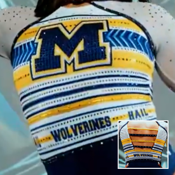
View a video of this leotard here.
Elizabeth: 7.400
Design 2.4/3, Construction 1.4/2, Concept & Identity 1.4/2, Overall Appearance 2.2/3
I actually really like this but think the belt with “Wolverines” and “Hail” ruins the whole thing. If the words were just not there, this would actually be a pretty fantastic leotard.
Savanna: 8.300
Design 2.2/3, Construction 1.8/2, Concept & Identity 2.0/2, Overall Appearance 2.3/3
I really liked this when I first saw it! It kind of goes along with the varsity style trend we’ve seen teams lean into in recent years. The “Hail” and “Wolverines” aren’t entirely necessary to know it’s a Michigan design, but I don’t mind the extra boost of school spirit.
Mariah: 6.700
Design 1.1/3, Construction 1.8/2, Concept & Identity 1.9/2, Overall Appearance 1.9/3
I’m clearly in the minority here, but I don’t think I like this. There’s just way too much going on. Maybe if the stripes stopped at the gold rhinestone belt instead of continuing below it I would find it a bit less overwhelming, but there’s just too many contrasting horizontal lines in my opinion. The colors are nice though, and I will admit, I think it looks better in motion than in still shots and it’s definitely not lacking in school spirit.
Frances: 8.900
Design 2.7/3, Construction 2.0/2, Concept & Identity 1.7/2, Overall Appearance 2.5/3
I appreciate how bold and graphic Michigan goes, leaning on color blocking rather than rhinestones and mesh. There’s a lot to look at, but you can’t say it’s not attention-grabbing. The only sticking point for me is the random cutout at the neckline.
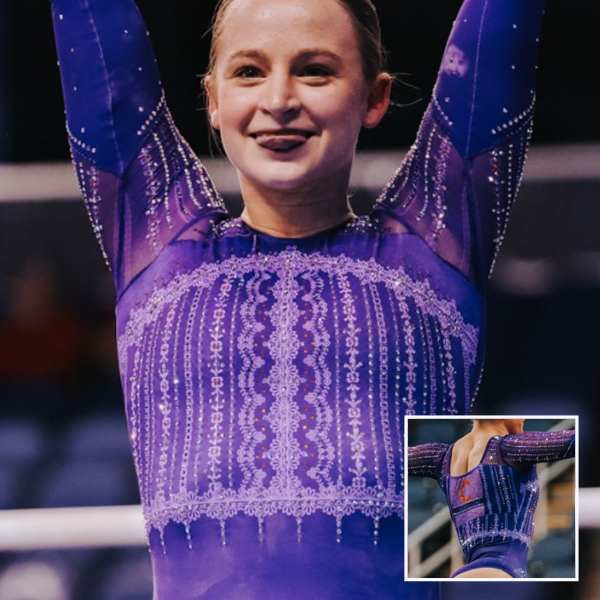
LSU: 7.775
View videos and images of this leotard here.
Elizabeth: 7.800
Design 2.0/3, Construction 1.9/2, Concept & Identity 1.7/2, Overall Appearance 2.2/3
LSU has a lot of really elaborate leos that, when something much simpler is debuted, I can’t help but feel underwhelmed or like there’s something missing. However, moderation is good in this case. I like the shiny purple paired with the matte white, and the ombre sleeves are really pretty. My favorite part, though, may be the pearl-like rhinestones on the sleeves, giving the design its name.
Savanna: 7.500
Design 2.1/3, Construction 1.9/2, Concept & Identity 1.1/2, Overall Appearance 2.4/3
First of all, I love that LSU allowed Lexi Zeiss to design this and basically name it after her with the “LZ” at the end of Pearlz. I like the ombre sleeves – especially the fact they are reversed – and the open back. While it did give stock design at first, I do have to give props for the construction because everything ties together relatively well. I think the only thing I would’ve liked would be an “LSU” logo somewhere, maybe on the back? Overall though, it’s a very solid design that the Tigers will get a lot of use out of.
Mariah: 7.800
Design 2.1/3, Construction 1.9/2, Concept & Identity 1.4/2, Overall Appearance 2.4/3
Upon first glance this one reminded me a bit of an all-purple design LSU debuted a couple years ago, but I prefer this one. I don’t think I’ve ever seen a leo with opposite ombre sleeves, but it works well here and keeps it from feeling like the design is cut off at the shoulder seams. The pearls on the sleeves are also a fun addition. There’s actually quite a lot going on with this design, but it flows well and is cohesive enough that it almost feels simple. I wish there was some gold or a logo or something to make it more undeniably LSU.
Frances: 8.000
Design 2.5/3, Construction 1.8/2, Concept & Identity 1.0/2, Overall Appearance 2.7/3
The purple is balanced well with the white, and I like the flow of the rhinestone placement. I agree with Savanna about the logo, but otherwise I think it’s pretty.
Georgia: 7.725
View a video of this leotard here.
Elizabeth: 9.000
Design 2.6/3, Construction 1.9/2, Concept & Identity 1.8/2, Overall Appearance 2.7/3
I actually really love this. The white gives such a classic look, but the design is complex. I love the hints of color and school spirit, as well as how the mesh parts mirror the rhinestone pattern. The mesh neckline/collar is also very interesting. I’m not sure I’ve ever seen that done before and I don’t dislike it.
Savanna: 8.100
Design 2.1/3, Construction 1.7/2, Concept & Identity 1.8/2, Overall Appearance 2.5/3
The details make this leo a really nice addition to Georgia’s closet. The side mesh cutouts are an interesting addition. Normally I can’t stand those, but it works with this and I don’t think I would like this design as much without them. I wish the red sparkles stood out just a little more, though.
Mariah: 8.100
Design 2.1/3, Construction 1.9/2, Concept & Identity 1.8/2, Overall Appearance 2.3/3
This has more dimension than a lot of the white leos we saw this week. The combination of the three different colors of stones and the mesh cutouts on the side make it a bit more interesting. I wish the “G” on the front stood out a bit more, but overall this is a pretty solid look.
Frances: 5.700
Design 1.5/3, Construction 1.6/2, Concept & Identity 0.8/2, Overall Appearance 1.8/3
This isn’t really giving anything IMO. If not for the logo, nothing about this says Georgia to me. I like that it plays with red and black rhinestones, but it feels sparse. It’s as if something is missing. Points back for using the specific ribbed fabric for the base.
Missouri: 7.650

View a video and images of this leotard here and more images here.
Elizabeth: 9.000
Design 2.6/3, Construction 1.8/2, Concept & Identity 2.0/2, Overall Appearance 2.6/3
Love. For once, mesh cutouts make sense! I also love the use of this interesting black mesh because, in person, it gave a bit of a gold look with some lighting, only adding to the school spirit.
Savanna: 8.600
Design 2.3/3, Construction 1.8/2, Concept & Identity 2.0/2, Overall Appearance 2.5/3
I’m so beyond thrilled with this design. I love the use of the tiger stripes and I do like the mesh sleeves. I don’t like how the mesh sleeve continued on the same sleeve as the tiger stripes. If the stripes design had continued on the arm all the way down, this would’ve gotten higher marks from me. It’s a stunning design though!
Mariah: 6.800
Design 1.3/3, Construction 1.8/2, Concept & Identity 1.8/2, Overall Appearance 1.9/3
The black sleeve throws off the flow for me. Overall, I wasn’t impressed by this one watching it on the broadcast but it’s certainly not bad. Missouri doesn’t do a lot of all white, so it’s nice to see them in something a bit different.
Frances: 6.200
Design 1.9/3, Construction 1.2/2, Concept & Identity 1.5/2, Overall Appearance 1.6/3
I love to see Missouri leaning into the tiger pattern, and it’s abstract enough to be a cool design on its own. The one full mesh sleeve isn’t my favorite, but it goes with the asymmetry motif. Also, I feel like the straight-cut mesh on the bodice clashes poorly with the swirly rhinestone design.
Arkansas: 7.600
View a video of this leotard here and images here.
Elizabeth: 8.800
Design 2.4/3, Construction 2.0/2, Concept & Identity 1.8/2, Overall Appearance 2.6/3
Of all the white leotards debuted this weekend, this was one of my favorites. I love how the almost-white shade of silver blended in with the white elements yet added a subtle pop of shimmer to emphasize certain elements of the design. I also love how the implementation of the zipper on the back allowed the design to be complete and not broken up by seams or holes.
Savanna: 8.500
Design 2.4/3, Construction 1.8/2, Concept & Identity 1.8/2, Overall Appearance 2.5/3
Oooh, this is something different for Arkansas and I really like it! I love the pattern. I think it’s just enough so that it stands out but not too much that it’s overwhelming for the eyes. The zipper is an interesting concept but if the gymnasts love it, that’s all that matters. And a bedazzled hog on the back? Come on, now, you can’t do much better than that.
Mariah: 7.400
Design 1.9/3, Construction 1.7/2, Concept & Identity 1.7/2, Overall Appearance 2.1/3
This doesn’t really stand out much to me but I like the inclusion of the very light silver detailing and the sparkle pattern on the shoulders is especially pretty. I’m not really a fan of the neckline though. Maybe I would’ve preferred a standard sweetheart cut instead?
Frances: 5.700
Design 1.5/3, Construction 1/2, Concept & Identity 1.2/2, Overall Appearance 2/3
I’m intrigued by the presence of a zipper on a leo. I don’t love how much mesh is happening, but I do love the addition of the shiny silver fabric. The larger red stones stand out but the pattern itself is lacking to me.
Stanford: 7.550
View a video and images of this leotard here.
Elizabeth: 8.400
Design 2.4/3, Construction 1.7/2, Concept & Identity 1.9/2, Overall Appearance 2.4/3
I mean, I like it, but it’s sort of just a black version of this design, which is fine, but I want more originality when it comes to leotards in this sport. But again, it’s a good leotard, just nothing revolutionary.
Savanna: 6.900
Design 1.5/3, Construction 1.4/2, Concept & Identity 1.8/2, Overall Appearance 2.2/3
I don’t understand the purpose of redoing a leotard that is two years old and just making it black instead of white. It’s nice, but Stanford did a fighting tree leotard, so I know it has the originality and creativity to make something that stands out.
Mariah: 7.900
Design 2.0/3, Construction 1.9/2, Concept & Identity 1.7/2, Overall Appearance 2.3/3
This is nice, but I wouldn’t have known it was new without being told. I wish the back straps didn’t continue to the side seams unless there was an element added to the front that the straps could connect to, but overall, there’s not much to dislike about it. The different sizes of gems used are also a nice touch.
Frances: 7.000
Design 1.7/3, Construction 2.0/2, Concept & Identity 1.3/2, Overall Appearance 2.0/3
This isn’t really that “out there” as far as Stanford leos go, but it’s not bad. I like the red straps on the back, and think they could continue them to the front and do something with that.
Denver: 7.525
View a video of this leotard here.
Elizabeth: 6.900
Design 1.8/3, Construction 1.7/2, Concept & Identity 1.5/2, Overall Appearance 1.9/3
I’m not sure I’ll ever get used to Denver’s change to a more “real” shade of red rather than crimson. The leo itself is fine but nothing to shout about. I like the sort of tree-root/lightning design, though.
Savanna: 8.000
Design 2.1/3, Construction 1.8/2, Concept & Identity 1.7/2, Overall Appearance 2.4/3
The design on the leo is fine. I like how it continues onto the sleeves in almost a sort of cascading pattern and the teardrop shaped crystals in the center add a bit more to the design. I almost wish it was black though because I feel like the design would stand out even more.
Mariah: 7.700
Design 2.1/3, Construction 1.8/2, Concept & Identity 1.5/2, Overall Appearance 2.3/3
There’s nothing wrong with this shade of red, but I’m having a hard time associating it with Denver. Overall the design is nice. There’s nothing I particularly like or dislike about it. I agree with Savanna though; I think I would prefer it in black.
Frances: 7.500
Design 1.9/3, Construction 1.7/2, Concept & Identity 1.6/2, Overall Appearance 2.3/3
I don’t mind this shade of red for Denver, though it does move rapidly towards Arkansas territory. I like the concept behind the storm design, but the execution is a bit messy. A big thumbs up for the teardrop-shaped rhinestones.
Utica: 7.475
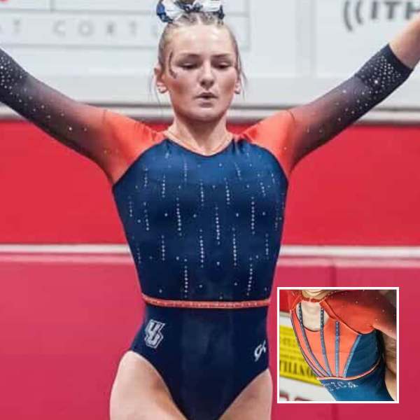
Elizabeth: 8.100
Design 2.2/3, Construction 1.7/2, Concept & Identity 1.8/2, Overall Appearance 2.4/3
A really nice design! It’s a simple base, with plain orange ombre sleeves and a plain navy body, but they work so well together and allow the few extra elements to pop. I like the thin belt and how it mirrors the thin back straps. A good one!
Savanna: 7.500
Design 2.0/3, Construction 1.7/2, Concept & Identity 1.7/2, Overall Appearance 2.1/3
The orange on this one is really nice! I like the rhinestones giving a cascade look down to the midsection, but I don’t love the back. I feel like opening it up with the straps would’ve made me love it so much more.
Mariah: 7.500
Design 1.9/3, Construction 1.7/2, Concept & Identity 1.8/2, Overall Appearance 2.1/3
This feels more Utica than their other design from this week. The shade of orange used is nice and I like the ombre sleeves. The back cutout is a bit odd though. I think it either needs to be bigger or done away with entirely. This is another good one to add to Utica’s impressively large leo closet.
Frances: 6.800
Design 1.6/3, Construction 1.8/2, Concept & Identity 1.4/2, Overall Appearance 2.0/3
With the orange, this is much more traditional for Utica, if a little basic. The pace of the ombre happening on the sleeves is actually really well done. One thing I am confused about is how they chose exactly where to end the cutout on the back.
Illinois: 7.300

View a video of this leotard here.
Elizabeth: 7.600
Design 2.2/3, Construction 1.4/2, Concept & Identity 1.7/2, Overall Appearance 2.3/3
There are a lot of good parts to this design. I love the low, wide neckline paired with the thicker collar. I also love the low swooping back. The mesh creates weird seams that I realize were probably unavoidable but that I think could have been solved by just not using mesh in the first place. The design could have shone on its own while maintaining the same fabric throughout.
Savanna: 7.400
Design 2.2/3, Construction 1.5/2, Concept & Identity 1.4/2, Overall Appearance 2.3/3
Illinois has never shied away from being different when it comes to fabrics, and this ribbed design is no exception. It looks extremely comfortable and the design is nice and cohesive all the way around. I do wish there were some straps in the back because I think a strappy back would’ve added something else to it, but it’s still a solid design.
Mariah: 8.400
Design 2.3/3, Construction 1.9/2, Concept & Identity 1.8/2, Overall Appearance 2.4/3
Illinois has so many great leos and this one is no exception. I don’t love the cut of the neckline, but it’s definitely unique. The tiny cursive “Illini” incorporated into the sparkle pattern on the front is quirky and fun. I like this one a lot!
Frances: 5.800
Design 1.8/3, Construction 1.2/2, Concept & Identity 1.0/2, Overall Appearance 1.8/3
There is not enough orange on this for me, given that that’s the color I associate with Illinois the most. I love the bodice fabric of course, and the mesh across the shoulders works well. The single strap across the back of the neck has oddly high placement and looks like it could be a sensory nightmare.
Iowa: 7.275

View a video of this leotard here and images here.
Elizabeth: 7.600
Design 2.0/3, Construction 1.8/2, Concept & Identity 1.8/2, Overall Appearance 2.0/3
I love the cascade of rhinestones down the front and how they turn from single stones to clusters. It ties in with the flowery (CORN HUSK?!) pattern on the collar. It’s a simple leo, but an effective one.
Savanna: 6.700
Design 2.0/3, Construction 1.5/2, Concept & Identity 1.2/2, Overall Appearance 2.0/3
Iowa rarely misses. This is a really nice design and I love the Hawkeye that’s rhinestoned onto the sleeve. My biggest thing with Iowa’s leotards is that I wish there was more color, because otherwise it’s an everyday black leotard. Add some more color to it and this would be a standout for me.
Mariah: 7.500
Design 2.0/3, Construction 1.7/2, Concept & Identity 1.6/2, Overall Appearance 2.2/3
I like the general look of this, but some of the details are not my favorite. The collar looks uncomfortably high, I wish the fabrics matched up at the side seams, and I wish there was some yellow incorporated somewhere. This design is very timeless and elegant though.
Frances: 7.300
Design 2.0/3, Construction 1.8/2, Concept & Identity 1.0/2, Overall Appearance 2.5/3
This is such an evening gown of a leo and I am here for it. The notable absence of seams on the mesh shoulders adds to the elegance. I love the triplet clusters of gems. The neckline button on the back does look a bit chunky and loose in terms of fit.
Ursinus: 7.175

View images of this leotard here.
Elizabeth: 8.400
Design 2.3/3, Construction 1.8/2, Concept & Identity 2.0/2, Overall Appearance 2.3/3
This is actually such a solid Ursinus design! I love the athletic look, as well as the use of matte fabric. It’s a simple yet effective idea executed to perfection.
Savanna: 7.500
Design 2.3/3, Construction 1.0/2, Concept & Identity 2.0/2, Overall Appearance 2.2/3
I really do like the way this looks, the construction is where I have the most issues. I don’t like how the rhinestoning doesn’t appear to look finished across the front and the seams are a little messy-looking in comparison to some other leotards we’ve seen from Ursinus.
Mariah: 8.000
Design 2.4/3, Construction 1.5/2, Concept & Identity 1.8/2, Overall Appearance 2.3/3
I think this is fun! I like the boldness of the colors and the athletic look of the design. There’s not a ton of sparkle, but the design doesn’t really need it. I think my favorite parts are the striped sleeve cuffs and the logo on the sleeve.
Frances: 4.800
Design 1.2/3, Construction 1.2/2, Concept & Identity 1.1/2, Overall Appearance 1.3/3
This is a little underwhelming. There was an attempt for continuity with the upper striping to the back, but it’s awkwardly cut off at the arms. The “Ursinus” text does really stand out, and the contrast in the color block works well.
Maryland: 7.025
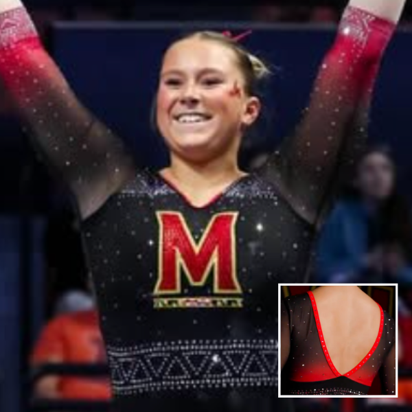
View a video of this leotard here.
Elizabeth: 8.100
Design 2.2/3, Construction 1.8/2, Concept & Identity 1.9/2, Overall Appearance 2.2/3
I don’t love it when teams debut a very similar leotard to one they already have and call it an update to that still fairly recent design. But taking this leo in isolation, I like it. The ombre sleeves are lovely, I love how the back mirrors that ombre, and I like the geometric rhinestone design creating the faux belt on the body.
Savanna: 7.700
Design 1.8/3, Construction 1.7/2, Concept & Identity 2.0/2, Overall Appearance 2.2/3
This is good but a little basic. I love the “M” leos and how Maryland always manages to tie it into the flag. This is a good iteration with the black-to-red ombre on the sleeves and even ever so slightly on the back.
Mariah: 7.200
Design 1.6/3, Construction 1.9/2, Concept & Identity 1.7/2, Overall Appearance 2.0/3
This feels so similar to one they already have that I didn’t even realize it was new. The open back is nice, but I don’t love how the ombre abruptly ends midway down. I also think the belt is unnecessary and throws off the look for me, but without it, it would probably look too similar to the design they already have.
Frances: 5.100
Design 1.5/3, Construction 1.2/2, Concept & Identity 1.0/2, Overall Appearance 1.4/3
There is a lot happening that is not necessarily cohesive. The triangle waistband pattern is the only thing tying the front and back together and I don’t think it was needed! I like the sparkly “M” logo, and the size of the open back is elegant. But as a whole piece, it doesn’t work for me.
Clemson: 6.950
View images of this leotard here and a video and additional images here.
Elizabeth: 7.800
Design 2.2/3, Construction 1.6/2, Concept & Identity 1.8/2, Overall Appearance 2.2/3
I love the all-purple look, as well as the simple block “C” on the back in orange, and the printed-on pattern. I don’t love the mesh sleeves and how they transition back into solid fabric, though. This is a fine design for me, but nothing revolutionary compared to everything else we’ve seen from Clemson this season.
Savanna: 6.700
Design 1.8/3, Construction 1.3/2, Concept & Identity 1.6/2, Overall Appearance 2.0/3
This leo will automatically go into the record books as the one Clemson won its first ACC championship ever in, and it’s a good one for the books. The mix of fabrics is not my personal favorite and the printed design is an interesting choice, but it’s a good leotard for making history.
Mariah: 7.200
Design 1.7/3, Construction 1.6/2, Concept & Identity 1.8/2, Overall Appearance 2.1/3
This one is a mixed bag for me. I’m on the fence about the patterned fabric on the front but I really like the way it looks on the mesh arms. However, I wish the arms didn’t transition back to solid fabric towards the bottom. My biggest gripe is definitely that the pattern doesn’t line up at the back. I like the all-purple look though and think it’s overall a pretty nice design.
Frances: 6.100
Design 1.8/3, Construction 1.2/2, Concept & Identity 1.1/2, Overall Appearance 2.0/3
The obvious misalignment in the patterns on the back panels stands out immediately. I like how it’s all purple, and the lace detailing is fine but doesn’t make too much of an impact.
Kentucky: 6.900

View a video of this leotard here and images of the front here.
Elizabeth: 7.300
Design 2.0/3, Construction 1.7/2, Concept & Identity 1.5/2, Overall Appearance 2.1/3
I like the subtle feather design on the white here, as well as the silver accents, similar to what Arkansas did on its design for SECs. I wish there were some pops of blue somewhere, though. Maybe with the feathers or rhinestones throughout to make it a bit more Kentucky?
Savanna: 6.800
Design 1.7/3, Construction 1.6/2, Concept & Identity 1.3/2, Overall Appearance 2.2/3
This is interesting to me for a few reasons. I like the use of the mesh throughout the design and the sparkle patterns are a really nice touch. It looks like it goes a little too far down though because it almost clashes with the UK logo at the bottom. I feel like it needs a little more color, but overall, not a bad leotard!
Mariah: 7.800
Design 2.1/3, Construction 1.8/2, Concept & Identity 1.6/2, Overall Appearance 2.3/3
I like the design and cut of this but I think I wish there was a bit more color or something to add contrast. They used the same really light silver that Arkansas used, but without any colored rhinestones it falls a bit flat. It’s aesthetically very pretty though.
Frances: 5.700
Design 1.5/3, Construction 1.5/2, Concept & Identity 0.9/2, Overall Appearance 1.8/3
To me, it’s not giving enough “Kentucky” vibes. What is supposed to be a feather in the gem design reminds me of a fern, which is still pretty, but feels out of place. I do like the one-shoulder effect on the top.
Utah State: 6.700

View pictures of this leotard here and here and a video here.
Elizabeth: 6.800
Design 1.7/3, Construction 1.7/2, Concept & Identity 1.6/2, Overall Appearance 1.8/3
I’m afraid Utah State is starting to fall into the “all the leotards look the same” hole. I do like the rhinestone pattern on the sleeves, as well as the sleeves being a gray-blue rather than white. Otherwise, it’s just another navy leo with mesh sleeves.
Savanna: 6.300
Design 1.8/3, Construction 1.5/2, Concept & Identity 1.1/2, Overall Appearance 1.9/3
The front design is very intricate, but I almost wish there would’ve been some sparkles on the sides to connect it to the back and make it more cohesive. Without the “Utah State” on the back, I would not have associated it with the Aggies, so I would need a little more added to make me like it just a touch more.
Mariah: 7.900
Design 2.1/3, Construction 1.9/2, Concept & Identity 1.6/2, Overall Appearance 2.3/3
This feels very Utah State to me. I wasn’t sure how I felt about the belt at first, but when I noticed it on the sleeves, I was less bothered by it. Overall this is nice, albeit not super exciting.
Frances: 5.800
Design 1.2/3, Construction 1.6/2, Concept & Identity 1/2, Overall Appearance 2/3
The first thing I noticed was how the mesh sleeves create the lighter blue/gray secondary color for Utah State. Now I’m not sure if the rhinestone pattern on the bodice has a specific meaning, so to me it looks like a generic “let’s put rhinestones” layout. Though the ladder effect down the sleeve is a nice touch.
Minnesota: 6.650
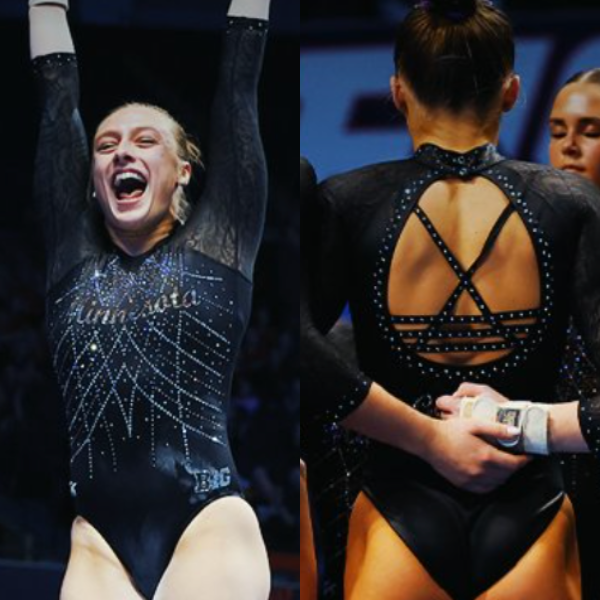
View a video of this leotard here.
Elizabeth: 7.400
Design 2.0/3, Construction 1.7/2, Concept & Identity 1.7/2, Overall Appearance 2.0/3
The patterned sleeves are one of my favorite recent trends in leotard designs. They’re subtle yet level up a leotard’s overall design. As for the rest of this leo, I could take it or leave it. I feel like the script “Minnesota” on the chest doesn’t stand out enough for my liking, and the back straps are a bit too busy paired with the front rhinestone pattern.
Savanna: 6.900
Design 2.0/3, Construction 1.6/2, Concept & Identity 1.3/2, Overall Appearance 2.0/3
The patterned sleeves on this are probably my favorite of all the leotards this weekend. I agree that the “Minnesota” should stand out a bit more in terms of the overall design, but it’s a really pretty leotard otherwise.
Mariah: 7.200
Design 1.6/3, Construction 1.9/2, Concept & Identity 1.6/2, Overall Appearance 2.1/3
I wish the script “Minnesota” stood out more and they chose only one style of back straps, but other than that, this is solid. It’s not incredibly memorable, but it’s a nice option to have. I wish there was some maroon incorporated somewhere for a bit more school spirit. We haven’t gotten a maroon design from the Gophers yet this year so that’s an element that’s been lacking this season. Maybe for regionals?
Frances: 5.100
Design 1.3/3, Construction 1.5/2, Concept & Identity 0.8/2, Overall Appearance 1.5/3
I don’t mind this if not for the lace sleeves. That being said, it feels disjointed, as if many ideas converged onto one leo. The words in gold script are a nice touch to go with the glitz of the rest of the design.
Cortland: 6.475
Elizabeth: 6.500
Design 1.7/3, Construction 1.6/2, Concept & Identity 1.4/2, Overall Appearance 1.8/3
It’s fine. The shade of red is lovely, though, and I like the dueling pieces of school spirit on the front and back.
Savanna: 6.300
Design 1.5/3, Construction 1.4/2, Concept & Identity 1.7/2, Overall Appearance 1.7/3
This is really solid for Cortland and one it will definitely get a lot of use out of. I wish the school elements were a little bit more visible or stood out more somehow, but it’s a really pretty design.
Mariah: 6.000
Design 1.4/3, Construction 1.6/2, Concept & Identity 1.4/2, Overall Appearance 1.6/3
It’s fine, but a bit boring. The red color is nice and bright, but I think it drowns out the sparkle design a bit. The “C” on the front could especially use a bit more emphasis. I don’t love the belt on this particular design, but I appreciate that it continues onto the back.
Frances: 7.100
Design 2.0/3, Construction 1.7/2, Concept & Identity 1.2/2, Overall Appearance 2.2/3
You can’t really go wrong with an all-red leo. I like the use of rhinestones on the arms, and the blingy “Cortland” on the back is amazing. The “C” on the front is overpowered a tad and could use more emphasis.
Auburn: 6.325
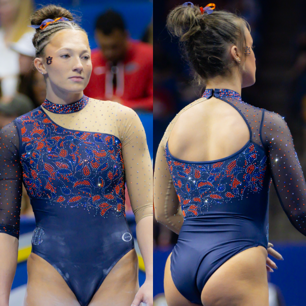
View a video of this leotard here.
Elizabeth: 7.400
Design 2.0/3, Construction 1.8/2, Concept & Identity 1.6/2, Overall Appearance 2.0/3
I love the leaf rhinestone pattern on the body created with orange and blue rhinestones. It’s such a fun concept. I also love the asymmetric look. I don’t love the nude sleeve—I might have preferred a white mesh or solid navy one instead, but I don’t hate it either.
Savanna: 6.100
Design 1,6/3, Construction 1.4/2, Concept & Identity 1.3/2, Overall Appearance 1.8/3
This is not my favorite Auburn design. The singular nude sleeve is one of my biggest pet peeves in leotard designs and I don’t particularly like it here. If the sleeves were that identical blue and the design had continued, I probably would enjoy this a lot more.
Mariah: 7.200
Design 1.5/3, Construction 1.8/2, Concept & Identity 1.8/2, Overall Appearance 2.1/3
There’s so much I like about this but I can’t get over the nude mesh sleeve. I don’t typically dislike asymmetry in a design, but I think the contrast is maybe just too distracting for me and I also just generally dislike nude mesh. However, I LOVE the rhinestone pattern and the incorporation of blue and orange stones throughout the design. This was so close to being really great.
Frances: 4.600
Design 1.1/3, Construction 1.2/2, Concept & Identity 1.0/2, Overall Appearance 1.3/3
This design could have gone without the nude arm; I am not a fan. Even white would have worked better. The floral pattern is nice, though. The orange rhinestones really stand out in the solid clusters.
Utica: 6.275
Elizabeth: 5.100
Design 1.5/3, Construction 1.3/2, Concept & Identity 1.2/2, Overall Appearance 1.6/3
Utica has so many leotards, but I wish it would focus on quality over quantity. With this one specifically, I don’t like the cardigan look paired with the weird vertical line down the center. I do like the interesting fabric used with the “cardigan” part of the body, though. And, I really like the back! The horizontal straps are unique, and I like the rhinestones on top allowing them to really pop.
Savanna: 6.600
Design 1.8/3, Construction 1.3/2, Concept & Identity 1.5/2, Overall Appearance 2.0/3
I feel like Utica’s leotards are starting to have some similar elements because I know I’ve seen this exact back design before on one of its leos. It’s fine, I like the front, but I’d love it if that top part was navy and not white.
Mariah: 5.900
Design 1.4/3, Construction 1.6/2, Concept & Identity 1.1/2, Overall Appearance 1.8/3
Utica has historically done very well incorporating a lot of orange, so this falls a bit flat for me. There’s also just some things about this design that lack cohesion or seem unnecessary. It’s fine upon first glance though, just not my favorite from Utica.
Frances: 7.500
Design 2.4/3, Construction 1.5/2, Concept & Identity 1.2/2, Overall Appearance 2.4/3
I like this! I think the blue/purple ombre on the chest creates a nice depth, and the white really pops. I like how the front is so angular, which is continued on the back with the asymmetrical straps. I could see the straps being potentially problematic in terms of floppiness, but for aesthetic purposes, it’s nice.
California: 6.200
View pictures and a video of this leotard here.
Elizabeth: 6.400
Design 2.2/3, Construction 0.8/2, Concept & Identity 1.4/2, Overall Appearance 2.0/3
This is a design I really like from afar but which shows its flaws up close. The execution isn’t there (messy seams, unevenness in places, etc.), but that aside, I love the stained glass/abstract concept going on here. Plus, the funky back is fun.
Savanna: 6.100
Design 1.8/3, Construction 1.2/2, Concept & Identity 1.2/2, Overall Appearance 1.9/3
At first glance, this is an absolutely gorgeous leotard. It reminds me of something that California would’ve done when Liz Crandall-Howell was designing for the Golden Bears. Looking at it close up, I don’t like it as much. The cross straps look like they’re not aligned properly and it throws the whole back off for me. An open back would’ve added so much more to this for me but instead it just looks like it was thrown together.
Mariah: 7.000
Design 2.1/3, Construction 1.4/2, Concept & Identity 1.4/2, Overall Appearance 2.1/3
This actually looks a bit more like something Utah State would wear than Cal, but I like the idea of it regardless. I think adding some gold rhinestones may have helped it feel more Cal. It’s a nice leo, but it certainly has its flaws, execution and quality-wise. I do like the way the three different navy fabrics were used to create some dimension despite being a monochromatic look.
Frances: 5.300
Design 1.0/3, Construction 0.5/2, Concept & Identity 1.8/2, Overall Appearance 2.0/3
I like the ombre shading created by the rhinestone spacing on the front, and how the back is smothered in bling. The two blue tones used on the front successfully create the broken glass effect they were going for. But to me, something is off in the back—an unintentional unevenness maybe?
Oklahoma: 6.200

View a video of this leotard here.
Elizabeth: 7.800
Design 2.2/3, Construction 1.7/2, Concept & Identity 1.7/2, Overall Appearance 2.2/3
In person, you honestly couldn’t really see the black because of how sparkly the whole thing was. Which I’m fine with because in still images, it’s a bit of a weird design element. I don’t dislike it, but it’s certainly unique.
Savanna: 4.700
Design 1.1/3, Construction 1.0/2, Concept & Identity 1.2/2, Overall Appearance 1.4/3
There is nothing you can do to make me like this leotard. Even though it’s velvet on the bottom, the black chestplate thing in the center is just not it for me.
Mariah: 6.100
Design 1.1/3, Construction 1.6/2, Concept & Identity 1.7/2, Overall Appearance 1.7/3
This is a strong no from me. There’s just entirely too much going on, and there aren’t even any particular details that I like. If I had to pick a favorite part it would be the back.
Frances: 6.200
Design 1.4/3, Construction 1.6/2, Concept & Identity 1.2/2, Overall Appearance 2.0/3
I like to see Oklahoma using black to mix things up. The back is nice, if simple. The front is a lot. I don’t think the gems were necessary on the black strips. Because it’s black AND sparkly, it’s hard to focus on anything else about the design.
Rutgers: 6.150

View a video of this leotard here.
Elizabeth: 6.100
Design 1.4/3, Construction 1.6/2, Concept & Identity 1.6/2, Overall Appearance 1.5/3
Let’s start on the surface: I like the idea to go with a gray base and play with various shades of neutrals. However, the design on top is just not for me. I’ll leave it at that, but I do appreciate Rutgers going for something different.
Savanna: 6.200
Design 1.2/3, Construction 1.3/2, Concept & Identity 1.8/2, Overall Appearance 1.9/3
I love the idea behind this, but the execution is lacking just a little for me. The design being printed is a little off-putting to me, but props for getting the color combination spot on to give this the perfect armored look. I just need a little more sparkle or something.
Mariah: 5.300
Design 0.8/3, Construction 1.3/2, Concept & Identity 1.7/2, Overall Appearance 1.5/3
I’m generally not a huge fan of printed designs, so this one is not for me. It has a lot of school spirit and is definitely unique though.
Frances: 7.000
Design 2.5/3, Construction 1.0/2, Concept & Identity 2.0/2, Overall Appearance 1.5/3
This leo is purple in some lighting, blue in others, silver in most. To be fair, real-life armor is probably the same way. This leo is all concept, almost costume-ish, but I appreciate Rutgers’ boldness. The only drawback for me is that it’s a printed design.
Fan Poll
Congrats to Arizona for winning last week’s fan poll! Vote for your favorite design from this week here.
READ THIS NEXT: The Dismount: Conference Championships
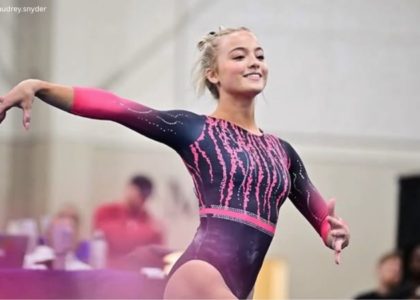
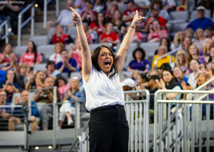
Judged by Elizabeth Grimsley, Savanna Wellman, Mariah Dawson, and Frances Leadman