Gymnastics fans love leotards, it’s just a fact. We love seeing new designs, creating our own, and especially judging them. That’s why we’re back for another season of leotard rankings! Each week we’re analyzing new designs to find our weekly faves. Here’s the rubric we’re working with:
- Design (3): How strong the overall design is in terms of color, balance, composition, and visual flow. Does it feel intentional and cohesive?
- Construction (2): Quality of materials, fit, finish, and sparkle application. Does the leotard look well-made and flattering in motion and on camera?
- Concept & Identity (2): How successfully the leotard communicates a clear concept or identity through design choices — balancing team branding with creativity and cohesion. Does it feel like this team in a good way?
- Overall Appearance (3): The general visual impression: Does the leotard stand out (positively) on the floor? Is it polished, elegant, and memorable?

Don’t agree with our ranking? Make your opinion heard by voting in the fan poll at the end of the article each week or by voicing your thoughts on social media!
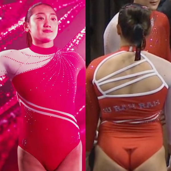
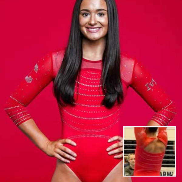
North Carolina: 9.500

View a video of this leotard here.
Elizabeth: 10.000
Design 3.0/3, Construction 2.0/2, Concept & Identity 2.0/2, Overall Appearance 3.0/3
UNC rarely misses, so when I saw the teaser for this leo, I had high hopes. Somehow, the actual leo blows those expectations out of the water. This is perfection in a leotard. Everything about it is gorgeous, and I can’t think of a single thing I’d change or improve. The iconic argyle is used perfectly and not overdone. The subtle ombre adds just the right touch of blue here and there. The construction is crafted in a way that there are no random, ugly seams. The back is fun, unique, and incorporated in a way that adds support and structure without going overboard. I could go on and on about this leotard for hours (and sort of already have). It may even be my favorite of all time? At the very least it’s in the top three.
Savanna: 9.300
Design 2.8/3, Construction 1.7/2, Concept & Identity 2.0/2, Overall Appearance 2.8/3
LOVE. Normally, I find leos like this a little too busy, but this is just enough of each element to where it isn’t overdone. The argyle is such a nice touch, and the jewels being the same color as the material makes it look sophisticated. The only flaw I find is the back; I’m not the biggest fan of the back, something just feels off about it, but it’s a minor flaw in an otherwise fantastic leo for the Tar Heels.
Rebecca S: 9.500
Design 2.8/3, Construction 1.8/2, Concept & Identity 2.8/2, Overall Appearance 2.9/3
Spectacular. I’m always a white leo fan, and this hits all the right notes in terms of branding and color. The back is a little odd to me.
Tara: 9.200
Design 2.8/3, Construction 1.6/2, Concept & Identity 2.0/2, Overall Appearance 2.8/3
I had really high hopes based on the previews and while I don’t love it as much as I thought I would, it’s still a lovely leo! I love the incorporation of the argyle pattern and the subtle ombre. The UNC logo pops really well on the front too. I’ve been trying to pinpoint what exactly I don’t like, and I think it’s the construction of the back.
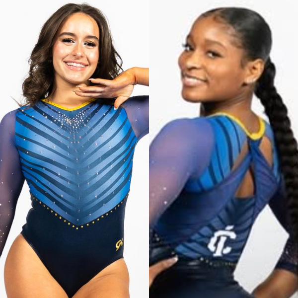
Clemson: 8.350

View a video and images of this leotard here.
Elizabeth: 8.400
Design 2.5/3, Construction 1.6/2, Concept & Identity 1.8/2, Overall Appearance 2.5/3
We saw an iteration of this leotard with white sleeves during the preseason, but I think I like it with purple even more. The subtle white-to-ombre on the body really works, and I love the back as well. I could take or leave the rhinestone design on the bodice, but overall, another great leotard for the Tigers in the Liz Crandall-Howell design era.
Savanna: 7.900
Design 2.3/3, Construction 1.5/2, Concept & Identity 1.7/2, Overall Appearance 2.4/3
I definitely prefer the purple sleeves to the white sleeves of this particular design. I really like the mix of orange and purple crystals throughout the leotard and the ombre from white to purple is such a nice touch. Definitely a win for Clemson!
Rebecca S: 9.000
Design 2.6/3, Construction 1.8/2, Concept & Identity 1.9/2, Overall Appearance 2.7/3
This is obviously just a late 2010s Cal leotard in purple. That’s a compliment. Pretty, dainty, good use of colors. I can just really easily visualize this on Nina Schank, you know? I’m adjusting my score up a bit to compensate for the fact that I personally can’t stand Clemson’s colors, which is not their fault. I don’t actually want the team to pretend orange isn’t part of it.
Tara: 8.100
Design 2.3/3, Construction 1.6/2, Concept & Identity 1.7/2, Overall Appearance 2.5/3
I was super excited to see what Crandall-Howell would do with Clemson leos because she hit so many out of the park at Cal! This one is no different. The ombre is stunning, the colored rhinestones pop, and the “C” on the back is a nice touch. It’s such a departure from the Amy Smith-era leos and I’m here for it.
Arizona State: 7.700

View images of this leotard here and more here.
Elizabeth: 8.400
Design 2.5/3, Construction 1.8/2, Concept & Identity 1.5/2, Overall Appearance 2.6/3
I really like this. The overall design and colors are relatively muted, but somehow they still pop? I love the darker gold fabric used and the cut of the design where the arms meet the bodice. The back is my favorite part, though. You rarely see full mesh with a solid design on top, and I really like the concept. It makes the script Sun Devils logo pop.
Savanna: 8.400
Design 2.5/3, Construction 1.6/2, Concept & Identity 1.8/2, Overall Appearance 2.5/3
Obsessed. Love the incorporation of the pitchfork logo and the gold overlay in the front. The mesh sleeves work here, and I love the Sun Devils on the back. It’s different but it stands out in a positive way.
Rebecca S: 5.200
Design 2.4/3, Construction 0.7/2, Concept & Identity 0.5/2, Overall Appearance 1.6/3
I love the way the pitchfork flows into the shaping of the leotard. I don’t love the gold color, which mostly just looks brown and doesn’t say “ASU” as clearly as I want. I also feel like the lettering on the back could have been less chunky.
Tara: 8.800
Design 2.6/3, Construction 1.8/2, Concept & Identity 1.7/2, Overall Appearance 2.7/3
I love this! Seeing more teams use the darker gold look is refreshing—it looks a lot better than the lighter gold. The V design pairs well with the sparkly pitchfork and is accented well. The script “Sun Devils” feels slightly out of place to me, it feels like a different font or maybe coupling that with rhinestones would work better?
Sacramento State: 7.700
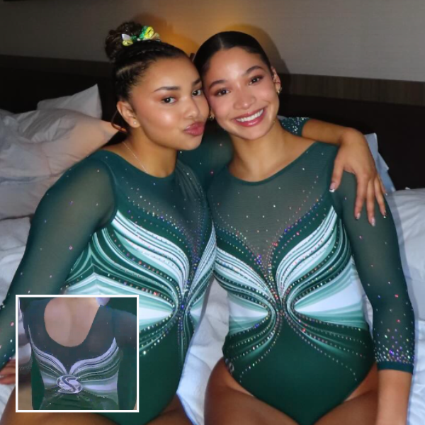
View a video of this leotard here and images here.
Elizabeth: 7.800
Design 2.2/3, Construction 1.6/2, Concept & Identity 1.8/2, Overall Appearance 2.2/3
I normally don’t like this kind of design, but somehow it’s really working for me in this iteration and with the lovely dark green. The back, with the logo at the center of the two sides coming together, ties it all together.
Savanna: 7.700
Design 2.1/3, Construction 1.6/2, Concept & Identity 1.7/2, Overall Appearance 2.3/3
It’s giving butterfly/angel wing vibes and I really like it! I like the slow cascade of the rhinestones down the sleeves and the mix of shades of green throughout. Dark green is a hard color to pull off, but it works here.
Rebecca S: 7.800
Design 2.1/3, Construction 1.7/2, Concept & Identity 1.7/2, Overall Appearance 2.3/3
Love. Sacramento State is a team where every leotard looks so different and this one is another total novelty. Using the logo to tie together the swirlies in the back is well executed. I also think that the mesh matches the solid color of the bottom well, which isn’t always the case in leotards with a single base color but multiple fabrics.
Tara: 7.500
Design 2.0/3, Construction 1.6/2, Concept & Identity 1.7/2, Overall Appearance 2.2/3
Sacramento State leos can get wild and while I feel like this is less wild than some of the others we’ve seen, it still very much reminds me of a Sacramento State leo! Incorporating some lighter green and white in the design adds the dimension this leo needs.
Arkansas: 7.675

View a video of this leotard here and images here.
Elizabeth: 8.400
Design 2.4/3, Construction 1.7/2, Concept & Identity 1.7/2, Overall Appearance 2.6/3
When I first saw the reveal video, I thought, “Oh, just another red and white Arkansas leo.” But it definitely grew on me. I really like the red and white stripe design—especially how there’s a subtle ombre at the edges—as well as how the back plays into that theme. In concept, I don’t care for the solid fabric around the shoulders and how there’s a random mesh match on the chest. However, I’ve decided it actually works because it blends in with the mesh, so it’s not particularly noticeable, and it also solves the problem these leotards sometimes encounter with a weird, random mesh seam.
Savanna: 7.900
Design 2.4/3, Construction 1.8/2, Concept & Identity 1.3/2, Overall Appearance 2.4/3
I’ve had issues in the past with Arkansas’ leotards because they all started to look the same in the last few years, but this is not an issue with this particular design. The red and white stripes are such a nice touch and I love how that idea continues into the back with the strappy back. The changes in the size of the jewels in the midsection is a very nice detail to help draw additional attention to the pattern in the front. Very nicely done!
Rebecca S: 6.700
Design 2.1/3, Construction 1.4/2, Concept & Identity 1.2/2, Overall Appearance 2.0/3
I don’t mind this. I don’t love it. It’s not that memorable to me, but it gets the job done. The ombre arms are a strength.
Tara: 7.700
Design 2.3/3, Construction 1.6/2, Concept & Identity 1.6/2, Overall Appearance 2.2/3
I really liked this at first, but as I watched the meet I didn’t love it as much. At a distance, I don’t love the way the strappy back is designed—I think it’s the curves contradicting the otherwise geometric design— but the front stripes are nice. It fits in with Arkansas’ leo brand as well.
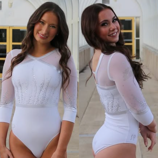
Penn: 7.675

View a video of this leotard here.
Elizabeth: 8.900
Design 2.6/3, Construction 2.0/2, Concept & Identity 1.7/2, Overall Appearance 2.6/3
When I first saw this leo, I thought it was fine. But the more I rewatched the Reel, the more it grew on me. I noticed little things I loved. Normally, when mesh is used on the bodice and the sleeves, the execution is lacking. But somehow, the body mesh here is lined so impeccably that it blends seamlessly with the sleeves. I also love the rhinestone outline of the solid fabric, as well as the big bold block P and the back straps.
Savanna: 6.300
Design 1.4/3, Construction 1.3/2, Concept & Identity 1.7/2, Overall Appearance 1.9/3
It’s a little plain, but I think it was really nicely done. I’m not the biggest fan of mesh being used on the sleeves, so that automatically brings this one down for me just a smidge. I do enjoy the rhinestone “P” in the front and the criss-cross design of the back.
Rebecca S: 9.300
Design 2.6/3, Construction 2/2, Concept & Identity 1.9/2, Overall Appearance 2.8/3
I absolutely adore this. One of my biggest pet peeves is designs that neglect to think about the side/underarm region, and the use of mesh all the way down with the sparkle border feels so intentful. The big logo isn’t gaudy on a leotard that’s relatively clean otherwise. The pictures don’t quite capture how rich and vibrant the red looked on TV. The only thing I’d add is something else at the neck.
Tara: 6.200
Design 1.5/3, Construction 1.4/2, Concept & Identity 1.5/2, Overall Appearance 1.8/3
This feels like a leo that was all over the place a few years ago. It’s nothing special, but it’s a solid leo for Penn to have in its closet. The strappy back elevates what would otherwise be a pretty plain design.
Illinois: 7.525
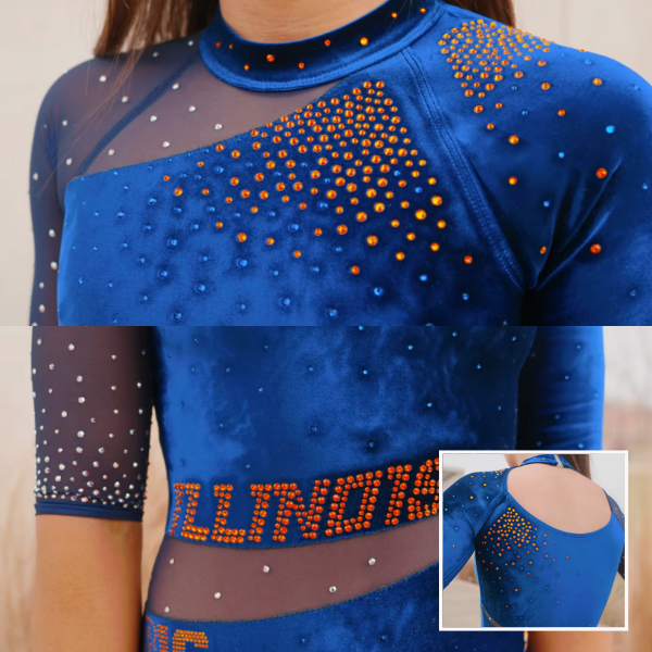
View a video of this leotard here.
Elizabeth: 7.400
Design 2.4/3, Construction 1.0/2, Concept & Identity 1.4/2, Overall Appearance 2.6/3
Teams have been introducing velvet into designs more and more regularly recently, but full (or nearly full) velvet is still rare. I really like the asymmetric design here, as well as how well the orange rhinestones pop on the blue velvet. The construction isn’t perfect just because of the way velvet is, but that’s really the only thing I dislike.
Savanna: 7.500
Design 2.4/3, Construction 1.2/2, Concept & Identity 1.5/2, Overall Appearance 2.4/3
Velvet! I love seeing more and more velvet incorporated into leotard designs, but I’m not the biggest fan of the mesh in the waistline. I would have liked to see the velvet continue all the way down. I also like the mix and match of the colored jewels throughout, it adds a variance into the design that I appreciate.
Rebecca S: 8.500
Design 2.4/3, Construction 1.7/2, Concept & Identity 1.9/2, Overall Appearance 2.5/3
Lovely! Great use of velvet, great use of orange. Thoughtful and restrained. The back could use a little work, for me: It’s very blank below the hole which is placed very high up the back.
Tara: 6.700
Design 1.9/3, Construction 1.2/2, Concept & Identity 1.6/2, Overall Appearance 2.0/3
The orange rhinestones pop really well against the blue velvet! I wish it had a little something else, but it definitely lets the velvet shine.
Texas Woman’s: 7.525

View a video of this leotard here.
Elizabeth: 6.300
Design 1.8/3, Construction 1.2/2, Concept & Identity 1.5/2, Overall Appearance 1.8/3
The feathered sleeves is such a fun concept, and I love the multi-colored rhinestones on the front. The design as a whole is fine but somehow looks dated? It’s a good leotard, but I’m not obsessed with it.
Savanna: 7.400
Design 2.1/3, Construction 1.5/2, Concept & Identity 1.5/2, Overall Appearance 2.3/3
I love the concept of the feathered look and I think it works here, I do wish it wasn’t quite all of the way down the sleeves though. Love the bejeweled logo on the back though!
Rebecca S: 7.900
Design 2.4/3, Construction 1.3/2, Concept & Identity 1.8/2, Overall Appearance 2.4/3
This is a good one. It’s different for TWU but coherent and uses the colors well. I like the sparkles, too: Red is used well and it’s not over the top into clumpy. I agree with Elizabeth that it recalls the great V-neck wave of the early 2010s, but I don’t mind that.
Tara: 8.500
Design 2.5/3, Construction 1.6/2, Concept & Identity 1.8/2, Overall Appearance 2.6/3
This is nice! The feathered design works super well with the TWU logo on the back, and the ombre and rhinestones help tie it together as well. Win for TWU!
Alabama: 7.475
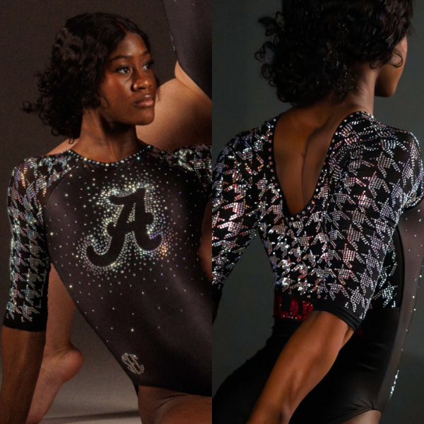
View images of this leotard here.
Elizabeth: 7.900
Design 2.4/3, Construction 1.6/2, Concept & Identity 1.9/2, Overall Appearance 2.0/3
I love when Alabama leans fully into houndstooth. It’s such an iconic pattern for the university. I wish there was a touch more red than just on the back with the block Alabama, though—maybe sprinkled throughout the arm design—because somehow, despite all the rhinestones, it’s a rather plain leotard? I can’t believe I’m saying that; I just need a tad more oomph.
Savanna: 8.200
Design 2.2/3, Construction 1.5/2, Concept & Identity 1.9/2, Overall Appearance 2.6/3
The houndstooth is one of my favorite patterns and I can immediately associate this design with Alabama. I feel like it needed some more red as well, but it’s a minor complaint to have an updated houndstooth pattern in the leotard collection.
Rebecca S: 6.100
Design 1.6/3, Construction 0.8/2, Concept & Identity 2/2, Overall Appearance 1.7/3
This is a great concept and I love to see the Alabama houndstooth in use in leotards, but just sparkles on plain black are, to me, boring. I wish there was more going on conceptually and that the sparkle on the arms and back was less chunky. Can’t fault this one on knowing what team it belongs to, though!
Tara: 7.700
Design 2.0/3, Construction 1.6/2, Concept & Identity 1.9/2, Overall Appearance 2.2/3
This is most certainly, undeniably an Alabama leo. The simple rhinestone ‘A” and “Alabama” let the houndstooth speak for itself and prevent the leotard from becoming overly busy.
Eastern Michigan: 7.450

View videos of this leotard here and here.
Elizabeth: 6.800
Design 2.0/3, Construction 1.4/2, Concept & Identity 1.4/2, Overall Appearance 2.0/3
It’s relatively simple, but I like that about it. The back straps almost mirror the front design, which ties things together nicely. I also like the shade of green used. Side note, though: Can teams please not use filtered lighting in their leo reveal videos? Or at the very least, also post regularly lit images to show us a good view of the front and back. If I hadn’t seen the broadcast with this leo in normal lighting, I’d be pretty annoyed.
Savanna: 6.000
Design 1.8/3, Construction 1.4/2, Concept & Identity 0.9/2, Overall Appearance 1.9/3
It’s a simple yet classic design. I really like the v-shaped waist component and the jewels incorporated into the front. I’m not sure if it was intended, but it’s really fun that the strappy back imitates the design on the front. It’s a solid design, just wish it had a little bit more to associate it with the Eagles.
Rebecca S: 8.800
Design 2.7/3, Construction 1.9/2, Concept & Identity 1.5/2, Overall Appearance 2.7/3
This is really lovely. I love the use of matte black: It balances the green and the sparkle and makes the whole thing look very dignified. It’s really flattering, too. A winner.
Tara: 8.200
Design 2.5/3, Construction 1.5/2, Concept & Identity 1.6/2, Overall Appearance 2.6/3
This has to be one of my favorite new leos of the week! The sublimated V-shaped lines on the front are nice and I love how the back straps and rhinestones on the sleeves have a similar pattern to tie everything together. The subtle ombre on the body and sleeves is lovely and pairing the green with black works well.
Western Michigan: 7.400
View images of this leotard here.
Elizabeth: 7.600
Design 2.3/3, Construction 1.8/2, Concept & Identity 1.2/2, Overall Appearance 2.3/3
This is really lovely and such a departure for Western Michigan. I love the risk it took for an all-white leotard. The silver accents are great, and I love the delicate rhinestone design. The simple yet effective back also pairs well. I would have liked a tiny bit more school spirit than the logo on the sleeve, especially since I can hardly tell that’s what it is. This could be any school’s leotard.
Savanna: 6.200
Design 1.6/3, Construction 1.4/2, Concept & Identity 1.2/2, Overall Appearance 2.0/3
Ooooh, I love when Western Michigan deviates from its color palette. This is a really nice design, I kind of wish the crystals stood out a little bit more or were colored so we could tell who this leotard actually belonged to. But this is still a really nice addition to the closet.
Rebecca S: 8.500
Design 2.9/3, Construction 1.9/2, Concept & Identity 0.8/2, Overall Appearance 2.9/3
Can I tell that this is a Western Michigan leotard? No. Can I see that right sleeve logo without squinting? Nope. Do I want to frame this and gaze at it adoringly all day? Yes. Lovely. So flattering. The shiny ribbon-y accent is just spectacular.
Tara: 7.300
Design 1.8/3, Construction 1.7/2, Concept & Identity 1.5/2, Overall Appearance 2.3/3
If I hadn’t seen the logo on the right arm, I wouldn’t have known it was a Western Michigan leo. That said, it’s a lovely leo—it’s super elegant and the metallic silver straps pair well with the white. The wavy rhinestone pattern gives an otherwise plain design life.
Kentucky: 7.300
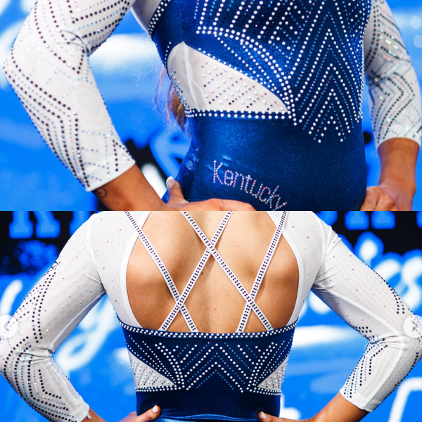
View images and a video of this leotard here.
Elizabeth: 6.700
Design 1.9/3, Construction 1.5/2, Concept & Identity 1.5/2, Overall Appearance 1.8/3
For debuting this leo at the annual Excite Night meet, the design isn’t super exciting. I mean, it’s fine, but it’s also nothing special. My favorite parts are the sleeves and the rhinestone-covered backs traps.
Savanna: 6.900
Design 1.9/3, Construction 1.6/2, Concept & Identity 1.3/2, Overall Appearance 2.1/3
The design fits the vibe of Excite Night, but it’s almost a little boring compared to some of the other designs that Kentucky has debuted in the past. I like the expansion of the rhinestones all the way around the leotard and even on the straps on the back. Bonus points for the mix of different shades of blue jewels that are incorporated throughout, it makes it a little bit more exciting.
Rebecca S: 7.500
Design 2.7/3, Construction 1.3/2, Concept & Identity 1.7/2, Overall Appearance 2.5/3
I quite like this one. I always like when Kentucky uses white: it’s not necessarily a signature part of the gymnastics team’s visual identity, but for the athletic department as a whole, it certainly is. The large sparkles used more sparingly look very intentional, and I like the different colors. The way that the blue “bodice” intersects with the waistband segment looks quite awkward, and I can’t immediately name the font that the “Kentucky” is written in but it could definitely use a bit more pizzazz.
Tara: 8.100
Design 2.3/3, Construction 1.7/2, Concept & Identity 1.6/2, Overall Appearance 2.5/3
This is very in line with what Kentucky’s done recently. The details on it are stunning—the different shades of rhinestones really add to this leo, and the white ones on the blue bodice really pop. Adding blue ones to the back straps works really well in this case and elevates the criss-cross back to another level.
Hamline: 7.075
View details of this leotard here and an image of the front here.
Elizabeth: 7.200
Design 2.0/3, Construction 1.4/2, Concept & Identity 1.4/2, Overall Appearance 2.4/3
This may be my favorite Hamline leo. The shade of red is so lovely, and I like the use of gray mixed in with the black. The sparkles add just the right touch as well.
Savanna: 7.400
Design 2.4/3, Construction 1.6/2, Concept & Identity 1.1/2, Overall Appearance 2.3/3
I am not a fan of the straight waistline, but that’s the only complaint I have about this leotard. The design is beautiful, I love that shade of red and the sparkles really compliment the color combination. It’s a good leotard that will definitely get used for years to come!
Rebecca S: 5.900
Design 1.7/3, Construction 0.9/2, Concept & Identity 1.4/2, Overall Appearance 1.9/3
I like the colors in this one and how the colors give it shaping. My biggest complaints are that the waist is, for me, slightly awkwardly placed and that I don’t understand the shaping of the open back: I’m the last person to be going “omg how can she wear a bra” but the hole here being so wide but short is bound to play strangely with straps.
Tara: 7.800
Design 2.4/3, Construction 1.6/2, Concept & Identity 1.4/2, Overall Appearance 2.4/3
This is a really nice addition to the Hamline leotard collection! It’s well-balanced and the rhinestones give it the flare it needs.
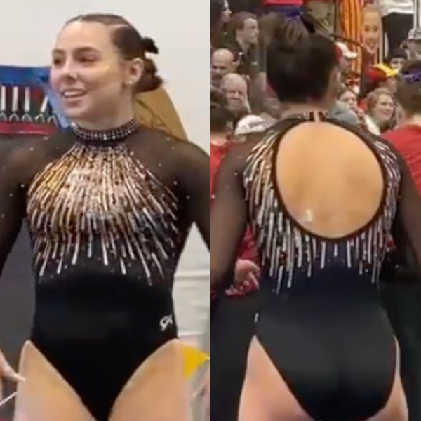
Rutgers: 6.625
View a video of this leotard here.
Elizabeth: 8.000
Design 2.4/3, Construction 1.4/2, Concept & Identity 1.8/2, Overall Appearance 2.4/3
The fact that Rachael Riley designed this one is so fun. I really like it, too. The way the asymmetric design on the front flows into the diagonal straps on the back is a clever touch, and I love the matte red as well. I’m never a huge fan of putting a team cheer or slogan on a leo, so I don’t love Ru Rah Rah here, but it’s not offending me either.
Savanna: 6.900
Design 1.8/3, Construction 1.3/2, Concept & Identity 1.7/2, Overall Appearance 2.1/3
I love a good two-colored sleeve design! It gives a retro design in a really nice way. I also like the starburst style of the sparkles by the collar and I actually like the incorporation of the school spirit because otherwise, I would not have known it was a Rutgers leo.
Rebecca S: 4.900
Design 1.2/3, Construction 0.9/2, Concept & Identity 1.4/2, Overall Appearance 1.4/3
This is good execution of a design that just overall isn’t for me. The asymmetry of the back I find unflattering, and I agree with Elizabeth that putting a chant on there is a little much. I like the candy cane waistline, but I would like it more if the leotard didn’t tend to crease there.
Tara: 6.700
Design 1.8/3, Construction 1.2/2, Concept & Identity 1.7/2, Overall Appearance 2.0/3
The front is nice, but I think the back could have been executed better. In fact, I like the sketch in the video—the cutout and straps look skinnier and longer which I would prefer.
Winona State: 6.600

View images and a video of this leotard here.
Elizabeth: 6.400
Design 1.6/3, Construction 1.6/2, Concept & Identity 1.6/2, Overall Appearance 1.6/3
Two new leotards for Winona this season?! Good for the Warriors! This is a plain design, but I can already see it being a workhorse for many years. Embroidered designs aren’t super common these days in college, and I like its use here. On the otherwise simple leotard, the shiny warrior head really pops.
Savanna: 7.500
Design 2.2/3, Construction 1.4/2, Concept & Identity 1.7/2, Overall Appearance 2.2/3
I can’t recall seeing another embroidered logo on a leotard so bonus points for originality already. It’s a very simple design, but it works for this team. I love the strappy back and how the crystals expand to the back of the leo to give it a little more oomph.
Rebecca S: 6.400
Design 1.5/3, Construction 1.7/2, Concept & Identity 1.6/2, Overall Appearance 1.6/3
There are a number of little touches that elevate this one. The sparkles are restrained, I love that the waistband has a little bit of shaping in the front, and I appreciate the matte black bottom.
Tara: 6.100
Design 1.6/3, Construction 1.3/2, Concept & Identity 1.5/2, Overall Appearance 1.7/3
It’s not super revolutionary, but it gets the job done. My favorite part is definitely the back!
UC Davis: 6.350
View images of this leotard here.
Elizabeth: 7.200
Design 1.8/3, Construction 1.4/2, Concept & Identity 1.8/2, Overall Appearance 2.2/3
I love the ode to Lake Tahoe, as well as what I assume is the shape of the lake on the sleeve with the university’s logo. The tie-dye/water/Milky Way effect is a cool pattern for a leo, and the shades of blue work well together. Funny enough, it doesn’t scream UC Davis to me, but regardless, it’s a nice leotard.
Savanna: 6.700
Design 1.8/3, Construction 1.3/2, Concept & Identity 1.4/2, Overall Appearance 2.2/3
This is such a departure of what we’ve come to expect from UC Davis but I don’t hate it. I LOVE the mix of blues throughout and how there’s a kind of ombre from top to bottom. The fabric doesn’t necessarily look the most comfortable, but this is a really nice design from the Aggies.
Rebecca S: 6.200
Design 1.7/3, Construction 0.8/2, Concept & Identity 2.0/2, Overall Appearance 1.7/3
This one wins on commitment to a concept. I think a little bit of white somewhere for contrast would have improved how well it works as a leotard. The fabric looks super creasey, which is probably down to the manufacturer. But what a great idea.
Tara: 5.300
Design 1.3/3, Construction 1.3/2, Concept & Identity 1.3/2, Overall Appearance 1.4/3
Unlike the Sacramento state leo, the subluxed wavy pattern doesn’t work for me here. If it didn’t have the UC Davis logo on the sleeve, I would have assumed this was a DP leo and not a college team. It’s not a terrible leo, but it’s definitely not my favorite.
Pittsburgh: 6.200
View a video of this leotard here.
Elizabeth: 7.200
Design 2.2/3, Construction 1.0/2, Concept & Identity 1.6/2, Overall Appearance 2.4/3
I love this shade of blue, and paired with the bright yellow accents makes for such a bold look. The rhinestone design isn’t doing it for me. I think it’s one of the iconic Pittsburgh bridges, but it’s not super clear. If I can’t tell up close in a video, I doubt it’s any clearer from afar either. Just a bit better execution and this could have been a really stellar leo.
Savanna: 6.100
Design 1.7/3, Construction 1.2/2, Concept & Identity 1.3/2, Overall Appearance 1.9/3
Pittsburgh, we need to have a talk about the usage of rhinestones. Yes, I love the use of them here, but I needed a little bit more differentiation in the size of the stones so I could tell what this was supposed to be. Otherwise, this is a good design, I just wish I understood it a little bit better so I could see the symbolism of the….bridge? I think that’s what we decided it looked like.
Rebecca S: 5.200
Design 1.5/3, Construction 0.6/2, Concept & Identity 1.7/2, Overall Appearance 1.4/3
City identity leotards are great but it definitely helps if you can actually see the design. Good thought, not so good execution.
Tara: 6.300
Design 1.7/3, Construction 1.3/2, Concept & Identity 1.5/2, Overall Appearance 1.8/3
The blue with yellow accents is stunning. The rhinestone homage to the Pittsburgh bridges is a nice touch, but it could be executed better—it’s a little hard to make out.
Simpson: 6.200
View a video of this leotard here.
Elizabeth: 7.200
Design 2.4/3, Construction 1.2/2, Concept & Identity 1.4/2, Overall Appearance 2.2/3
This may be my favorite Simpson leo. I love the firework/feather-esque design on the chest, as well as how the rest is relatively simple. It allows the pattern to pop. I wish the rhinestone SC on the chest popped more, but otherwise this is a bit win for the Storm.
Savanna: 6.700
Design 2.2/3, Construction 1.2/2, Concept & Identity 1.2/2, Overall Appearance 2.1/3
Now this is a fun design! I love the firework-esque design and the jewel-encrusted collar adds an extra bit of sparkle to this design. I had to squint really, really hard to find the Simpson logo on the front, it kind of blends in with the front. I wish it stood out a little more, but overall a hit leo for Simpson!
Rebecca S: 4.200
Design 1.4/3, Construction 1.3/2, Concept & Identity 0.3/2, Overall Appearance 1.2/3
I don’t think I would have known there was a logo there if the others hadn’t told me. It’s a pretty leotard, but I don’t get a lot of team identity from it.
Tara: 6.700
Design 2.2/3, Construction 1.2/2, Concept & Identity 1.3/2, Overall Appearance 2.0/3
I love the firework design! It definitely wasn’t the smartest move to put the rhinestone “SC” logo on top of it—it’s super busy and hard to pick out.
Cornell: 6.125
View images of the front of this leotard here.
Elizabeth: 6.400
Design 1.6/3, Construction 1.6/2, Concept & Identity 1.4/2, Overall Appearance 1.8/3
The shade of red is lovely. The rhinestone design leaves a lot to be desired for me, but it’s not offensive either. I also like the back. It’s interesting without being too much.
Savanna: 6.100
Design 1.6/3, Construction 1.3/2, Concept & Identity 1.3/2, Overall Appearance 1.9/3
There is a LOT happening with the rhinestones here. I like the designs, but it’s almost too much for me and I love a good rhinestone moment. Otherwise, this is a fine leotard for Cornell.
Rebecca S: 5.700
Design 1.4/3, Construction 1.6/2, Concept & Identity 1.3/2, Overall Appearance 1.4/3
This is very Cornell. It could probably have a bit more complexity: I’d have loved an accent color here. But it’s quite pretty and well constructed.
Tara: 6.300
Design 1.6/3, Construction 1.4/2, Concept & Identity 1.4/2, Overall Appearance 1.9/3
It’s a little plain, but that also lets the red do a lot of talking. It’s a lovely shade of red, and very much Cornell. Curving the rhinestones is a nice touch, too. It doesn’t work as well on the back, but it’s nice on the front. It’s not anything super intricate, but it gets the job done
Ithaca: 5.850
View images of this leotard here.
Elizabeth: 5.900
Design 1.7/3, Construction 1.0/2, Concept & Identity 1.4/2, Overall Appearance 1.8/3
The front is good, but I don’t care for the floppy straps on the back. I sort of wish it was just the plain continuation of the design with the yellow neckline strap. The extra fabric that has no structural purpose just doesn’t feel like it really fits.
Savanna: 6.300
Design 1.7/3, Construction 1.1/2, Concept & Identity 1.6/2, Overall Appearance 1.9/3
The front is nice, I like the look of the crystals in the front of the design, but I’m not the biggest fan of how the stripes kind of fade into the center of the leotard. The back is confusing me the most though. The straps are almost useless in my opinion. I wish they would’ve stuck with an open back design because I would’ve liked it so much better.
Rebecca S: 4.900
Design 1.6/3, Construction 0.7/2, Concept & Identity 1.2/2, Overall Appearance 1.4/3
I think this could use some work on the construction front, but I like the print design and the use of the school colors. The yellow is a definite strength here.
Tara: 6.300
Design 2.0/3, Construction 1.0/2, Concept & Identity 1.5/2, Overall Appearance 1.8/3
The front is GORGEOUS. The back leaves a bit to be desired with the unnecessarily large straps. Adding the logo is a nice touch, but I’m almost wishing it was a color that fit better with the leo.
Fan Poll
Congrats to Clemson for winning last week’s fan poll! Vote for your favorite design from this week here.
READ THIS NEXT: In the Heat of the Moment, Gators Stay “Calm and Confident” to Win SEC Opener
Judged by Elizabeth Grimsley, Savanna Wellman, Rebecca Scally, and Tara Graeve