

Gymnastics fans love leotards. It’s just a fact. We love seeing new designs, creating our own, and especially judging them. That’s why we’re back for another season of leotard rankings! Each week, we’re analyzing new designs to find our weekly faves. Here’s the rubric we’re working with:
- Design (3): How strong the overall design is in terms of color, balance, composition, and visual flow. Does it feel intentional and cohesive?
- Construction (2): Quality of materials, fit, finish, and sparkle application. Does the leotard look well-made and flattering in motion and on camera?
- Concept & Identity (2): How successfully the leotard communicates a clear concept or identity through design choices — balancing team branding with creativity and cohesion. Does it feel like this team in a good way?
- Overall Appearance (3): The general visual impression: Does the leotard stand out (positively) on the floor? Is it polished, elegant, and memorable?

Don’t agree with our rankings? Make your opinion heard by voting in the fan poll at the end of the article each week or by voicing your thoughts on social media!
Kent State: 8.750

Elizabeth: 9.800
Design 3.0/3, Construction 1.9/2, Concept & Identity 2.0/2, Overall Appearance 2.9/3
Early contender for my favorite leotard of the season. It’s great from afar, it’s great up close (the subtle details really make it for me), it’s good in motion. I love everything about it. The little lightning bolts that fade out on the sleeves?! Come ON. I think the only two things I’d change would be to have a normal thin gold cuff, instead of trying to incorporate the same belt design from the body there, and only having “Golden Flashes” on the belt on the back and plain white mesh or solid fabric on the front. Otherwise, 10/10 work.
Jessica N: 9.200
Design 2.8/3, Construction 1.8/2, Concept & Identity 1.8/2, Overall Appearance 2.8/3
We need to see more leos like this. In fact, I can envision this very design working well for almost every color combination out there. Mixing fabrics in back usually doesn’t work, but here it’s eye-catching, although I have to wonder if that mesh is going to hold up–it looks kind of flimsy.
Sara: 9.300
Design 3/3, Construction 1.7/2, Concept & Identity 1.9/2, Overall Appearance 2.7/3
The Golden Flashes really outdid themselves with this design. I love the ombre on the top along with the “K” in the middle. The sleeves are stunning, and the “Golden Flashes” across the waist accents the leo really well. The only part I don’t love is the back; it seems like someone just stuck fabric on it to try something new and it doesn’t work. But overall, this is a job well done.
Julianna: 9.300
Design 2.8/3, Construction 1.8/2, Concept & Identity 2.0/2, Overall Appearance 2.7/3
This is so different for Kent State, and I’m really loving it! Honestly, the only thing I don’t love about this is the “Golden Flashes” being across the stomach. It’s a little harsh of a cut from the bottom to the top with this, but everything else about it is perfect. The ombre, the gold specks going up the arms, the high mock neck, and the back… Really beautiful for Kent State.
Mariah: 6.800
Design 1.4/3, Construction 1.6/2, Concept & Identity 1.9/2, Overall Appearance 1.9/3
In theory this checks a lot of boxes for me. I should like it, but I’m not sure I do. The lettering on the front of the belt is a bit distracting, and I don’t like that the detail is repeated on the sleeves. I like the ombre, but I think the opaque fabric on the sleeves combined with the high neckline makes the design feel a bit too dated for my taste. The back is nice, though, even if it doesn’t seem to coordinate all that well with the front.
Katherine: 8.100
Design 2.2/3, Construction 1.6/2, Concept & Identity 1.9/2, Overall Appearance 2.4/3
I love the front, but the back definitely takes a lot of points off for me; I just think it looks weird with the skinny straps going down into bigger netting. It’s unfortunate because the front is just about perfect with the blocky logo, ombre, and sparkles. The lightning bolts are a cute touch on the sleeves, but as someone who just finished the #Scandoval season of Vanderpump Rules, they give me horror flashbacks #iykyk. But that’s just a me problem.
LIU: 8.683

Elizabeth: 8.800
Design 2.5/3, Construction 1.8/2, Concept & Identity 1.9/2, Overall Appearance 2.6/3
Looove. The colors are phenomenal, I love the use of a lot of matte white, the yellow outline on the straps is fantastic, and the script “Sharks” on the chest really pops. My only dislike is the placement of the yellow belt. I like that pop of color, but it feels oddly low? I wonder if doing some sort of white to blue ombre and incorporating yellow in a different way would have worked better? Regardless, this is a great one for LIU, and a perfect example of how you can make a “cheaper” leotard without it actually looking cheap or boring.
Jessica N: 9.000
Design 2.8/3, Construction 1.7/2, Concept & Identity 1.8/2, Overall Appearance 2.7/3
LIU is known for its playful leotards, and this one is cheery without being gimmicky. There’s just enough detail to keep it interesting, and the expanse of blue evokes the ocean, which goes well with the “Sharks” script. One minor complaint is that the collar looks loose, but otherwise I really enjoyed seeing this leo in action.
Sara: 9.000
Design 2.7/3, Construction 1.8/2, Concept & Identity 1.8/2, Overall Appearance 2.7/3
LIU did a really good job with this leotard. I like the “Sharks” across the top with the white, yellow, and blue stacked one below the other. The colors not only pop, but they work really well together in this leo. The back complements the front well, making the leotard look very cohesive.
Julianna: 8.700
Design 2.5/3, Construction 1.8/2, Concept & Identity 1.7/2, Overall Appearance 2.7/3
This may be one of my favorites for LIU! This is just enough that is not overwhelming with colors or concepts. The white at the top into the mock neck is really nice, the yellow V elongates the look, and I love the gems across the top with the “Sharks” script. Really nice addition for the Sharks, and I hope we see more of it this season!
Mariah: 8.100
Design 2.3/3, Construction 1.7/2, Concept & Identity 1.8/2, Overall Appearance 2.3/3
I really don’t like the fit of the neckline, but everything else about this is so pretty. The colors are excellent and the yellow piping on the back straps is a unique detail. This is simply a good design for the Sharks.
Katherine: 8.500
Design 2.5/3, Construction 1.8/2, Concept & Identity 1.7/2, Overall Appearance 2.5/3
This is a very “cute” leotard, which is a compliment; some leos are elegant, while others, like this, give more fun vibes, which I think is a nice touch for competition. The colors of this remind me of “Toy Story” or some other cartoon, and the font of “Sharks” adds to that; I also love the sparkles around that word. Finally, ombre sleeves are a welcome element for me always.
West Virginia: 8.383

View a video of this leotard here and images here.
Elizabeth: 9.200
Design 2.7/3, Construction 1.9/2, Concept & Identity 1.8/2, Overall Appearance 2.8/3
I love an athletic look, and this design fulfills all my hopes and dreams. The matte fabric paired with the incredible amount of rhinestones works so well together. I also love the back straps of varying widths and colors. Everything about this leotard is working for me.
Jessica N: 4.700
Design 1.4/3, Construction 1.1/2, Concept & Identity 1.2/2, Overall Appearance 1/3
I am the odd person out in thinking there’s too much going on here. In motion, the lines went every which way, the gold cuffs were distracting, and the back gapped. Get rid of the confetti beading, too.
Sara: 9.000
Design 2.5/3, Construction 2/2, Concept & Identity 1.8/2, Overall Appearance 2.7/3
When I first saw this leotard, I was amazed. I love the varsity look, and the gold really complements the dark blue. It reminds me of this Mountaineer leo, which I also love. This was really well done.
Julianna: 9.400
Design 2.8/3, Construction 1.8/2, Concept & Identity 2.0/2, Overall Appearance 2.8/3
This is such a winner for the Mountaineers! I don’t recall seeing a leotard like this in the past with maybe the exception of the Penn leotard from a few years back. The back is stunning, and the amount of shine is perfect. This looked gorgeous in action, and I really love how it embraces WVU in its use of all its colors.
Mariah: 9.000
Design 2.5/3, Construction 1.8/2, Concept & Identity 2.0/2, Overall Appearance 2.7/3
I tend to like a lot of West Virginia’s looks, and this is no exception. This design immediately reminded me of the movie “Bring It On.” I love athletic designs, so this is right up my alley. The only detail I’m not absolutely in love with is the transition from the front to the back at the waist. I feel like there’s a way the stripes on the front could’ve transitioned a bit more seamlessly into the back strap design.
Katherine: 9.000
Design 2.8/3, Construction 1.7/2, Concept & Identity 1.8/2, Overall Appearance 2.7/3
This is my favorite design of the week by far! I love the varsity leo look, and something about this one feels vintage while still being modern (the sparkles probably help with that). The back is beautiful with the blue and white straps and the sparkles, and the colors also look really bright and pop out on the design.
Winona State: 8.267

View a video and images of this leotard here.
Elizabeth: 8.000
Design 2.4/3, Construction 1.6/2, Concept & Identity 1.6/2, Overall Appearance 2.4/3
Winona State is quietly a very good leotard team, and this design doesn’t stray from that. I love the shade of purple used, as well as the rhinestone design on the chest. The black accents also work really well, as well as the varying strap widths. Starting off 2026 strong!
Jessica N: 8.100
Design 2.5/3, Construction 1.6/2, Concept & Identity 1.5/2, Overall Appearance 2.5/3
I also like the color of this leotard, with Winona State staying true to its palette of purples. The darker strips are a nice contrast to the lighter rhinestones, subtly refreshing the look from a team that usually pairs purple with white, and making this leo fit right into its existing wardrobe closet.
Sara: 9.100
Design 2.8/3, Construction 1.7/2, Concept & Identity 1.8/2, Overall Appearance 2.8/3
I really love this leo. The idea of a legacy leo is amazing, and the purple mixed with the gold and black designs is beautiful. The back with the black and purple overlapping straps is so unique, and I love the “Winona State” below it.
Julianna: 8.500
Design 2.4/3, Construction 1.7/2, Concept & Identity 1.7/2, Overall Appearance 2.7/3
I really like this! I love the “Winona State” across the back and the gem placement. It could have approached “too much” with the sparkle, but ultimately walks the line perfectly.
Mariah: 8.200
Design 2.4/3, Construction 1.8/2, Concept & Identity 1.6/2, Overall Appearance 2.4/3
There’s quite literally nothing to dislike about this leotard. I think it’s a very well-done design, and the colors are beautiful. I would add some piping to the neckline for a bit more contrast, but it’s a really great design as is.
Katherine: 7.700
Design 2.4/3, Construction 1.3/2, Concept & Identity 1.6/2, Overall Appearance 2.4/3
The front of this design is quietly very complex with the different sparkle colors and patterns across the body, so I love that this leo shows a high level of detail without it coming across as too much. I would like to see the straps taking up more of the back, but that’s a minor complaint. Very nice for Winona State!
Southern Utah: 8.000
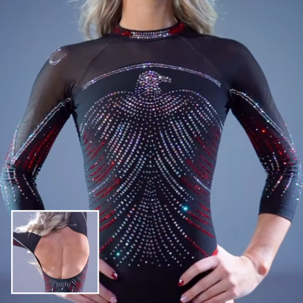
View a video of this leotard here.
Elizabeth: 7.200
Design 2.0/3, Construction 1.5/2, Concept & Identity 1.7/2, Overall Appearance 2.0/3
The idea is great, and while I don’t care for the design up close, it does look good from afar when you can’t see the specific Thunderbird details as much. I like the use of matte black fabric and multi-colored rhinestones. The back is also great.
Jessica N: 8.600
Design 2.6/3, Construction 1.5/2, Concept & Identity 1.8/2, Overall Appearance 2.7/3
SUU won the Best of Utah meet by a mile in terms of leotards. This Thunderbird looks regal compared to renditions where the mascot looks clunky. I don’t mind that the bird outline is indistinct at a distance. It gives the look subtlety instead of being in your face. The back of this leotard, though, is a wardrobe malfunction waiting to happen.
Sara: 8.600
Design 2/3, Construction 1.8/2, Concept & Identity 2/2, Overall Appearance 2.8/3
I have to say, this is one of the most stunning leos I’ve seen in a while. The open back is amazing and the sparkly front forming into a bird at the top is chef’s kiss. The mesh lines at the top are not the most flattering, but other than that, SUU nailed this.
Julianna: 8.500
Design 2.5/3, Construction 1.5/2, Concept & Identity 1.8/2, Overall Appearance _2.7/3
I really love this for SUU, wow! I love the gem designs on the chest, the subtle red throughout the leotard, and it looked really beautiful in motion at the Best of Utah. This was definitely a show stopper for me.
Mariah: 8.100
Design 2.1/3, Construction 1.9/2, Concept & Identity 1.8/2, Overall Appearance 2.3/3
This is a really well-done leo! I like the way the design transitions onto the sleeves. It’s not my favorite design ever, but there’s nothing specific I really dislike about it. It’s hard to fault a design that’s clearly been very well thought out.
Katherine: 7.000
Design 2.1/3, Construction 1.2/2, Concept & Identity 1.4/2, Overall Appearance 2.3/3
The bird on the front is really creative, and quietly so, but the silver curving lines going down the neck and sleeves feel like they interrupt the rest of the design. Without them, I would have very few complaints.
Springfield: 7.850

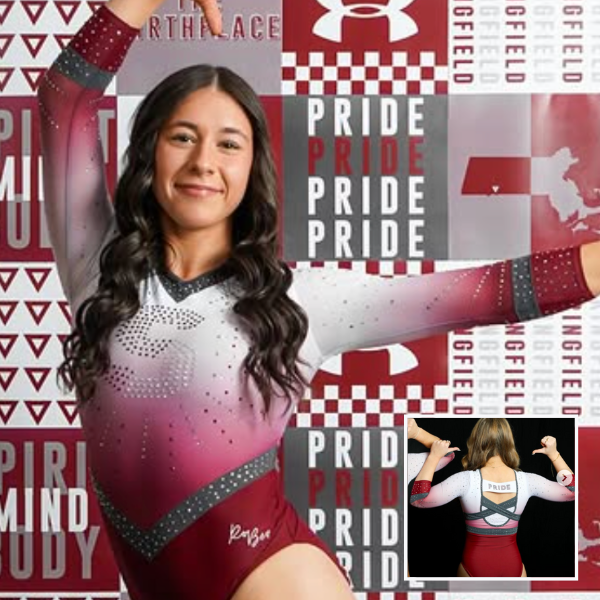
View a front pic of this leotard here and a back pic here.
Elizabeth: 8.200
Design 2.4/3, Construction 1.5/2, Concept & Identity 1.7/2, Overall Appearance 2.6/3
Very very good for Springfield. I’m not in love with the belt just as a general concept, but it doesn’t take away from the design enough to turn me against the leotard as a whole. I love the ombre, the gray accents, and the multi-colored rhinestones. The dual-color block “S” is a fun idea in theory, but unfortunately, from afar, the white disappears, making the “S” just look sort of weird and incomplete. As for the back, I need one less thing going on.
Jessica N: 5.700
Design 1.2/3, Construction 1.4/2, Concept & Identity 1.4/2, Overall Appearance 1.7/3
I hate those gray straps swooping out to nowhere until they hit the side seams, and I don’t like the white filling in the space between. The V-neck hits too high on some of the gymnasts. Give them some breathing room!
Sara: 8.000
Design 2.2/3, Construction 1.5/2, Concept & Identity 1.6/2, Overall Appearance 2.7/3
This Springfield design seems like a newer version of this one. I love the “S” and the belt. I think the subtle sparkles in the middle work well with the “S” and the ombre is well done. I love the back part of the belt but not the swooped strap design. Still, great job by Springfield.
Julianna: 8.800
Design 2.2/3, Construction 1.6/2, Concept & Identity 1.4/2, Overall Appearance 2.6/3
This is really nice! I love this color scheme with the main colors and the ombre, and I love the “S” with the firework gems across the chest. I don’t love the thick band across the back; I think it would have sufficed with the gray back straps if they were a little higher. Overall, really great addition for Springfield!
Mariah: 8.100
Design 2.3/3, Construction 1.7/2, Concept & Identity 1.8/2, Overall Appearance 2.3/3
Love this! I think committing to only one detail on the back would’ve helped it feel a bit more intentional, but I’m sold on everything else. I love the colors, the logo, and the way the charcoal grey bands are incorporated throughout the design. I don’t think I’ve ever seen Springfield in a bad design, and this one seems like a sparkly, revamped version of a good one it’s been wearing for years.
Katherine: 8.300
Design 2.2/3, Construction 1.6/2, Concept & Identity 1.4/2, Overall Appearance 2.1/3
I like the general concept of this, but I do feel that the belt takes away from the design, similar to how I feel about the collar and wrists on this Oklahoma leo. I don’t mind that color on the back, but the front looks disjointed with it. Without the belt, I would have very little to critique about this design. The “S” is a great way to show off school spirit.
Bowling Green: 7.650

View a teaser video of this leotard here.
Elizabeth: 9.000
Design 2.6/3, Construction 1.8/2, Concept & Identity 1.8/2, Overall Appearance 2.8/3
A really great design from Bowling Green. A lot of teams can ruin a good thing by trying to do too much. Bowling Green succeeds by keeping it simple and letting the ombre and rhinestone pattern shine. I think I would have preferred the top to transition from white to orange ombre on the sleeves to flow better from the body, but it looks fine as is as well.
Jessica N: 5.300
Design 1.4/3, Construction 1.1/2, Concept & Identity 1.3/2, Overall Appearance 1.5/3
As a fan of muted colors, I like this shade of orange, but the black is too stark. The white horizontal band across the chest gives this leo a snowflake sweater look, and the neckline is ill-defined. This leotard does score some points for originality. There’s nothing else out there that looks like this, for better or worse.
Sara: 9.100
Design 2.7/3, Construction 1.8/2, Concept & Identity 1.8/2, Overall Appearance 2.8/3
I love this unique design by Bowling Green. The orange ombre is amazing and the design on the sleeves is gorgeous. Not sure about the dark orange top, as it is not the most flattering, but everything else is amazing from the design to the shade.
Julianna: 7.000
Design 2.0/3, Construction 1.2/2, Concept & Identity 1.8/2, Overall Appearance 2.0/3
I don’t really love the color, but that’s really just my personal preference of not loving orange. I do appreciate how different this leotard is and that it’s not overdone with the gems on the chest and arms. I’m not a huge fan of the black line across the chest, but I get why it’s there for design purposes. All that being said, I do think it’s a fun addition for Bowling Green, as they don’t have a good orange leotard and this one fills that void.
Mariah: 6.700
Design 1.7/3, Construction 1.7/2, Concept & Identity 1.4/2, Overall Appearance 1.9/3
This is another one that I really should like in theory, but I don’t. The details just aren’t quite right. The dark piping along the top feels very out of place. I think if it had been incorporated into the neckline as well or ditched entirely and replaced with a sweetheart neckline, the design would feel more cohesive. I don’t love the geometric sparkle design, but I’m not totally put off by it. The orange ombre is really pretty, but the leotard as a whole just falls a little flat compared to the other ombre orange leotard in Bowling Green’s closet, which happens to be one of my all-time faves.
Katherine: 8.800
Design 2.4/3, Construction 1.8/2, Concept & Identity 1.8/2, Overall Appearance 2.8/3
Love Bowling Green leos and the color orange, so I love this! I really like the different sparkle patterns on the sleeves vs. the middle band; they are unique from one another while still being in synergy. My only complaint would be the lower back; I think the white should diffuse further down like it does on the front to avoid the look of a “diaper.”
Iowa State: 7.483
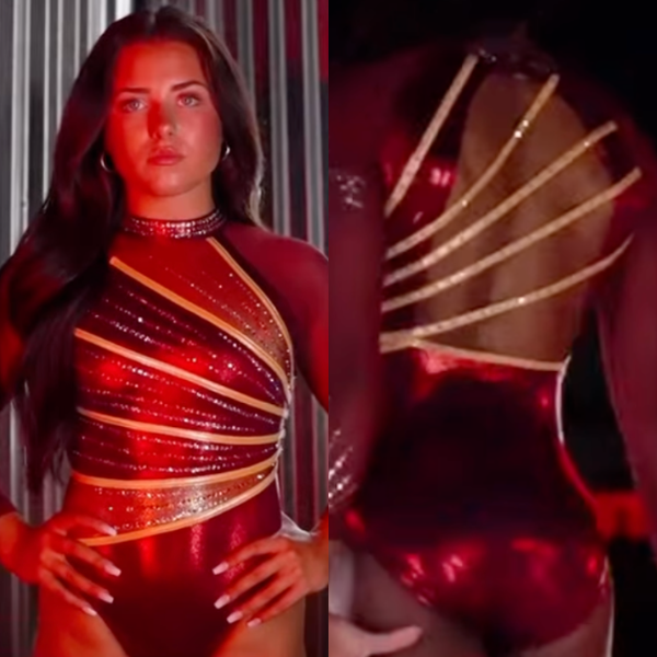
View a video of this leotard here.
Elizabeth: 7.600
Design 2.4/3, Construction 1.4/2, Concept & Identity 1.2/2, Overall Appearance 2.6/3
I really like how the front mirrors the back straps, as well as how the gold pops on the shiny red. It’s very Iowa State, which could be a good or a bad thing. Good for visual identity, but it also runs the risk of blending into the rest of the closet.
Jessica N: 6.000
Design 1/3, Construction 2/2, Concept & Identity 2/2, Overall Appearance 1/3
I find this color combination paired with the shiny fabric garish. There’s so much gold that all you see is the leotard when you should be watching the gymnast. Even though it’s not to my taste, I will say that the design is well thought out and cohesive from front to back, which cannot be said for a large number of college leos.
Sara: 7.600
Design 2.5/3, Construction 1.3/2, Concept & Identity 1.3 /2, Overall Appearance _2.5_/3
The gold straps on both the back and front are really pretty but it is kind of odd on both areas of the leo. I also think it’s similar to other Iowa State leos in the past, which contributes to a cohesive closet, but like Elizabeth said, it also risks blending in rather than standing out.
Julianna: 7.400
Design 2.2/3, Construction 1.2/2, Concept & Identity 1.5/2, Overall Appearance 2.5/3
I like the front of this a lot, but the back not so much. The deep red shade is nice, as is the high neck and the use of both school colors. The back straps are somewhat throwing me off, although I do think it looked beautiful in action. It’s a pretty leotard, just not my favorite from the Cyclones.
Mariah: 8.300
Design 2.3/3, Construction 1.8/2, Concept & Identity 1.8/2, Overall Appearance 2.4/3
I will admit, when I watched the broadcast, I didn’t notice that this was a new design, but that doesn’t mean I don’t like it. The diagonal gold straps on the back and the front coordinate perfectly, and I’m always a fan of asymmetrical designs. I also thought it looked great in motion. Overall, no complaints.
Katherine: 8.000
Design 2.6/3, Construction 1.6/2, Concept & Identity 1.4/2, Overall Appearance 2.6/3
This is really beautiful! It’s not too different from other Iowa State leotards, but it’s a really nice execution with the different segments of the body on the front and the twin design on the back without the fabric; I like that asymmetry. It also looked really nice in motion.
Clemson: 7.200

View a video of this leotard here and images here.
Elizabeth: 6.800
Design 2.0/3, Construction 1.4/2, Concept & Identity 1.4/2, Overall Appearance 2.0/3
I love the velvet, I love the simple purple and white look, and I love the script “Clemson” on the thicker cuffs. The rhinestone pattern doesn’t feel like it really fits the rest of the vibe, but it’s a small complaint.
Jessica N: 5.300
Design 1.4/3, Construction 1.1/2, Concept & Identity 1.2/2, Overall Appearance 1.6/3
Velvet can be polarizing. I personally neither love it nor hate it, but I actually prefer it to the mesh portion of this garment, which is so light and thin that it looks almost nude when you see the leotard in action. The sparkles seem like they were placed to take up space rather than to flatter anyone, and rhinestones on the shoulders seemed to droop like crystals on an old chandelier when the gymnasts stood with their arms at their sides.
Sara: 8.000
Design 2.3/3, Construction 1.6/2, Concept & Identity 1.6/2, Overall Appearance 2.5/3
Clemson has stepped up its leotard game, and this leo is no exception. The sparkle design is elegant and the subtle orange on the sleeves is great. The simplicity is smart, especially since past leos have looked otherwise.
Julianna: 7.800
Design 2.0/3, Construction 1.8/2, Concept & Identity 1.5/2, Overall Appearance 2.0/3
I’m such a velvet leotard lover, and this did not disappoint. I love the shade of purple; it makes the entire leotard really elegant, but I’m not the biggest fan of the firework gems on the back. I appreciate the subtle use of the orange gems and the V cut of the back, but I think it would’ve been even better if it was a little bit simpler on the back to let the front shine.
Mariah: 6.900
Design 1.6/3, Construction 1.7/2, Concept & Identity 1.7/2, Overall Appearance 1.9/3
I love the velvet and the small pops of orange in the sparkle design; however, the geometric design on the front just doesn’t make sense with the firework design. The “Clemson” on the cuffs and the logo on the sleeve are nice school spirit touches though. I think sticking to one type of sparkle design would make this a more cohesive look.
Katherine: 8.400
Design 2.2/3, Construction 1.8/2, Concept & Identity 1.6/2, Overall Appearance 2.3/3
I’m not the biggest fan of velvet, but this design looks pretty overall even with that material. There are so many unique and beautiful accents; I love the tiny orange sparkles, the unique font of “Clemson” on the sleeves, and the fireworks below the shoulders. You can find something new every time you look at this design.
UCLA: 7.200
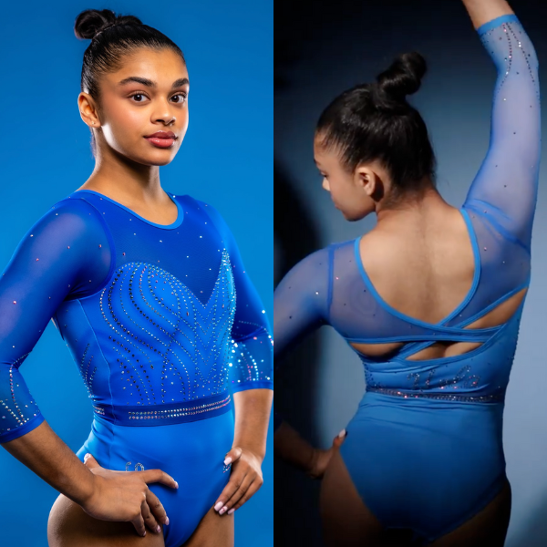
View images & a video of this leotard here.
Elizabeth: 6.800
Design 2.0/3, Construction 1.2/2, Concept & Identity 1.6/2, Overall Appearance 2.0/3
It’s fine? The back honestly saves this leotard for me. If it were a normal scoop back like the front makes it seem like it will be, it would be pretty boring. I do want to call out the very subtle way the fabric underneath the rhinestones is tinted/dyed darker to create almost a washed effect that makes the rhinestones pop even more. Apart from that, though, there’s nothing too special about this design. It’s honestly a little Florida-y for me?
Jessica N: 6.400
Design 1.6/3, Construction 1.3/2, Concept & Identity 1.6/2, Overall Appearance 1.9/3
I like that the color is true to the UCLA logo instead of being a random shade of blue. The criss-cross back accentuates the V-taper of the athletes on whom the leotard fits well, but like many of UCLA’s uniforms the past few years, it looks loose and saggy on some. This team relies on the sweetheart neckline way too much and needs to think more creatively.
Sara: 7.400
Design 2/3, Construction 1.8/2, Concept & Identity 1.6/2, Overall Appearance 2/3
I’m not always a fan of all-blue leotards, but this one was honestly really good. The back works well with the front sparkle design, but the only downfall for me is the shade of blue. I agree with Elizabeth that it looks like it could be a Florida leo.
Julianna: 7.700
Design 2.4/3, Construction 1.5/2, Concept & Identity 1.5/2, Overall Appearance 2.3/3
I am in love with this blue color and the sweetheart cut of the top. This looked really beautiful in action, and I really love the mesh arms and back details. I feel like I almost needed more to push it over the top, but this was definitely one of my favorites from the weekend.
Mariah: 7.700
Design 2.3/3, Construction 1.7/2, Concept & Identity 1.4/2, Overall Appearance 2.3/3
This is nothing groundbreaking, but it’s very pretty. I’m not sure I like the back cutouts, but the sparkle design, fabric color, and sweetheart neckline are lovely. It looks a lot like some other designs the Bruins have, and I think it could’ve used a little yellow somewhere.
Katherine: 7.200
Design 2.2/3, Construction 1.5/2, Concept & Identity 1.2/2, Overall Appearance 2.3/3
This is very pretty, but nothing super out of the ordinary for UCLA. I feel that I wouldn’t have known it was new at first glance. I don’t have a lot of critiques about the design itself, and I do love this electric blue that UCLA has been using in its designs. I just wish it was more adventurous overall.
Wilberforce: 6.983
Elizabeth: 7.200
Design 2.2/3, Construction 1.4/2, Concept & Identity 1.4/2, Overall Appearance 2.2/3
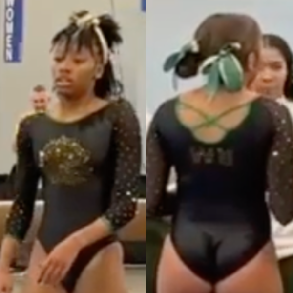
Yes, it’s plain, but I don’t hate that about it. Plus, it’s pretty different from everything else Wilberforce has done so far, so this makes for a great black staple in the Bulldogs’ closet. The solid body really allows the sparkly logo on the chest to shine, and I like the pops of green on the cuffs and back straps as well.
Jessica N: 7.400
Design 2.2/3, Construction 1.5/2, Concept & Identity 1.6/2, Overall Appearance 2.1/3
This is a cute and youthful leotard. It’s the little black dress in Wilberforce’s closet of green frocks. I would have liked the back straps to be placed lower so the shoulder blades didn’t have a lumpy appearance and WU could be more centered.
Sara: 7.000
Design 2.2/3, Construction 1.3/2, Concept & Identity 1.4/2, Overall Appearance 2.1/3
I love a good all-black leotard as a base. It just works so well, and I love the sparkly sleeves. Wilberforce took the saying “less is more” and turned it into this leotard, which is great. The back straps are odd but somehow still work with the overall design.
Julianna: 7.400
Design 2.0/3, Construction 1.8/2, Concept & Identity 1.2/2, Overall Appearance 2.4/3
I agree this is a great leo to have for whenever; it’s clean, sleek, and embodies Wilberforce perfectly. I really love the sparkly mesh arms and the thin green straps across the back. A great addition for the Bulldogs!
Mariah: 7.000
Design 2.0/3, Construction 1.5/2, Concept & Identity 1.6/2, Overall Appearance 1.9/3
I often find many of the current leotard designs too busy, but this one definitely doesn’t have that problem. It may be simple, but it’s a solid design, and actually very different for Wilberforce. I wish there was a little more sparkle dispersed around the logo on the body of the leotard since there is a ton on the sleeves, but otherwise I see no issues.
Katherine: 5.900
Design 1.6/3, Construction 1.3/2, Concept & Identity 1.2/2, Overall Appearance 1.8/3
There are a lot of subtle instances of school spirit on this one with the small instances of color (the back straps and sparkles) that make a relatively quiet design more interesting, but it does feel too quiet overall. I wish more was done with the black body.
Bridgeport: 6.900
View a video of this leotard here.
Elizabeth: 6.600
Design 2.0/3, Construction 1.4/2, Concept & Identity 1.9/2, Overall Appearance 2.3/3
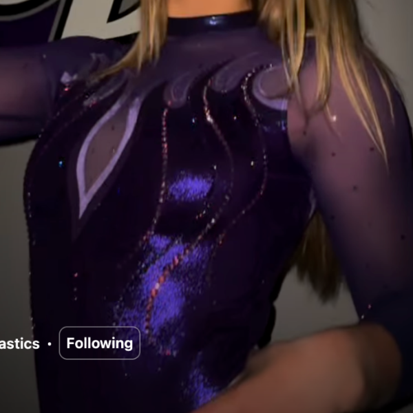
Look, if you told me Bridgeport put “Hot Hot Hot” on a leotard, I would have said, “Ew, no thank you.” But I appreciate a full lean into a concept, and doing a flame leotard as an homage to that saying, which does mean a lot to Bridgeport, I can get on board with.
Jessica N: 7.000
Design 1.5/3, Construction 1.5/2, Concept & Identity 1.9/2, Overall Appearance 2.1/3
Bridgeport goes hard for the purple, not just in its uniforms, but even in renovating its gym. Yes, this leo is flamboyant, but it’s over the top with a wink, and I’m here for it. More teams should incorporate mottos into their leotards. Why limit it to school or mascot names?
Sara: 6.300
Design 1.4/3, Construction 1.4/2, Concept & Identity 1.6/2, Overall Appearance 1.9/3
Is it a little crazy to say I don’t love this leo from Bridgeport? I admire the idea of flames, but it doesn’t seem to work for me. The mesh sleeves are good, but the light and dark purple accents with little orange sparkles seem a bit offputting.
Julianna: 8.000
Design 2.3/3, Construction 1.7/2, Concept & Identity 1.7/2, Overall Appearance 2.3/3
This is a fun addition for Bridgeport! I love the “Hot Hot Hot” incorporation, and it definitely makes this leo one that will live on in Bridgeport’s wardrobe, as this has been a staple in the culture of the program for such a long time. I love the light purple outline on the dark purple body, and the mesh arms let the flames shine on their own and really make a statement.
Mariah: 7.500
Design 2.1/3, Construction 1.6/2, Concept & Identity 1.7/2, Overall Appearance 2.1/3
Fully leaning into a concept helps a design that reads a bit like an old school stock design feel intentional and fun. The design is simple, but it’s well done and a unique idea. The purple color is also very pretty.
Katherine: 6.000
Design 2.0/3, Construction 1.4/2, Concept & Identity 1.7/2, Overall Appearance 1.9/3
This is definitely creative, but I wish that the flame design looked a little less vintage. The whole thing feels a little old school, which is a shame since it is a novel concept with the words matching the design. Also, I like the subtly different color of the sparkles on the front, and the material for the top of the back that stretches onto the sleeves looks arrogant.
Ohio State: 6.517

View a video of this leotard here and a picture of the back here.
Elizabeth: 6.000
Design 1.5/3, Construction 1.5/2, Concept & Identity 1.5/2, Overall Appearance 1.5/3
I get why teams redo designs, but I don’t think we need to call them new leos. Is it an improvement on the classic? I guess? I do prefer this new back to the old one. I honestly would have enjoyed this as a redone design if Ohio State had won another conference title and “had” to redo the leo to add another buckeye leaf to the arm or something.
Jessica N: 5.800
Design 1.5/3, Construction 1.5/2, Concept & Identity 1.2/2, Overall Appearance 1.6/3
Well, there’s no mistaking that this is an Ohio State leotard with that overpowering logo on the chest. I can’t tell if the repeating image on the right arm is a buckeye leaf, and without knowing its symbolism, it seems like this was added because someone was afraid the leo would look too basic. I like the band on the back in and of itself, but its placement makes the resulting cutouts look awkward.
Sara: 6.000
Design 1.3/3, Construction 1.5/2, Concept & Identity 1.6/2, Overall Appearance 1.6/3
I don’t like the fact that Ohio State did copy paste on a leo they already have. While I still love the glittery “Ohio State” part on the front, it is boring seeing the same old designs being reused. Red and black are fairly easy colors to work with, and I’d love to see them try something different.
Julianna: 7.300
Design 2.0/3, Construction 1.5/2, Concept & Identity 1.8/2, Overall Appearance 2.0/3
I do love when the classic leos get a revamp, but I’m not in love with this solely because of the arm. I love the slick black look and truly the entire front and back, but the arm is really throwing the leo off balance and taking away from how good this could be.
Mariah: 7.200
Design 1.7/3, Construction 1.7/2, Concept & Identity 1.8/2, Overall Appearance 2.0/3
Based on memory alone, I would not be able to distinguish this from the previous design, but it was a solid design originally and still is. The extremely sparkly buckeye leaves being only on one arm makes the design look a bit off balance, as does the difference in sparkle between the back and the front. However, I do love the eye-catching logo design.
Katherine: 6.800
Design 2.0/3, Construction 1.5/2, Concept & Identity 1.3/2, Overall Appearance 2.0/3
I’m sure there are differences between this one and the original, but I can’t recall them off the top of my head, and if that’s the case, I don’t think this one is different enough to be meaningful or memorable. So, why do a new design? It’s fine, it just seems silly. I also don’t like that the buckeye leaves are only on one sleeve. It feels like a major design flaw to me.
Eau Claire: 6.333

View a video sneak peek of this leotard here.
Elizabeth: 7.400
Design 2.3/3, Construction 1.4/2, Concept & Identity 1.4/2, Overall Appearance 2.3/3
Eau Claire always does a good job given that it has some pretty hard colors to work with together. The front design is flattering, and I like the back straps in isolation, but I think I wish they were a bit less glaring in execution.
Jessica N: 6.100
Design 1.8/3, Construction 1.5/2, Concept & Identity 1.5/2, Overall Appearance 1.3/3
Here’s another leo where I like the sleeves and not much else. The front is nondescript, but the big yellow straps are a real eyesore. This leotard would have been so much classier if the straps were eliminated altogether.
Sara: 7.700
Design 2/3, Construction 1.5/2, Concept & Identity 1.7/2, Overall Appearance 2.5/3
This leo from Eau Claire is pretty overall, and the bedazzled collar is also beautiful. I think the big straps really complement the thin line design on the front, giving the leo as a whole a more interesting look.
Julianna: 5.500
Design 1.5/3, Construction 1.2/2, Concept & Identity 0.8/2, Overall Appearance 2.0/3
I like this, but it’s not my favorite from Eau Claire. The thick yellow straps are a little too big for me, I think if they were thin, this would have complemented the skinny front gem lines much better. I do like the mesh sleeves and the high neck, but I need a little more everywhere else.
Mariah: 6.200
Design 1.4/3, Construction 1.6/2, Concept & Identity 1.4/2, Overall Appearance 1.8/3
The front and the back don’t seem like they are from the same design. The lines on the front are very thin, but the straps on the back are incredibly chunky in comparison. Everything else is fine though, and the sparkle design on the collar is very pretty.
Katherine: 5.100
Design 1.5/3, Construction 1.2/2, Concept & Identity 0.6/2, Overall Appearance 1.8/3
I actually do like the back of this a lot, but its blockiness does not really fit with the rest of the design, which is more subtle and elegant. The front is not my favorite, as the stripe design looks a little awkward against the rest of the design.
Brockport: 6.300

View an image of the front of the leotard here.
Elizabeth: 6.000
Design 1.8/3, Construction 1.2/2, Concept & Identity 1.2/2, Overall Appearance 1.8/3
It’s not my favorite recent Brockport design, but it’s also not bad either. I like the shade of green used, but the front design isn’t super thrilling. As for the back, it doesn’t feel like it fits with the front? A bit more cohesiveness would bring the score up for me.
Jessica N: 6.000
Design 1.6/3, Construction 1.4/2, Concept & Identity 1.4/2, Overall Appearance 1.6/3
This leotard didn’t make much of an impression on me while watching the meet. Looking at it closely, I see there are some nice elements. It’s hard to go wrong with a black mesh sleeve, and the design on the bodice is pretty, even if it did get lost under the lights of the arena. Since there’s little gold on the front, the back straps are not well integrated, but they did provide a pop of color on camera.
Sara: 7.100
Design 2/3, Construction 1.6/2, Concept & Identity _1.6_/2, Overall Appearance 1.9/3
I had the pleasure of seeing this leotard in-person this past weekend. I absolutely love the front of this leo with the golden eagle on the side and feather design in the middle. What brings it down for me is the back; it seems too bland, and the gold strap accents seem a bit weird with the green on the sides.
Julianna: 6.700
Design 1.9/3, Construction 1.2/2, Concept & Identity 1.6/2, Overall Appearance 2.0/3
I like elements of this, but it’s not my favorite from Brockport. I really love the unique gem pattern on the front, but I’m not crazy about where the cut to the black fabric lays, or the straps. I do appreciate the utilization of the team colors throughout, but I think different colored straps or just a plain green back with scattered gems would’ve been enough and really seamless.
Mariah: 6.300
Design 1.6/3, Construction 1.3/2, Concept & Identity 1.6/2, Overall Appearance 1.8/3
This leo is not bad, but is definitely not my favorite from Brockport, and there’s a few details I’m not loving. It lacks a bit of cohesion between the back, front, and sleeves in terms of pattern. While the front would ideally evoke the feathers of the Golden Eagle mascot, in reality the design looks a bit like a turkey from afar. I do really like the rhinestoned “Brockport” on the back though.
Katherine: 5.700
Design 1.7/3, Construction 1.2/2, Concept & Identity 1.2/2, Overall Appearance 1.6/3
I really like the front of this, but am not as big of a fan of the back. While green and gold are the school’s colors, I don’t think the gold straps go as well cohesively with the darker tones of the green and black. The gold collar also feels a little misplaced, but that is not as obvious as the staps. I think this could have been left as a mostly green and black design, with the eagle logo kept as an accent.
Stout: 6.300
View images of this leotard here and a video here.
Elizabeth: 5.500
Design 1.5/3, Construction 1.5/2, Concept & Identity 1.0/2, Overall Appearance 1.5/3
There’s nothing bad about this leotard, but there’s nothing that jumps out at me either. It’s a good, serviceable leotard that I could see the team wearing for years. Which it will be doing.
Jessica N: 7.400
Design 2.4/3, Construction 1.5/2, Concept & Identity 1.6/2, Overall Appearance 1.9/3
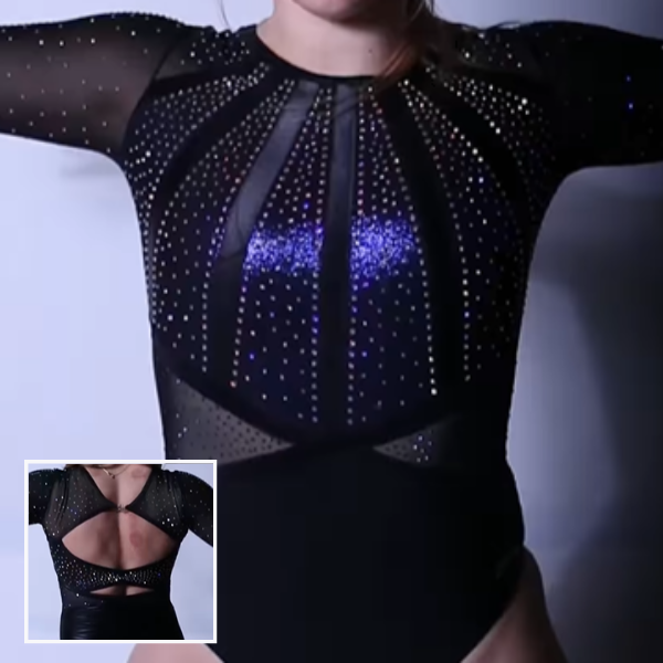
I’m on the fence about this one. I like the back and I appreciate that the leotard looks mostly black until it catches the light and then you see flashes of violet. But ultimately I don’t like the shaping on the chest, and that’s the portion of the leo that we spend the most time looking at.
Sara: 7.700
Design 2.3/3, Construction 1.5/2, Concept & Identity 1.7/2, Overall Appearance 2.2/3
This leotard is really gorgeous and I love the “Stout” across the side sleeve. The back works really well with the front design and I think the dark blue accents are amazing. The only offputting thing to me is the triangles in the middle, but still a great leotard overall.
Julianna: 5.500
Design 1.0/3, Construction 1.5/2, Concept & Identity 1.0/2, Overall Appearance 2.0/3
Another leotard that if I wasn’t told was new I wouldn’t have known. It’s a nice design, but nothing really makes this stand out. I do really like the back, but I think there could’ve been something else to really distinguish it.
Mariah: 7.300
Design 2.1/3, Construction 1.5/2, Concept & Identity 1.6/2, Overall Appearance 2.1/3
This isn’t super unique and definitely has stock design energy, but it’s a solid look that will stand the test of time. It’s very sparkly, and the “Stout” on the sleeve is a nice touch. This is possibly an unpopular opinion, but I like the mesh triangles at the waist and how they transition onto the back and are mirrored with the other back details.
Katherine: 4.400
Design 1/3, Construction 1.3/2, Concept & Identity 0.9/2, Overall Appearance 1.2/3
I do not love the design of this, in particular the front midsection with the mesh triangles and the top with the mesh cutouts between the sparkly portions. I also don’t like that the back is so uneven with the tiny opening towards the bottom compared to the way bigger one above it. One element I do like, however, is the “UW Stout” on the sleeve.
California: 6.250
View videos and images of this leotard here.
Elizabeth: 5.500
Design 1.5/3, Construction 0.8/2, Concept & Identity 1.2/2, Overall Appearance 2.0/3
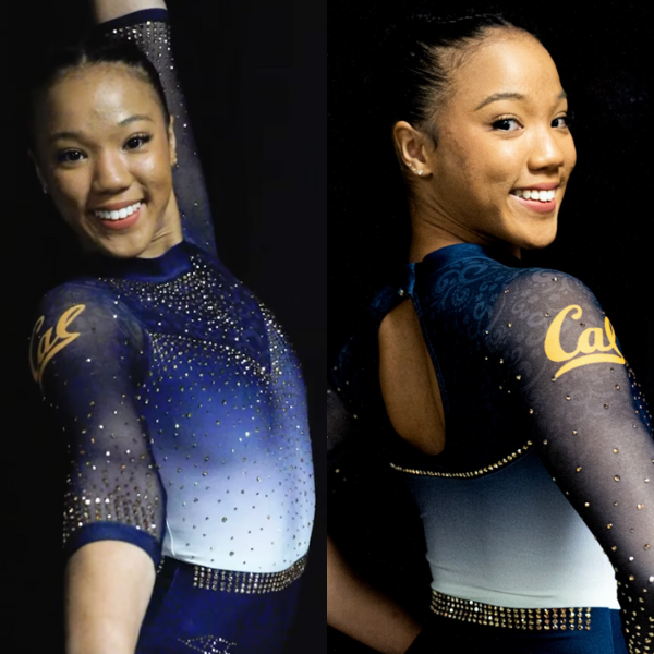
Meh. It’s a little too busy for me. I don’t care for the pattern on the sleeves, and the way the chest mesh is thicker/darker than the arm mesh doesn’t work for me. It’s a design that works better for me from afar than up close where you can see all the details.
Jessica N: 5.900
Design 1.3/3, Construction 1.5/2, Concept & Identity 1.1/2, Overall Appearance 2/3
Something about this design doesn’t work, and I can’t quite put my finger on what it is. Maybe it’s the circular cutout butting up against a nearly horizontal line and the white hitting another line of demarcation. The texture on the sleeves and shoulders is an unnecessary element. This isn’t the elegant standard we’re used to from Cal.
Sara: 5.500
Design 1.2/3, Construction 1.4/2, Concept & Identity 1.4/2, Overall Appearance 1.5/3
The only part I really like is the dark blue to ombre white on the top. The rest is a little odd. The sleeves seem overdone, and the little glitter line on the back just seems like it was put there since the designer didn’t know what else to do.
Julianna: 7.500
Design 2.5/3, Construction 1.0/2, Concept & Identity 1.5/2, Overall Appearance 2.5/3
I really like this! There are some elements that are throwing me off, like the gem stomach band, only because it is so harsh. Without it, this still would’ve been beautiful, and the ombre on top would’ve seamlessly blended into the dark bottom. Other than that, this might be one of my favorites from the weekend, and it looked beautiful in motion.
Mariah: 5.700
Design 1.4/3, Construction 1.4/2, Concept & Identity 1.2/2, Overall Appearance 1.7/3
This is way too busy for my taste. The ombre torso is a great start, but the patterned mesh on the chest and arms is distracting. There are also a lot of gems near the neckline, but not enough on the back. I can’t say this is one of my favorites from the Golden Bears.
Katherine: 7.400
Design 2.5/3, Construction 1.1/2, Concept & Identity 1.7/2, Overall Appearance 2.⅓
I like most of this, but the sleeve pattern, which is the same one as on the neck, tries to be subtle but remains clearly different from the rest of the design; it just doesn’t fit. The sparkles on the front and the design as a whole are really pretty, but it is overall very similar to most other California leos.
LSU: 6.233

View a video & images of this leotard here.
Elizabeth: 6.200
Design 1.8/3, Construction 1.2/2, Concept & Identity 1.4/2, Overall Appearance 1.8/3
It’s fine. The purple is somehow more purpley than LSU normally purples, but the straps seem out of place (they’re not even the same shade purple), and the way the mesh connects to the solid fabric makes me think of one of those weird 2000s crop sweater things people wore. I do really like the rhinestone pattern, but it’s not enough to “save” the rest of the design for me.
Jessica N: 5.600
Design 1.3/3, Construction 1.7/2, Concept & Identity 1.1/2, Overall Appearance 1.5/3
This leotard went overboard with the sparkles. Since there’s nowhere to put them on the back, it appears that the designer put them all on the front. Because there’s so little fabric on the back, this leotard looks unbalanced, and undergarments were on full view for those gymnasts who opted to wear a bra.
Sara: 6.000
Design 1.7/3, Construction 1.5/2, Concept & Identity 1.4/2, Overall Appearance 1.4/3
The purple is elegant, but not totally sure about the keyhole front. The sparkly design is nice too, but I felt that only the back looked really good on camera. However, I do agree with Jessica that it seemed like the designer felt that they could only put the sparkles on the front due to the back design. Not bad, just a little boring to me.
Julianna: 6.800
Design 2.0/3, Construction 1.5/2, Concept & Identity 1.3/2, Overall Appearance 2.0/3
This was definitely a great leo to wear on a big stage for this first competition because of the attention it demands, but this is not my favorite for the Tigers. There are almost too many details that I wish were scaled back to show the actual cut and design, since I do like pieces of this leo. I absolutely love the open back and chest cutout, but there is so much going on that it takes away from the beauty of the actual design.
Mariah: 5.400
Design 1.3/3, Construction 1.5/2, Concept & Identity 0.9/2, Overall Appearance 1.7/3
I think the sleeve design is my favorite part, but I’m not in love with the rest of it. The sparkle design on the front is a bit odd to me, and although I love the gems placed around the open back, I’m not a fan of the thin straps. They just look loose and floppy.
Katherine: 7.400
Design 2.2/3, Construction 1.5/2, Concept & Identity 1.5/2, Overall Appearance 2.2/3
While it may seem like just another purple leo for LSU, there’s a lot more going on in this one than meets the eye. The back is really interesting and unique, and the sparkle pattern on the front with the snowflakes is definitely a departure from its usual. I agree with Elizabeth that the purple does feel different from its usual, too.
Arizona: 5.233
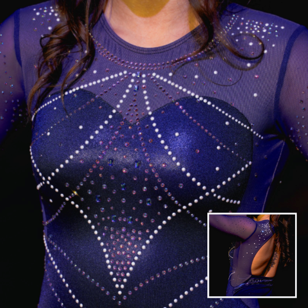
View images of this leotard here and here and a video here.
Elizabeth: 4.000
Design 1.2/3, Construction 1.0/2, Concept & Identity 0.6/2, Overall Appearance 1.2/3
If you didn’t explicitly tell me this design was new, I wouldn’t have had any idea. It’s honestly pretty boring? Don’t tell me the good leotards went away with Taylor Spears… It’s also a nearly identical stock design to one of Clemson’s new ones we got a sneak peek of during preseason.
Jessica N: 5.000
Design 1.5/3, Construction 1.2/2, Concept & Identity 1/2, Overall Appearance 1.3/3
There is nothing memorable about this leotard. The mesh on the sides is the only thing that differentiates the front half from a stock design. If you’re going to spend money on a custom creation, make it look different than a developmental program mainstay.
Sara: 5.500
Design 1.3/3, Construction 1.2/2, Concept & Identity 1/2, Overall Appearance 2/3
I think this leo overall is really nice. However, the “V” designs across the middle could be doing more to catch my eye. The gems and cutout on the back is beautiful, but in the end the leo just doesn’t give off the Wildcat vibe we’ve seen in the past.
Julianna: 5.500
Design 1.5/3, Construction 1.5/2, Concept & Identity 0.5/2, Overall Appearance 2.0/3
This is a really stunning leotard, but I would have to agree that I would have never known this was new. I do think it is really pretty and flattering with the sweetheart neckline under the sparkles, and I love the open back. It looked beautiful on TV, but doesn’t scream Arizona to me, so not my favorite for the Wildcats.
Mariah: 5.500
Design 1.5/3, Construction 1.4/2, Concept & Identity 1/2, Overall Appearance 1.6/3
There’s nothing wrong with this, it’s just a bit boring. I’ve come to expect more from Arizona, so this design is a bit underwhelming. I do like the use of the different colored gems, specifically the pearls, but I don’t love the sparkle pattern, and I think I will forget about this whole design by next week. Nothing about it really ties it to Arizona.
Katherine: 5.900
Design 1.2/3, Construction 1.2/2, Concept & Identity 0.8/2, Overall Appearance 1.5/3
I normally love Arizona’s leos, so for me not to like this is a departure from my usual. It’s not particularly bad, there’s just nothing unique about it, a trait that I’ve come to associate with Arizona. I am also not a fan of the bodice on the front; it does not fit very well with the openness of the back.
West Chester: 4.533
Elizabeth: 3.400
Design 1.0/3, Construction 0.5/2, Concept & Identity 0.5/2, Overall Appearance 1.4/3
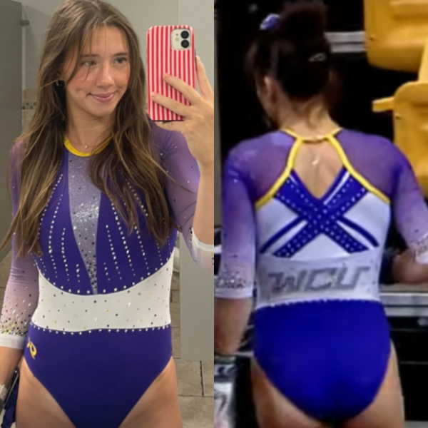
It’s a mixed bag for me. I love the shade of purple used, as well as the shimmery fabric in the V and the multi-colored rhinestones on the arms. However, that thick white belt sort of ruins it all. It’s so in-your-face and random. If it didn’t exist, this would have been a near-perfect leotard for me.
Jessica N: 4.900
Design 1.3/3, Construction 1.3/2, Concept & Identity 1.1/2, Overall Appearance 1.2/3
The midsection of the leotard looks like a WWE belt worn backward. The design would have been so much better without it. I like the color of the sleeves, the ombre, and the placement of the sparkles. I wish the team would have built on those elements instead of turning the leo into a hodgepodge of ideas.
Sara: 3.600
Design 1.1/3, Construction 0.7/2, Concept & Identity 0.6/2, Overall Appearance 1.2/3
The purple on this leotard is not quite giving the same aesthetic as other West Chester leos I’ve seen. The rhinestones are a little bland on the top, and the middle and back are a little wonky with the criss-cross design. Overall, not a great leotard, but not awful either.
Julianna: 5.000
Design 1.5/3, Construction 0.8/2, Concept & Identity 1.2/2, Overall Appearance 1.5/3
The thick white stomach band is the biggest aspect throwing me off about this leo. The concept was great, the execution just missed it a little. A thinner band in the middle with the rest of this would have made the contrast much less harsh, but I really do like the rest of this!
Mariah: 4.600
Design 1.0/3, Construction 1.2/2, Concept & Identity 1.1/2, Overall Appearance 1.3/3
I wish I was a fan of this, but it’s just too disjointed for my taste. The white belt stands out so much against the rest of the design, and it’s the first thing your eye is drawn to. I also think that if the material of the deep V and the ombre material on the sleeves were the same, the design would look more intentional. I would also get rid of the white paneling under the straps and just go for an open back instead. The rhinestones on the sleeves are my favorite part.
Katherine: 5.700
Design 1.6/3, Construction 0.8/2, Concept & Identity 1.6/2, Overall Appearance 1.7/3
The white band on the front really interrupts this design for me. The back actually looks beautiful, and I like the ombre of the sleeves, too; there’s just something about the presence of the band on the front that lowers the rest of the look for me. I do like the subtle use of yellow on the collar and back of the neck though.
Fan Poll
Vote for your favorite design from the past two weeks here.
READ THIS NEXT: The Dismount: Week 2
Judged by Elizabeth Grimsley, Jessica Needle, Sara Finkelstein, Julianna Roland, Katherine Weaver, and Mariah Dawson


Arizona! Classy! The color is spectacular!