
Gymnastics fans love leotards, it’s just a fact. We love seeing new designs, creating our own, and especially judging them. That’s why we’re back for another season of leotard rankings!
Each week we’re analyzing new designs to find our weekly faves. Leos can earn up to three points for design; up to two points for construction, which includes fabric, fit, and sparkle; up to one point each for school/theme spirit and creativity; and up to three points for overall appearance. This week Tara, Tyler, and Aaron are joining editor-in-chief Elizabeth for judging.
Don’t agree with our ranking? Make your opinion heard by voting in the fan poll at the end of the article each week or by voicing your thoughts on social media!
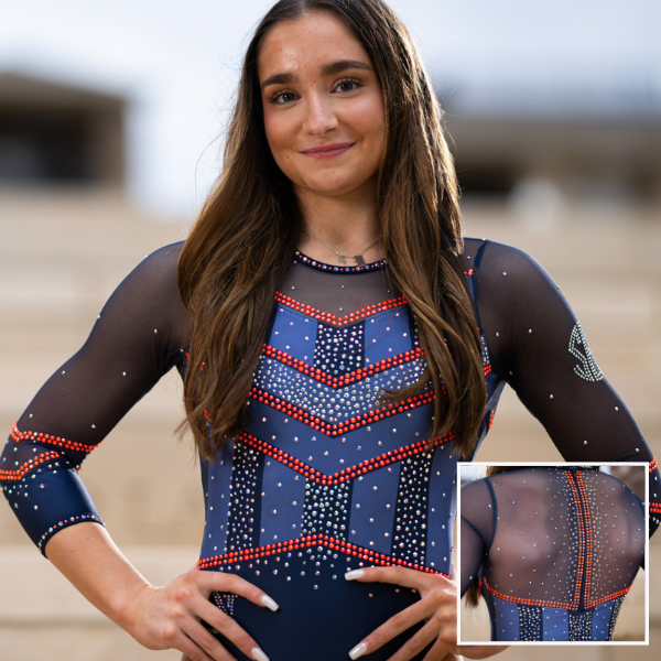
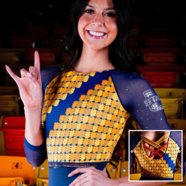
Auburn: 8.725
View a video of this leotard here.
 Elizabeth: 8.400
Design 2.5/3, Construction 1.8/2, School/Theme Spirit 0.7/1, Creativity 0.9/1, Overall Appearance 2.5/3
When I first saw this leo, I loved it. The bright orange rhinestones are just so bold and stand out so well, and I love them paired with the lighter and darker shades of blue. Maybe one of my favorite Auburn leos ever?
 Tara: 8.400
Design 2.4/3, Construction 1.7/2, School/Theme Spirit 0.8/1, Creativity 0.8/1, Overall Appearance 2.6/3
I love how this is an ode to the military without being “in your face” military like some of the ones we’ve seen in the past. I love the design as a whole and the orange rhinestones really pop. Auburn nailed this one!
Tyler: 8.700
Design 2.6/3, Construction 1.8/2, School/Theme Spirit 0.8/1, Creativity 0.8/1, Overall Appearance 2.7/3
I think this leo is really striking. The design includes just the right amount of orange stones to really pop yet not be overwhelming. The back design is stunning and unique.
 Aaron: 9.400
Design 3/3, Construction 2/2, School/Theme Spirit 0.9/1, Creativity 0.5/1, Overall Appearance 3/3
This leotard reminds me of a superhero’s uniform. The amount of sparkles is perfect and the mesh top that extends halfway down the arms looks comfortable and flattering. While I like the leotard, it is not the most unique; I have seen similar designs used by other teams.
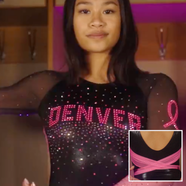
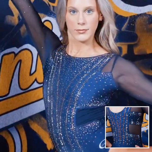
Denver: 8.650
View a video of this leotard here.
Elizabeth: 7.600
Design 2.0/3, Construction 1.8/2, School/Theme Spirit 0.8/1, Creativity 0.6/1, Overall Appearance 2.4/3
This may be one of my favorite pink leos. Really the only thing I don’t like is the back, which just feels unnecessary. The neon pink rhinestones pop, and the ombre sleeves are a nice touch.
Tara: 8.800
Design 2.5/3, Construction 1.8/2, School/Theme Spirit 1.0/1, Creativity 0.8/1, Overall Appearance 2.7/3
This is an excellent pink leo! Using pink rhinestones is super smart and really makes the pink pop against the black body. I love a good ombre sleeve and it works well here. The back is a great idea, though I wish it was open around the criss-cross fabric. The arched “Denver” logo on the front gives it school spirit, too.
Tyler: 8.400
Design 2.4/3, Construction 1.8/2, School/Theme Spirit 1/1, Creativity 0.7/1, Overall Appearance 2.5/3
This Barbie is a stunning leo. I love the saturated pink stones in combination with the lighter pink ones. From the ombre sleeves to sheer pink straps on the lower black, the details are tasteful and fun. With the inclusion of “Denver” on the front, this feels like a Denver leo despite not leaning on the normal school colors.
Aaron: 9.800
Design 3/3, Construction 2/2, School/Theme Spirit 0.8/1, Creativity 1/1, Overall Appearance 3/3
I am obsessed with this leotard. It is obvious Denver was going for a pink leotard, but going with a black base was a smart move that allows the pink rhinestones to really pop. It’s pink and cute, but isn’t too flashy.
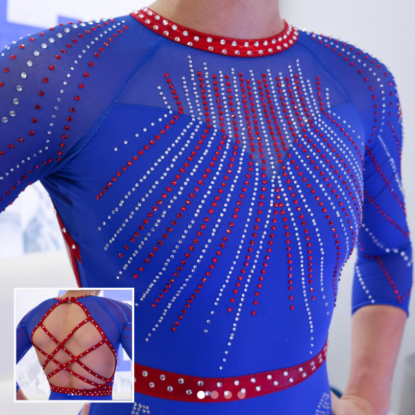
Air Force: 8.375
View images of this leotard here.
Elizabeth: 8.400
Design 2.4/3, Construction 1.8/2, School/Theme Spirit 0.8/1, Creativity 0.8/1, Overall Appearance 2.6/3
This is great! I love the shade of bright blue, and the red accents look amazing paired with it. I also love the cascading rhinestone pattern and how the back straps mimic it a little bit. Plus, the way the party continues onto the sleeves is great. Air Force is such a quietly good leotard team.
Tara: 8.100
Design 2.4/3, Construction 1.6/2, School/Theme Spirit 0.8/1, Creativity 0.7/1, Overall Appearance 2.6/3
This leo is so vibrant and I love it. The fabric is super bright and including the red rhinestones add another level to it. I love the pattern of the rhinestones on front as well as the open, crossy back.
Tyler: 8.400
Design 2.5/3, Construction 1.8/2, School/Theme Spirit 1/1, Creativity 0.6/1, Overall Appearance 2.5/3
This is a stunning leo. I love how bright and impactful the fabric choice is. It really makes the rhinestones pop. The collar matching the band around the waist is a nice touch. This color combo easily could have been too much, but the execution and design are well-balanced and exciting.
Aaron: 8.600
Design 3/3, Construction 2/2, School/Theme Spirit 1/1, Creativity 0.3/1, Overall Appearance 2.3/3
The diamonds and colors are stunning by themselves, but both the blue and red are very saturated which throws off the cohesiveness of the leotard. I think a darker blue would have worked better here, but at least it is very Air Force.
Utah: 7.575
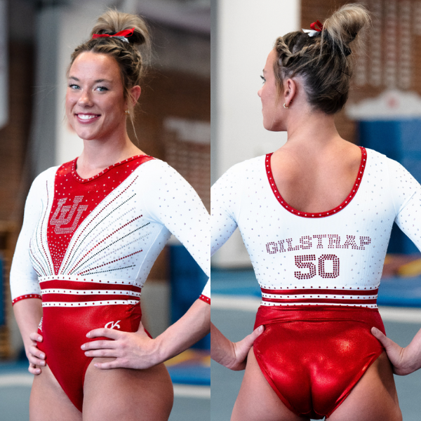
View images of this leotard here.
Elizabeth: 5.600
Design 1.2/3, Construction 0.8/2, School/Theme Spirit 0.9/1, Creativity 0.7/1, Overall Appearance 2.0/3
I really dislike the faux cardigan look, and I don’t understand why teams think it’s cute. This is an otherwise good leotard, though. I love the matte white and red, the back is fun, and the red rhinestones really pop.
Tara: 8.100
Design 2.4/3, Construction 1.6/2, School/Theme Spirit 0.8/1, Creativity 0.8/1, Overall Appearance 2.5/3
I like this! It’s a nice blend of elegant and sporty. The combination of the V with the rhinestone pattern on the front works well, the back is unique with the names and “50” for Utah gymnastics’ 50th anniversary, and the lines around the waistline bring it together. It’s the perfect leo to represent 50 years of Utah gymnastics.
Tyler: 6.900
Design 2/3, Construction 1.2/2, School/Theme Spirit 0.8/1, Creativity 0.7/1, Overall Appearance 2.2/3
I wasn’t a huge fan upon first viewing, but the more I looked at this leo, the more I liked it. The design feels celebratory, and I love white on a leo. I think the color blocking gives it a vaguely vintage look, which makes sense for the 50th anniversary.
Aaron: 9.700
Design 3/3, Construction 2/2, School/Theme Spirit 1/1, Creativity 1/1, Overall Appearance 2.7/3
I love a throwback leotard, especially one done as well as this one. The last name on the back is a great touch. It’s modern yet it screams the powerful legacy of Utah gymnastics. This leotard is definitely not in your face, but it’s well executed and has a deeper meaning behind it.
Iowa: 7.550
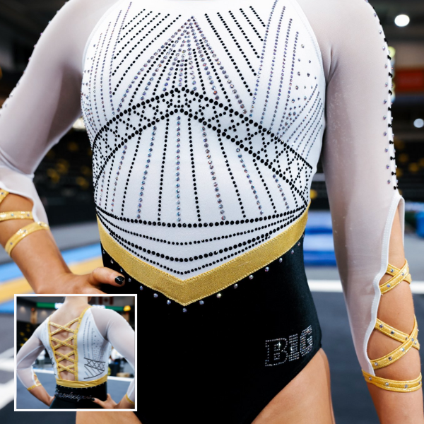
View images of this leotard here and a video here.
Elizabeth: 8.600
Design 2.7/3, Construction 1.5/2, School/Theme Spirit 0.8/1, Creativity 0.8/1, Overall Appearance 2.8/3
I LOVE this. Maybe my new favorite Iowa leo. The mostly matte white and black look really makes the gold pop, and I love the rhinestone design; the use of different-colored sparkles was so smart. My only gripe is the sleeves. While I like the concept, the execution just wasn’t there. Some parts look too tight while other areas look a bit loose.
Tara: 7.700
Design 2.6/3, Construction 1.3/2, School/Theme Spirit 0.7/1, Creativity 0.8/1, Overall Appearance 2.3/3
I love almost everything about this—the front, the criss-cross back, the balance of color…it’s all lovely. I want to like the open, crossy sleeves, but the execution isn’t quite there. It’s a unique concept, but the fabric just doesn’t lay right.
Tyler: 7.000
Design 2.2/3, Construction 1.2/2, School/Theme Spirit 0.8/1, Creativity 0.8/1, Overall Appearance 2/3
I love this color combination. The complex rhinestone pattern is effective, and the back straps are unique. Unfortunately, I think this leo is over-designed. The sleeve straps are totally unnecessary and poorly executed.
Aaron: 6.900
Design 2/3, Construction 1.2/2, School/Theme Spirit 1/1, Creativity 0.7/1, Overall Appearance 2/3
The first thing I notice is the strappy arms and back, which for me is not working. The back is okay, and the strappy arms are at least unique. This leotard is at least pretty different from ones I’ve seen from other programs, but I feel like Iowa has put out a similar rendition of this leotard before.
Utica: 7.550
Elizabeth: 7.800
Design 2.2/3, Construction 1.7/2, School/Theme Spirit 0.7/1, Creativity 0.7/1, Overall Appearance 2.5/3
I swear, Utica’s leotard budget must rival Oklahoma’s because the number of new leotards we’ve seen from it is pretty insane, especially for a DIII team. From afar, this leo appears boring. However, once you see the details, it’s actually quite nice. I like the subtle orange incorporated, and the sleeves are especially nice. I also like the back straps and how the white really makes them pop.
Tara: 7.500
Design 2.2/3, Construction 1.7/2, School/Theme Spirit 0.7/1, Creativity 0.5/1, Overall Appearance 2.4/3
Utica is really killing the leotard game, even more so when you consider it’s a Division III program! The blue and white ombre is lovely, the crossy back is nice, and the positioning of the rhinestones takes it to the next level.
Tyler: 6.800
Design 2/3, Construction 1.8/2, School/Theme Spirit 0.5/1, Creativity 0.5/1, Overall Appearance 2/3
This is a solid leo, especially for a newer program. I love the orange rhinestones on the dark blue background. The placement of the stones specifically is a highlight for me in this design. However, I am not a fan of the thick straps on the back. I think if there was a variety of thicknesses in the back straps, I might like the design more.
Aaron: 8.100
Design 2.4/3, Construction 2/2, School/Theme Spirit 0.7/1, Creativity 0.3/1, Overall Appearance 2.7/3
I enjoy this leotard, although it doesn’t necessarily stand out. The navy and blue blend well together, and the ombre arms are a nice touch. The neck also rides up to the perfect level and doesn’t look too uncomfortable.
Penn State: 6.650
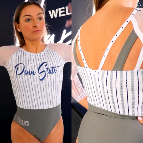
View a video of this leotard here.
Elizabeth: 8.800
Design 2.6/3, Construction 1.8/2, School/Theme Spirit 1.0/1, Creativity 0.9/1, Overall Appearance 2.5/3
This screams Penn State. I love grey because it’s such a rarely used color for most teams. In this case, it works well with the matte white because it allows the blue to really pop. I also love the pinstripes and the unique back.
Tara: 8.300
Design 2.5/3, Construction 1.7/2, School/Theme Spirit 0.7/1, Creativity 0.8/1, Overall Appearance 2.6/3
The grey and white balance super well with the script blue “Penn State”. I love how the striping is subtle—I saw someone say it reminded them of baseball uniforms and I definitely see where they’re coming from with the pinstripe look. Plus, it works super well with the leo. I also love how the open, strappy back is executed while being different from a lot of open backs we’ve seen over the years.
Tyler: 5.000
Design 1/3, Construction 1.5/2, School/Theme Spirit 0.8/1, Creativity 0.5/1, Overall Appearance 1.2/3
So, I really dislike this leo. I can appreciate the unique choices that were made in the construction, especially the unique straps in the back and vertical pinstripes. But, I am not a fan of this color combination. The grey included in the bottom third of the leo does not work for me. I wish the grey was incorporated more throughout the leo so the solid section of the color wasn’t so out of place.
Aaron: 4.500
Design 1/3, Construction 1/2, School/Theme Spirit 0.5/1, Creativity 1/1, Overall Appearance 1/3
This leotard has great potential but I am not loving the gray bottom and white top. The colors clash, making it look like a separate bottom and top half. I do enjoy the loud and obvious “Penn State” in the front, though.
Utah State: 6.625
View images of this leotard here.
Elizabeth: 6.800
Design 1.5/3, Construction 1.6/2, School/Theme Spirit 1.0/1, Creativity 1.0/1, Overall Appearance 1.7/3
This is objectively ugly, but I appreciate the fact that Utah State went all in with the design. I definitely prefer the first “Spectrum Magic” design to this one, but there’s something retro about this that makes me not hate it like I should. The design is literally the seats!
Tara: 7.000
Design 1.7/3, Construction 1.6/2, School/Theme Spirit 1.0/1, Creativity 1.0/1, Overall Appearance 1.7/3
Is this the prettiest leo? No. Is it objectively VERY Utah State? Yes. The ode to the seats in the arena is clever; someone in our Slack said it looks like a beehive which is also fitting since Utah is the beehive state. The strappy back is my favorite part.
Tyler: 5.700
Design 1/3, Construction 1.5/2, School/Theme Spirit 1/1, Creativity 1/1, Overall Appearance 1.2/3
This leo is hard to look at. The design is VERY busy. And, without context, the pattern on the front is confusing. Is it a beehive? Gold coins from Mario Bros? Scales? But, once I understood the “Spectrum Magic” theme of honoring 55 years of fans supporting the teams at the Dee Glen Smith Spectrum, I was endeared to this leo portraying the seats of the arena. I can’t help but appreciate a big swing, even if it’s an aesthetic miss.
Aaron: 7.000
Design 2.3/3, Construction 1/2, School/Theme Spirit 0.7/1, Creativity 1/1, Overall Appearance 2/3
This is one of the more unique leotards I’ve seen in a while, so I give credit to Utah State for going outside the box. The design almost reminds me of honeycomb but I’m not exactly sure what the leotard is going for. It is not the prettiest, but I have seen way worse.
Maryland: 6.575
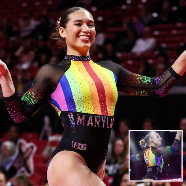
View a video of this leotard here.
Elizabeth: 8.200
Design 2.2/3, Construction 1.8/2, School/Theme Spirit 1.0/1, Creativity 1.0/1, Overall Appearance 2.2/3
Look… Is this leo “good?” Not really; it’s giving circus tent a little. But I also don’t really care because it’s bigger than that. Maryland, a team so close to D.C., being this bold with a Pride leo is really awesome to see. My favorite parts are the nearly full sleeves of rainbow rhinestones and trans-color back straps.
Tara: 6.900
Design 1.7/3, Construction 1.7/2, School/Theme Spirit 1.0/1, Creativity 0.8/1, Overall Appearance 1.7/3
While I don’t actually love the design of this leo aesthetically, it’s hard to fault it too much when it’s definitely giving “Pride meet leo.” The rainbow rhinestones on the sleeve are my favorite part. The “Maryland” across the front and “Terrapins” across the back are nice touches as well.
Tyler: 7.500
Design 1.9/3, Construction 1.8/2, School/Theme Spirit 1/1, Creativity 0.8/1, Overall Appearance 2/3
I am partial to a Pride leo, so I might be grading on a curve here. I really love the sleeves. The pride rainbow made of stones on the black fabric is stunning. I just wish they would have continued that design on the front instead of opting for the aggressive, solid rainbow panel.
Aaron: 3.700
Design 1/3, Construction 1/2, School/Theme Spirit 0.2/1, Creativity 0/1, Overall Appearance 1.5/3
I love a good pride leotard, but this just looks like they sewed a rainbow flag onto a leotard and called it a day. The vibrant rainbow clashes with the muted black accents, but the sparkles are top notch.
California: 6.125
View a video of this leotard here.
Elizabeth: 5.600
Design 1.6/3, Construction 1.4/2, School/Theme Spirit 0.6/1, Creativity 0.4/1, Overall Appearance 1.6/3
While California knocks it out of the park when it debuts a leo that’s really out of the box, its standard blue designs are always boring and all look so similar that it’s hard to tell them apart. I like the sides on this design, but there’s really nothing special about it. It’s just another blue leo with sparkles, and the construction feels a bit off.
Tara: 6.000
Design 1.8/3, Construction 1.4/2, School/Theme Spirit 0.6/1, Creativity 0.4/1, Overall Appearance 1.8/3
I don’t hate it and I don’t love it. Cal blue is lovely and the sparkles are nice, but it’s just not particularly special or memorable. Plus, the cutoffs between the mesh and fabric aren’t my favorite.
Tyler: 5.000
Design 1.5/3, Construction 1.2/2, School/Theme Spirit 0.5/1, Creativity 0.3/1, Overall Appearance 1.5/3
If you asked an AI image generator to create a “sparkly blue gymnastics leo,” I imagine you’d get something like this. Is it bad? No. Is it boring? Certainly.
Aaron: 7.900
Design 2.5/3, Construction 1.5/2, School/Theme Spirit 1/1, Creativity 0.2/1, Overall Appearance 2.7/3
Overall, this leotard looks great. The mesh arms are cohesive with the rest of the leotard and the sparkles are heavy – which I like. However, this looks like every other California leotard I’ve seen. The dark blue is stunning, but it’s nothing new at this point.
Greenville: 6.150
View a video of this leotard here and an image of the front here.
Elizabeth: 7.800
Design 2.2/3, Construction 1.7/2, School/Theme Spirit 1.0/1, Creativity 0.7/1, Overall Appearance 2.2/3
Greenville started off its program leotards a bit rocky, but it’s knocked it out of the park this season. The ombre sleeves on this one are lovely, and the big rhinestone pattern on the chest speaks for itself.
Tara: 5.800
Design 1.4/3, Construction 1.5/2, School/Theme Spirit 0.9/1, Creativity 0.4/1, Overall Appearance 1.6/3
The ombre sleeves are definitely my favorite part of this leo. The logo on the front and “Panthers” on the back scream Greenville, but there’s not much to it other than that. It’s a solid leo, but not my favorite.
Tyler: 4.800
Design 1.2/3, Construction 1.3/2, School/Theme Spirit 0.8/1, Creativity 0.2/1, Overall Appearance 1.3/3
While I like the stoned pattern of the team’s mascot, everything else is so bland. The orange on the sleeve and the orange on the main design don’t match. I dislike the shape of the cutout on the back. Just not a fan of this one, unfortunately.
Aaron: 6.200
Design 2/3, Construction 1/2, School/Theme Spirit 1/1, Creativity 0.2/1, Overall Appearance 2/3
Stanford started a trend with leotards like this. I love the orange and black mesh and Greenville’s mascot being in the middle screams school spirit, but I have one question – where are the sparkles?
Cortland: 6.125
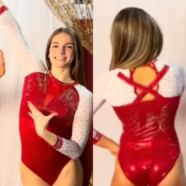
View a video of this leotard here.
Elizabeth: 5.600
Design 1.7/3, Construction 1.6/2, School/Theme Spirit 0.7/1, Creativity 0.6/1, Overall Appearance 1.8/3
It’s a good enough leotard for Cortland. I like the intricate rhinestone design on the front, and the white sleeves paired with the red body is classic and looks good on everyone. The back, however, has too many straps. Like, those small ones at the top near the neckline are completely unnecessary, even if they do mirror the subtle front design.
Tara: 5.900
Design 1.7/3, Construction 1.3/2, School/Theme Spirit 0.6/1, Creativity 0.5/1, Overall Appearance 1.8/3
This is a solid leo overall. The red and white is nice and it has a good amount of sparkle. The “C” on the back gives it school spirit. The transition between the straps and the back is a little abrupt and oversized compared to the cutout, but I like the thought.
Tyler: 5.400
Design 1.6/3, Construction 1.2/2, School/Theme Spirit 0.6/1, Creativity 0.4/1, Overall Appearance 1.6/3
This leo is fine. I appreciate the clean lines, classic look, and tastefully placed stones. The straps on the back are a bit confusing to me. I’m specifically perplexed how the large straps that make up the “X” design on the back end abruptly on the shoulders. I do however like the rest of the back design with the Cortland “C” made out of whitespace. However, I’m partial to Cortland leos that feature dragon elements for their mascot “Blaze the Red Dragon.”
Aaron: 7.600
Design 2.4/3, Construction 1.8/2, School/Theme Spirit 0.7/1, Creativity 0.5/1, Overall Appearance 2.4/3
The combination of red and white is stunning and the sparkles aren’t too overpowering. The “X” strap on the back looks a bit out of a place, but that is my only critique for this leotard.
Fan Poll
Congrats to Utica for once again winning last week’s fan poll! Vote for your favorite design from this week here.
READ THIS NEXT: Gymnast to Coaching: Embracing New Roles in a New Chapter
Article by Elizabeth Grimsley, Tara Graeve, Tyler Irish, and Aaron Doyle


Denver mean score is incorrect, should be 8.650 instead of 6.650
*Cortland