
When the college gymnastics season rolls around, some fans are excited for perfect 10s while others look forward to difficult skills and fun choreography. But we’re not going to lie. While those things are great, we love the leos most of all. And so, we’re back for another season of leotard rankings!
Each week we’re analyzing new designs to find our weekly faves. As always, leos can earn up to three points for design, up to one point each for fabric, sparkle, school spirit, and uniqueness, and up to three points for overall appearance. This week Naomi, Katherine, Mariah, and Talitha are joining editor-in-chief Elizabeth for judging. And, reminder that each season we save all the NCGA and USAG new team leos to judge together at the end of each division’s respective postseason, so be on the lookout for our thoughts on those then!
Don’t agree with our ranking? Make your opinion heard by voting in the fan poll at the end of the article each week or by voicing your thoughts on social media!
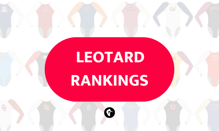
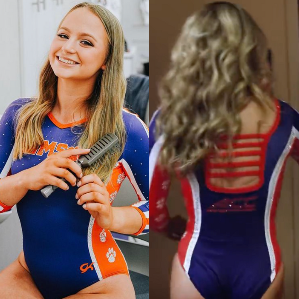
Illinois: 7.820
View a video of this leotard here and images here.
 Elizabeth: 7.800
Design 2.4/3, Fabric 0.9/1, Sparkle 0.8/1, School Spirit 0.7/1, Uniqueness 0.6/1, Overall Appearance 2.4/3
I love an all-orange look, and the shades used here are just phenomenal! The way the design is, and how the different fabrics are mixed, also avoid making it look too one-note, which is a feat. My only (small) complaint is that it doesn’t scream Illinois to me, probably because it doesn’t often do all-orange. But again, that’s a small thing.
 Naomi: 8.200
Design 2.5/3, Fabric 1/1, Sparkle 1/1, School Spirit 0.6/1, Uniqueness 0.7/1, Overall Appearance 2.4/3
I love an orange leo, and this is a particularly great example of one. I’m a big fan of the open back, the sparkle placement, the ombré sleeves, and the shade of orange too. Illinois doesn’t do a lot of orange leos so this didn’t scream “Illinois” to me at first, but overall it’s a great addition to its leo collection!
 Katherine: 7.600
Design 2.5/3, Fabric 0.8/1, Sparkle 0.6/1, School Spirit 0.7/1, Uniqueness 0.7/1, Overall Appearance 2.3/3
Always here for orange! Seems like a great combination of ombre and sparkles, too. I’m just trying to resist the temptation to take points off just because this reveal video continues the trend of showing just enough to get an idea of the whole design but being too dark to really get it. Is it a tease or a full reveal? Make up your mind!
 Mariah: 7.200
Design 2.3/3, Fabric 0.8/1, Sparkle 0.6/1, School Spirit 0.6/1, Uniqueness 0.7/1, Overall Appearance 2.2/3
Despite the fact that I look terrible in orange and would not want to personally wear this, I love an all-orange leo. The different shades and materials go nicely together instead of clashing, and I’ll always love an open back and an ombre sleeve.
 Talitha: 8.300
Design 2.5/3, Fabric 0.9/1, Sparkle 1.0/1, School Spirit 0.8/1, Uniqueness 0.7/1, Overall Appearance 2.4/3
I love this leotard! The ombre effect is beautiful and so is the use of crystals on the chest and the neck. The back is also gorgeous. I’m a bit bothered by the presence of the logo on the forearm, but it’s a minor criticism. A+!
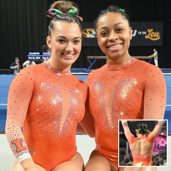
UCLA: 7.780
View a video of this leotard here and images here.
Elizabeth: 7.600
Design 2.4/3, Fabric 0.8/1, Sparkle 0.8/1, School Spirit 0.8/1, Uniqueness 0.8/1, Overall Appearance 2.0/3
My initial reaction wasn’t a positive one, but this is a design that’s definitely grown on me. I just think overall it’s a bit too busy. I want more white and blank space. I love the armpit mesh (not something I thought I’d ever say), and the neck collar (again, not something I thought I’d ever say). As for the back, I wish the straps stopped at the opening and didn’t continue onto the body. That feels unnecessary.
Naomi: 7.700
Design 2.3/3, Fabric 0.9/1, Sparkle 0.8/1, School Spirit 0.8/1, Uniqueness 0.7/1, Overall Appearance 2.2/3
I think I like this. I feel like the lowest yellow flower could have been removed, and I think I would prefer a simpler halter-style neckline without the armpit mesh. I’m also not 100% on the back straps that continue onto the body of the leotard. That being said, the colors here scream UCLA, I’m a big fan of the floral theme, and the leo really stands out! UCLA picked a difficult theme and design and for the most part it pulled it off.
Katherine: 8.200
Design 2.6/3, Fabric 0.8/1, Sparkle 0.8/1, School Spirit 0.8/1, Uniqueness 1/1, Overall Appearance 2.2/3
We’ve seen flowers grow in popularity (no pun intended) lately, but this design takes that trend to another level. There’s a lot going on here, but I think it looks really nice on the whole. I love the color scheme, and the level of detail on the flowers is really impressive, too. This was a risk that paid off.
Mariah: 7.200
Design 2.1/3, Fabric 0.8/1, Sparkle 0.7/1, School Spirit 0.7/1, Uniqueness 0.7/1, Overall Appearance 2.2/3
There’s maybe a bit too much going on here for me, but it doesn’t look too terribly distracting. I applaud the use of yellow and appreciate that they went all in on such a bold design. I don’t love the armpit mesh, and this definitely isn’t my favorite UCLA leo ever, but I can appreciate the concept and the execution. I think this is one that will grow on me.
Talitha: 8.200
Design 2.3/3, Fabric 0.9/1, Sparkle 0.9/1, School Spirit 0.8/1, Uniqueness 1.0/1, Overall Appearance 2.3/3
So, I’m not a fan of super busy designs nor of flowery patterns. However, this leotard has grown on me fast! I can’t help but admire the sophistication of the front design and the sleeves, the clever use of colors, and the beautiful use of crystals. I don’t really like the back straps, though. They give a strange athletic vibe to an otherwise ethereal leotard.
Auburn: 7.260

View images of the front of this leotard here and a video here.
Elizabeth: 6.600
Design 1.7/3, Fabric 0.6/1, Sparkle 0.7/1, School Spirit 0.8/1, Uniqueness 0.5/1, Overall Appearance 2.3/3
Auburn doesn’t use this sort of ombre often, and I really like it. The design itself on the front is pretty overdone, so the back was certainly needed to elevate the leo as a whole. I love how “Auburn” is displayed on the back strap.
Naomi: 8.300
Design 2.4/3, Fabric 1/1, Sparkle 0.8/1, School Spirit 1/1, Uniqueness 0.6/1, Overall Appearance 2.5/3
Love it! Is it an Earth-shattering design? No. But everything is executed really well. I love the white-orange-navy ombré sleeves, I love the sparkle placement, and I’m obsessed with the ombré deep V. I even like “Auburn” going across a back strap, although I’m not a massive fan of the other back straps being sparkly.
Katherine: 6.800
Design 2.3/3, Fabric 0.6/1, Sparkle 0.6/1, School Spirit 0.8/1, Uniqueness 0.4/1, Overall Appearance 2.1/3
This is nice, but I didn’t realize it was new at first glance; it feels like it takes all of Auburn’s other recent favorite motifs (white and orange ombre, navy body, squiggly sparkles, etc.) and puts them together in one design. It follows that this doesn’t get a lot of uniqueness points from me, with the exception of the Auburn on the backstrap; that’s a nice touch.
Mariah: 7.600
Design 2.3/3, Fabric 0.9/1, Sparkle 0.8/1, School Spirit 0.8/1, Uniqueness 0.5/1, Overall Appearance 2.3/3
This is probably one of my favorite recent Auburn looks, but to be honest, I didn’t realize it was new when I was watching the meet. I love the variation in the crystals used, and the ombre is perfect. I don’t love how wide the back straps are or just how wide the open back is in general, but the rest is great.
Talitha: 7.000
Design 2.2/3, Fabric 0.8/1, Sparkle 0.8/1, School Spirit 0.8/1, Uniqueness 0.8/1, Overall Appearance 2.4/3
I like this, but I didn’t immediately realize it was new. Perhaps it’s because the front is reminiscent of other pre-existing leotards? That aside, I love the ombre effect, and I adore the back. Extra points from me!
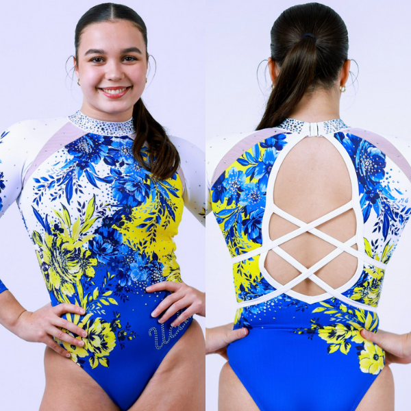
Arizona: 7.160
View images of this leotard here and a video here.
Elizabeth: 7.100
Design 2.0/3, Fabric 0.6/1, Sparkle 0.7/1, School Spirit 1.0/1, Uniqueness 0.8/1, Overall Appearance 2.0/3
It’s an updated version of the “old” flag leo Arizona has, and I like it! The shoulders on video are SO sparkly, and I love the use of the rhinestones to really make the design pop. I do think I prefer the old version a touch more, but that’s just personal preference.
Naomi: 7.100
Design 2.1/3, Fabric 0.8/1, Sparkle 0.6/1, School Spirit 0.8/1, Uniqueness 0.8/1, Overall Appearance 2/3
This leo looks great in photos, but I’m not as big of a fan of it on TV. The red sparkles really got lost, and I think the shoulders are over-sparkled. I also think the navy neckline is a bit too thick. I love the Arizona flag idea, but for me the sparkle placement just isn’t quite perfect.
Katherine: 7.700
Design 2.5/3, Fabric 0.7/1, Sparkle 0.7/1, School Spirit 0.7/1, Uniqueness 0.6/1, Overall Appearance 2.5/3
I was absolutely obsessed with Arizona’s original flag design, so I guess it’s natural that any other attempt would fall flatter in comparison. I don’t hate this, but I definitely preferred the brighter colors of the OG design. Otherwise, though, I like the sparkles and block A on the back.
Mariah: 7.000
Design 1.8/3, Fabric 0.7/1, Sparkle 0.8/1, School Spirit 0.8/1, Uniqueness 0.8/1, Overall Appearance 2.1/3
I LOVED the initial iteration of this leotard, and while this one is still pretty, it falls a bit flat in comparison for me. I really like the amount of sparkle, but I wish there was maybe red fabric under the red sparkles? They just don’t stand out as much as I would like them to. Other than that, this is solid, just not as good as the original.
Talitha: 6.900
Design 1.9/3, Fabric 0.7/1, Sparkle 0.8/1, School Spirit 0.8/1, Uniqueness 0.7/1, Overall Appearance 2.0/3
I quite like this, but I think more could’ve been done to match the top and the bottom halves of the leotard. They kind of look like two separate designs stitched together, and I only mildly buy into it. I wish the neck had crystals too, it feels a bit plain compared to the rest.
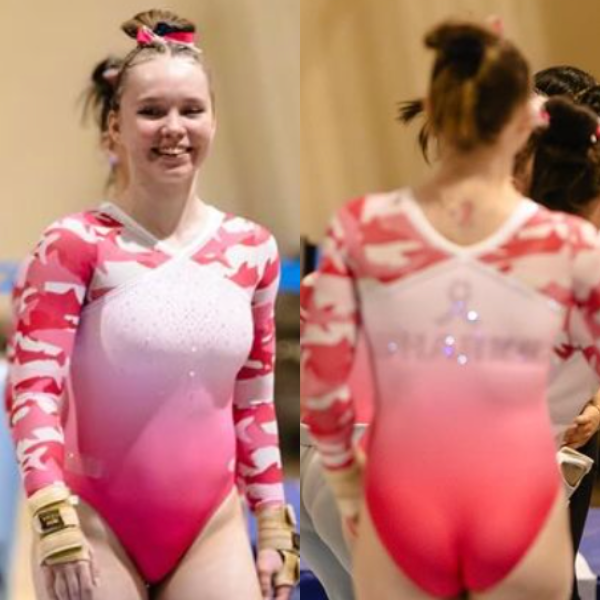
Oregon State: 7.060

View a video of this leotard here.
Elizabeth: 6.900
Design 2.0/3, Fabric 0.7/1, Sparkle 0.7/1, Theme Spirit 0.8/1, Uniqueness 0.7/1, Overall Appearance 2.0/3
I like the sort of geometric design of this leo a lot. The shade of pink used may not necessarily be for me, but it certainly pops on the screen. My only complaint is there isn’t more here that screams Oregon State.
Naomi: 6.000
Design 2/3, Fabric 0.5/1, Sparkle 0.6/1, Theme Spirit 0.8/1, Uniqueness 0.6/1, Overall Appearance 1.5/3
Hrm. I can think of a lot of elements I like in isolation, but the whole is not equal to the sum of its parts. I think the main thing I’m struggling with is the contrasting shades of pink in these particular fabrics, plus the very low, and in my opinion unnecessary, back straps. It’s on theme, and to me the geometric sparkle pattern is pretty Oregon State, but I’m just not particularly enthusiastic about this leo.
Katherine: 8.000
Design 2.5/3, Fabric 0.8/1, Sparkle 0.8/1, Theme Spirit 0.6/1, Uniqueness 0.7/1, Overall Appearance 2.6/3
As with the Illinois design, I absolutely love it, even more than that one I think… This video just drives me crazy! That aside, this probably ties with Michigan State’s stunner as my favorite pink leo of all time. I love the criss-cross sparkles on the front, and the shade of pink is just right.
Mariah: 6.300
Design 2.1/3, Fabric 0.6/1, Sparkle 0.5/1, Theme Spirit 0.7/1, Uniqueness 0.5/1, Overall Appearance 1.9/3
To be transparent, I’m not a fan of pink, specifically bright pink, so the multiple shades is a bit hard for me to look at. The design is nice, however, and the pink is obviously on theme. I also really like the back. I wish there had been some sort of school logo/name/signifier somewhere though because it could be any team’s leo.
Talitha: 8.100
Design 2.4/3, Fabric 0.9/1, Sparkle 0.8/1, Theme Spirit 1.0/1, Uniqueness 0.6/1, Overall Appearance 2.4/3
I like this design, especially the chest. I also really like the back. It looks more like a Florida pink leotard than an Oregon State one, but the leo itself is lovely.
Clemson: 6.640
View an image of the front of this leotard here and a video here.
Elizabeth: 7.200
Design 2.0/3, Fabric 0.7/1, Sparkle 0.8/1, School Spirit 1.0/1, Uniqueness 0.7/1, Overall Appearance 2.0/3
I love an athletic look, so this design really speaks to me. However, I like the front more than the back. On the back, the ACC logo is weirdly big, and the sides almost cut too far into the back purple panel. Overall, it’s a good design, though.
Naomi: 5.500
Design 1/3, Fabric 0.5/1, Sparkle 0.5/1, School Spirit 1/1, Uniqueness 1/1, Overall Appearance 1.5/3
This is one of those leos where I feel like it’s gone too far down the “athletic” road and ends up looking more like a swimsuit than anything else. I like the back and the color blocking, but it just doesn’t come together as an NCAA gymnastics leo for me.
Katherine: 5.100
Design 1.5/3, Fabric 0.5/1, Sparkle 0.4/1, School Spirit 1/1, Uniqueness 0.5/1, Overall Appearance 1.2/3
Clemson has made quite the noise in its inaugural seasons on all fronts: scores, home attendance, and, love them or hate them, leotard designs. While the school spirit definitely abounds with this one, there’s too many design elements I don’t like, most of all the orange sides (they just don’t fit in with the rest) and the half-strappy back. It’s mostly a miss for me.
Mariah: 7.500
Design 2.3/3, Fabric 0.8/1, Sparkle 0.5/1, School Spirit 1.0/1, Uniqueness 0.7/1, Overall Appearance 2.2/3
We saw this one in preseason, and I’ve been excited for Clemson to actually debut it in competition! I love the athletic look and the simplicity of the design as a whole. It lacks a bit of sparkle, but it makes up for it in school spirit. This is my favorite from Clemson leo so far.
Talitha: 7.900
Design 2.4/3, Fabric 0.9/1, Sparkle 0.6/1, School Spirit 0.9/1, Uniqueness 0.8/1, Overall Appearance 2.3/3
I really like this! I think it’s perfect for Clemson’s first season—it’s the type of leotard that, 15 or 20 years from now, future Clemson teams will look back on and will recreate as a vintage design. I’m not a fan of the back, but the front and the sides are lovely!
Towson: 6.380
View images of the front of this leotard here and the back here.
Elizabeth: 7.200
Design 2.2/3, Fabric 0.7/1, Sparkle 0.7/1, School Spirit 0.8/1, Uniqueness 0.6/1, Overall Appearance 2.2/3
I really like this. It’s fairly simple, but the gold rhinestones and criss-crosses on the back really pop. It’s also a flattering cut and design on all the gymnasts.
Naomi: 7.600
Design 2.3/3, Fabric 0.8/1, Sparkle 0.6/1, School Spirit 1/1, Uniqueness 0.7/1, Overall Appearance 2.2/3
I like it, but I think there is room for improvement. I really wish there was an open strappy back rather than the faux straps going through the mesh. And the rhinestones on the arms feel a little tacked on. But I love the shiny fabric and the high neck, and the overall leo has a great athletic feel!
Katherine: 5.700
Design 2/3, Fabric 0.4/1, Sparkle 0.3/1, School Spirit 1/1, Uniqueness 0.3/1, Overall Appearance 1.7/3
Meh. In spite of the big sparkly Tiger logo, I think this is pretty dull overall. There’s barely a sparkle in sight on the rest, and I almost wish the ones that are there weren’t because they look thrown on as an afterthought. There isn’t anything awful about it; I’m just bored.
Mariah: 6.100
Design 1.9/3, Fabric 0.6/1, Sparkle 0.5/1, School Spirit 0.7/1, Uniqueness 0.6/1, Overall Appearance 1.8/3
This is a pretty solid look. I’m not crazy about the gold fake straps on the back, and I wish it had more sparkle. Otherwise, it’s a pretty classic looking design, so it’s hard to be mad at it.
Talitha: 5.300
Design 1.5/3, Fabric 0.6/1, Sparkle 0.4/1, School Spirit 0.8/1, Uniqueness 0.5/1, Overall Appearance 1.5/3
I’m not a huge fan of the design nor of the use of mesh. I’m also not convinced that the back design matches the front. Overall, I can see that it’s a good effort, but I don’t love it.
Eastern Michigan: 5.500
View a video of this leotard here.
Elizabeth: 6.200
Design 1.7/3, Fabric 0.5/1, Sparkle 0.6/1, School Spirit 0.8/1, Uniqueness 0.8/1, Overall Appearance 1.8/3
The reveal video makes me like this design more than I should, I think. I love the back on it, the shade of green used, and the matte white. I don’t like, as Savanna calls it, the boob sling design on the front. Maybe if the fabric was flat instead it would be better?
Naomi: 4.900
Design 1/3, Fabric 0.5/1, Sparkle 0.8/1, School Spirit 0.8/1, Uniqueness 0.8/1, Overall Appearance 1/3
I love a matte white, and I love this color combo. After that, I have very few positive things to say about this leo. I really don’t like the green fabric crossing at the neck. The ruching throws off the sparkle pattern. The whole leo seems designed to draw attention to the gymnasts’ chests, which is a big pet peeve of mine. I just don’t get why leo designers think this boob sling look is in any way a good idea.
Katherine: 5.400
Design 1.4/3, Fabric 0.7/1, Sparkle 0.7/1, School Spirit 0.6/1, Uniqueness 0.5/1, Overall Appearance 1.5/3
Oh man, I really want to like this, but that ruching at the top…why? I like the dark green against the white, and the sparkles at the wrists are pretty, too. I’m just so distracted by the top.
Mariah: 5.100
Design 1.2/3, Fabric 0.6/1, Sparkle 0.5/1, School Spirit 0.7/1, Uniqueness 0.6/1, Overall Appearance 1.5/3
Respectfully, I’m not a fan. The back is fine, but the front design is lacking a bit in execution for me. The green fabric looks too bulky, especially all bunched up at the neck. I love this shade of green on leotards, and I’m always a fan of matte white, but I think the contrast just adds to the disjointedness of this particular design. Maybe a lighter-weight fabric or something less shiny or contrasting could’ve been better here?
Talitha: 5.900
Design 2.0/3, Fabric 0.2/1, Sparkle 0.5/1, School Spirit 0.7/1, Uniqueness 0.7/1, Overall Appearance 1.8/3
I’m probably the only one, but I quite like the ruching effect. Unfortunately, I don’t think that it’s the right fabric for it. I also wonder if, for this type of design, black, rather than white, would’ve been a better color.
Iowa: 5.000
View a video of this leotard here.
Elizabeth: 4.900
Design 1.5/3, Fabric 0.6/1, Sparkle 0.5/1, School Spirit 0.5/1, Uniqueness 0.3/1, Overall Appearance 1.5/3
It’s pretty boring and yet another leo from Iowa that doesn’t use yellow or gold, but I don’t hate it. I think the way the logo rhinestones go over multiple fabrics is clever, and I like the sleeve mesh in the same way I liked it on the recent Arkansas leo. But otherwise this is super plain and doesn’t have much excitement going on with it.
Naomi: 4.900
Design 1/3, Fabric 0.4/1, Sparkle 0.8/1, School Spirit 0.7/1, Uniqueness 1/1, Overall Appearance 1/3
Umm…I guess I’m impressed that Iowa managed to ruin a simple but effective design with such ill-placed mesh. Why is the hawk logo split down the middle? Why is there mesh going down the sides of the sleeves? Why is there a tiny mesh triangle in the back? And why is Iowa allergic to the color yellow? We will never know the answers to these questions.
Katherine: 5.400
Design 2/3, Fabric 0.4/1, Sparkle 0.3/1, School Spirit 0.7/1, Uniqueness 0.3/1, Overall Appearance 1.7/3
My feelings about this one are basically identical to my feelings about Towson’s, coupled with the usual disgruntlement with Iowa for never going that extra mile to create a really unique and different design. Couldn’t the Hawkeye at least have been yellow? Again, it’s not bad, just so boring.
Mariah: 4.900
Design 1.5/3, Fabric 0.7/1, Sparkle 0.5/1, School Spirit 0.4/1, Uniqueness 0.3/1, Overall Appearance 1.5/3
As usual with Iowa, there’s no yellow, so I have to dock points on school spirit. This is also just not very cute. I love the mesh on the sleeves, but I don’t really understand its purpose on the neckline. If they wanted something more eye catching on the front, they could’ve just done the hawkeye in yellow crystals.
Talitha: 4.900
Design 1.2/3, Fabric 0.5/1, Sparkle 0.4/1, School Spirit 0.6/1, Uniqueness 0.6/1, Overall Appearance 1.6/3
I’m sorry, I don’t like this… I usually enjoy imaginative uses of mesh fabric, but this is just not very pretty. The crystal pattern is also a bit boring. Underwhelming.
LIU: 4.500
View images of this leotard here.
Elizabeth: 2.500
Design 0.5/3, Fabric 0.6/1, Sparkle 0.2/1, Theme Spirit 0.6/1, Uniqueness 0.1/1, Overall Appearance 0.5/3
No. For so many different reasons. I still think the shark camo is clever, but that’s just about the only thing I like about this leo. I hate when teams just copy a leo they already have but make it pink for the theme. It’s lazy. I also am never a fan of the inverted V neckline.
Naomi: 4.600
Design 1.5/3, Fabric 0.5/1, Sparkle 0.4/1, Theme Spirit 1/1, Uniqueness 0.2/1, Overall Appearance 1/3
When I look at this I just hear the TikTok “oh no” sound in my head. I was iffy on the shark camo thing to begin with, and it’s heartbreaking to see LIU use its very limited leo budget on a pre-existing design in pink. I guess the ombré on the body isn’t too bad? And it’s a pink leo that’s pink? After that, I kind of run out of nice things to say.
Katherine: 6.100
Design 1.8/3, Fabric 0.4/1, Sparkle 0.6/1, Theme Spirit 0.8/1, Uniqueness 0.6/1, Overall Appearance 1.9/3
I’m getting ready to dodge the tomatoes that are about to get thrown at me for saying I don’t hate this, probably because I don’t hate the shark camo motif LIU is becoming known for. Other than that, it’s your typical pink leo; not much else bad to say about it.
Mariah: 5.400
Design 1.6/3, Fabric 0.6/1, Sparkle 0.4/1, Theme Spirit 1.0/1, Uniqueness 0.3/1, Overall Appearance 1.5/3
This reminds me a lot of the pink camo shirts my high school made for a pink-out football game back in, like, 2012, which is not necessarily a compliment. Incorporating the sharks into the camo pattern is creative, but LIU has done it before, so even that aspect doesn’t feel particularly unique. It’s on theme and manages to have school spirit as well, which was my gripe with the Oregon State pink leo. The ombre is also really pretty, so I’ll give it that.
Talitha: 3.900
Design 1.2/3, Fabric 0.7/1, Sparkle 0.7/1, Theme Spirit 0.8/1, Uniqueness 0.2/1, Overall Appearance 1.0/3
I love pink, but it really doesn’t belong with sharks, does it? This is a no for me, sorry. I quite like the use of ombre, but I’m really not drawn to the sleeves nor, as Elizabeth said, to the inverted V neckline.
Fan Poll
Congrats to Kent State for winning last week’s fan poll! Vote for your favorite design from this week here.
READ THIS NEXT: Leotard Rankings: Week 6
Article by Elizabeth Grimsley, Naomi Stephenson, Katherine Weaver, Mariah Dawson, and Talitha Ilacqua
I vote for Lindenwood’s debut leo this week. Designated ‘the Finale’, unfortunately. I guess you missed that one.
We judge all USAG leotards together the week after USAG nationals! It will be included there.
When you’re comparing a leo that’s an updated design to its older counterpart (like az this week), can you in the future link to an image of the older version too for those who don’t know it?
That’s a great idea! For Michigan State and Penn State, we believe the videos linked show the older version, but we will try to do this moving forward. Thanks for the suggestion!