
It’s NCAA gymnastics season and the leotards are as sparkly as ever. And with new designs comes your favorite series: Leotard Rankings! Each week we’re analyzing leotard debuts to find our weekly faves. There will be up to three points for design, up to one point each for fabric, sparkle, school spirit and uniqueness, and up to three points for overall appearance. This week Izzi, Savanna and Katherine are joining our editor-in-chief, Elizabeth, to help judge.
Don’t agree with our ranking? Make your opinion heard by voting in the fan poll at the end of the article each week or voicing your thoughts on social media.
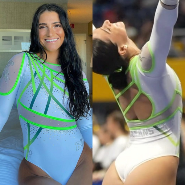
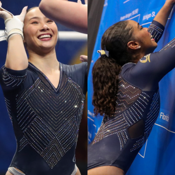
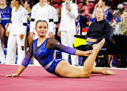
Michigan State: 8.525
View a video of this leotard here.
 Elizabeth: 9.100
Design 2.8/3, Fabric 0.9/1, Sparkle 0.8/1, School Spirit 0.9/1, Uniqueness 0.9/1, Overall Appearance 2.8/3
I LOVE this. I’ll admit, it’s not as good from afar, but I don’t care? The white is GREAT. The neon and Spartan green combo is GREAT. The design flows SO well and is—you guessed it—great! Michigan State stays winning.
 Izzi: 6.900
Design 2.4/3, Fabric 1.0/1, Sparkle 0.7/1, School Spirit 0.4/1, Uniqueness 0.9/1, Overall Appearance 1.5/3
I agree with Elizabeth that this looks much better in these pictures than from far away. I don’t really get the lime green, but the white is great. The flow of all the lines together is perfect—it really makes the leo one cohesive look.
 Savanna: 8.800
Design 2.7/3, Fabric 0.8/1, Sparkle 0.8/1, School Spirit 0.8/1, Uniqueness 1.0/1, Overall Appearance 2.7/3
This was one of my favorites from the weekend! Everything flows together beautifully from the stripes and sparkle on the front (even if I wish they were a slightly darker green) to the straps on the back. A win for the Spartans!
 Katherine: 9.300
Design 2.9/3, Fabric 0.9/1, Sparkle 0.7/1, School Spirit 0.8/1, Uniqueness 1.0/1, Overall Appearance 3.0/3
I love everything about this. This neon green feels sort of throwback Y2K, but with a modern twist with the white and ombre elements. Michigan State has been my favorite leo team for a minute now, and this design capped off another great season of that.
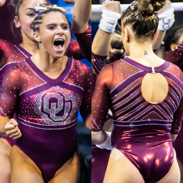
Oklahoma: 7.700
View a video of this leotard here.
Elizabeth: 7.100
Design 2.0/3, Fabric 0.7/1, Sparkle 0.6/1, School Spirit 0.8/1, Uniqueness 0.6/1, Overall Appearance 2.4/3
This is great. It’s very classic Oklahoma but with a bit of an updated twist with the shimmery arms. The neckline isn’t my favorite—I almost might have preferred the sleeves to be white to really make the design pop—but it’s a very athletic look, which I do enjoy.
Izzi: 7.900
Design 2.3/3, Fabric 0.8/1, Sparkle 1.0/1, School Spirit 0.9/1, Uniqueness 0.4/1, Overall Appearance 2.5/3
Thank god they returned to this simpler, more athletic look for the regional final. These are the kinds of Oklahoma leos from the early 2010s that I loved. I agree with Elizabeth on the sleeves, I would have loved to see the cream color that Oklahoma usually does so well.
Savanna: 8.100
Design 2.5/3, Fabric 0.8/1, Sparkle 1.0/1, School Spirit 0.8/1, Uniqueness 0.5/1, Overall Appearance 2.5/3
Love the simplicity of this one! Like everyone else said, this one returns to the glory days of Sooner leotards. The sparkles on the back makes this for me. They’re not too much but they make it stand out.
Katherine: 7.700
Design 2.7/3, Fabric 0.7/1, Sparkle 0.6/1, School Spirit 0.7/1, Uniqueness 0.5/1, Overall Appearance 2.5/3
I like this departure to the Oklahoma leo archetype of old. The sparkle explosion around the OU logo is my favorite part. I wish the sleeves delivered just as much shine, but they’re not too bad. This one and Michigan State’s tie for my favorites of the week.
California: 7.700
View a video of this leotard here.
Elizabeth: 8.200
Design 2.4/3, Fabric 0.9/1, Sparkle 0.9/1, School Spirit 0.8/1, Uniqueness 0.8/1, Overall Appearance 2.5/3
After watching the initial video, I thought the leo was nice, but there were certain elements I didn’t love. However, after seeing gymnasts actually wearing and competing in it, I love it! The rhinestone pattern is great, and I love how it’s based off the Bay Bridge. The only thing I’d change is the back. The zipper is a little awkward looking. I might have done a simple scoop back or an open back instead.
Izzi: 8.100
Design 2.2/3, Fabric 0.8/1, Sparkle 1.0/1, School Spirit 0.9/1, Uniqueness 0.4/1, Overall Appearance 2.8/3
This concept feels similar to LSU, but unfortunately I think LSU did it slightly better. This one is really nice though, I don’t even mind the side cutouts. It’s nothing revolutionary, but it looked great on them and I’m always a fan of geometric sparkle patterns.
Savanna: 7.800
Design 2.4/3, Fabric 0.6/1, Sparkle 1.0/1, School Spirit 0.9/1, Uniqueness 0.5/1, Overall Appearance 2.4/3
Love the rhinestone pattern on this one! It gives off a subtle school spirit, and it’s not too much in the overall scheme of things. The v-neck is really nice too, not too deep and it flattered each gymnast that we saw.
Katherine: 6.700
Design 2.1/3, Fabric 0.5/1, Sparkle 0.8/1, School Spirit 0.7/1, Uniqueness 0.6/1, Overall Appearance 2.0/3
It’s OK. The color is a little different than the navy blue California usually goes for, so points for uniqueness. To say it’s based off the bridge is nice in theory, but watching the video, it feels like a reach. Maybe I just don’t get it.
Georgia: 7.525

Elizabeth: 7.500
Design 2.3/3, Fabric 0.7/1, Sparkle 0.7/1, School Spirit 0.8/1, Uniqueness 0.6/1, Overall Appearance 2.4/3
Georgia debuting a leo I mostly like? Is the world ending? The sweetheart neckline is nice, I like the majority red and black design, and all the elements tie in well together.
Izzi: 7.900
Design 2.3/3, Fabric 0.6/1, Sparkle 1.0/1, School Spirit 0.8/1, Uniqueness 0.6/1, Overall Appearance 2.6/3
This is so much simpler than most of Georgia’s recent leos, and I like it! The asymmetry is fun and not too chaotic. I think the ombre is kind of unnecessary, and it would have been nice to continue the color blocking on the sleeves.
Savanna: 8.100
Design 2.5/3, Fabric 0.8/1, Sparkle 0.9/1, School Spirit 0.8/1, Uniqueness 0.5/1, Overall Appearance 2.6/3
Probably my favorite one from Georgia this season! It’s not too much of one element, but each one has its moment to shine throughout the leotard. A win for the Dawgs!
Katherine: 6.600
Design 2.3/3, Fabric 0.5/1, Sparkle 0.6/1, School Spirit 0.5/1, Uniqueness 0.6/1, Overall Appearance 2.1/3
This is pretty. I like the combination of the transparent red mesh on top with the solid red and black on the rest of the body. The sparkles are also pretty. It’s definitely my favorite Georgia leo in a while.
LSU: 7.400

View a video of this leotard here.
Elizabeth: 5.400
Design 1.4/3, Fabric 0.6/1, Sparkle 0.6/1, School Spirit 0.6/1, Uniqueness 0.6/1, Overall Appearance 1.6/3
I’ve come to the conclusion that LSU’s style of leo design isn’t my taste. Which is fine, because that’s my opinion (cough). Anyway, I don’t like the combo of black and purple in this one. Plus, there’s way too much mesh. At least it does look flattering on most of the gymnasts. And another positive? It’s far from the worst leo from this week!
Izzi: 8.700
Design 2.6/3, Fabric 0.8/1, Sparkle 1.0/1, School Spirit 0.7/1, Uniqueness 0.8/1, Overall Appearance 2.8/3
I think I’m going to be the minority on this, but I really love this one! The black and purple is very elegant, though I think this would also look great with a purple body and gold accents. I don’t love the shoulder cutout or the chest hole, but they both fit well enough with the design that it doesn’t bother me. I love the sparkle design and how it flows with the fabric angles as well.
Savanna: 8.900
Design 2.5/3, Fabric 0.9/1, Sparkle 1.0/1, School Spirit 0.9/1, Uniqueness 0.9/1, Overall Appearance 2.7/3
You’re not alone, Izzi! This is much better than its other debut this weekend. The sparkles stood out and reminded me of tiger stripes, a good nod to the mascot. The side cutouts were probably my least favorite part, but I can overlook that because of how well the purple and black worked together.
Katherine: 6.600
Design 2.1/3, Fabric 0.7/1, Sparkle 0.7/1, School Spirit 0.5/1, Uniqueness 0.4/1, Overall Appearance 2.2/3
This feels similar to most other new LSU leos of late. It’s nothing special, but I’m not offended by it. I actually do like the amount of mesh used on the sides. I would also give bonus points for the video shoot idea, because the leo looks cool against the blurred lights of the bridge.
Florida: 7.050

View more pictures of this leotard here.
Elizabeth: 6.000
Design 1.5/3, Fabric 0.8/1, Sparkle 0.5/1, School Spirit 0.6/1, Uniqueness 0.6/1, Overall Appearance 2.0/3
This is boring and I hate the belly band, but I do love the material, subtle black ombre, and shade of blue used in this design. I think I would have preferred a different colored sleeve or maybe something with ombre. I realize that would be “another blue and white Florida leo,” but this shade of blue feels very different to what the Gators normally do.
Izzi: 9.100
Design 2.9/3, Fabric 1.0/1, Sparkle 1.0/1, School Spirit 0.5/1, Uniqueness 0.7/1, Overall Appearance 3.0/3
I thought this was boring when I first saw it, but the more I look at the details, the more I really like how delicate it is. I absolutely love that the open back is paired with a simpler front design. This is how it always should be! I love everything about this leo.
Savanna: 7.000
Design 2.1/3, Fabric 0.6/1, Sparkle 1.0/1, School Spirit 0.4/1, Uniqueness 0.8/1, Overall Appearance 2.1/3
This is fine. It looks a lot like all of the other blue Florida leotards to me, but the back is definitely my favorite part. It’s subtle, even if it doesn’t look super comfortable.
Katherine: 6.100
Design 2.0/3, Fabric 0.5/1, Sparkle 0.7/1, School Spirit 0.3/1, Uniqueness 0.3/1, Overall Appearance 2.3/3
The sparkles are pretty. I also didn’t notice the subtle black ombre until Elizabeth pointed it out. That’s a nice and somewhat unique touch, but other than that, it’s a typical Florida leo and it feels like there’s nothing left to say about it.
UCLA: 7.050

View a video of this leotard here.
Elizabeth: 5.600
Design 1.5/3, Fabric 0.7/1, Sparkle 0.6/1, School Spirit 0.5/1, Uniqueness 0.5/1, Overall Appearance 1.8/3
The back is great—it reminds me of the ombre Penn State leo with the logo on the front—but the front is SO boring. Plus, it doesn’t scream UCLA to me at all. It’s a nice leo in general, but not something I’d pick for a regional final for UCLA.
Izzi: 8.600
Design 2.5/3, Fabric 1.0/1, Sparkle 0.9/1, School Spirit 0.7/1, Uniqueness 0.8/1, Overall Appearance 2.7/3
UCLA has been trying to do a lot with their recent leos, and I like that this one is simpler. With that open back, you don’t need a ton going on in the front, and I like the sparkle pattern they chose. It would have been nice to see some gold sparkle on here for more school spirit, though.
Savanna: 7.400
Design 2.1/3, Fabric 0.9/1, Sparkle 0.8/1, School Spirit 0.3/1, Uniqueness 0.9/1, Overall Appearance 2.4/3
Open. Strappy. Back. Yes, please! The front is OK—I wish it had something UCLA related on it—but the back automatically wins this for me.
Katherine: 6.600
Design 2.2/3, Fabric 0.7/1, Sparkle 0.7/1, School Spirit 0.4/1, Uniqueness 0.4/1, Overall Appearance 2.2/3
I like the sparkle pattern a lot, especially how it’s replicated on the front and the sleeves. The way UCLA almost looks like it’s part of that design is a nice touch, too. It’s not the most exciting leo, but it looks pretty overall.
Nebraska: 6.725

View images of this leotard here.
Elizabeth: 6.000
Design 1.7/3, Fabric 0.7/1, Sparkle 0.7/1, School Spirit 0.6/1, Uniqueness 0.5/1, Overall Appearance 1.8/3
This is pretty good! It’s boring, but there’s nothing I dislike about it. A basic black leo is hard to get wrong, and I like the splash of color and school spirit with the red and white lines.
Izzi: 7.300
Design 2.0/3, Fabric 0.7/1, Sparkle 0.7/1, School Spirit 0.9/1, Uniqueness 0.7/1, Overall Appearance 2.3/3
Looking at these pictures now, I kind of wish they put the Huskers on the front. The front looks a little blank to me, and the placement of Huskers on the back feels odd. Otherwise, I have no complaints.
Savanna: 7.200
Design 2.1/3, Fabric 0.7/1, Sparkle 0.6/1, School Spirit 0.8/1, Uniqueness 0.7/1, Overall Appearance 2.3/3
I love the color combination! It’s just enough of red and white to make it stand out, but I agree with Izzi that the Huskers should’ve been on the front.
Katherine: 6.400
Design 2.2/3, Fabric 0.7/1, Sparkle 0.4/1, School Spirit 0.5/1, Uniqueness 0.4/1, Overall Appearance 2.2/3
I like this design a lot. It’s abstract without being too weird. I wish a little something different had been done with the word “Huskers” so that it blends into the design better, but it’s a minor complaint.
Boise State: 6.500
View a video of this leotard here.
Elizabeth: 6.500
Design 1.8/3, Fabric 0.5/1, Sparkle 0.7/1, School Spirit 0.8/1, Uniqueness 0.7/1, Overall Appearance 2.0/3
I like this for the most part. It’s an updated version of the same design that uses nude instead of white at the top. My only gripe here is why aren’t all the white parts solid?! The small mesh part to make it look off-the-shoulder is BAD!
Izzi: 7.600
Design 2.2/3, Fabric 0.3/1, Sparkle 1/1, School Spirit 1/1, Uniqueness 0.9/1, Overall Appearance 2.2/3
I liked the way this leo looked in motion on the broadcast more than I like the pictures here. I love the Broncos across the chest! It’s a fun way to make it a Boise State leo without a boring logo. The white mesh shoulders are very bizarre and distracting to me. All solid white and this would have been a great leo.
Savanna: 7.400
Design 2.0/3, Fabric 0.5/1, Sparkle 0.8/1, School Spirit 1/1, Uniqueness 1/1, Overall Appearance 2.1/3
I agree with Izzi that this looked better in motion than in pictures. I didn’t initially notice the Broncos across the chest, but now that I see it, I like it! It’s different, but why why WHY did we need the mesh at the top? Keep it matching the rest of the shoulders, and this would’ve been scored higher.
Katherine: 4.500
Design 1.0/3, Fabric 0.5/1, Sparkle 0.7/1, School Spirit 0.4/1, Uniqueness 0.5/1, Overall Appearance 1.4/3
This is a little too throwback for me. The orange tendrils look kind of cool, but the whole design feels like an old Florida leo. As Elizabeth said, the shoulders are also really odd.
Auburn: 5.900

View a video of this leotard here.
Elizabeth: 6.100
Design 1.6/3, Fabric 0.8/1, Sparkle 0.7/1, School Spirit 0.7/1, Uniqueness 0.6/1, Overall Appearance 1.7/3
Meh. The colors used are nice, but I really don’t like the design. Derrian Gobourne actually posted pics in the training leo, and I like it. Just put white sleeves on that and call it a day. A lot of teams make the mistake of doing too much.
Izzi: 6.800
Design 2.0/3, Fabric 0.4/1, Sparkle 1.0/1, School Spirit 0.8/1, Uniqueness 0.2/1, Overall Appearance 2.4/3
I actually kind of liked this one, but I wish they didn’t add the ombre at the top. Solid white, at least on the sleeves, would have looked more cohesive to me.
Savanna: 5.500
Design 1.5/3, Fabric 0.5/1, Sparkle 0.5/1, School Spirit 0.5/1, Uniqueness 0.8/1, Overall Appearance 1.7/3
And here lies another example of trying to do too much. Normally, I love a good ombre regardless of where it is, but this didn’t really work for me. If the sleeves had been one color, I would’ve liked this more.
Katherine: 5.200
Design 1.5/3, Fabric 0.6/1, Sparkle 0.5/1, School Spirit 0.5/1, Uniqueness 0.4/1, Overall Appearance 1.7/3
With the exception of the amazing all orange earlier this season, Auburn’s leos are starting to look pretty similar. That said, you’d think I’d like this pop of orange more, but it’s just OK. The sparkles also feel a little busy all together.
Missouri: 5.650
View a video of this leotard here.
Elizabeth: 6.100
Design 1.5/3, Fabric 0.7/1, Sparkle 0.9/1, School Spirit 0.6/1, Uniqueness 0.4/1, Overall Appearance 2.0/3
My first thought when I saw this was why is Missouri wearing Brown’s leo? I actually really like the concept of incorporating neon, but I just don’t prefer the underlying stock design.
Izzi: 6.000
Design 1.5/3, Fabric 0.8/1, Sparkle 0.8/1, School Spirit 0.8/1, Uniqueness 0.1/1, Overall Appearance 2.0/3
I agree with Elizabeth. I do not prefer this stock design. To me, once a leo is a Nastia Cup leo, that’s the only way I will be able to picture it for the rest of time.
Savanna: 5.900
Design 1.5/3, Fabric 0.8/1, Sparkle 0.8/1, School Spirit 0.7/1, Uniqueness 0.4/1, Overall Appearance 1.7/3
When I saw this the first time, I was really wondering why the sparkles were green, but turns out it was just lighting. Anyway, this is fine. The deep V isn’t quite my favorite, but the design overall is OK. I would’ve liked a little more on the back.
Katherine: 4.600
Design 0.8/3, Fabric 0.5/1, Sparkle 0.8/1, School Spirit 0.6/1, Uniqueness 0.4/1, Overall Appearance 1.5/3
This is one of a few neon moments this week, but I’m not a fan of the execution. It’s hard to pinpoint why. Maybe it’s the stock design underneath falling flat; maybe it looks weird over the ombre black and white. There’s a little too much going on.
LSU: 5.550

View photos and videos of this leotard here.
Elizabeth: 3.200
Design 0.5/3, Fabric 0.3/1, Sparkle 0.3/1, School Spirit 0.8/1, Uniqueness 0.8/1, Overall Appearance 0.5/3
It’s a big ole nope from me. I really don’t like anything about it? It’s too overt. The only redeeming factor is it kind of looks like a fleur-de-lis, which would be clever school spirit if it is the case.
Izzi: 6.400
Design 1.8/3, Fabric 0.8/1, Sparkle 1.0/1, School Spirit 0.8/1, Uniqueness 0.8/1, Overall Appearance 1.2/3
I certainly don’t hate this as much as everyone else seems to, but it’s nothing special. I really like the LSU styles of Gnat times, and for some reason this reminds me of that. It definitely was too busy for video, though.
Savanna: 6.100
Design 1.4/3, Fabric 0.7/1, Sparkle 0.5/1, School Spirit 0.9/1, Uniqueness 0.8/1, Overall Appearance 1.8/3
My first reaction to this was immediately no, but I do see some things about it that I like now that I’ve looked at it closer. It’s an even balance of all three school colors, which makes me happy. I don’t necessarily like the sparkle on white mesh. I think it would be better if the white was matte.
Katherine: 6.500
Design 2.1/3, Fabric 0.7/1, Sparkle 0.4/1, School Spirit 0.5/1, Uniqueness 0.8/1, Overall Appearance 2.0/3
It’s not bad. I liked this better watching the meet than seeing it in still pictures. I do like the butterfly motif, but it feels a little random for LSU, a school with an actual animal mascot that’s not that.
Oklahoma: 4.900

View a video of this leotard here.
Elizabeth: 7.200
Design 2.0/3, Fabric 0.7/1, Sparkle 0.7/1, School Spirit 0.8/1, Uniqueness 0.8/1, Overall Appearance 2.2/3
I love matte white on a leo pretty much no matter what. I think my one thing with this design is I wish the top part of the patterned V didn’t just abruptly stop. The back, design and overall look are great though.
Izzi: 2.000
Design 0.0/3, Fabric 0.1/1, Sparkle 0.7/1, School Spirit 0.5/1, Uniqueness 0.7/1, Overall Appearance 0.0/3
I’ve typed out and deleted multiple sentences because I don’t even know what to say about this. Oklahoma keeps doing a similar design with boob triangles surrounded by a pattern, and I hate it every time. This is just way too much for one leo. I give a small nod to the creamy white fabric, though. Please use more of that, KJ.
Savanna: 6.300
Design 1.7/3, Fabric 0.7/1, Sparkle 0.7/1, School Spirit 0.6/1, Uniqueness 0.7/1, Overall Appearance 1.9/3
It’s not awful. It’s just a lot of things tied together into one leotard, and it just blows my mind. The back is probably my favorite part, it’s unique in terms of Oklahoma leotards, but the psychedelic looking diamonds make me dizzy.
Katherine: 4.100
Design 1.4/3, Fabric 0.6/1, Sparkle 0.6/1, School Spirit 0.5/1, Uniqueness 0.5/1, Overall Appearance 0.5/3
This reminds me of the geometric pattern OU debuted earlier this year. I wasn’t a fan of that, and I don’t like this one either. I especially dislike the random slits of it across the body. The design without that is simple but pretty; I’d rather it have been left alone.
Michigan: 4.725

View a video of this leotard here.
Elizabeth: 3.000
Design 0.5/3, Fabric 0.4/1, Sparkle 0.4/1, School Spirit 0.6/1, Uniqueness 0.6/1, Overall Appearance 0.5/3
The pairing of those two colors on the sleeves with the pattern looks really bad and has a brown/green hue. I also just hate the overall design in general. The crop-top camisole look was so early 2000s. And the pointless nude mesh? I normally don’t mind nude, but that’s only when it has a point. Here, just make the back hole bigger or not. Don’t fake it with useless extra fancy fabric.
Izzi: 4.400
Design 0.8/3, Fabric 0.1/1, Sparkle 0.9/1, School Spirit 0.8/1, Uniqueness 0.8/1, Overall Appearance 1.0/3
Michigan went 2-for-2 on terrible leos this weekend! All I can think is camisole under a long sleeve shirt, and it makes me feel like I’m in sixth grade. I completely agree with Elizabeth’s assessment of the back; I was appalled at the nude mesh around the large keyhole.
Savanna: 4.900
Design 1.4/3, Fabric 0.5/1, Sparkle 0.6/1, School Spirit 0.5/1, Uniqueness 0.6/1, Overall Appearance 1.3/3
I don’t like the mix of blue and yellow—it looks like multiple colors of Play-Doh mixed together. The design itself is OK—it reminds me of a firework in a sense—but the back definitely needed to lose the nude mesh.
Katherine: 6.600
Design 2.0/3, Fabric 0.7/1, Sparkle 0.6/1, School Spirit 0.8/1, Uniqueness 0.6/1, Overall Appearance 1.9/3
When schools that have cranked out a million different versions of the same general leo go off the beaten path, I almost always like it by default. This yellow pattern is out there for sure, and with all that going on in the front, it’s a lot…but I don’t hate any of it.
Michigan: 4.525

View a video of this leotard here.
Elizabeth: 5.300
Design 1.0/3, Fabric 0.9/1, Sparkle 0.9/1, School Spirit 0.8/1, Uniqueness 0.8/1, Overall Appearance 1.0/3
Michigan ruined what could have been a pretty good leo (velvet body, angular V neckline, nice sparkle design, simple sleeves) by adding the ugly and random and tacky mesh strap things on top. That single element just ruins the entire leo for me.
Izzi: 3.100
Design 0.2/3, Fabric 0.4/1, Sparkle 0.7/1, School Spirit 0.8/1, Uniqueness 0.8/1, Overall Appearance 0.2/3
Michigan, WHY? The use of nude mesh this year is out of control, and I hope someone at GK plans to remove it as an option on the leo designer. The mesh neckline on top of the velvet makes this leo look like a first draft on project runway. Michigan, you’re better than this!
Savanna: 5.000
Design 0.6/3, Fabric 0.5/1, Sparkle 1.0/1, School Spirit 0.7/1, Uniqueness 0.8/1, Overall Appearance 1.4/3
I haven’t found a single leotard that uses nude mesh that I like. If that was replaced with maybe black or even white, I would love this because everything else is so solid!
Katherine: 4.700
Design 0.8/3, Fabric 0.5/1, Sparkle 0.8/1, School Spirit 0.6/1, Uniqueness 0.7/1, Overall Appearance 1.3/3
I’m half and half on this one. I like some elements, like the collar and chest, but I’m not a fan of the mesh straps on the back. Also, nude mesh in small doses can be fine, but the fact that most of the back is that material is too much.
Minnesota: 3.600

View a video of this leotard here and images here.
Elizabeth: 2.800
Design 0.2/3, Fabric 0.2/1, Sparkle 0.5/1, School Spirit 0.6/1, Uniqueness 1.0/1, Overall Appearance 0.3/3
Absolutely not. There are so many things I hate that I don’t even know where to start. How about with WHY?? The nude mesh doesn’t work here. The darker shade of it blends in too much with the red too much, and the lighter just looks like white (which I would have just preferred to have been used for everyone). Plus, neither mesh even matches the gymnasts anyway. And that’s not even touching on the horrid design. It’s just bad.
Izzi: 3.000
Design 0.2/3, Fabric 0.1/1, Sparkle 0.8/1, School Spirit 0.8/1, Uniqueness 1.0/1, Overall Appearance 0.1/3
I don’t think I have much to add here. I even feel like I’m the target for this kind of leo because I tend to like funky asymmetry, but no.
Savanna: 3.600
Design 0.5/3, Fabric 0.1/1, Sparkle 0.7/1, School Spirit 0.7/1, Uniqueness 1.0/1, Overall Appearance 0.6/3
Oh boy. I normally can find positive things, but there’s really not a lot here I like. The nude mesh doesn’t work with this style of leotard, not to mention that it’s not even an accurate match for the gymnast. It also just doesn’t look very comfortable to compete in.
Katherine: 5.000
Design 0.7/3, Fabric 0.6/1, Sparkle 0.8/1, School Spirit 0.6/1, Uniqueness 1.0/1, Overall Appearance 1.3/3
The nude mesh here is definitely a miss. I should hate the asymmetrical design more than I do, but I think the nude mesh is so egregious that I don’t by proxy. And because I’m me, of course I really like all the sparkles. I’ll borrow Real Housewife Erika Jayne Girardi’s nickname for herself to describe this: a pretty mess.
Fan Poll
Congrats to Brockport for winning the NCGA fan poll! Vote for your favorite from NCAA regionals here.
READ THIS NEXT: Leotard Rankings: NCGA
Article by Elizabeth Grimsley, Izzi Baskin, Savanna Whitten and Katherine Weaver
Like what you see? Consider donating to support our efforts throughout the year! [wpedon id=”13158″]
Michigan State hasn’t missed all year they nailed the leotard game all season
I can’t believe they did Mya Hooten dirty like that. I can only hope that the mesh looked not burnt orange in real life.
I was at the meet and can confirm it looked just as burnt orange irl.