
It’s NCAA gymnastics season and the leotards are as sparkly as ever. And with new designs comes your favorite series: Leotard Rankings! Each week we’re analyzing leotard debuts to find our weekly faves. There will be up to three points for design, up to one point each for fabric, sparkle, school spirit and uniqueness, and up to three points for overall appearance. This week Emily L, Peri and Rebecca S are joining our editor-in-chief, Elizabeth, to help judge.
Don’t agree with our ranking? Make your opinion heard by voting in the fan poll at the end of the article each week or voicing your thoughts on social media. And, wondering where the new NCGA and USAG team leos are? Check out our ranking of those leotards the week after each respective national championship at the end of the season.
Alabama: 8.175

View a video of this leotard here.
 Elizabeth: 9.100
Design 2.7/3, Fabric 0.8/1, Sparkle 0.8/1, School Spirit 1.0/1, Uniqueness 1.0/1, Overall Appearance 2.8/3
I’m obsessed. I love when teams lean into their unique school pattern, and the execution of the houndstooth here is superb. I love the otherwise simple design, the pop of red in the script A and the sleeve rhinestones.
 Emily L: 6.800
Design 2/3, Fabric 1/1, Sparkle 0.4/1, School Spirit 0.9/1, Uniqueness 0.5/1, Overall Appearance 2/3
I just don’t like this one very much. I’m not a huge fan of the houndstooth design in general, and the sparkles just seemed over the top to me. It’s not bad, but I just don’t like it as much as I like some of Alabama’s other leos.
 Peri: 7.800
Design 2.3/3, Fabric 0.7/1, Sparkle 0.8/1, School Spirit 0.9/1, Uniqueness 0.7/1, Overall Appearance 2.4/3
Maybe it’s just me, but recreating the houndstooth with stones rounds it out too much. I am a sucker for a black leo with colored stones though, so the two almost cancel each other out. I also feel like between the houndstooth and the script A, the back text doesn’t hold as much school spirit weight.
 Rebecca S: 9.000
Design 2.9/3, Fabric 0.9/1, Sparkle 0.8/1, School Spirit 1/1, Uniqueness 0.8/1, Overall Appearance 2.6/3
I can see where Peri’s coming from with the houndstooth looking a little odd in sparkle, but I also agree with Elizabeth that Bama absolutely should lean into its trademark design. I also really love that the red sparkles are so vibrant on this leotard. I don’t know how they pulled that off (maybe just buying a different type of sparkle) because colored patterns on dark fabrics are tough to execute.
George Washington: 8.150
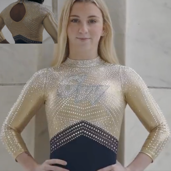
View a video of this leotard here.
Elizabeth: 8.700
Design 2.5/3, Fabric 0.9/1, Sparkle 0.9/1, School Spirit 0.8/1, Uniqueness 0.9/1, Overall Appearance 2.7/3
I looooove this! The amount of gold—and “real” gold vs. using yellow or something that doesn’t read as gold—so fantastic, and I love the amount of sparkle, too. Paired with the matte navy body really makes the rest of the design pop. My only issue is this sort of high-neck front makes me want it paired with a fully open back. In my opinion, the small keyhole gives the overall feel of having too much fabric? It’s hard to explain. That’s a minor complaint though.
Emily L: 9.000
Design 2.8/3, Fabric 1/1, Sparkle 1/1, School Spirit 0.7/1, Uniqueness 0.7/1, Overall Appearance 2.8/3
Oh my gosh, I love this one! I just love everything about it. My favorite parts are the pattern of the sparkle and the transition into the navy at the bottom. And the shade of gold that they used is so pretty.
Peri: 8.600
Design 2.5/3, Fabric 0.9/1, Sparkle 1.0/1, School Spirit 0.8/1, Uniqueness 0.8/1, Overall Appearance 2.6/3
GW put on a masterclass on using gold and navy in this leo. Its flashier designs typically have stones that look like armor, but it one-upped itself this time by making it look textured. Points too for leaving the underside of the whole arm less stoned—that looks way more comfortable.
Rebecca S: 6.300
Design 1.9/3, Fabric 0.4/1, Sparkle 0.6/1, School Spirit 0.8/1, Uniqueness 0.8/1, Overall Appearance 1.8/3
I basically got jumpscared by this video because a solid gold body is usually such a disaster, but GW made the best of it. I don’t adore this, but it’s solid. My biggest critique besides the fabric is that it has a really excessive quantity of gems basically everywhere. It looks so crunchy! I find the sleeve stripes a little odd, and the GW logo on the front doesn’t stand out as much as I’d have liked, but it’s still solid.
Arkansas: 8.100

View a video of this leotard here and images here.
Elizabeth: 7.700
Design 2.3/3, Fabric 0.8/1, Sparkle 0.8/1, School Spirit 0.7/1, Uniqueness 0.8/1, Overall Appearance 2.3/3
I like this! It’s not very “Arkansas,” but I like it nevertheless. The gunmetal grey is especially good, and I’m into the rhinestone pattern, unique back and ombre sleeves.
Emily L: 7.900
Design 2.3/3, Fabric 1/1, Sparkle 1/1, School Spirit 0.8/1, Uniqueness 0.5/1, Overall Appearance 2.3/3
Overall I like this one! I love the ombre sparkly sleeves and the slightly open back. The only thing I don’t like as much is the gunmetal stripes across the stomach.
Peri: 8.000
Design 2.4/3, Fabric 1/1, Sparkle 0.8/1, School Spirit 0.6/1, Uniqueness 0.7/1, Overall Appearance 2.5/3
Hello gunmetal! Between the rhinestone placement and matte fabric, this leo looks like one of the more comfortable ones in the SEC.
Rebecca S: 8.800
Design 2.6/3, Fabric 1/1, Sparkle 1/1, School Spirit 0.7/1, Uniqueness 0.8/1, Overall Appearance 2.7/3
So pretty! As we’ve discussed before, Arkansas has branding rules that forbid it from using meaningful quantities of black on its leotards, so gray is a very smart way around that. The matte body is lovely, the multicolor sparkles are pretty, and the strappy waistband and back are creative and fabulous.
Auburn: 7.175

View a video of this leotard here.
Elizabeth: 7.200
Design 2.2/3, Fabric 0.7/1, Sparkle 0.7/1, School Spirit 0.8/1, Uniqueness 0.5/1, Overall Appearance 2.3/3
I like this a lot. There’s nothing extraordinary about it, though. I think it would be one I’d fall in love with after seeing it in person though. I like the simple design on the front because it really lets the school logo stand out. I also like that the back is not only strappy but ombre strappy. The placement of the “belt” is also flattering, too.
Emily L: 8.200
Design 2.5/3, Fabric 1/1, Sparkle 1/1, School Spirit 0.9/1, Uniqueness 0.3/1, Overall Appearance 2.5/3
I really like this! I always love ombre, so I really like how the whole leo is ombre instead of just the sleeves. I also love the criss-cross back and how they aren’t all the same color.
Peri: 6.700
Design 2.0/3, Fabric 0.6/1, Sparkle 0.6/1, School Spirit 0.7/1, Uniqueness 0.5/1, Overall Appearance 2.3/3
This would be one of my favorites out of Auburn if the logo was more legible. Blue stoning stands out a tad more than orange over the white, still leaving the back and sleeves to incorporate space that can contrast orange. The belt placement is perfect, reading like the bottom of a rib cage instead of a belt.
Rebecca S: 6.600
Design 1.6/3, Fabric 1/1, Sparkle 1/1, School Spirit 0.9/1, Uniqueness 0.3/1, Overall Appearance 1.8/3
I disagree with the others about the belt: I think it’s substantially too high, and I’d personally have placed the logo a little higher too. Overall, this is pretty, though. I like the ombre on the straps, and I find the lack of a specific neckline feature oddly refreshing. The overall look is nice but not particularly memorable.
Towson: 6.825

View a video of this leotard here.
Elizabeth: 6.600
Design 1.8/3, Fabric 0.7/1, Sparkle 0.7/1, School Spirit 0.7/1, Uniqueness 0.7/1, Overall Appearance 2.0/3
I like this. The design on top is nice and adds just the right amount of gold to make it stand out without being too busy. I also like how the arms are subtly tied into the overall design, as well as the back hole. The only thing that’s giving me pause is the transition from design to solid. It’s a bit awkwardly placed.
Emily L: 7.300
Design 2.5/3, Fabric 0.6/1, Sparkle 0.8/1, School Spirit 0.5/1, Uniqueness 0.4/1, Overall Appearance 2.5/3
Maybe it’s just me but this reminds me of a Missouri leo. I like it! I wouldn’t call it unique, but I like the sparkles and the hole in the back. There isn’t too much school spirit either, but overall I think it’s good.
Peri: 6.300
Design 1.7/3, Fabric 0.7/1, Sparkle 0.5/1, School Spirit 0.6/1, Uniqueness 0.6/1, Overall Appearance 2.2/3
The detailing on the arms plays a big role in tying the overall design together. I just wish there was either a stark contrast or an intentional fade between the top and bottom half of the body. Big points from me for making sure the different gold tones all match, especially how they’re clustered at the back.
Rebecca S: 7.100
Design 2.2/3, Fabric 0.7/1, Sparkle 0.7/1, School Spirit 0.7/1, Uniqueness 0.8/1, Overall Appearance 2.0/3
This is not revolutionary, but it’s completely fine. I really like how the pattern is placed on the cuffs and the faux neckline is nice, though the combination with the real neckline is a little odd. The back hole is so-so.
Ball State: 6.775

View a video of this leotard here.
Elizabeth: 7.700
Design 2.3/3, Fabric 0.7/1, Sparkle 0.7/1, School Spirit 0.9/1, Uniqueness 0.8/1, Overall Appearance 2.3/3
I really like this! Normally I wouldn’t like the upper design here, since it’s a bit too cropped cardigan, but in this case it works because of the ombre and how it all flows smoothly from one element into the next—even onto the back. Having the actual statue as a logo is great for school spirit, but I personally don’t love it; it’s a little too obvious. I get it though, and am not going to take too much off for that in my score. Overall this is a good leo. Ball State is really killing it lately with its designs.
Emily L: 6.900
Design 1.8/3, Fabric 0.8/1, Sparkle 0.6/1, School Spirit 1/1, Uniqueness 0.9/1, Overall Appearance 1.8/3
I know it’s based on the statue, but I just don’t like it. I really do not like the triangle in the middle, and I feel like the entire bottom half of the leo is very bland. I respect the creativity, but this one just isn’t for me.
Peri: 8.100
Design 2.4/3, Fabric 0.9/1, Sparkle 0.6/1, School Spirit 0.9/1, Uniqueness 0.8/1, Overall Appearance 2.5/3
Shoutout to Ball State for being one of the few teams to include school branding without doing back text or a hip logo! This leo also looks super comfortable, with the mystique on the back being used as a design element rather than the main fabric.
Rebecca S: 4.400
Design 0.8/3, Fabric 0.7/1, Sparkle 0.7/1, School Spirit 0.7/1, Uniqueness 0.8/1, Overall Appearance 0.7/3
This is… really weird. Maybe the others are getting something I’m not, but for me it’s a hard no. There’s way too much going on. The triangle on the front is weird, but the extremely geometrical black trapezoid above it is even weirder. Plus, the ombre doesn’t flow into the rest of the design at all. You can’t really see from these pics, but the sparkles on the neckband are very excessive. I also would never have guessed that this was Ball State. I lived in Indiana for years, and this is the first I’ve heard of it apparently having an important statue.
Penn State: 6.500

View a video of this leotard here and details here.
Elizabeth: 6.300
Design 1.6/3, Fabric 0.5/1, Sparkle 0.5/1, School Spirit 1.0/1, Uniqueness 1.0/1, Overall Appearance 1.7/3
I’ll give all the creativity points here, but it’s almost a little too cheesy? In fact, this design reminds me more of a New Hampshire leo than it does a Penn State one. Overall, good not great.
Emily L: 6.700
Design 1.5/3, Fabric 0.7/1, Sparkle 1/1, School Spirit 1/1, Uniqueness 1/1, Overall Appearance 1.5/3
Well, you can’t say this one isn’t unique! The claw marks and the paw print cutouts on the back are so interesting, and I love the concept—I just don’t really love how it looks altogether.
Peri: 6.600
Design 1.7/3, Fabric 0.6/1, Sparkle 0.5/1, School Spirit 1.0/1, Uniqueness 1.0/1, Overall Appearance 1.8/3
THIS is how you buy into a theme, and I give Penn State credit for capitalizing on the symmetry of paw prints. Continuing the claw marks onto the mesh was a clever move too.
Rebecca S: 6.400
Design 1.7/3, Fabric 0.5/1, Sparkle 0.5/1, School Spirit 1/1, Uniqueness 1/1, Overall Appearance 1.7/3
Full points for school spirit, baby. This isn’t the prettiest leotard Penn State has ever worn by a long shot, but the commitment to the bit is through the roof.
Utah: 5.900
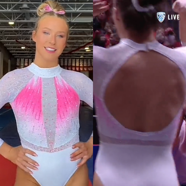
View a video of this leotard here, an image on the second slide here and a video from the competition here.
Elizabeth: 5.700
Design 1.5/3, Fabric 0.8/1, Sparkle 0.6/1, Theme Spirit 0.6/1, Uniqueness 0.7/1, Overall Appearance 1.5/3
This is a big no from me. It’s very similar to Florida’s pink leo but even busier. The pink seems too random and to me sort of screams “here are my boobs!” I do like the arm fabric/texture, though, but not in this context. Also, I have a problem with pink being associated with Title IX. It feels too “pink is for girls, blue is for boys” to me.
Emily L: 8.600
Design 2.7/3, Fabric 0.8/1, Sparkle 1/1, Theme Spirit 1/1, Uniqueness 0.4/1, Overall Appearance 2.7/3
It may be an unpopular opinion, but I like this one! It’s hard for me to dislike a pink leo, and I also like the neck and the use of sparkles. The only thing I don’t love is the UU logo on both sleeves.
Peri: 5.300
Design 1.5/3, Fabric 0.5/1, Sparkle 0.7/1, Theme Spirit 0.5/1, Uniqueness 0.7/1, Overall Appearance 1.4/3
This feels busier than it has to be, since the detailing is mostly in the texture and stoning. I give the Red Rocks credit for tapering the faux belt so it doesn’t cut the design in half as much as it could have.
Rebecca S: 4.000
Design 0.8/3, Fabric 0.3/1, Sparkle 0.5/1, Theme Spirit 1/1, Uniqueness 0.5/1, Overall Appearance 0.9/3
No, thank you. The only part of this that’s acceptable to me is the matte white bottom. The more I look at the mesh and sparkle patterns, the more bizarre they get. The sparkle “waistband” over mesh is odd, and the chunkiness of the ombre is just ugly. I don’t know if they were going for a tie-dye effect at the top there, but it does not look good either way.
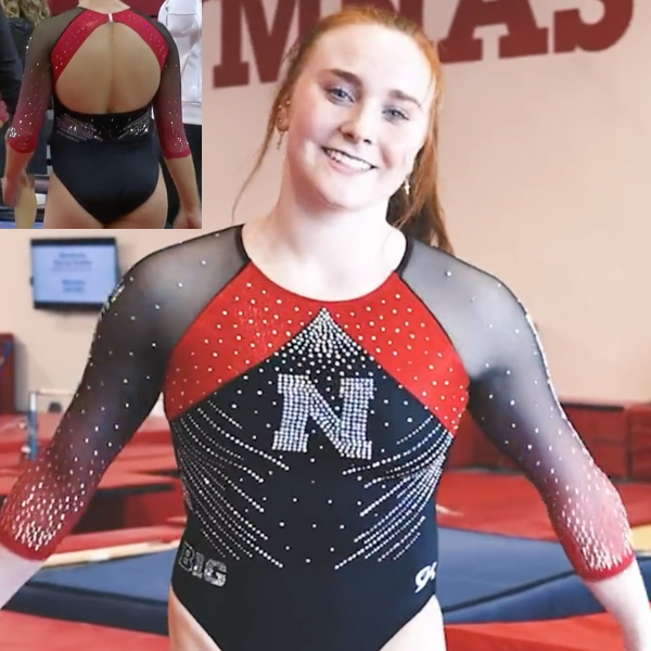
Nebraska: 5.475
View a video of this leotard here.
Elizabeth: 5.200
Design 1.5/3, Fabric 0.5/1, Sparkle 0.5/1, School Spirit 0.7/1, Uniqueness 0.5/1, Overall Appearance 1.5/3
I can’t pinpoint what, but there’s something that’s just not gelling with this design for me. Maybe it’s the solid blocks of red around the armpit or maybe it’s the fact that the ombre doesn’t really seem to go with the overall solid body. Maybe it’s just that the leo is just boring in general. I’ve come to expect wild designs from Nebraska, and this is a snooze-fest by comparison.
Emily L: 6.400
Design 2/3, Fabric 0.8/1, Sparkle 0.5/1, School Spirit 0.5/1, Uniqueness 0.6/1, Overall Appearance 2/3
There’s kind of a lot going on here. The red patches up at the top combined with the stripes of sparkles on the torso are a lot to look at. I think I might’ve liked it more without one or the other—I just don’t like both!
Peri: 5.300
Design 1.5/3, Fabric 0.5/1, Sparkle 0.6/1, School Spirit 0.6/1, Uniqueness 0.4/1, Overall Appearance 1.7/3
This looks like an AI-generated average of past Nebraska leos, and I’m not mad at it at all. If I can be picky about it, the red mesh and red mystique are slightly different, but in motion I wasn’t able to see the difference.
Rebecca S: 5.000
Design 1.1/3, Fabric 0.7/1, Sparkle 0.5/1, School Spirit 0.7/1, Uniqueness 0.8/1, Overall Appearance 1.2/3
What? I’m confused. This doesn’t make sense to me. Those armpit bands are so odd to me, and the sparkle placement isn’t doing anything for me either. I guess the sleeves are nice. Maybe a neckband could have tied this together somehow.
Rutgers: 3.575
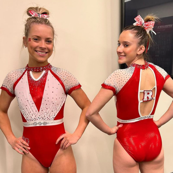
Elizabeth: 2.600
Design 0.5/3, Fabric 0.2/1, Sparkle 0.2/1, School Spirit 0.6/1, Uniqueness 0.9/1, Overall Appearance 0.2/3
Looking at this leotard makes me physically angry. I just hate everything about it. The only good part is the back. I hate the sleeves, I hate the white fabric on the front and how it’s layered over the red, and I hate the neck collar. Like the Florida equivalent, I hope this leotard never sees the light of day again.
Emily L: 4.300
Design 0.7/3, Fabric 0.5/1, Sparkle 0.9/1, School Spirit 0.5/1, Uniqueness 1/1, Overall Appearance 0.7/3
I really don’t like the short sleeves. The sleeves also look kind of loose, which I’m sure is more comfortable, but it doesn’t look very nice. And something about the white parts on the chest just don’t look good either. Overall this one is just a miss for me.
Peri: 4.300
Design 0.9/3, Fabric 0.4/1, Sparkle 0.5/1, School Spirit 0.6/1, Uniqueness 0.9/1, Overall Appearance 1.0/3
Give it sleeves, and I wouldn’t mind it? Rutgers has leaned into the “more is more” look over the last few years, and I just wish this design had sleeves to help distribute how much is going on.
Rebecca S: 3.100
Design 0.3/3, Fabric 0.5/1, Sparkle 0.5/1, School Spirit 0.6/1, Uniqueness 1/1, Overall Appearance 0.2/3
I think all the major points have been covered here by the other judges. Every time I look at it, it gets worse. What on earth were they thinking? The only way this garment could MAYBE be acceptable is under a fluffy skirt for a 4-year-old’s tap dance recital.
Bonus! Nastia Liukin Cup Seniors: 5.650
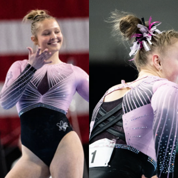
View a video of this leotard here.
Elizabeth: 4.200
Design 1.2/3, Fabric 0.5/1, Sparkle 0.4/1, Meet Spirit 0.6/1, Uniqueness 0.4/1, Overall Appearance 1.2/3
Meh. Way too much is going on with the back straps that you can’t even see some of the details, making it pointless. I know there’s the rule about coverage, but you don’t also need straps—just do plain fabric. I also dislike the front. It reminds me of one of my least favorite and overused-in-NCAA stock designs. Considering all the NLC leos over the years, this one may actually be one of my least favorites.
Emily L: 7.200
Design 2/3, Fabric 0.6/1, Sparkle 0.9/1, Meet Spirit 1/1, Uniqueness 0.7/1, Overall Appearance 2/3
There’s kind of a lot going on with this one. The stripes at the top going side to side and then up and down is just too much for me to look at. Also, like Elizabeth said, I don’t like the back straps, it just looks like they were trying to do too much, and it didn’t work out. But I love the shade of pink they used!
Peri: 4.500
Design 1.3/3, Fabric 0.5/1, Sparkle 0.4/1, Meet Spirit 0.5/1, Uniqueness 0.4/1, Overall Appearance 1.4/3
If we take the Nastia silhouette off and produce it in eight different colors, boom. We have a level 10 nationals leo. I can’t back it much beyond that because if we remove the actual silhouette of Nastia and the pink, we’d have no way of associating it with her or her meet.
Rebecca S: 6.700
Design 2.0/3, Fabric 0.7/1, Sparkle 0.8/1, Meet Spirit 0.8/1, Uniqueness 0.5/1, Overall Appearance 1.9/3
I don’t hate this nearly as much as everyone else. Yeah, it’s an odd riff on a stock design, but overall I think it’s relatively pretty. Weaknesses include the back straps and the fact that the waistline isn’t continuous, but I think the sleeves are very pretty and the pattern overall is fairly elegant. Also, props to Nastia for finally moving on from high necks, which have been unpopular with athletes in the past. Plus, relative restraint in sparkle placement!
Fan Poll
Congrats to Missouri for winning the Week 7 fan poll! Vote for your favorite from Week 8 here.
READ THIS NEXT: Leotard Rankings: Week 7
Article by Elizabeth Grimsley, Emily Lockard, Peri Goodman and Rebecca Scally
Like what you see? Consider donating to support our efforts throughout the year! [wpedon id=”13158″]

Penn States Leo is adorable. Perfect amount of sparkle, too much is distracting from the whole routine. To call it “cheesy” is just nasty. Any PSU student/alumni or fan would be proud!!