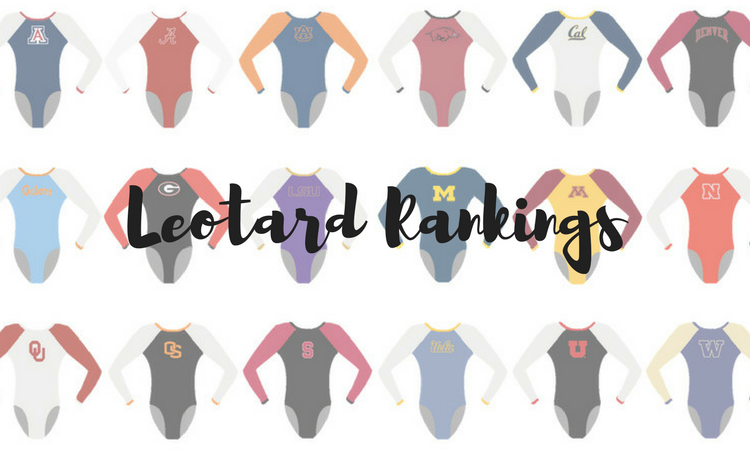
Do you ever see a leo and think it looks more like another team’s style than the team wearing it? Us too, which is why for this week’s leotard rankings, we’re doing less of a ranking and having more of a discussion about which team leos we think would work just as well or perhaps even better for other squads. Share your thoughts with us in the comments or on social media.
Oklahoma
Elizabeth: When I first saw this leo, I thought wow that’s something Utah would wear. It’s very unlike Oklahoma to go the black and white route, but I love it all the same.
Carolyn: If you just change the “OU” to a “DU” and tweak the colors just a bit, I think that this would be a great Denver leo!
Tara: I’m going to echo Carolyn here—I can definitely see Denver wearing something similar!
Utah
Elizabeth: I think majority white is what makes this the least like a Utah leo. It gives me Rutgers vibes for sure. Either way, it’s great!
Carolyn: This one really looks like a Utah leo, but if Arkansas adapted it, I could see it on that team too!
Tara: This is really on par with Arkansas’ recent new leos. I could definitely see the Razorbacks adopt this one too.
Stanford
Elizabeth: Look at Stanford being hip with the ombre and artsy design. I could see a team like Nebraska wearing this with the addition of a funky back.
Carolyn: Like Elizabeth said, I too can see this as a Nebraska leo. Nebraska often uses a lot of upper chest designs so this one reminded me of them.
Tara: The front design is giving me major Sacramento State vibes.
Rutgers
Elizabeth: I’m pretty sure when this design debuted I went to check and see if the leo Georgia has that’s similar is exactly the same or just super similar. It’s the latter, but it could work for either team.
Carolyn: This one gives me strong N.C. State vibes considering the use of the red, black and white. N.C. State also has a nice mix of leos that have color blocks and leos that are ombre, and this one is the perfect cross of that.
Tara: I’m pretty sure Georgia has a very similar leo, and I’m feeling like Nebraska has a similar one too. It definitely works for all three of these teams.
Pittsburgh
Elizabeth: We talked a lot about how this fish-scale design looks like LSU’s version. However, I have to admit that I prefer Pitt’s. It’s definitely more purpley than the Panthers normally use though.
Carolyn: I think that if West Chester had the budget for this leo, this would be a great look for it. I feel like the colors fit it better than for Pitt.
Tara: Like Elizabeth said, it reminds me of LSU’s version. I’d also love to see Washington incorporate this design in its purple and gold.
North Carolina
Elizabeth: Obviously taking out the baby blue, this leo could work for a number of teams. But I think I could see it as an Oregon State all-black design most likely.
Carolyn: Like Elizabeth said, this leo could work for many teams just because it is an all-black design with mesh and feathers and nothing specific on it that represents UNC. BYU debuted this butterfly design this past season that also incorporates some mesh that is really similar to this leo, so I would probably swap this leo to BYU.
Tara: This could work for a lot of teams! UCLA is the first team that comes to mind, but I can also see Oregon State pulling it off.
Nebraska
Elizabeth: When I saw this leo at regionals, I thought man Nebraska must have hated seeing Arkansas debut an eerily similar leo at SECs. When I think Nebraska, I definitely don’t think red and white, despite it wanting to move in more of that direction.
Carolyn: There is just simply no other team that would wear this like Arkansas would. This leo fits in SO well with Arkansas’ other designs, follows its brand guidelines and looks like this one that it already has, so this was a no-brainer for me.
Tara: It’s definitely similar to the new Arkansas one! Though I also think it’s 100% something Oklahoma would wear.
Alabama
Elizabeth: This is exactly the kind of elaborate design with random extra features that Oklahoma would wear. I’m just surprised Alabama went for the collared neck first.
Carolyn: For some reason I can see UCLA wearing this! Almost all of UCLA’s designs are symmetrical like this one or this one, and all have a royal feel to them like this Alabama one does.
Tara: This one’s very Oklahoma. The crimson and white and elaborate design are on par with typical Oklahoma designs.
Air Force
Elizabeth: Using mostly red is so unlike Air Force despite its colors obviously being red, white and blue. I could see this more on Arizona, which has many leos already that make me think, “America.”
Carolyn: I’m not sure if this counts or not, but I think if UIC still had a program then this would be a great leo to add to its collection. Both teams share the same red, white and blue colors, and I think it would fit in well.
Tara: Yep, this could definitely be an Arizona leo. Arizona loves to lean into the red, white and blue colors with ombre, and this one fits the bill.
William & Mary
Elizabeth: I would love to see Michigan State wear a leo like this. The shade of green is lovely, and unlike my fellow editors, I don’t mind the use of nude mesh.
Carolyn: Since Iowa wears a lot of nude mesh, it would only make sense for me to think of it when I see this leo. Just change the green to black, turn the arm squiggles into gold, and there you have it.
Tara: I feel like I’ve seen this on other teams before. If we’re going with this one as is, I could see it being an Alaska leo.
READ THIS NEXT: Leotard Rankings: Tokyo Olympic Leotards
Article by Elizabeth Grimsley, Carolyn Lien, Tara Graeve
Like what you see? Consider donating to support our efforts throughout the year!


