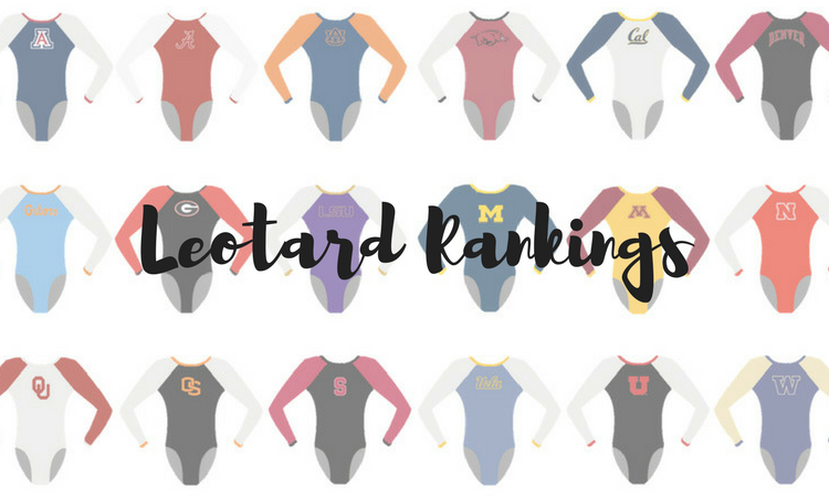
The criteria is a little different this season as we tweak some of our point totals to better analyze the designs. There will be up to three points for design, up to one point each for fabric and sparkle, school spirit and uniqueness and up to three points for overall appearance. This week Claire, Emily M and Izzi are joining Editor-in-Chief Elizabeth to help judge.
Note: Texas Woman’s debuted a new leo, but we are saving it to judge closer to the USAG national championships.
Iowa: 8.925
(Note the fact that the nude mesh is different shades to match skin tones.)
Elizabeth: 8.500
Design 2.7/3, Fabric 0.8/1, Sparkle 0.8/1, School Spirit 0.6/1, Uniqueness 0.9/1, Overall Appearance 2.7/3
I, unlikely many of my fellow editors, love a good nude mesh leo. I think it’s the illusion of a long sleeve leo looking like a short sleeve one that does it for me. But then Iowa had to go and make it even better by matching the nude to the gymnasts’ skin tones.
Claire: 9.100
Design 3/3, Fabric 1/1, Sparkle 0.8/1, School Spirit 0.6/1, Uniqueness 1/1, Overall Appearance 2.7/3
I’m one of those editors who generally doesn’t like nude mesh leos, but the combination of sparkles, a simple black bodice and mesh that actually matches the gymnasts’ skin tones make this one a stunner. Other teams take note: This is the new gold standard for incorporating nude mesh into leos.
Izzi: 9.200
Design 2.8/3, Fabric 1.0/1, Sparkle 0.9/1, School Spirit 0.7/1, Uniqueness 0.9/1, Overall Appearance 2.9/3
I loved this leo—turns out I don’t hate nude mesh, I just hate nude mesh that doesn’t match the gymnast! It gives off figure skating vibes but still feels like a gymnastics leotard. My one complaint is the cutout in the back—it seems weird to have a cutout when the fabric is supposed to match the skin anyways.
Emily M: 8.900
Design 2.8/3, Fabric 1.0/1, Sparkle 0.5/1, School Spirit 0.8/1, Uniqueness 1.0/1, Overall Appearance 2.8/3
You simply love to see mesh matching gymnasts’ skin tones. I usually hate nude mesh. Maybe it was because it’s not really “nude!” This looks so classy, with the black sweetheart neckline. A real winner.
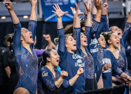
Temple: 8.900
Elizabeth: 8.200
Design 2.3/3, Fabric 0.8/1, Sparkle 0.7/1, School Spirit 1.0/1, Uniqueness 1.0/1, Overall Appearance 2.4/3
Up close, the design is a bit busy, but I love the story behind it—and it looks great in motion. I also love the unique back and how the clasps work.
Claire: 9.300
Design 3/3, Fabric 0.7/1, Sparkle 1/1, School Spirit 0.7/1, Uniqueness 1/1, Overall Appearance 2.9/3
I love absolutely everything about this! The graffiti is great on its own, but the crystal embellishments take it to the next level. And that back is just so cool.
Izzi: 9.000
Design 2.5/3, Fabric 1.0/1, Sparkle 1.0/1, School Spirit 1.0/1, Uniqueness 1.0/1, Overall Appearance 2.5/3
I absolutely love the ode not just to the school, but the city of Philadelphia! The use of sparkle is incredible and actually complements the design instead of overpowering it. Though it’s busy, I actually prefer the design up close when the detail shines through.
Emily M: 9.100
Design 2.5/3, Fabric 1.0/1, Sparkle 0.8/1, School Spirit 1.0/1, Uniqueness 1.0/1, Overall Appearance 2.8/3
Phew Temple! The top of this guy is just a touch busy and chaotic, but from far away the colors look so stunning. I love the back! I love the city pride! What a fun look.
Illinois: 8.325
Elizabeth: 8.800
Design 2.8/3, Fabric 0.7/1, Sparkle 0.8/1, School Spirit 0.7/1, Uniqueness 1.0/1, Overall Appearance 2.8/3
I love everything about this leo, but I especially love the back. It’s SO creative, and I love how orange is incorporated. Add in the front V + triangles, and this design is a real winner for me.
Claire: 8.500
Design 2.6/3, Fabric 0.7/1, Sparkle1/1, School Spirit 1/1, Uniqueness 0.7/1, Overall Appearance 2.5/3
Gorgeous design from Illinois! The illusion deep sweetheart neckline isn’t my favorite, but that’s really my only criticism. That back is so unique and absolutely fantastic.
Izzi: 7.900
Design 2.2/3, Fabric 1/1, Sparkle 0.8/1, School Spirit 0.7/1, Uniqueness 0.7/1, Overall Appearance 2.2/3
I’m really torn on this one because I love the front and I hate the back (unpopular CGN opinion). The front is flattering, and I like the mesh illusion. I love the sparkle on the back, but not the huge cutout and straps—they fit weirdly in motion and cut off the design.
Emily M: 8.100
Design 2.5/3, Fabric 1.0/1, Sparkle 0.6/1, School Spirit 0.6/1, Uniqueness 0.9/1, Overall Appearance 2.5/3
I really like a lot about this leo, like the extremely unique back and the use of colored crystals. My hang up is with the cut of the neckline.
Arkansas: 8.000
Elizabeth: 7.200
Design 2.6/3, Fabric 0.3/1, Sparkle 0.6/1, School Spirit 0.7/1, Uniqueness 0.7/1, Overall Appearance 2.3/3
I love a good red and white matte leo, and I even like the fish scale design, but for some reason the overall design looks cheap. I feel that way about a lot of Ozone leos. I don’t know if it’s the fabric used or what, but meh.
Claire: 7.500
Design 2/3, Fabric 0.5/1, Sparkle 1/1, School Spirit .7/1, Uniqueness 1/1, Overall Appearance 2.3/3
There’s a lot I like about this leo: The fish scales, the sparkle pig and cool back construction. However, like Elizabeth said, there’s something about the material that’s just not working for me.
Izzi: 9.200
Design 2.7/3, Fabric 0.9/1, Sparkle 1.0/1, School Spirit 1.0/1, Uniqueness 0.9/1, Overall Appearance 2.7/3
I absolutely loved this new Arkansas leo. Apparently my fellow editors don’t like the material, but I actually found it really nice in action. It looked more matte out on the competition floor, which felt very sophisticated (and like Jordyn is bringing some UCLA leo designing to Fayetteville). I love the lower waist, and I am obsessed with the fish scale design. The only problem for me is the back, which like the Illinois leo, feels excessive and overdesigned.
Emily M: 8.100
Design 2.5/3, Fabric 0.6/1, Sparkle 1.0/1, School Spirit 0.8/1, Uniqueness 0.9/1, Overall Appearance 2.3/3
This is really nice! I love the back—simple but unique—and the crystal pattern is nice. The V line at the waist is very retro, but not my most favorite.
Southern Utah: 7.475
Elizabeth: 7.500
Design 2.2/3, Fabric 0.7/1, Sparkle 0.8/1, School Spirit 0.9/1, Uniqueness 0.5/1, Overall Appearance 2.4/3
Black + open back/back hole + school spirit in the form of colored rhinestones. This is a win for me. Sure, it may be a touch boring, but every team needs a good black leo, and this is a good black leo for Southern Utah.
Claire: 8.200
Design 2.3/3, Fabric 0.7/1, Sparkle 1/1, School Spirit 1/1, Uniqueness 0.5/1, Overall Appearance 2.7/3
A simple, athletic black leo with lots of sparkles (including a giant crystal mascot)? I’m sold.
Izzi: 7.000
Design 2.0/3, Fabric 0.5/1, Sparkle 1.0/1, School Spirit 1.0/1, Uniqueness 0.4/1, Overall Appearance 2.1/3
This leo is just so boring to me. I do appreciate the school spirit, but besides that there’s not much to be excited about. It’s fine.
Emily M: 7.200
Design 2.0/3, Fabric 1.0/1, Sparkle 0.8/1, School Spirit 0.9/1, Uniqueness 0.6/1, Overall Appearance 2.4/3
I love an all-black look! The use of colorful crystals also gets an A+ from me. This isn’t the most unique look, but I enjoy it.
Auburn: 7.100
Elizabeth: 7.200
Design 1.8/3, Fabric 0.9/1, Sparkle 0.8/1, School Spirit 0.8/1, Uniqueness 0.9/1, Overall Appearance 2.0/3
You can’t say this leo isn’t unique. For the most part I like it, but I just can’t get past the faux camisole underneath the V in the front and back, giving me real Limited Too, 2000s vibes.
Claire: 7.100
Design 1.5/3, Fabric 1/1, Sparkle 1/1, School Spirit 1/1, Uniqueness 0.7/1, Overall Appearance 1.9/3
This one’s frustrating because it’s almost so good! If they’d left off the ombre panels from the neckline and back, this would have been pretty great.
Izzi: 7.100
Design 1.6/3, Fabric 0.7/1, Sparkle 1.0/1, School Spirit 0.6/1, Uniqueness 1.0/1, Overall Appearance 2.2/3
I don’t hate this as much as I thought I would. Like Elizabeth, I find it really hard to ignore the fake camisole, but the rest of the design holds up. For me, the criss-cross belt saves it from being too terrible.
Emily M: 7.000
Design 1.0/3, Fabric 0.8/1, Sparkle 0.6/1, School Spirit 0.8/1, Uniqueness 1.0/1, Overall Appearance 2.8/3
I am enamored with the color of this ombre. The bronze that it hits is *chef’s kiss.* I dislike how busy it is, though. There are just too many pieces at the neckline along the front and back.
Nebraska: 6.775
Note: Black part on bottom is velvet.
Elizabeth: 5.700
Design 1.7/3, Fabric 1.0/1, Sparkle 0.6/1, School Spirit 0.5/1, Uniqueness 0.4/1, Overall Appearance 1.8/3
When I first saw this leo this fall, I thought it was pretty boring compared to what Nebraska has revealed lately. But then I realized the body was velvet, skyrocketing my opinion of it at least a couple points-worth.
Claire: 7.100
Design 2.2/3, Fabric 1/1, Sparkle 0.7/1, School Spirit 0.5/1, Uniqueness 0.5/1, Overall Appearance 2.2/3
This leo is pretty enough, but not especially memorable. I am very curious where they hid the sparkly corn cob, though…
Izzi: 7.400
Design 1.8/3, Fabric 1.0/1, Sparkle 1.0/1, School Spirit 0.6/1, Uniqueness 0.6/1, Overall Appearance 2.4/3
This leo is pretty boring, but there’s velvet, which takes it up a notch. I like the sparkle on the arms. Besides that, it’s pretty inoffensive.
Emily M: 6.900
Design 1.8/3, Fabric 0.8/1, Sparkle 1.0/1, School Spirit 0.8/1, Uniqueness 0.5/1, Overall Appearance 2.0/3
This is just alright. The ombre is nice, and it’s very flattering on everyone, but we’ve seen so many iterations of flame patterns, I just can’t take it anymore!
Minnesota: 6.750
Elizabeth: 7.000
Design 1.6/3, Fabric 0.6/1, Sparkle 0.6/1, School Spirit 0.7/1, Uniqueness 0.7/1, Overall Appearance 1.8/3
This design had such potential, but it just misses the mark for me. I love the white on top. It reminds me of that super athletic Michigan leo. However, the mesh belly band is just too wide.
Claire: 7.200
Design 2.2/3, Fabric 0.5/1, Sparkle 0.7/1, School Spirit 0.7/1, Uniqueness 1/1, Overall Appearance 2.1/3
I really love the top half of the leo; the pairing of white bodice and black mesh sleeves is very cool and slightly retro. I even like the mesh band (the piping makes it work). However, the shiny grey bottom half seems out of place. If it were maroon or even black, I think it’d bring the whole look together.
Izzi: 6.400
Design 2.1/3, Fabric 0.3/1, Sparkle 0.5/1, School Spirit 0.8/1, Uniqueness 0.5/1, Overall Appearance 2.2/3
In theory I love this leo, but something about it is off. I don’t mind the mesh band, but I think it’s a bit too wide. I like the jersey-style of the block lettering on the front, but the lack of Minnesota colors in the rest of the leo seems like a missed opportunity for me.
Emily M: 6.400
Design 1.9/3, Fabric 0.5/1, Sparkle 0.6/1, School Spirit 0.8/1, Uniqueness 0.6/1, Overall Appearance 2.0/3
I really enjoy the colors here. They’re very different for the Gophers. I hate the mesh belt, though, which brings the whole thing down for me. Why mesh?!
READ THIS NEXT: Leotard Rankings: Week 1
Article by Elizabeth Grimsley, Claire Billman, Izzi Baskin and Emily Minehart
Like what you see? Consider donating to support our efforts throughout the year! [wpedon id=”13158″]


