
This summer we’re continuing our team-specific throwback leotard rankings. Rather than looking at single meets, we’re taking a trip down memory lane for individual teams, taking into account a wide range of leos from different eras and finding our all-time favorites from a single program, as well as illustrating how designs have changed over the years.
Here’s how it’ll work: Our judges for the week will choose their top 10 and rank them based on their personal preferences. Plus, you’ll get a chance to tell us your thoughts! Did we leave out your all-time fave from the team? Let us know in the comments or on social media.
This week, we’re taking on West Virginia with Mary Emma and Tara joining Elizabeth for the rundown.
Elizabeth
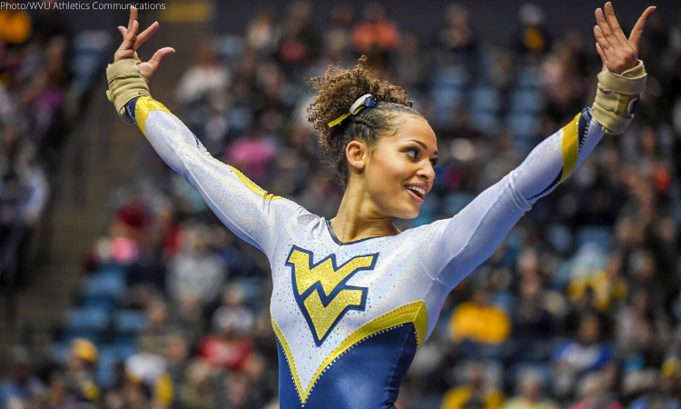
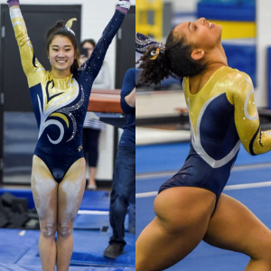
No. 13: West Virginia: Like UCLA’s above, this is another great modern take on a classic throwback design.

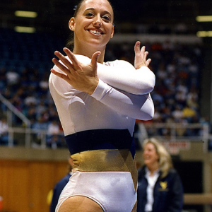
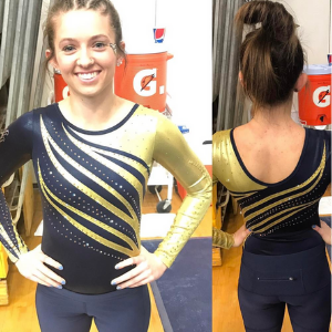
No. 2: I know some of my peers gripe at this leo’s design for being too much like a circus tent, but I like it. The back is especially nice with the thicker straps over the open back.

No. 3: The older sister to my No. 1, I love the gold fabric used in this design. Paired with the white and limited navy makes this a great leo.

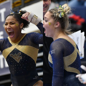
No. 4: Normally a leo like this would be nothing special: full navy with some rhinestones around the logo on the chest. But my favorite part is the back. I can’t get enough of the thin white and gold stripes in the v.

No. 5: While the neckline isn’t my favorite, this leotard sits so high on my list because of the use of what I like to call “real gold” fabric. It’s an older design, but I still like it.
No. 6: There’s a bit of a drop off between my No. 5 leo and this one, but here we are. I like the color used here and the effort made with doing a design on the arms with rhinestones. It’s just a little too plain to sit anywhere higher than No. 6.
No. 7: I hadn’t seen this leotard before searching through the archives for this post, but it’s a good one. I like the use of silver and gold/yellow on a navy backdrop.

No. 8: More use of white please! I like this leo for its focus on the large logo, which I know some of my fellow editors don’t care for. I also love the thick yellow back band.

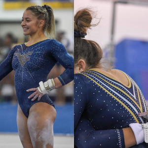
No. 9: The subtle ombre in the starburst design is what lands this leotard on my list.

No. 10: I don’t love the shade of yellow/gold used, but overall the design is solid and I like the effort on the unique back as well.
Mary Emma

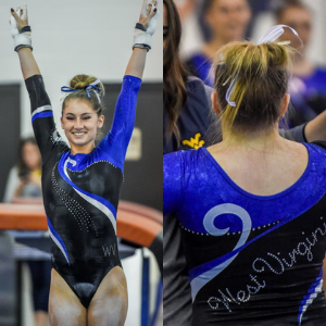
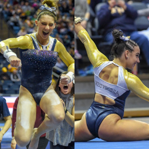
No. 1: I really appreciate this modern take on a classic throwback design (see my No. 10 pick). The ombre blue is gorgeous, and it just screams WVU to me.

No. 2: I was on the fence about this one when I first saw it, but it’s really growing on me. The circus tent design is unique, and I really like the strappy back.

No. 3: This is very much a classic WVU design. I love the way the yellow accents pop on the leo without being too much.

No. 4: When I picture a West Virginia leo, this is the one I think of. I love the starburst design and the ombre on the sleeves.
No. 5: My favorite part of this leo is the sparkly logo on the chest. West Virginia definitely does not shy away from these types of designs. The gold stripe is not normally something I gravitate toward, but I like how it looks in this case.

No. 6: Another classic West Virginia logo design. I don’t like this one quite as much as the two previous ones because it’s a bit too busy, but it still has a place in my top 10.
No. 7: Because there’s a lack of gold, this leo does not immediately scream West Virginia to me, but I kinda like that it went for something a bit different here.

No. 8: This is a really pretty yet simple design. It has a lovely navy color and just the right amount of sparkle.

No. 9: While I don’t love the shade of yellow used here, I really like the swirly design and the sparkle, so this has a place in my top 10.
No. 10: I had to include this classic throwback leo in my top 10. It gives me Wonder Woman vibes, and of course it was the inspiration for my No. 1 pick.
Tara

No. 1: I love the modern take on a classic design. The ombre is stunning, and it has just the right amount of gold. It’s a clever way to incorporate the logo, and I dig it.

No. 2: I love a good starburst design, and this is a good one. It’s bright and vibrant, has just the right amount of sparkle and the subtle ombre on the sleeves is great.

No. 3: It may not be the most unique of the bunch, but it’s a nice one. I love the gold ribbon and how it continues onto the back. Plus, the small logo on the front is a great touch.

No. 4: This leo has grown on me. My favorite part is the crossy back, but the front is nice too.
No. 5: I enjoy the sparkle details on this. A+ for the use of gold sparkles in the logo, too. It’s pretty simple, yet very nice.
No. 6: The execution of this swirl design is excellent. It’s well balanced, and I enjoy the addition of a sparkle swirl to complement the rest of the design.

No. 7: This is super simple, but I like it. It’s elegant and has just the right amount of sparkle. You can’t go wrong with simple navy and sparkles.
No. 8: This leo reminds me a lot of the other starburst leo, but I enjoy it as well. My only real complaint is the navy is so dark that it’s coming off as more black than navy.
No. 9: I don’t typically love gold sleeves like this, but the rest of the design makes up for it. From the navy bodice to the open back with “West Virginia” on the strap is lovely, and I enjoy the vertical navy and white by the neckline.

No. 10: I couldn’t not include this classic. While I definitely like the modern take on this better, this is still a great design with cleverly incorporated school spirit.
READ THIS NEXT: Throwback Leotard Rankings: Michigan State
Article by Elizabeth Grimsley, Mary Emma Burton and Tara Graeve
Like what you see? Consider donating to support our efforts throughout the year! [wpedon id=”13158″]


One comment